Modern UI Design for IIN Desserts

Supreet S


IIN Desserts
The Mission
IIN Desserts is a boutique bakery dedicated to crafting sweet memories one slice at a time. Their core mission is to elevate traditional baking by pairing organic ingredients with bespoke artisanal design and bold flavor innovation. They needed a digital presence that perfectly mirrored the premium, handcrafted quality of their physical products.
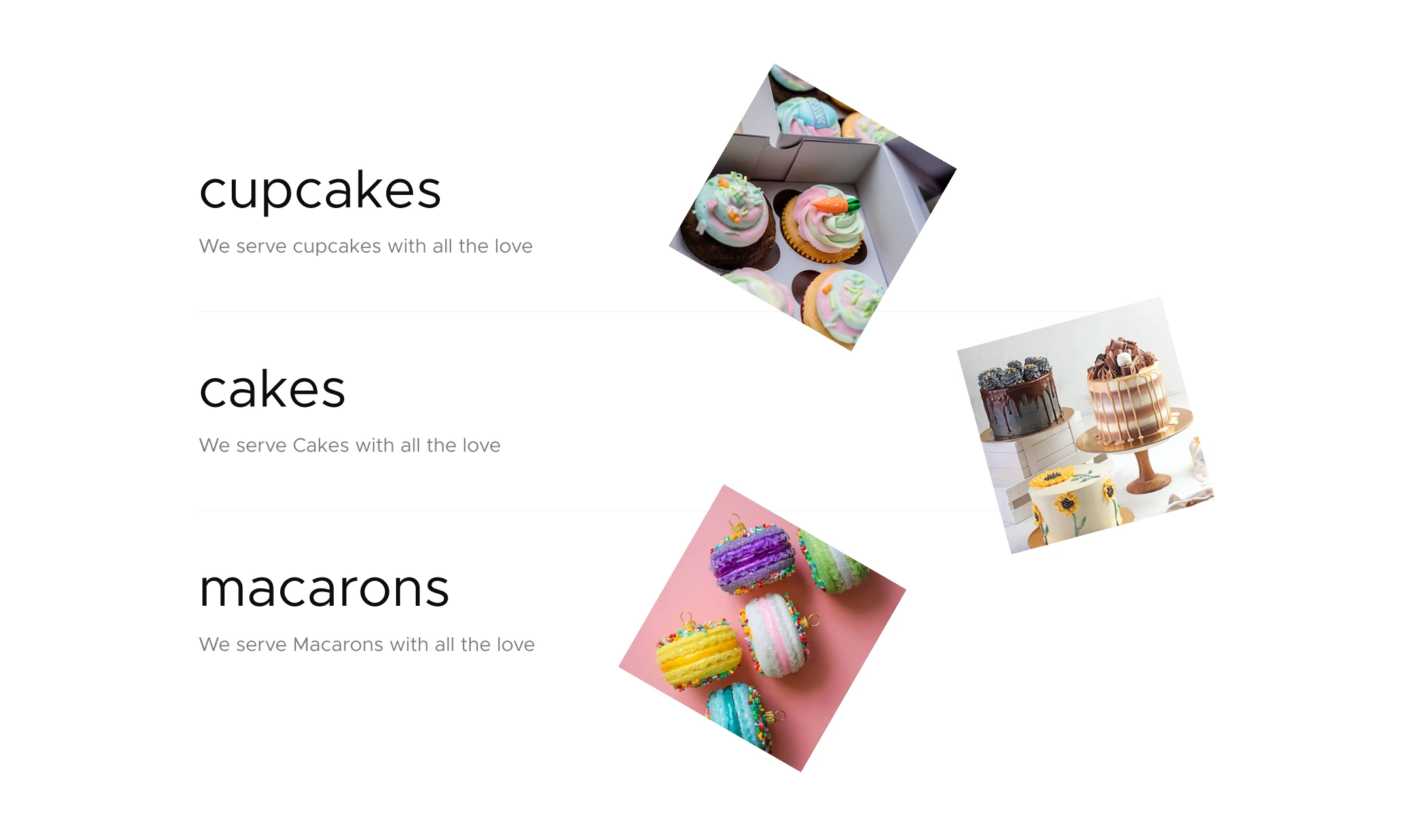
Food Menu Section
The Challenge
Many bakery websites fall into the trap of feeling cluttered or overly rustic. The primary challenge for this UI project was to break away from standard food industry templates and build an interface that felt distinctly modern, editorial, and sophisticated. The design needed to put the mouthwatering photography front and center while clearly communicating the brand philosophy and high quality standards to the user.
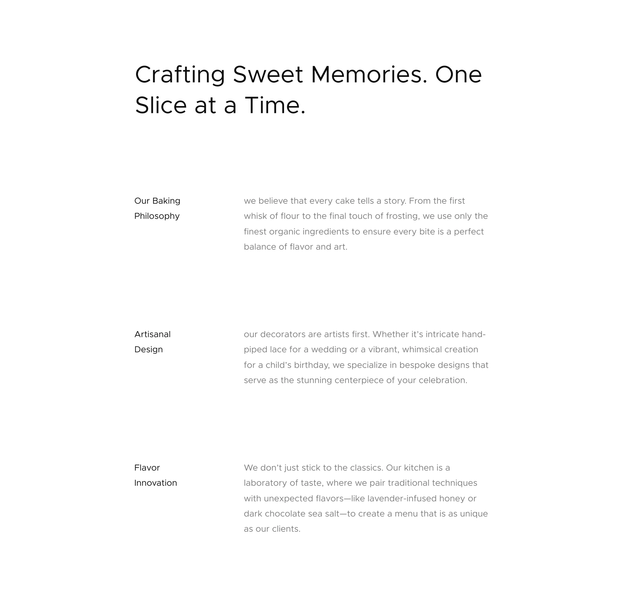
Our Values Section
The Concept
To achieve this, I developed a highly minimalist, magazine style layout. By utilizing vast amounts of white space, I ensured that the vibrant colors and textures of the pastries would serve as the primary visual anchors. I paired a stark, modern sans serif typeface with a playful, hand drawn script to balance corporate professionalism with the warm, human touch of artisanal baking.
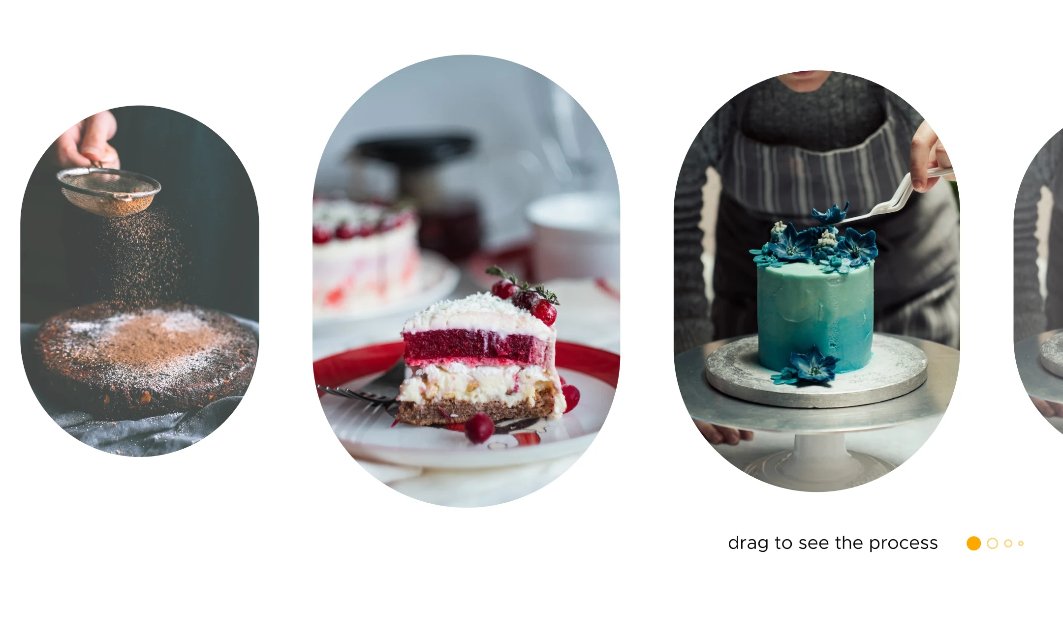
Process Section (Interactive Gallery)
Design Breakdown
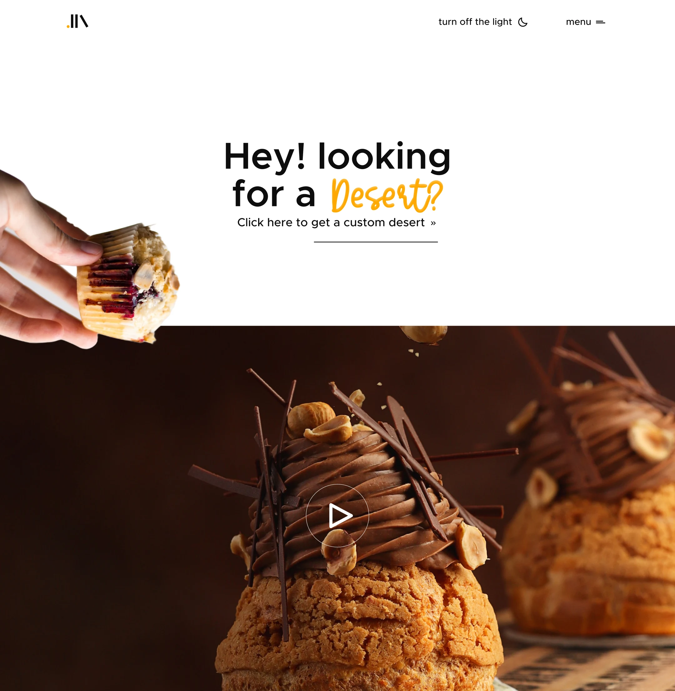
The Hero Experience: The landing page features a striking, high resolution image of a pastry that playfully interacts with the edge of the screen. Paired with the inviting headline and a direct call to action to get a custom dessert, it immediately engages the user's appetite and curiosity.
Interactive Lighting: I integrated a seamless "turn off the light" toggle in the top navigation. This custom dark mode feature not only provides a highly modern user experience but also allows the rich colors of the baked goods to dramatically pop against a sleek dark background.
Editorial Layout: For the core informational sections, I utilized an asymmetrical text grid. This layout breaks down their Baking Philosophy, Artisanal Design, and Flavor Innovation into easily digestible, elegant blocks of text, creating a smooth and calming reading experience.
Typography: The structural contrast between the bold, geometric headers and the flowing script accents creates a perfect visual metaphor for the brand itself: highly structured traditional techniques mixed with vibrant, unexpected flavor profiles like lavender infused honey.
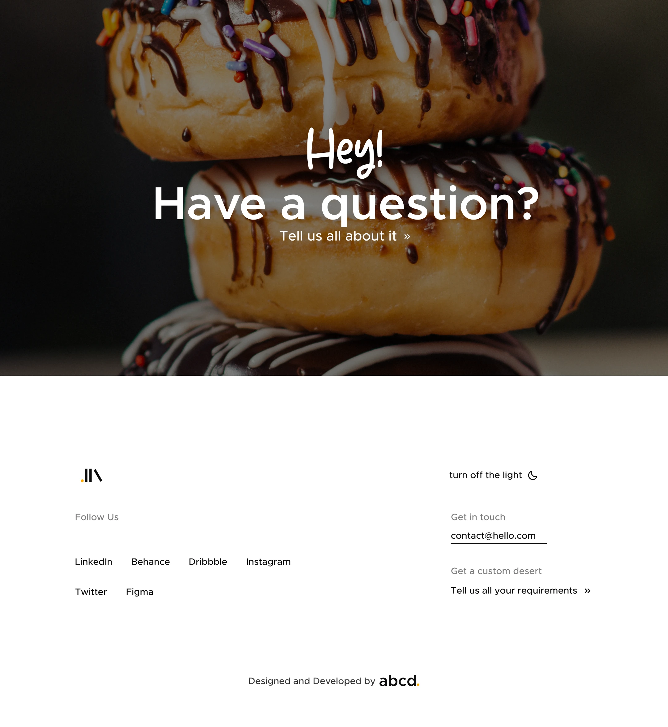
Footer and Main CTA
The Outcome
The final website UI is a clean, mouthwatering digital storefront. I successfully translated the physical artistry of IIN Desserts into an intuitive, visually engaging online experience that drives user interaction and elevates the brand above its local competition.
Let's Build Your Vision
Looking to elevate your digital storefront with a custom, high conversion UI design? Let's connect and craft an unforgettable experience for your users.
Like this project
Posted Jul 10, 2026
View my minimalist website UI design for a premium boutique bakery. I combined modern editorial layouts, dark mode integration, and artisanal branding.