Dhaka Stock Market Data Analysis With Python
MOHAMMAD ULLAH
IntroductionDataset OverviewLet's proceed to the analysis.Import the necessary librariesLoading the dataset with pandasCheck the data typesCalculate basic summary statistics for each column (mean, median, standard deviation, etc.)Get the top 5 companies with the highest total volume:Explore the distribution of the 'Close' prices over timeIdentify and analyze any outliers (if any) in the dataset of volume columnCreate a line chart to visualize the 'Close' prices over timeCalculate and plot the daily percentage change in closing pricesInvestigate the presence of any trends or seasonality in the stock pricesApply moving averages to smooth the time series data in 15/30 day intervals against the original graphCalculate the average closing price for each stockIdentify the top 5 and bottom 5 stocks based on average closing price.Calculate and plot the rolling standard deviation of the 'Close' pricesCreate a new column for daily price changeAnalyze the distribution of daily price changesIdentify days with the largest price increases and decreasesIdentify stocks with unusually high trading volume on certain daysExplore the relationship between trading volume and volatilityCorrelation matrix between the 'Open' & 'High', 'Low' &'Close' pricesCreate heatmaps to visualize the correlations using the seaborn package.Acknowledgments
Introduction
Welcome to a journey through the Dhaka stock market of 2022!
This blog is your gateway to decoding market trends, deciphering data patterns, and discovering the specifics of Bangladesh's financial landscape. Through Python-powered analysis and visualizations, we'll unveil the underlying narratives behind stock movements. Join me on this data-driven journey as we unravel the Dhaka stock market's story, offering valuable insights for traders, investors, and enthusiasts seeking a deeper understanding of market dynamics.
Dataset Overview
Within this analysis, we harnessed a
CSV file containing a substantial dataset for exploration. The dataset comprises 49,159 rows and 7 columns, encapsulating a wealth of information related to the Dhaka stock market. It spans the time period from January 2022 to June 2022, encompassing a diverse array of 412 companies. Key features in this dataset include columns such as Date, Name, Open, High, Low, Close, Volume. This dataset offers a comprehensive perspective on the dynamics of the Dhaka stock market, allowing for in-depth analysis and insights into this sector.Let's proceed to the analysis.
Import the necessary libraries
These libraries are essential components for our analysis.
NumPy: Utilized for numerical operations and array manipulations.
Pandas: Essential for data manipulation and analysis, offering powerful data structures and tools.
Matplotlib.pyplot: Enables the creation of visualizations, including plots, charts, and graphs.
Seaborn: A robust library for statistical data visualization, enhancing the aesthetics and overall appeal of visual representations.
Loading the dataset with pandas
In this section, the stock market data is imported using the
read_csv() function from the pandas library within a .py file in VS Code. Following this, the head() function is employed to showcase the first 5 rows of the dataset, providing an initial overview of the structure and contents of the Dhaka stock market data.Output:
Check the data types
Verify the data types of all columns using the following command. Ensuring correct data formatting is crucial before analysis. Analyzing data in the wrong format can lead to inaccurate insights or results.
Output:
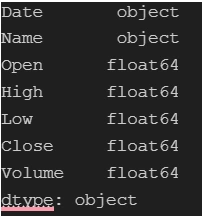
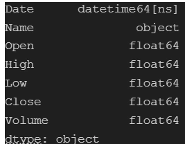
We notice an issue with the data type of the
Date column—it appears as an object type when it should be in a DateTime format. Therefore, we need to convert the object type to datetime. Let’s proceed with that conversion.Utilizing
pd.to_datetime(), we perform the conversion. Additionally, we set dayfirst=True since the date format is %d%m%y. Let's recheck the data types to confirm the successful conversionOutput:
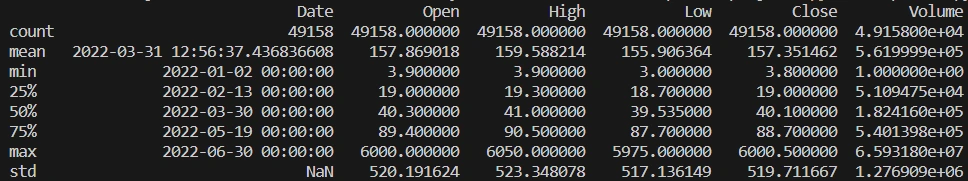
Calculate basic summary statistics for each column (mean, median, standard deviation, etc.)
The code generates essential statistical measures for the
df DataFrame using the describe() function. This function delivers crucial metrics including count, mean, standard deviation, as well as minimum and maximum values for each numerical column in the dataset. These statistics offer a comprehensive overview of the data's central tendencies and variability.Output:
Get the top 5 companies with the highest total volume:
Handpicking key companies from the dataset allows for a deeper analysis of their market impact. The code snippet identifies the top 5 companies by their total trading volume.
Output:

Explore the distribution of the 'Close' prices over time
Analyzing the 'Close' price distribution over time for the top 5 companies, this code generates histograms for each company. The visualizations provide insights into the variations in closing prices, facilitating a comparative assessment of their stock performance.
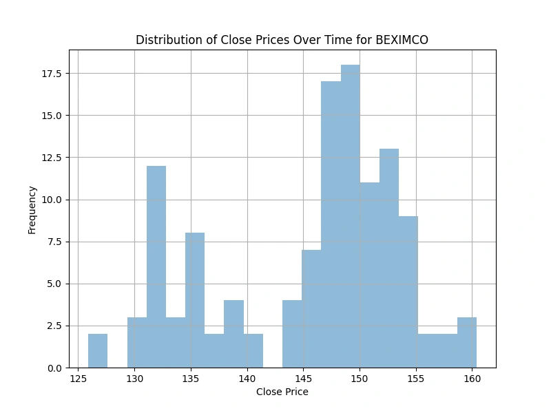
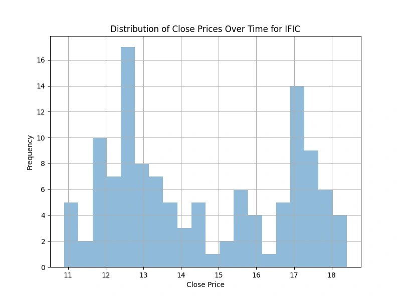
(2 selected plots from the 5 output plots are provided for reference.)
Identify and analyze any outliers (if any) in the dataset of volume column
volume columnOutliers beyond the maximum quartile in the 'Volume' boxplots indicate:
Unprecedented Extremes: Representing values extraordinarily higher than the upper quartile (Q3) and even beyond the maximum observed values.
Exceptional Market Activity: Signifying unparalleled and exceptionally rare trading volumes for these companies, often unique and unmatched in the dataset.
Possible Data Anomalies: Needing scrutiny for accuracy, as these extreme values might sometimes arise from errors or anomalies in the data.
Unmatched Market Events: Reflecting extraordinary market occurrences or exceptional trading interests that significantly deviate from typical market behavior.
Potential Market Impact: While confirming the accuracy, highlighting moments of extreme market activity that could have impacted short-term price movements or market perceptions.
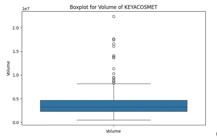
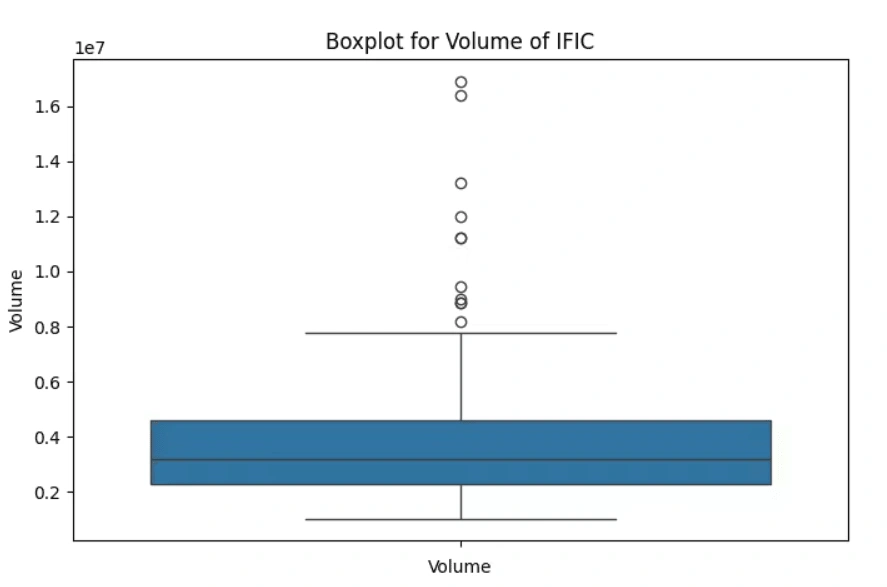
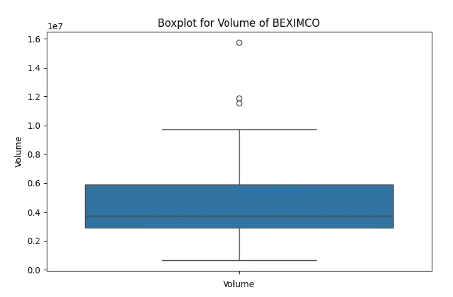
(3 selected plots from the 5 output plots are provided for reference.)
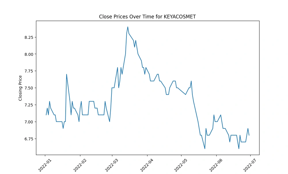
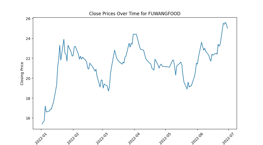
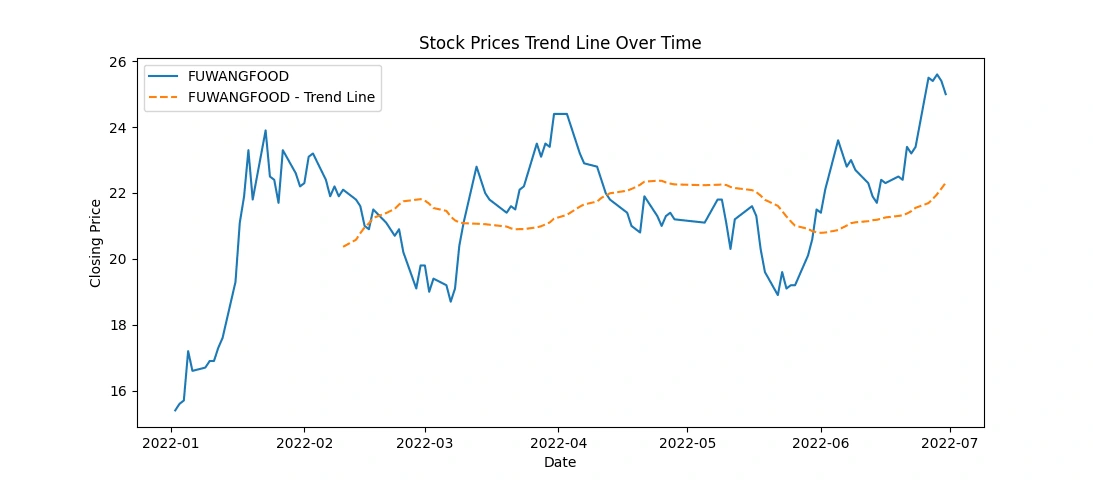
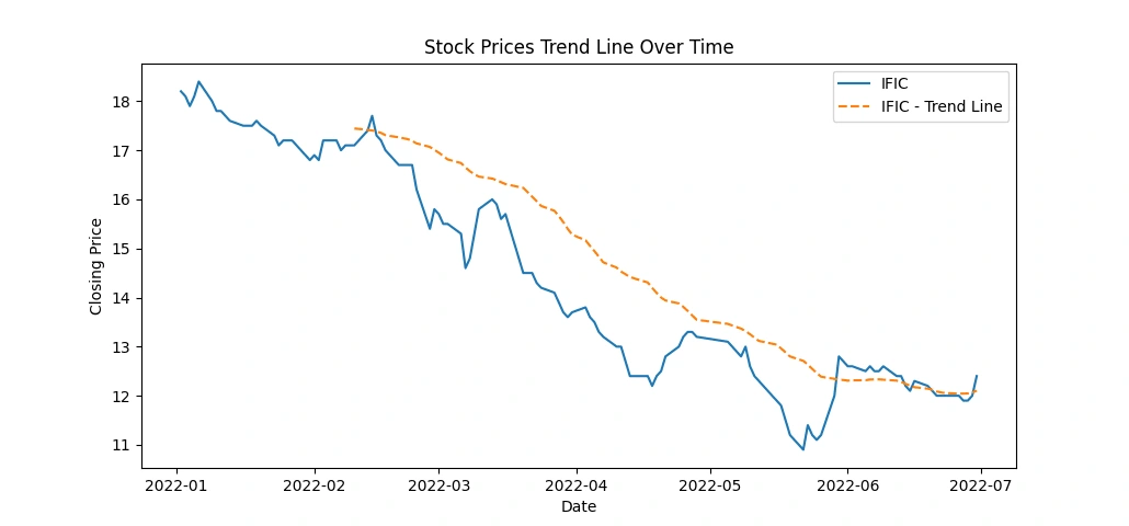
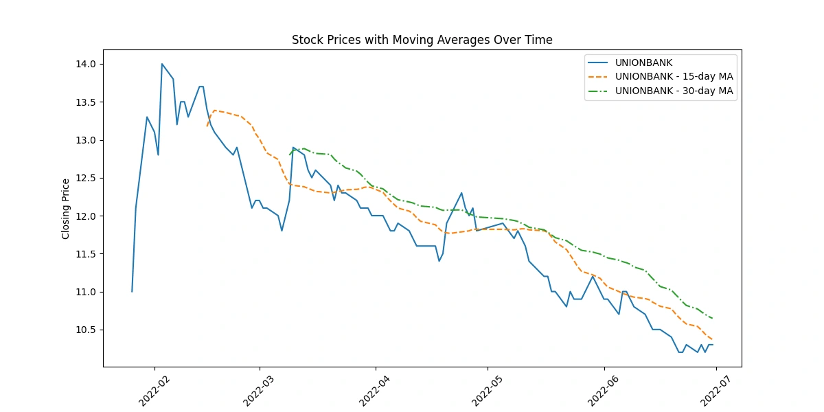
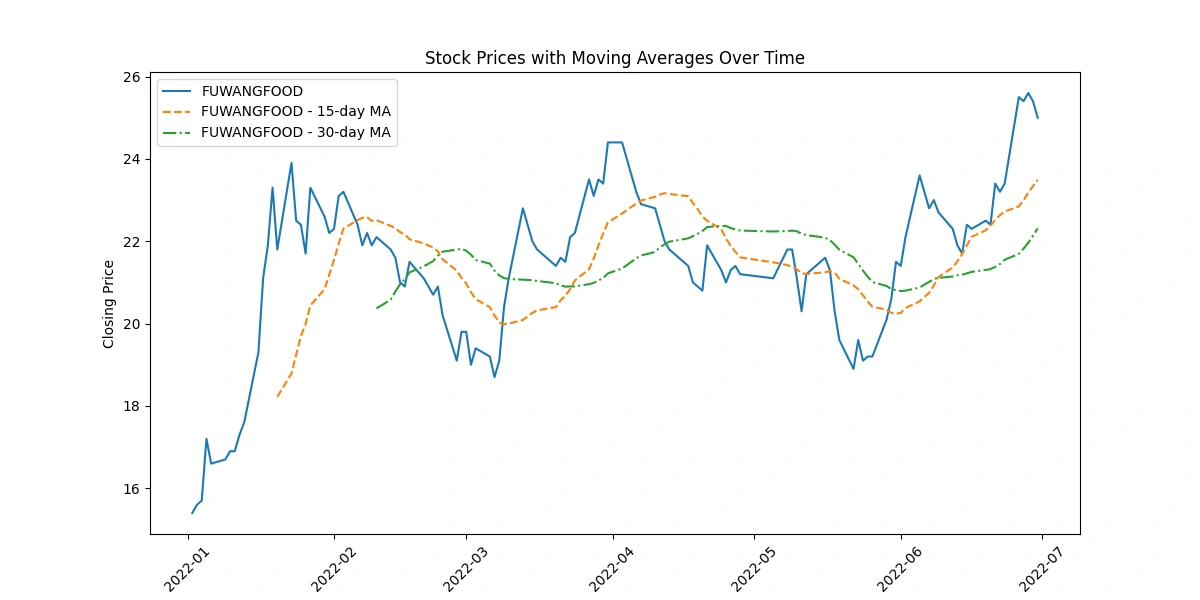
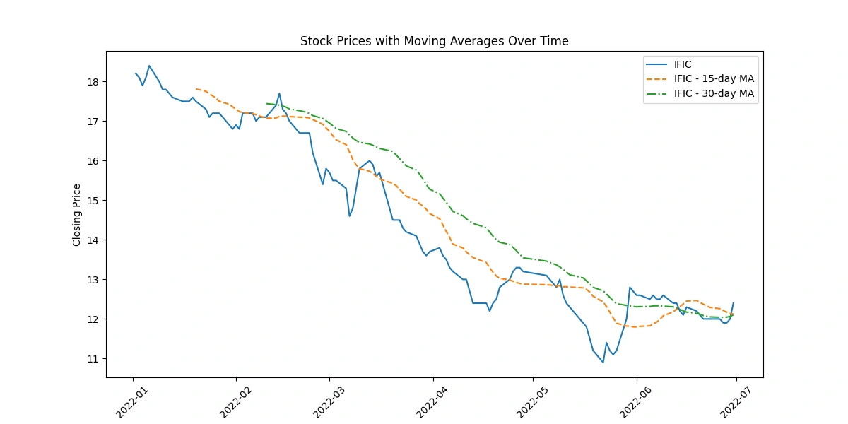
Create a line chart to visualize the 'Close' prices over time
Generate line charts depicting the 'Close' prices over time for each selected company, unraveling the historical trends and patterns in their stock performance.
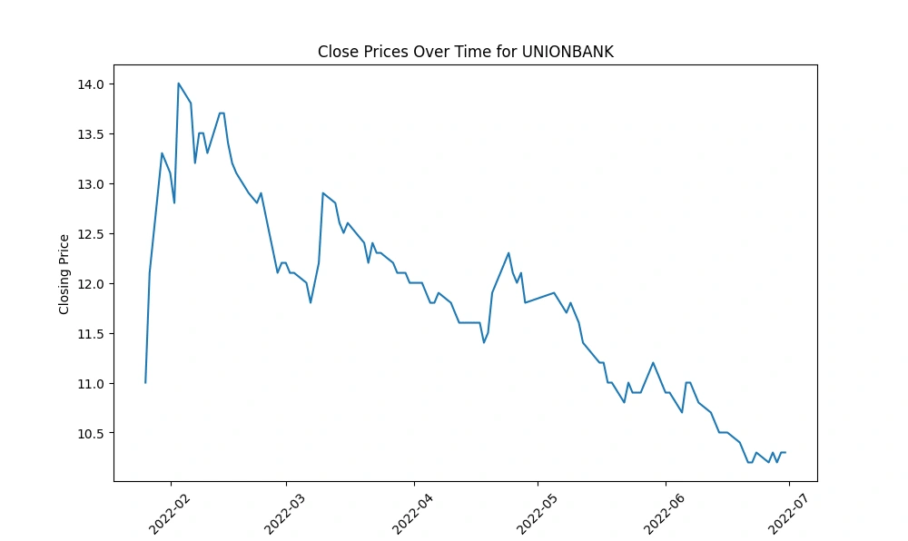
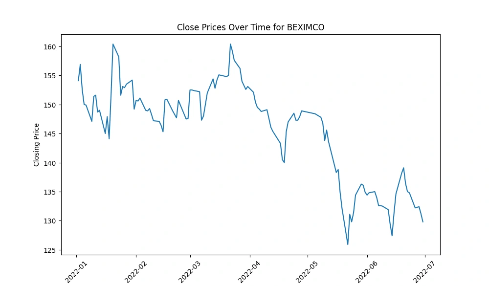
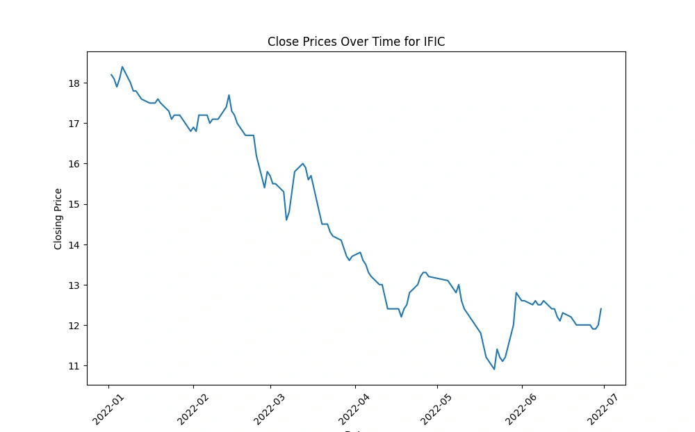
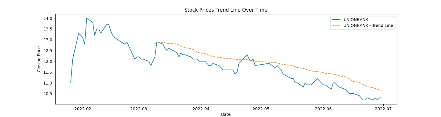
IFIC and UNIONBANK: These companies experienced a rapid decline in their 'Close' prices over the observed period, indicating a consistent downward trend in their stock prices.
FUWANGFOOD: In contrast, FUWANGFOOD exhibited an increasing trend in its 'Close' prices from January 2022 to July 2022, suggesting a rise in stock prices over this period.
These observations can provide insights into the performance of these companies within the given timeframe. It's important to analyze the reasons behind these trends—whether they are influenced by company-specific factors (like earnings reports, market news, or company performance) or broader market conditions—to better understand the drivers behind the stock price movements.
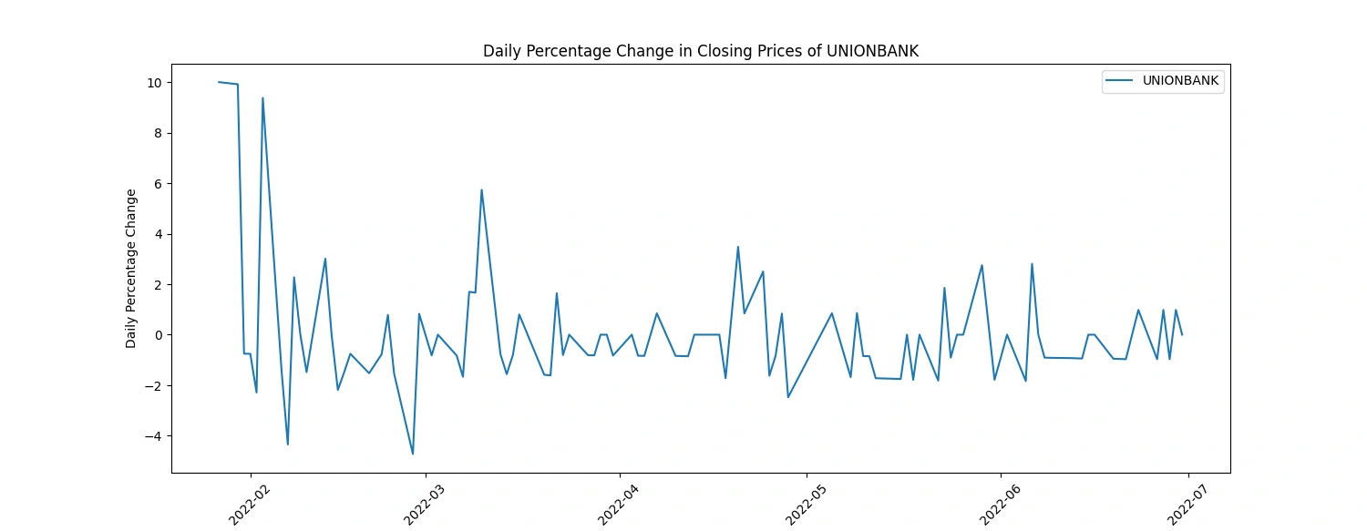
Calculate and plot the daily percentage change in closing prices
Here's a more concise breakdown of insights from daily percentage change in closing prices:
Volatility Identification: Higher fluctuations suggest more volatile stock behavior, potentially indicating greater risk.
Trend Recognition: Consistent positive or negative changes signal potential upward or downward trends in stock prices.
Event Impact: Sharp spikes or drops may align with significant company or market events, influencing stock prices.
Comparative Analysis: Comparing changes among companies highlights differing market sensitivities or strengths.
Trading Signals: Useful for short-term strategies, indicating potential buy/sell opportunities based on price movements.
Risk Evaluation: Assessing fluctuations aids in adjusting risk management strategies for investments.
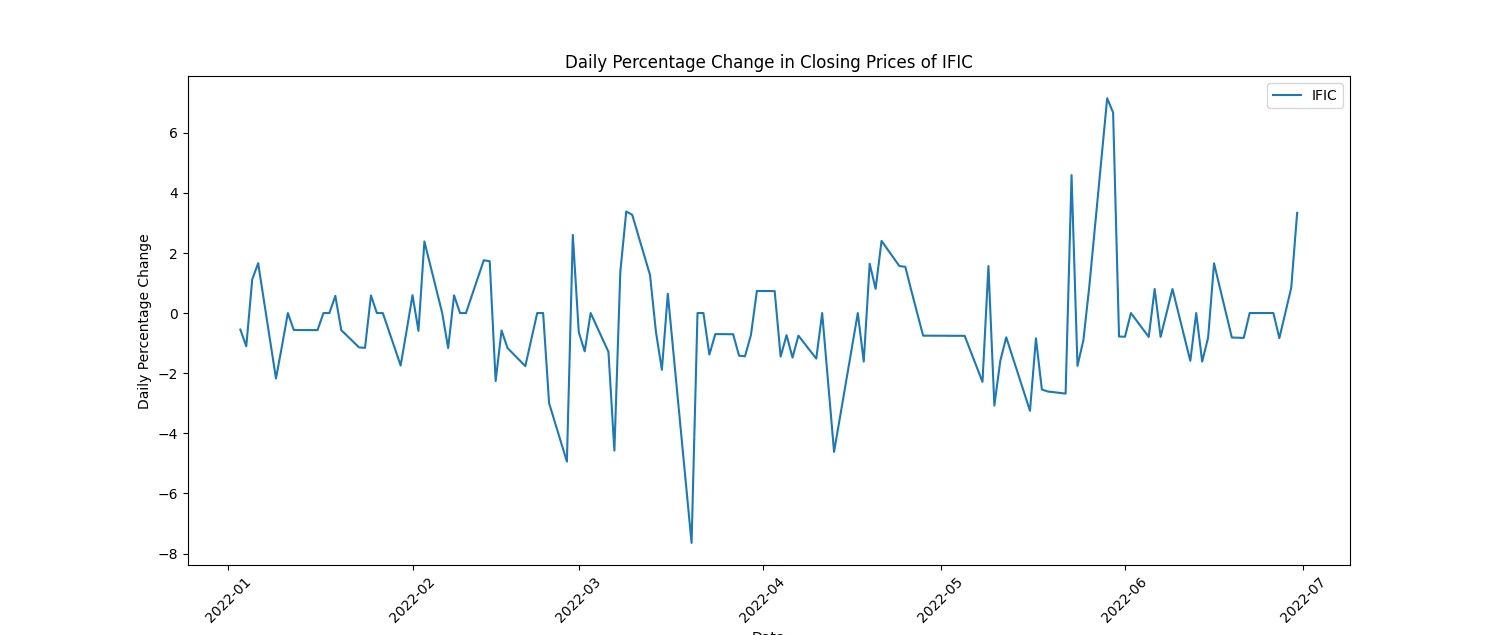
(2 selected plots from the 5 output plots are provided for reference.)
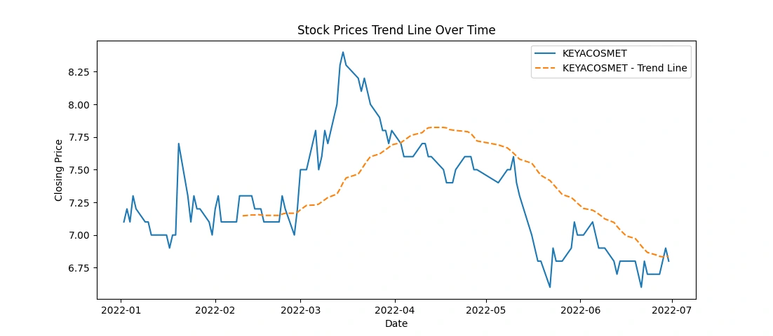
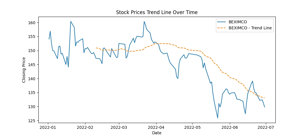
Investigate the presence of any trends or seasonality in the stock prices
This code snippet creates line charts displaying the stock prices over time for each of the top 5 companies, along with a rolling average trend line for a smoother representation of the trends. Here's what the code accomplishes:
Data Plotting: It generates individual line charts for each company's 'Close' prices over time.
Trend Line: Adds a rolling average line (e.g., 30-day) to visualize the trend in stock prices. This line represents the average closing price over a specified window (30 days in this case).
Visualization: Titles, labels, and legends are set for clarity in the visualization.
This code provides a visual representation of both the actual closing prices and a smoothed trend line, aiding in identifying the general trend in stock price movements over time for each company. Adjustments to the rolling window size or other visualization aspects can be made as needed for better analysis and presentation.
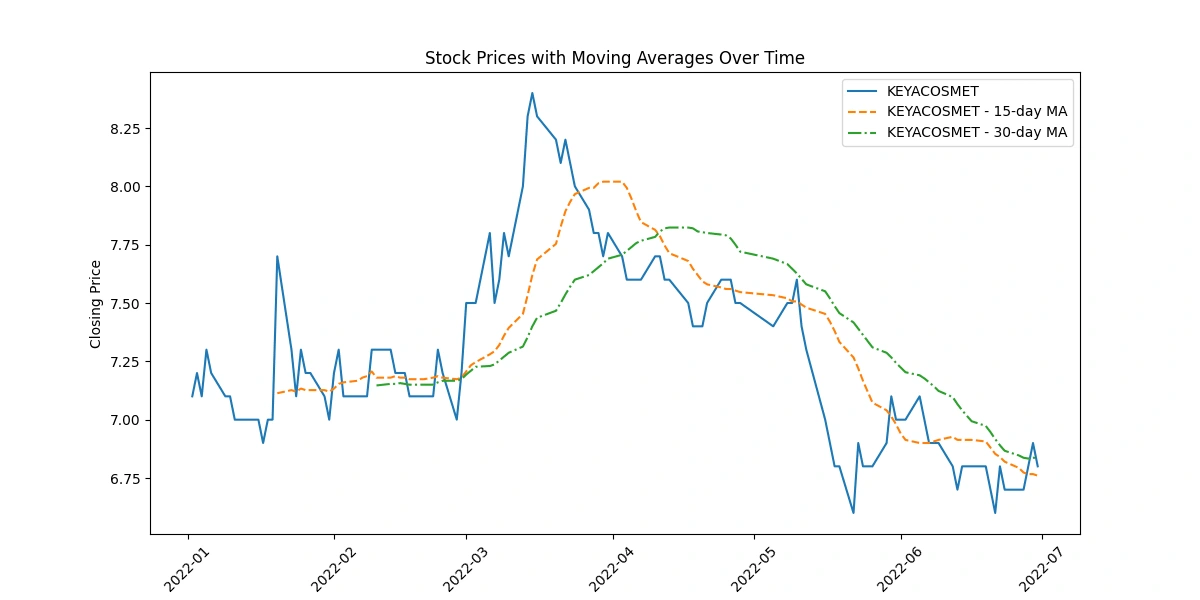
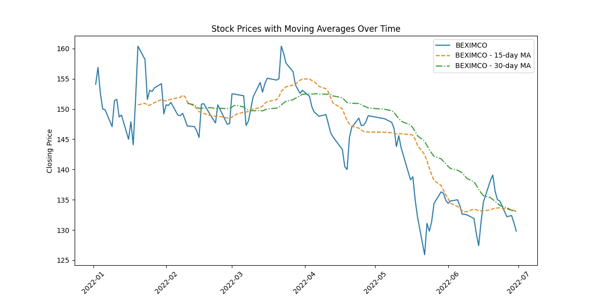
Apply moving averages to smooth the time series data in 15/30 day intervals against the original graph
The code depicting original closing prices alongside 15-day and 30-day moving averages offers these insights:
Trend Visualization: Shows long-term trends by smoothing price data, aiding in trend identification.
Signal Analysis: Crosses between moving averages indicate potential shifts in trends, guiding short-term decision-making.
Volatility Indication: The gap between prices and moving averages highlights market volatility.
Support/Resistance Levels: Interaction between prices and moving averages identifies potential support or resistance levels.
Momentum Confirmation: Consistent alignment between prices and moving averages confirms momentum in price movement.
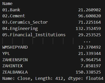
Calculate the average closing price for each stock
This code groups the DataFrame by the 'Name' column and then calculates the mean of the 'Close' prices for each group, resulting in the average closing price for each stock using the
'groupby()' function. The output will display the average closing price for all the stocks available in the dataset.Output:
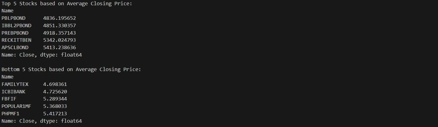
Identify the top 5 and bottom 5 stocks based on average closing price.
Output:
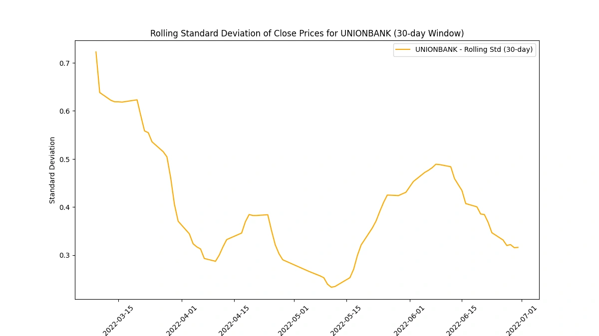
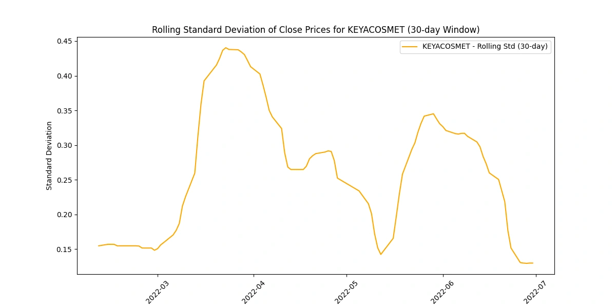
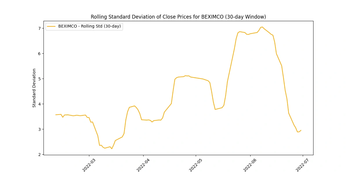
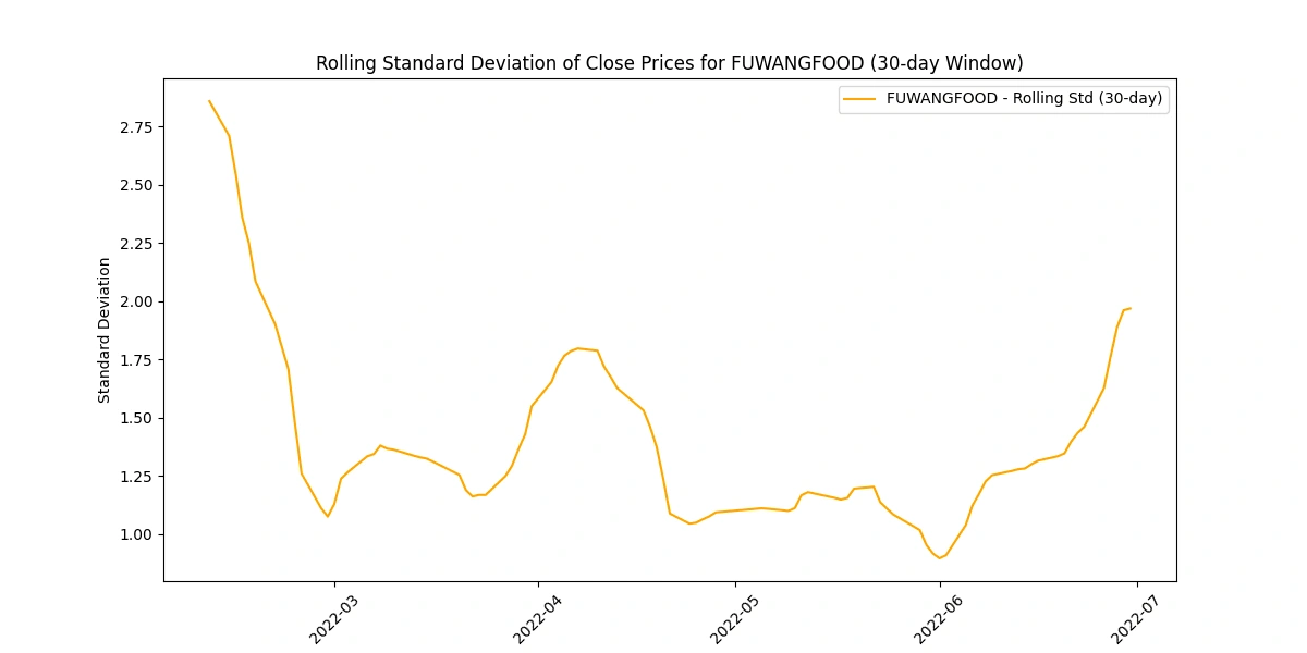
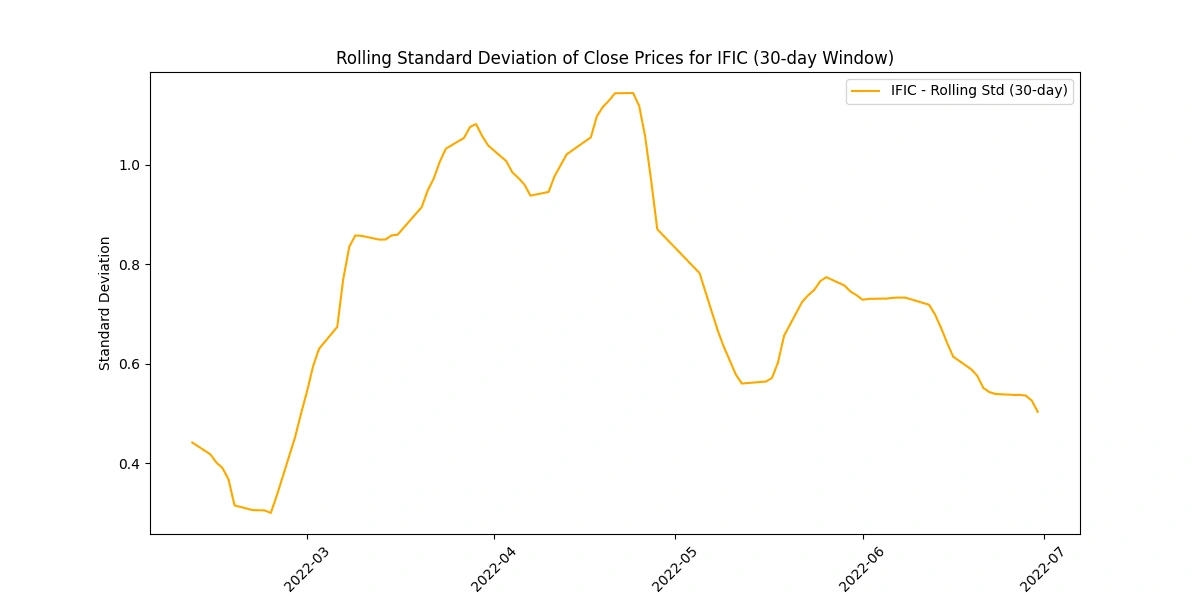
Calculate and plot the rolling standard deviation of the 'Close' prices
Analyzing the rolling standard deviation provides insights into
Volatility Levels: Comparing standard deviations helps gauge volatility differences among companies.
Market Uncertainty: Peaks in standard deviation may indicate uncertain market periods or impactful events.
Risk Perception: Higher standard deviations suggest higher risk due to greater price variability.
Stability Indicator: Lower standard deviations imply more stable prices, appealing to risk-averse investors.
Trading Insights: Fluctuations guide risk management strategies and identify potential trading opportunities.
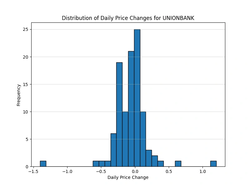
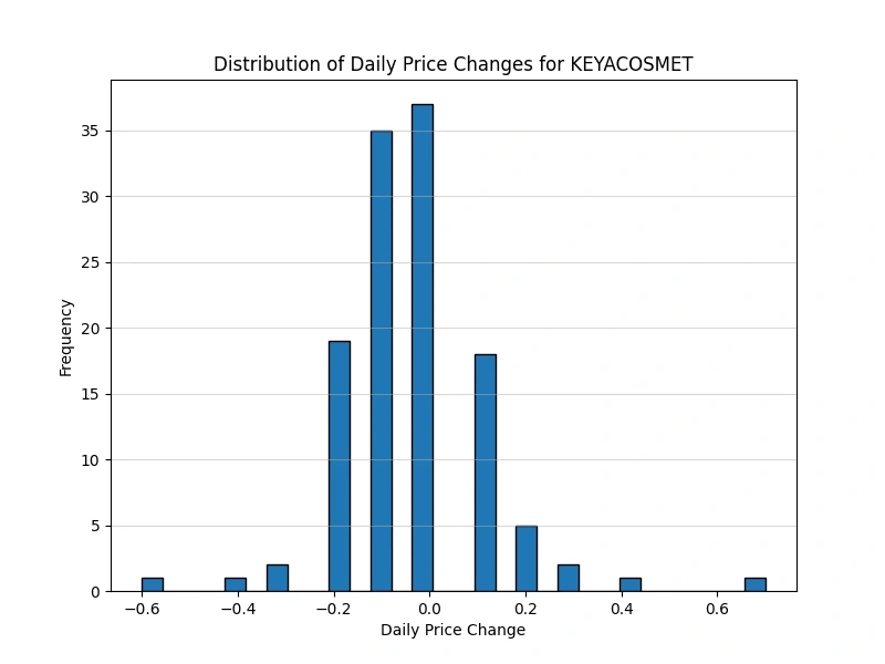
Create a new column for daily price change
Output:

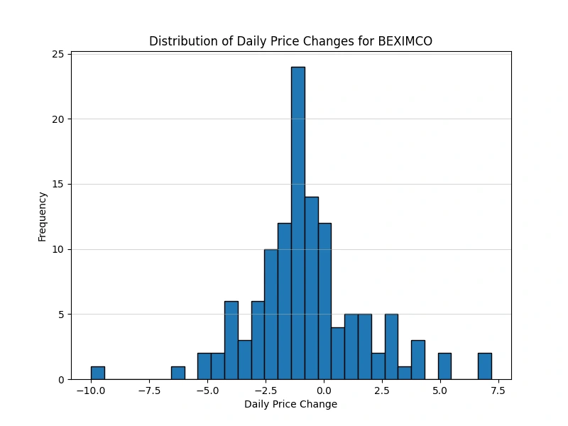
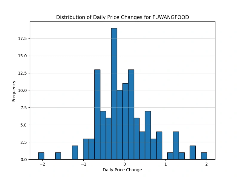
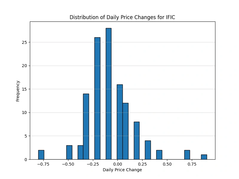
Analyze the distribution of daily price changes
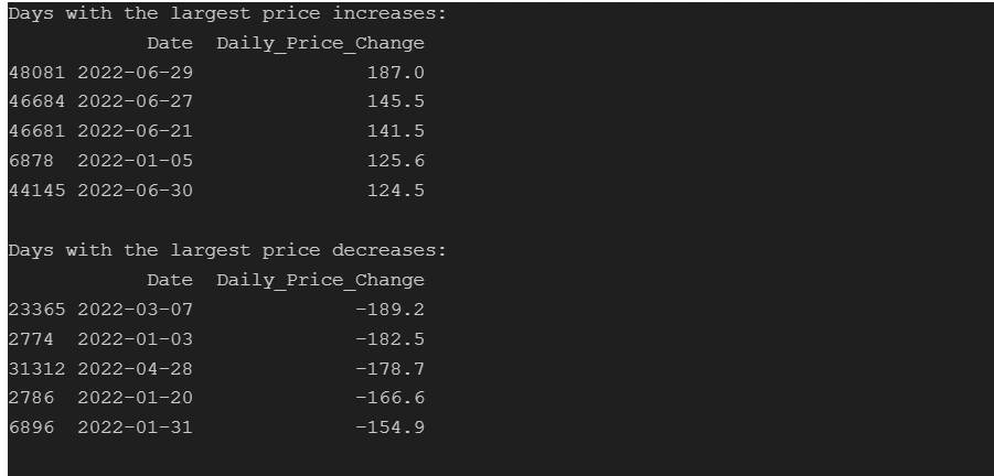
Identify days with the largest price increases and decreases
Output:
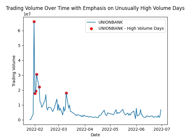
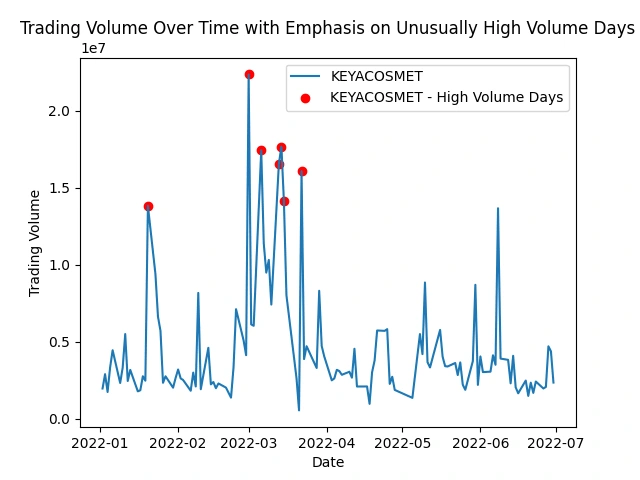
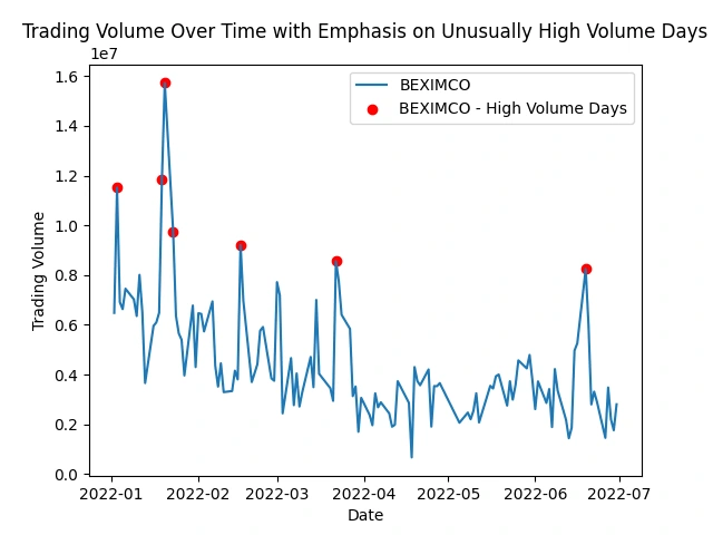
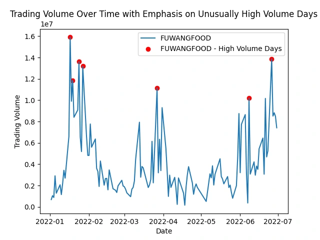
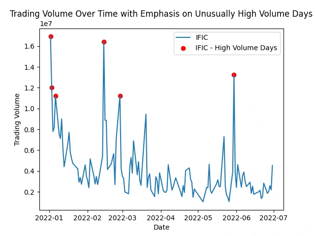
Identify stocks with unusually high trading volume on certain days
This analysis helps spot peaks in trading activity, indicating potential market events or investor interest. It shows patterns, events, or irregularities that might impact specific stocks or the market as a whole.
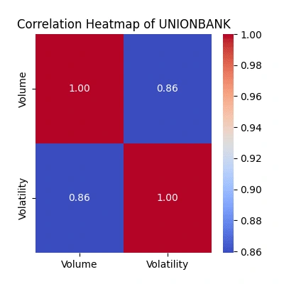
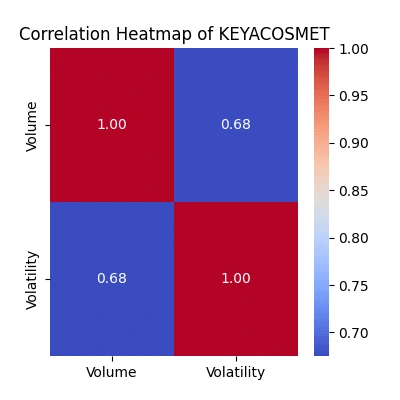
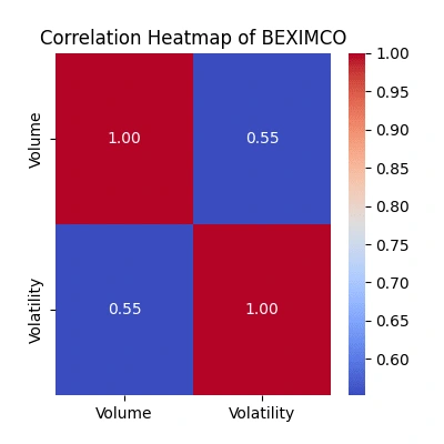
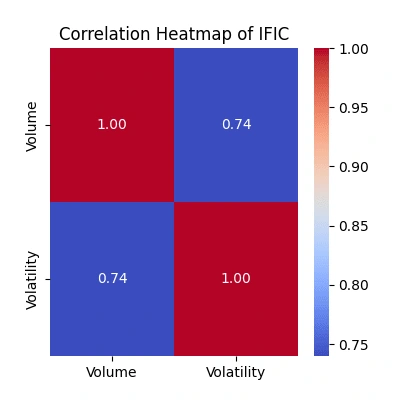
Explore the relationship between trading volume and volatility
The correlation heatmaps show how trading volume relates to price volatility:
Strength of Relationship: The color intensity and the value annotated within each cell represent the correlation coefficient. A value close to
1 signifies a strong positive correlation, while a value near -1 indicates a strong negative correlation. Values closer to 0 suggest a weaker or no linear relationship.Volume-Volatility Link: Look for patterns where higher trading volume aligns with increased volatility. Strong positive correlations indicate they often move together.
Comparing Companies: Differences in correlations among companies highlight unique trading behaviors. Higher correlations suggest more synchronized volume-volatility movements.
Trading Insights: Identify potential periods where increased trading volume predicts higher volatility, guiding potential trading strategies.
Watch for Exceptions: Notice any unexpected relationships or instances where volume and volatility don't align as anticipated, which might warrant further investigation into market behavior.

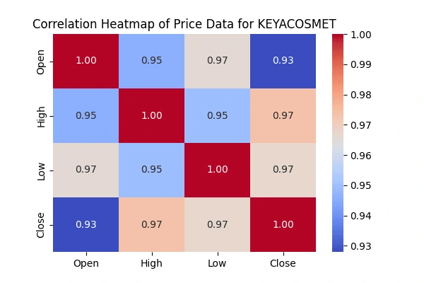
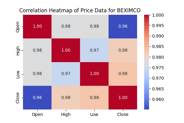
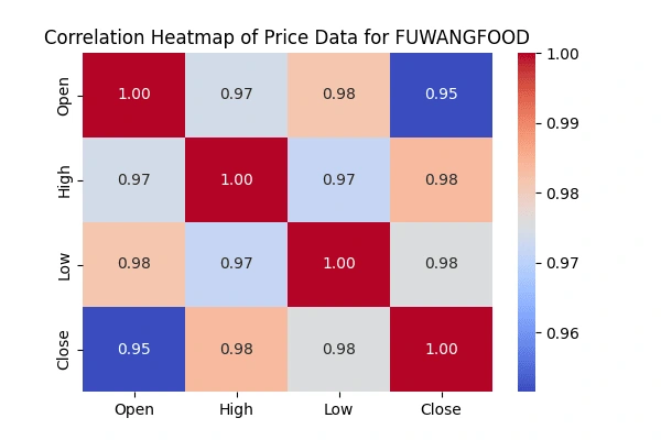
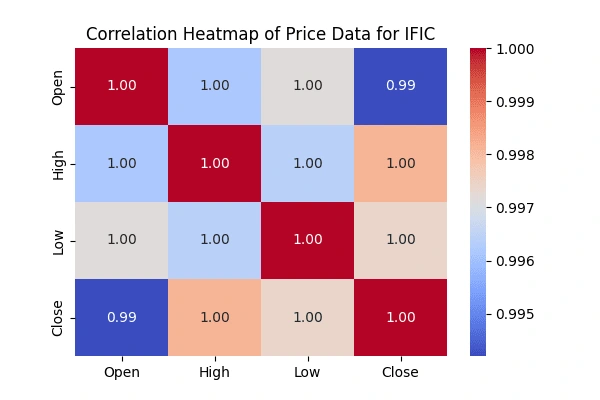
Correlation matrix between the 'Open' & 'High', 'Low' &'Close' prices
'Open' & 'High', 'Low' &'Close' pricesCreate heatmaps to visualize the correlations using the seaborn package.
seaborn package.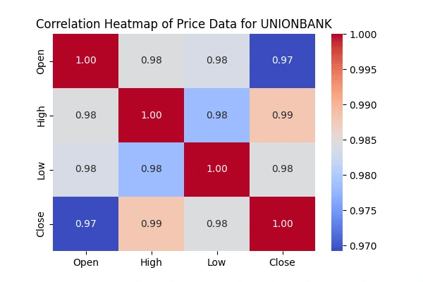
Acknowledgments
I express my sincere appreciation to Bohubrihi for their invaluable contributions to this analysis, offering guidance and resources that significantly enriched the project.
Like this project
Posted Apr 21, 2024
.
Likes
0
Views
100