
In short
Problem
A climate fintech selling a game to commuters and an audit trail to corporations, with one logo file and nothing holding the two halves together.
Role
Brand identity, design direction
What I made
Mark, colour and type systems, the 3D token, brand guidelines, launch print, the site
What I directed
The product team's app screens. I wrote the rules and reviewed the work. I did not draw the screens.
Status
Brand shipped. App launched May 2026. Product ongoing.
Year
2025 - present
Tools
Illustrator, Blender, Fusion 360, Figma, Framer
Act I December 2025. The pen is theirs.
What I found
I joined in December 2025, thirteen months after the company was registered. There was a product being built, a team building it, and a gold coin.
That was the brand. One file. No palette, no type, no rules, no second version of the logo for the places the first one did not fit. Every flyer and every screen had been improvised from whatever was nearest, and it showed.
Five months later the app launched with a system underneath it.
One logo file
A gold coin. Rope edging, a ring of leaves, and a serif R with a leaf growing out of its leg. There was one version of it: no flat version, no single colour version, nothing for a dark background. Not because those were rejected, but because there was no version system to put them in.
The case against it is not taste. It is that a logo spends most of its working life small. Sixteen pixels in a browser tab. One icon among thirty on a home screen. A pickup on a map that is moving. Everything that made this one look expensive at full size is the first thing to disappear.

Before
After
Size 200px
Drag it down. The mark holds its shape all the way to sixteen pixels, because there is nothing in it that can be lost.
A spec nobody had ever set
The only written note that survived from the old brand is four lines long. Space Grotesk Bold, forty pixels, on an eighteen pixel line box, over a green gradient.
Convert your commute
font-family: Space Grotesk; font-weight: 700; font-size: 40px; line-height: 18px; background: linear-gradient( 90deg, #38E078 0%, #1F7A41 100% );
Forty point type in an eighteen point line box, set exactly as written.
Two lines of it collide. The descenders of the first sit inside the capitals of the second. Nobody had ever set two lines of it, and that is the actual finding: this was written down and never used. It is what a brand with no system looks like from the inside.
The handbook
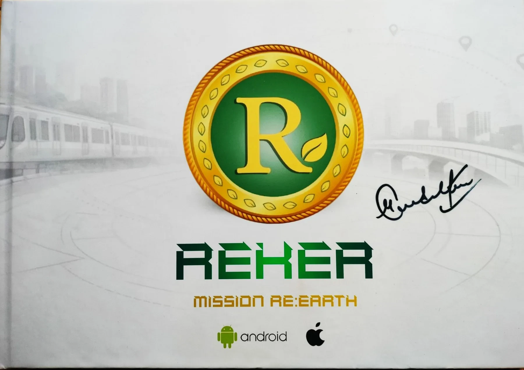
The handbook that existed when I arrived, signed by Sachin Tendulkar.
They had printed a hardcover, and Sachin Tendulkar had signed it. On the front, the gold coin over a desaturated stock photograph of a metro, under MISSION RE:EARTH set in a squared techno face with a gradient running through the letters, and the Android and Apple logos dropped in at the bottom.
I keep coming back to this object, because it is the most sincere thing in the entire folder. Real money was spent on it. Somebody got Sachin Tendulkar to put his name on it. And it still could not be handed to the person it was made for.
That signature is also why the new cover has a fixed space on the left. It is not a flourish I added. It is an asset the brand already had, and the job was to build something worth putting it on.
The product, in words only
There was a build. I have no screenshots of it and I am not going to reconstruct one from memory, so this part of the before has to be taken on trust. Three things were wrong with it.
Brand green was the background and the text at the same time. State and hierarchy were invisible, because nothing had enough contrast to be a state.
Emoji, generated cityscapes and photographic sticker cutouts were doing the work of product illustration. Not around the interface, inside it.
The reward grammar was random. Coins, streaks, carbon saved and map pickups were each drawn a different way, so nothing on screen told you what was earnable.
What was not wrong: the screens were not a random collection of styles. There was a house look. It was just built on nothing, so it could not be extended, corrected or handed to anybody.
Act II The pen is mine.
What I made
Reker sells a game to a commuter and an audit trail to a compliance officer. Everything below gets held against both of them, because a system that only satisfies one of the two is not a system, it is a preference.
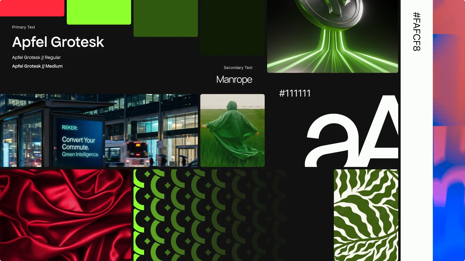
The board the whole system came off.
The mark
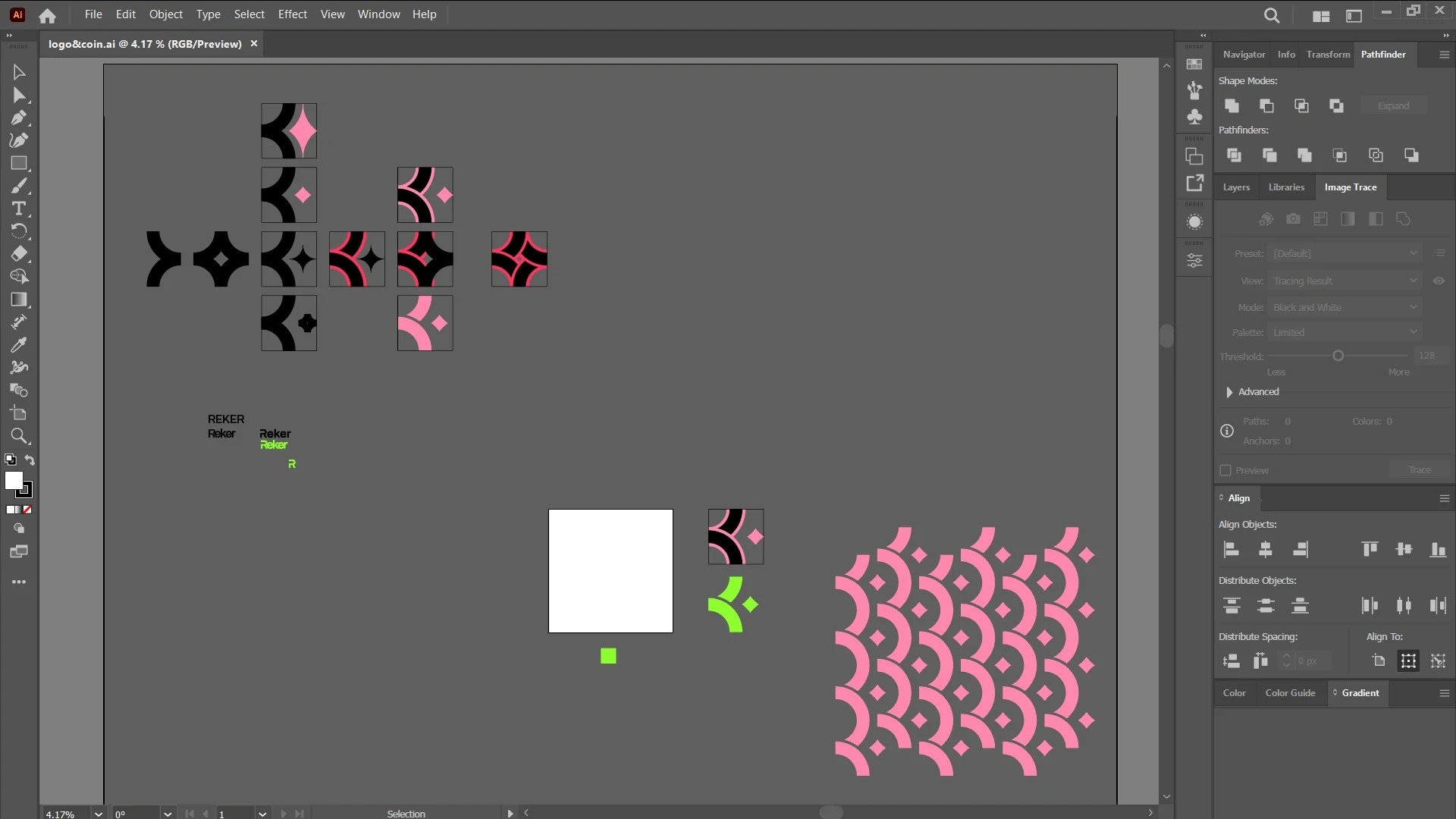
Working file. The variations that did not survive are still on the board.
Decision 01
Two shapes, not a picture of money
Why
The old logo was a drawing of a coin, which is what most of the category already is. The mark is a junction instead: two swept counters reading as routes meeting, with the diamond as the thing you pick up along one. It is defensible because it is not a noun anybody else can also draw.
Trade-off
An abstract mark has no free recognition on day one, so it needs the wordmark beside it for a good while. That is a real cost, paid in the first year, in exchange for owning something later.
Held against both readers
The commuter
On the Purple Line at nine in the morning. Wants this quick, worth it, and a bit of a game.
Reads as a pickup. It is the shape on the map, on the coin and on the icon, so the thing you are collecting and the thing you tapped to install are visibly the same object.
The compliance officer
Signing off a BRSR disclosure. Wants the number to hold up when somebody audits it.
Reads as infrastructure. Nothing about it is cute, so it survives being put on a slide next to a disclosure framework without undermining the number beside it.
Colour
Green was never in question. What was in question is what green is allowed to do, and the old build had answered that badly enough to make the interface unreadable.
Reker green
Aa Reker green 100, #CBFFA1 Aa Reker green 200, #C1FF8E Aa Reker green 300, #B4FF77 Aa Reker green 400, #8CFF2E Aa Reker green 500, #77D927 Aa Reker green 600, #66BA22 Aa Reker green 700, #315910 Aa Reker green 800, #23400C Aa Reker green 900, #0F1C05
Base
Aa Blackout, #111111 Aa Off white, #FAFCF8 Aa Stone, #2F2F2F
Alert red
Aa Alert red 400, #FF293B Aa Alert red 700, #991923
Aa
Reker green 400 G-04
The primary. Every call to action.
#8CFF2E carries #111111 at 14.80 to 1
The pair the ramp exists to prevent
Turn every metro ride into rewards 1.24 to 1
Turn every metro ride into rewards 14.80 to 1
Reker green on off white. Nothing at any size survives this. The same green, used the way the ramp intends: as the surface, with Blackout on top.
The other half of the palette is not flat at all. The guidelines specify a set of gradient fields as the brand's secondary colour, reserved for marketing grounds and kept out of the interface, where a moving background would fight every piece of state the ramp above is trying to signal.
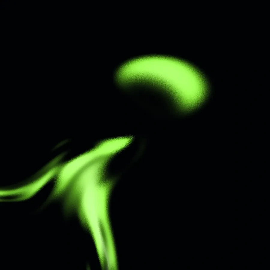
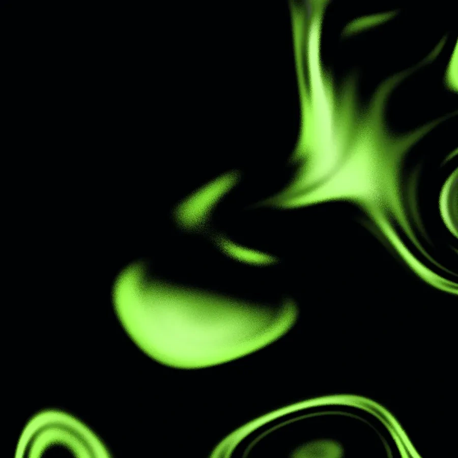
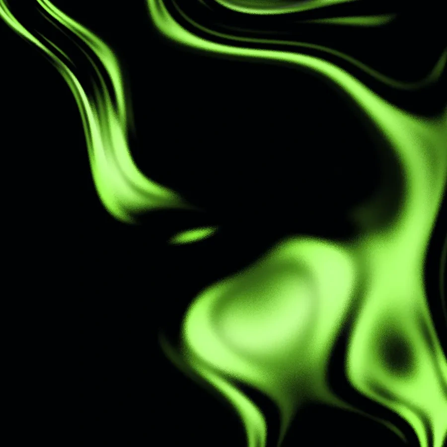
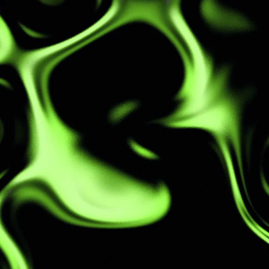
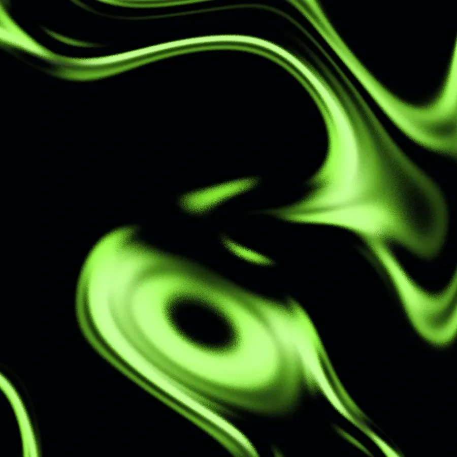
The secondary palette is not more stops, it is movement. Core green collapsing into Blackout, specified as background imagery for marketing and kept out of the interface entirely.
Decision 02
Green is a surface, never a foreground
Why
Patching the contrast failures one at a time fixes those screens and nothing else. A ramp where every stop names what reads on it, and at what ratio, makes the mistake hard to repeat by anybody, without asking me first.
Trade-off
Nine stops is a lot to hold in your head, and most of them are never reached for. In practice the team used 400, 700 and 900 and almost nothing else, so six of the nine exist to stop somebody inventing a tenth rather than because anything asked for them.
Held against both readers
The commuter
On the Purple Line at nine in the morning. Wants this quick, worth it, and a bit of a game.
Full-strength green on near-black is the loudest thing on the phone, and it is reserved for the action that earns you something. It never has to compete with itself.
The compliance officer
Signing off a BRSR disclosure. Wants the number to hold up when somebody audits it.
The 700 and 800 stops give a serious, low-chroma version of the same brand for a dashboard, so the enterprise product is recognisably Reker without being lit up like a game.
Type
Turn every metro ride into rewards
Regular, Medium, Bold, Extra-Bold
Never the BRUKT weight. It is a distressed cut, and a compliance dashboard cannot wear a distressed cut.
Verified commute data for Scope 3 Category 7 reporting.
Extra Light, Light, Regular, Medium, Bold
Nothing forbidden. This is the workhorse, and it carries every paragraph and every piece of interface text.
Daily Metro, Daily Reward-O
Regular only
Never for long copy, never for anything critical, never anywhere near a number an auditor reads.
Samples are set in stand-ins. Apfel Grotezk, Manrope and Reenie Beanie are the real specification.
Decision 03
Every typeface carries a prohibition
Why
A pairing tells you what to use. It says nothing about where not to go, and where-not-to-go is exactly where systems break. Naming the BRUKT weight as forbidden, and fencing the handwriting away from anything critical, gave the team a rule they could apply with me nowhere in the room.
Trade-off
Three faces is one more than this strictly needed. The handwriting earns its keep in the consumer app and is dead weight in the enterprise half, so the brand carries a typeface on every page it will never appear on.
The token
The reward needed to be an object rather than a number. It was modelled as a real one: drawn in CAD with a milled edge and a struck face, exported to STEP and STL alongside the render meshes, so it could be manufactured if anybody ever wanted to hand somebody a physical one.

Turn it over
Struck in signature metal. This is the token everywhere it appears in three dimensions.
Fusion 360
Parametric solid. Knurled edge, raised rim, struck face. Out as F3D, STEP and STL.
Material studies
Generated previews, cheap and fast, to pick a direction before spending render time on it.
Blender
Studio HDRI, brushed metal, dispersion glass for the variants. Every shipped render came out of here.
Generated previews, not deliverables
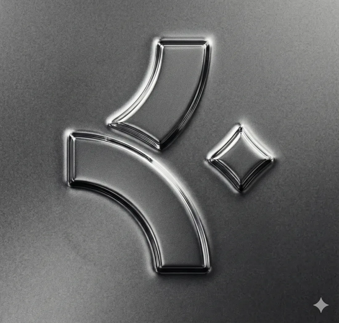
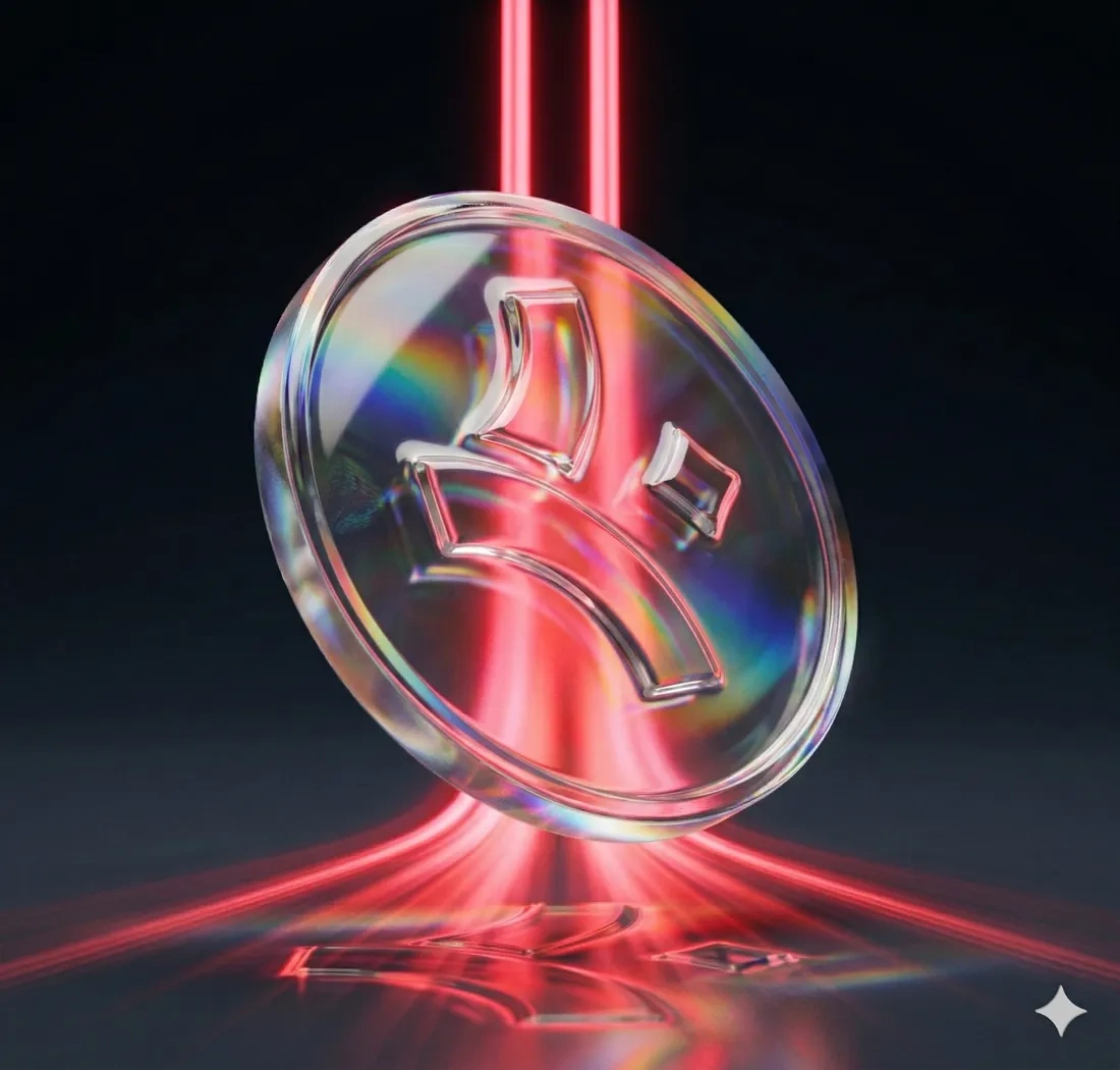
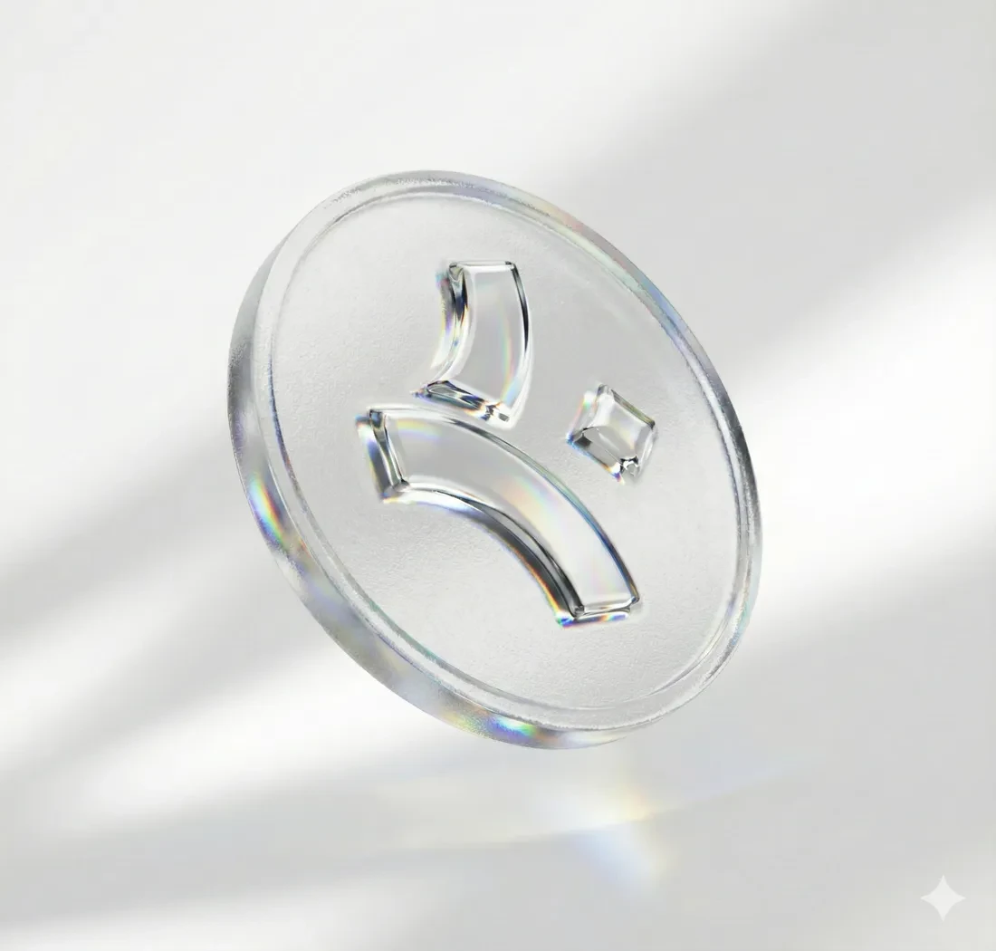
These three are generated images. They exist because a Blender render takes hours and a wrong material direction costs all of them, so the cheap version came first and answered the question. Everything that shipped was modelled and rendered by hand afterwards.
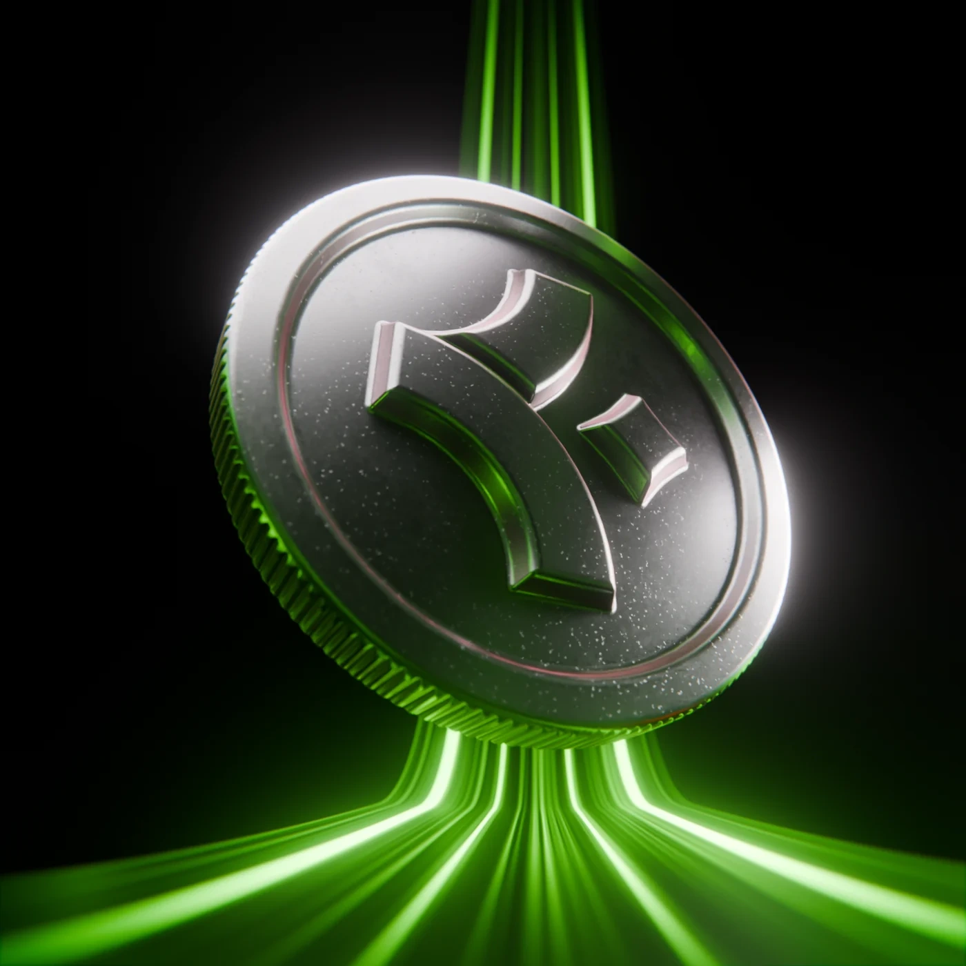
Signature metal. Every three-dimensional appearance of the token.
Core green, flat. Every two-dimensional appearance of the same token.
Decision 04
Two dimensions green, three dimensions metal
Why
The token had to be a toy in the app and an instrument on a balance sheet. Rather than two brands, one object with two renderings: flat and green where it is a game piece, machined and metallic where it is evidence. The rule is one sentence long, which is why it survived contact with a team.
Trade-off
It means every piece of marketing that wants weight needs a render, and renders are slow. When there is no time for one, people reach for the flat green version in a place that wanted the metal.
Held against both readers
The commuter
On the Purple Line at nine in the morning. Wants this quick, worth it, and a bit of a game.
Flat green at twenty pixels on a moving map, collected by the hundred. It is a game piece and it behaves like one.
The compliance officer
Signing off a BRSR disclosure. Wants the number to hold up when somebody audits it.
Machined metal on the cover of an executive summary. Same object, and the weight is doing the arguing before a single figure is read.
The trail, and the pattern
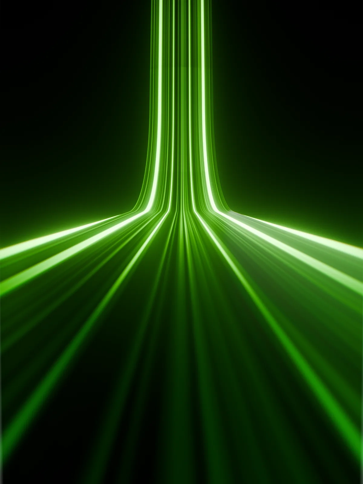
Ten wedges, one vanishing point, three flat colours. The Blender scene is the same ten wedges with emission turned on, which is why the shape survived the trip intact.
As drawn As rendered
The second texture is not derived from the mark. It is the mark. The Illustrator swatch tiles logo.v1 brick by column at a half offset, and that offset is the whole trick: every sweep meets its neighbour end to end, so the eye stops counting logos and starts reading one continuous arcade. Same ingredient, no logo in sight.
Decision 05
The pattern is the logo's second shape
Why
A brand needs something to hold a surface when the logo cannot be there, and borrowed decoration is how brands end up looking like each other. Tiling the mark itself means there is nothing new to learn, approve or get wrong: the texture and the logo are one drawing at two densities.
Trade-off
Below about forty pixels a tile the diamond fills in and the arcade reads as a generic scallop, which loses the only thing tying it to the logo. It has a minimum size, and the document does not say what it is.
What it became
Seven surfaces, one system. Each one is here because it exercises a different rule, and the rule is named on it rather than left for you to spot.
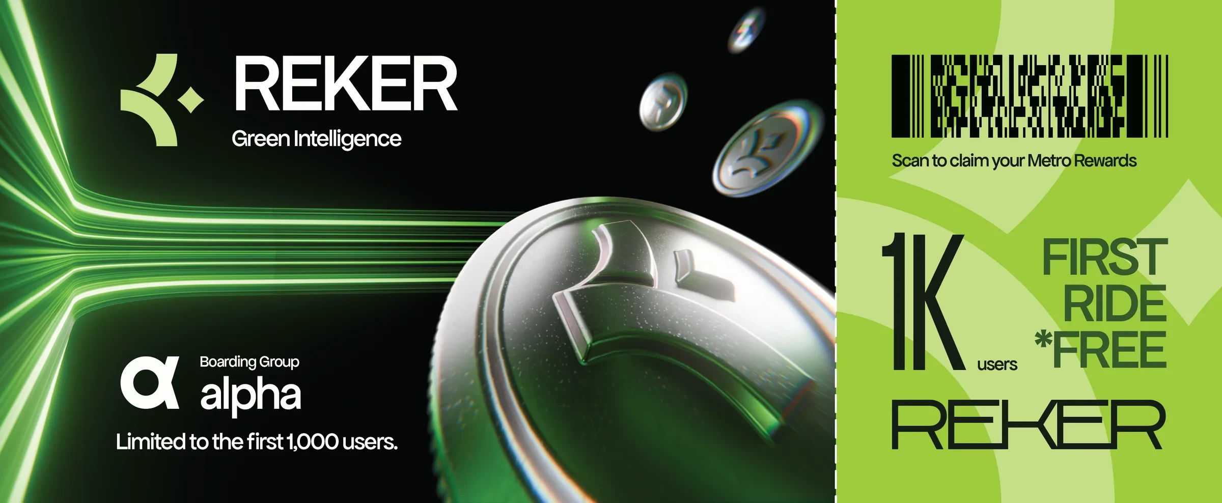
Three dimensions, so the token is metal
The launch instrument. A tear-off stub, a barcode, and a promise to the first thousand users printed twice in the largest type on the piece.
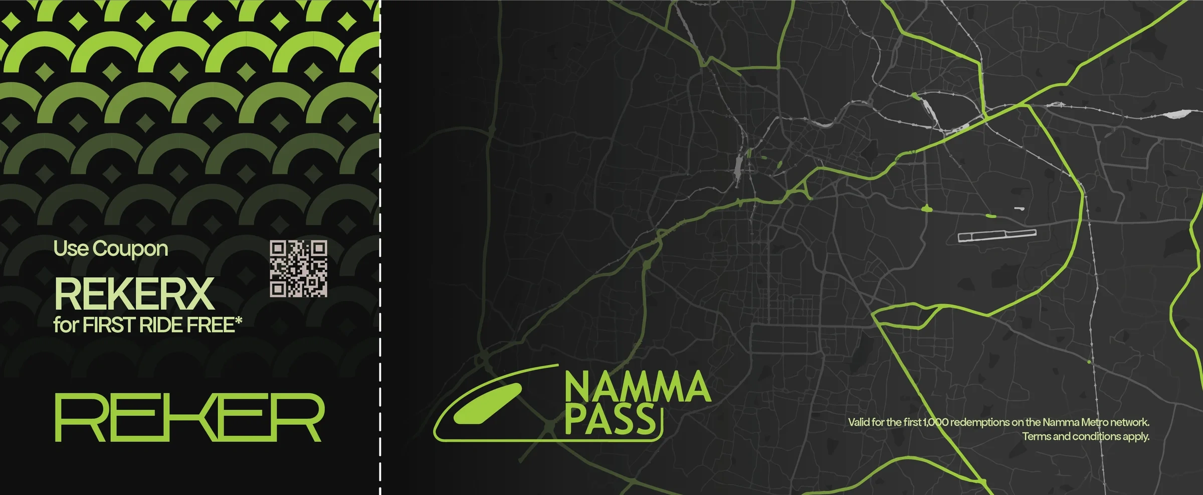
The pattern holds a surface with no logo on it
The whole left panel is the mark tiled at a half offset. Nobody reads it as a logo, and it could not belong to anybody else.
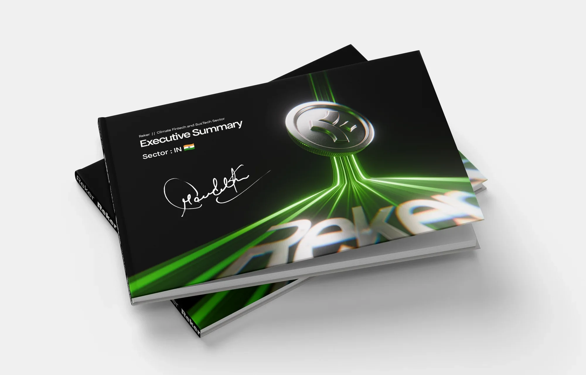
Same format as the old one, aimed at a different reader
The direct answer to the signed hardcover in Act I. Same format, and it carries the same signature: Sachin Tendulkar's, which the brand already had and which the old cover had wasted.
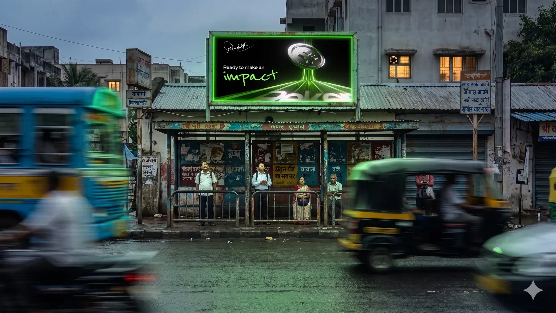
The handwriting carries the feeling, never the fact
Reenie Beanie doing exactly the job it was fenced off for: one word, at the emotional end of the sentence, nowhere near a number.
Generated mockup scene. The artwork on it is the real thing.
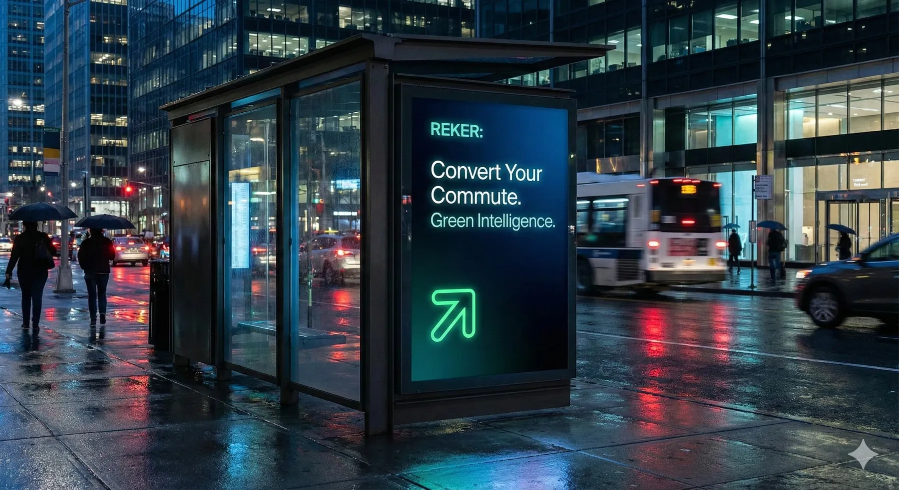
Green as a surface, Off White on top
The enterprise register on the street. No coin, no game, no handwriting: a proposition and an arrow.
Generated mockup scene. The artwork on it is the real thing.
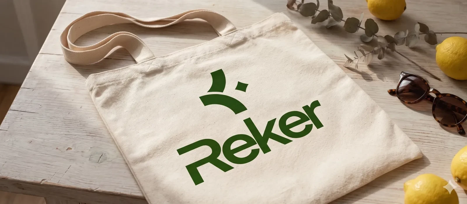
White on dark, black on light
The logo colour rule stitched into thread, where you cannot cheat it with a drop shadow.
Generated mockup scene. The artwork on it is the real thing.
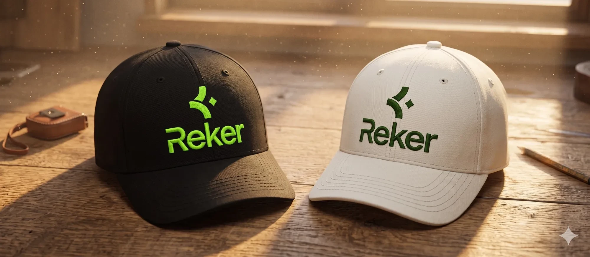
One colour, one ink, still the logo
The test the old coin could never sit for. Strip out every gradient and the mark is still the mark.
Generated mockup scene. The artwork on it is the real thing.
Boarding pass Pass, reverse Executive summary Billboard Transit poster Caps Tote
The one I keep going back to is the executive summary, because it is the same object as the handbook in Act I. Landscape hardcover, printed properly, carrying the same signature. Only the reader changed, and everything about the cover changed with them.
Drag the handle. The format does not move; everything else does.
Before After Wipe between Before and After
Same object, same signature, eighteen months apart. A souvenir on the left, a document somebody has to act on on the right.
Held against both readers
The commuter
On the Purple Line at nine in the morning. Wants this quick, worth it, and a bit of a game.
Gets the boarding pass, the wallpaper and the icon. Things you hold, keep or tap, and every one of them leads with the token.
The compliance officer
Signing off a BRSR disclosure. Wants the number to hold up when somebody audits it.
Gets the executive summary and the transit poster. No coin, no game, no handwriting, and the same brand underneath.
The site
Pioneering Green Intelligence • Bengaluru
Hi! We are Reker a Digital Steward from Bengaluru turning your commute into Environmental Impact.
Reker is more than an app; it is a movement. We empower urban stewards to reclaim the value of their sustainable choices through high-fidelity tracking and a premium rewards ecosystem.
Download on the App Store Get it on Google Play

Sustainably crafted Urban stewardship Elite rewards Namma Metro exclusive Sustainably crafted Urban stewardship Elite rewards Namma Metro exclusive
The launch site, rebuilt here in the page rather than screenshotted, so it runs on the same tokens as everything above it. Copy is the site's own.
Act III The pen is theirs again. The rules are mine.
What happened when other people used it
I wrote the rules and reviewed the work. The product team's designers drew every screen below, and that boundary is the interesting part of this project rather than a disclaimer on it.
A brand system is a bet that a stranger can carry your intent without you in the room. The only way to grade that bet is to look at what comes back.
App screens below: the Reker product design team. Brand system, direction and review: mine.
3 of 4 held.
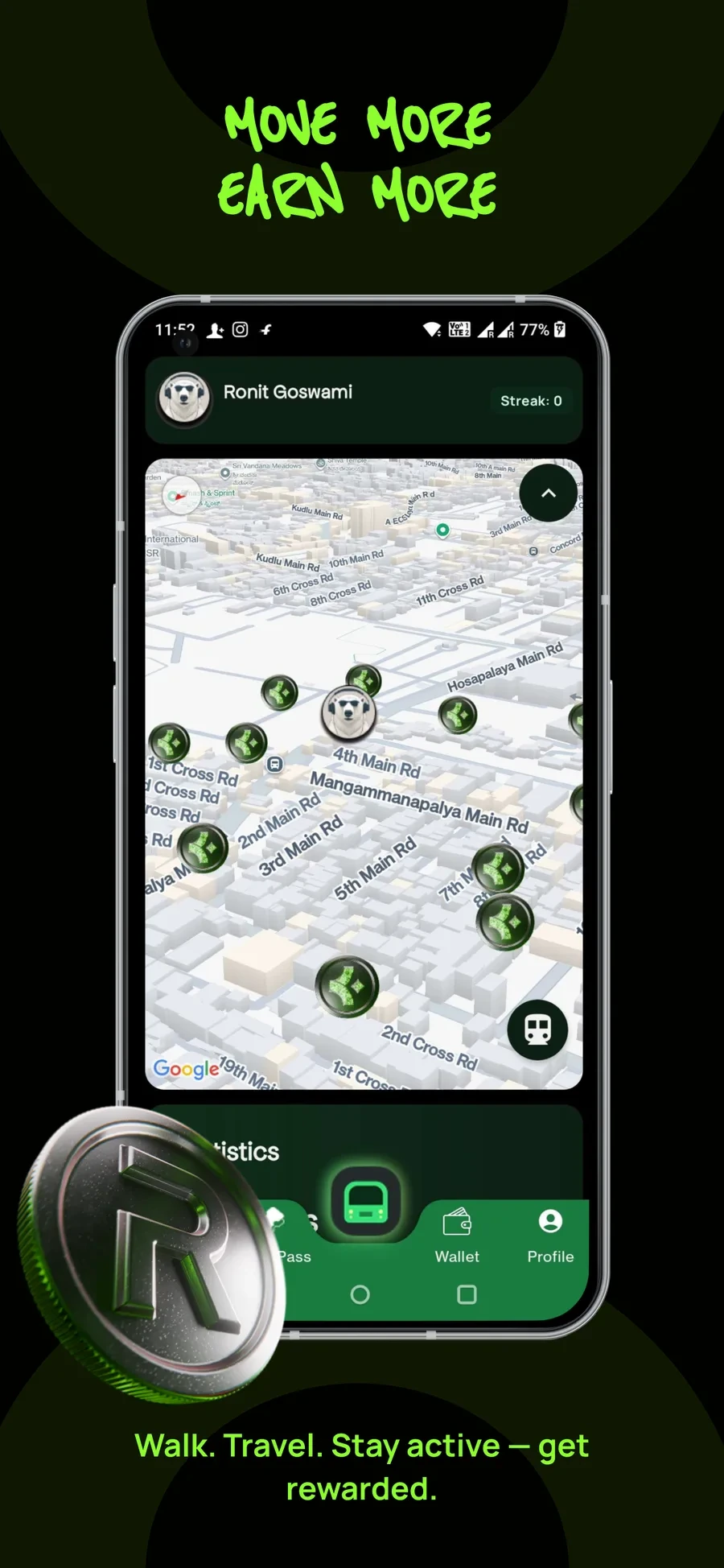
What the guidelines said
Two-dimensional representations of the token are always in core green. The mark is the pickup, at every size it appears.
What shipped
Every pickup is the mark in core green, legible at roughly twenty pixels while the map is moving.
What I would change Nothing. This is the small-size test the old coin could never have passed, running in production on a moving map.
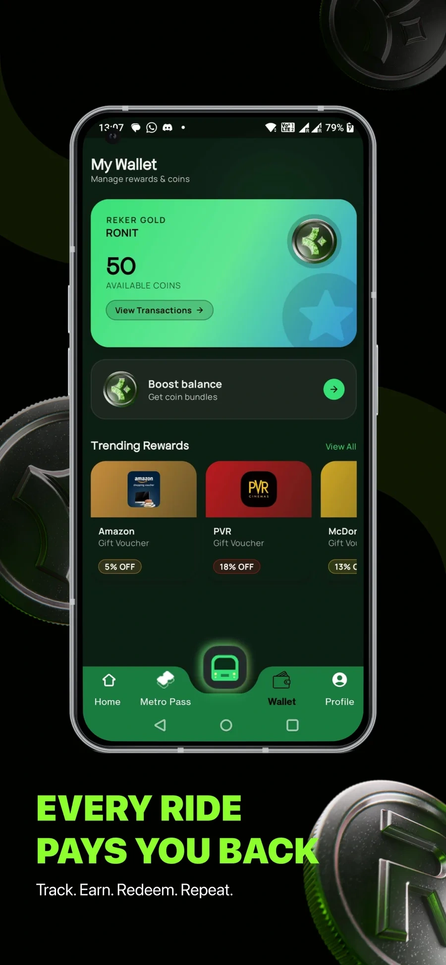
What the guidelines said
Green is a surface colour. Blackout or Off White sits on top of it. Never green on green.
What shipped
Green surfaces carry dark type throughout. The failure the old build was full of does not appear once.
What I would change Nothing, and this is the one I would point at first. The ramp was written to make this specific mistake hard to make.
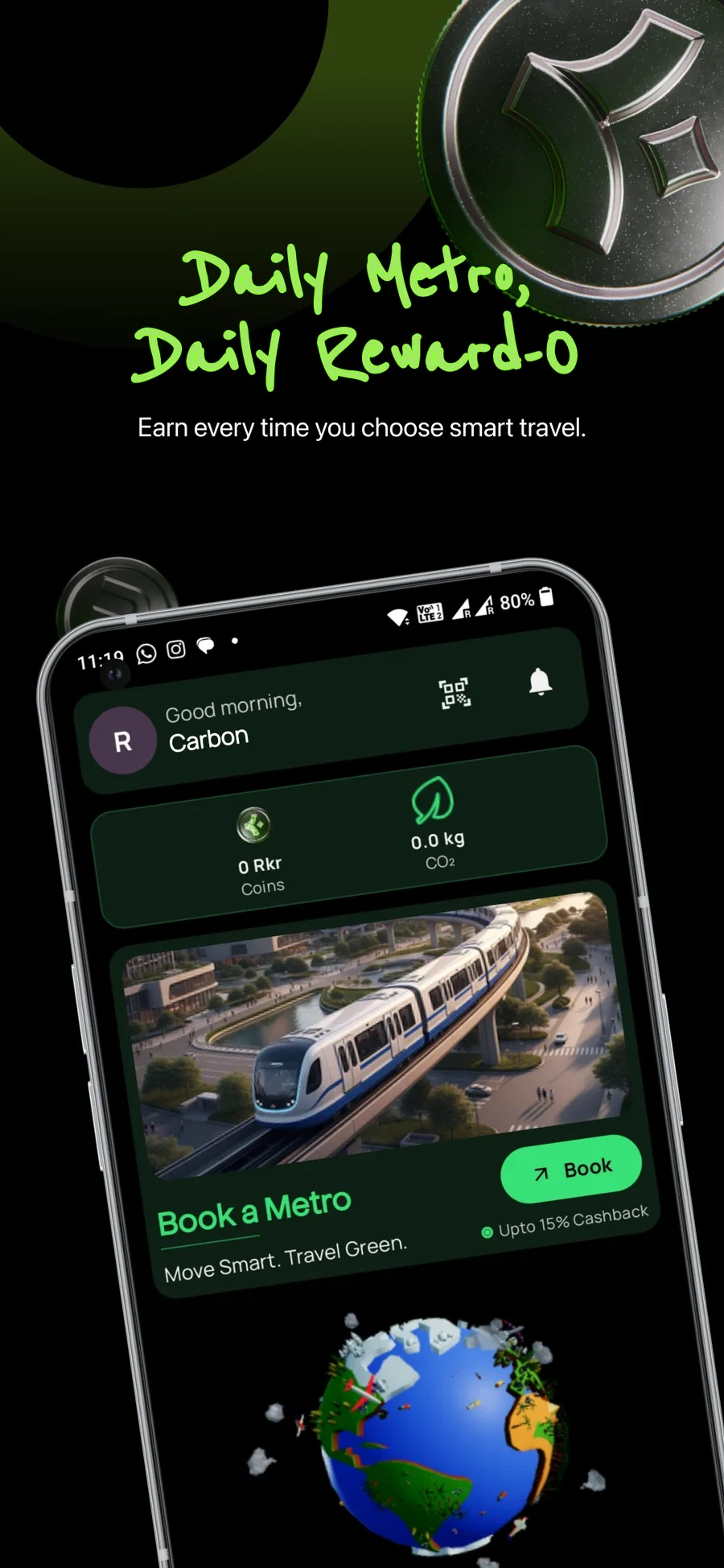
What the guidelines said
Reenie Beanie for the fun layer only, never for anything critical. Coins and CO2 read as a matched pair.
What shipped
The handwriting sits in the marketing frame and nowhere near a figure. The coin balance and the CO2 total are one component with two slots.
What I would change Nothing. The rule working as written, including the part about keeping the handwriting away from any number.
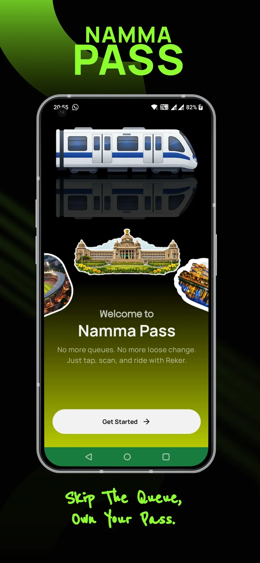
What the guidelines said
Imagery is a dynamic urban environment in the brand colours. The three-dimensional language is the coin, in signature metal.
What shipped
An emoji train and three photographic sticker cutouts, on the screen that introduces the paid product.
What I would change Mine, not theirs. The guidelines said what imagery should feel like and never said what to reach for when there is no budget for a shoot. A rule with no supplied alternative gets solved with whatever is to hand, and that is a documentation failure.
Launch, and ten thousand
The boarding pass was the launch instrument. It promises the first thousand users a free ride, and it says so twice, in the biggest type on the piece.
Limited to the first 1,000 users.
Reker launched on the Play Store and the App Store in May 2026. Two months later:
10,000+
Registered users
6,000+
Metro bookings
2,000+
Namma Pass users
25+
Tonnes of CO2 estimated avoided
Just over two months after launch. Figures reported by Startuppedia , 2 September 2026.
I did not cause those numbers. A product team, an engineering team and two founders did. What I can say exactly is that the thing ten thousand people signed up through was wearing this system, and the artefact that did the asking was mine.
Where the brand went without me
I built one identity for two readers and quietly assumed the commuter would stay in front, because the commuter is where the volume is.
Today reker.world opens with Enterprise Mobility Intelligence and Scope 3 Emissions. My own launch site's description still reads join the movement of urban stewards in Bengaluru. The compliance officer took the homepage.
Launch
Join the movement of urban stewards in Bengaluru.
Now
Enterprise Mobility Intelligence and Scope 3 Emissions.
That is the system working, not failing. The half of the identity built for an audit was already there when the company needed to turn the story towards one, and nothing had to be redrawn to do it. If I had designed only for the reader who looked most important at the time, this move would have cost a rebrand.
Reker is built by Evolvevol Tech Private Limited, founded by Shreyank Ullagaddimath and M. Nagasrinivas Rao. I worked on it in-house at Y4E Labs from December 2025.
Work with me
Want a brand like this one?
Identity, a system with rules a product team can follow without me in the room, and a 3D token modelled by hand in Blender. If your brand is one logo file and a lot of improvising, tell me what you're making.
0 likes · 0 views · Oct 12, 2026
Brand and product identity for Reker: mark, palette, type rules, 3D token and brand handbook; system launched and applied across product and marketing.


