
In short
Problem
Students preparing for exams like JEE burn their energy deciding what to study next, and the timetables they make fall apart after the first bad day.
Role
Solo. Product thinking, interaction design, visual design
What I made
Onboarding (11 screens), home deck, calendar, new task, focus timer, design system
Status
Personal concept. Not tested with users yet.
Year
2025
Tools
Figma, Mockup templates
Why study plans fail
I’m a JEE student, and most todo apps are basically the same app - a list, a calendar, a checkbox. None of them know what a year of exam prep feels like.
So I reimagined one around the problem I actually had. Not what to write down, but what to do next.
Kinematics Rotation Thermodynamics Electrostatics Optics Organic Equilibrium Calculus Vectors Probability Waves Magnetism Matrices Solutions Modern physics Coordination
Syllabus overwhelm
The syllabus is so big that picking a starting point becomes the first wall.
The illusion of planning
A perfect timetable on day one. One bad day throws it off, then comes the guilt, then no plan at all.
Motivation runs out
Prep lasts months. Without seeing progress, discipline wears thin long before the exam.
New chapter Revise Practice
Deciding what's next
New chapter, revision or practice problems. Making that call every day uses up the energy meant for studying.
Who it's for
Aarav is closest to my own JEE prep, so the design is built around him. Sneha and Vikram are where it should stretch next. I didn't interview anyone for them, and the screens don't cover what they need yet.
Closest to my own prep

Aarav, 17
JEE Main and Advanced. Class 11, Jaipur
Spends more time planning to study than actually studying.
Where his day goes
School Coaching Homework Self-study
School, coaching and homework come first. Self-study gets what's left.
Needs
A study routine he can actually keep
Understanding concepts, not memorising them
Keeping pace with coaching
Gets in the way
Timetables abandoned by day two
Guilt after an hour lost to YouTube or Instagram
School, coaching and self-study all at once
Extrapolated

Sneha, 20
NEET, second drop year, hostel in Kota
Revises what she already knows and misses her weak spots.
Weak topics found and fixed, and revision that doesn't let old chapters fade
Not covered yet - Weak-topic tracking and spaced revision
Extrapolated

Vikram, 26
UPSC CSE, second attempt, works full time in Bengaluru
Two hours after a nine-hour workday, and none of it to spare on deciding.
Exactly what to do in the time he has, with current affairs next to static subjects
Not covered yet - Current affairs, and feedback on written answers
What's already out there
My reference board. Most of it is a list, a calendar or a progress ring. Deciding what to do next is still left to you.
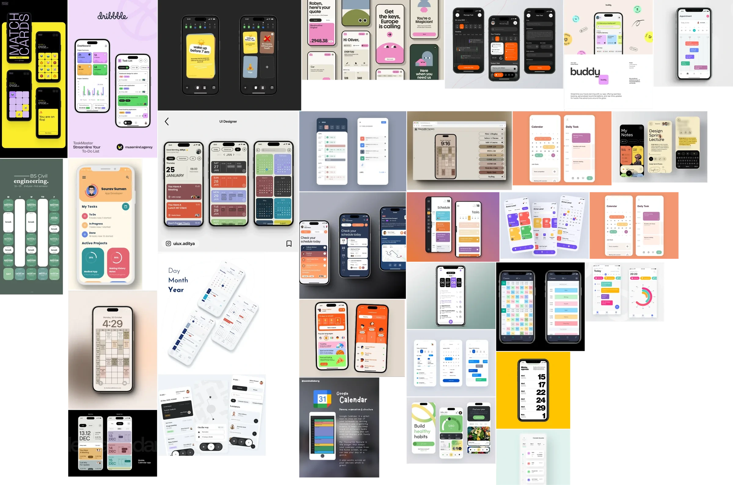
The reference board I collected before designing.
The idea it all hangs on
Pick for them, without taking the choice away
An overwhelmed student wants to be told what to do. A rigid plan is exactly what they give up on. Zenith sits in between, and every screen lands somewhere on this line.
The app decides You decide
01 Builds the plan App decides
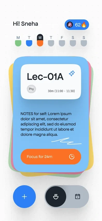
02 Picks the next card App suggests
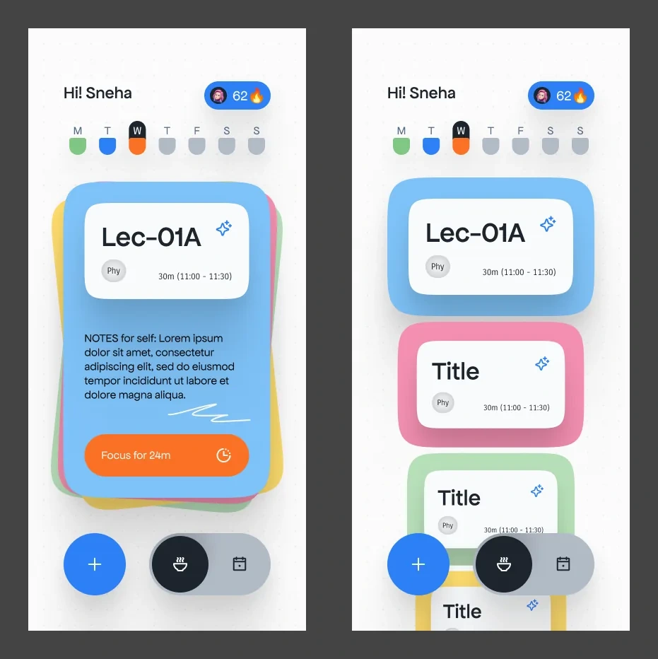
03 Fans out the rest You choose
04 Shows the whole week You check
05 Takes your own tasks You decide
App decides
Decision 01
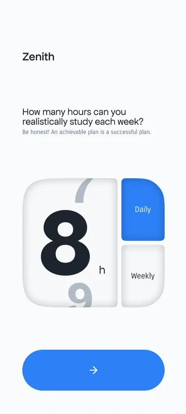
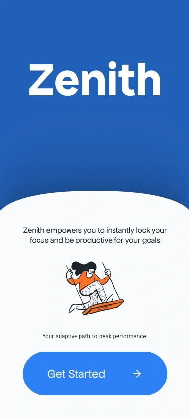
Build the plan from three honest answers
Why
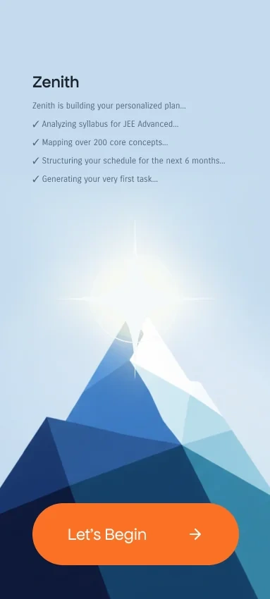
Syllabus overwhelm starts before day one. So onboarding doesn't ask anyone to build a timetable. It asks for the exam, the exam date and the hours they can really give each week, then builds the plan from that. The hours screen says it straight - be honest, an achievable plan is a successful plan.
Trade-off
The plan is only as good as those answers. Overestimate the hours and the rigid timetable is back. And the plan-building checklist promises syllabus analysis that needs a real content model for each exam, which isn't designed.
01 Splash

02 Intro
03 Sign up
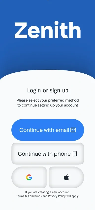
04 Email
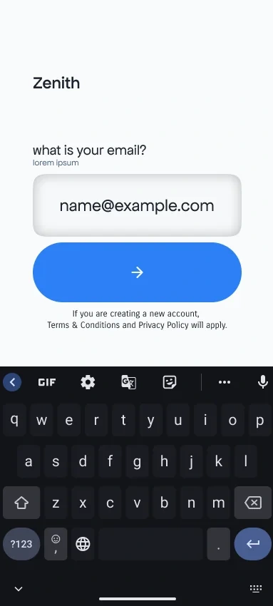
05 Code
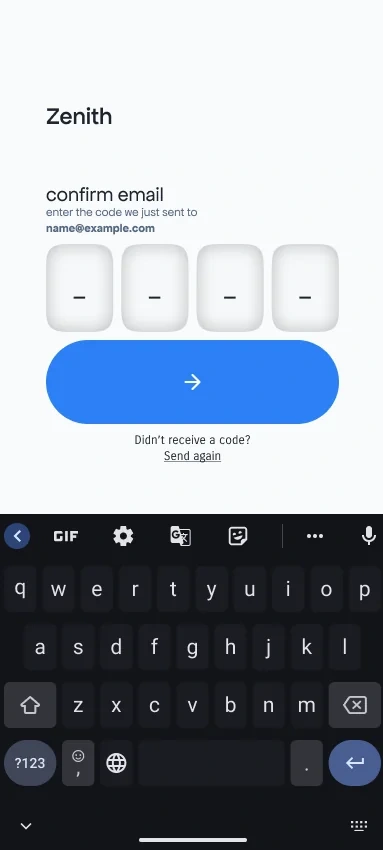
06 Password
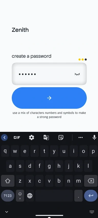
07 Exam
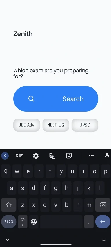
08 Exam date
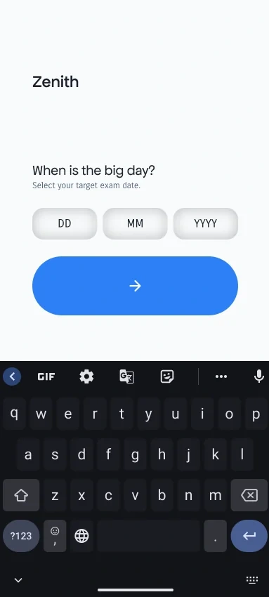
09 Hours
10 Building

11 Begin
App suggests
Decision 02
One card, not a list
Why
Deciding what's next is the daily drain. So the home screen shows one task, big, with one action - start a focus session. The rest of the day stays out of sight until it's wanted.
Trade-off
It hides the day. Students who like seeing everything at once can feel blind, and the app has to get the top card right most of the time or people stop trusting it.
Try it
The deck
The top card is the app's pick for right now. Fan out the rest and pick any card - it goes on top.
Fan out the deck
Or press and hold the top card
Lec-01A Phy 30m (11:00 - 11:30) Notes for self Focus for 24m
L-01A Chem 30m (11:00 - 11:30) Notes for self Focus for 24m
L-01A Maths 30m (11:00 - 11:30) Notes for self Focus for 24m
You choose
Decision 03
Overruling takes one gesture
Why
Plans get abandoned when changing them feels like failing. Holding any corner of the top card fans out what's next, and picking a different card is as quick as accepting the suggestion.
Trade-off
Press and hold is invisible. Nobody finds it without a hint, and the first-run hint isn't designed yet.
Stacked, then fanned.
You check
Decision 04
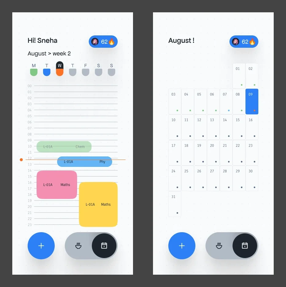
The whole picture, when you ask for it
Why
Some days need the overview, around school and coaching. One toggle swaps the card for a week timeline with a line at the current time, and a month grid where every day carries a status dot.
Trade-off
It's a second way to read the same plan. Two views to keep in sync, and a bottom bar that now carries a mode switch next to the add button.
Week timeline and month grid.
You decide
Decision 05
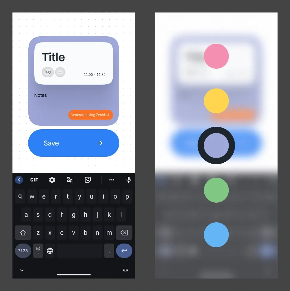
Your tasks, your colours
Why
Coaching homework and school tests never arrive on the plan's schedule. Adding a task is one card with a title, tags, time and notes, and the student picks its colour so the day reads at a glance.
Trade-off
Every task added by hand should push the rest of the plan around, and that reshuffle isn't designed. The card also has a Generate using Zenith AI button for notes, which needs clear limits on what it writes.
New task, and picking its colour.
Staying power
Built to last months, not a week
The first week of any plan is easy. These decisions are for month four.
Decision 06
A calm screen with wide margins
Why
Stress is already high. The app keeps one thing on screen and a 50px margin on both sides, so it feels like room to breathe rather than a dashboard.
Trade-off
Less fits on a small phone. Long task names wrap sooner, and there's no space beside the card for anything else.
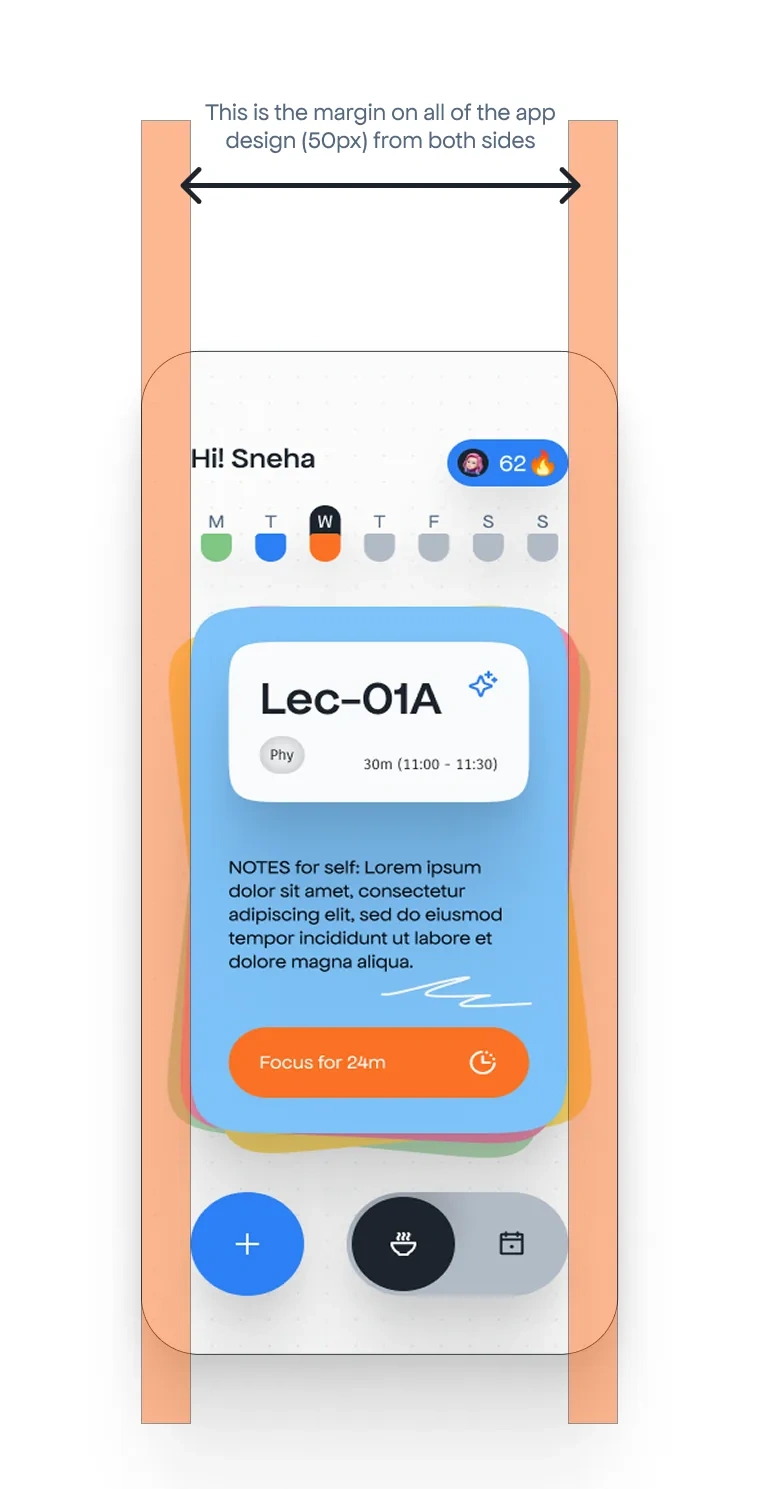
Decision 07
Colour the week, count the streak
Why
Progress has to be visible to keep motivation going. Each day in the week strip turns green when everything's done, blue when it's partly done, orange while it's in progress and grey when nothing's started. The streak counts days of completed tasks.
Trade-off
A streak cuts both ways. Break it and it turns into the same guilt Aarav already feels after a bad day, which is exactly what the missed-day design has to handle.
Hi! Sneha
Streak: 62
M M, All tasks done
T T, Partly done
W W, In progress , today
T T, Not started
F F, Not started
S S, Not started
All tasks done
Partly done
In progress
Not started
Focus mode
The phone stops being the distraction
Decision 08
Focus mode goes dark
Why
The card's one action opens a focus timer. Big numbers on a dark screen and almost nothing to tap, so there's no reason to stay on the phone.
Trade-off
The card sets the length up front. A 24-minute block suits a lecture, not a three-hour mock test, and longer sessions aren't worked out yet.
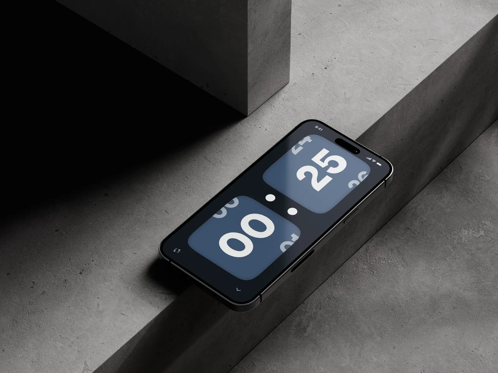
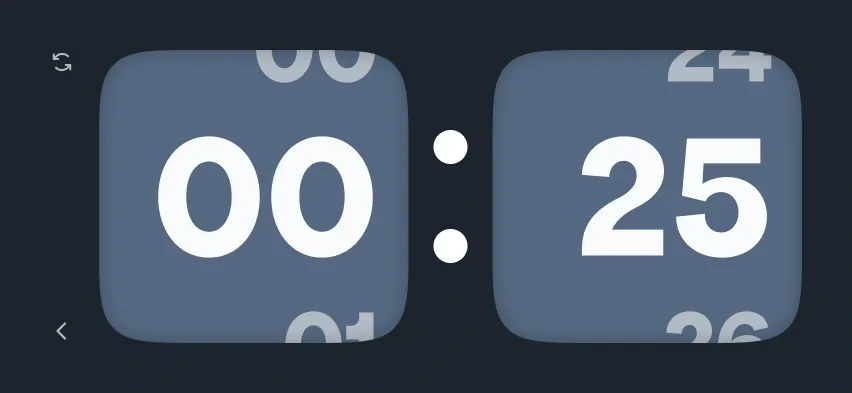
The timer screen. Digits roll like a flip clock.
Identity and kit
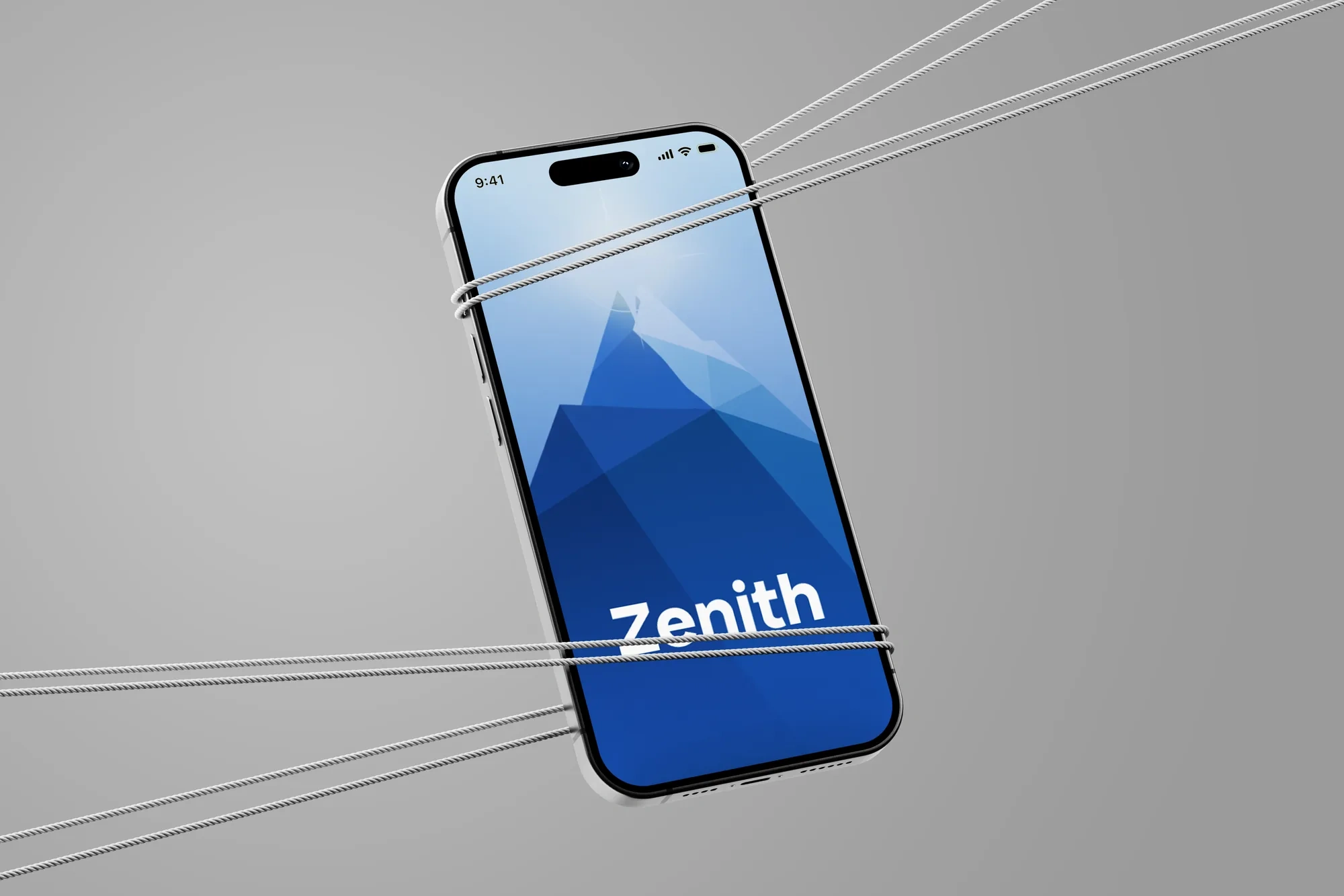

App icon
Aa
Apfel Grotezk for titles and text, Carrois Gothic for small labels and times
Main
Dark #1d242d
Surface #f9fafb
Blue #2d80f6
Orange #fb7124
Slate #546881
Cards
Blue card #7ec2f8
Green card #96d199
Lavender card #afb7e0
Yellow card #ffdc6d
Pink card #f6a2be
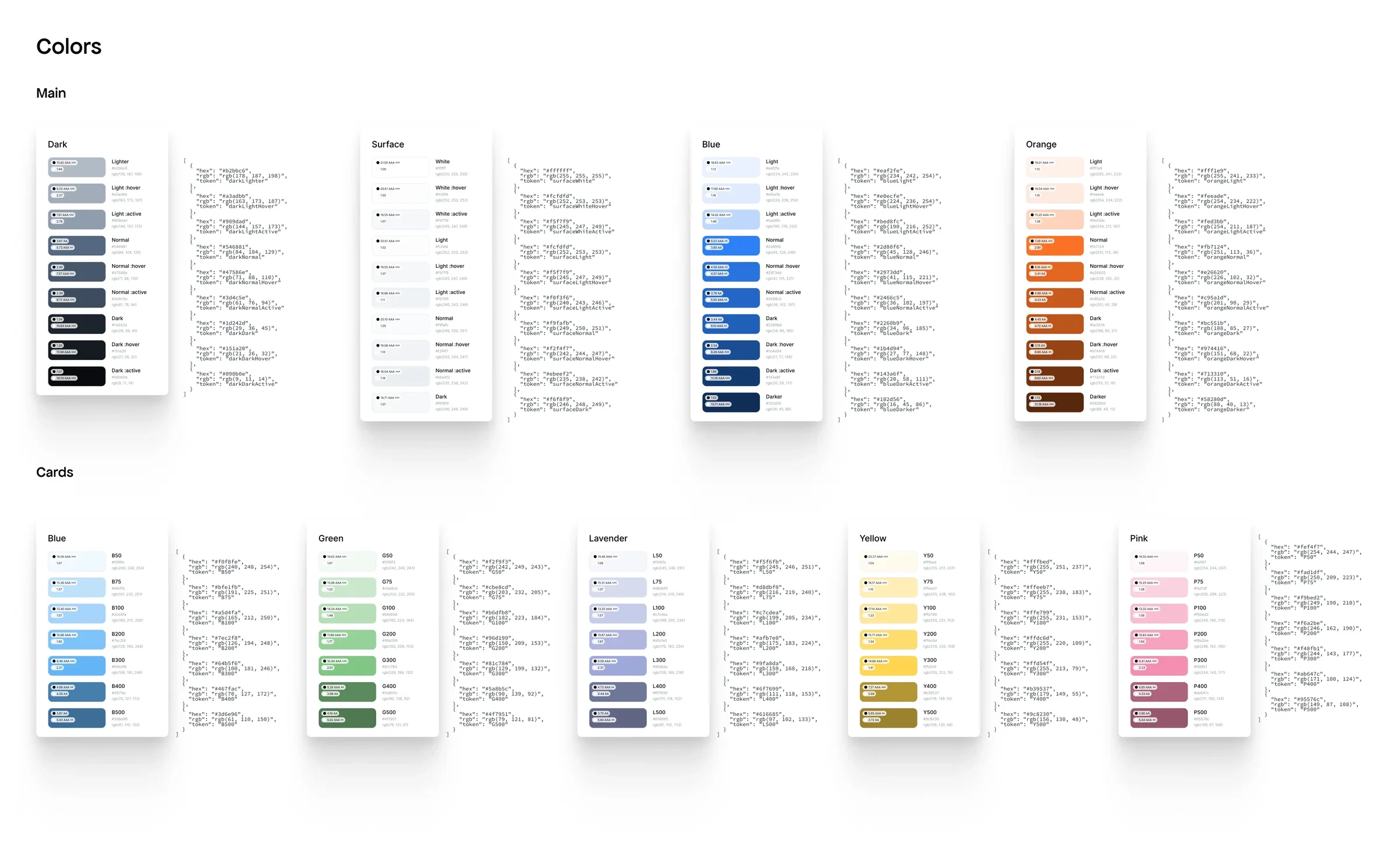
Every colour with its hover and active states and a contrast rating.
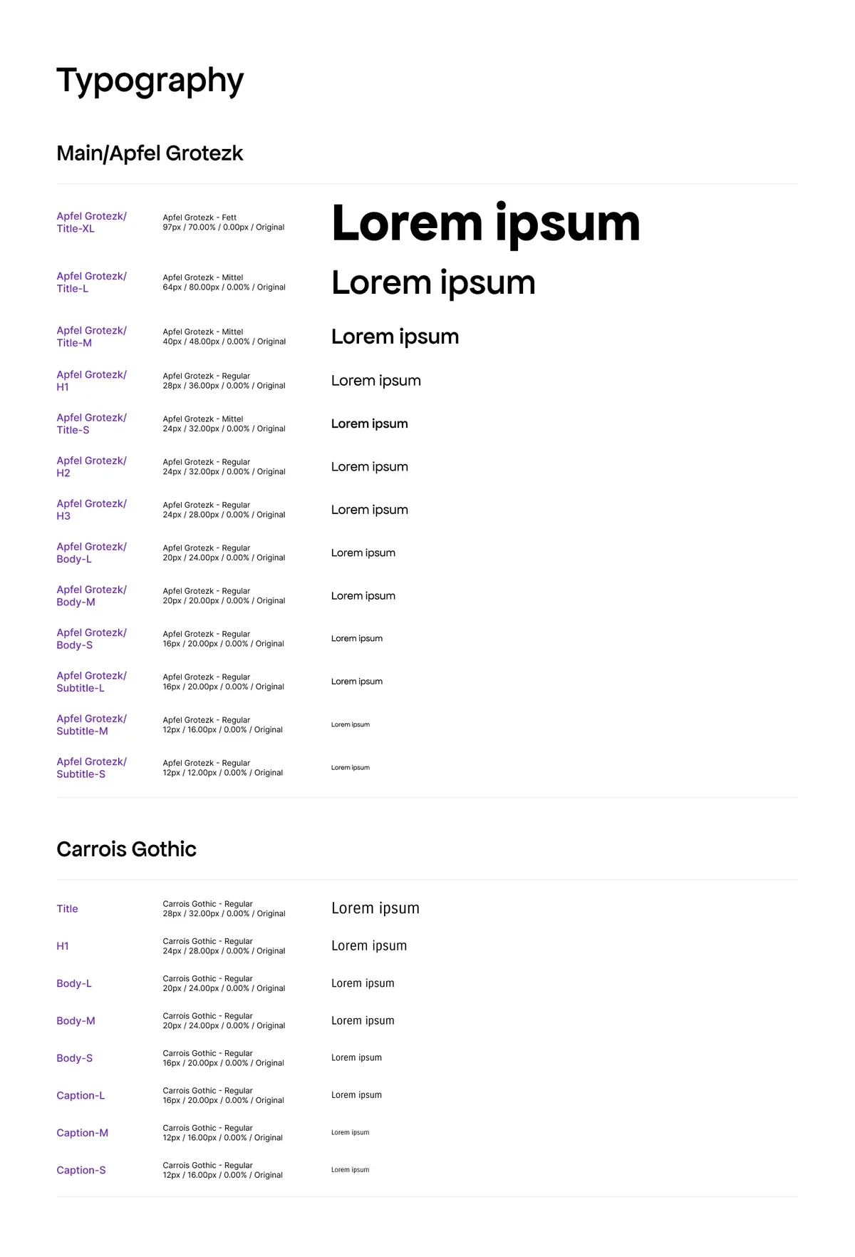
Type scale.
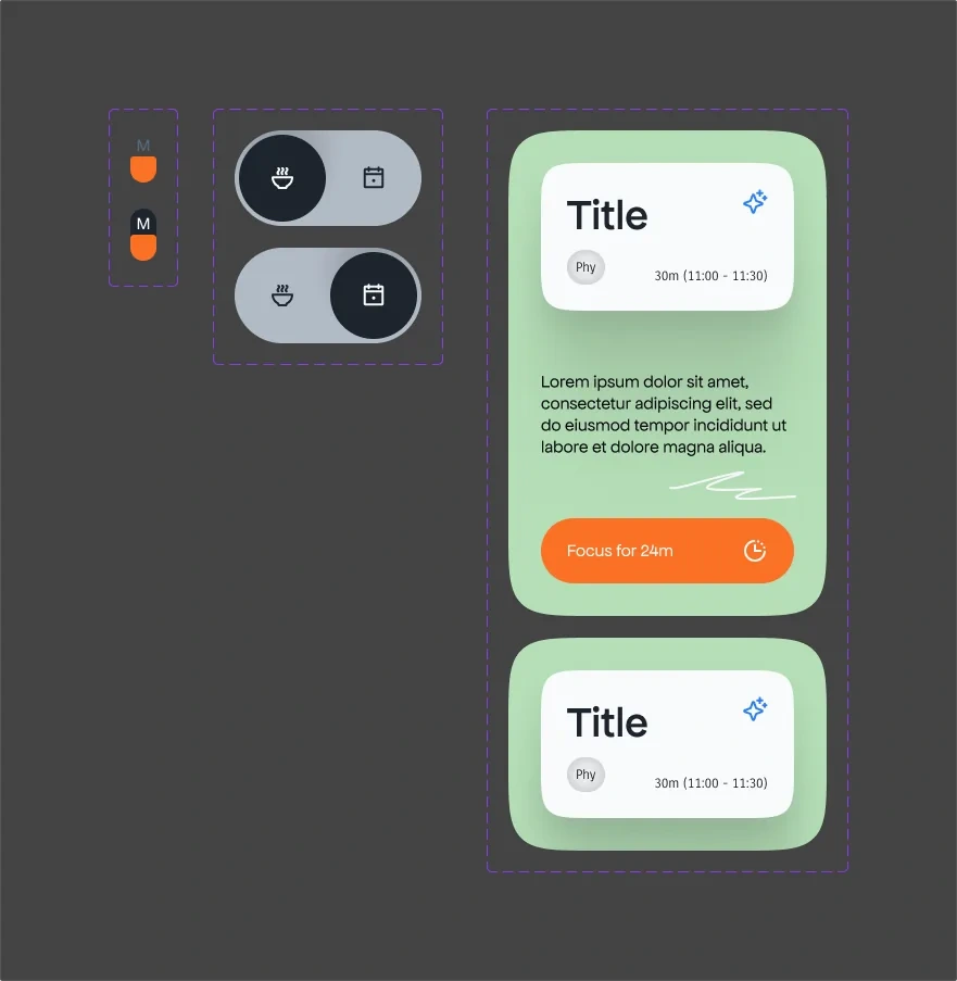
App components.
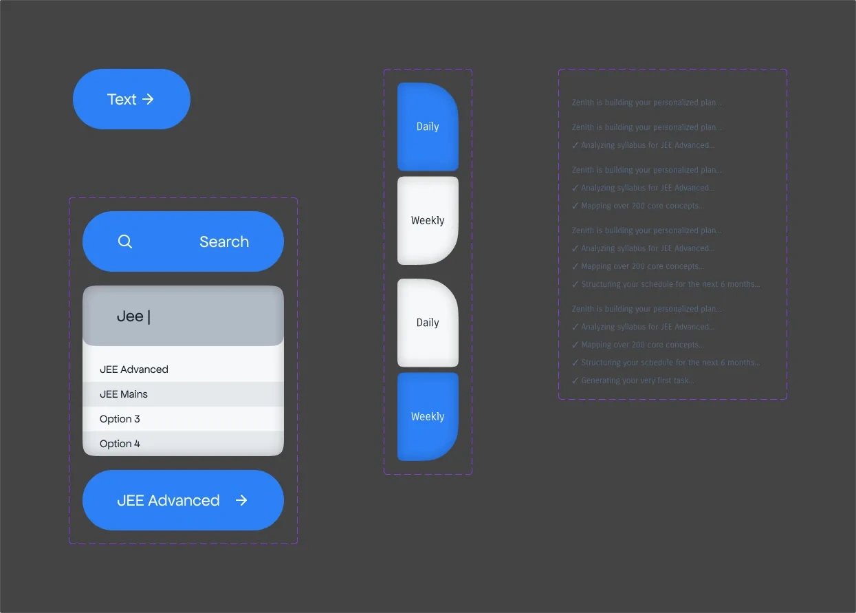
Onboarding components.
Work with me
Want an app like this one?
From the problem to the screens, and the system behind them. If your product has to keep someone going for months, tell me what you're making.
0 likes · 0 views · Oct 12, 2026
Zenith — a personal UX concept for a JEE study planner: onboarding, card-based home, focus timer and a design system to keep students on track.

