Heaven Matcha - Concept Brand Identity

Jana Janeš


Welcome to Heaven Matcha, a matcha bar and brand built around a playful, rich and soft atmosphere.
I wanted to move away from the usual calm and minimal matcha aesthetic and imagine matcha as a playful and soft escape instead.
The idea was to create a little world that feels bubbly, silky and warm. Something between a summer afternoon, a fairytale and a tiny touch of royalty.
The concept for Heaven Matcha started with a feeling.
Before working on the visual identity, I explored words, feelings and images that felt connected to the kind of atmosphere I wanted the brand to have.
Bubbly. Soft. Silky. Royal. Summery. Warm. Feminine. Fairytale.
These associations helped shape the name Heaven Matcha and became the starting point for the whole visual direction.
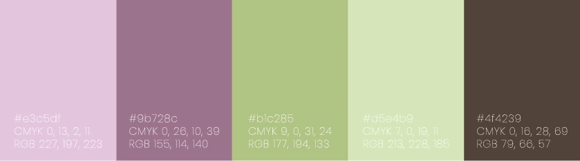
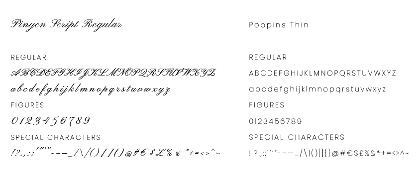
From there, I collected images that captured these feelings and used them to define the colours, typography and visual language. This way, the identity grew naturally from the atmosphere of the brand.

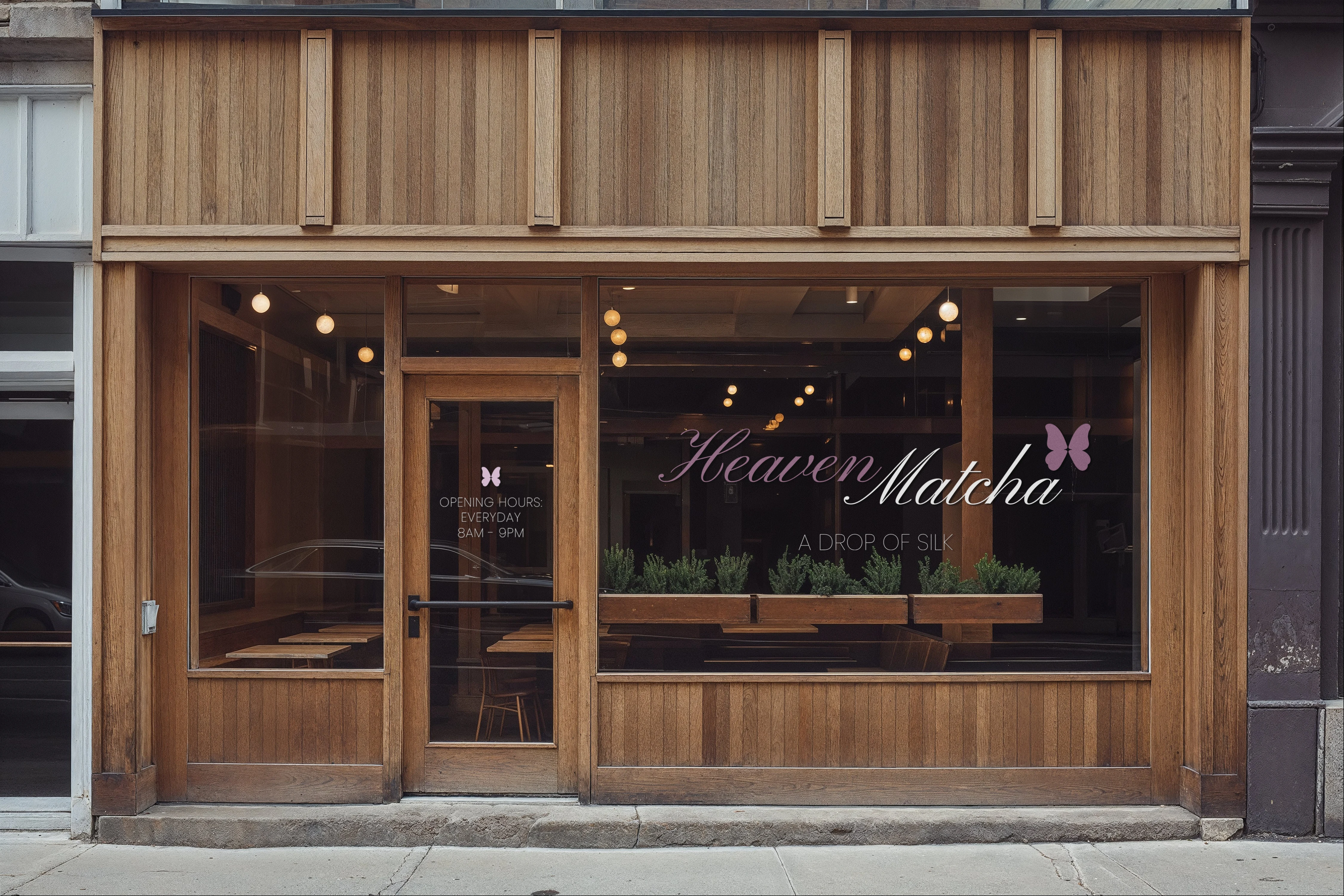
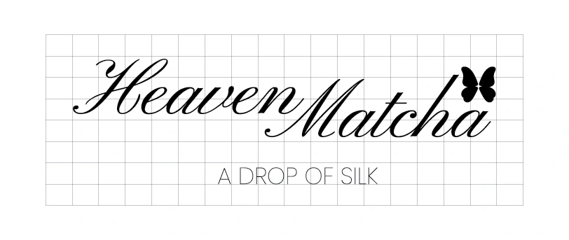
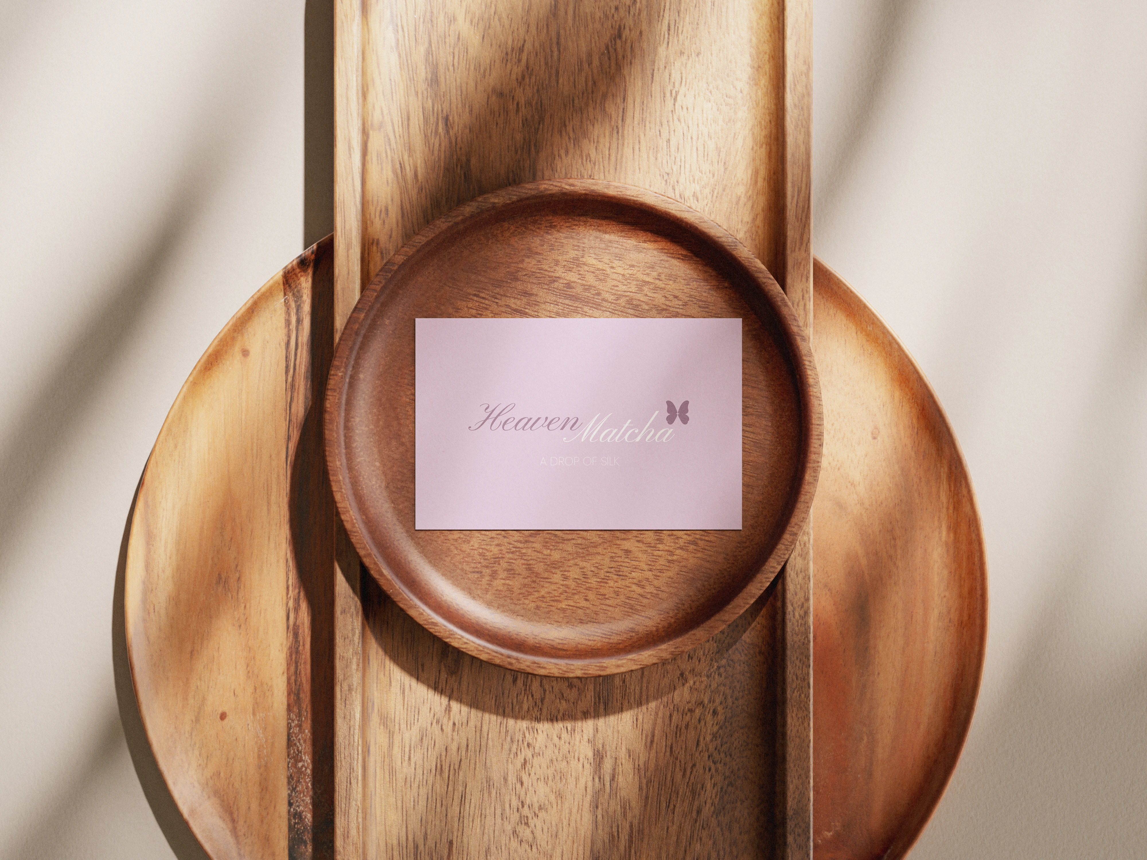
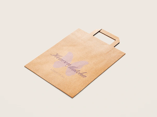
The logo was designed to feel soft and inviting, while its rounded, fluid character introduces the playful side of the concept.
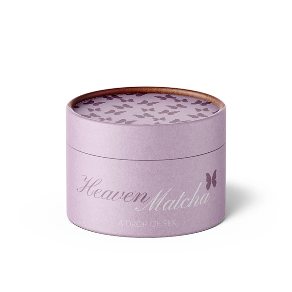
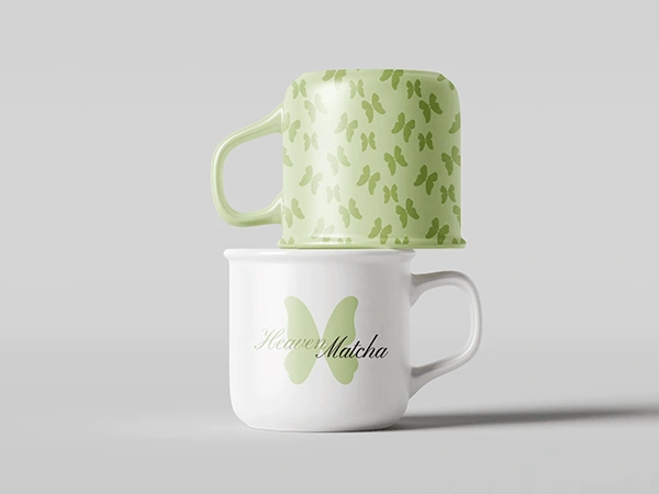
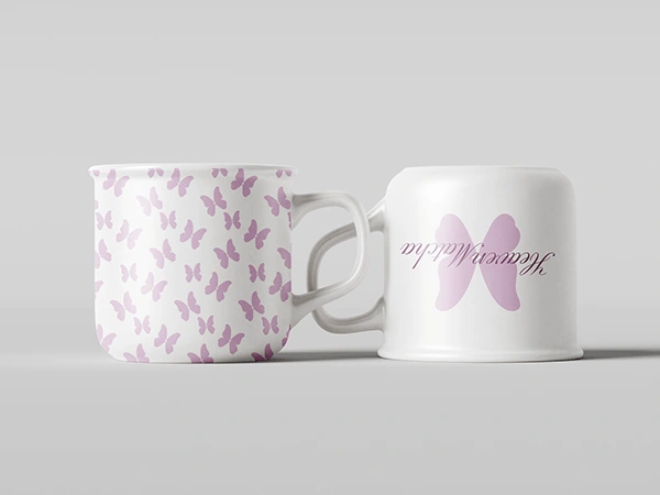
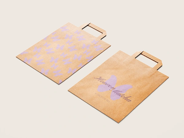
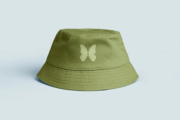
The butterfly is integrated into the logo and later becomes a recurring graphic element throughout the identity.
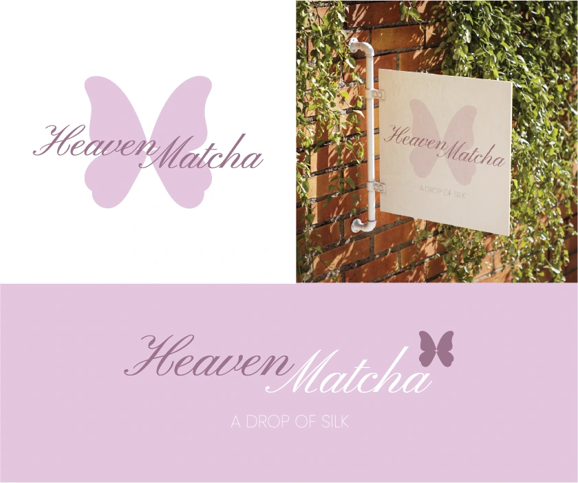
The richness comes through the colour palette and the contrast between delicate and more expressive elements.
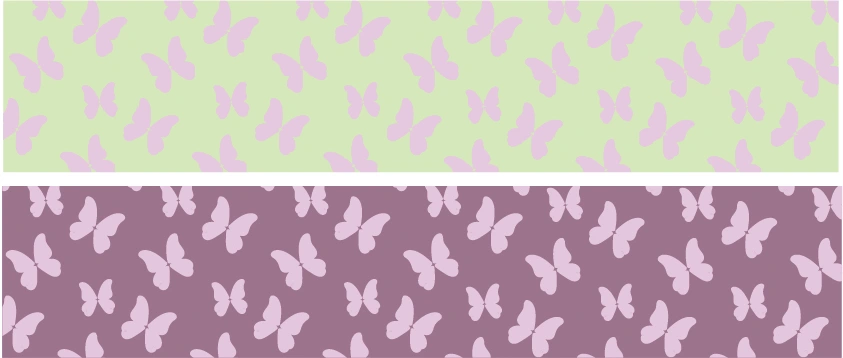
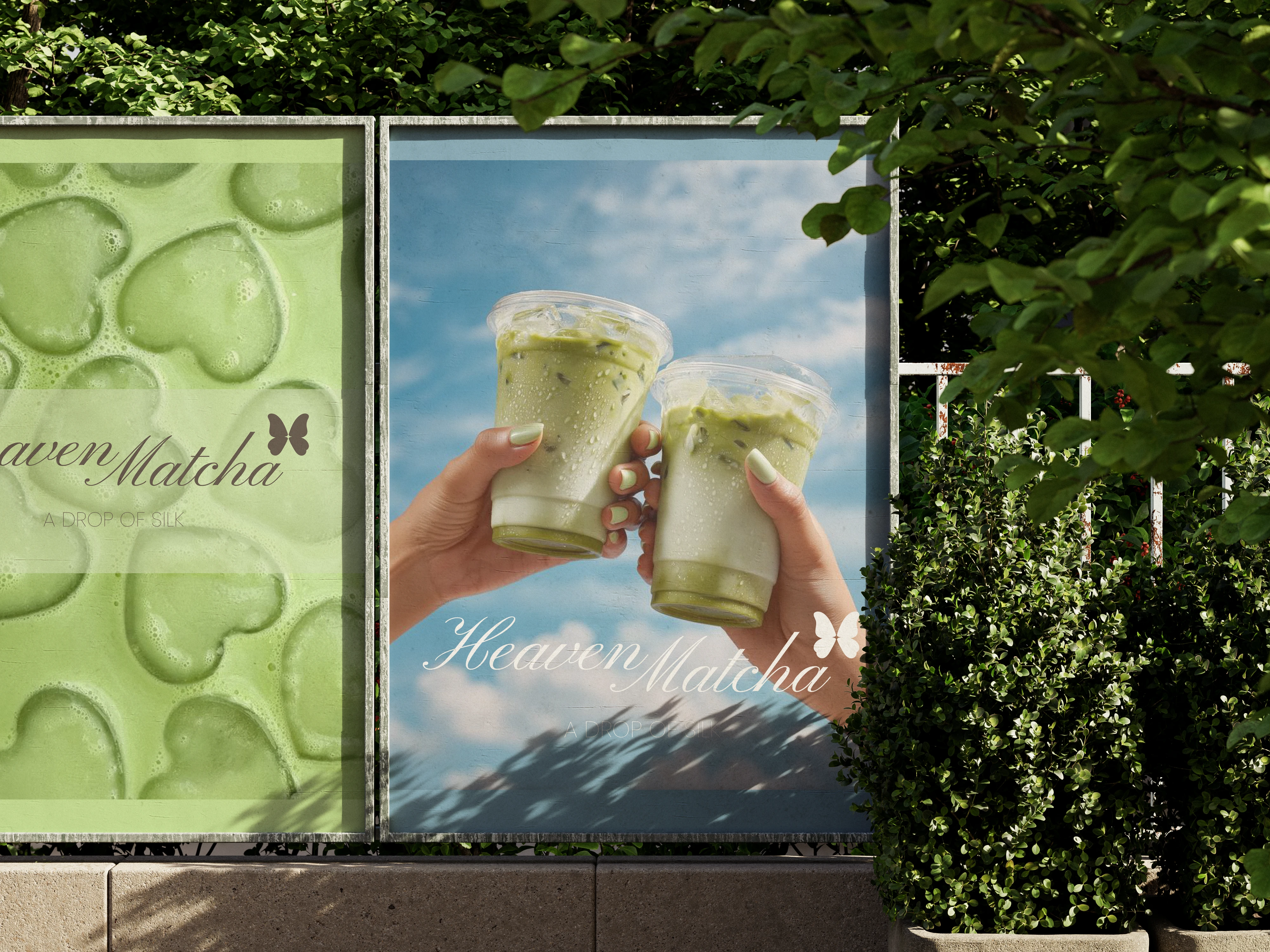
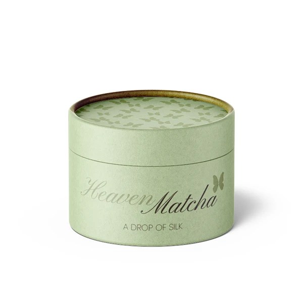
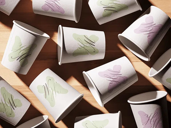
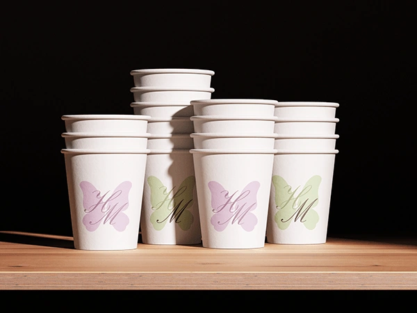
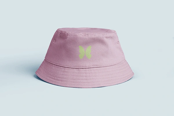
The butterfly became one of the main elements of the identity. I used it in the logo and repeated it throughout the different applications to bring a bit of movement, playfulness and connection to the whole visual system.
Like this project
Posted Sep 1, 2026
A matcha bar built around a concept where playfulness, softness and richness come together. I hope you enjoy exploring this project as much as I enjoyed creating it.