Branding, packaging and web design for BeeWell Vitamins
Julia Bowling
The Brand
BeeWell vitamins is a women-owned company who create vitamins that are specifically targeted towards women's health. The client wanted large vibrant colors, clean images and happy people representing the brand.
MoodBoard
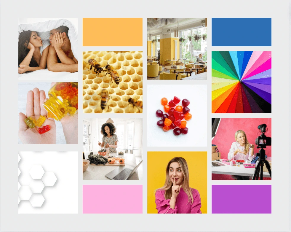
The images above created a good starting point for where the client wanted the brand to go. We know we wanted vibrant colors, happy people and to incorporate the bumblebee into the brand as a reoccurring icon.
The Logo
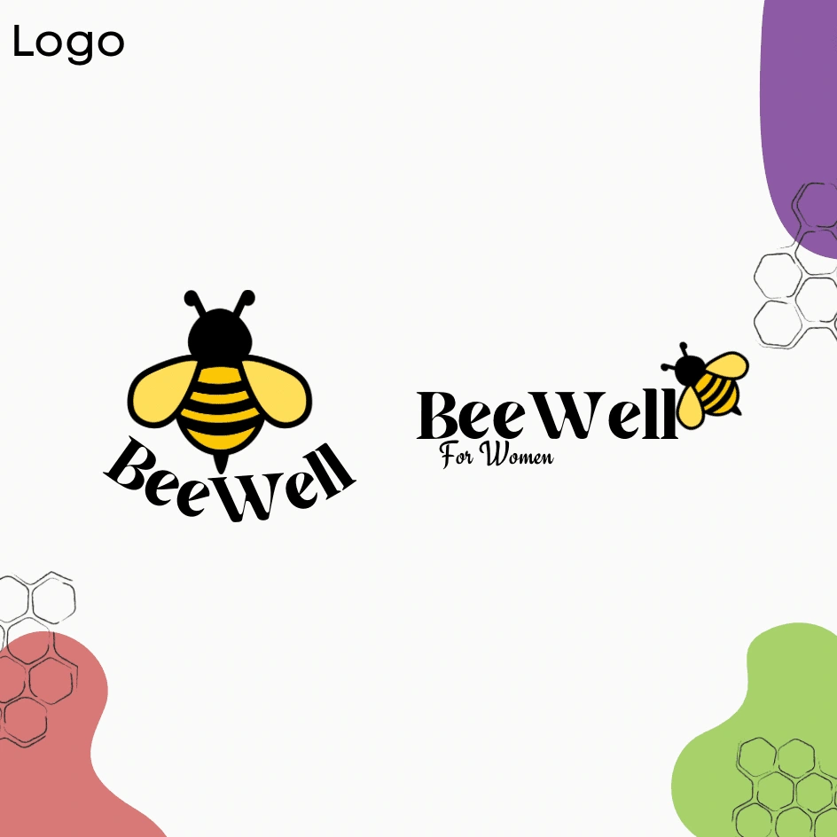
The client was adamant about incorporating the bumblebee into the logo as a reoccurring icon that would be recognizable on products in stores. We designed the horizontal logo as the main image that would be printed on products, the vertical logo would be included for company purposes.
Packaging Design
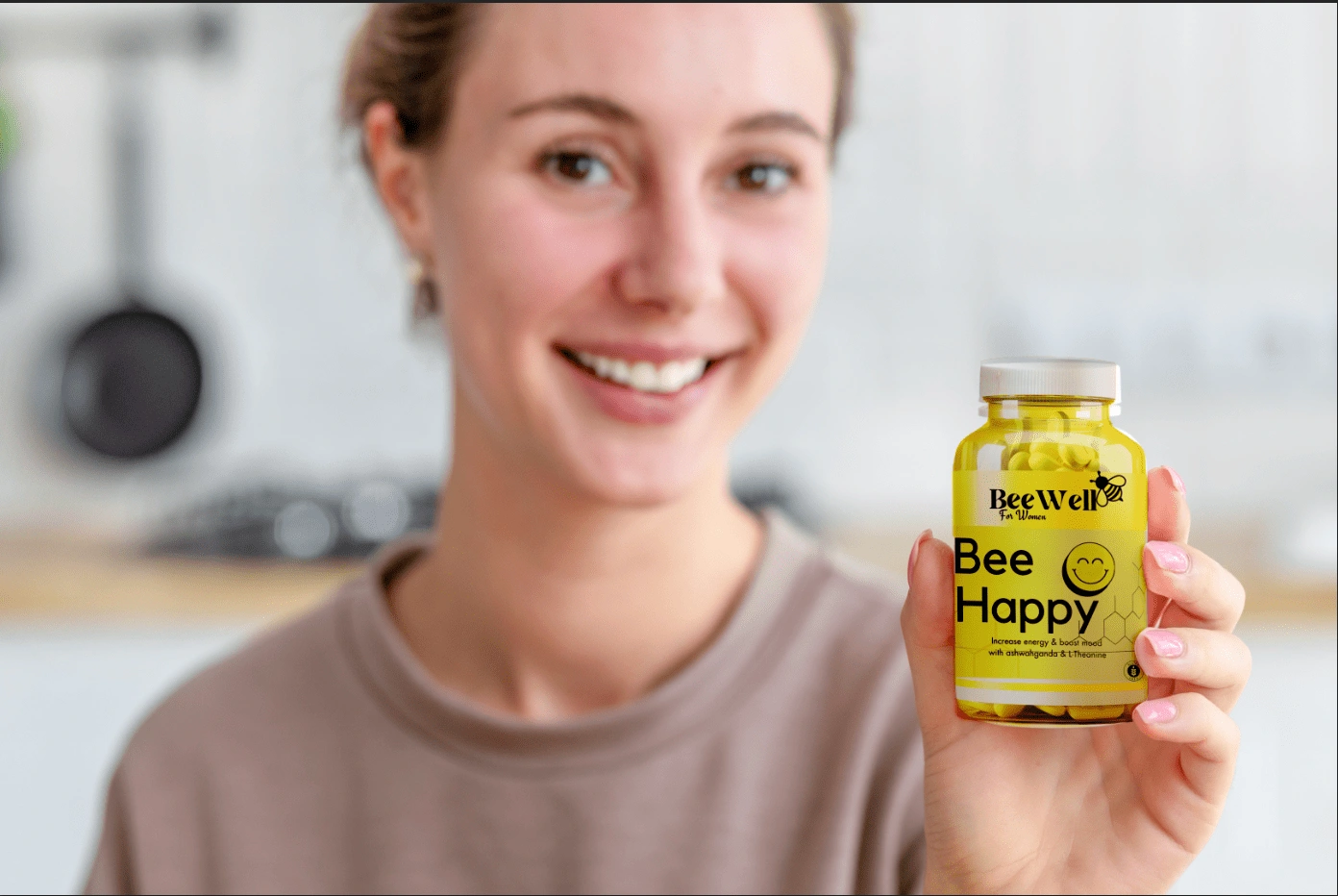
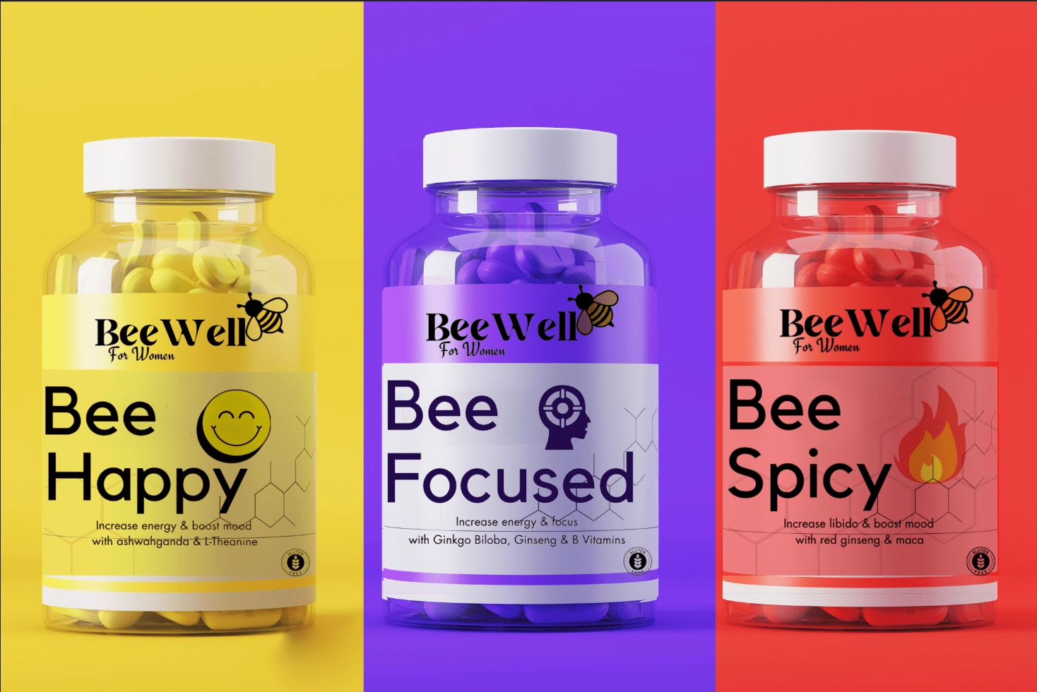
The client wanted the vibrancy of the brand to bleed through into the product packaging. We wanted BeeWell vitamins to stand out in store aisles. Eventually, we came up with this option of color coding the bottles based on the use of the vitamin. The client was very happy with being able to still incorporate the bumblebee imagery.
Web Header Design

The client wanted a unique header design with happy, healthy and vibrant in mind. The client also wanted something that could remain timeless, while also advertising the vitamin subscription service offered on their website.
Thank You!
Thank you for viewing this project! I'd love the opportunity to work with you!
Like this project
Posted Jan 7, 2024
A brief overview of a branding project for BeeWell Vitamins! This includes logo design, packaging and web header design.