Built with Framer
Bloc Agency Brand Identity & Web Design
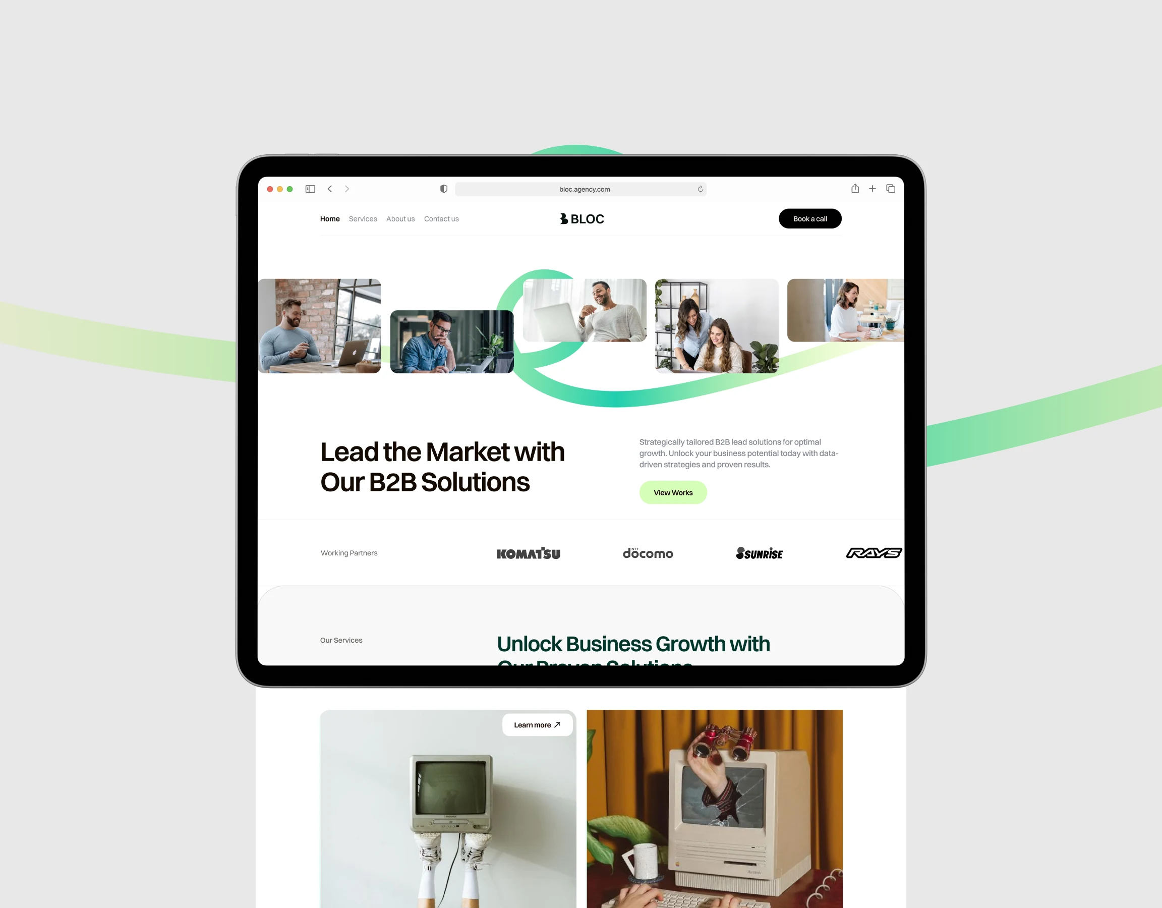
Bloc Agency: A Modern Brand Identity & Web design for B2B Growth
Bloc Agency, a B2B solutions provider, needed a complete brand identity and website that would position them as a modern, trustworthy partner for business growth. The project involved developing a sophisticated visual system and designing a user-centric digital experience focused on converting visitors into leads. My role was to create a cohesive brand that communicates professionalism and innovation, from the core logo to the final, polished website.
Live website: Https://bloc.framer.website
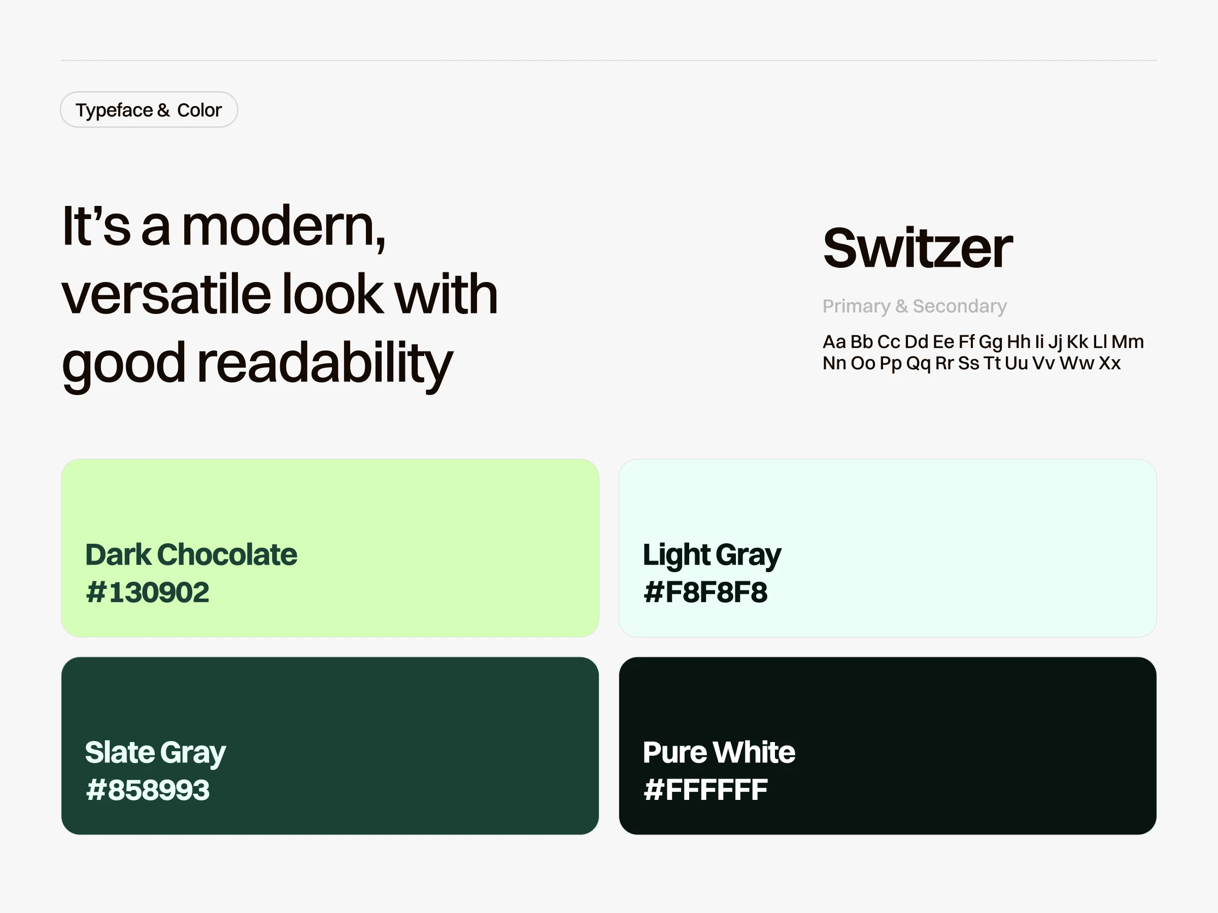
Style guide for Bloc
The brand identity is built on a foundation of clean, modern aesthetics. The 'B' symbol in the logo is strong and geometric, representing a foundational 'building block' for business growth. The color palette combines a deep, trustworthy slate gray with a fresh, optimistic light green, creating a look that is both professional and approachable. The 'Switzer' typeface was chosen for its excellent readability and versatile, modern character, ensuring all communication is clear and confident.
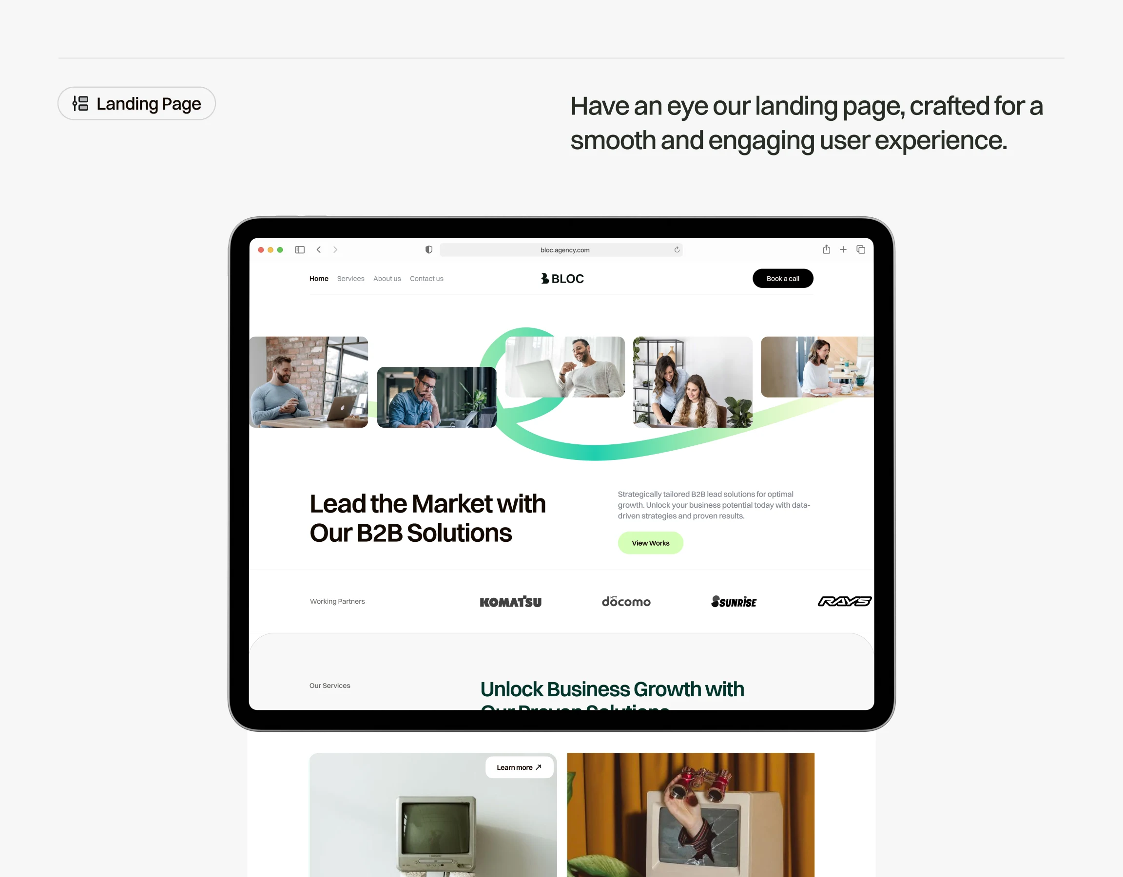
Homepage for Bloc
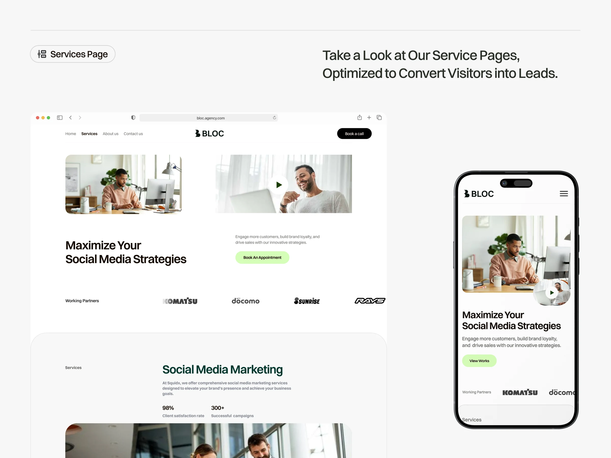
Service page for Bloc
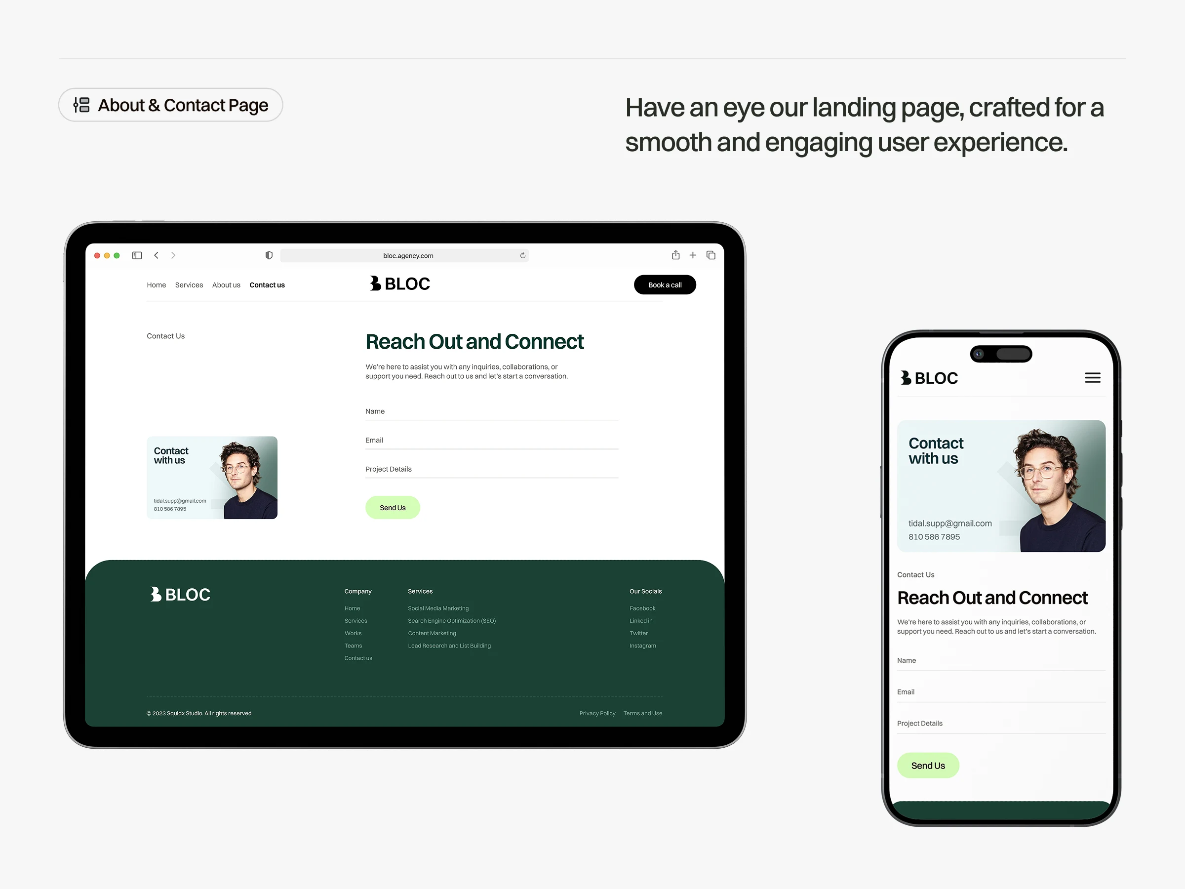
About page for Bloc
The website was designed to be a smooth and engaging experience that guides users toward conversion. The UI is built on a solid grid system, ensuring a clean, organized, and consistent layout across all pages. From the high-impact Landing Page designed to capture attention, to the clear and informative Services Page, and the simple, frictionless Contact Page, every element is crafted to build trust and encourage users to take the next step.
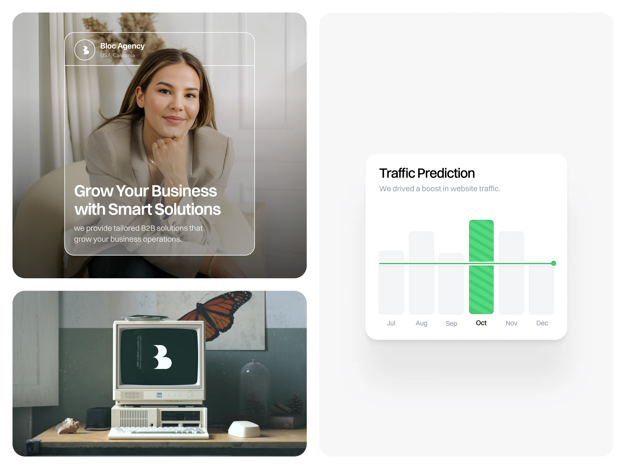
Branding Slide for Bloc
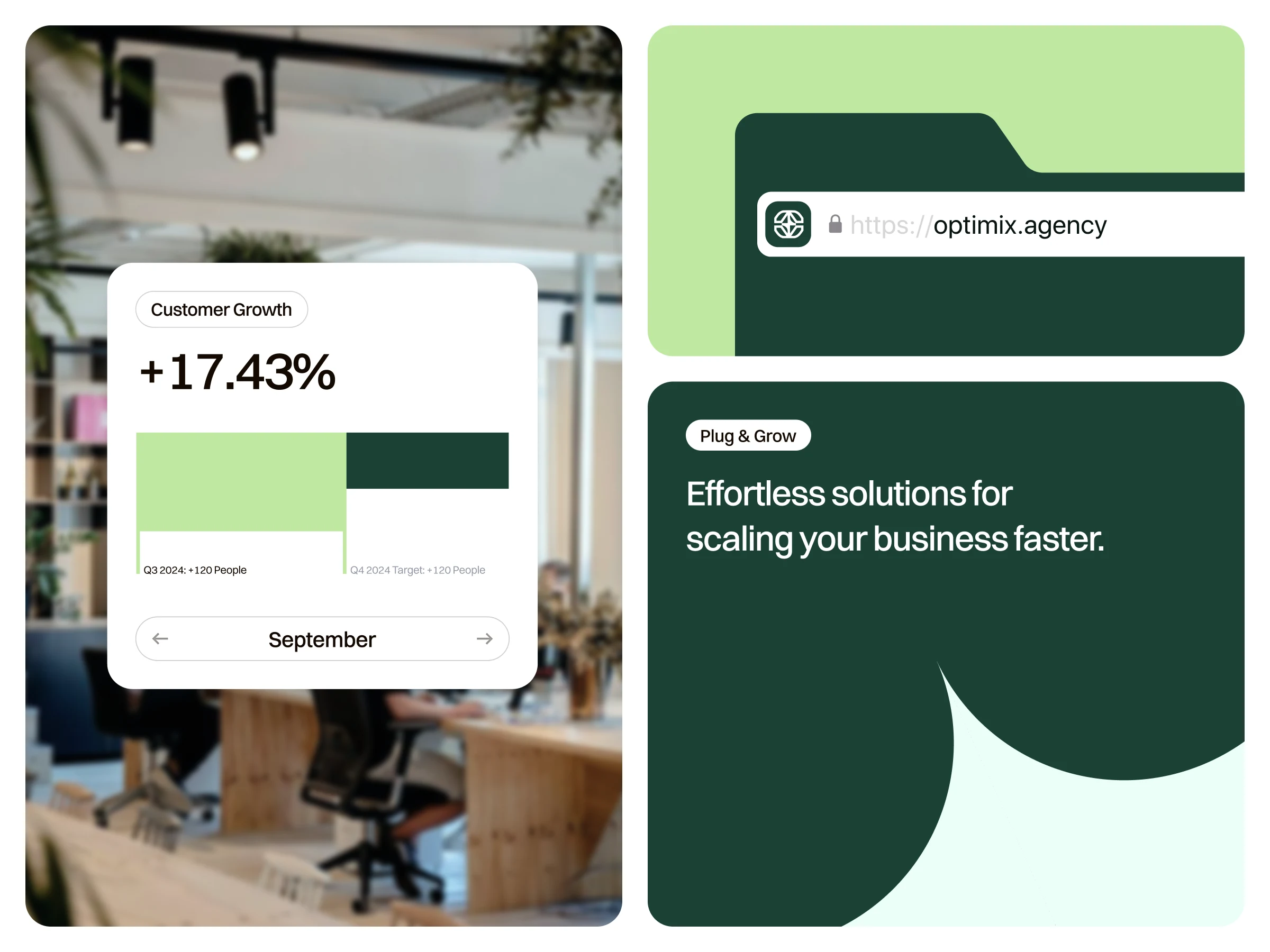
Branding slide for Bloc
To reinforce Bloc Agency's value proposition, the design prominently features clean, easy-to-understand data visualizations. We created a system of minimalist charts and graphs to showcase key metrics like traffic prediction and customer growth. This data-driven approach does more than just present numbers; it visually communicates a story of success and tangible results, providing powerful social proof and building confidence with potential clients.
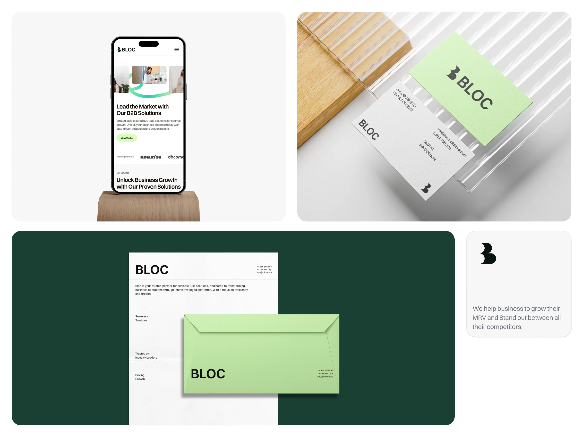
business card, letterhead, and multi-device mockup images for Bloc
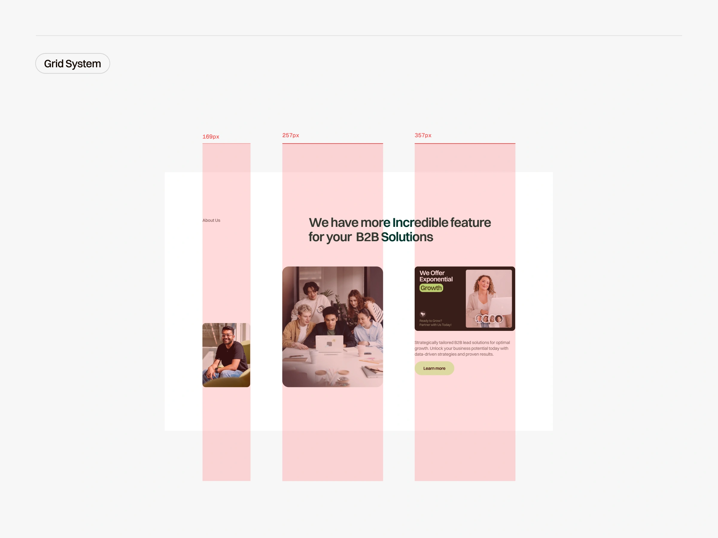
Bento grid for Bloc
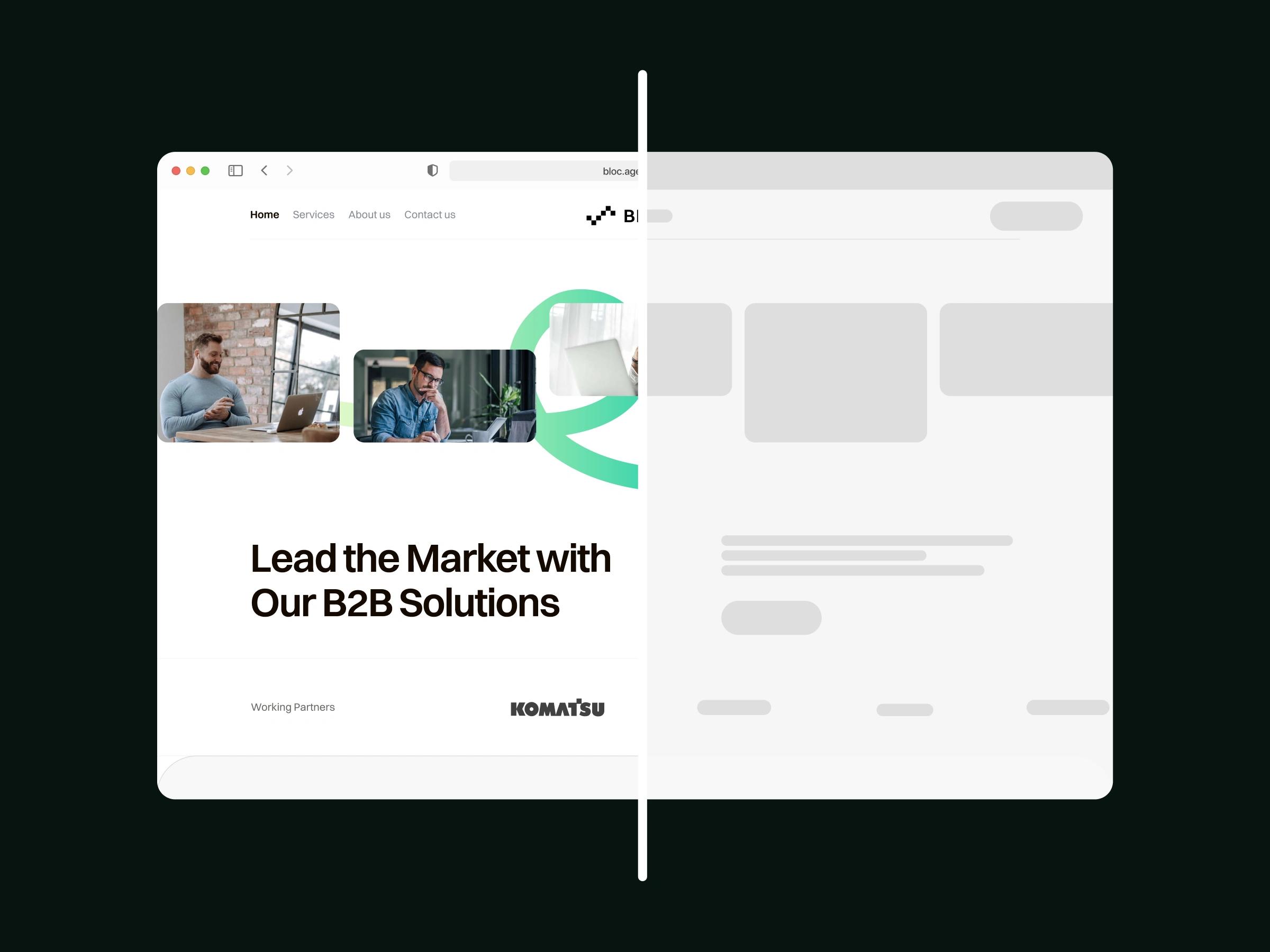
Homepage for Bloc
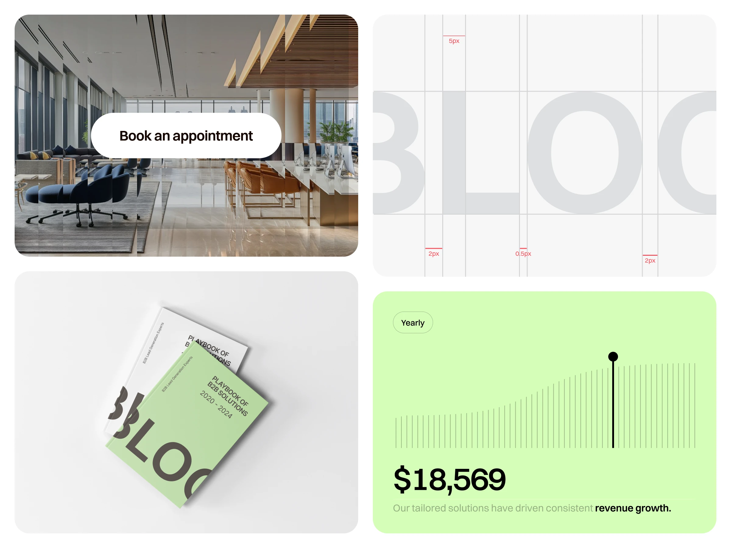
Branding slide for Bloc
The Bloc Agency brand was designed to be consistent and versatile across all applications. The sophisticated visual identity translates seamlessly from the digital website to physical brand collateral, including modern business cards and professional letterhead. The responsive design ensures a flawless experience on any device. This holistic approach guarantees that Bloc Agency presents a unified, polished, and memorable brand identity at every single touchpoint.
Like this project
Posted Aug 20, 2025
Created a modern brand identity and website for Bloc Agency to enhance business growth.
Likes
5
Views
18
Timeline
Sep 4, 2024 - Oct 2, 2024

