Mintable - Brand Identity Design
"The most human NFT platform"
Mintable is an NFT marketplace that connects buyers and sellers. At Mintable, we reimagine the NFT experience and empower creators and buyers alike to maximise their success. However, they didn't want to take on a one-size-fits-all approach like other major NFT platforms. They wanted to be the NFT platform that focuses on the customer experience and be their guiding light in their discovery of the vast NFT world. The Mintable team and I teamed up to build an overarching brand strategy and direction, and create the visual look and feel of the brand following that strategy.
🔗 Website: www.mintable.app

Creative Support
Brand Strategy
Logo Design
Creative Direction
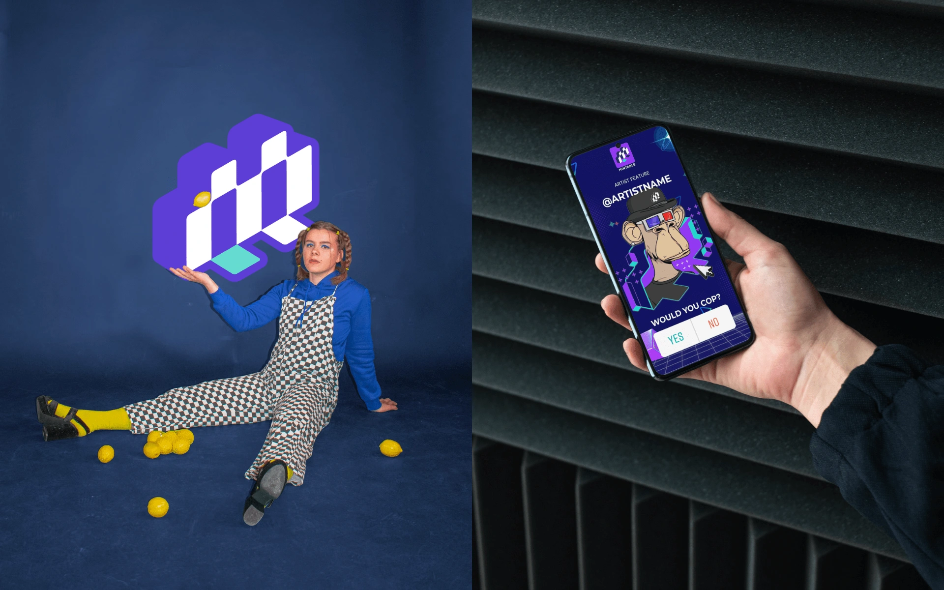
Brand imagery
Objectives
The main objective was to differentiate the brand from other NFT platforms by achieving a fresh, modern and unique visual identity and making the NFT experience more approachable and empowering. The process of creating, buying and selling NFTs should be fun and users should not have to worry about customer service or a lack of knowledge. Mintable comes in by being the platform that truly cares about the users, being the easiest platform to use and being supportive at every touchpoint.
Strategy
Step 1 - Streamlining
Mintable constantly releases cutting-edge features and redefines the NFT space, but had a problem with gaining impact and engaging new users. To have a more objective-oriented visual identity & strategy, we decided to dig deeper into their features and thought processes and streamline them into 3 large buckets- Social, Personalisation, Customer Centricity. We believe that these are the main edge Mintable has over other platforms and will allow them to not only retain existing users but also engage new users. These 3 differentiating factors of Mintable were then expanded and implemented in the Brand Identity.
Step 2 - Visual identity
The second step of the strategy was to build a visual identity that would be relevant to the target audience. Mintable already had a recognisable logo mark, a simple "M", and we retained that and made improvements to the mark to complement the new Brand Strategy.
Logo Design Concept
The logo is a play between the letter 'M' (Mintable's original logo mark), and a bridge with 2 doors, symbolising creators and buyers walking through each door and meeting in the same world, with Mintable being the bridge that connects the two. It's also inspired by building blocks, displaying trustworthiness and the evolutionary nature of Mintable, who constantly builds and improves according to their users' needs.
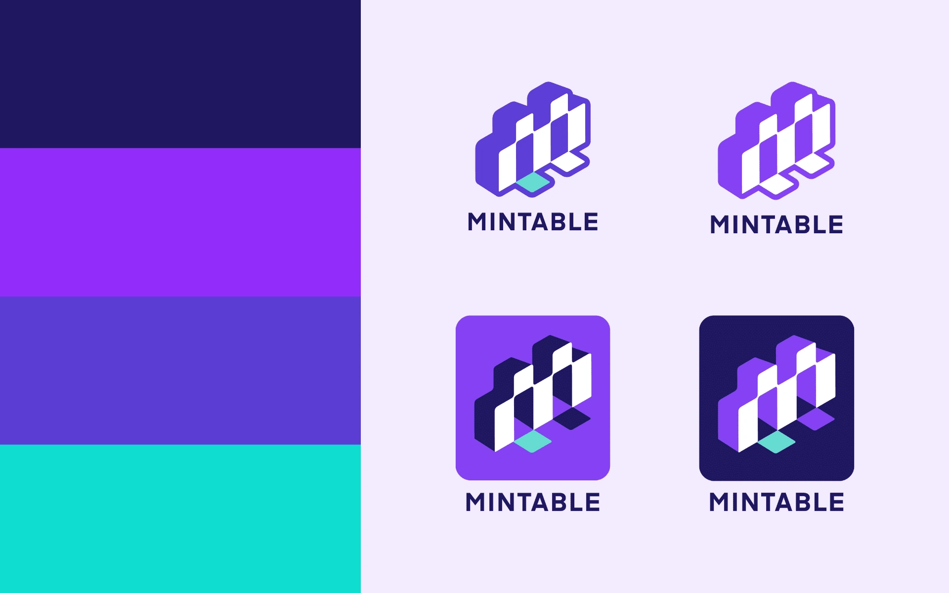
Color palette, logo & logo variations
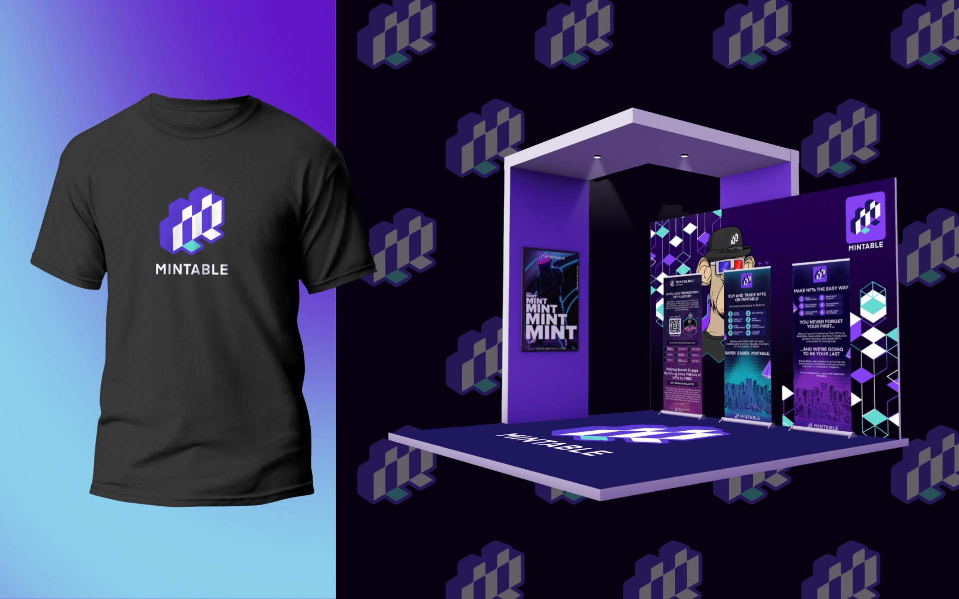
Brand activation & apparel mockup
Like this project
Posted Jul 5, 2022
Mintable is the NFT platform that focuses on the customer experience and be their guiding light in their discovery of the vast NFT world.

