Kernel Design System for IMDb
Smridhi Gupta
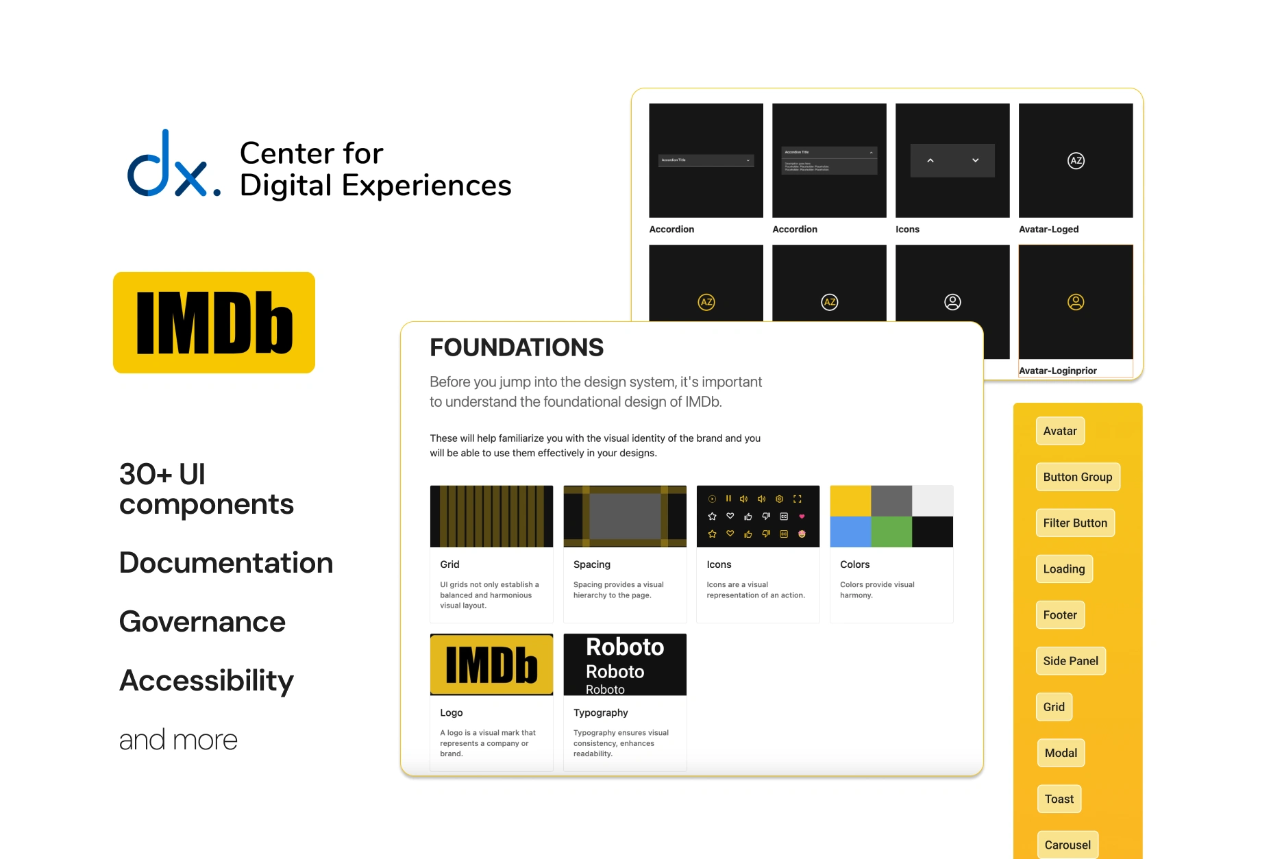
Creating a Design System for an info database website: IMDb
This project focuses on systems thinking. The result is a full design system which contains- brand and content guidelines, design principles, UI components, accessibility rules, governance information and system management.
This project aimed to create a robust design system that fosters collaboration, ensures consistency, and improves overall user experience. This design system is for designers. However, it was made to be a collaborative resource for both designers and developers.
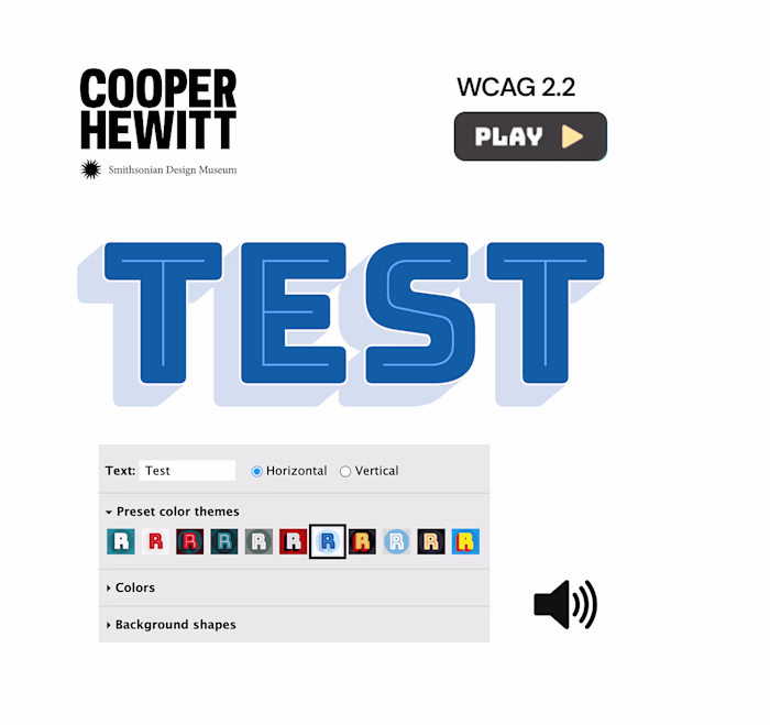
A quick look at the Kernel Design System
First, what is a design system?
A style guide on Figma right?
Well, not really.
Through study materials and instruction of our professor,
I learned that:
a design system is all encompassing
What do I mean by that? Here’s a better definition:
“ A design system is a collection of documented elements that embody the design principles and rules of an organization.” (Vesselov & Davis, 2019)
Another definition we followed throughout:
“ Design systems are a culture change designed as a UI kit” Lauren LoPrete
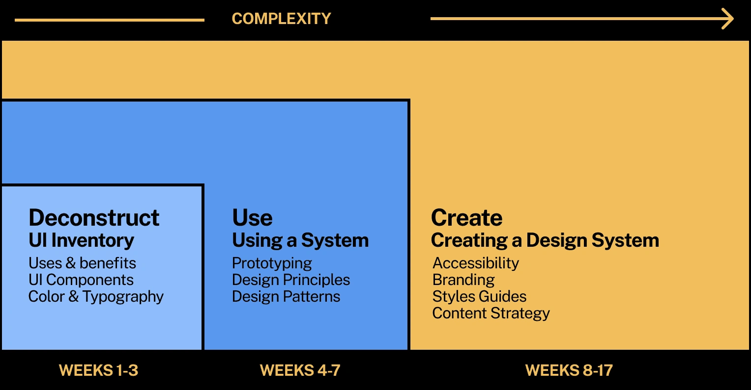
Project Timeline
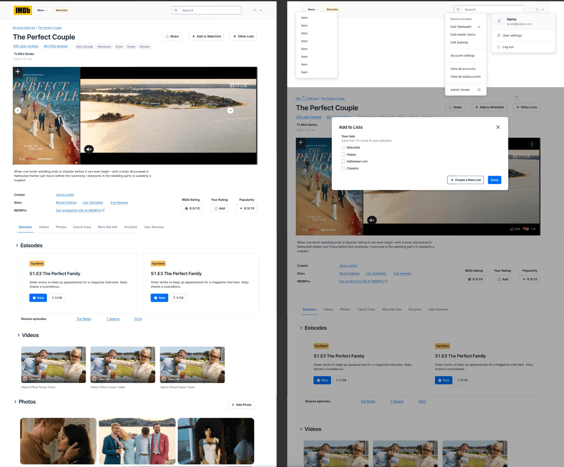
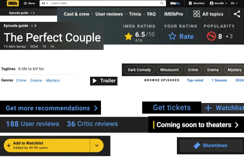
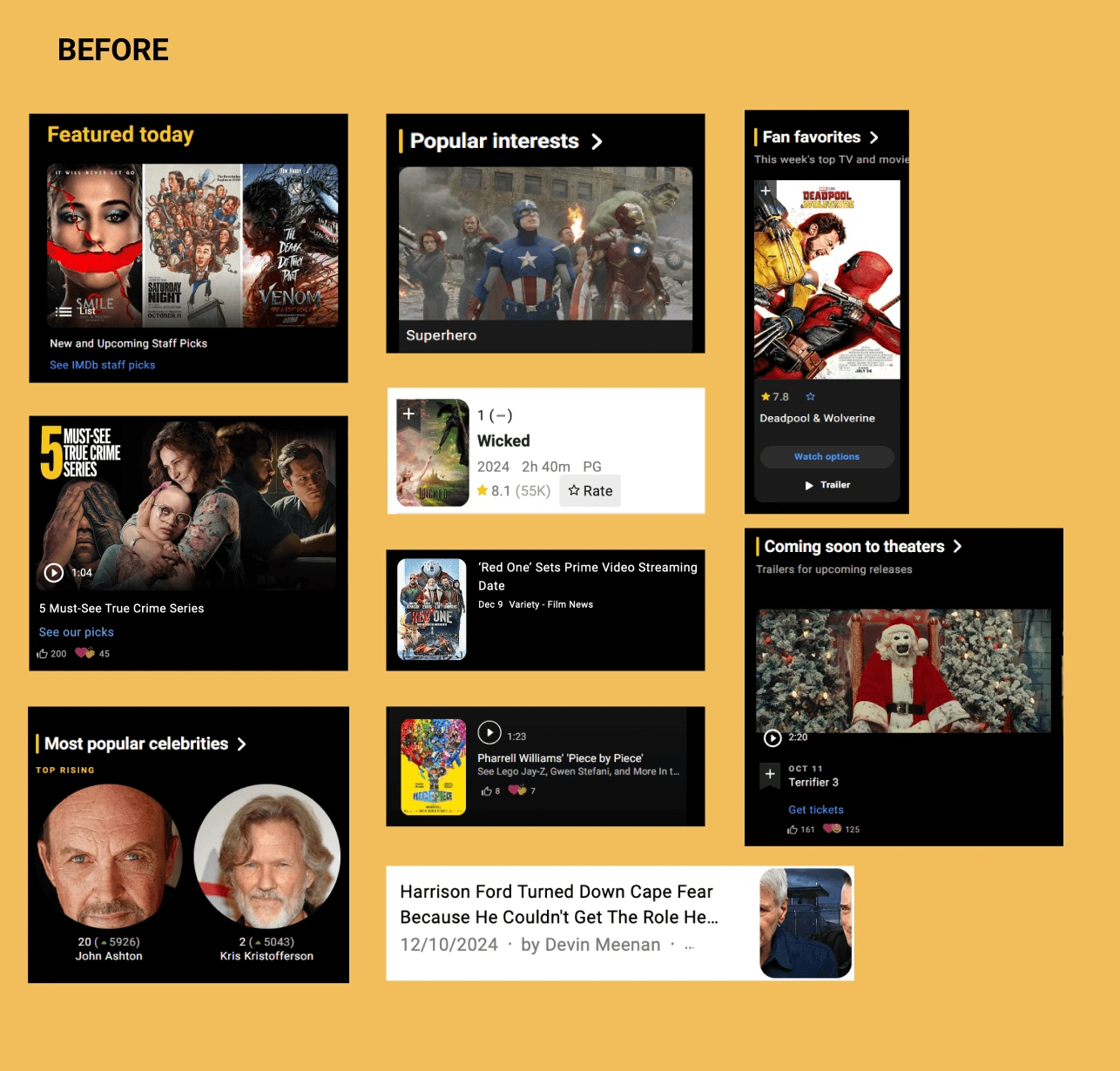
Did you know there are over 15 different types of buttons on just the homepage of the IMDb website?
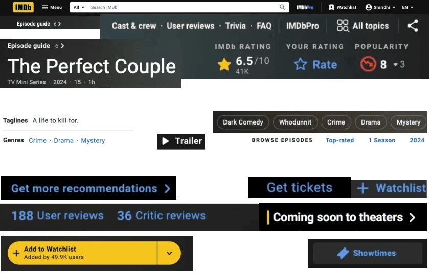
A plethora of different buttons on the IMDb webpage
Other areas that need improvement:
A range of different elements
Navigation: Menus, breadcrumbs, and other navigation aids
Text: Different fonts, sizes, and weights used for headers, body text, and captions
Media: Types (images, videos) and sizes used across the website
Icons: Distinct icons
Buttons: Styles and colors
Links: Text links and their respective destinations
Filters: Different filtering options available to refine content
Components: Reusable elements such as carousels
Supplementary Information: Additional content, such as disclaimers, footers, and copyright information
To understand these, I conducted a UI audit of the IMDb website and created a comprehensive UI inventory.
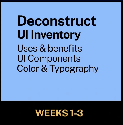
Step 1:
Elements 101 - the UI inventory
To gain a better understanding of both the current visual elements of the website and also the information presented, I created a full inventory of the UI. The inventory highlighted the problems that I wanted to address on the new Design system.
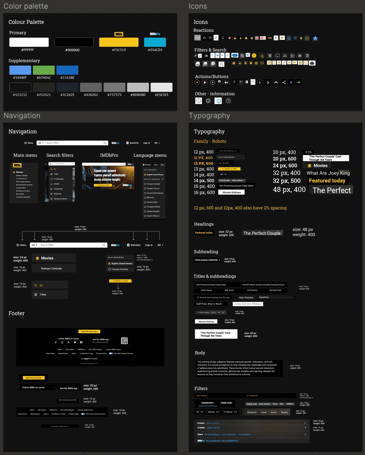
A snippet of the UI Inventory
What stood out:
An abundance of buttons
An abundance of text styles making it difficult to understand the hierarchy of information
Many variations of carousels with diverse designs
At this stage, we have an inventory, and three issues we want to address (buttons, typographic styles and carousels) with a new design system.
To further understand how design systems work, I redesigned the IMDb interface using a different design system - Paste, by Twilio. This gave me a nuanced understanding of the user - i.e. who will be using this design system. It also introduced well sorted and usable components as an essential part of using a design system. While this process was harder at first, it became much clearer later on in the process.
Why did I pick Paste?
I was looking for:
The components I needed for the IMDb website including navigation menus, buttons, typography and visuals/image boxes.
Flexibility for ease of grouping components together.
A comprehensive design system that encompasses all aspects of a website’s UI.
Explanations, reasonings and examples of components.
IMDb.com redesigned using Paste Design System
1. Using Paste, most of the content on the IMDb interface became more digestible.
2. A consistent layout helps users understand content better.
3. It was difficult to compress all the buttons on the IMDb webpage into the new design system. However, the result highlighted a hierarchy of information.
Using a new design system was not an easy task to take on, it was confusing what component to use where - especially all the buttons, badges, labels and icons. However, the documentation proved to be an important resource that helped guide me through the process. The dos and don'ts as well as the purpose of each component made it much easier to place each component. It instilled in me why documentation is an integral part of any design system.
Phew okay so I have:
- an inventory
- redesigned webpages
- I understand how to design for users
Let's create our own design system.
In order to create a design system, we followed the atoms to organisms approach made popular by Jack Frost.
We started with our building blocks - design tokens - atoms such as typography, colors, spacing, margins, padding.
Then, we used these tokens to build our molecules such as buttons, basic typography, avatars and badges.
Next, we added our organisms such as in-page navigation, cards, modals, tooltips and so on. Finally, we added some templates such as topbar navigation, footer and carousels.
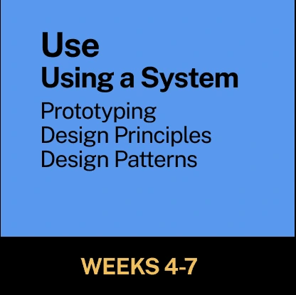
Part 1: The design
Part 2:
Putting the Design System together:
Socialization support
Design Principles
Accessibility Rules
Governance Information
UI Components - structure, documentation and design assets
The design system prioritizes an easy-to-navigate structure that promotes learning and exploration, reduces cognitive overload, and ensures a natural and intuitive hierarchy for enhanced clarity and usability.
The design system consistently delivers an engaging and personalized interaction, ensuring that exploring its various components remains an enjoyable and captivating journey for designers.
The design system is engineered to spark curiosity and promote engagement by offering a range of components and tools that not only encourage but also facilitate experimentation and imaginative design solutions.
The design system is built on the principle of providing users with all the necessary information and resources needed to empower them in creating their own unique designs, fostering a seamless and guided design process.
To ensure an optimal user experience and accessibility on IMDb, the following five guidelines are fundamental. These principles are key to enhancing navigation, usability, and inclusivity across the site, ensuring that all users, regardless of their abilities, can fully access and engage with IMDb's content.
1. Consistent Background Colors for Similar Sections or Page Hierarchies.
2. Descriptive Alt Text for Images
3. Sufficient Color Contrast throughout the website
4. Responsive Design for Device Independence
Following these tailored guidelines, the Kernel Design System adheres to the broader principles of WCAG 2.0, known as POUR:
Perceivable: Ensuring all users can perceive information, including those relying on assistive technologies.
Operable: Supporting navigation and interaction through various input methods.
Understandable: Making content and functionality intuitive and user-friendly.
Robust: Ensuring compatibility with diverse technologies and tools.
Now that we're all done.
Introducing..
A demo of the design system and how to peruse it
Typographic System
Clear Hierarchy: Noted in the audit and subsequent inventory of the design system, our key focus was on hierarchy of information. Established clear distinctions between headings, subheadings, and body text with a consistent use of font sizes, weights, and line heights.
Scalable Typography: Implemented a more flexible and responsive typography system that adapts seamlessly across different screen sizes and devices.
Spacing guidelines: to provide additional assistance in using typography.
Standardized Text for Buttons: Established uniform button text styles and sizes to ensure clarity and consistency in call-to-action elements.
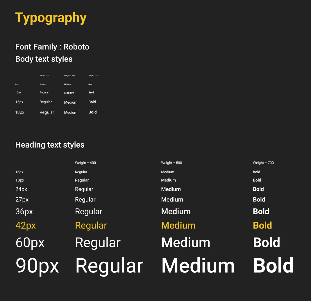
Typographic system
Button, anchor and avatar sorting
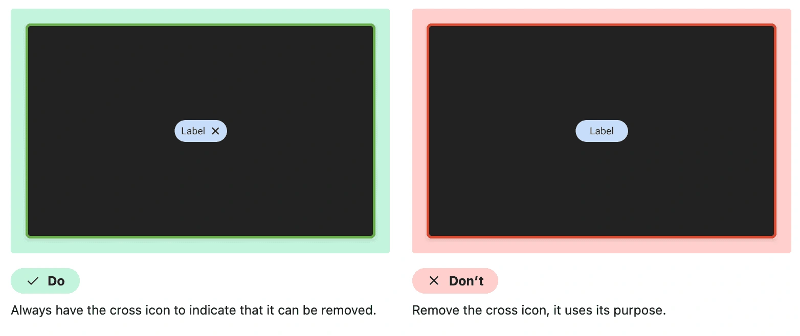
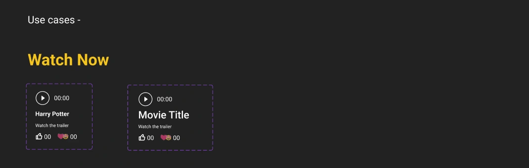
Consistent button design: Icon + button set as the standard, removing confusing iterations of different buttons.
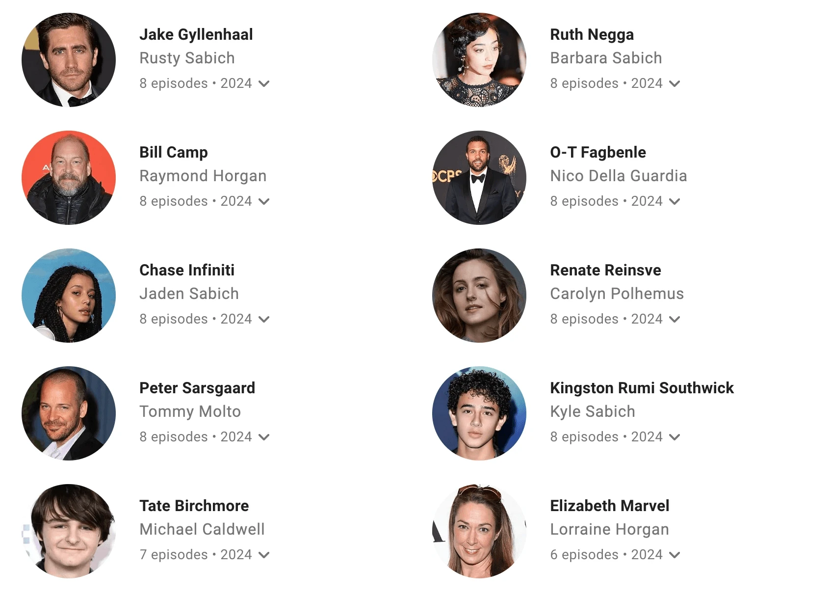
Making the information concise using avatars: Sections such as cast that contain images of people can be incredibly long on IMDb. We sought to make these concise, making the pages more navigable overall.
Anchors for information that opens in a new window: IMDb's variety of buttons don't make it entirely easy for users to get familiar with them. We sough to use Anchors to specify links that open in new tabs. This ensures consistency and familiarity that allows users to intuitively navigate the website. These can also be used within button styles.
Simplifying card components
With over 10 types of different card types, we standardized cards: These cards can account for all the information that is present in the current different card types, while remaining visually similar to provide more continuity to the website.
Navigation - maintaining consistency & hierarchy
Adding consistent menus across the website: With multiple drop down menus, IMDb has a new style attached to each menu, leading to inconsistent visual design.
Re-arranging key information into in-page navigation: As an information database website, IMDb holds a lot of information and comes across as overwhelming.
It can be difficult to find the relevant information because of
a. the sheer length of pages which leads to scrolling fatigueb. inconsistent hierarchy of information which leads to a higher number of users dropping off.
This is why the in-page navigation is essential. Leading users to know from the get-go:
what information is available to them
how to access that information
Would we do anything differently if we had more time?
In short, yes.
1. Most importantly, we would like to collaborate with developers to make sure the design system caters to both developers as well as designers.
2. Create additional components - especially for media and advertisements, which occupy considerable space.
3. Research and test the existing Information Architecture to ensure better documentation of the components and further define the hierarchy of information on the interface.
The design system project provided an invaluable experience, emphasizing the importance of systems thinking in both team collaboration and creating solutions for diverse user groups, namely designers and developers. Throughout the project, several key learnings emerged that contributed to the overall success and effectiveness of the design system.
Firstly, conducting the UI inventory revealed the significance of consistency in design. Ensuring uniformity across various components and patterns significantly improves user experience and enhances brand recognition. This process highlighted the necessity of adhering to a cohesive visual language throughout the design system.
Secondly, as the project progressed to creating a system, the importance of clear and concise documentation became evident. Proper documentation not only facilitates the adoption and implementation of the design system but also serves as a valuable resource for stakeholders, enabling them to understand the design principles, components, and best practices effectively.
In addition to these key learnings, the project led to a notable outcome - achieving proficiency in Figma, a leading interface design tool. This newfound expertise proved essential in designing and managing the design system components, streamlining the workflow, and collaborating effectively with the team.
Reflecting on the project, it is clear that the experience has significantly contributed to personal growth as a designer and cultivated a keen interest in design systems. This understanding of the holistic approach to design will continue to shape future projects and foster a more user-centric and collaborative mindset in the design process.
Like this project
Posted Sep 11, 2025
Developed a design system for IMDb to enhance UI consistency and user experience.
Likes
1
Views
4
Timeline
Aug 11, 2024 - Dec 20, 2024
Clients
Center for Digital Experiences