Case Study: Improving Konga’s Search and checkout experience

Don Precious

Online shopping has become a big deal in Nigeria, and the percentage of people who shop online as opposed to going to physical stores continues to grow exponentially as the years go by. At first, it was just clothes and gadgets. But we have seen a rise in niche online stores catering to groceries.
As the rise and growth become prevalent, some of the issues users face while using some of these stores become more and more visible, and in the words of Don Norman in his book “The Design of Everyday Things.”
“It’s not enough that we build products that function, that are understandable, and usable; we also need to build products that bring joy and excitement, pleasure and fun, and yes, beautify people’s lives.”
I decided to do a UX analysis of one of the e-commerce stores that caters chiefly to the Nigerian audience, intending to improve the search and checkout experience.
Background
Konga is one of the leading e-commerce companies in the e-commerce ecosystem in Nigeria. They cater to both B2B and B2C customers, hence catering to both businesses and individuals. It is one of the biggest online marketplaces, catering to B2B and B2C customers. They retail products from various categories, including gadgets, groceries, beauty and fashion, home equipment, and more.
Role
I was the UX designer responsible for user research, wireframing, and design. From conducting online user interviews and surveys to uncovering the problem areas preventing users from searching and finding their desired products or trying to check out products they already added to their cart and proposing possible solutions to the highlighted issues. This is a solo project.
Goals
- To enhance user efficiency by streamlining the search-to-checkout process to help them find and purchase products quickly and easily.
- To improve the search functionality to deliver accurate and relevant results.
- To streamline the checkout process to minimize user frustration and increase completion rates.
- To provide a consistent and intuitive navigation experience throughout the search and checkout processes.
- To establish trust and transparency throughout the search-to-checkout journey.
Basic Guidelines for the Project
- Design for a specific circumstance: Imagine a person that wants to purchase a cloth/gadget but doesn’t have any idea of what is the best thing for them
2. Get help when needed: A better search experience could increase user retention and conversion rates while reducing drop-off rates.
Process

Design Process.
User Research
User Interviews
To achieve the goal and objective of this project, I conducted an online survey using Typeform, first for users who use e-commerce stores to shop. I carried out another study where I streamlined my research to just users who shop using Konga (mobile app, web app, or both). The goal was to understand some of the issues users faced using the app's search functionality, their frustrations, and how and what they would want to be improved. I grouped the results from this research into facts, insights, and opportunities.

Synthesizing results from user interviews carried out
Some key takeaways from the discussions:
- Users mostly find the checkout process (on the mobile app) complex, leading to cart abandonment.
- Slow mobile app load time, especially when users are searching for products.
- Users encounter a lot of irrelevant search results that do not match what they are looking for and, therefore, become inundated by similar products.
- Users want a more precise and detailed definition of products using relevant information like size, features, material, color, and other important information.
Discovery
Personal observation While I think Konga is an excellent product because it’s chiefly Nigerian, every product listed there was sold by Nigerian and for Nigerians. I encountered specific issues while using the mobile app I didn't meet on the web. Here are some:
Load time: The load time for searching for products is prolonged. And in some cases, I have to revert to the web app or not shop entirely in cases where I need more time to open my web.
Mobile Optimization: First thing I said when I opened the mobile app was;
“This mobile app is clearly an afterthought.”
Even if that wasn’t the intention, that was what the app communicated. It felt like actual thought went into the web app, and the mobile app was later designed. Navigating the app was challenging, and the checkout process on the app was very tedious.
Aesthetics: While my focus for this project is simplifying search and checkout, I found the app’s user interface lacking (users consistently pointed this out during my research).
One thing I loved about the product is the timeliness of their delivery. They deliver within the set timeframe and communicate effectively if any delay occurs.
Ideation
To resolve some of the issues identified during the user interview process, I brainstormed ideas using different techniques to arrive at possible solutions.
Using the “How might we” technique, here are some of the critical questions:
- How might we make search users more relevant and personalized to the user’s preferences?
- How might we simplify the checkout process and reduce cart abandonment rates?
- How might we improve the user interface to keep users in the app until they can complete their tasks?
User Flow
I broke down my users using a flow diagram to visualize the user’s journey and highlighted the key touchpoints and decision points within the search-to-checkout experience.

User flow for searching and completing a purchase
Designing the solution
Wireframes
I created wireframes to provide a visual representation of the layout and structure of the app, focusing on the design's functionality, flow, and usability and helping me iterate rapidly before proceeding to more detailed designs.

Digital wireframes
User-testing and Iteration
I tested users on the wireframe to analyze and evaluate critical aspects like ease of use, completion rates, and user satisfaction. Using the results and feedback from the testing, I made iterative design changes to the wireframes and design.
Here are some of the features I improved and incorporated into the design:
Search Functionality.
Leveraging research and user testing results, I implemented practical search features in my design.

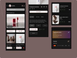
My improved Home page and search screens.
I added a scanner and voice search to improve the home screen's search functionality. The scanner enables users to visually search for whatever product they want by allowing them to scan or upload images to purchase so they can easily find it or similar products.
The voice search is incorporated primarily for accessibility, catering to users with situational or permanent disabilities.
The search screens show auto-suggestions and predictive search functionality that suggests products or categories based on user input. I added images close to the text to give users a preview before they pick a product.
Here is what Konga’s original home and search screens look like.

Konga’s existing home and screen pages.
Search Results

Different search results
Depending on what the user searches for, the results present a robust search experience that returns accurate and relevant search results.
Users see the most relevant products at the top of their search results, using factors like keyword match, popularity, ratings, and“user behavior.”
Advanced search features like “Did you mean?” or “Related Searches” also help users in places where the search query does not provide the desired results or products they are looking for.
The goal is not to return an empty search result to users, as in the third screen.
View Cart

product information and shopping cart.
There’s detailed product information here highlighting key features and benefits.
Checkout
Login/signup process
For users to checkout their products, they are provided with clear, concise checkout steps and options.
Based on the user research results, I designed a login/signup flow that streamlines the login processes at its best and further enhances usability.

Different login/signup screens to checkout
As the first step to simplifying the checkout process and reducing the abandonment rate, I designed a straightforward login and signup process.
Almost 18.75% of abandonment rates on e-commerce sites are due to strict password rules, and from my research, this was a pain point that users continuously emphasized.
To mitigate against this, I designed a solution that offers users the option of using a magic link or guest checkout.
The guest checkout option is available for users who prefer not to create an account or don’t want to go through the registration process.
Order review and confirmation

Complete the checkout screen and confirmation.
During the testing stage, a user pointed out that they didn’t know how many steps were required to complete the process. To solve that problem, I labeled each step and provided a brief description to help them understand what’s expected of users at every stage.
There’s an order review to validate users' addresses and payment inputs in real-time to minimize errors and ensure accurate delivery.
There’s also payment transparency so users can see the amount and why they pay the extra cost.
Users get a clear and immediate confirmation message or page after successful checkout when the order is confirmed.
Conclusion
This project was interesting, and I am happy to have seen it through to the end. I learned a lot of lessons that can inform my future design initiatives.
I delved into understanding user needs through a user-centered approach, conducting user research, testing, and iteratively designing solutions to improve the app’s user experience.
Key wins
- Improved app’s visual design
- Increased efficiency by streamlining the search to checkout processes
- Enhanced user experience
- I utilized a design approach that prioritizes the user's needs and concerns, addressing their pain points.
- Aligned with evolving user expectations and technology advancements.
Next Steps
I carried out this research as a personal project. There’s no perfect product, as humans will evolve and technologies advance. For the next steps, I’ll work on other projects and keep documenting my processes.
Thank you for reading to the end. I’ll love to hear what you think about this case study.
You can find more of my work on my Website, Dribbble, Instagram, and Behance.