Design System for BrainyCare
Harsitha A
Design System for BrainyCare
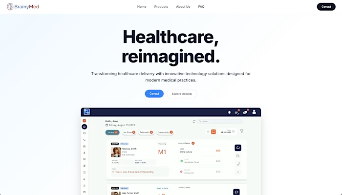
Client: BrainyCare (Mobile Healthcare Management Platform)
Industry: Health Tech / Practice Management
Challenge: Lack of UI consistency across patient and provider mobile applications, slow development cycles, and critical accessibility compliance issues (WCAG AA).
Solution: Creation and implementation of a comprehensive, cross-platform design system.
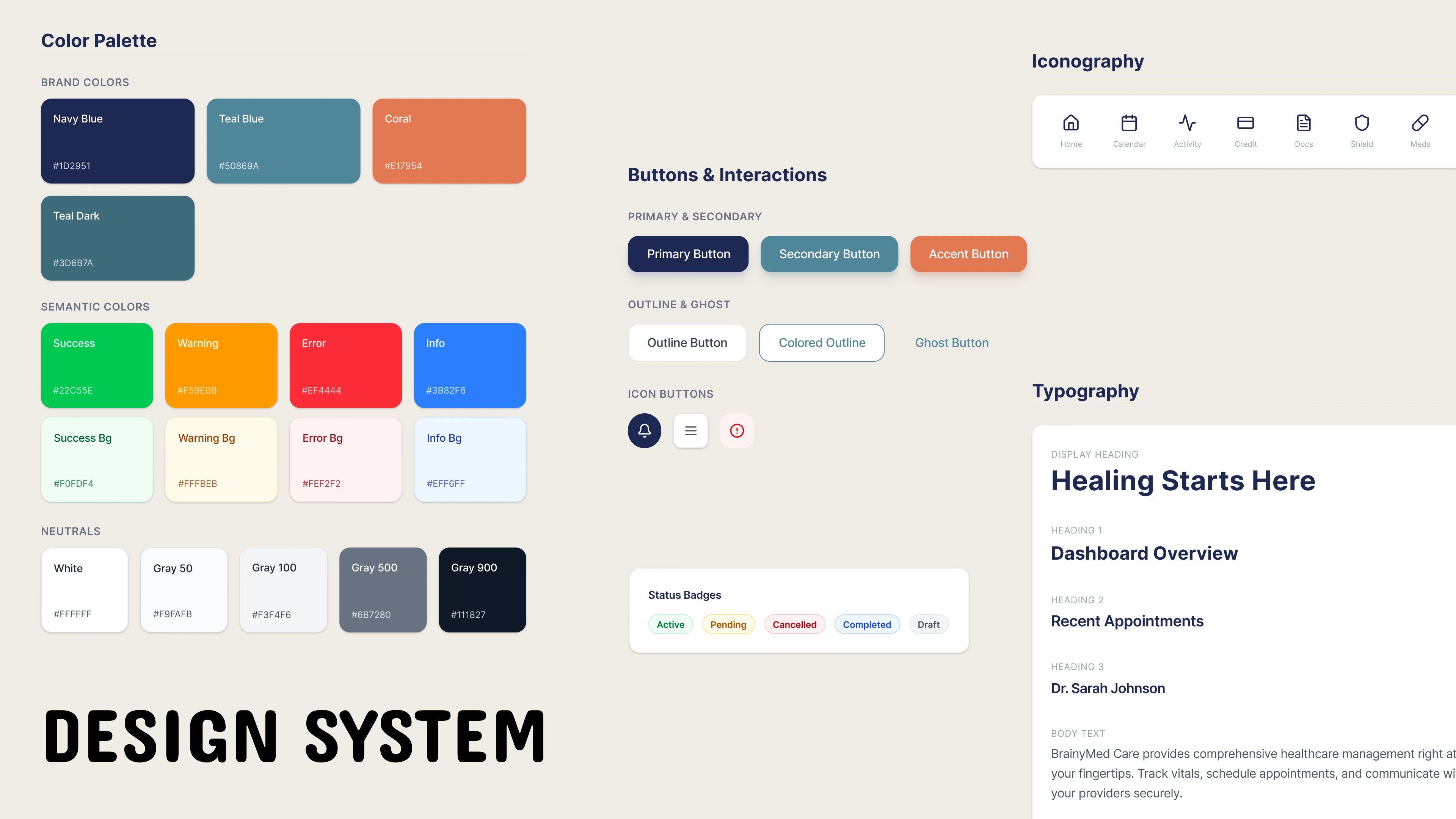
The Building Blocks
Color System: The system utilized a deep, trusting Navy Blue (primary) and a calming Teal Blue (secondary) for branding. Critical focus was placed on the Semantic Colors (Success, Warning, Error) to ensure immediate and unambiguous data interpretation (e.g., distinguishing a "Cancelled" appointment from a "Completed" task).
Typography: A clear, mobile-optimized typography scale was implemented, ensuring the Display Heading and Dashboard Overview headers were legible at a glance, vital for quick decision-making by medical staff.
Spacing & Grid: An 8pt grid system standardized all padding and margins, creating professional, clean data density required for clinical tables and patient records.
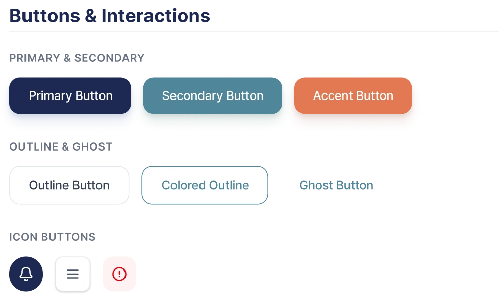
Buttons
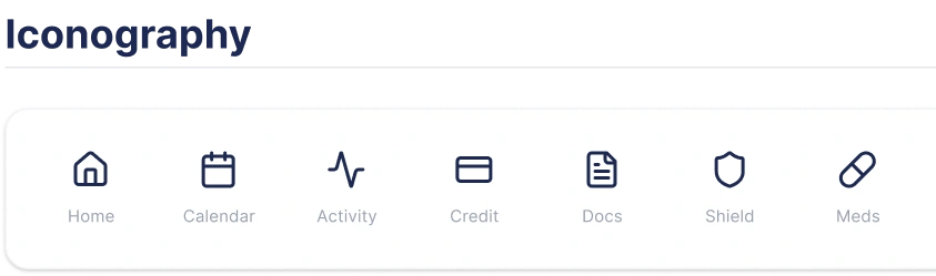
Iconography
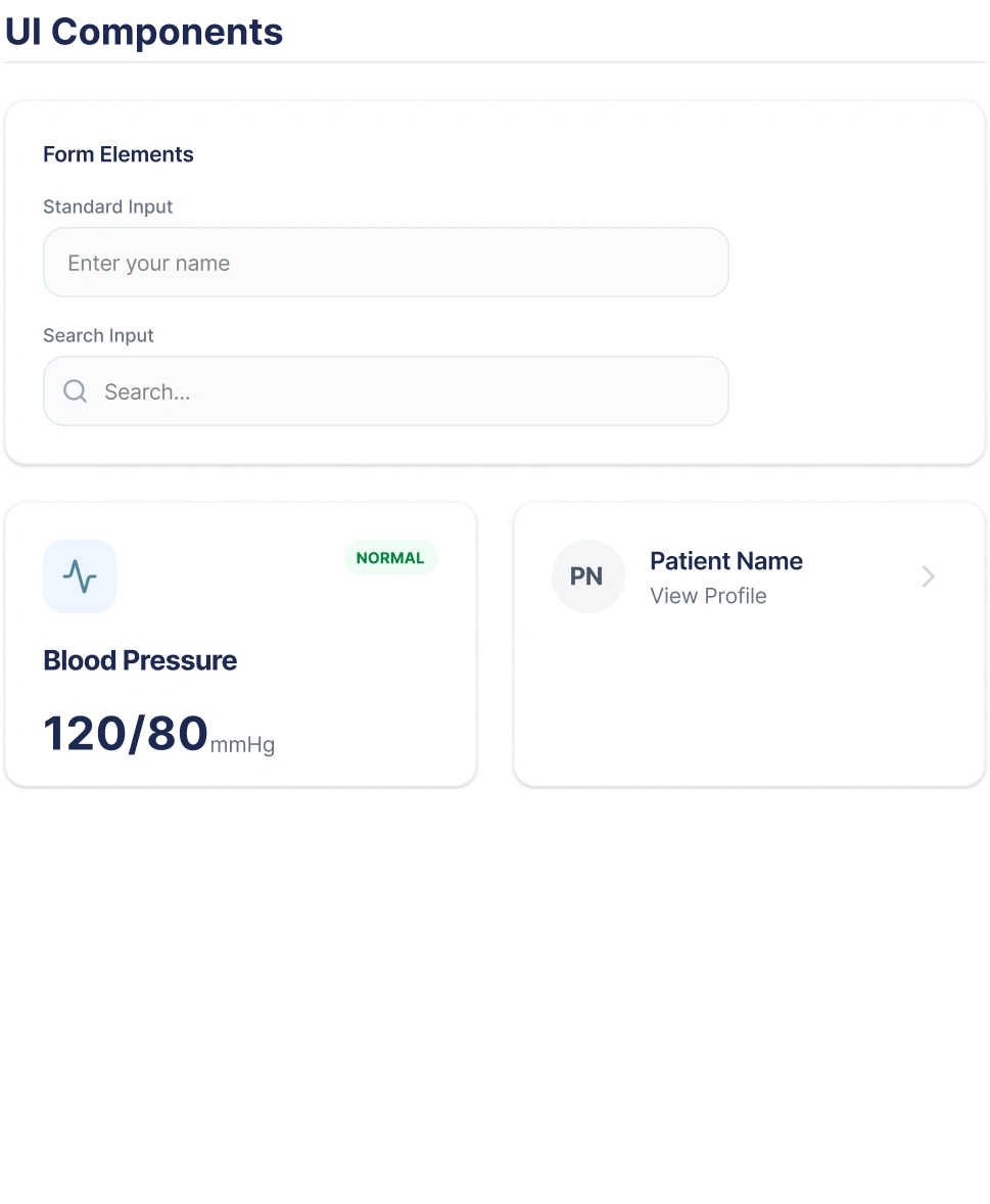
Components
Results and Impact
Design-to-Development Handoff Time: Reduced by 45% due to the adoption of a unified Storybook documentation site and code snippets.
Consistency Score: Product-wide visual consistency achieved 98%, as measured by the reduction of redundant, non-system components.
Accessibility: The mobile app now meets WCAG 2.1 AA standards across all core user flows, lowering organizational risk and expanding usability.
New Hire Onboarding: Time required for new designers and developers to become productive on the BrainyCare application was reduced from three weeks to under one week.
Like this project
Posted Dec 2, 2025
Created BrainyCare's design system development, ensuring WCAG AA compliance and 45% efficiency gain by standardizing UI from audit to launch.
Likes
0
Views
3
Clients
BrainyMed