Built with Spline
KeyJoy Studio Interactive E-commerce Website
Mereawi Musie
KeyJoy Studio
Overview
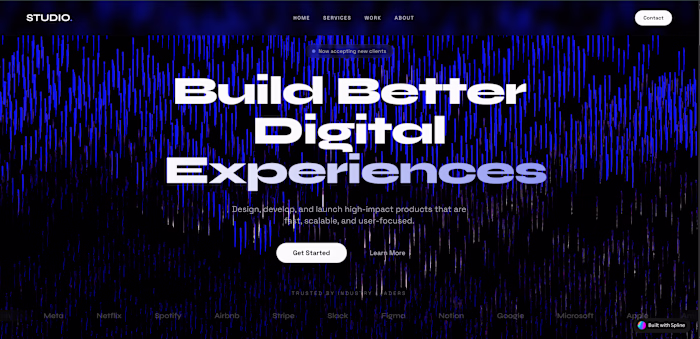
KeyJoy is an interactive e-commerce concept built around mechanical keyboards. The idea was simple: most keyboard shops feel flat and boring, even though the products themselves are very hands-on and satisfying to use. I wanted the website to reflect that same feeling you get when typing on a good keyboard.
The main focus of the site is an interactive 3D keyboard in the hero section. When users move their cursor, the keys respond. It’s not meant to be flashy, just enough to give a sense that the product is alive and responsive. The rest of the site supports that experience without getting in the way.
Goal
The goal was to make browsing keyboards feel natural and enjoyable instead of overwhelming. I wanted users to understand the product through interaction rather than long explanations.
Another important point was balance. The site needed to feel professional enough for serious buyers, but still friendly for people who are new to mechanical keyboards and just exploring.
How I Built It
3D Keyboard
I modeled the keyboard and keycaps in Spline, keeping the shapes clean and simple so everything stays clear and performs well. I paid attention to spacing and proportions so the layout feels organized, even when the keys move.
The 3D scene isn’t treated as a separate visual feature, it’s designed to feel like part of the website, not something pasted on top.
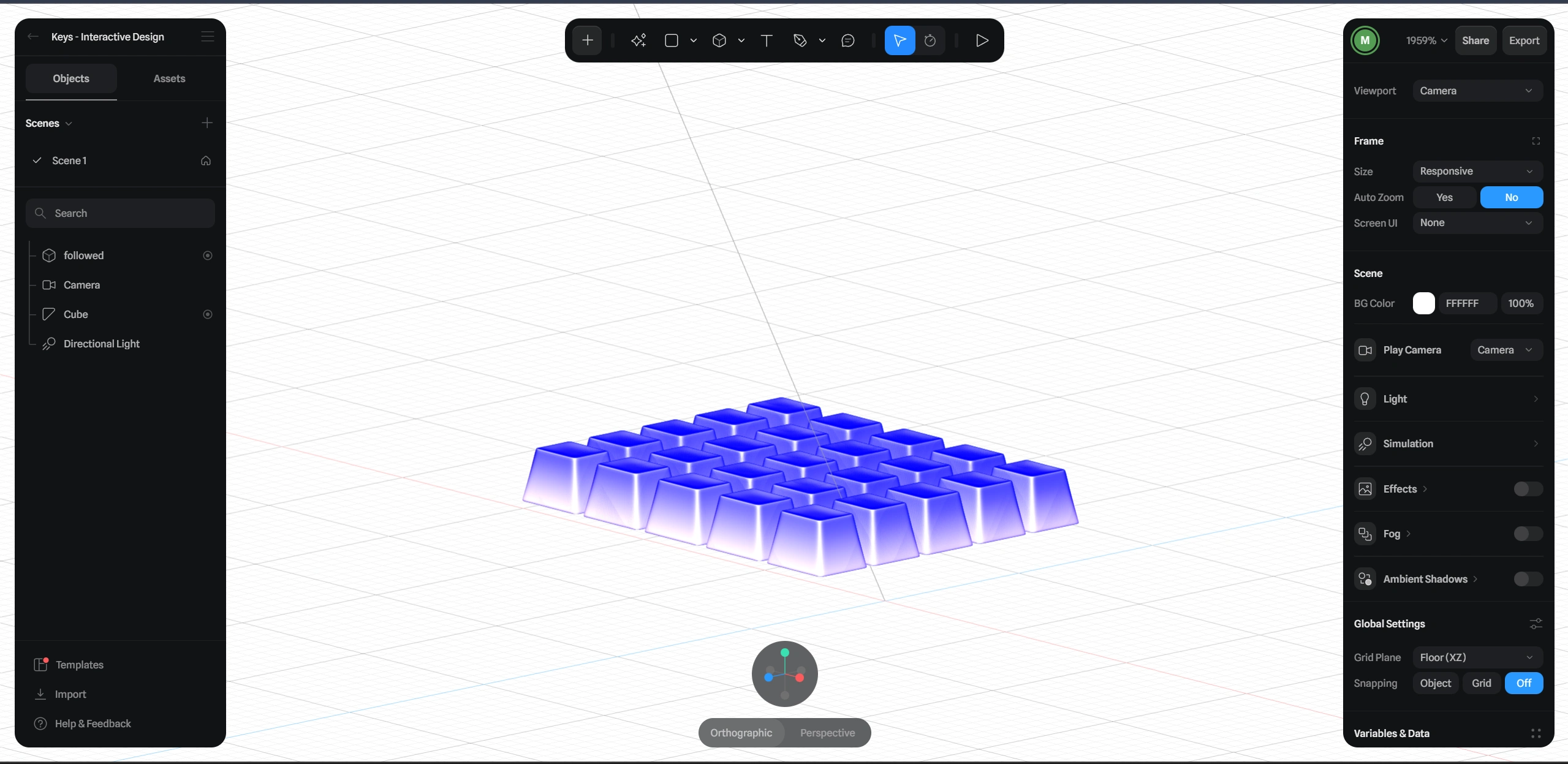
Base State of the Keys
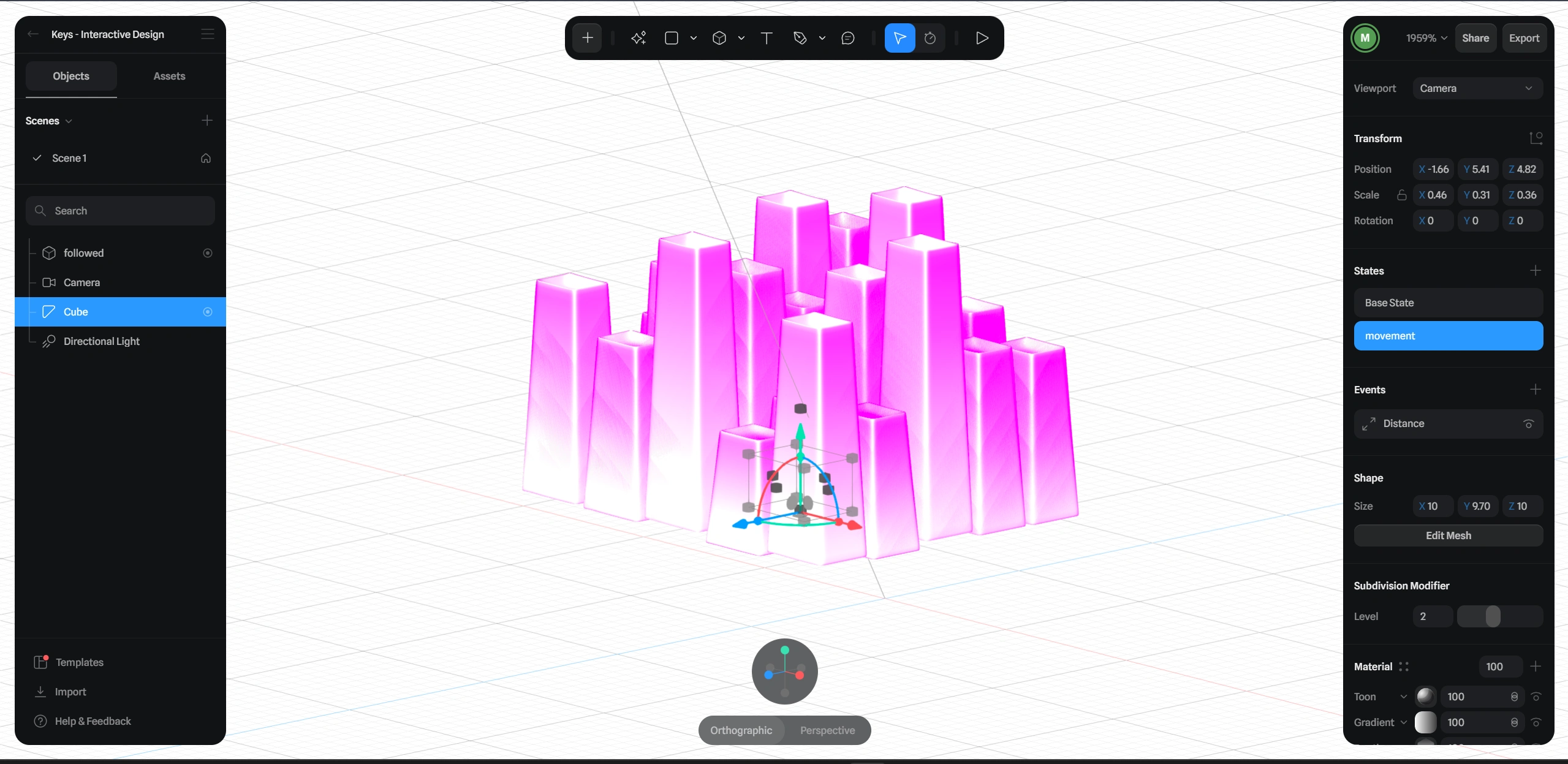
Hover state of the keys
Interactions
Most of the interaction revolves around subtle feedback.
Keys move as the cursor gets closer, giving a sense of depth.
The logo behaves like a key you can press, which helps set the tone right away.
Buttons and cards respond when you hover or click, so the site feels responsive instead of static.
Nothing is exaggerated. The idea was to keep interactions intuitive and familiar.
Motion
For page transitions and section reveals, I used simple animations that help content appear smoothly. Sections fade in and move up slightly as you scroll, and grids appear in small steps so everything is easier to read.
There’s also a bit of gentle movement in some elements to keep the page from feeling frozen, but nothing that distracts from the content.
UI and Layout
The interface uses rounded typography and spacing to keep things approachable. Colors are kept minimal and consistent, with brighter accents only where action is needed, like buttons or important links.
The layout is clean and easy to scan. Users can quickly understand what they’re looking at without having to think too much about where to go next.
Visual Setup
Lighting in the 3D scene was kept soft so the keyboard looks clear and readable without harsh reflections. Materials are mostly matte, which helps the keys feel realistic while still working well in a web environment.
This setup keeps things visually polished without pushing performance too far.
Final Result
The end result is a website that feels interactive without being complicated. Users can explore keyboards in a way that feels closer to using the product, not just looking at pictures.
This project shows how 3D and interaction can be used in a practical way, supporting the product and user experience rather than distracting from it. It’s a good example of blending visual design and frontend development while keeping everything simple and usable.
Tools
Spline for 3D modeling and interaction
React for the site structure
Framer Motion for animations
Tailwind CSS for styling and layout
Live Links
Like this project
Posted Dec 26, 2025
Designed and developed an interactive 3D experience for mechanical keyboards, combining a Spline hero scene with a clean, responsive website built in Lovable.
Likes
0
Views
6
Timeline
Dec 22, 2025 - Dec 22, 2025