Just wrapped a site redesign

Edna Chidinma


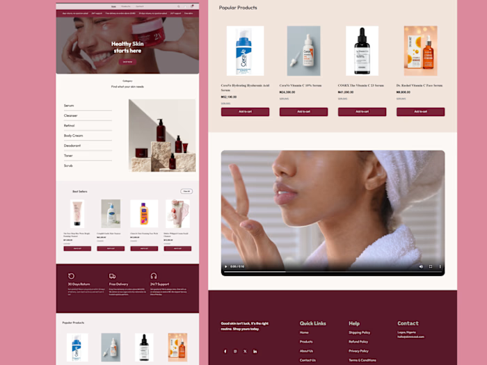
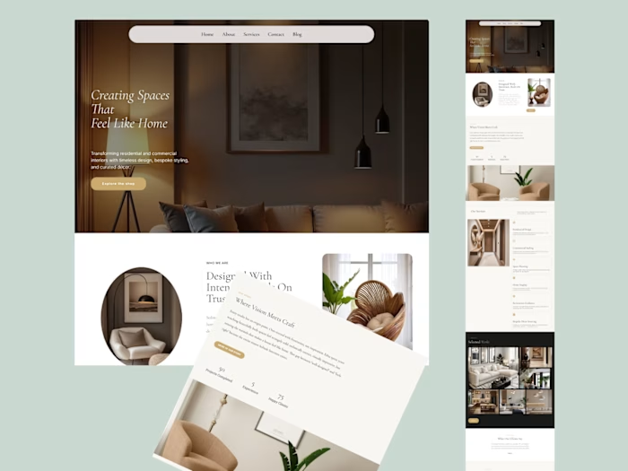
Just wrapped a site redesign for a managed network services & IT procurement company, and I'm pretty happy with how it turned out.
The old challenge: they offer two pretty different services (network monitoring + hardware procurement) and the site wasn't making that clear. So I built the homepage around two clear paths right at the top, book a network assessment, or browse their IT procurement catalog so visitors aren't left guessing.
Mobile was a priority too, a lot of visitors will hit this site from their phone first, so it had to hold up there just as well as desktop.
Like this project
Posted Aug 5, 2026
Just wrapped a site redesign for a managed network services & IT procurement company, and I'm pretty happy with how it turned out. The old challenge: they of...
Likes
0
Views
9
Timeline
Jul 29, 2026 - Aug 3, 2026