QuickGro - Grocery App
Overview
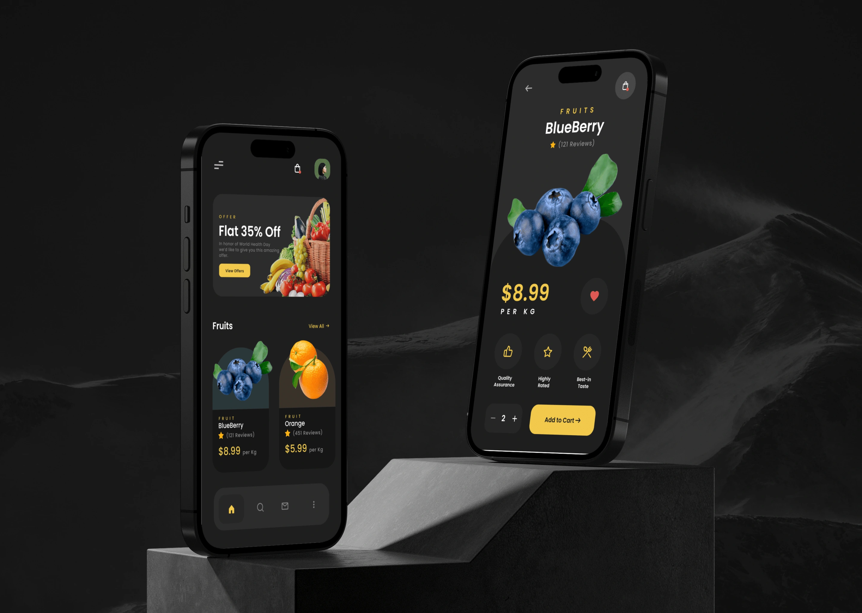
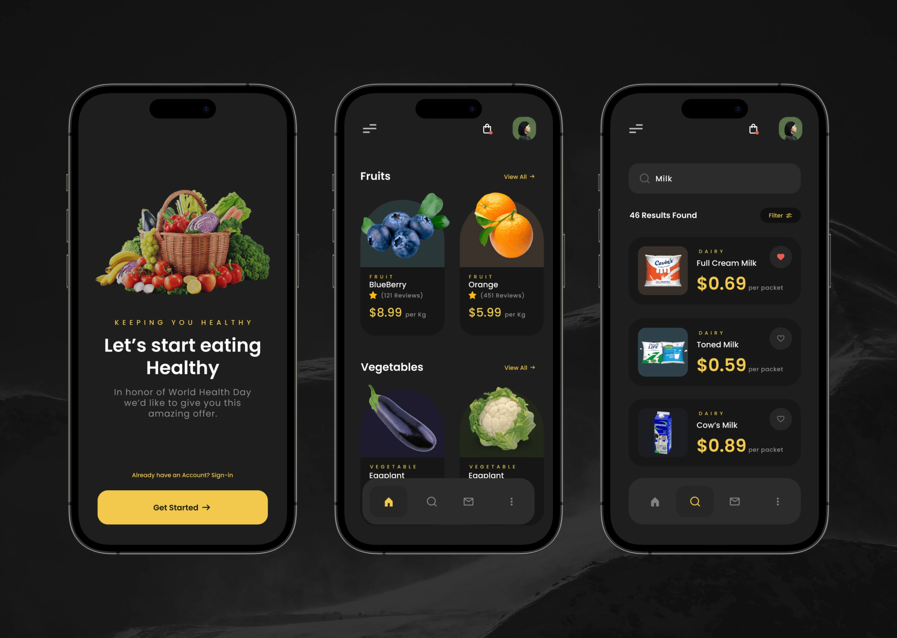
QuickGro is a premium grocery shopping app that caters to a discerning customer base seeking a seamless and luxurious shopping experience. As a UI/UX designer, my goal was to create an aesthetically pleasing and user-centric dark-themed grocery app that aligns with the preferences of the premium market segment. This case study outlines the design process, challenges, and solutions involved in creating QuickGro.
Project Goals
Design an elegant and visually appealing dark-themed UI to cater to the premium customer base.
Create an intuitive user experience that simplifies the grocery shopping process.
Incorporate features and functionalities that elevate the shopping experience for premium users.
Research & Analysis
Target Audience: Conducted market research to understand the preferences and habits of the premium customer segment.
Competitor Analysis: Studied other premium grocery apps to identify design trends and gather insights.
User Journey Mapping: Mapped out the user journey to identify pain points and opportunities for improvement in the shopping process.
Challenges and Solutions
Contrast and Readability: Dark themes can sometimes impact readability. To address this, I carefully selected contrasting colors and ensured legible text throughout the app.
Visual Hierarchy: Maintaining a balance between the luxurious aesthetic and intuitive hierarchy required careful consideration of element sizing and spacing.
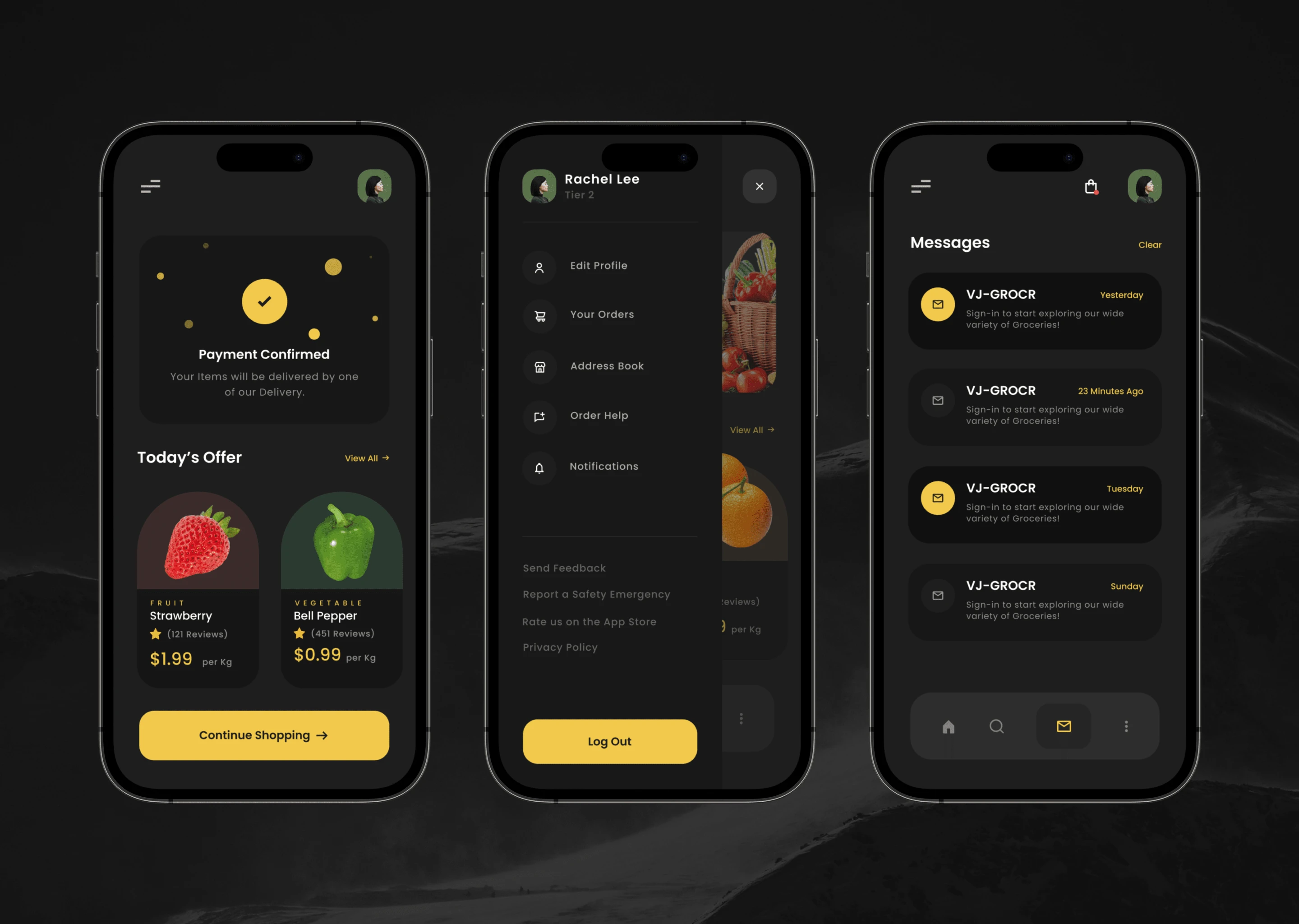
Navigation Complexity: To prevent overwhelming users with options, I implemented a collapsible navigation menu, keeping primary actions easily accessible.
Image Loading: High-resolution images posed a challenge in terms of loading speed. I optimized image sizes and implemented lazy loading to enhance performance.
Outcome
The QuickGro app successfully captures the essence of luxury and sophistication while delivering a seamless shopping experience to its premium users. The dark-themed UI, combined with intuitive navigation and personalized recommendations, creates a sense of exclusivity and convenience. User feedback indicates high satisfaction levels with the app's aesthetics and usability.
Key Takeaways
Balancing aesthetics with usability is crucial in catering to premium audiences.
Careful consideration of color contrast and readability is essential in dark-themed UI designs.
Intuitive navigation and personalized experiences contribute to an enhanced user journey.
Like this project
Posted Jul 4, 2023
Figma Community file - A grocery app designed in dark mode providing a sleek and modern interface for users who prefer a darker color scheme on their devices. …

