UX design for a tech startup: Wander Like Me
Overview 🔎
As lead designer, I collaborated with developers to create user flows and improve UX design and brand recognition of an Ottawa-based startup, Wander Like Me.
Wander Like Me provides instant itineraries chalked with authentic travel tips crafted by locals, making it easy to plan and build your next trip.
Problem & Solution 🤝
The client needed to effectively communicate their product offerings, helping users understand how to navigate the website.
Website Requirements:
• Comprehendible: Users must understand the products and services of the company.
• Usable: Users must be able to save their information and access their purchases easily and efficiently.
• Reliable: The website must present the most accurate, up to date information that users can access around the world.
Process 🛣
User Stories
When traveling outside of my city, I want to receive advice from locals, so that I can avoid tourist traps.
When traveling outside of my city, I want to have someone tell me where and how to explore and new place, so that I can save time and not go searching on Google.
When traveling outside of my city, I want to learn from a local, so that I can save time and have a unique experience, exploring as a local would.
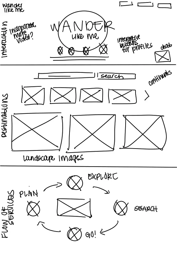
Home Page Lo-Fi Wireframes
For the lo-fi designs, I researched and pulled inspiration from airline and hotel websites. The user would understand this familiar travel website format and could understand the process of providing their final destination (country) quickly.

The CEO wanted many interactive features to create a unique and enjoyable experience.
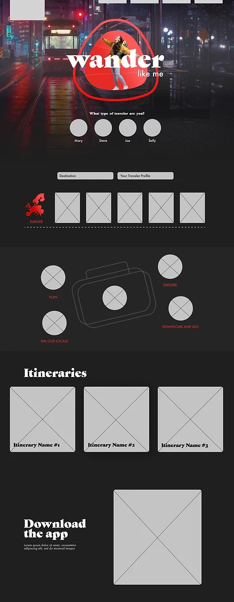
While the interactive features and images were appealing to the eye, it took away from the website requirement of being easily comprehendible. Users needed to understand the product and how to use the website. I removed many of the interactive features and visuals to not distract the user.

Home Page Hi-Fi Wireframes

Results 🎁
The submitted wireframe to developers, before user testing.

Takeaways 📣
After submitting the final wireframe to developers, I conducted user testing on the test site. I discovered users weren't interacting with the destination bar in it's proposed location. After initial testing, Crazy Egg data revealed where users were lingering the longest, and I placed the search bar and CTA buttons in these locations.
While the CEO requested many interactive features throughout the process and wanted the website to be extremely engaging, this did not accomplish the key website requirements. These proposed elements created distractions and didn't allow the user to quickly process the website's information.
Throughout this project, I was able to further understand the effectiveness of simplicity in UX Design and improve my user testing skills.
Like this project
Posted Dec 30, 2022
As lead designer, I collaborated with developers to create user flows and improve UX design and brand recognition of an Ottawa-based startup, Wander Like Me.
Likes
0
Views
23

