ARO Construction - Brand Identity
Hatypo Studio


Posted Jun 1, 2026
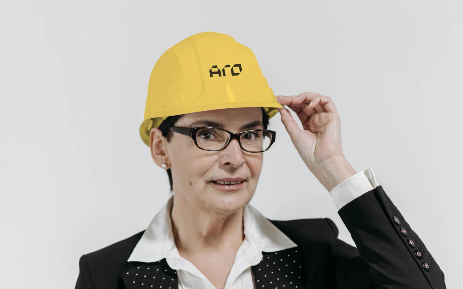
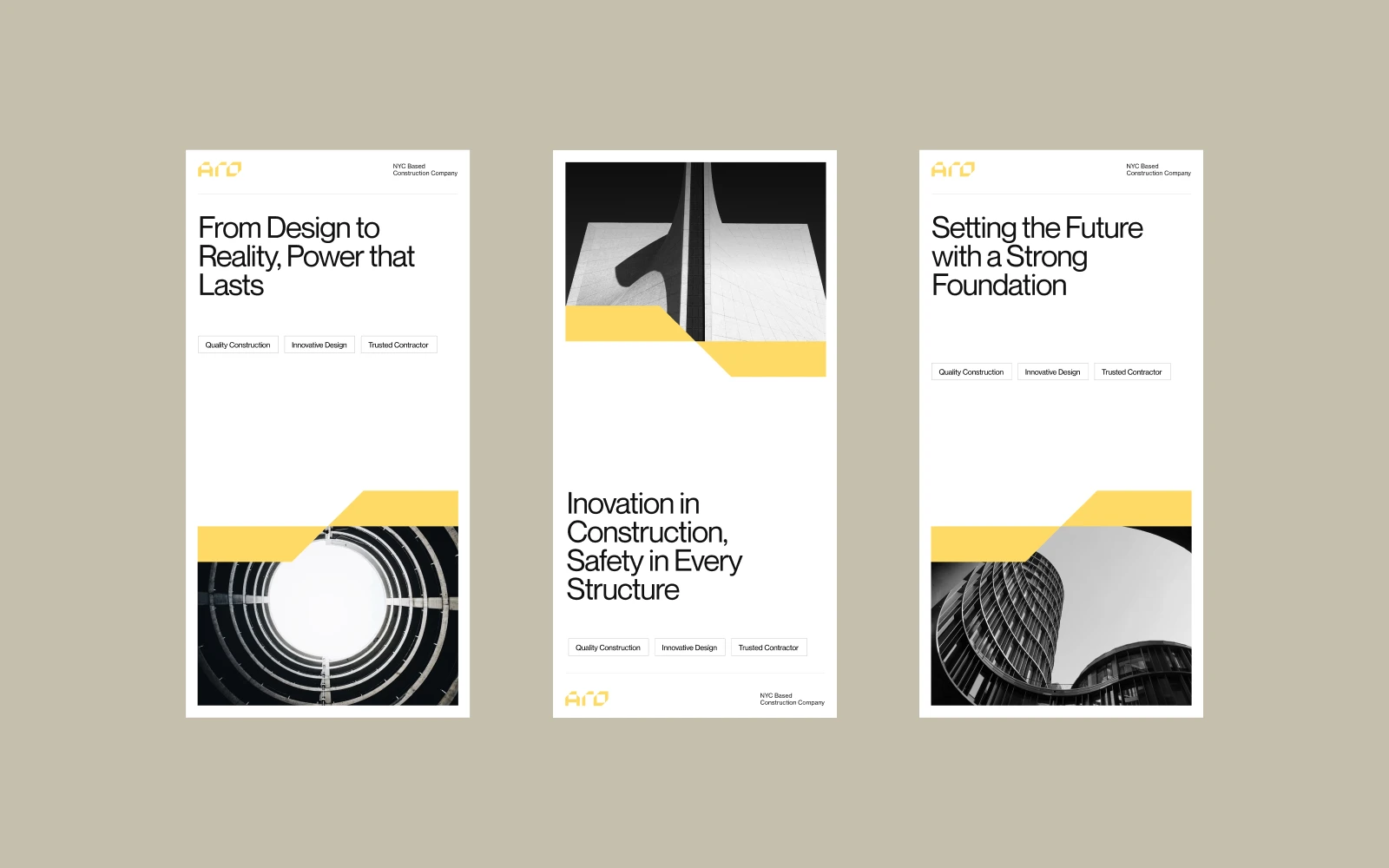
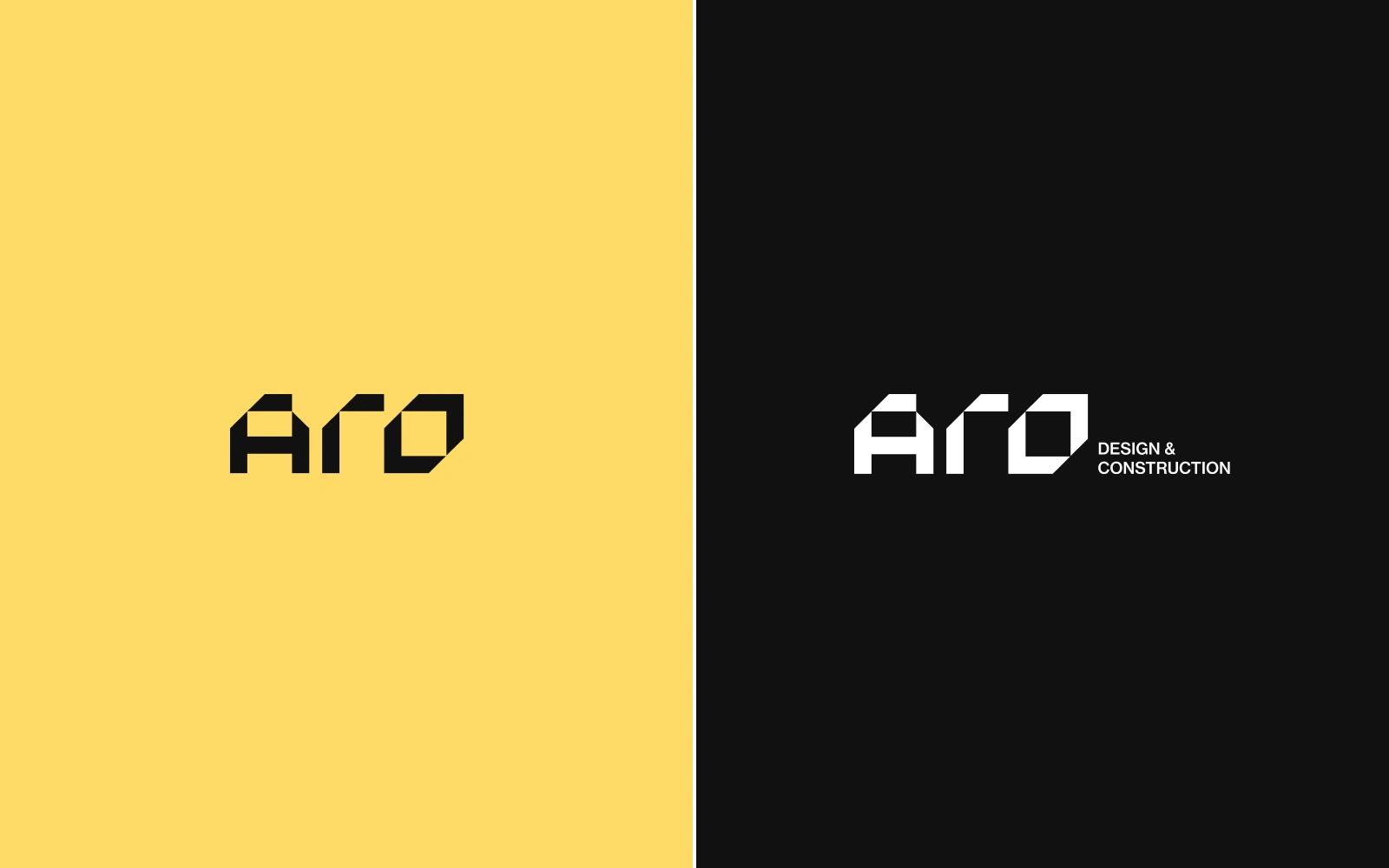
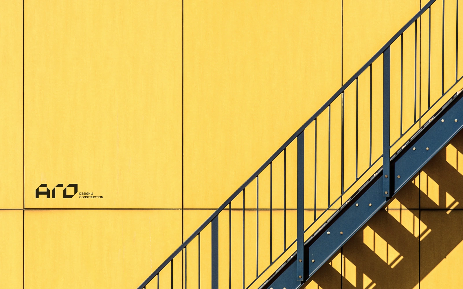
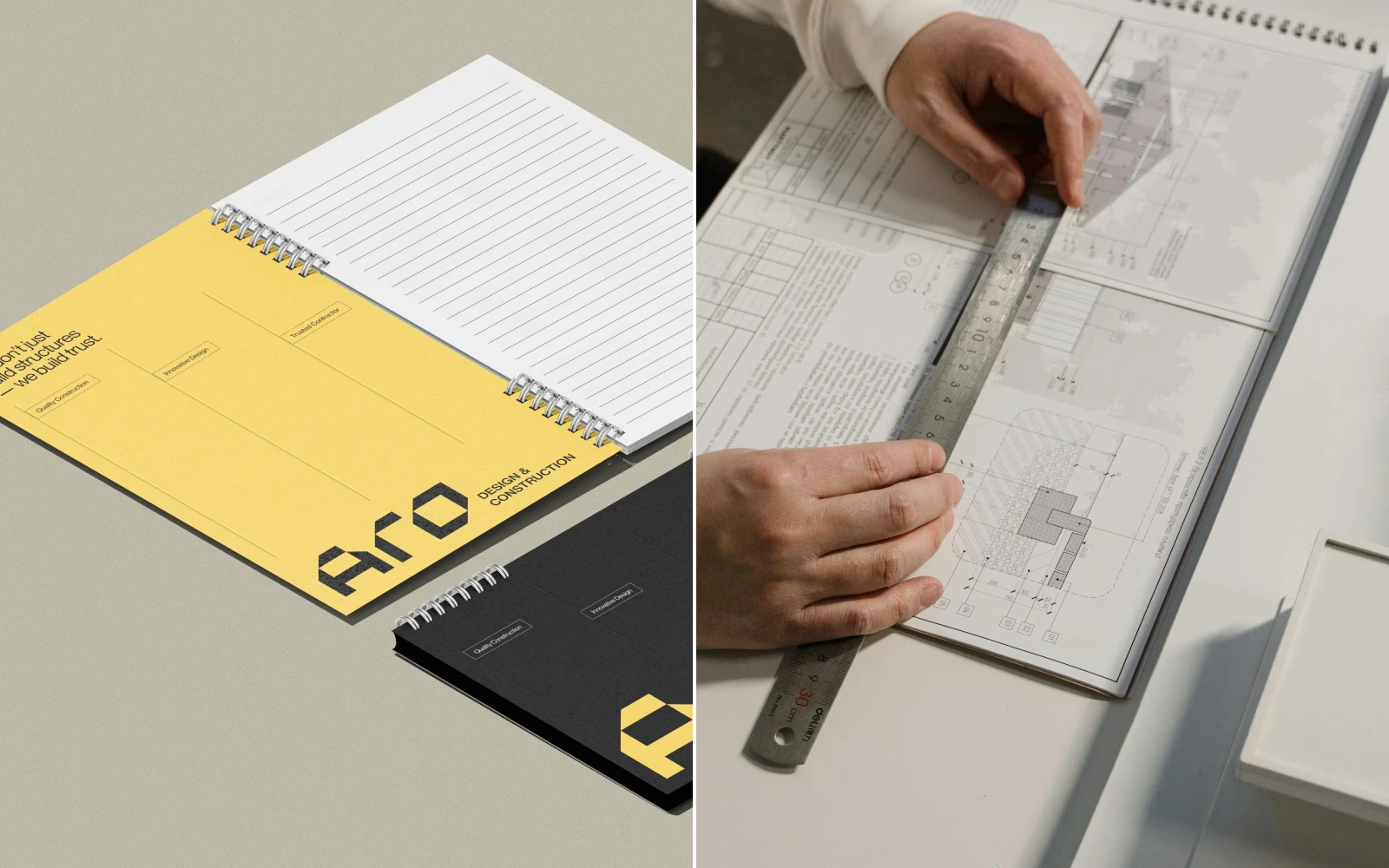
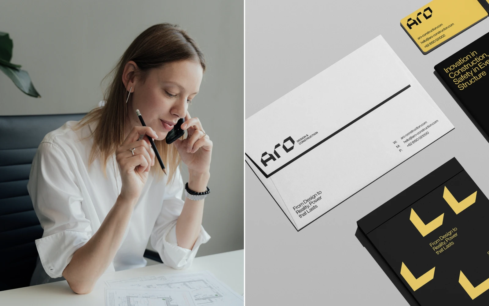
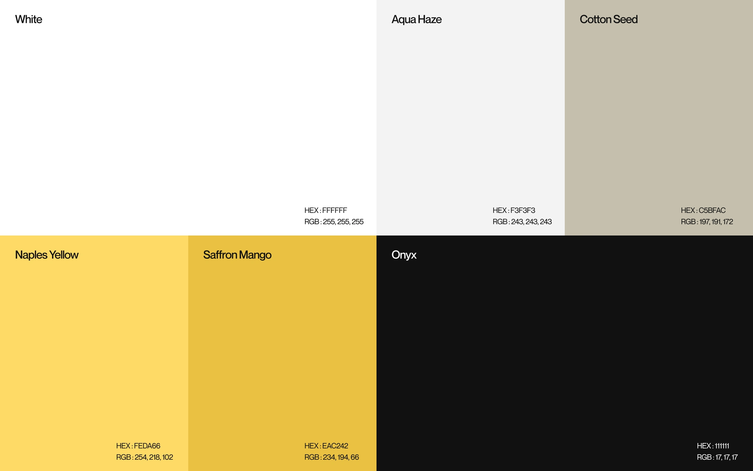
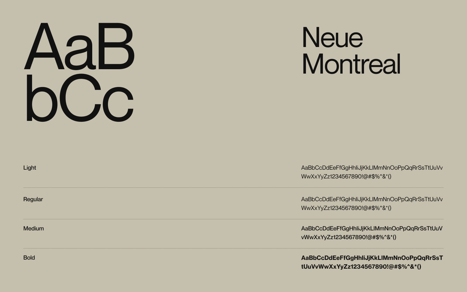
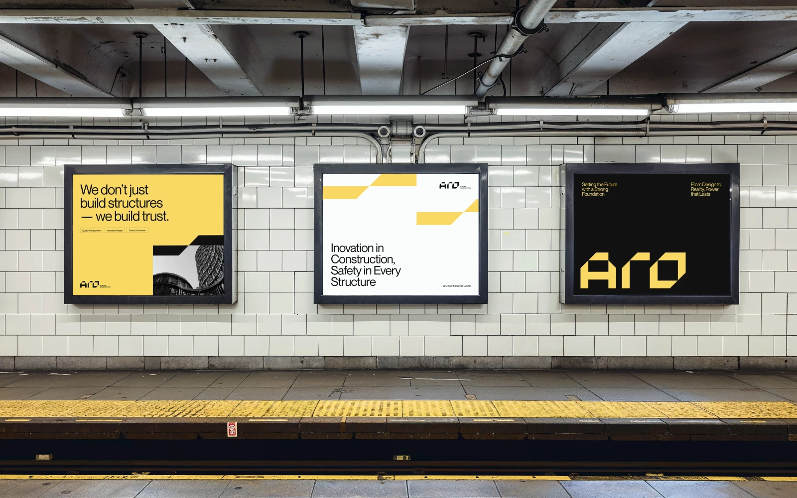
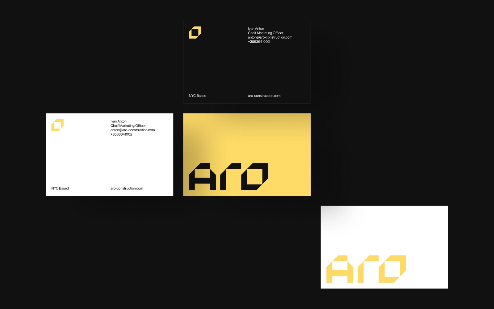
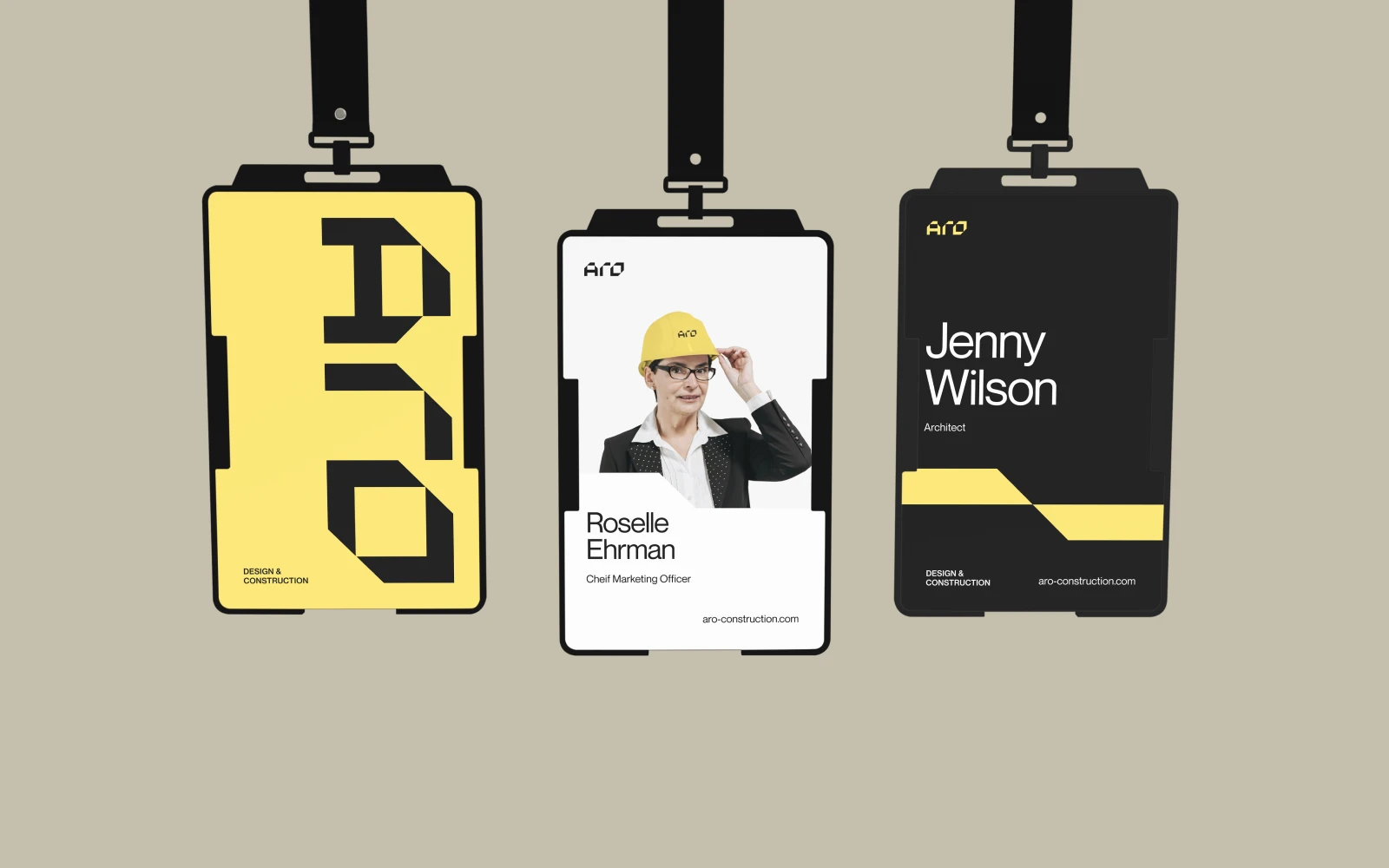
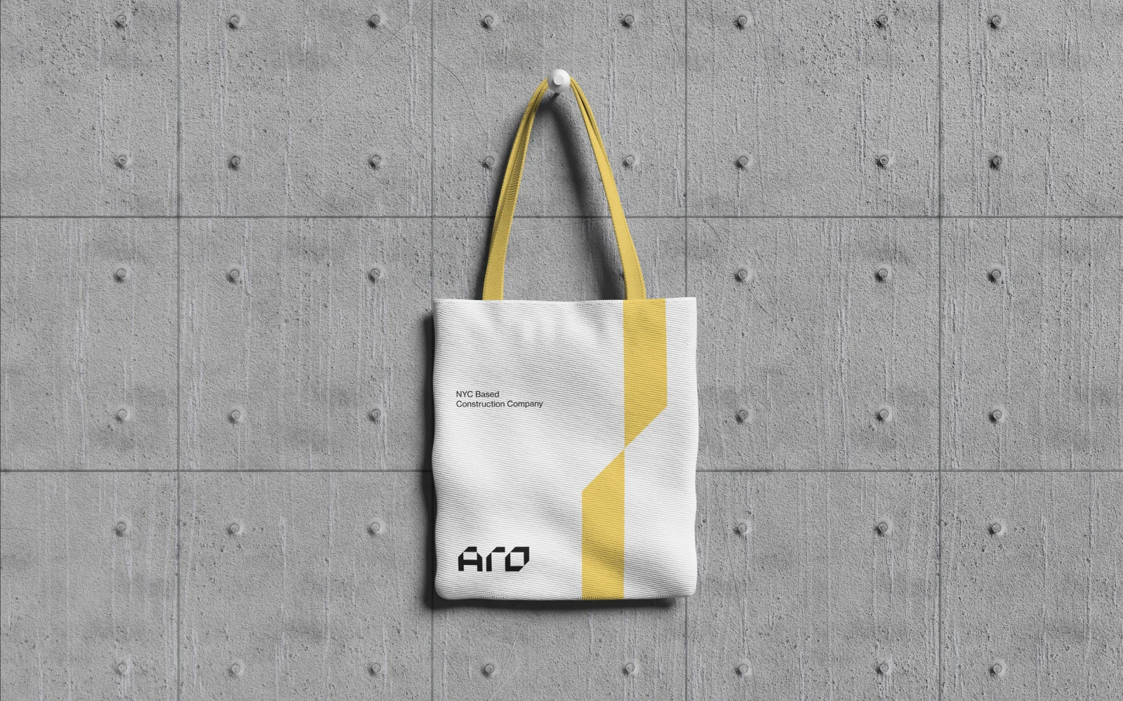
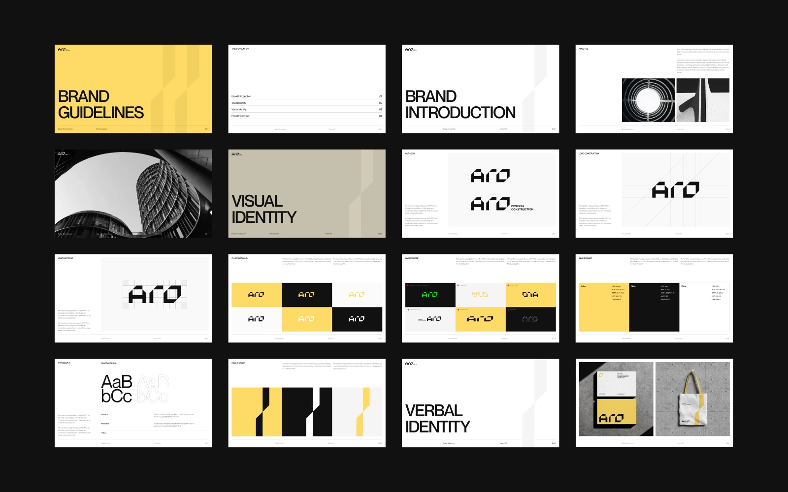
ARO — Design & Construction Brand Identity Bold Structure. Intelligent Design. Lasting Impact. ARO is a forward-thinking design and construction company that merges architectural vision with engineering precision. The goal for this branding project was to craft a strong visual identity that reflects the company’s core values: clarity, confidence, and innovation in the built environment. The logomark was developed with geometric discipline, drawing inspiration from architectural forms—angular, solid, and engineered with purpose. The sharp yellow accent conveys energy and action, while the monochromatic imagery emphasizes form, materiality, and structure. Every brand touchpoint, from stationery to digital assets, follows a clean grid system to reflect the company’s commitment to order and precision. This identity system positions ARO as more than a contractor—it presents the brand as a partner in progress. From proposal decks to construction sites, the design ensures consistency, trus