Better Half — From Logo to Visual Identity

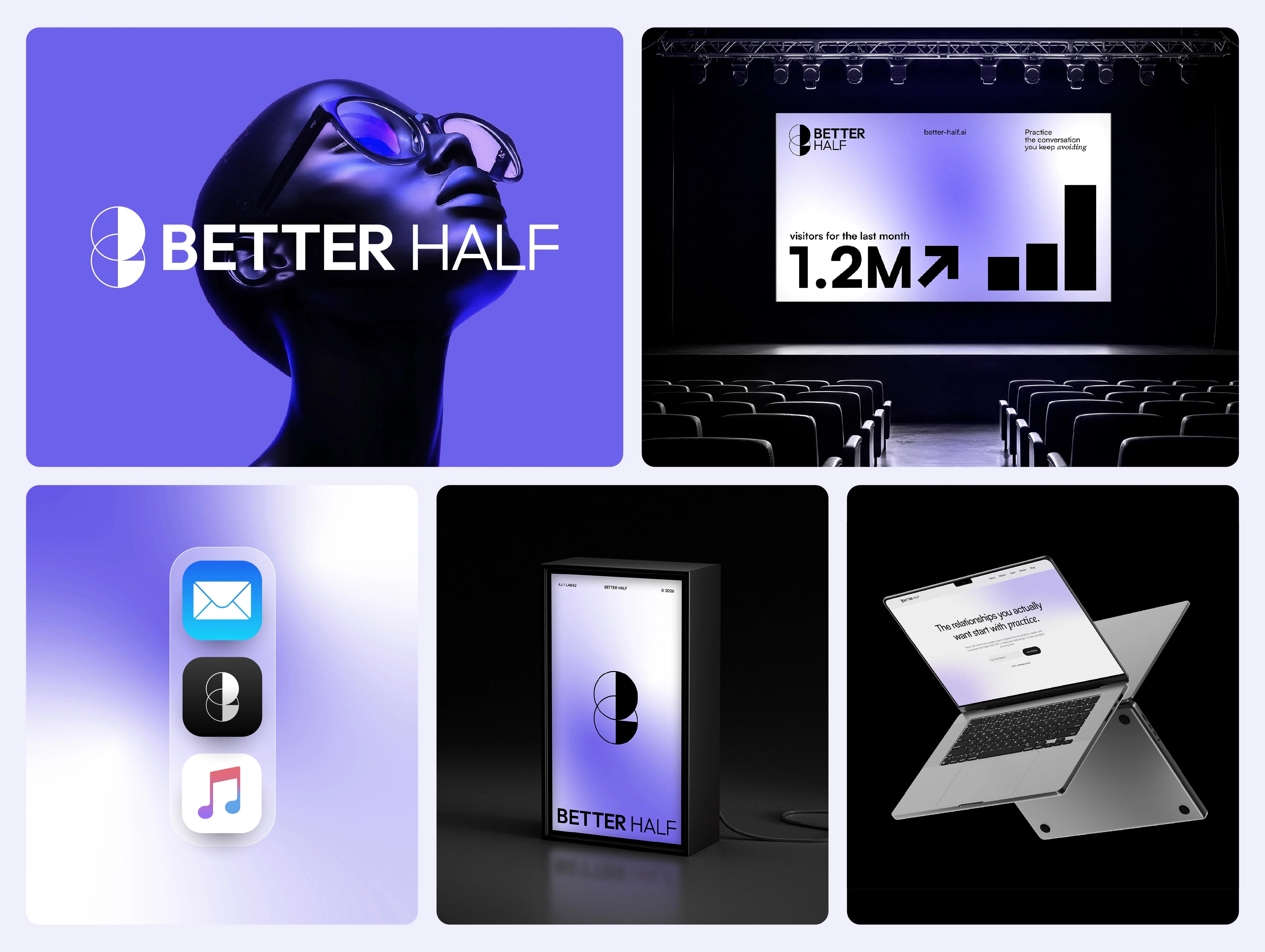
Better Half — From Concept to Identity
A simple idea of connection and balance, where two parts come together as one.
Designing with Geometric Forms
The identity is built on simple circles and clean divisions, creating a sense of structure and harmony. Where the circles overlap, a natural connection appears, linking the forms and softening the separation between them.
The result is a minimal and clear symbol that expresses a timeless idea.
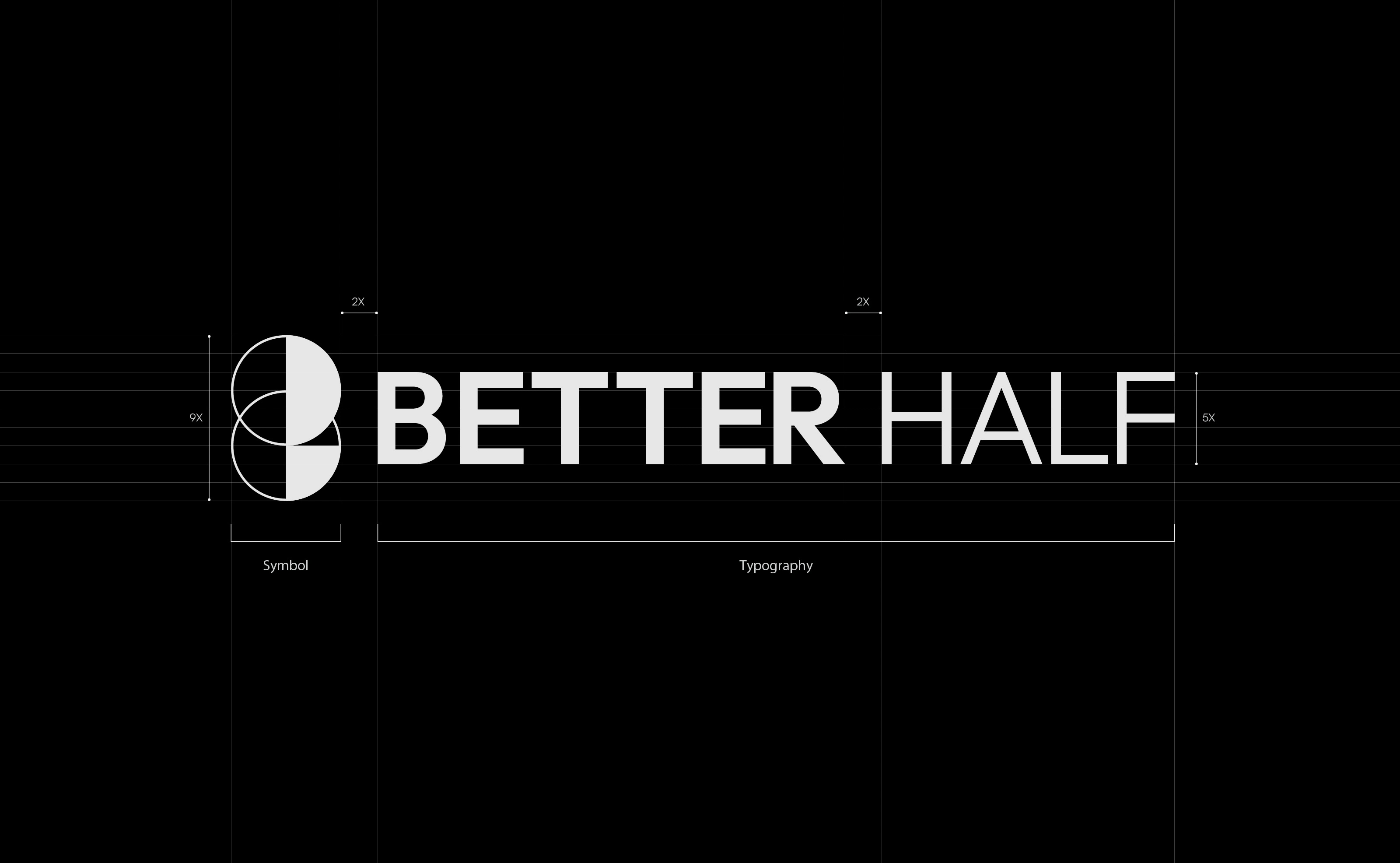
Logo Construction
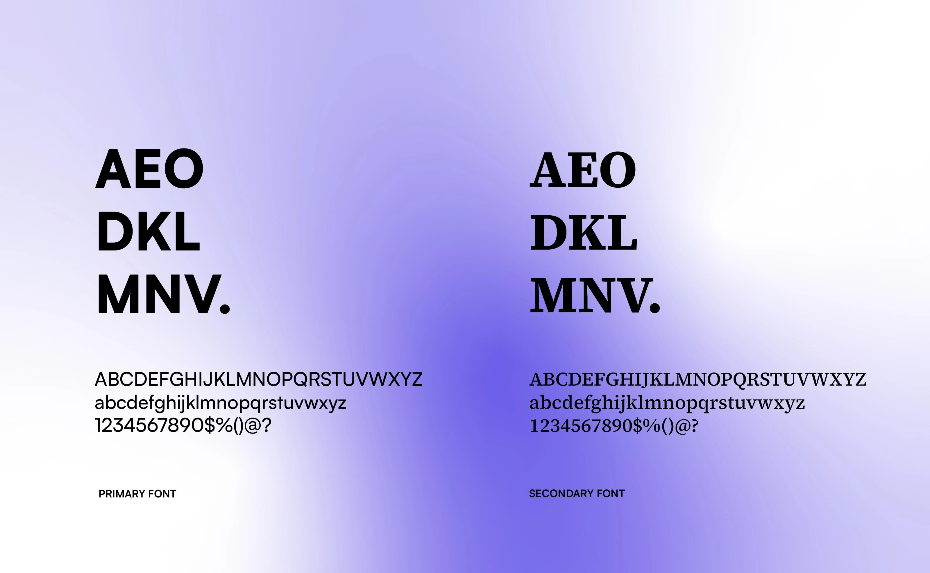
Typography
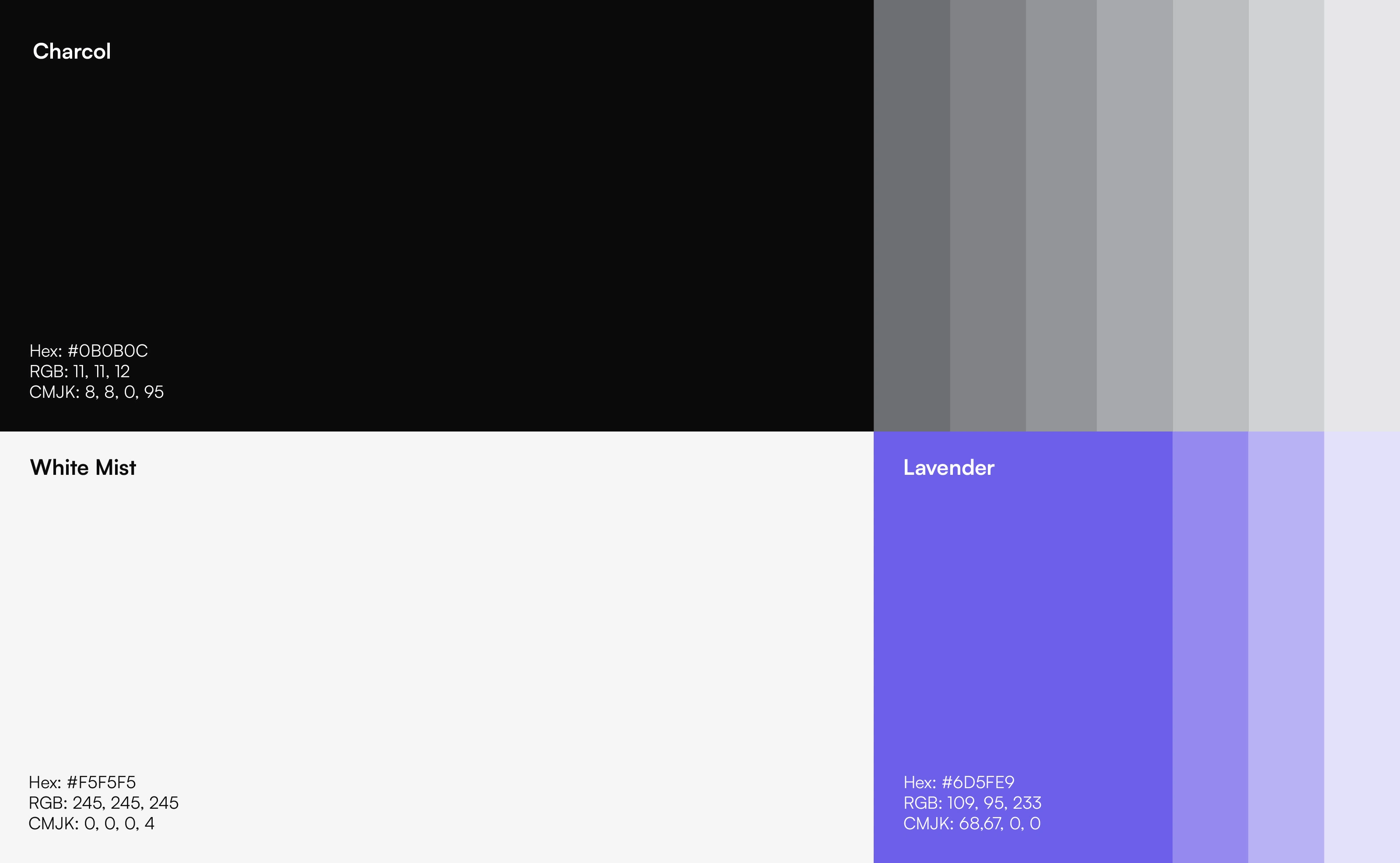
Colors
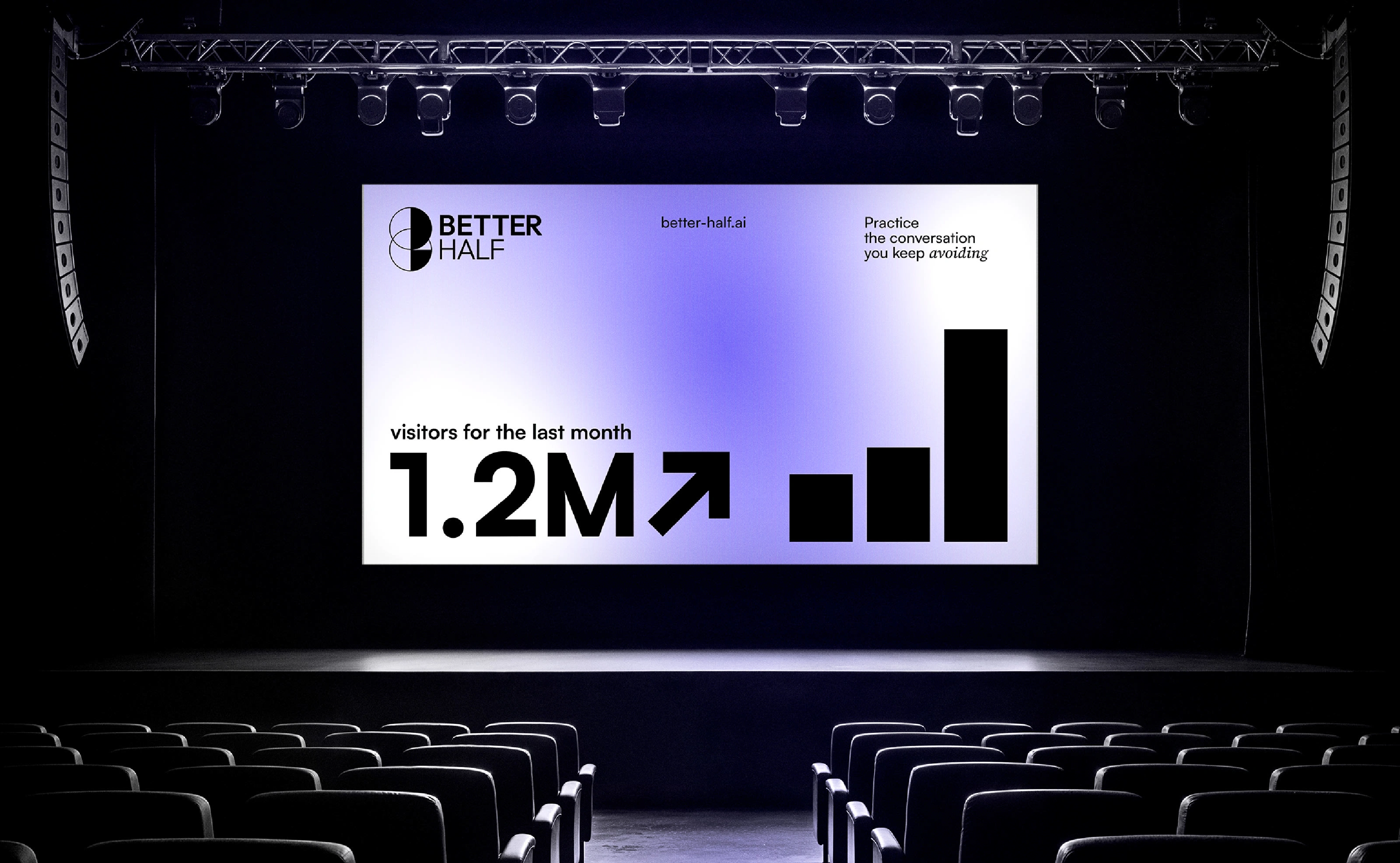
Billboard
The Impact
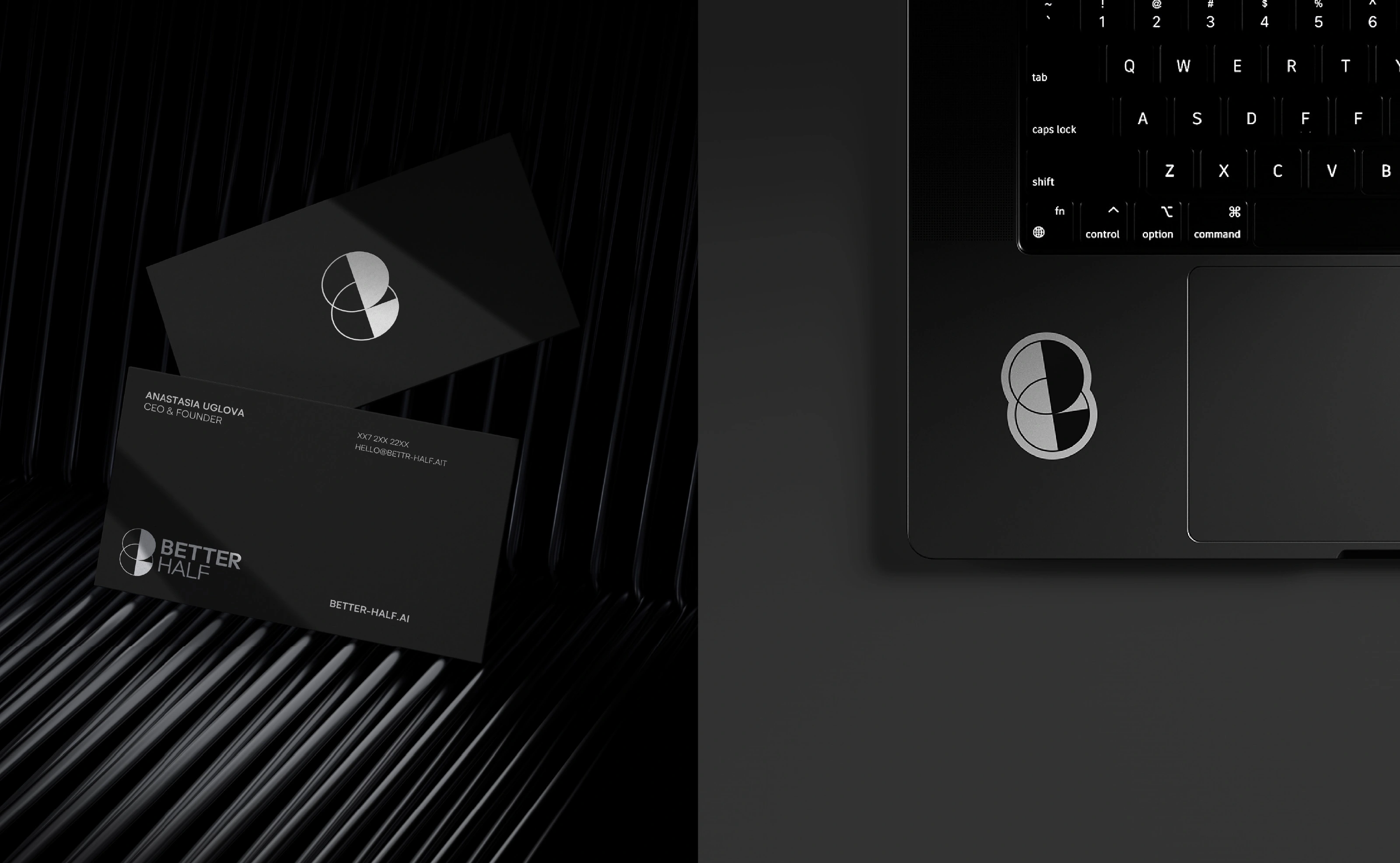
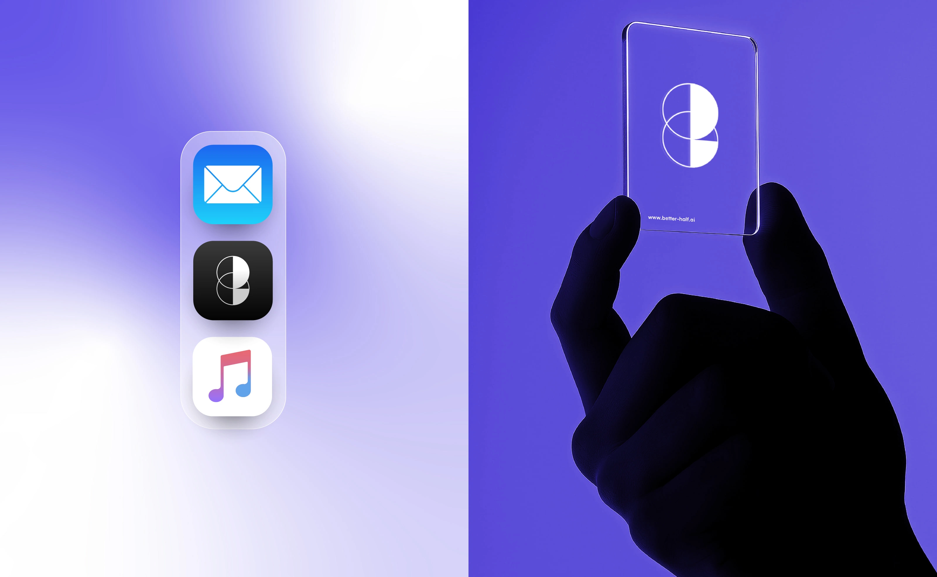
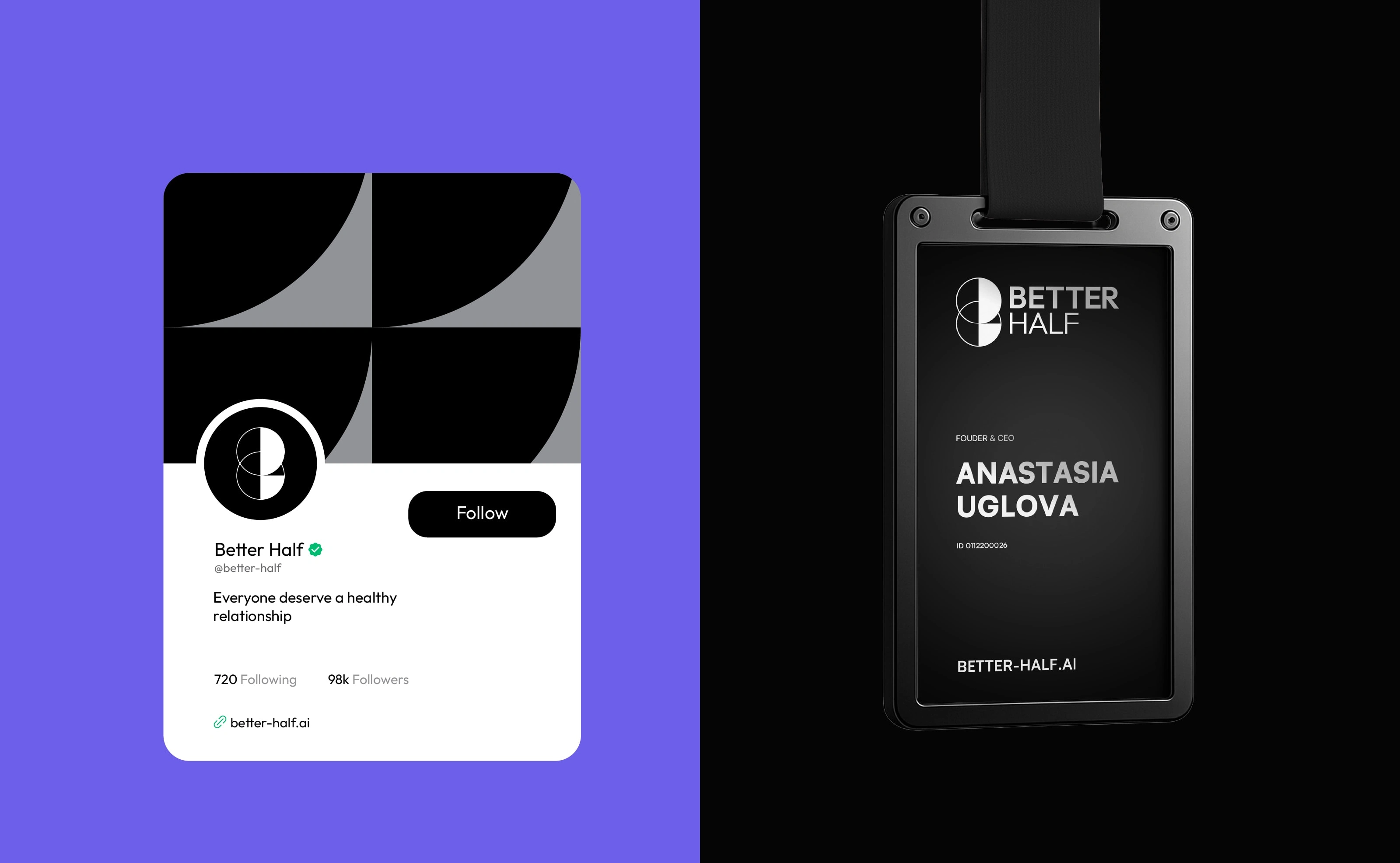
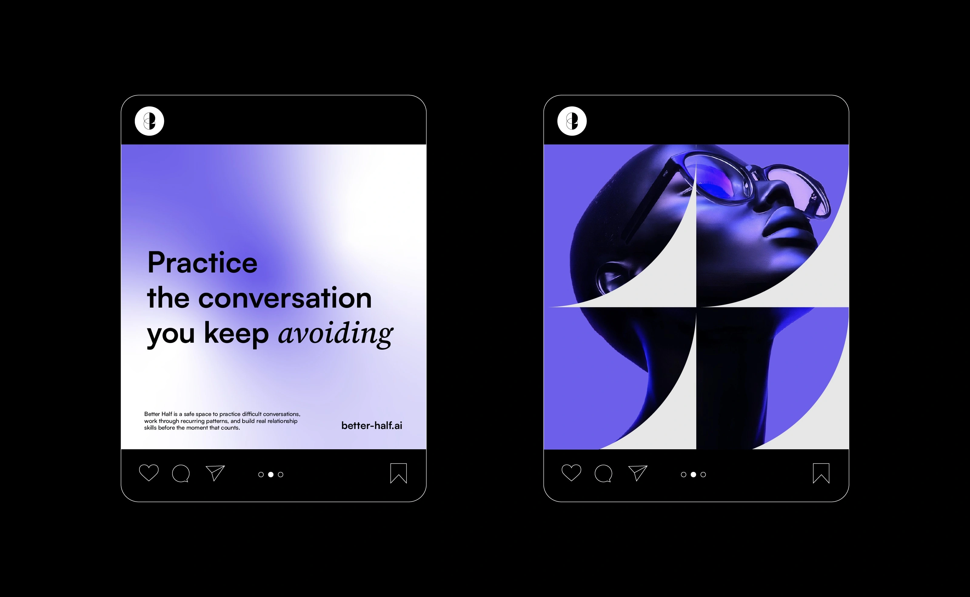
This work shaped Better Half into a clear and cohesive visual identity. Through a refined symbol and a minimal, structured system, the brand now expresses its core idea of connection with clarity and consistency. Applied across digital and physical touchpoints, the identity feels balanced, intentional, and easy to recognize, helping communicate the concept with simplicity and confidence.
Better-half.ai
What the client had to say
Aymen was incredibly patient with me and the team as we were working through uncertainty at the earliest stages of brand definition. He worked with us systematically to refine the logo and brand guidelines and provided beautiful assets.


Anastasia Uglova, Better Half
Apr 3, 2026, Client
0 likes · 19 views · Apr 9, 2026
Rebranded Better Half, developing a cohesive visual identity rooted in clarity, balance, and simplicity.
Timeline
Jan 19, 2026 - Apr 3, 2026