Reimagining 'Cuba, The Island I Treasure'
Client: Walter Fitzwater
Year: 2021
Services: Translation and Book Cover Redesign
Overview:
Walter Fitzwater approached our team for a comprehensive rework of his book 'Cuba, The Island I Treasure.' Initially published with a different publisher, the author felt the original release did not resonate with his vision nor connect with the intended audience. Our mission was twofold: refine the Spanish translation to capture the nuanced beauty of the author's voice and reimagine the book cover to encapsulate the essence of Cuba.
Translation Approach:
We began by delving deep into the text, ensuring the translation was not just linguistically accurate but culturally resonant. Our team, fluent in the regional dialects and idiomatic expressions of Cuba, worked meticulously to preserve the author's original tone and intent, making the narrative accessible to Spanish-speaking audiences while maintaining its authenticity.
The Logo
The personal brand of Walter Fitzwater is encapsulated within a monogram logo design, featuring his initials "W" and "F" in an elegant, signature-style script. This monogram is encompassed by a simple circle, denoting completeness and focus. Below this emblem, the full name "Walter Fitzwater" is typeset in a clean, sans-serif font, underscoring the personal and professional fusion that the author represents. The logo's monochromatic color scheme ensures its versatility and classic appeal, further solidifying the author's brand identity.
The design’s balance between personalization and professionalism mirrors the meticulous care put into the book translation and cover design, aiming to introduce Walter Fitzwater's work to a broader Spanish-speaking audience with a renewed and engaging presence

Logo creation in Monogram style
Design Process:
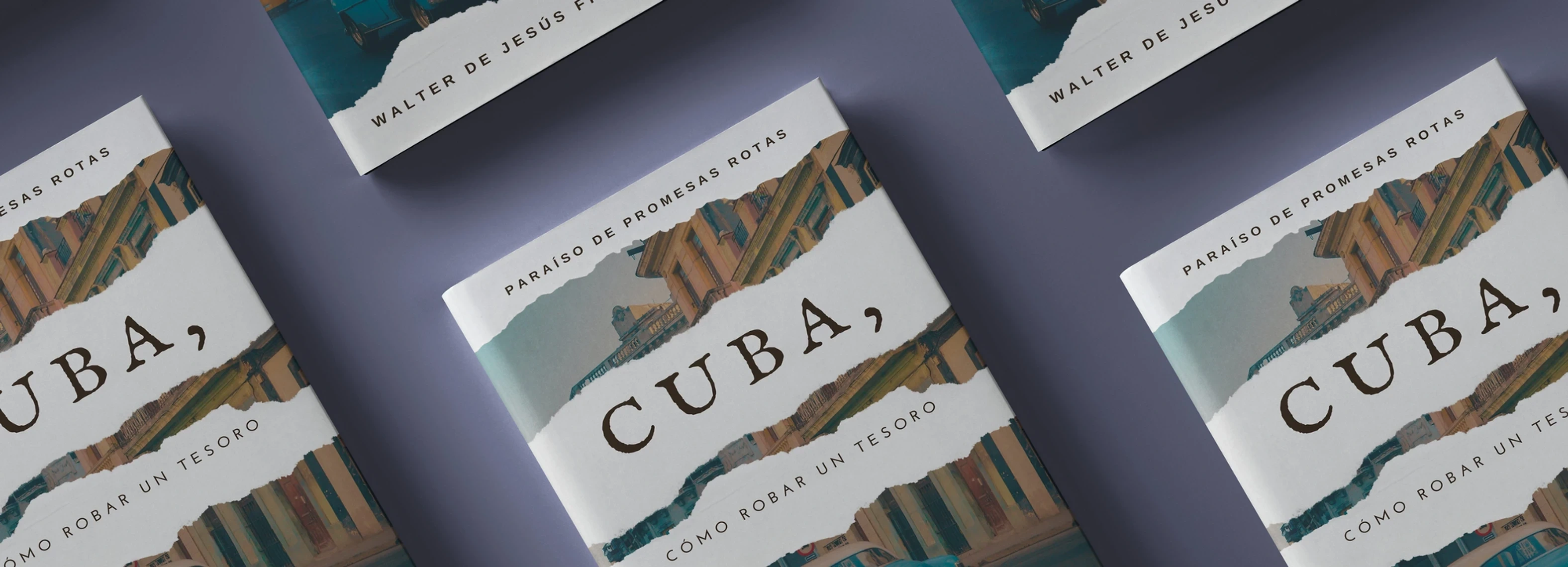
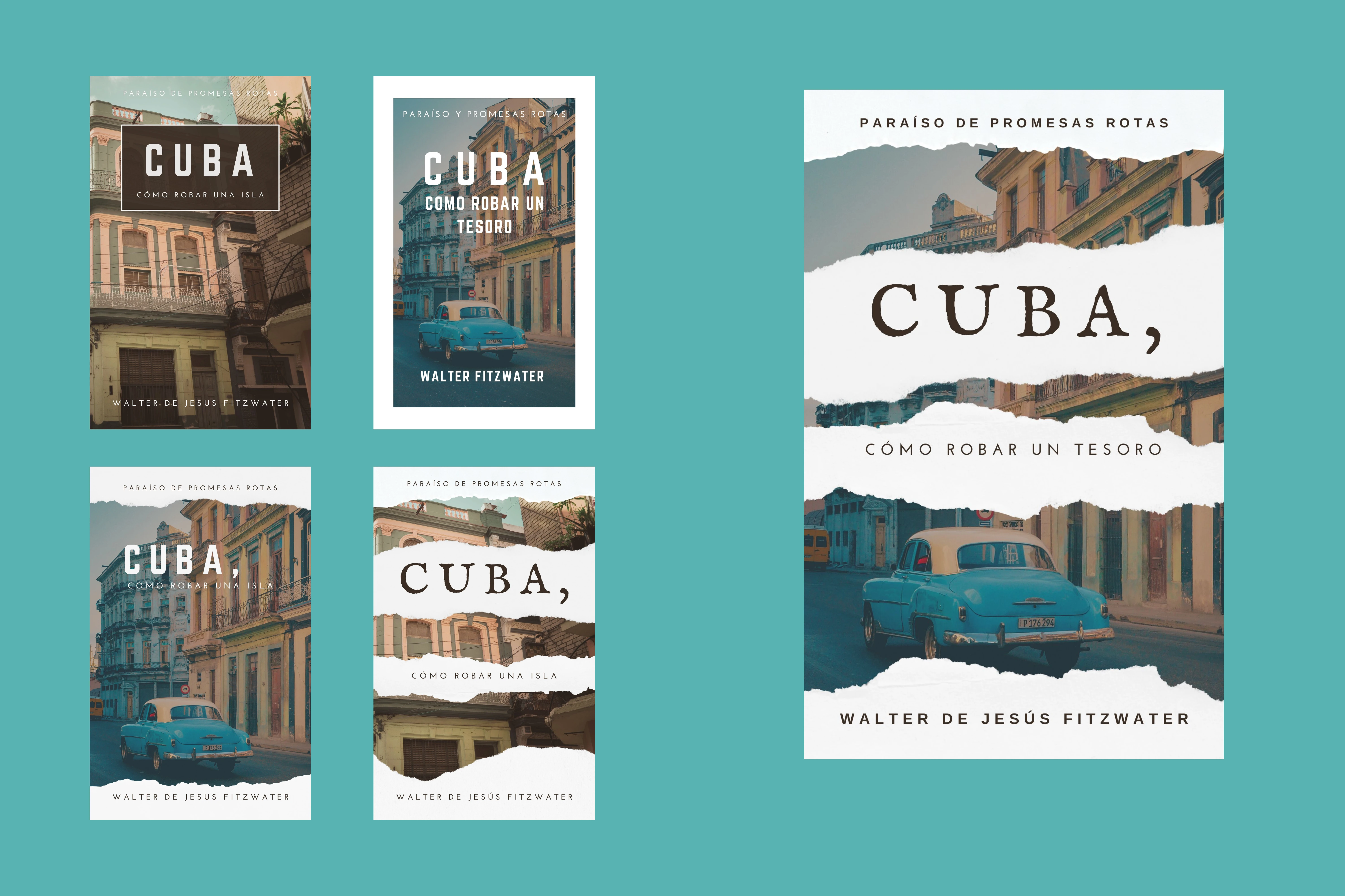
The second phase was the complete redesign of the book cover, so it's more eye-catching and modern. We kept the design minimal but strong. Using a photo of a typical Cuban street with an overlay of torn paper to remember the painful and tumultuous journey this country has gone through. The main fonts used there also reflect the same feeling while the secondary ones were kept simple so the design doesn't look cluttered or overpowering. The typographic choices reflect this balance of tradition and modernity, ensuring the book stands out in a crowded market.
Outcome:
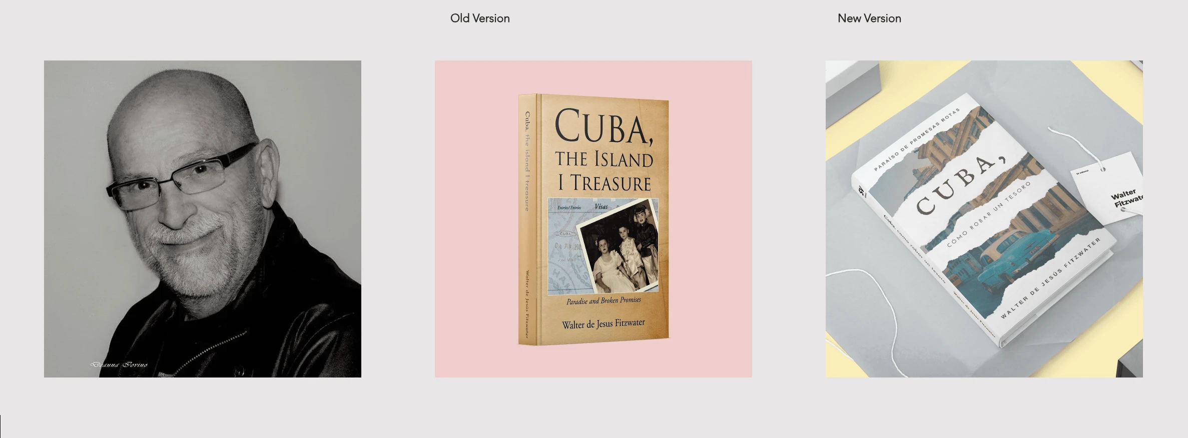
The author with the previous cover in his English version book vs the redesigned coverThis collaborative effort has culminated in a book that truly represents Walter Fitzwater's journey through Cuba's past and present. The final product is now poised for a successful launch, with a targeted marketing strategy designed to reach the hearts of readers globally. Through our comprehensive services, 'Cuba, The Island I Treasure' has been transformed into a literary piece that's not only visually compelling but also a true ambassador of Cuban culture and storytelling.
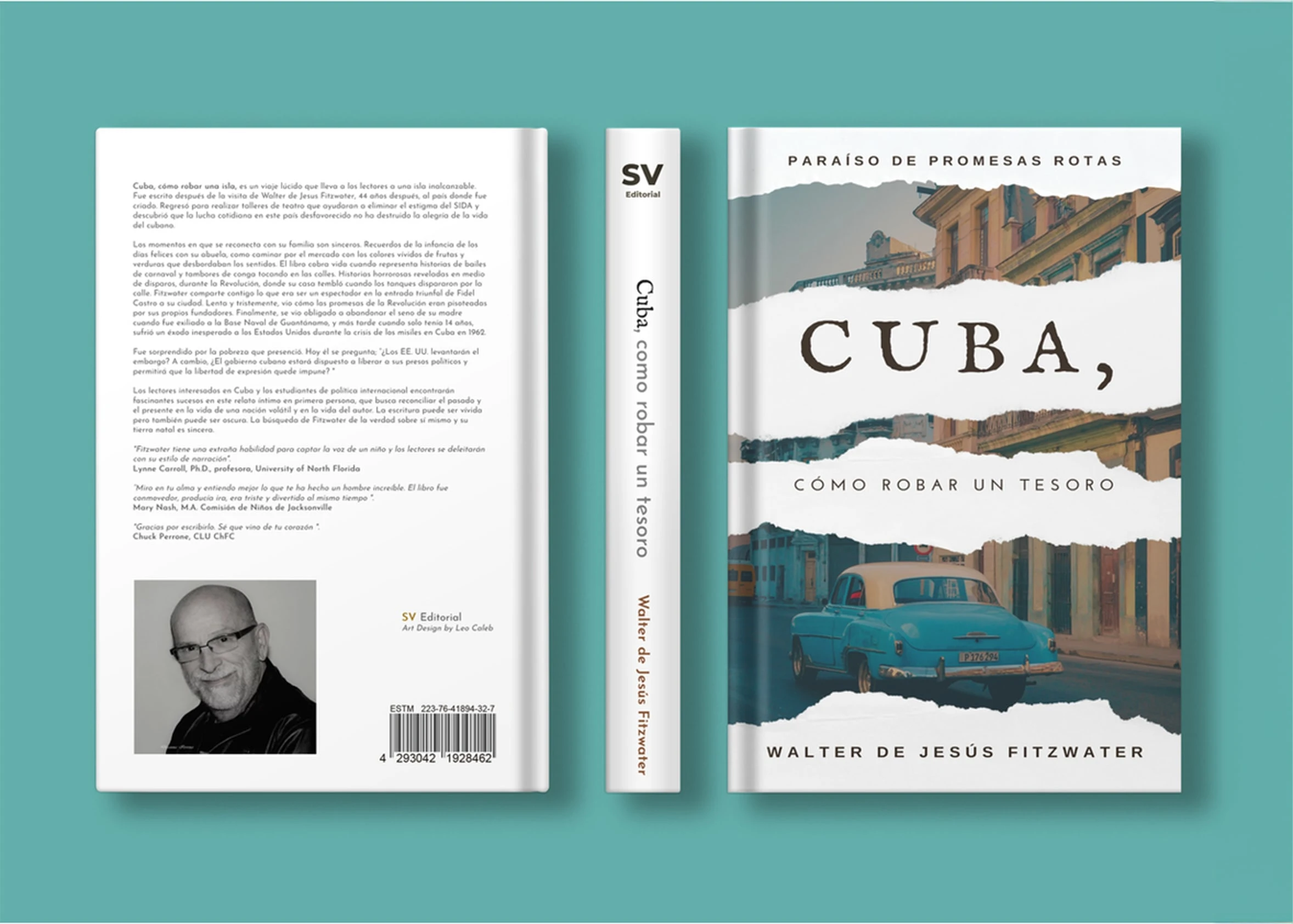
The design’s balance between personalization and professionalism mirrors the meticulous care put into the book translation and cover design, aiming to introduce Walter Fitzwater's work to a broader Spanish-speaking audience with a renewed and engaging presence.
Like this project
Posted Feb 19, 2024
Translated & redesigned "Cuba, the island I treasure" for author Walter Fitzwater, modernizing its appeal for a broader audience.


