Beverage Can & Tray Packaging Design

Pedro Santanna


Fiction Drinks — Can & Packaging Design
Scope: Packaging Design, Dielines & Prepress, Regulatory Labelling, Colour Management, 3D Modelling, Interactive 3D Preview
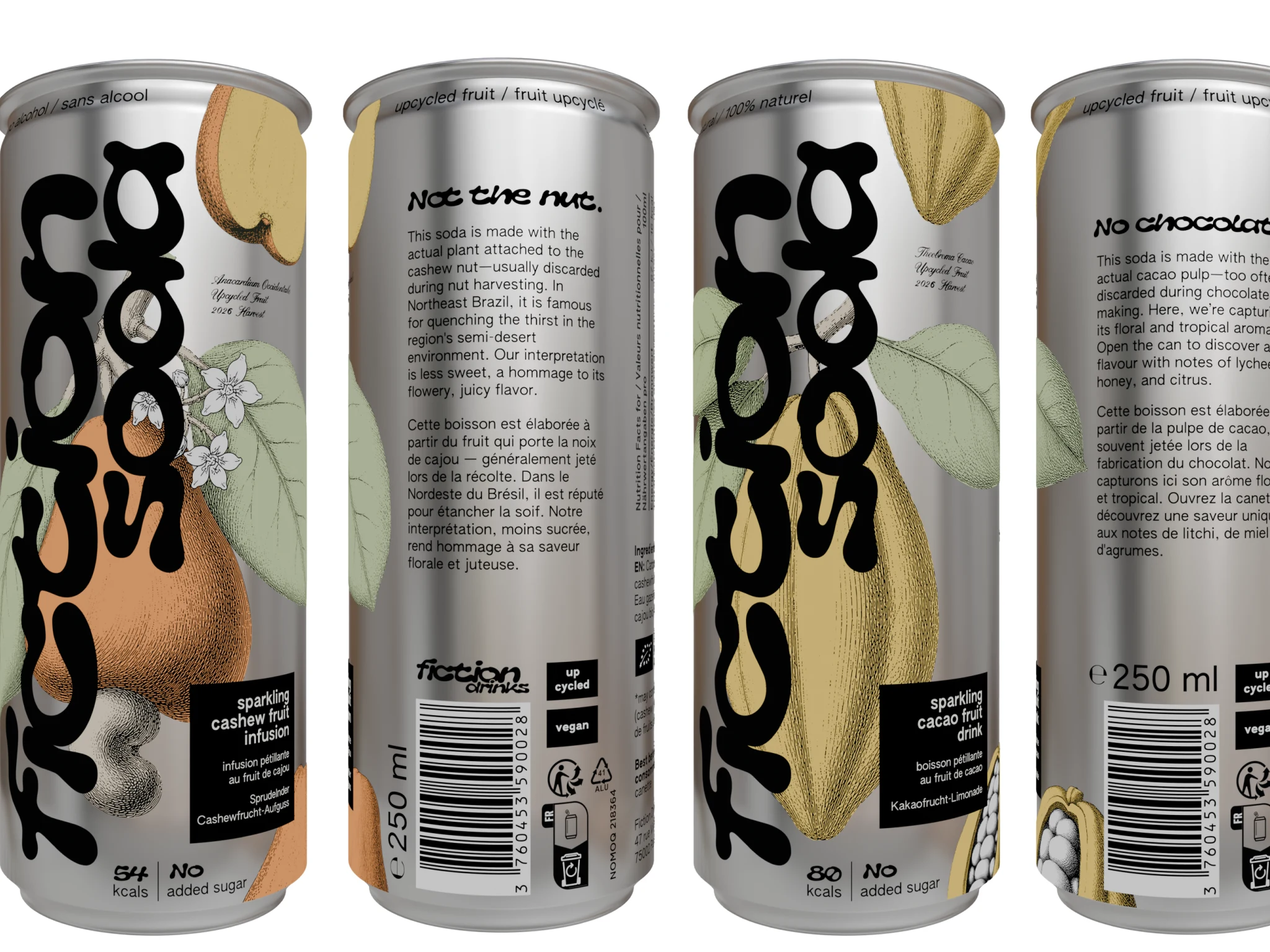
Cacao and Cashew soda cans
The Brief
Fiction Drinks makes sparkling sodas from fruit that usually goes to waste: the pulp discarded in chocolate making, and the cashew apple left behind in the nut harvest. The cans are launching in France and Germany.
The packaging had four jobs at once. Stand out on a shelf as a premium, slightly irreverent brand. Carry every mention two markets require, in three languages, on a slim 250 ml can. Survive a digital can press with hard physical limits. And extend to a 12-pack tray and a shipping case as an extension of the brand aesthetics.
One System, Every Flavour
The can is a system, not a one-off. A vertical wordmark runs the full height of the can, the fruit illustration wraps around the body, and a black descriptor block names the flavour in French and/or German and English. Cacao and Cashew share every structural decision. Only the fruit and its palette change, so a new flavour is a new illustration dropped into a locked layout rather than a new design project.
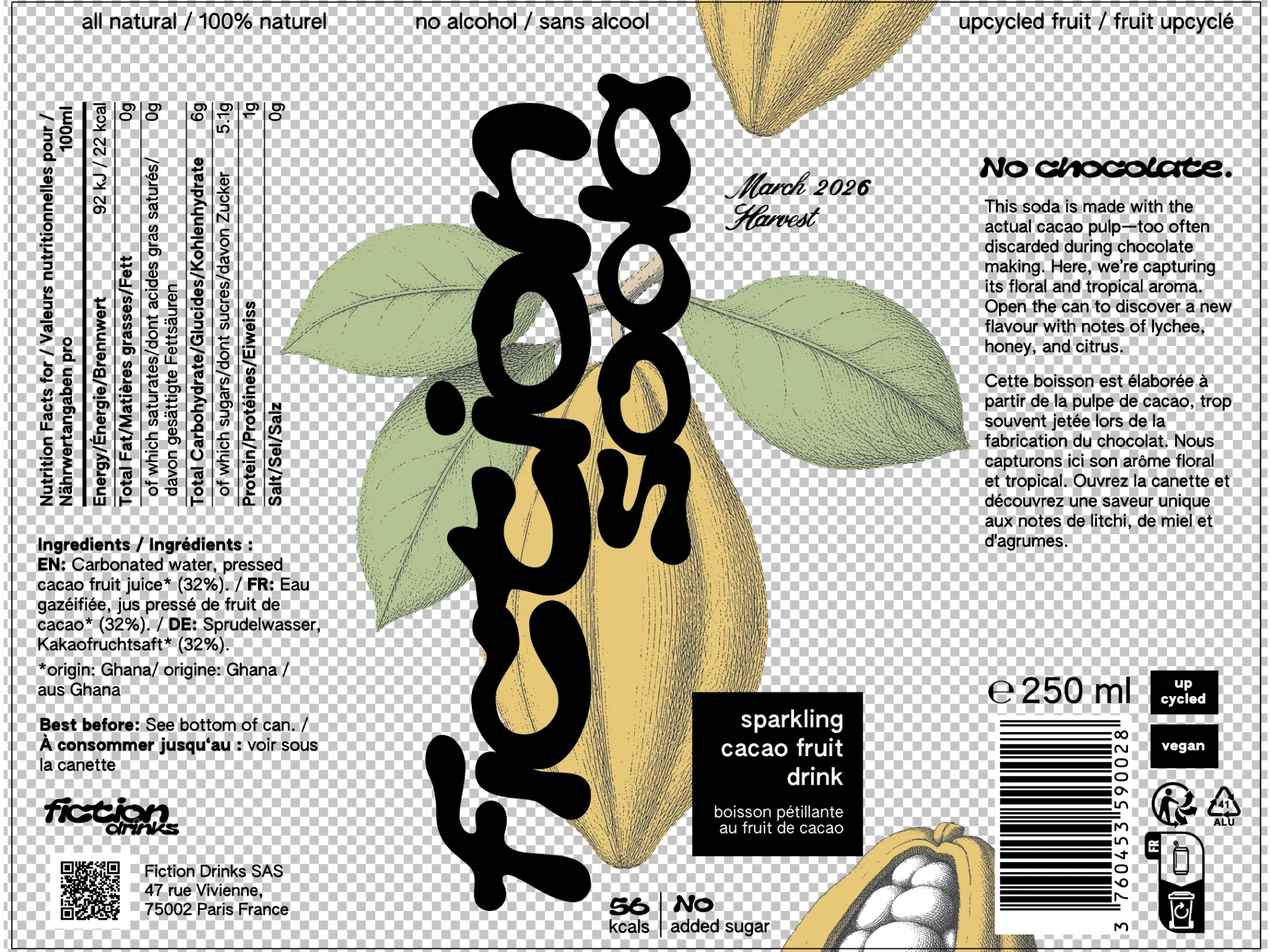
The full 173.8 × 134.8 mm wrap, front and back, as prepared for print.
The back panel does the regulatory work. Nutrition table and ingredients in three languages, compliant font sizes, an EAN-13 barcode per flavour and per market, the French Triman and aluminium recycling marks, a QR code and the legal entity. All of it laid out to stay legible on a curved surface a few centimetres wide.
Illustration That Survives the Press
Flat colour fruit under an antique engraving. The engraving layer was produced with an AI-assisted custom pipeline from the brand's flat-colour art and 3D form renders, then traced to vector and engineered for print. The engineering is where the real work was.
The problem is physics, not taste. The can printer runs at 700 dpi, so a single printed dot is about 0.036 mm. At can scale the finest hatch lines, and the gaps between them, are roughly one dot wide. Printed as drawn, the shadows fill in solid and the engraving black merges into the wordmark black.
The fix was to thin the lines, not redraw them. The finest hatching will always print as tone rather than as separate lines, so the lever that survives the press is total ink coverage. I built a vector process that thins every engraving path according to how dense its surroundings are: lightly in open areas, more than twice as much in the darkest masses. A seam fix tucks the colour shapes under the outlines, so thinning never opens white hairlines between colour and line.
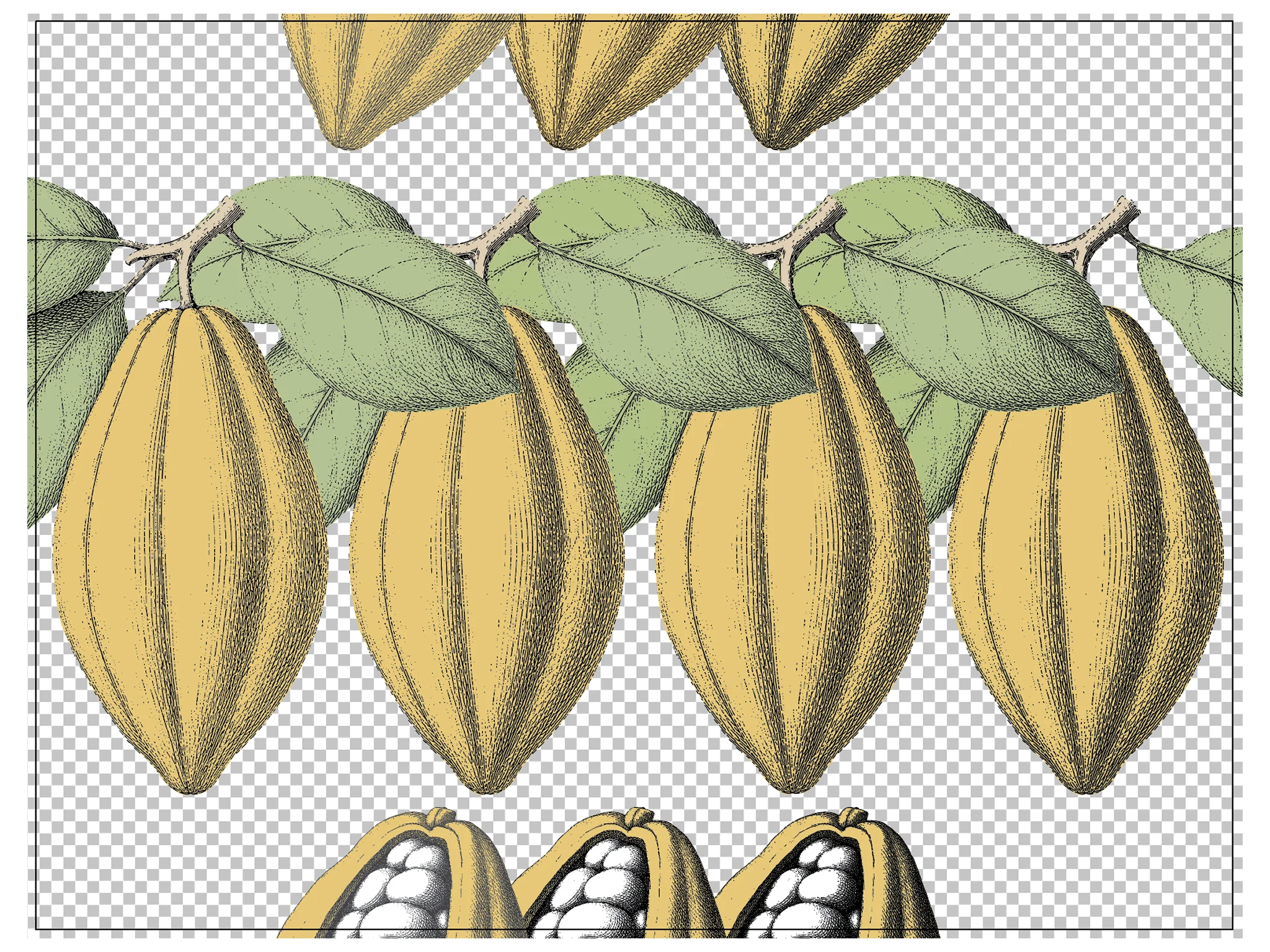
Same crop of the engraving on different variations for exhaustive testing.
Changes are tested one variable at a time. Sample rounds are designed so each can isolates a single decision against the current printed can, first the thinning at full black, then the same file at one flat black tint, on the same metallic matte finish.
Colour and Print Production
Colours are built for aluminium, not for a white screen. Every swatch has a CMYK build with no black in the mix, and the engraving prints as a single black channel rather than a four-colour black that would misregister on fine lines. Palette corrections are interpolated in CIELAB, so a halfway step is perceptually halfway, and every option is judged composited over bare aluminium, because that is what the eye actually sees.
Metallic cans need more than artwork. Each file carries separate effect layers (such as gloss) that can change not only how the can looks but how it feels to the touch. Metallic matte, metallic shiny and non-metallic versions were all prepared and compared before landing on a decision.
The 12-Pack Tray and Shipping Case
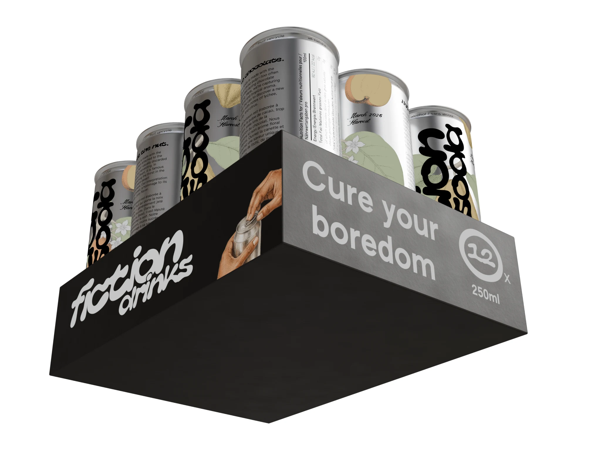
A tray that sells from the shelf. The 12 × 250 ml display tray wraps a black band around the cans with the wordmark, an illustrated hand cracking open a can, an inviting tagline and a bold 12 × 250 ml count. It is laid out on the tray's wrap dieline, with the seam placed on a corner so no panel breaks across it.
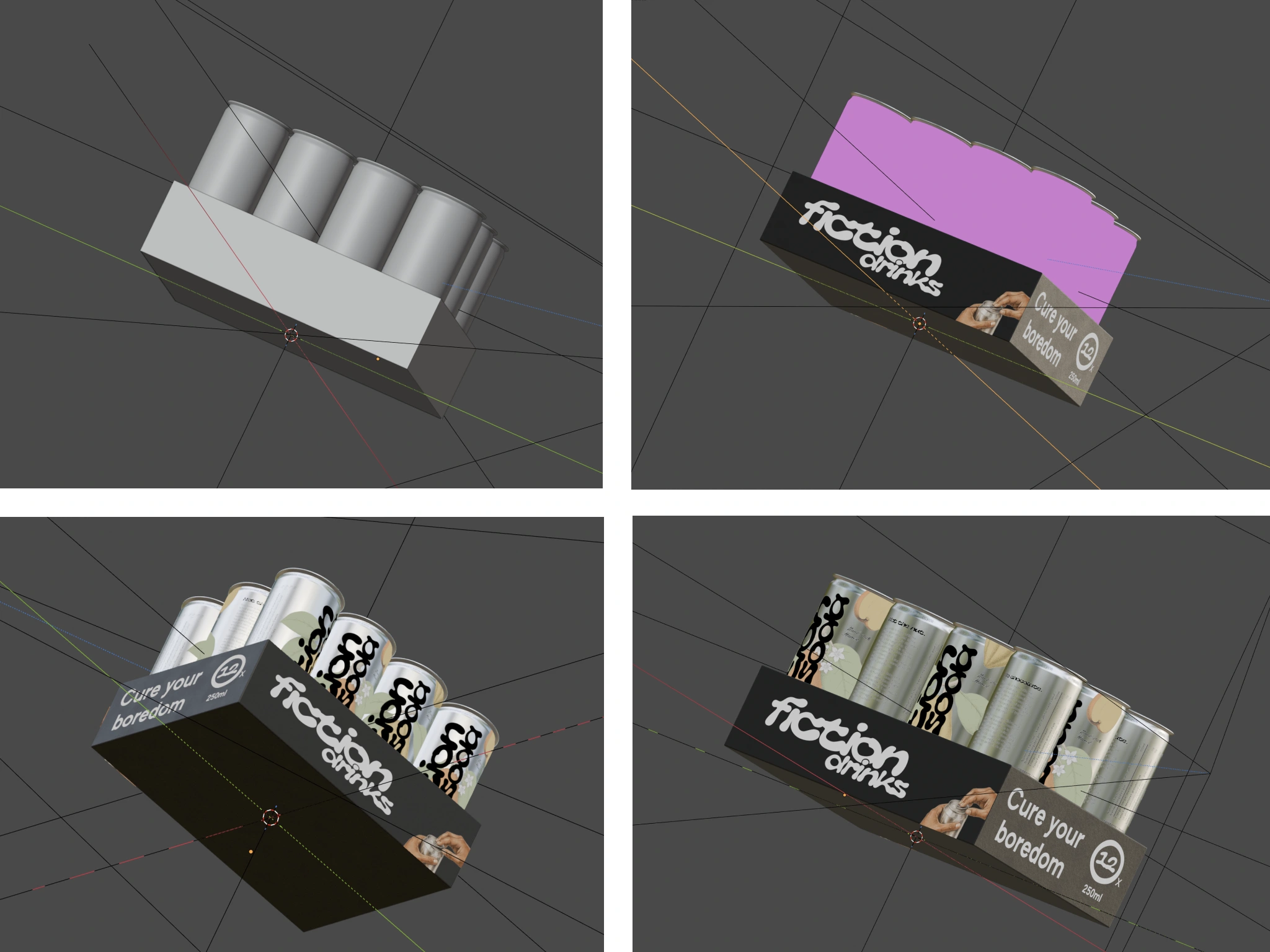
3D render of the 12-pack with both flavours.
See It Before It's Printed
Every design is reviewed on the real can shape. I modelled the slim can in Blender from the manufacturer's spec sheet and wrap the actual label artwork onto it under studio lighting. The same model can produce renders for websites, marketplaces and social.
And anyone can rotate it in a browser. A lightweight 3D viewer lets the team, a retailer or the printer spin the can, zoom into the details and swap between label versions live. Nothing to install, and no flat artboard to imagine in three dimensions.
Custom can viewer: Short clip rotating the can and switching labels.
Key Details
250 ml slim can wrap, 173.8 × 134.8 mm, built on the printer's dieline
Two flavours on one locked system, ready for more
Trilingual labelling for France and Germany, with barcodes per market
Engraving thinned path by path to hold its detail at 700 dpi
CMYK builds, single-channel black linework, base white and varnish separations for metallic cans
Scripted preflight of every print PDF
Physical sample rounds with controlled variables
12-pack display tray, plus a 24-can shipping case with pallet plan
3D models, product renders and an interactive browser viewer
Tools
Adobe Illustrator · Figma · Blender · Python · WebGL
Like this project
Posted Sep 17, 2026
Designed the can label and 12-pack tray for a soda brand, from dieline to print-ready files: trilingual compliance, precise specs and an interactive 3D preview.