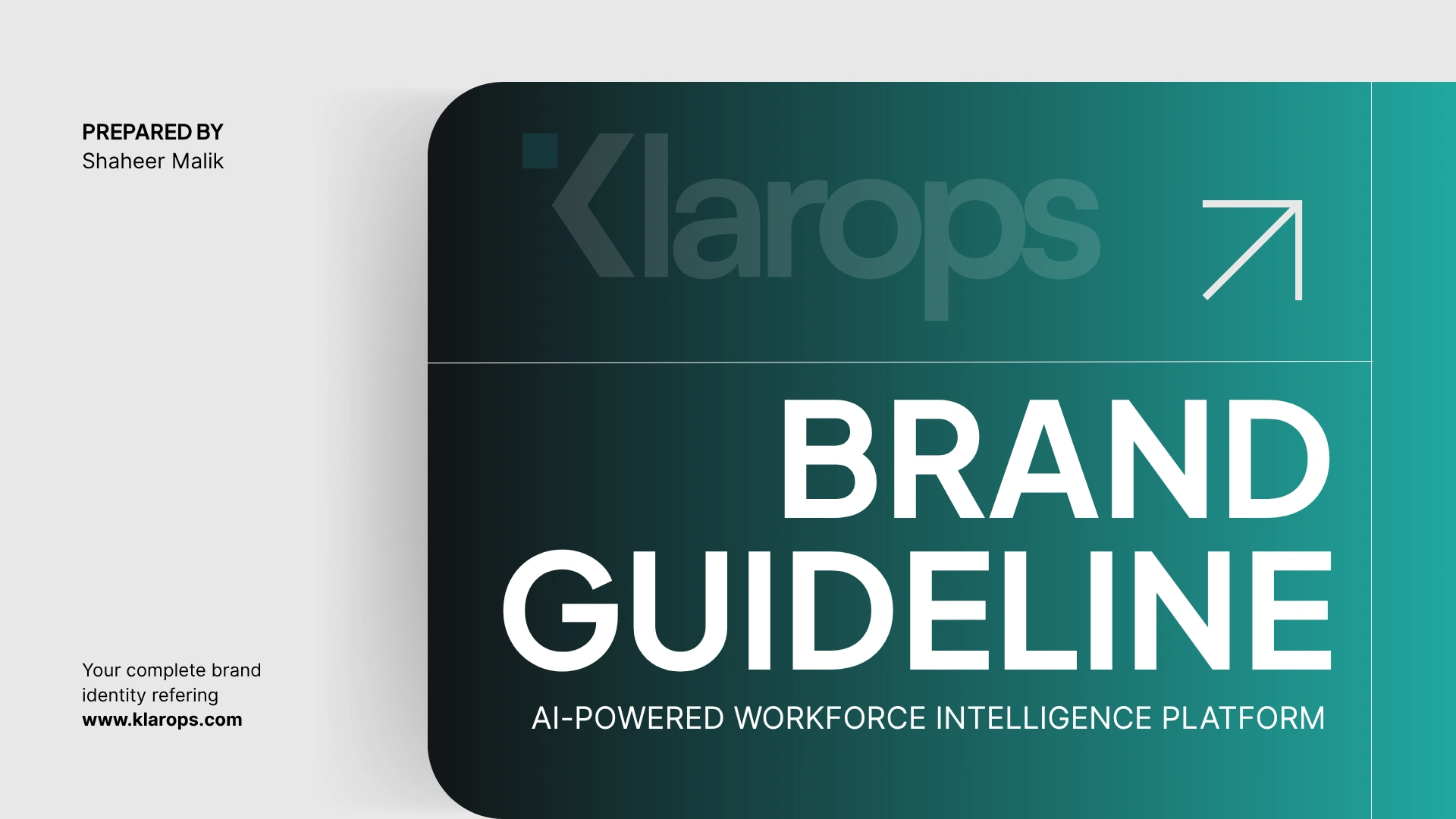
Klarops - AI Product Brand Guidelines

Shaheer Malik
Verified
1 collaborator


🏢 Client Overview
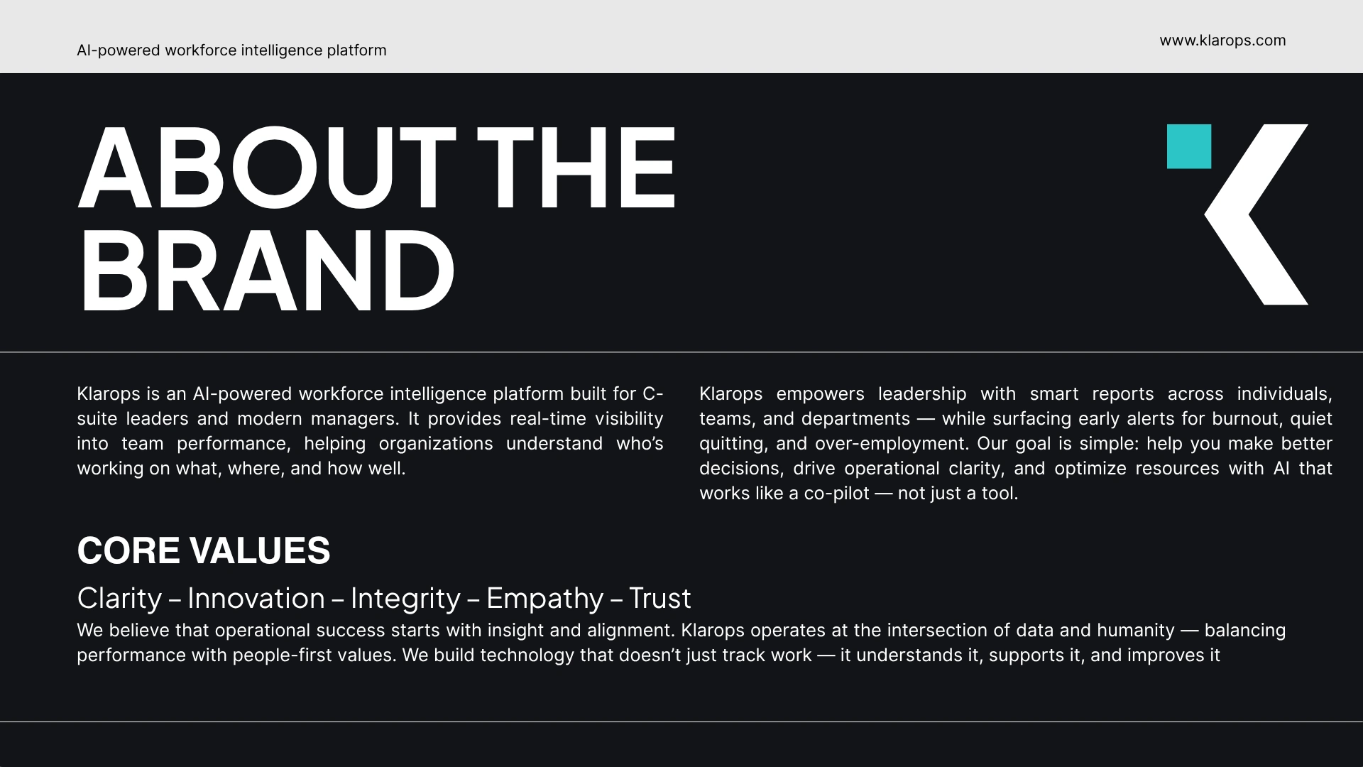
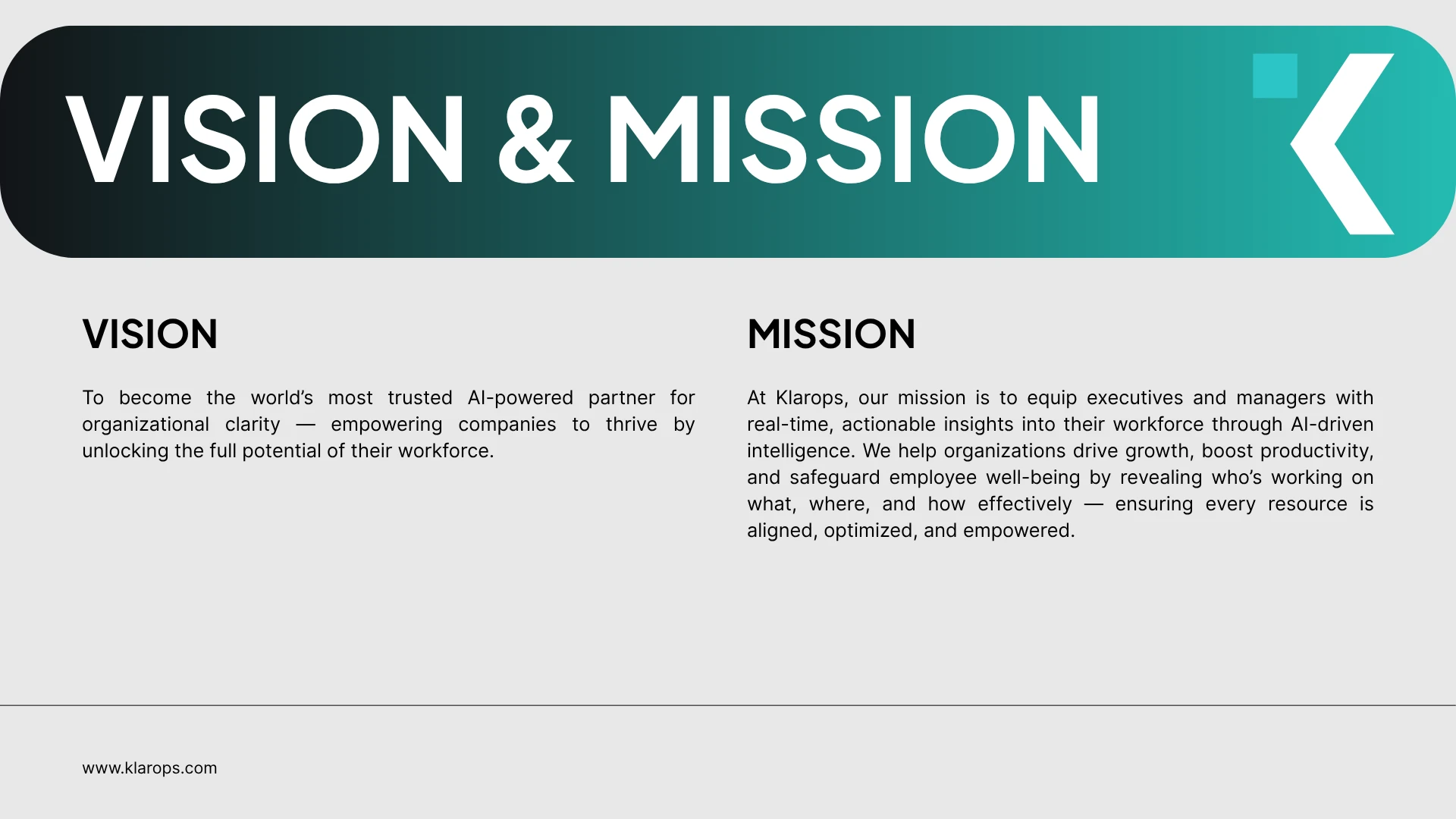
Klarops is a next-gen workforce intelligence platform that acts as an AI co-pilot for C-suite executives and managers. It helps organizations understand who’s working on what, where, and how effectively—with insights into employee performance, team efficiency, burnout risks, and more.
🎯 Project Goals
Reimagine Klarops’ visual identity to align with its cutting-edge AI positioning.
Create a scalable, professional brand system that builds credibility with enterprise clients and investors.
Ensure visual clarity, minimalism, and high functionality across all brand touchpoints.
🔍 Discovery & Brand Positioning
During the discovery phase, we mapped out Klarops’ competitive landscape and target personas (C-suite executives, team managers, and tech-forward startups). The visual direction was defined by:
Trust & Authority (AI, analytics, B2B enterprise)
Simplicity & Focus (data-driven clarity)
Human-Centric AI (friendly yet professional tone)
Klarops now presents a cohesive and professional identity that positions it as a serious player in the AI workforce intelligence space.
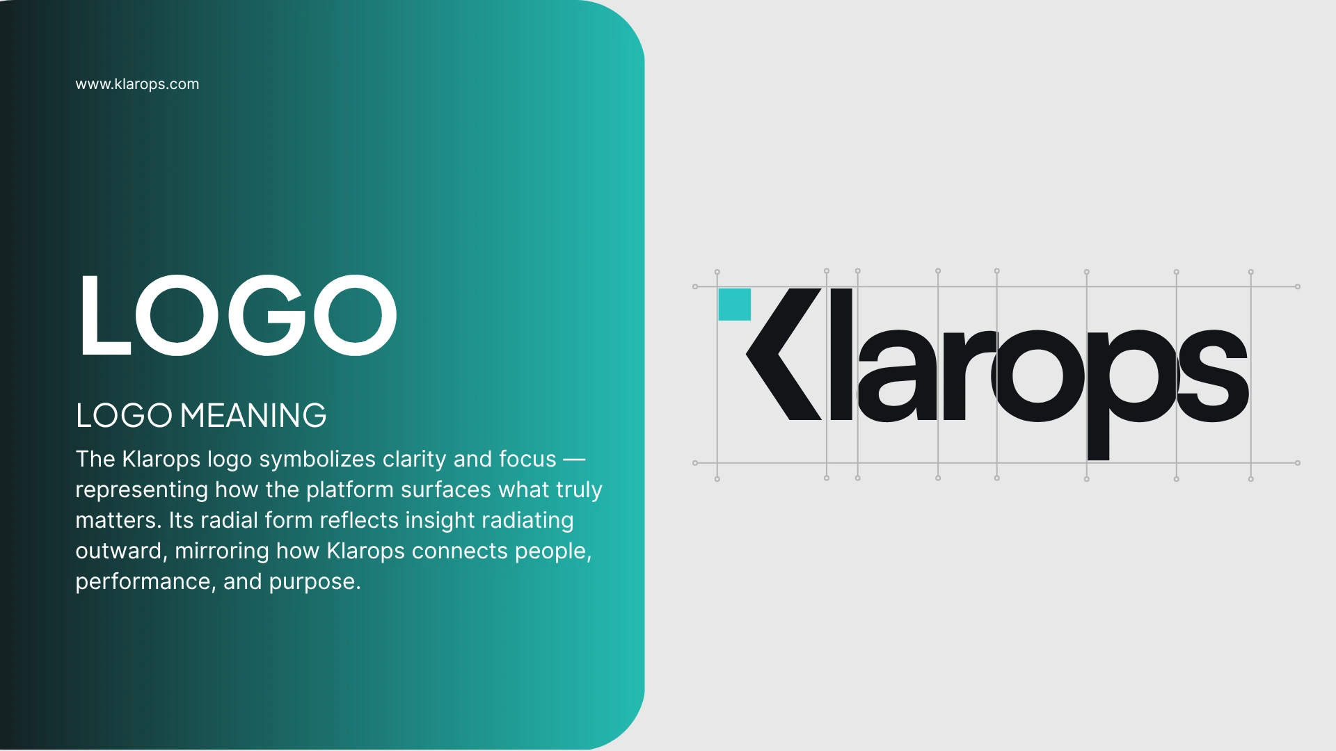
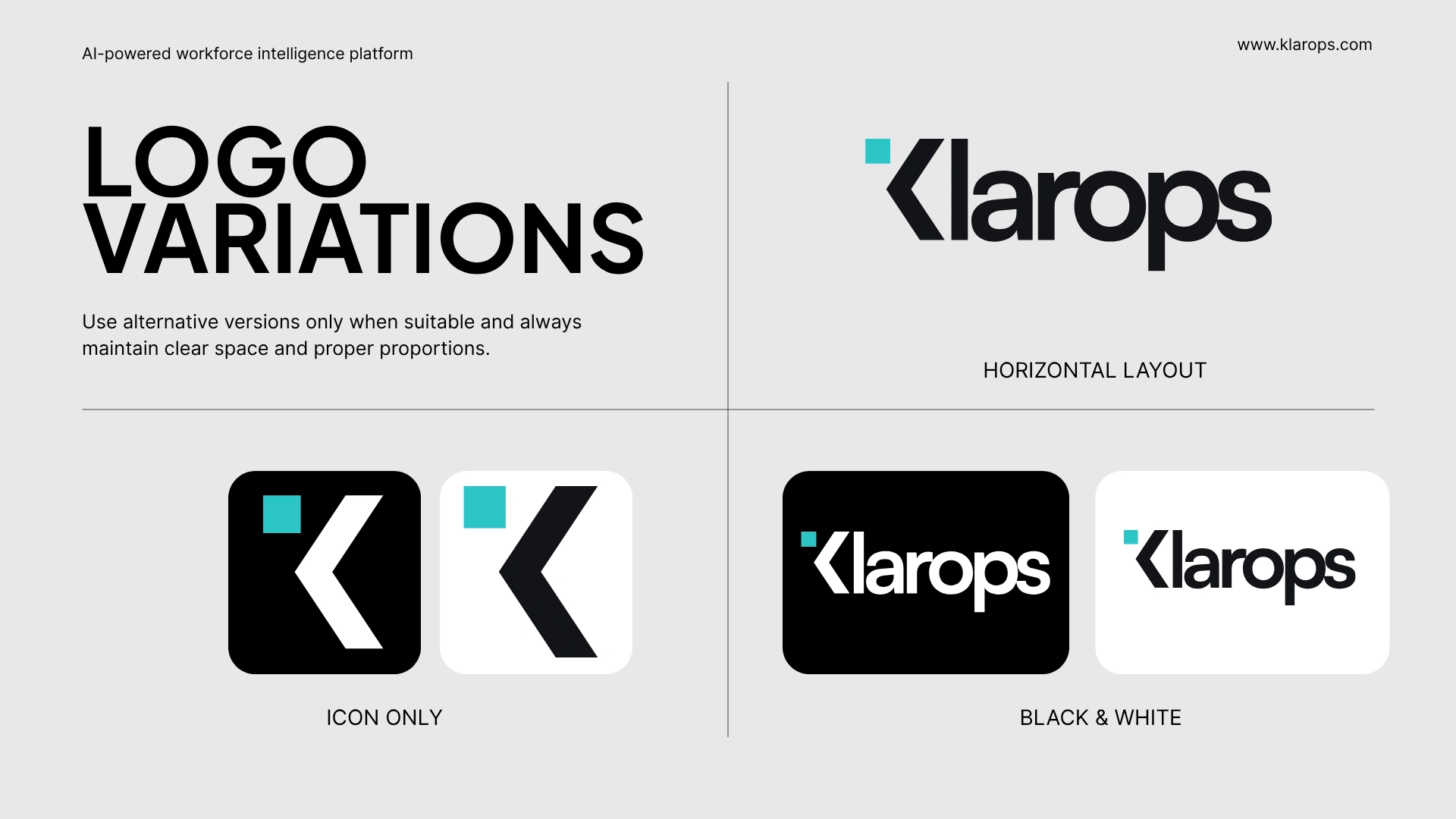
Logo System
A sleek, geometric logomark paired with bold, minimal typography. The design reflects precision and structure—mirroring Klarops’ intelligent insight engine.
The guidelines ensure consistency across internal teams and external touchpoints—from pitch decks and investor materials to the product UI itself.
Color Palette
Primary:
#24BBB2 – A fresh, modern teal representing innovation and intelligenceSecondary:
#121417, #E8E8E8 – Providing strong contrast and neutral grounding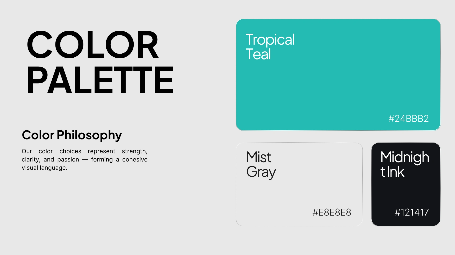
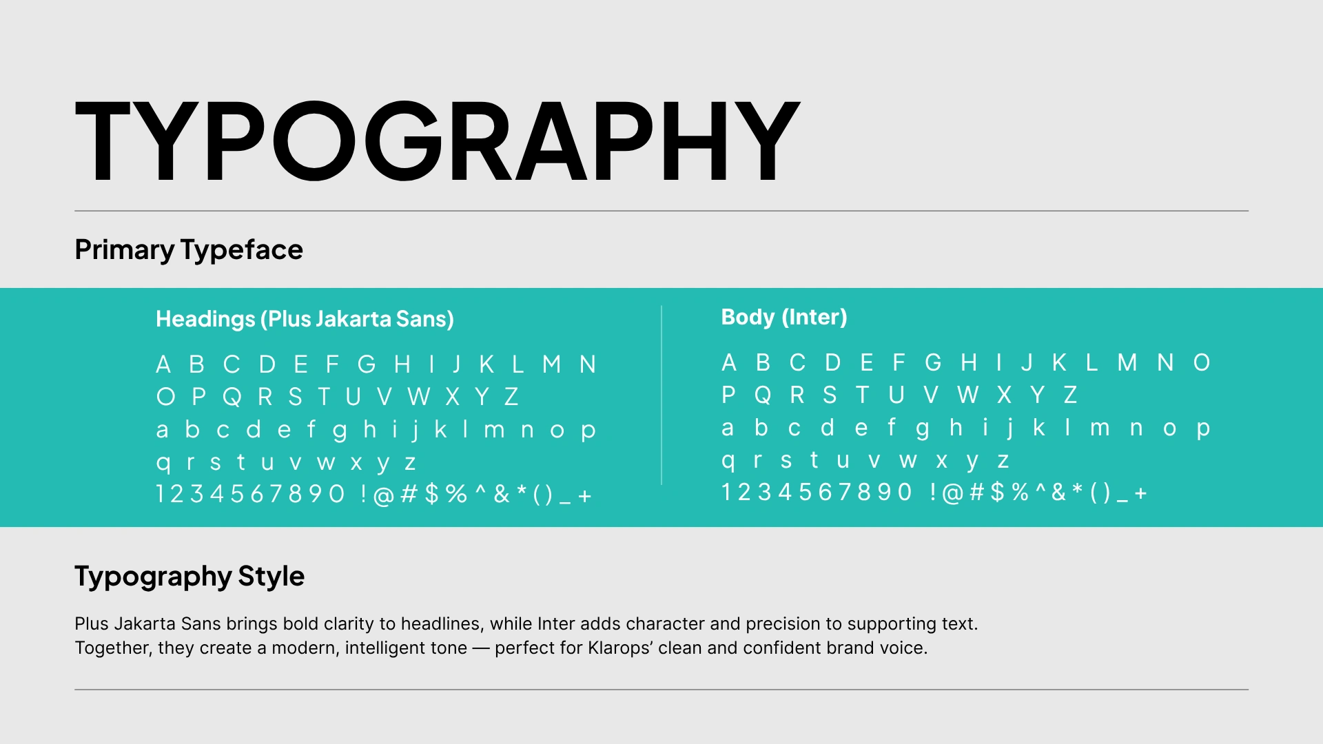
Typography
Font Family: Plus Jakarta Sans
A clean, functional sans-serif optimized for digital readability
Variants chosen for clear hierarchy and data-heavy interfaces
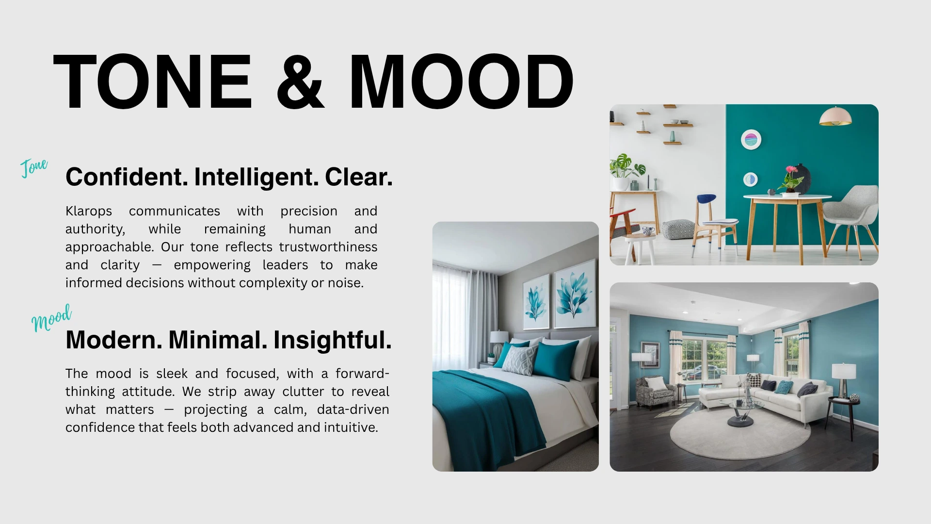
Tone & Mood
The brand tone is intelligent, calm, and confident. It avoids hype and favors clarity. Visual moodboards reflect modern B2B interfaces, AI dashboards, and organizational structure visuals.
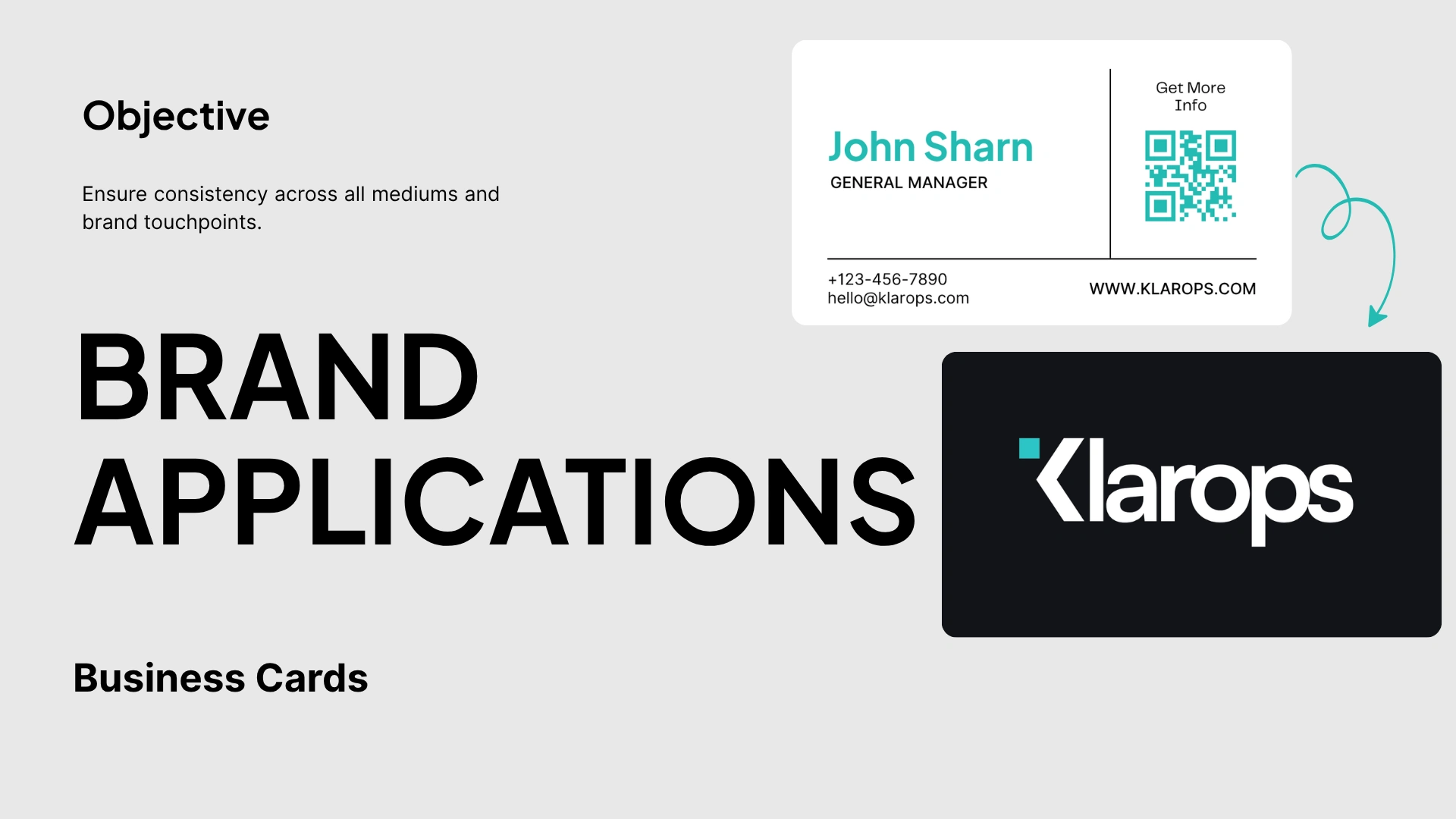
Deliverables
Finalized Logo System (mark, logotype, and variants)
Brand Color System with Accessibility Considerations
Typography Guidelines
Usage Rules for Web, Print & Presentation
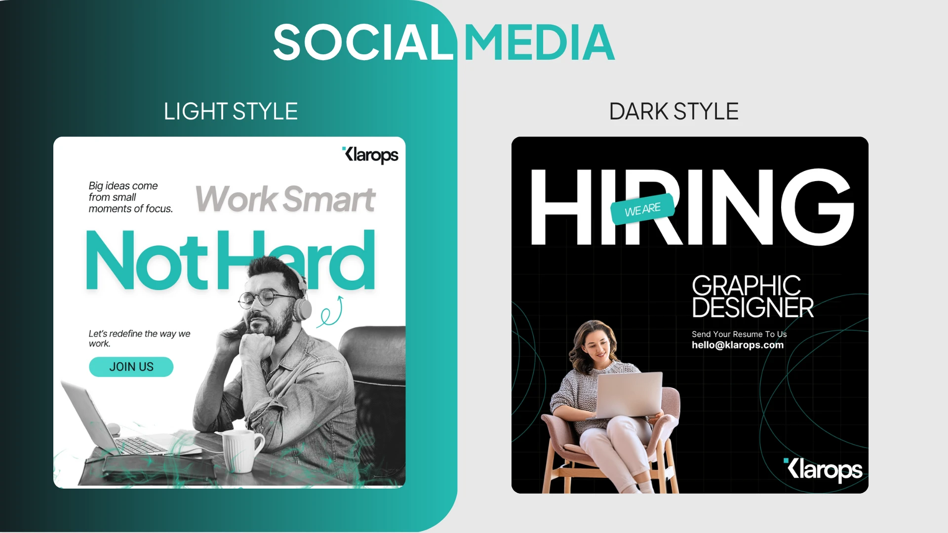
Social Media Post Templates
Tone & Voice Guidelines
Here’s a social media post suite based on the Klarops brand guidelines and case study, designed to position Klarops as a thought leader in AI-powered workforce intelligence.
Hope you've enjoyed
Like this project
What the client had to say
Great guy! Responds to messages very quickly, is very independent, organised and professional. He's a great designer!


Oche A, Klarops AI
Jul 22, 2025, Client
Posted Jul 23, 2025
Klarops now presents a cohesive and professional identity that positions it as a serious player in the AI workforce intelligence space.
Likes
0
Views
7
Timeline
Jul 16, 2025 - Jul 22, 2025
Clients
Klarops AI
Collaborators


UI/UX Design for Bulletproof AI's SaaS Platform
Bighits - A Sports Talent Hunt App in India
Mobile App Design for Social Coordination Planning App
Spline Ronin AirPods Render