Brand Identity and User interface design for Moca
Tim de Vries
Project Overview
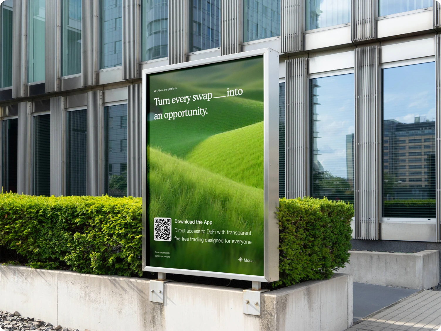
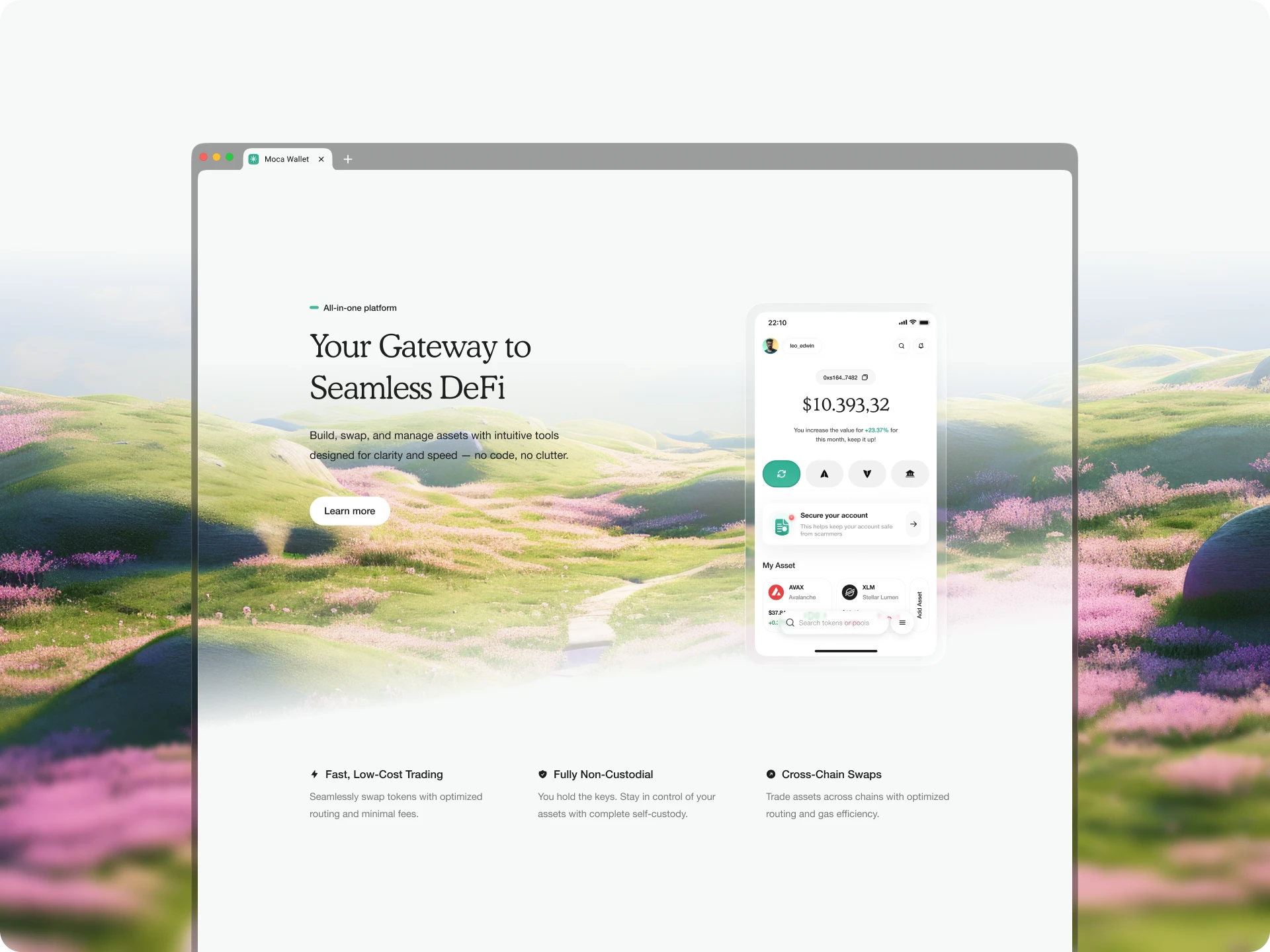
Moca is a sustainable decentralized exchange built for simplicity, speed, and accessibility. Our challenge was to craft a brand identity that communicates trust, innovation, and responsibility—while staying lightweight and approachable.
Brand Identity
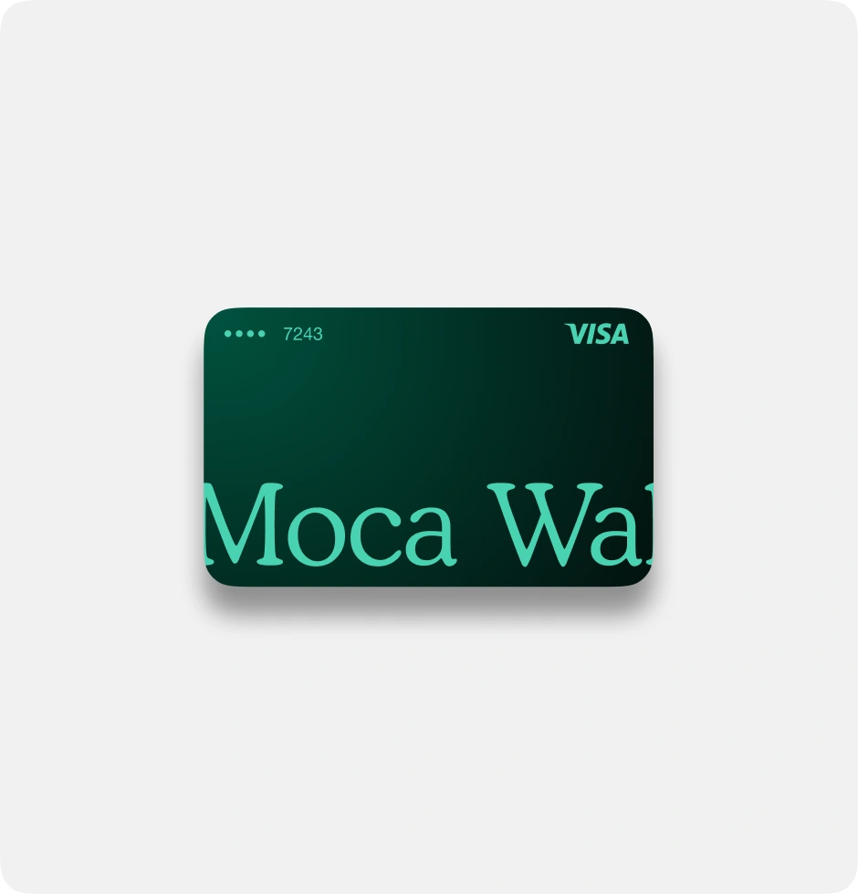
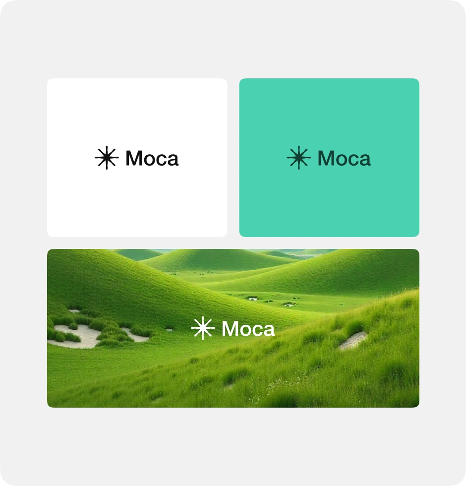
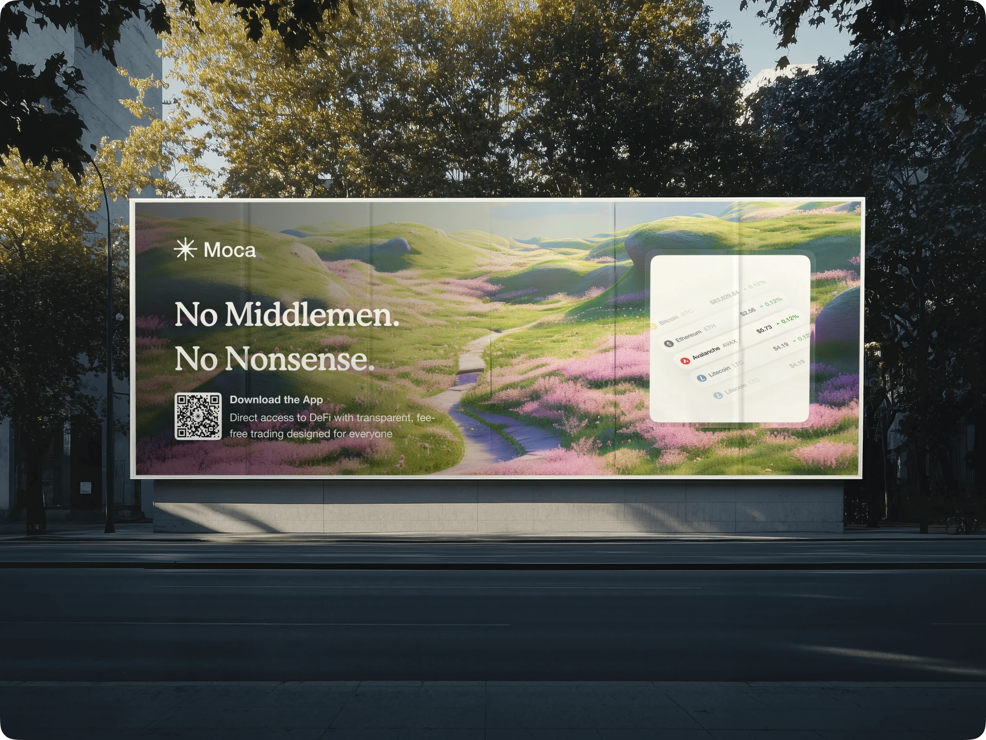
Moca’s identity is built around clarity, sustainability, and trust. The logo features a simple starburst symbol paired with a clean sans-serif wordmark, representing energy, flow, and connection in decentralized finance.
The brand’s color palette balances fresh green tones with neutral black and white. The green conveys growth, sustainability, and innovation, while the monochrome versions ensure versatility and legibility across all use cases—from digital dashboards to physical assets.
The use of lush, rolling landscapes ties the brand visually to nature, reinforcing Moca’s commitment to sustainability. The imagery communicates freshness, renewal, and a lighter ecological footprint, positioning Moca as the eco-conscious choice in decentralized trading.
Design Philosophy
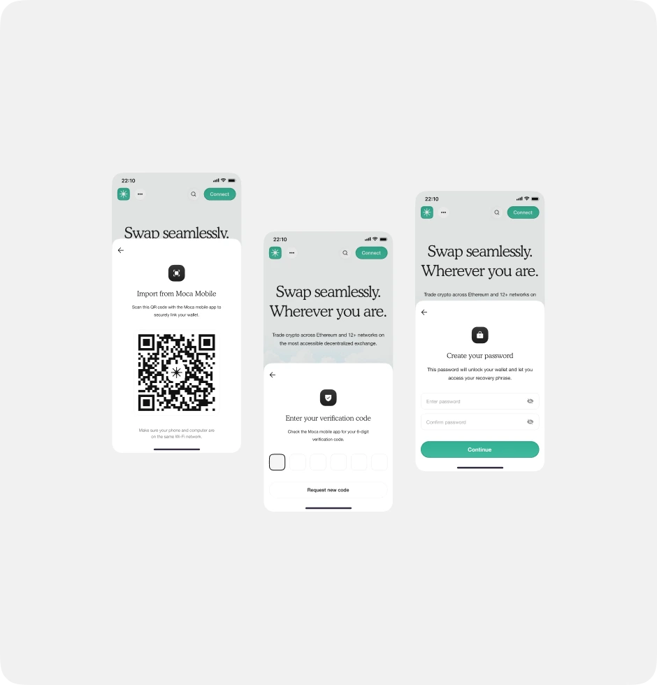
Moca’s design language is minimal, modern, and approachable. The visual system avoids clutter, embraces whitespace, and leans into nature-inspired hues—allowing the product experience to feel as effortless and sustainable as its mission.
Like this project
Posted Aug 26, 2025
Developed a sustainable brand identity for Moca, a decentralized exchange (DEX). Moca is a code name and not the name of the actual startup.
Likes
3
Views
52
Timeline
Jul 1, 2025 - Jul 10, 2025