St. Mary's Hospital: Appointment-First Website Concept

Anyadi Onyekachukwu


St. Mary's Hospital
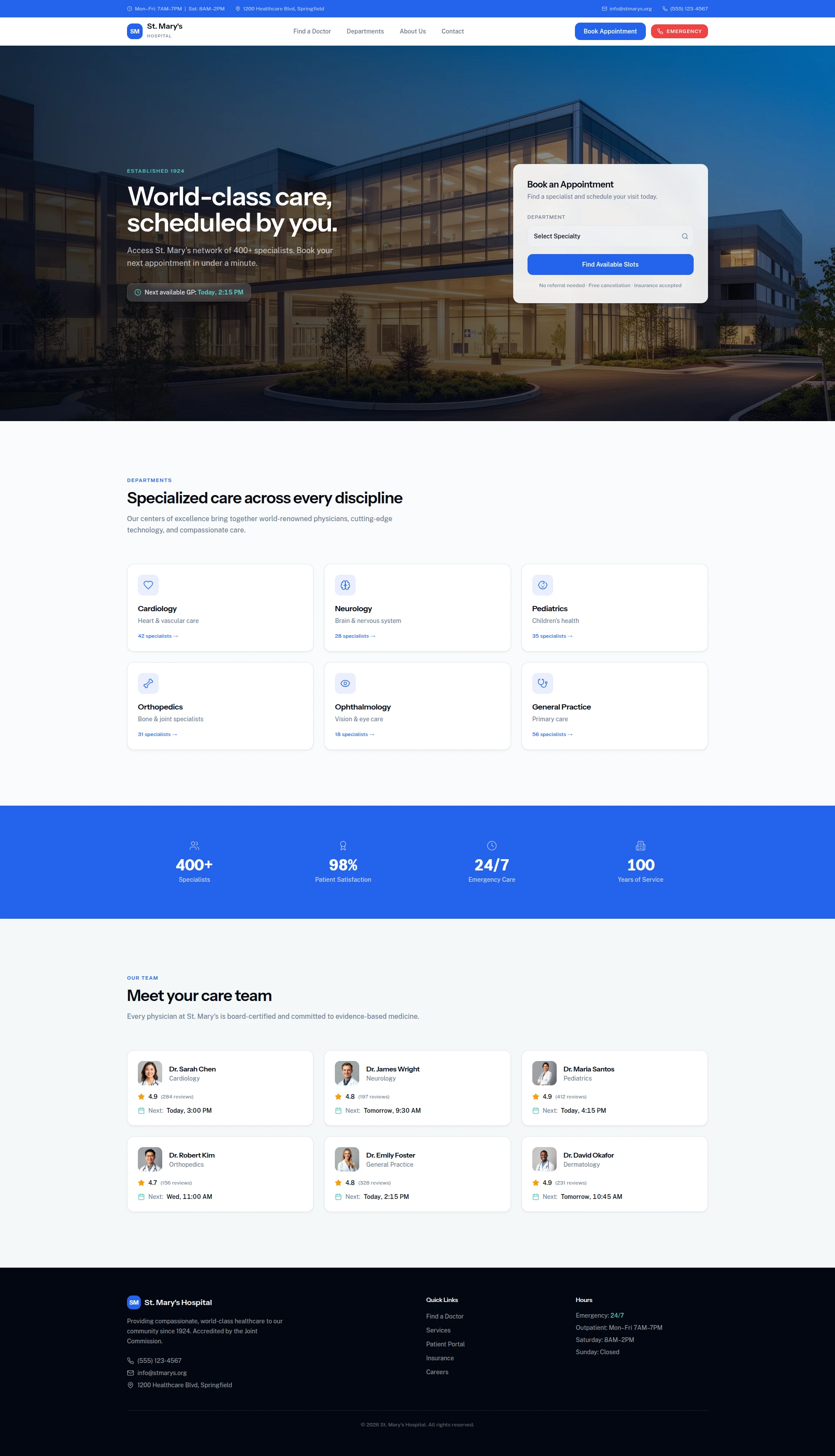
St. Mary's Hospital landing page
Appointment-first healthcare website concept
Concept project. I designed and built this healthcare landing page concept to explore a clearer path from “I need a doctor” to beginning an appointment request. It is not client work and the hospital, care-team, availability, and service information shown in the interface are illustrative.
Live concept: https://maryhospital.vercel.app
The design problem
Healthcare visitors may be stressed, short on time, or looking for urgent help. A hospital website needs to build confidence quickly, make the next action obvious, and keep emergency contact separate from routine appointment booking.
The approach
I made booking the primary action from the first screen, then organized the rest of the page around the information a visitor might need before taking that step.
Appointment action in the hero: A booking card sits beside the main message so visitors can begin without searching through navigation.
Clear emergency path: The design separates emergency contact from routine booking with its own visually distinct action.
Visible utility information: Contact details and opening-hours information are placed near the top of the page for quick access.
Scannable care exploration: Sample department and practitioner cards demonstrate how visitors could browse specialties and understand availability.
Calm, accessible visual hierarchy: A blue and white palette supports a clinical tone, while red is reserved for emergency-related UI. Generous spacing, large headings, and clear calls to action keep the page easy to scan.
My role
I handled the UI and frontend implementation, including the page structure, responsive layout, booking interaction concept, visual hierarchy, and component styling.
Stack
Next.js, React, TypeScript, Tailwind CSS, Supabase, and Lovable.
Outcome
The result is a working landing-page concept that demonstrates an appointment-led healthcare experience, with routine booking and emergency contact given distinct paths.
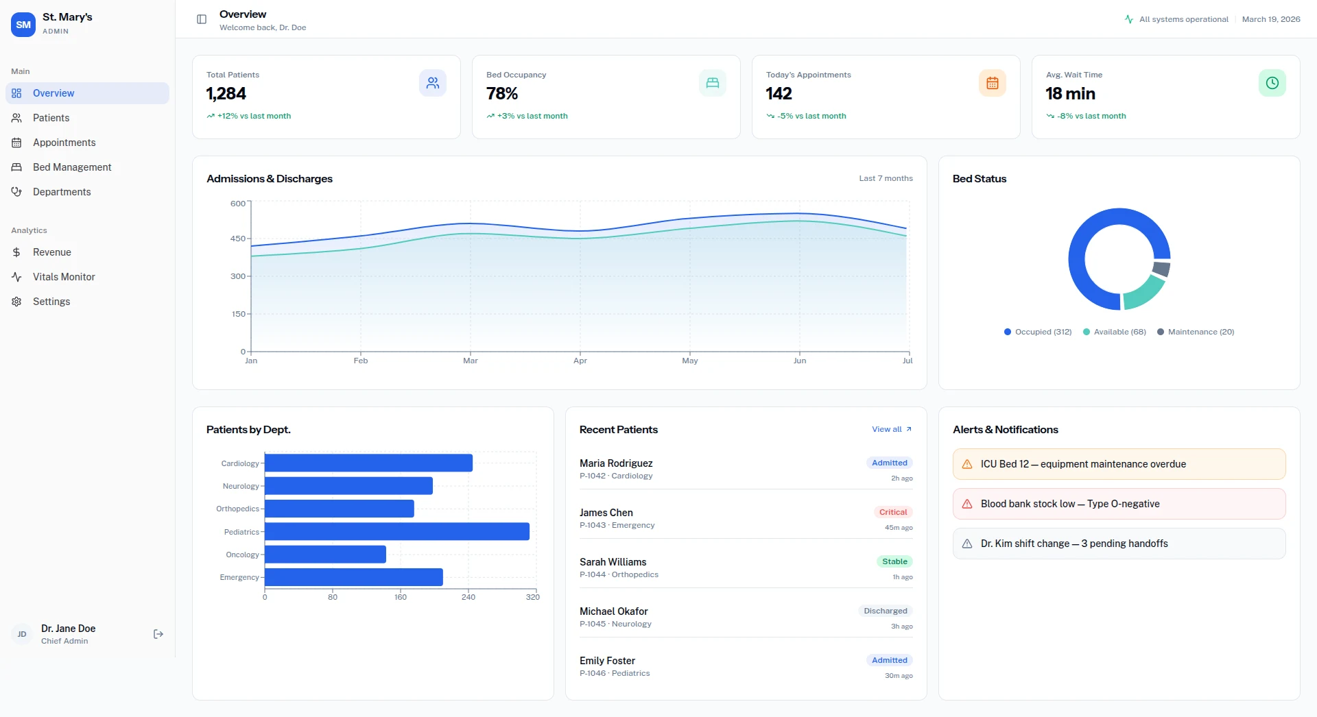
St. Mary's Hospital page overview
Like this project
Posted Oct 10, 2026
A concept healthcare landing page designed to make appointment booking clear, fast, and distinct from emergency contact paths.