GEHA
Brian White
Overview
A brand that was dated needed a quick complete overhaul for Fall before the take over of the iconic Chiefs stadium in Kansas City.
Challenge
The GEHA brand was dated, muted, and had multiple issues with readability. Brian White Design created initial mood boards and style tiles to show how the brand might look. We built a solid new design system for a fresh brighter look with patterning and icons that are easy to implement. As the brand pieces starting working together they hired me to design a new interactive look for their website and email marketing.
Our project approach and deliverables
Collective brain-storming sessions
Ideation & Styles
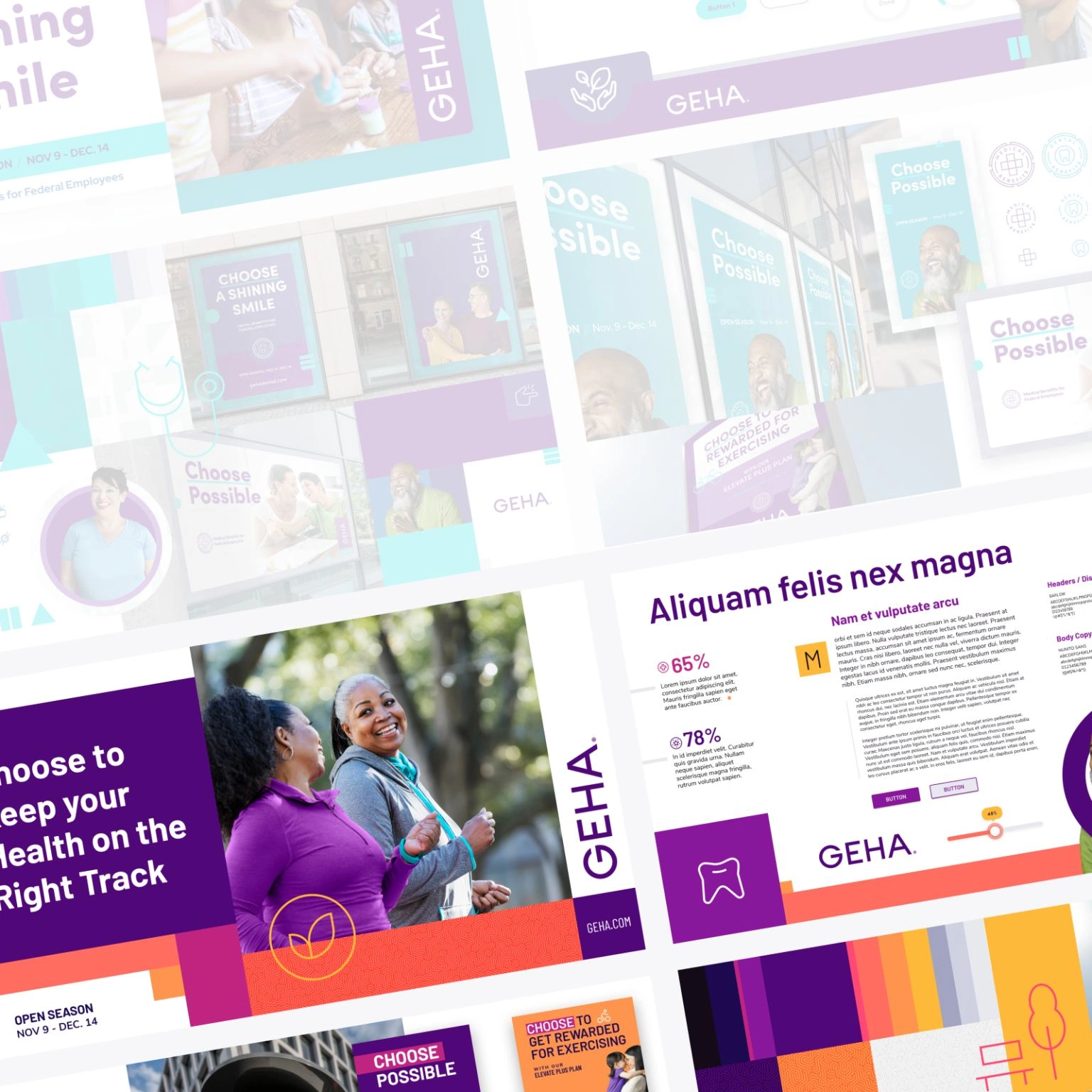
Design System
Marketing templates
Icon Design
Patterning / Styling
User Interface Design
Style Tiles and Moodboards
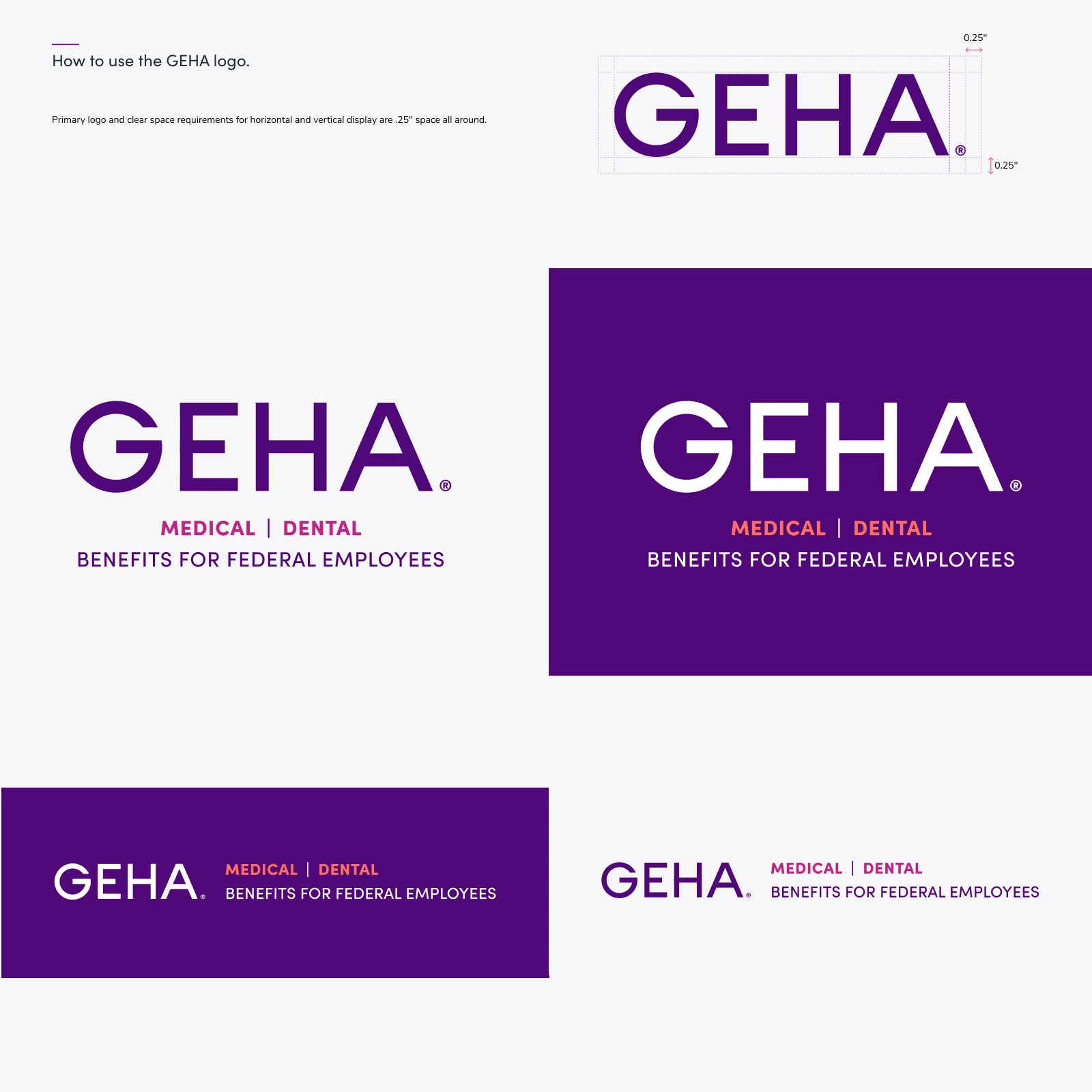
Not often do you hear “Go for it”. I was given tons of room to iterate and ideate on what I felt would be the best next-step forward for GEHA’s brand refresh. Every base aspect of the brand was re-envisioned. I was given a blank slate and could make whatever I thought would help the brand. The design system I made was adaptable to multiple sizes and shapes of art boards making it easy to shift for application.
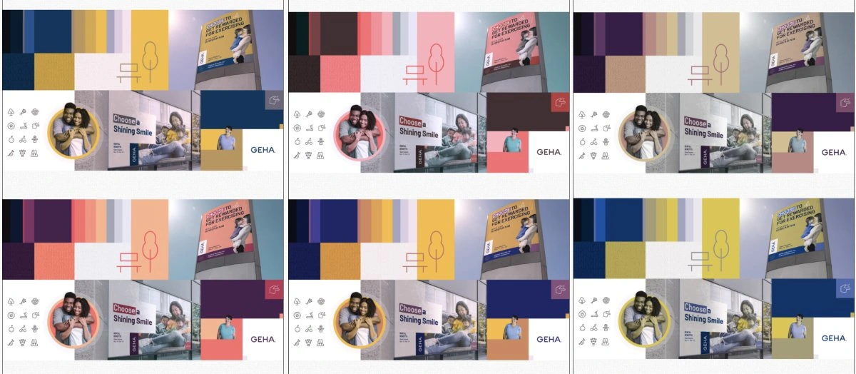
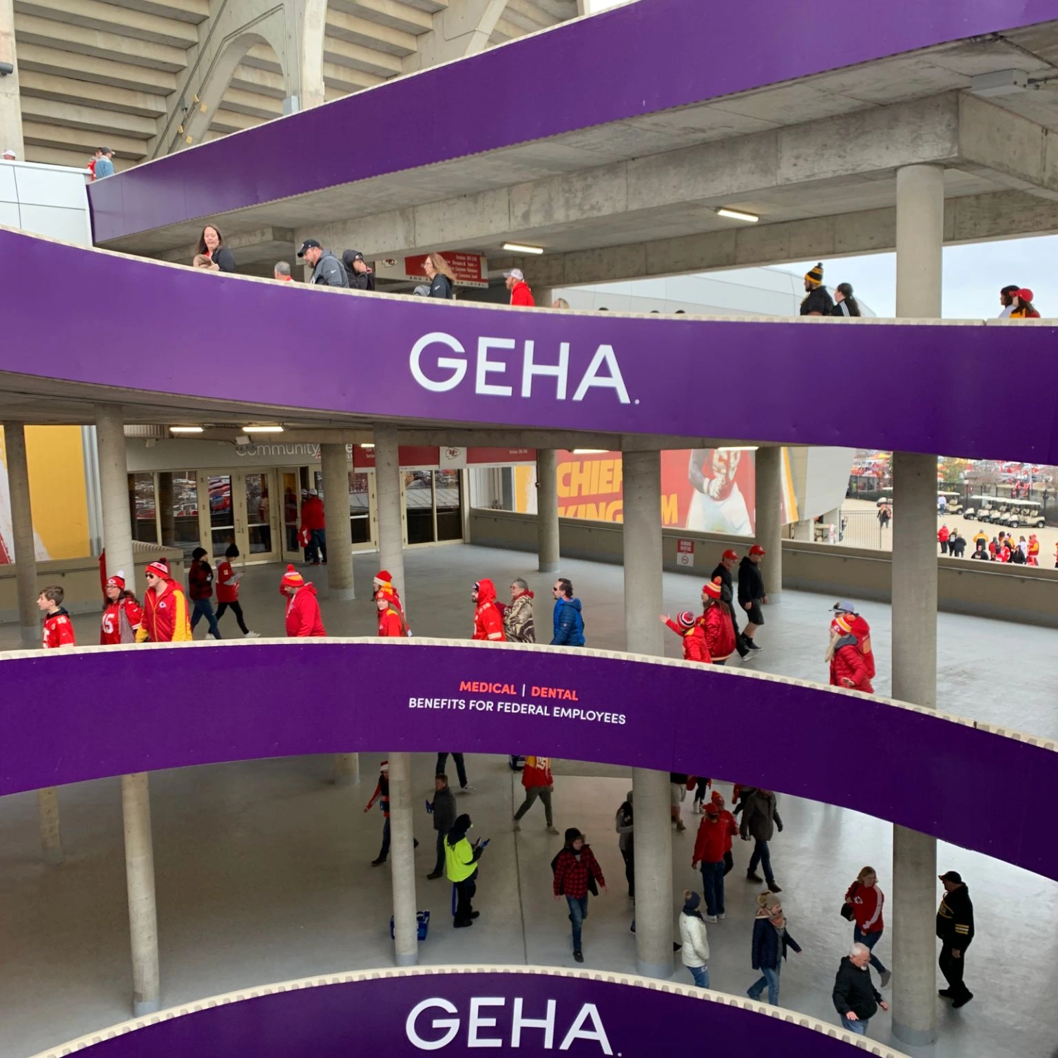
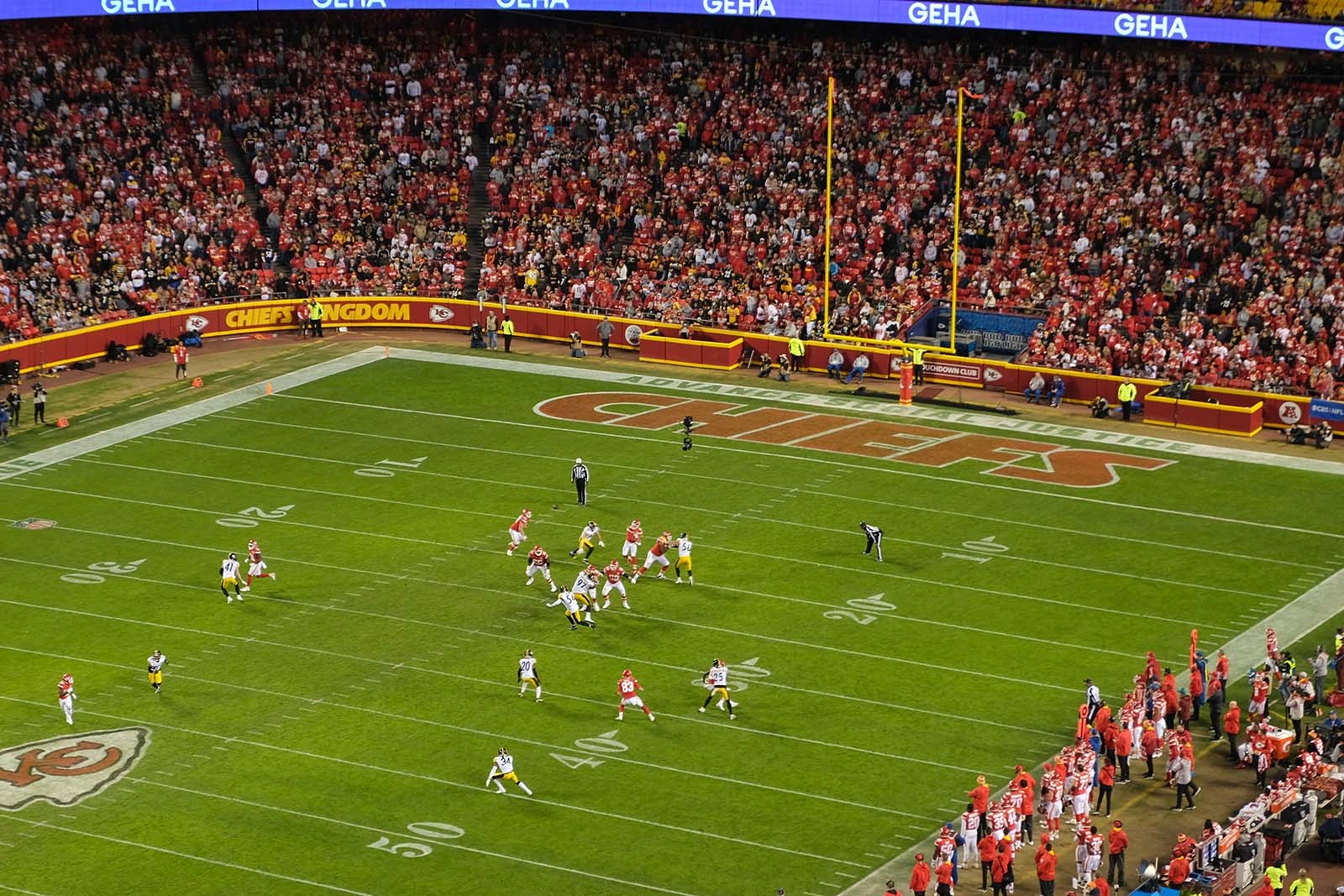
I pitched two style tiles with completely different color schemes. One was only cooler tones and this warm and approachable version was chosen. I was thankful to get to see the Chiefs play the Steelers and get a few shots of the marks at Arrowhead. What a game!
**note: I didn’t do the GEHA logo type.
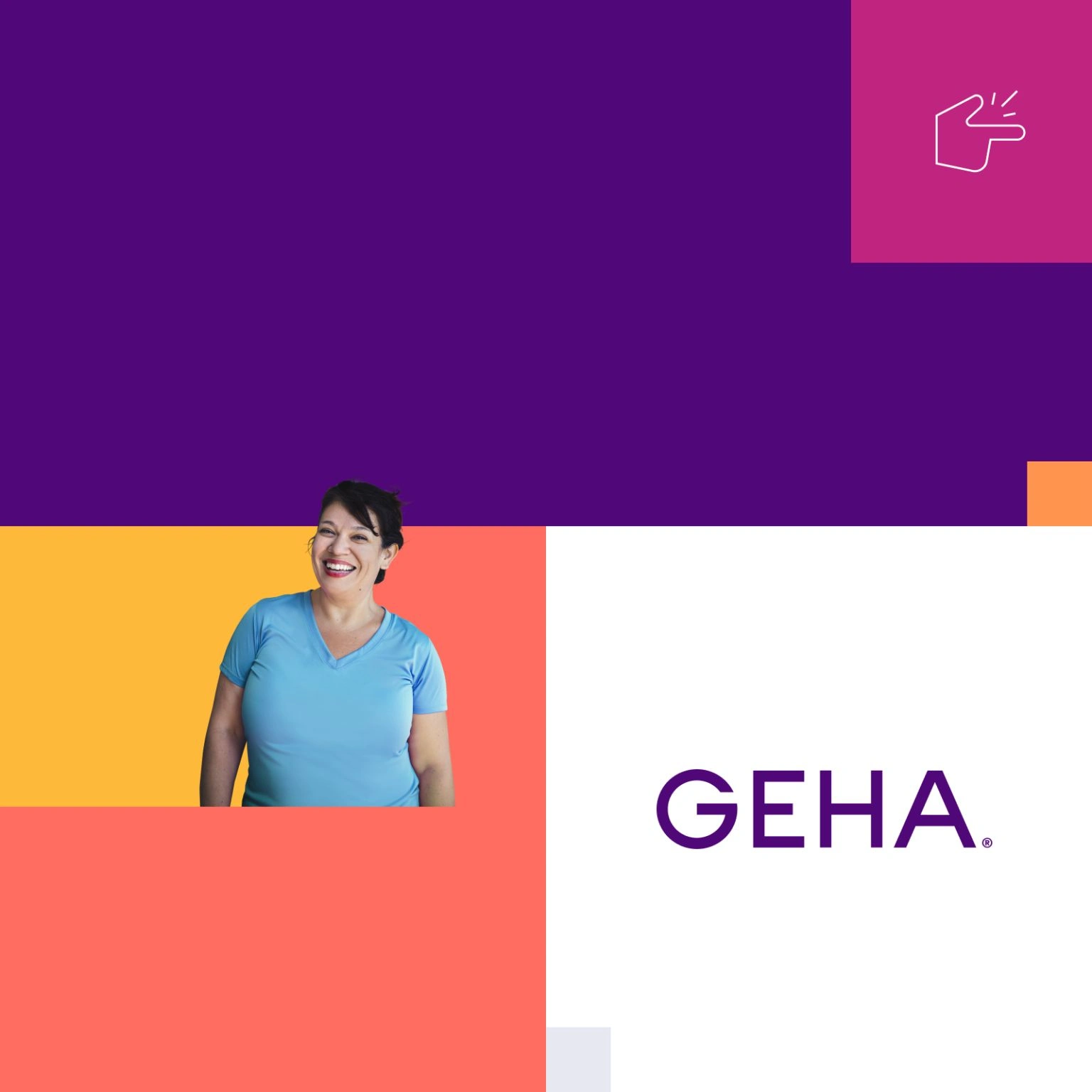
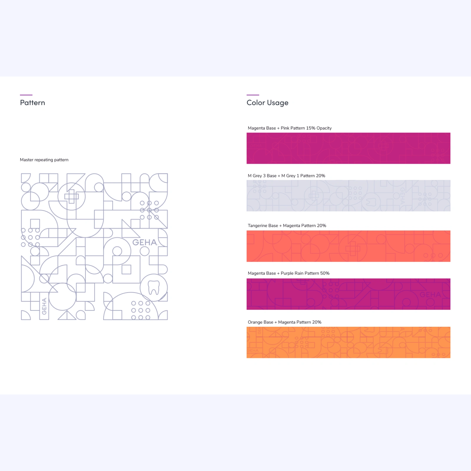
COLOR
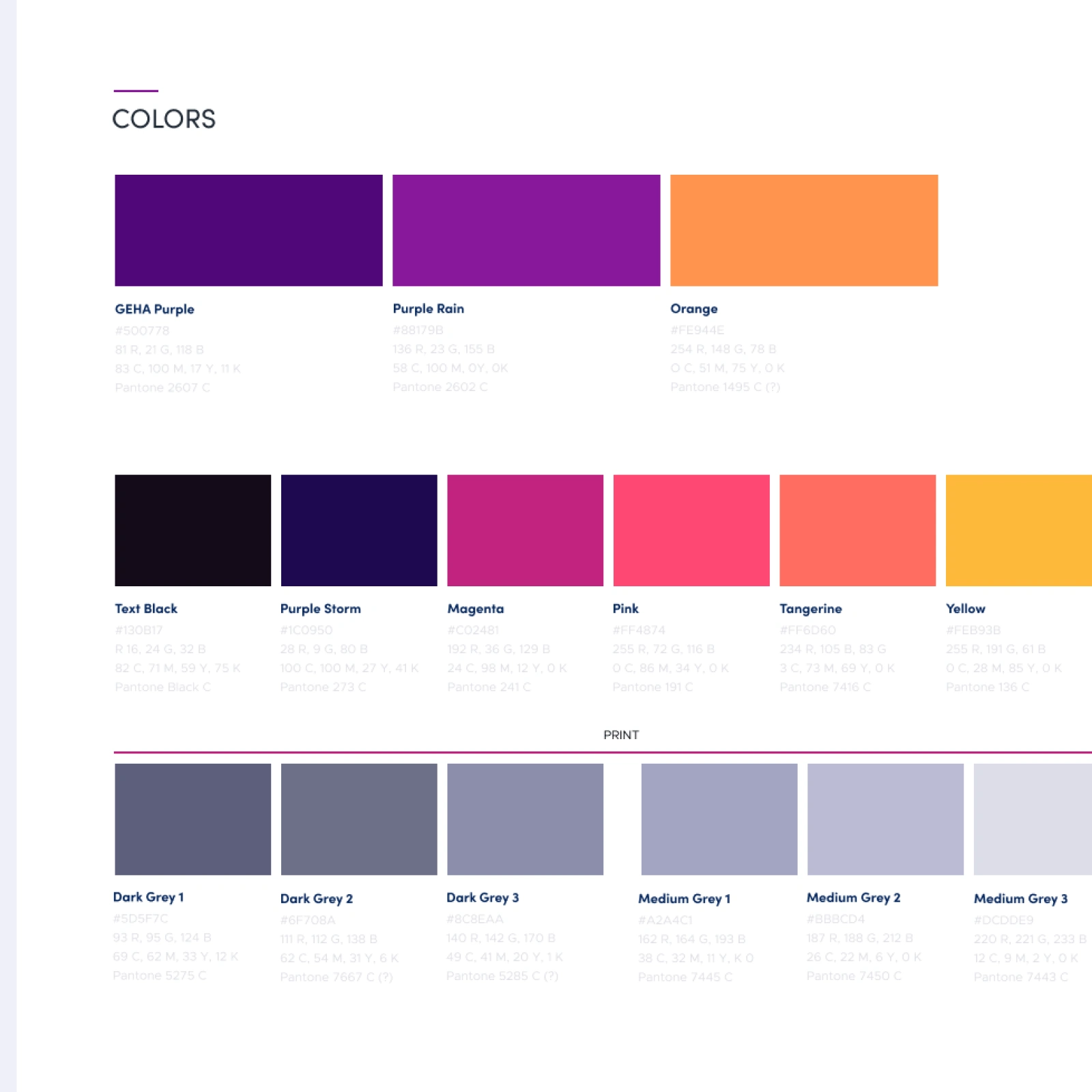
New color choices were bright, warm, and welcoming. The Grey’s were built directly off the main GEHA purple to give it warmth even in neutral spaces.
BRAND-SPECIFIC COLOR

BRAND-SPECIFIC COLOR
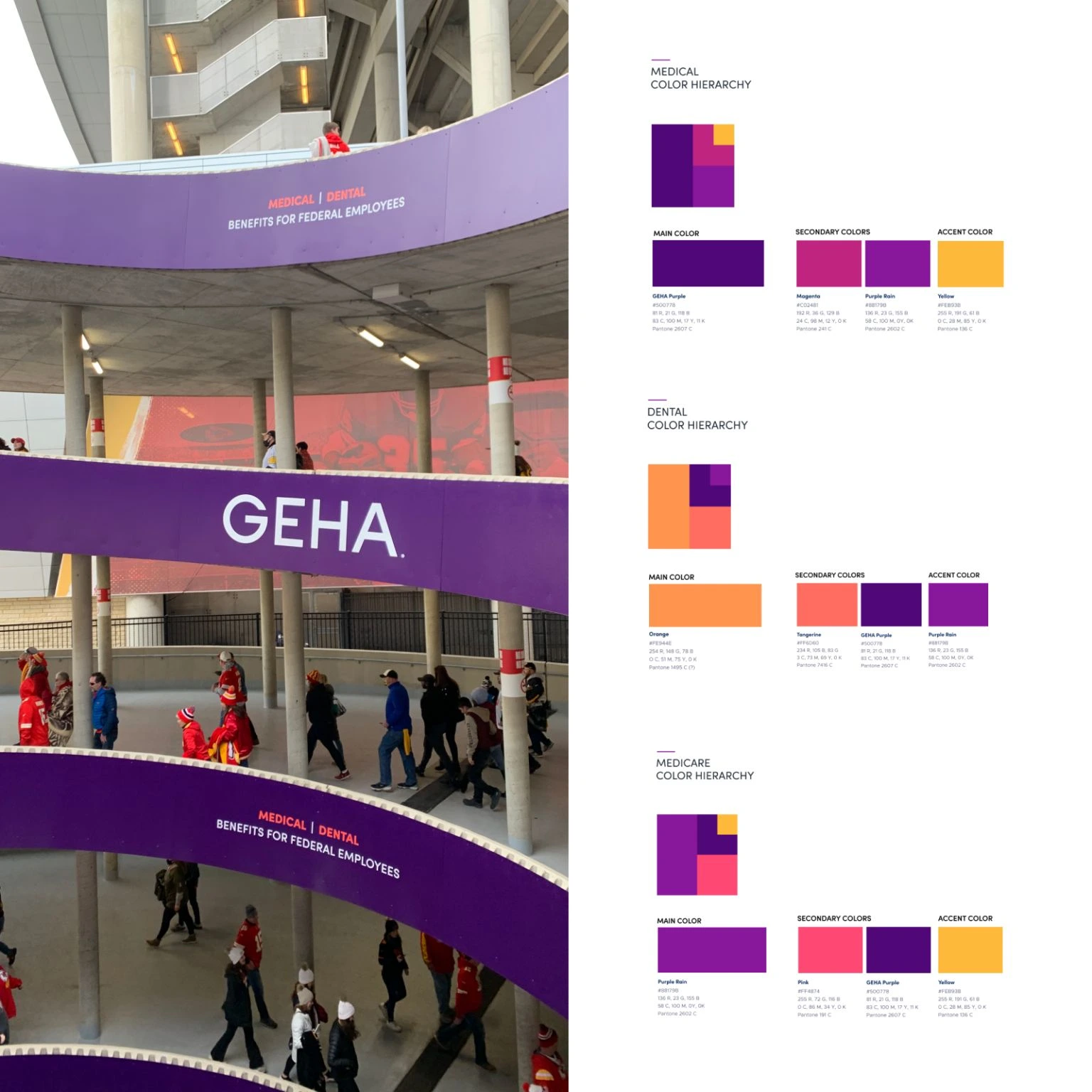
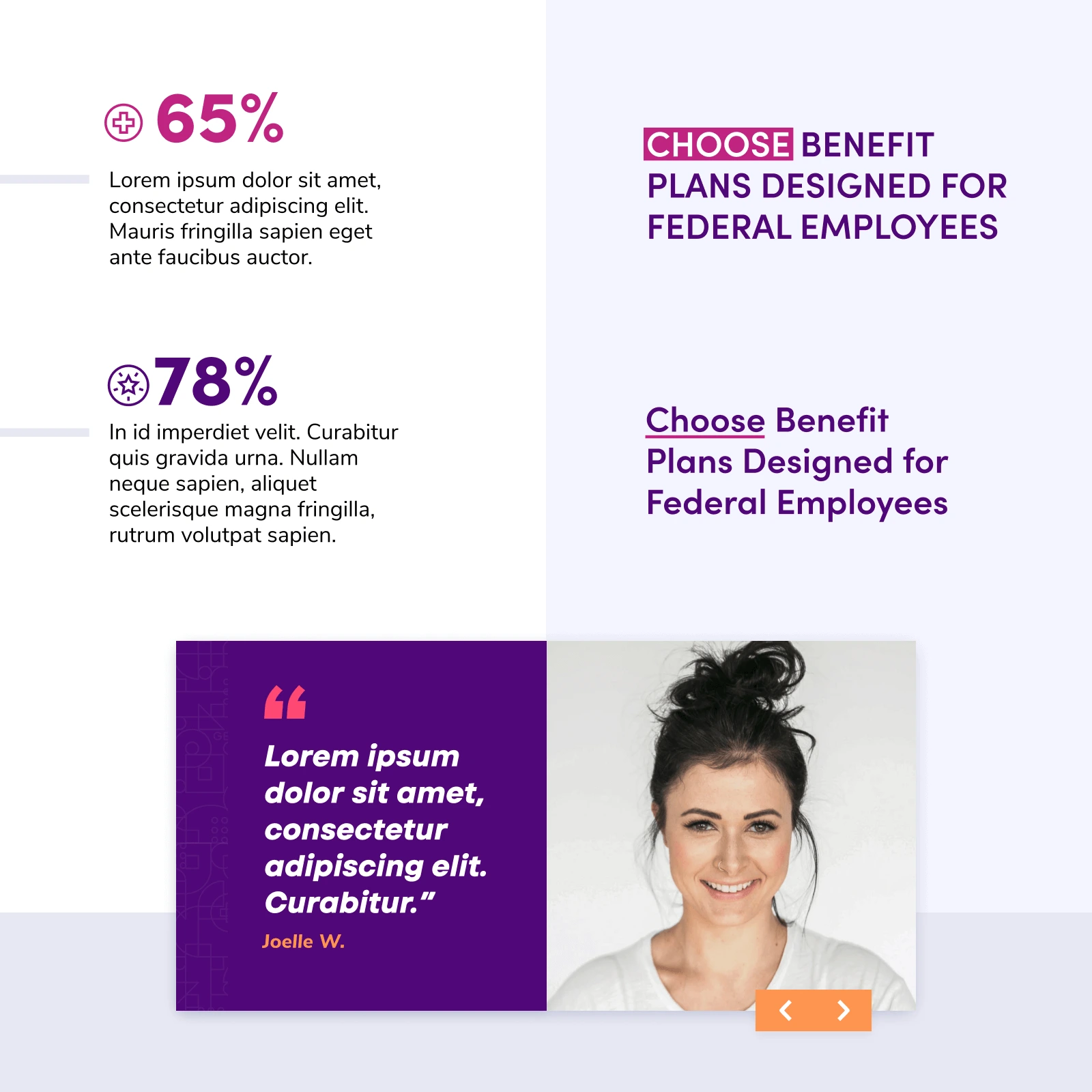
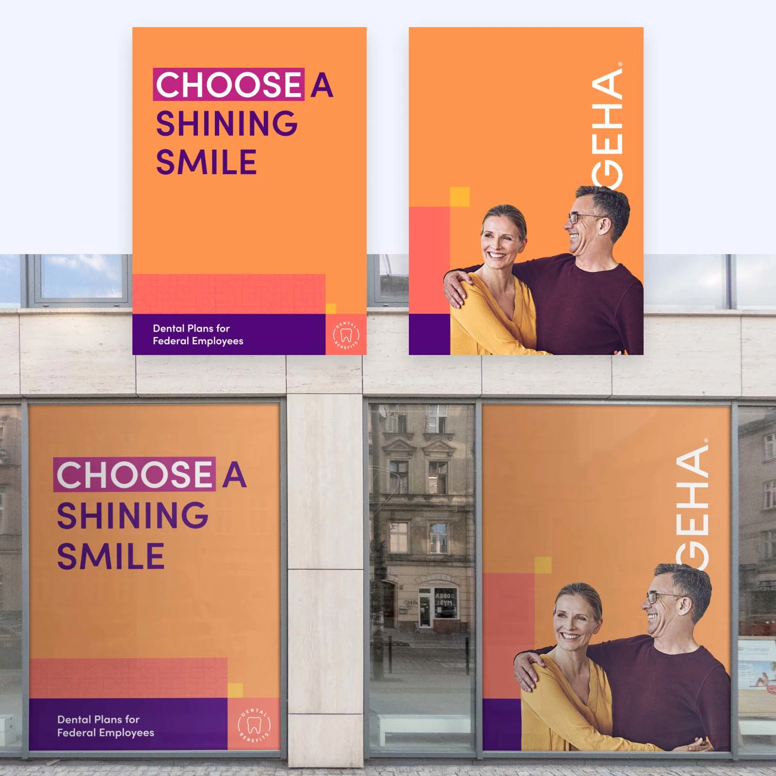
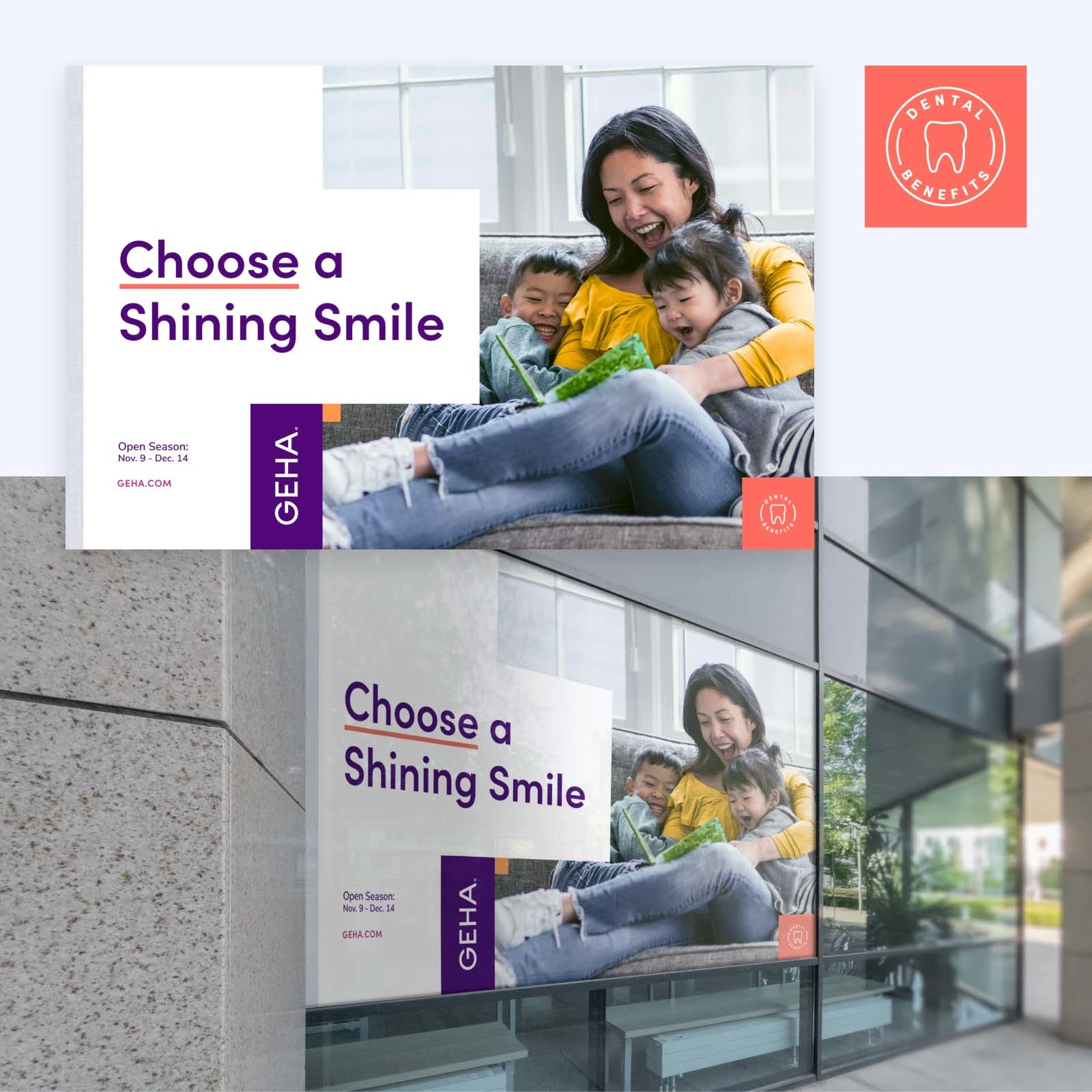
Their old colors were slightly dull and abrasive in certain combinations. I made an entirely new palette with subsets for each type of insurance. By using the same color palette but shifting the main colors for a specific focus, the brand will stay more cohesive.
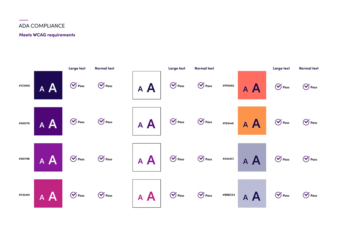
COLOR BLIND TESTS / ADA
I did tests on the main brand colors to see how color-blind people would view them and if the contrast and change between colors worked. I was amazed to see the changes to standard visual color that a small percentage of people deal with daily. The final colors were tested directly to work with ADA compliancy.
TYPOGRAPHY
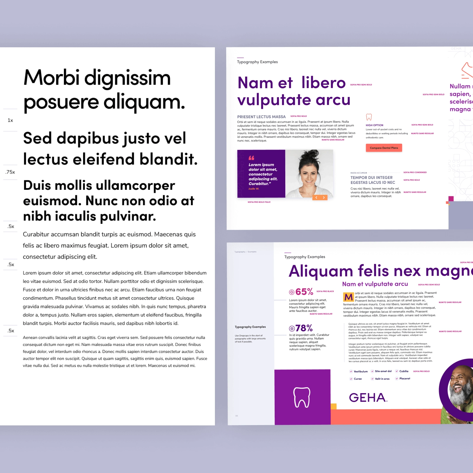
New typography choices were meant to convey readable, upbeat, warm, and approachable.
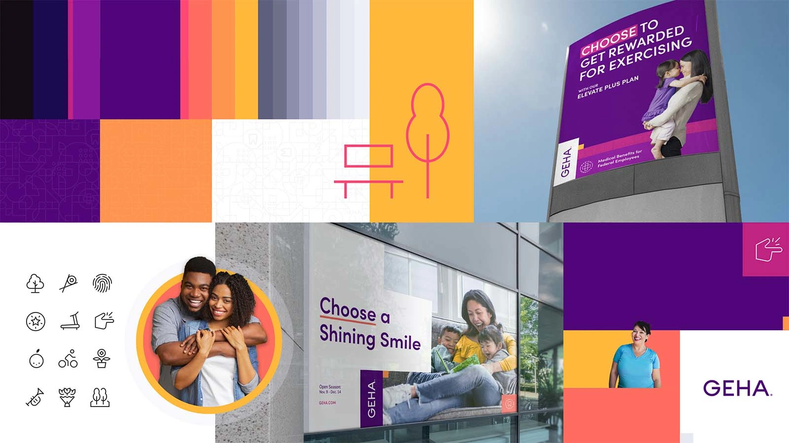
PATTERNING
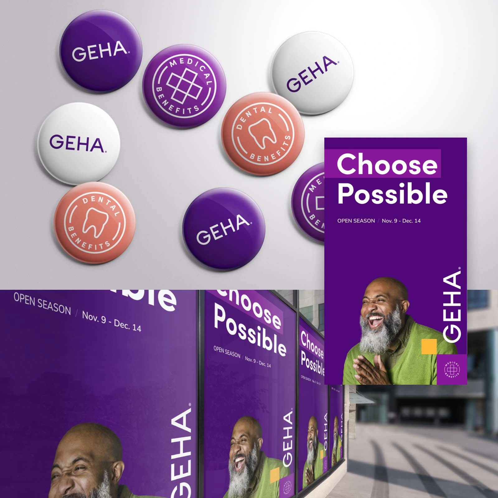
LOCK UPS
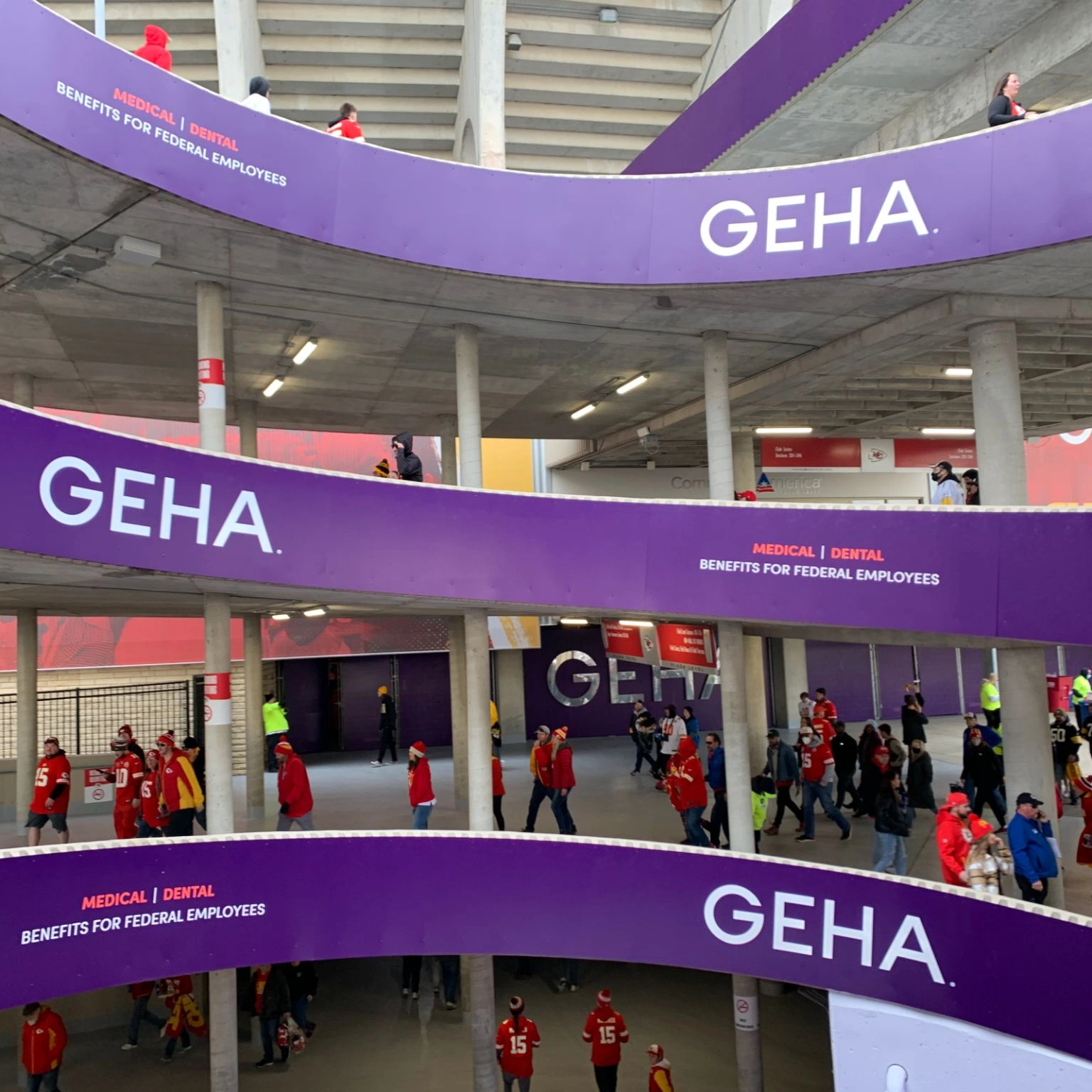
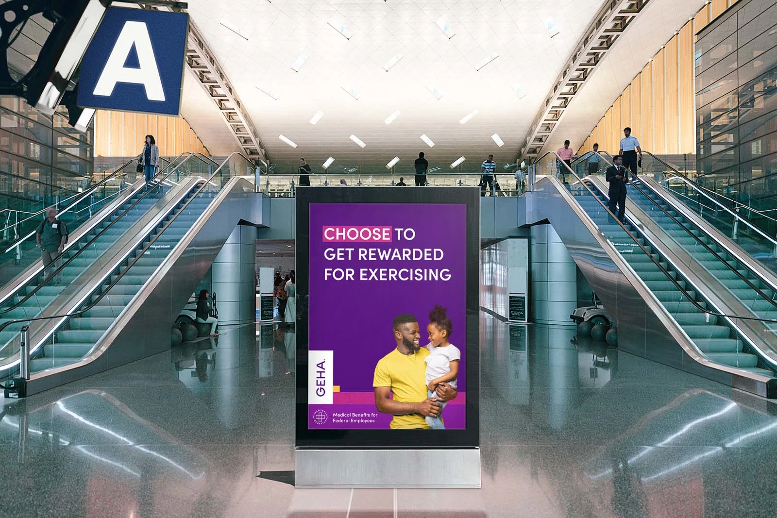
It was a blast to see the lockup designs I did huge in the stadium.
PATTERNING
PATTERNING
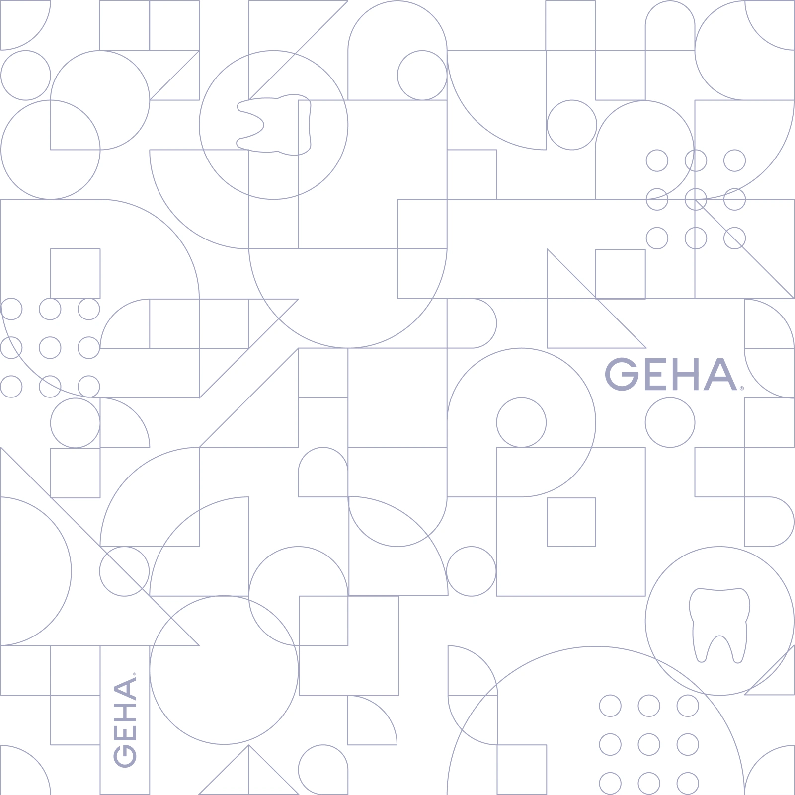
I came up with a new pattern system for the brand including multiple variations including a medical cross and tooth for various markets. The patterns are used throughout the brand in subtle ways to create a robust design system.
TYPOGRAPHY
ICON DESIGN
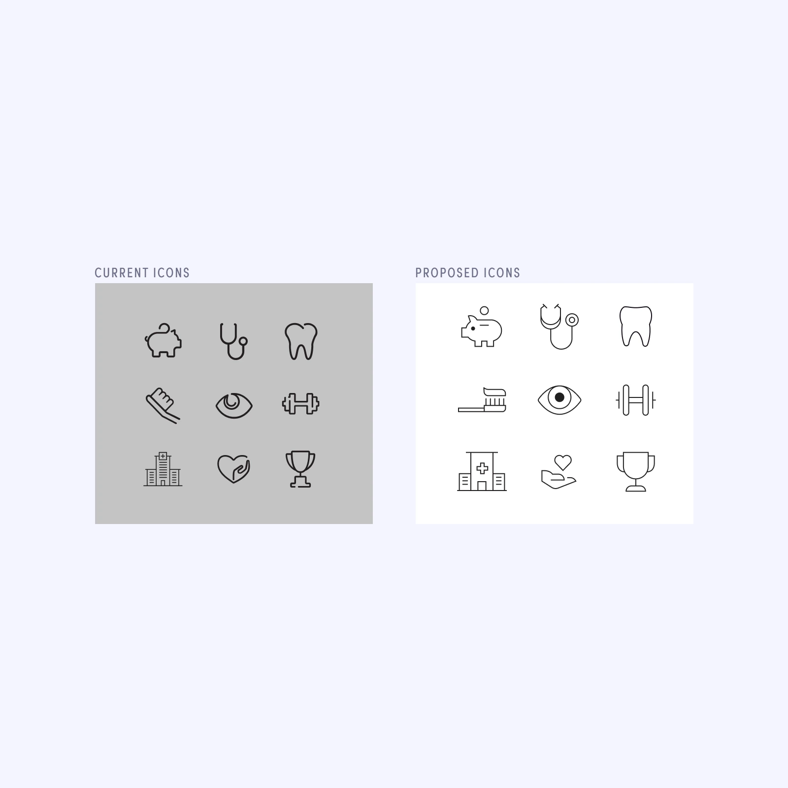
The old icons were dated using the “split path” type of icon that had a set-sized line weight making scaling incredibly hard. I came up with an algorithm for line weight and size scaling to ensure icons would scale correctly. Again, using the brand color system per market helps keep cohesiveness.
BADGES
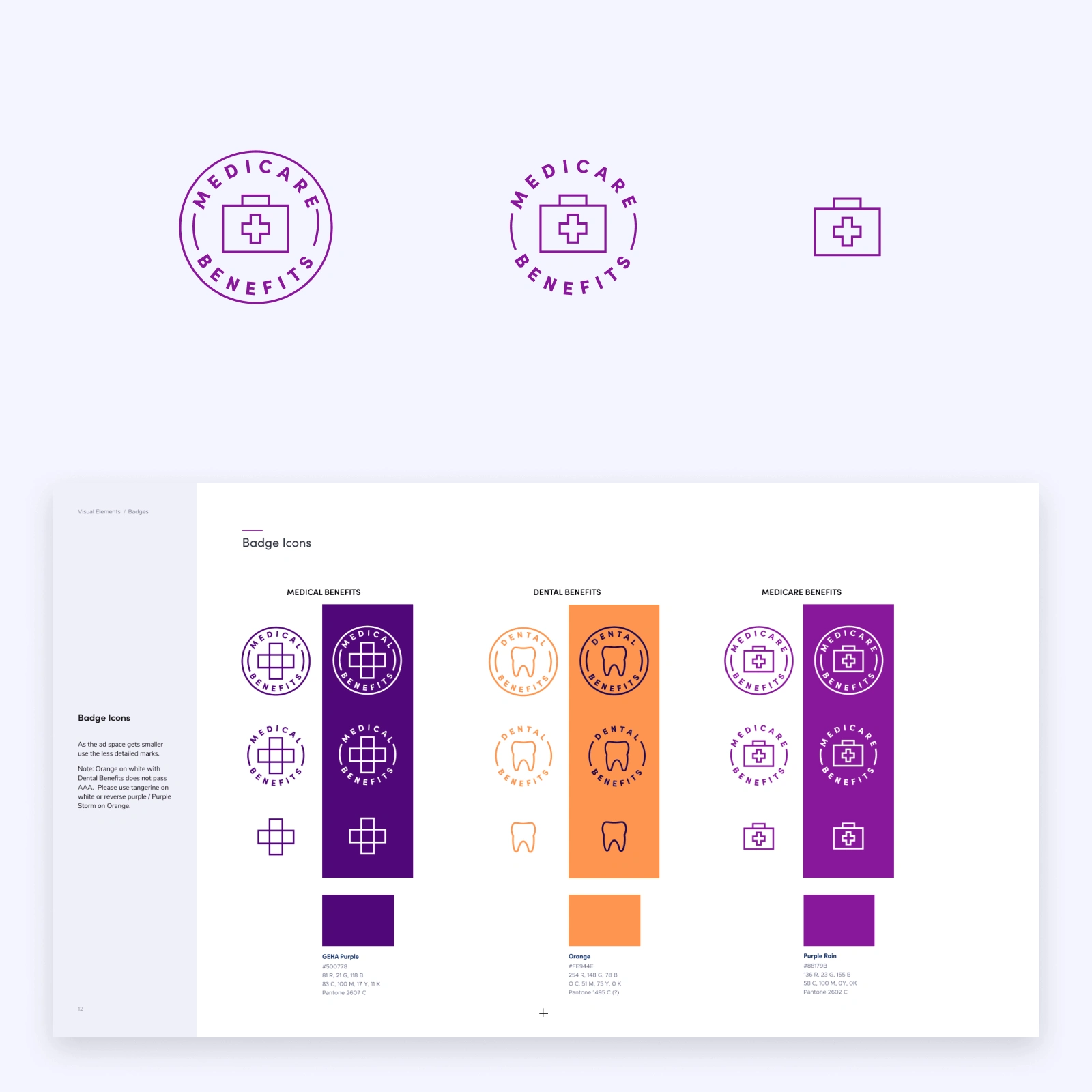
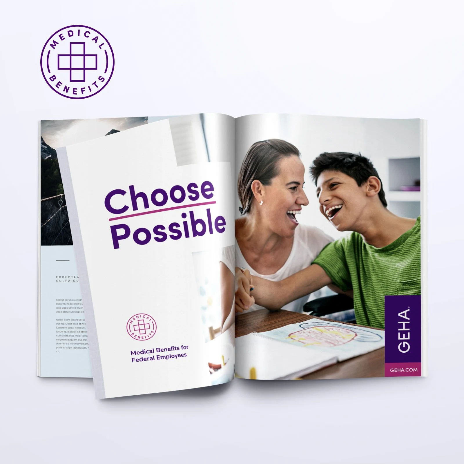
I created a new icon/badge system for the brand including Medical Benefits, Dental Benefits, and Medicare Benefits. The badges are responsive to the ad size and scale and simplify as needed. The badges can be used on both full-color backgrounds and light backgrounds and work well with the line-work patterns.
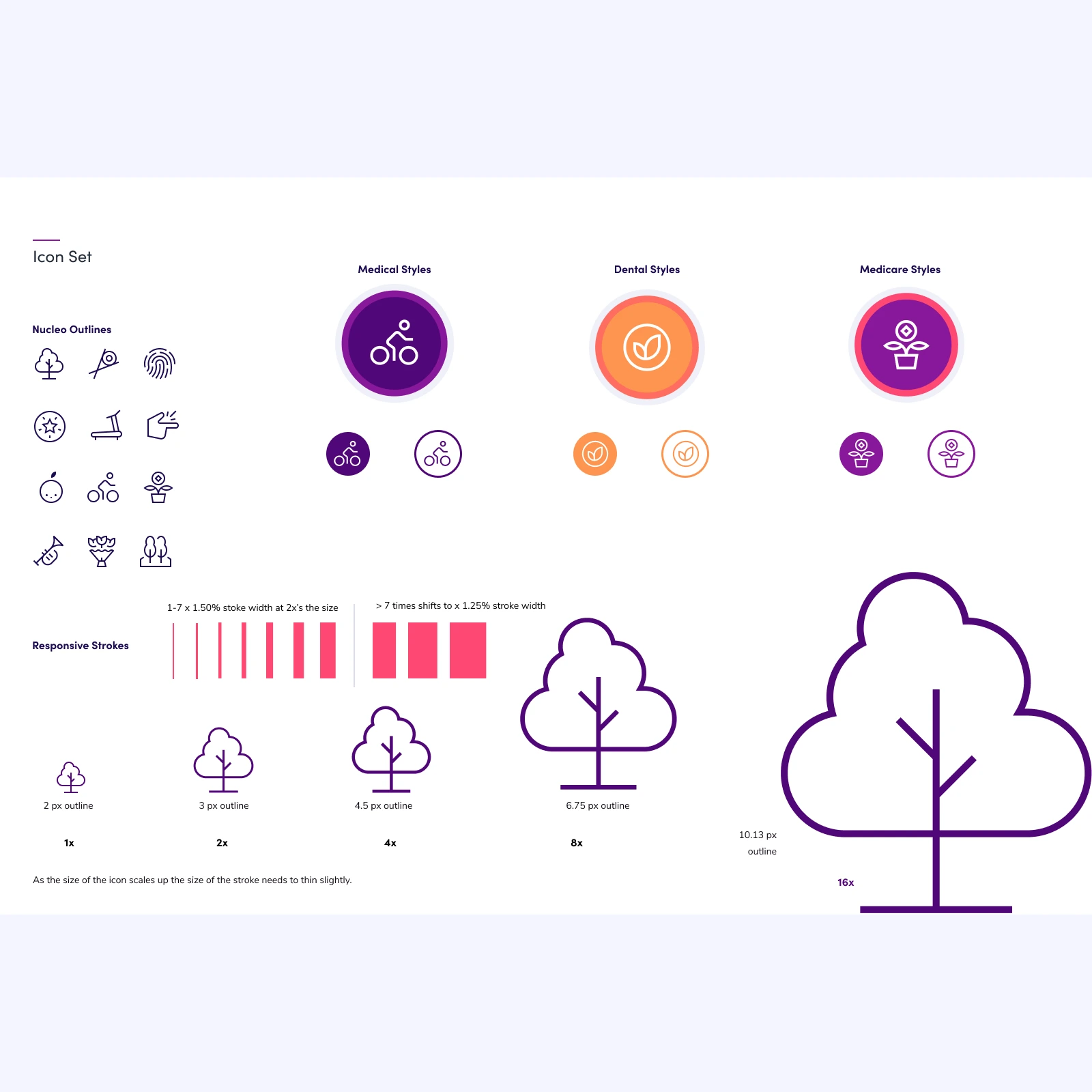
As the icons scale responsively the thickness of the line-work shifts to balance.
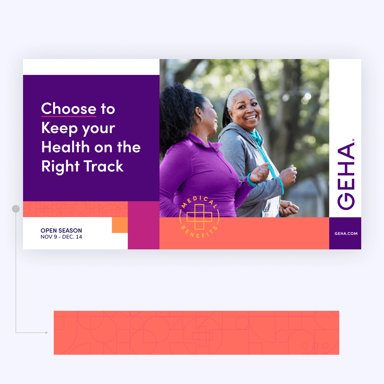
MARKETING DESIGN SysTEM
I came up with a math-based system for spacing and using the brand elements to make iterations and application of the brand easy for production and consistent.
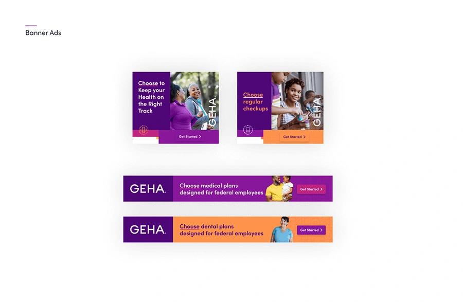
SOCIAL MEDIA
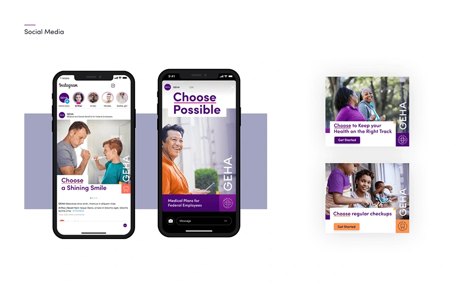
The brand elements worked great shifting from large scale down to social media and banner ads.
SOCIAL MEDIA
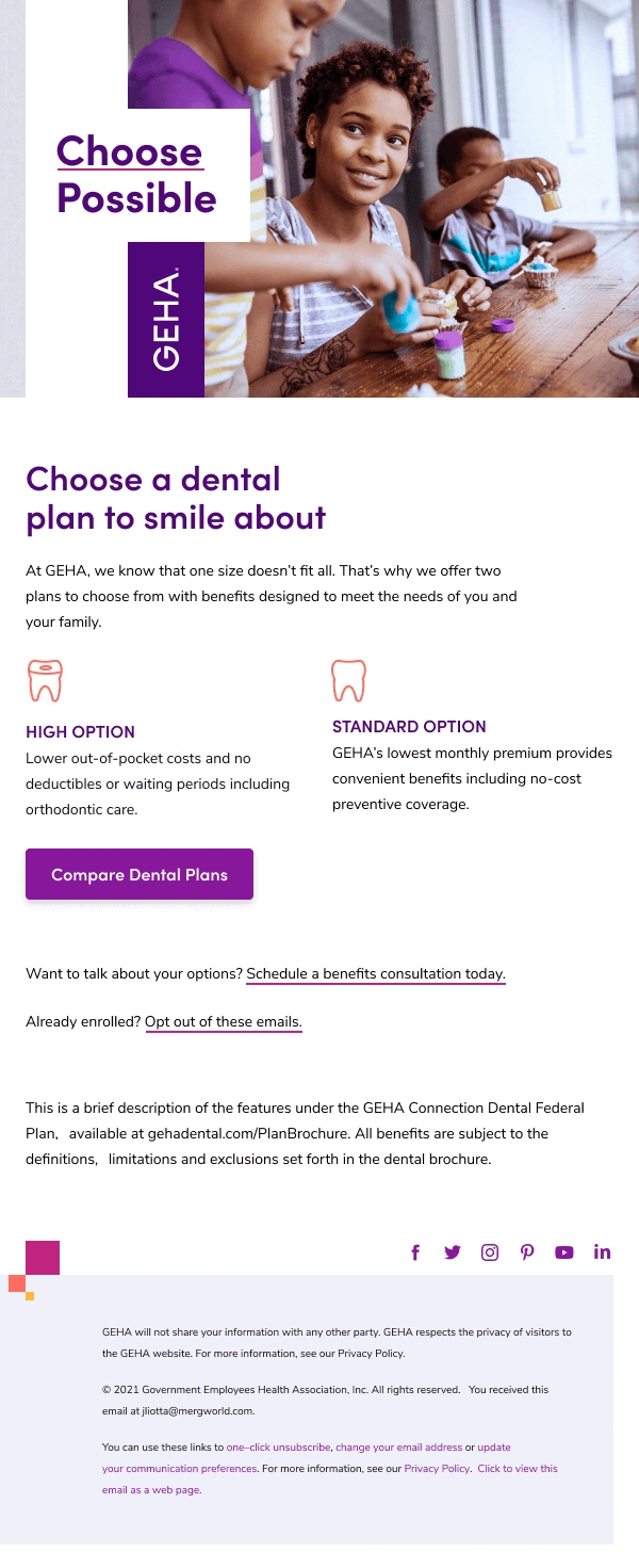
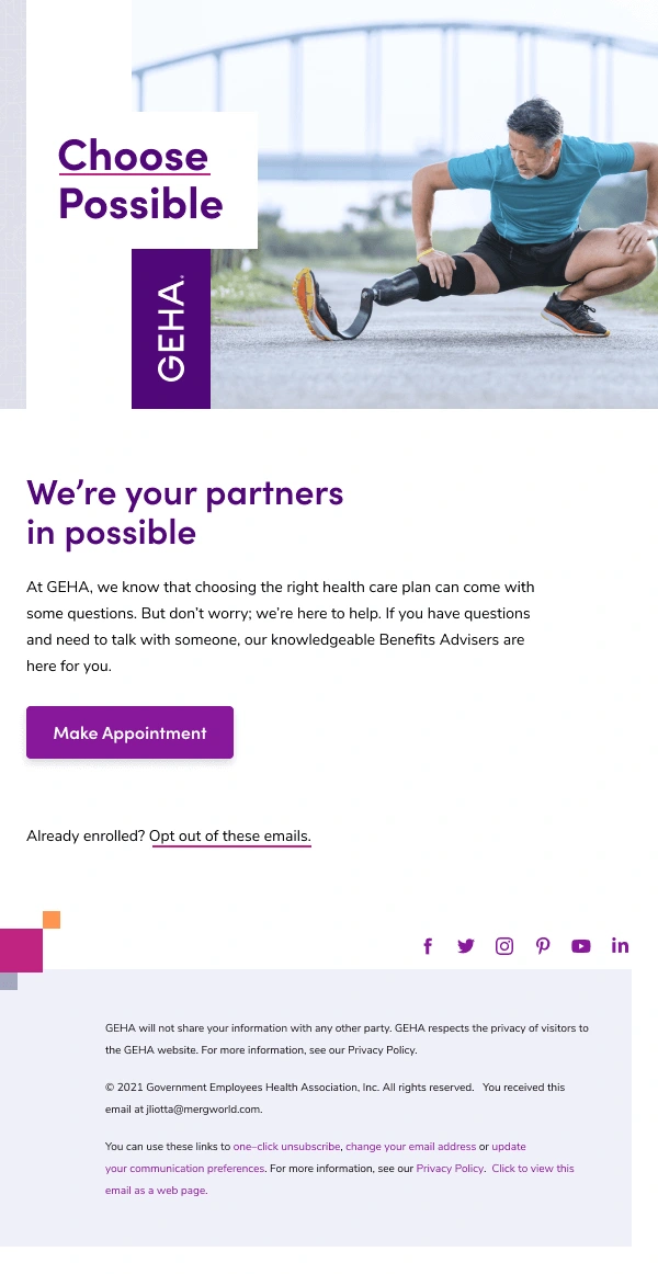
INTERACTIVE
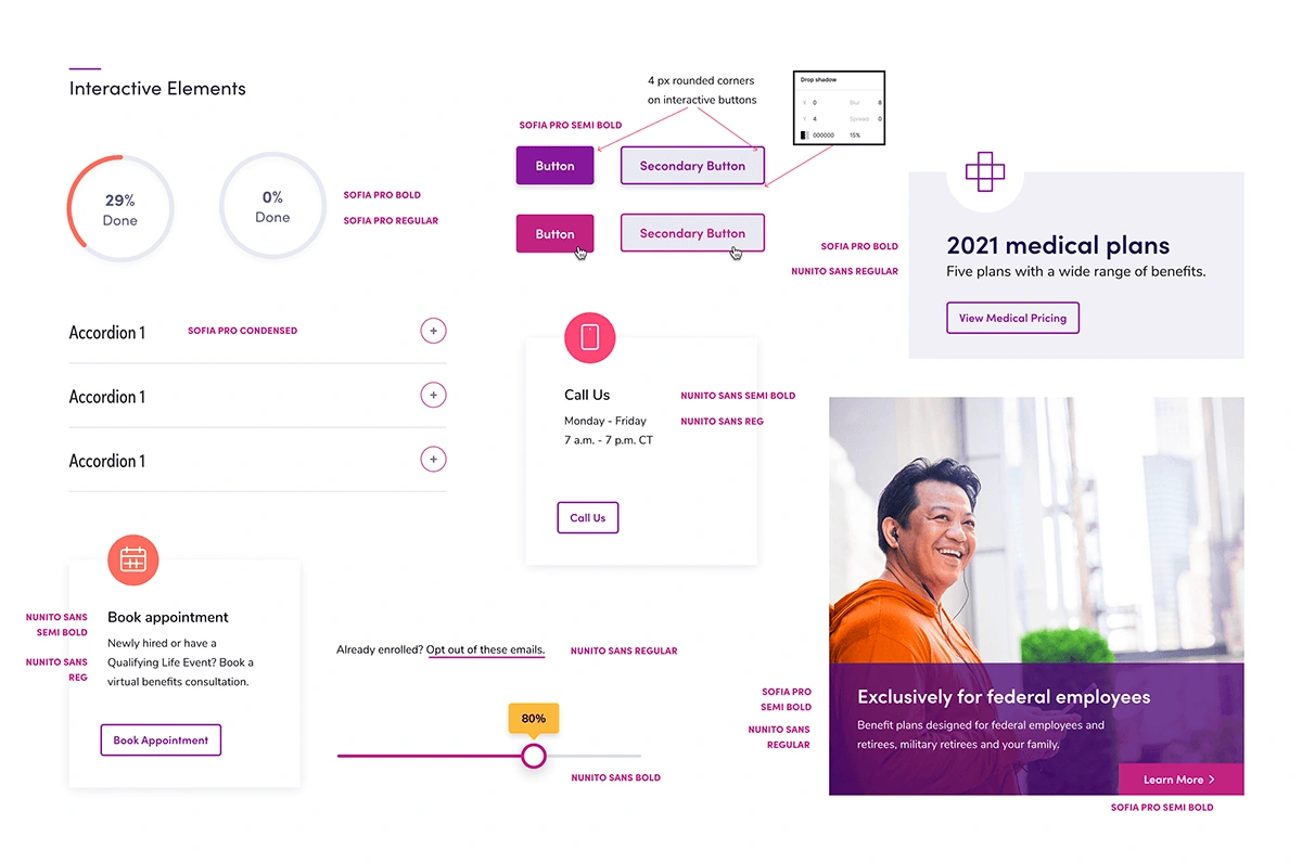
Design of various interactive elements to quickly see how the brand translates to web and email.
HOMEPAGE
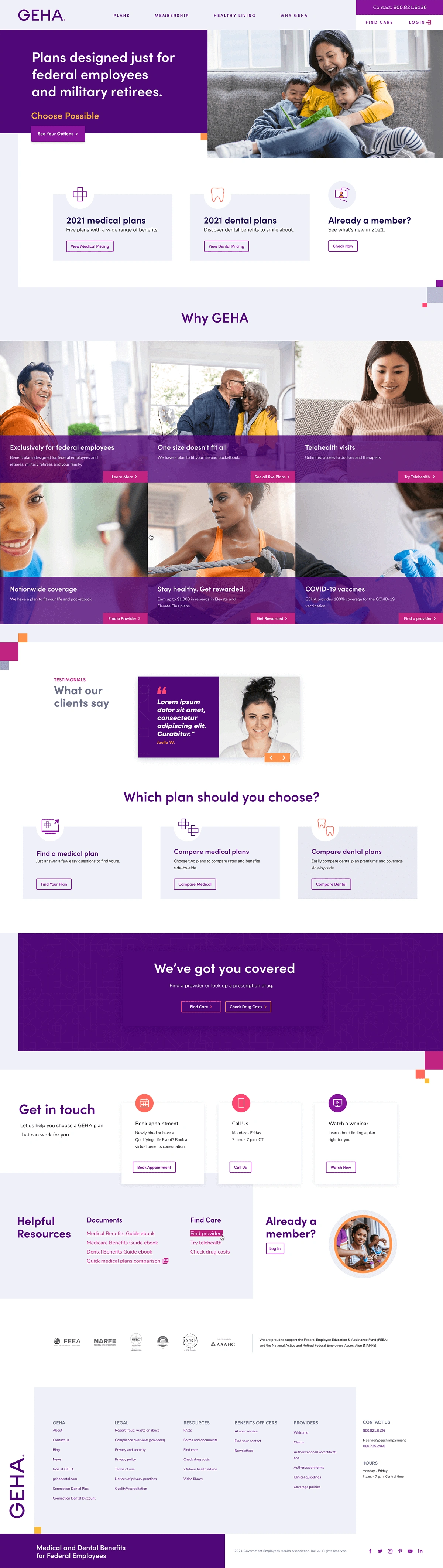
By using more white space and easier-to-see interactive color call-outs the site became more friendly and easier to use.
EMAIL DESIGN
HOMEPAGE
CONCLUSION
The new branding has been a hit and has been easy to implement in a variety of applications!
WHAT CAN I MAKE FOR YOU?
I work with organizations of all shapes and sizes.
Fill out my short project planner to get started.
Like this project
Posted Oct 4, 2023
Overview A brand that was dated needed a quick complete overhaul for Fall before the take over of the iconic Chiefs stadium in Kansas City.
Likes
0
Views
20
Clients
Geha