EGO — Waitlist

Adel Merabet

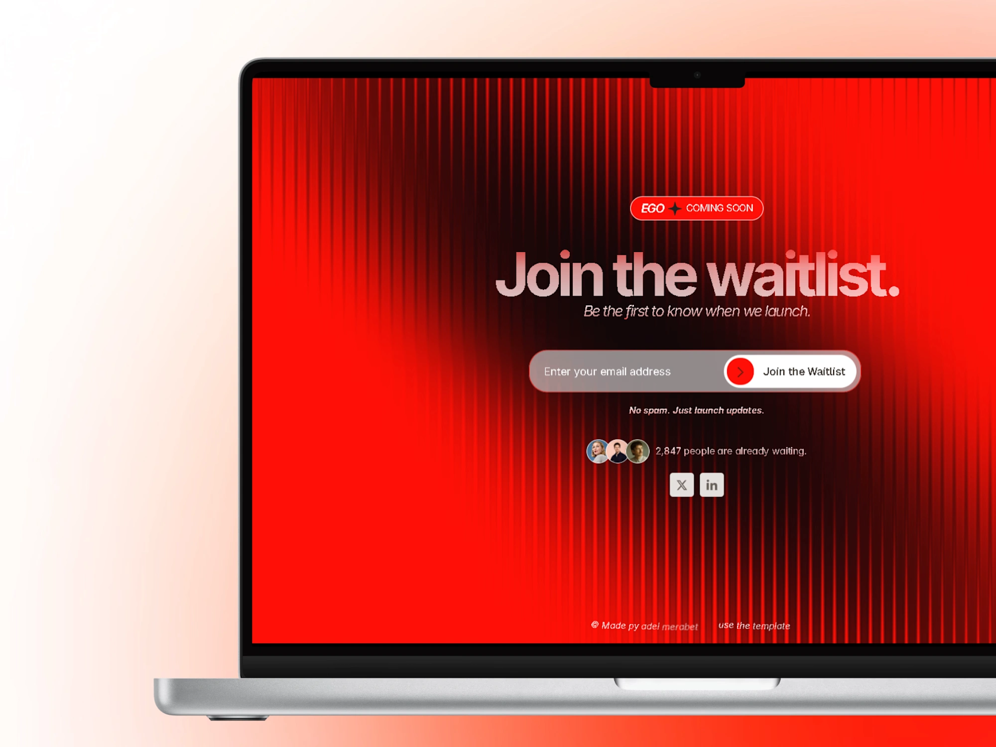
EGO Waitlist
A Framer waitlist template. A case study in making the first moment count.
01 — Overview
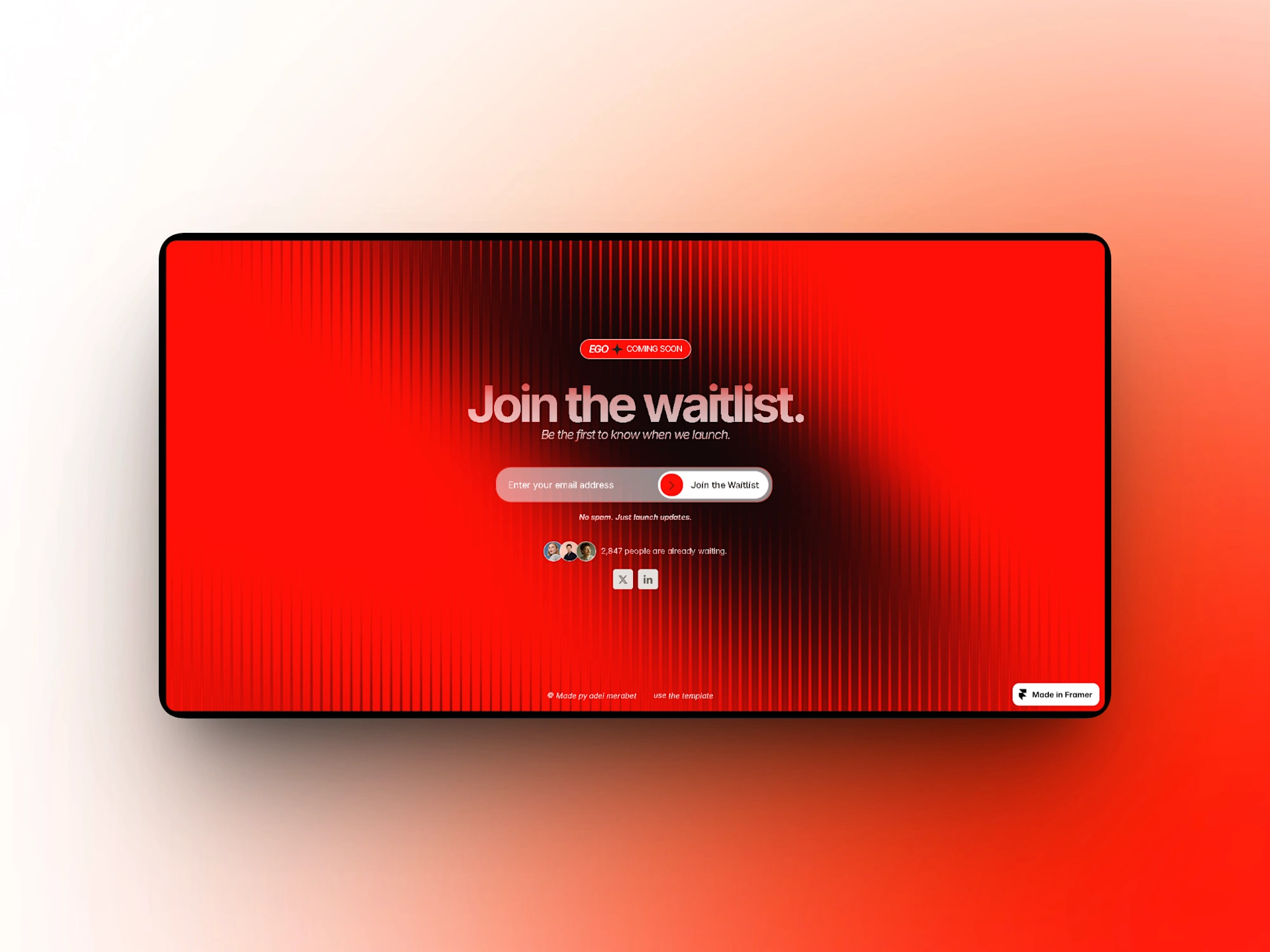
EGO is a Framer waitlist template for brands launching something worth waiting for. One page, one job: turn early interest into a list of people ready on day one. Red, loud, unapologetic. It's the product before the product ships.
02 — The Idea
Most waitlist pages read like afterthoughts: a headline, an email field, a thank you. EGO treats the waitlist as the first real product moment. Before people use what you're building, they experience how you present it.
So the page had to feel like a teaser, not a form. The question driving everything: how do we make "join the list" feel like the beginning of something, not a chore?
03 — The Direction
Bold red on near-black. The red isn't an accent, it's the argument: this product has an opinion, and it isn't shy. The dark contrast gives the page weight and keeps every element accountable. There's nowhere to hide on a near-empty canvas.
Typography carries the personality. Oversized, tightly tracked type that fills the frame like a poster. The minimal composition is deliberate: when your only job is one action, everything else is noise. The layout strips down to headline, proof, action.
04 — The Experience
The page moves in one line: statement, then decision. The headline states the promise in a few words, and the subcopy says who it's for. A brief proof strip answers "is this real?" before any commitment is asked.
Then the waitlist form, placed where the eye naturally lands, offers a single clear action. Scroll is short. The path from "what is this" to "I'm in" is a glance, not a journey.
05 — The Details
The polish lives in the moments around the form. Microcopy that sounds like the product, not a legal form: helper text, placeholder, and button label all carry the same voice. Social proof appears as a quiet counter and avatar cluster, suggesting momentum without shouting.
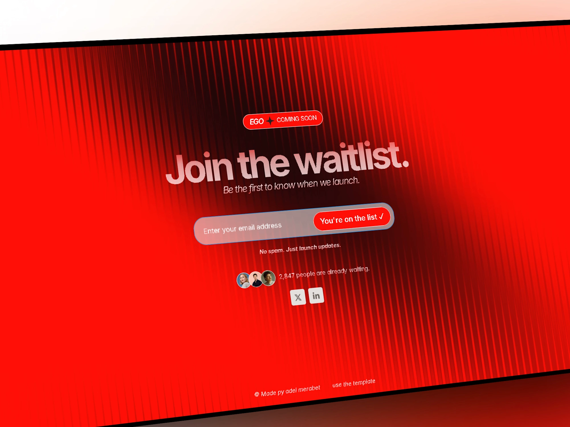
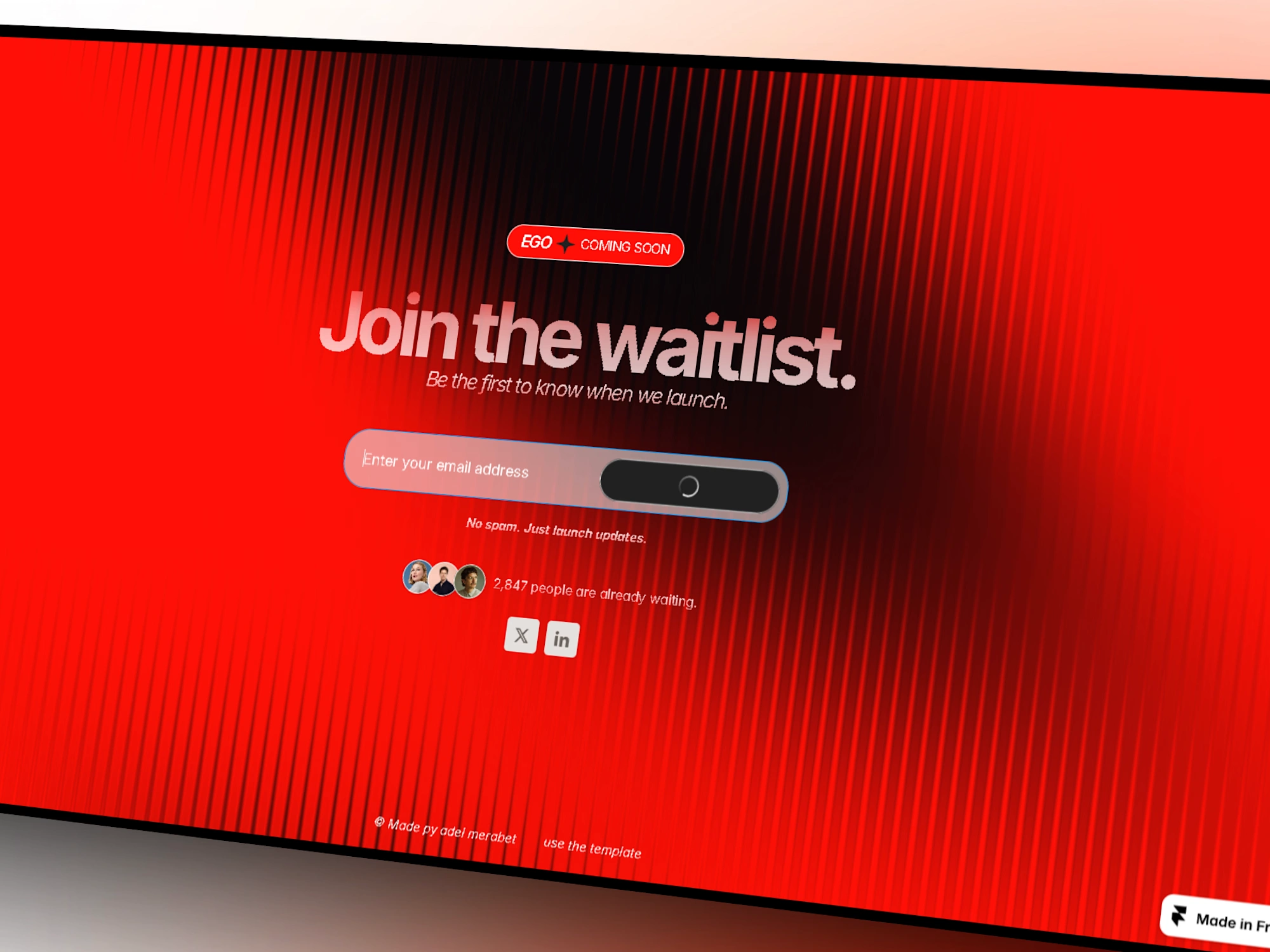
The interaction states do the heavy lifting. The button shifts on hover, shows a loading state while the request goes out, then the page swaps the form for a confirmation. Waitlist signup is a three-second moment. The details make those three seconds feel considered.
06 — Responsive
Desktop gets the full poster treatment: oversized type and room to breathe. Mobile keeps the same hierarchy, compressed without compromise. Type scales down in steps, the proof block tightens, and the form stays within thumb reach.
The CTA is never more than a short scroll away on any screen. Same page, same attitude, smaller canvas.
07 — Outcome
EGO is a waitlist page that acts like it has something to be proud of. It makes the ask small and the feeling big.
The result is a template that doesn't just collect emails. It sets the tone for the launch that comes after.
Like this project
Posted Sep 4, 2026
A Framer waitlist template for brands launching something worth waiting for. A case study in making the first moment count.
Likes
4
Views
28