Relay — AI Operations Platform

Adel Merabet

Relay — AI Operations Platform
Designing a premium SaaS marketing experience for an AI-powered operations platform.
Relay is a self-initiated SaaS concept built around one idea: letting AI handle repetitive business workflows while teams focus on higher-value work. This case study covers the full design and Framer build of its marketing site.
Role: UI/UX Designer · Product Designer · Framer Web Designer · Framer Developer
Tools: Framer · Figma · AI-assisted design
Project type: Self-initiated SaaS concept (Framer website design & development)
Timeline: August 2026
Platform: Framer
The Challenge
Modern teams work across email, CRM systems, spreadsheets, communication tools, and internal software. Repetitive operational work creates unnecessary handoffs, manual follow-ups, and fragmented information. The result is a lot of motion and very little progress.
The challenge was to build a website that communicates Relay's value immediately, while making a complex AI automation product feel simple, trustworthy, and easy to understand.
The design had to:
Communicate a complex SaaS product simply
Create a clear visual hierarchy
Make AI automation feel practical, not futuristic
Build trust through product-focused visuals
Feel launch-ready, like a premium SaaS experience
The Approach
I positioned Relay around a simple product narrative:
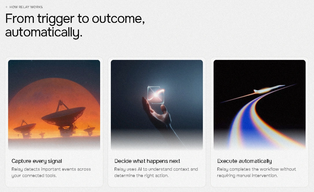
Signal → AI Decision → Automated Action
The entire site is built around this story, so a visitor understands how Relay works before they ever reach pricing or the CTA. The design leans on strong editorial typography, generous whitespace, and a restrained color system. It's a premium light-mode SaaS aesthetic, with product-focused visual storytelling and a clear CTA hierarchy throughout.
The page uses a modular section structure and responsive-first thinking, so every block holds up on its own and scales cleanly across breakpoints.
Information Architecture
The page flows in a deliberate order:
Hero → Problem → How Relay Works → Workflow Command Center → Integrations → Benefits → Pricing → FAQ → Final CTA
The logic is simple: establish the problem first, then the solution, then product proof, then capabilities, then pricing, then conversion. Each section earns the next one. Nothing jumps ahead of the story.
Product Storytelling
Relay's value is easiest to grasp through three core workflow concepts:
Capture every signal. Relay detects important events across the tools a team already uses.
Decide what happens next. AI understands context and determines the appropriate action.
Execute automatically. Relay completes the workflow without unnecessary manual intervention.
This three-step model turns an otherwise technical automation product into something a non-technical buyer can follow in seconds. That's the whole point of the narrative.
Visual Design
The visual system is built around a clean, premium SaaS aesthetic. Strong typographic hierarchy and high contrast carry the page, supported by generous spacing and subtle depth. Cards are refined, visual density is controlled, and every component speaks the same language.
Product UI-inspired visuals do the heavy lifting, so the design feels like the product itself rather than decoration around it. The composition stays responsive, and nothing is added unless it earns its place.
Key Sections
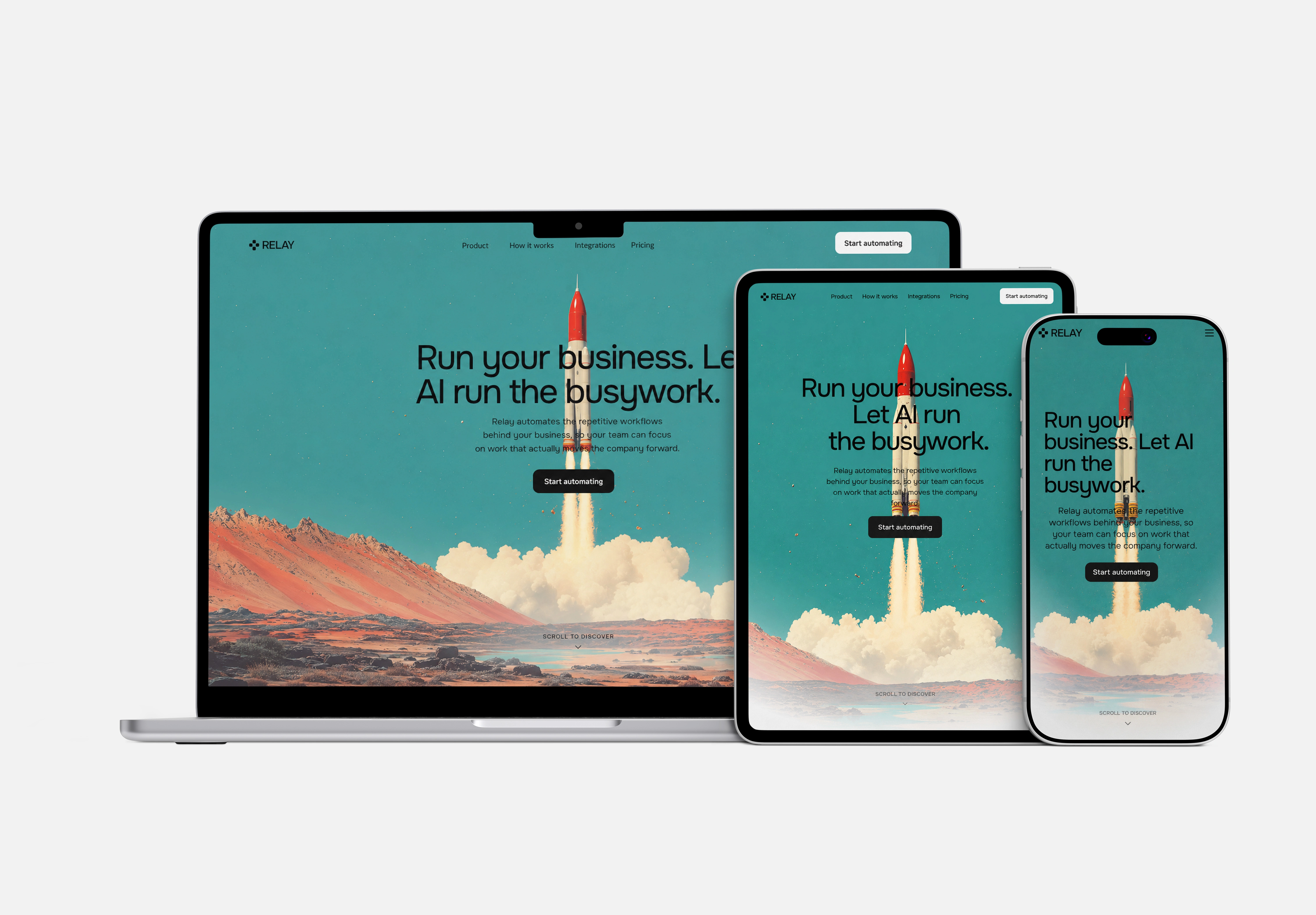
Hero. A direct value proposition focused on AI handling operational busywork. One clear message, one clear action.
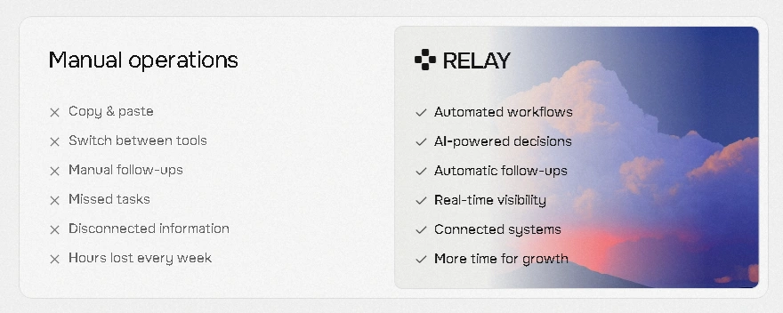
Problem. Shows the operational friction teams experience before Relay. It makes the pain concrete before offering the fix.
How it works. Uses the Signal → Decision → Action model to simplify the product into three understandable steps.
Workflow command center. Positions Relay as an operational control layer, not another disconnected tool in the stack.
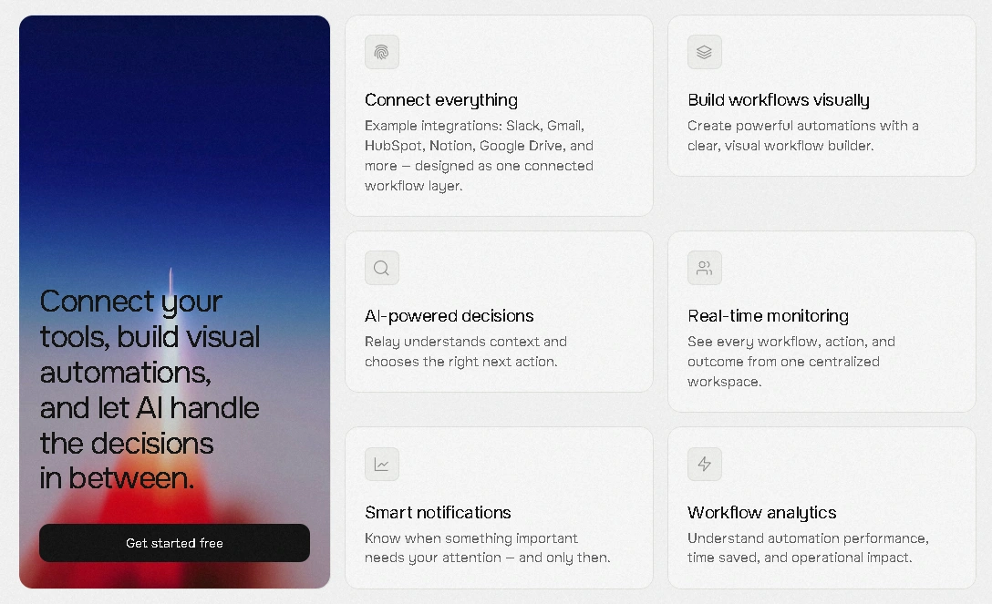
Integrations. Communicates that Relay works alongside the tools teams already use, rather than replacing them.
Manual vs Relay. A clear visual contrast between fragmented manual processes and automated workflows.
Benefits. Translates product capabilities into practical business outcomes.
Pricing. A simple three-tier SaaS structure that reinforces product credibility.
Final CTA. Ends the narrative with a focused conversion moment.
Framer Development
The site was built in Framer with a production-oriented mindset:
Responsive layouts across breakpoints
Reusable components for consistency
Interactive navigation
Section-based page architecture
Responsive typography
Hover and interaction states where they add value
Smooth scrolling
Polished CTA interactions
Full mobile adaptation
The website was designed and built in Framer as a polished SaaS marketing experience, with responsive layouts, reusable components, interactions, and product-focused visual storytelling.
Design Decisions
01 — Make the product understandable in seconds. A visitor should grasp what Relay does before scrolling. The Signal → Decision → Action model front-loads that understanding.
02 — Turn automation into a visual story. Automation is abstract. Showing it as a clear three-step flow makes it concrete and memorable.
03 — Use product UI as visual proof. The interface itself is the strongest evidence. Showing the workflow command center builds more trust than any claim could.
04 — Keep the interface premium without unnecessary decoration. Restraint is the point. Every element earns its place, and the whitespace does the work.
Outcome
The outcome was a polished SaaS marketing experience that demonstrates how Relay could be positioned as a modern AI operations platform. The final website combines product storytelling, visual design, responsive interaction, and Framer development into one cohesive experience.
Premium SaaS positioning
Clear product narrative
Responsive Framer experience
Portfolio-ready visual system
Reflection
Relay was an exercise in turning a complex AI automation product into a simple, visual story. The biggest design challenge was not adding more information, but deciding what the visitor needed to understand first.
The project sharpened how I approach SaaS product storytelling, visual hierarchy, and Framer development. It taught me that the strongest product pages are the ones that respect the visitor's attention and lead them through a single, clear narrative.
Like this project
Posted Aug 11, 2026
Self-initiated AI operations platform concept. Designed and built a premium Framer marketing experience around a Signal → Decision → Action narrative.