sikahaus: Making a Broad Practice Clear at a Glance

Christian Sika

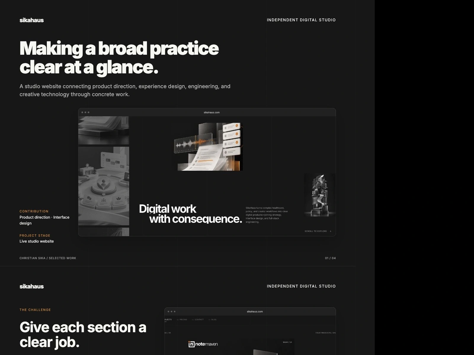
sikahaus: Making a broad practice clear at a glance.
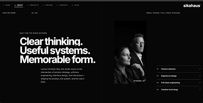
A studio website connecting product direction, experience design, engineering, and creative technology through concrete work.
The challenge
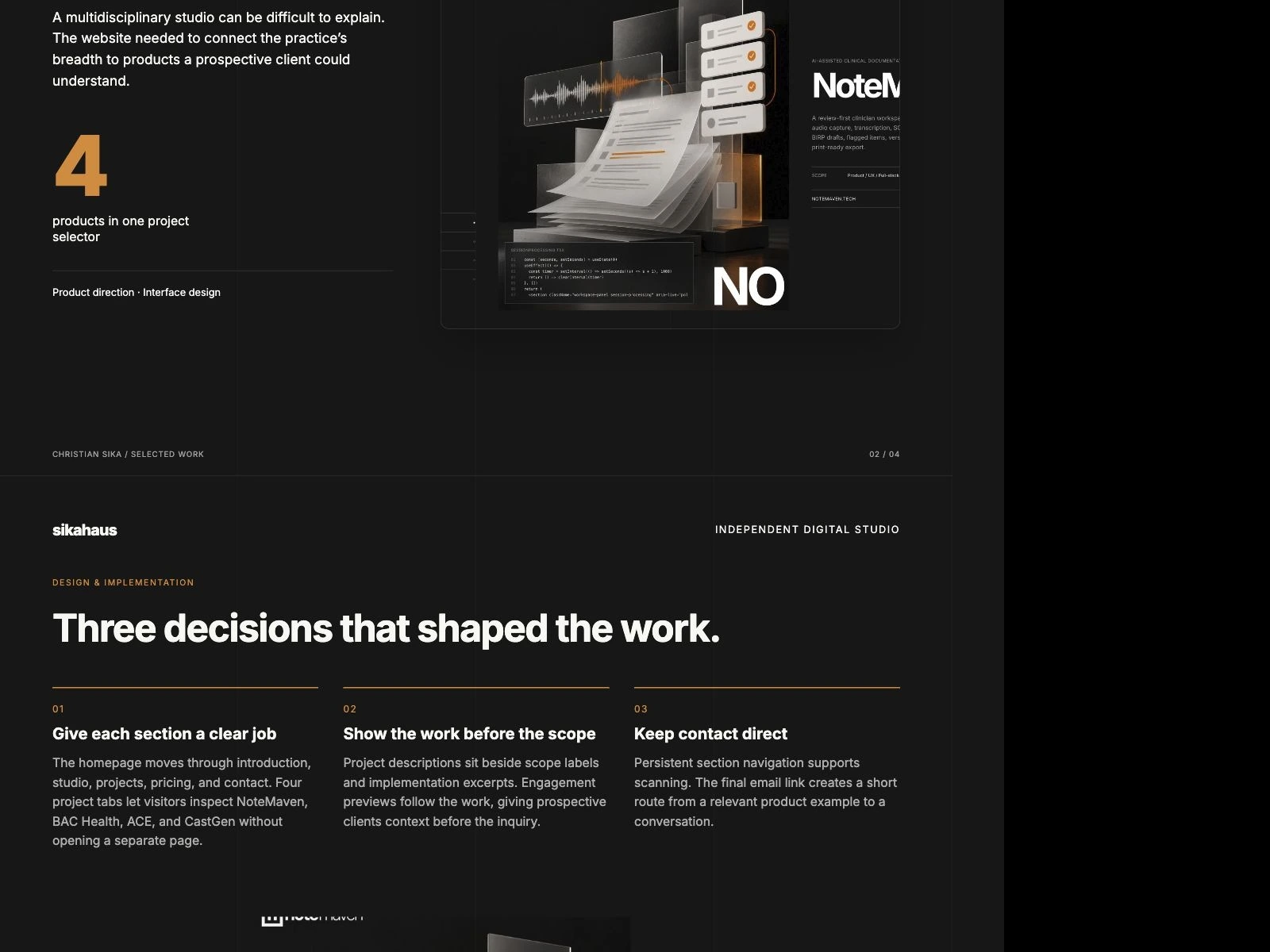
A multidisciplinary studio can be difficult to explain. The website needed to connect the practice’s breadth to products a prospective client could understand.
Role and scope
Studio led by Christian Sika. Case study examines the current public website.
Give each section a clear job
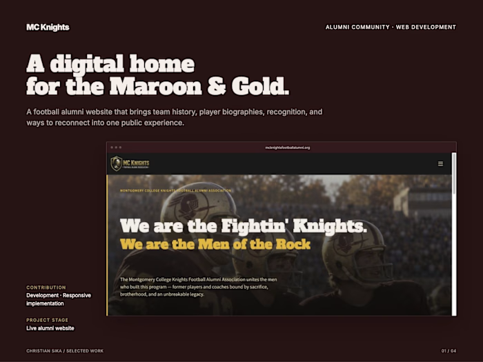
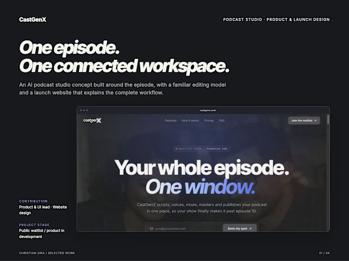
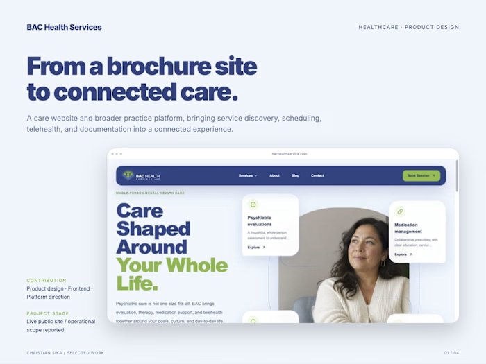
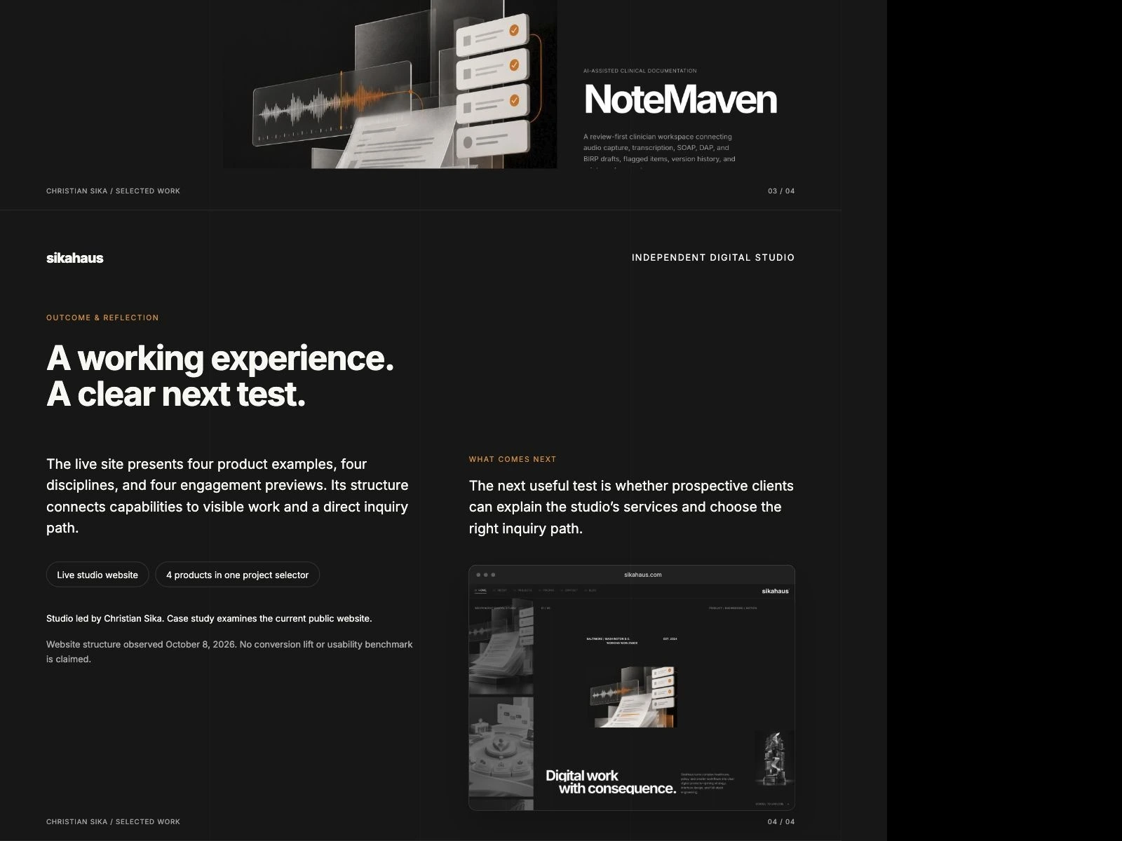
The homepage moves through introduction, studio, projects, pricing, and contact. Four project tabs let visitors inspect NoteMaven, BAC Health, ACE, and CastGen without opening a separate page.
Show the work before the scope
Project descriptions sit beside scope labels and implementation excerpts. Engagement previews follow the work, giving prospective clients context before the inquiry.
Keep contact direct
Persistent section navigation supports scanning. The final email link creates a short route from a relevant product example to a conversation.
Outcome
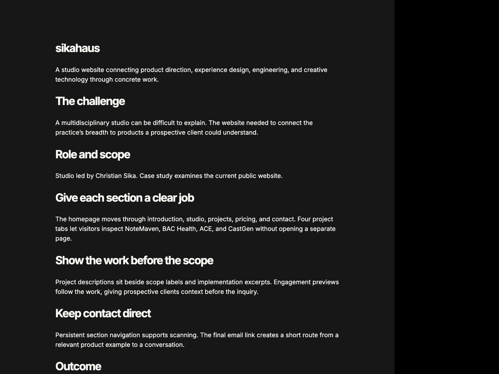
The live site presents four product examples, four disciplines, and four engagement previews. Its structure connects capabilities to visible work and a direct inquiry path.
Reflection
The next useful test is whether prospective clients can explain the studio’s services and choose the right inquiry path.
Website structure observed October 8, 2026. No conversion lift or usability benchmark is claimed.
Like this project
Posted Oct 8, 2026
A studio website connecting product direction, interface design, and engineering through four product examples and a direct inquiry path.
Likes
0
Views
0