Avocado OB-GYN Clinic Brand Redesign
Lora Raleva

Avocado OB-GYN Clinic had a bold and distinctive vision from the very beginning even its name was untypical for a medical clinic. But while the idea was strong, their initial branding didn’t fully capture this uniqueness or the confidence they wanted to project.
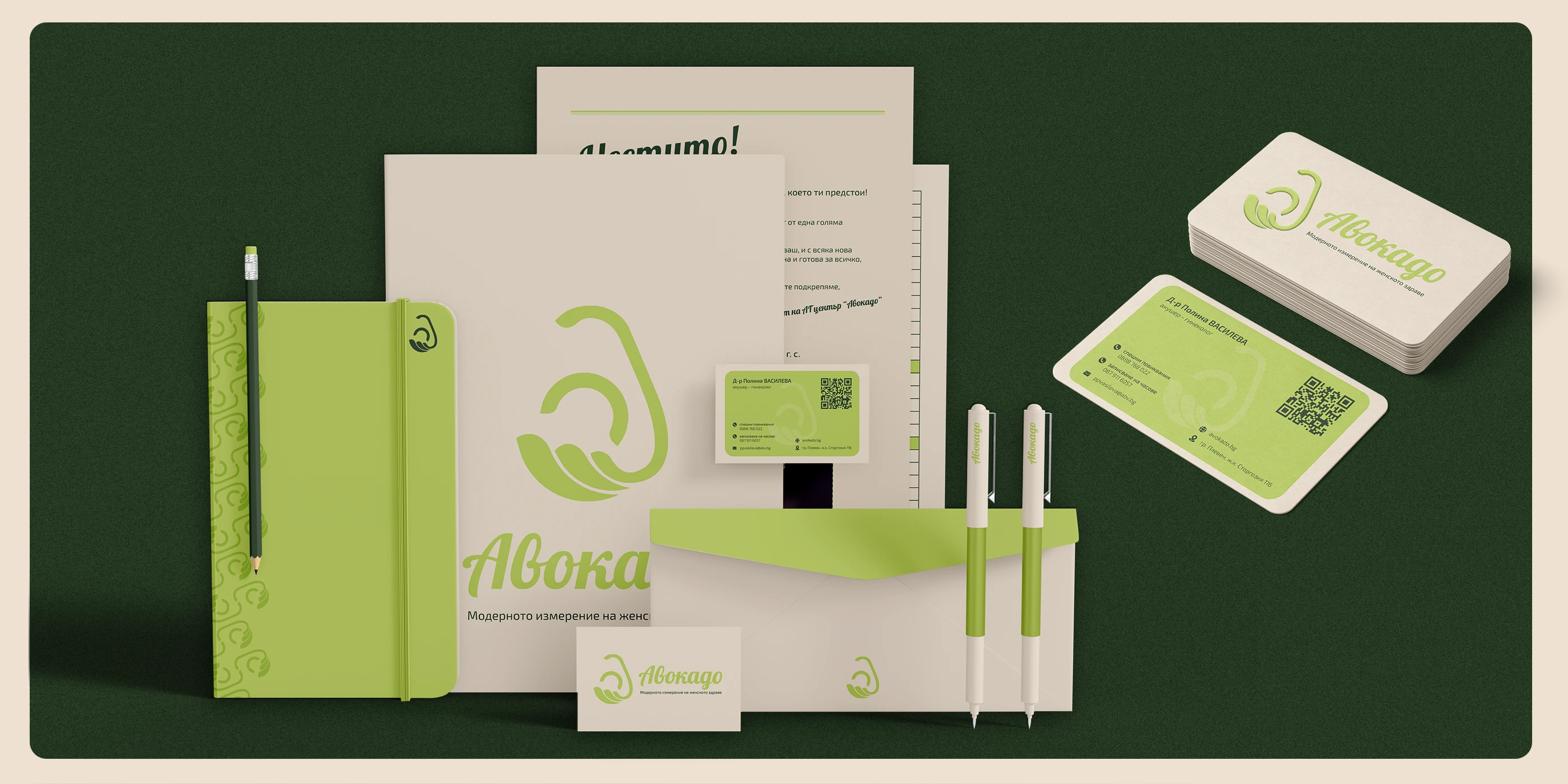
Through our collaboration, I redefined Avocado’s brand identity to reflect its modern, professional, and approachable character. My role included redesigning the logo, developing a cohesive visual identity system, and creating brand guidelines that communicate both expertise and warmth.
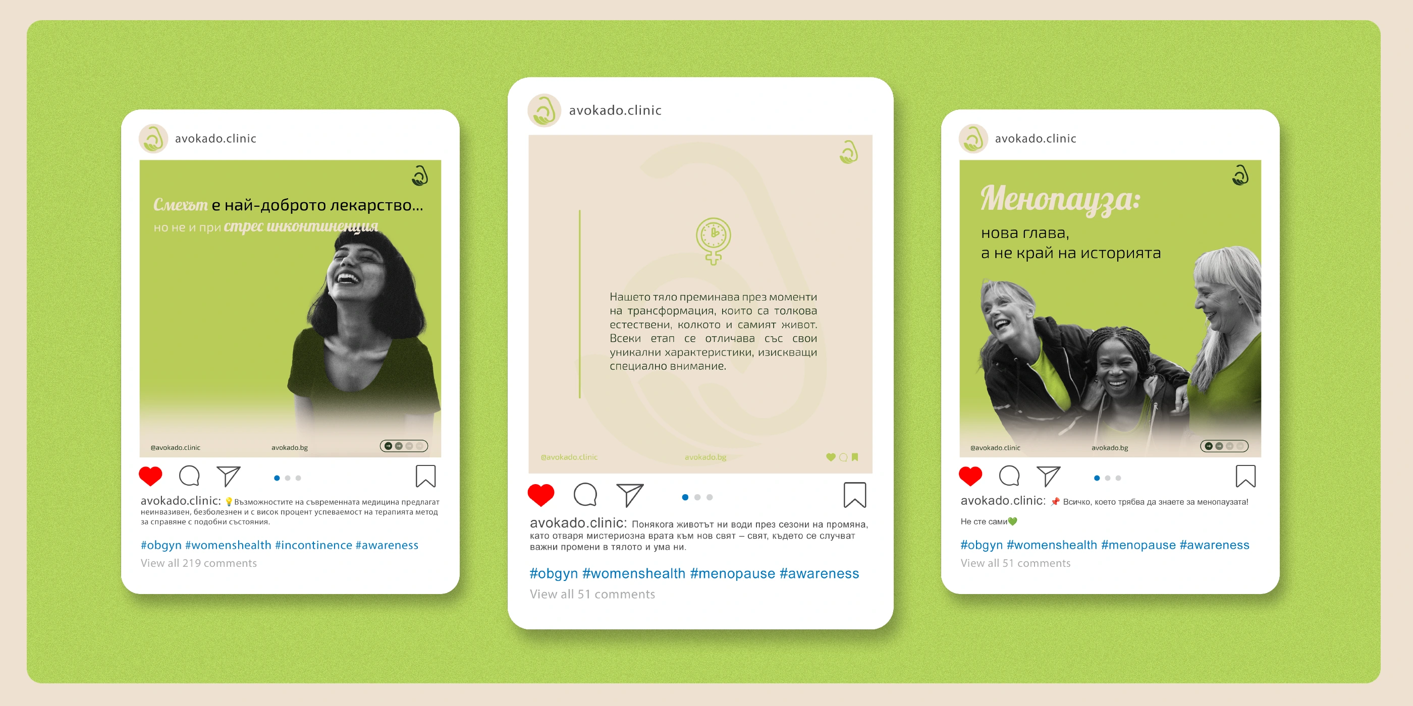
The new identity amplified Avocado’s bold concept, improved consistency across touchpoints, and helped the clinic stand out as a trusted, forward-thinking leader in women’s healthcare.


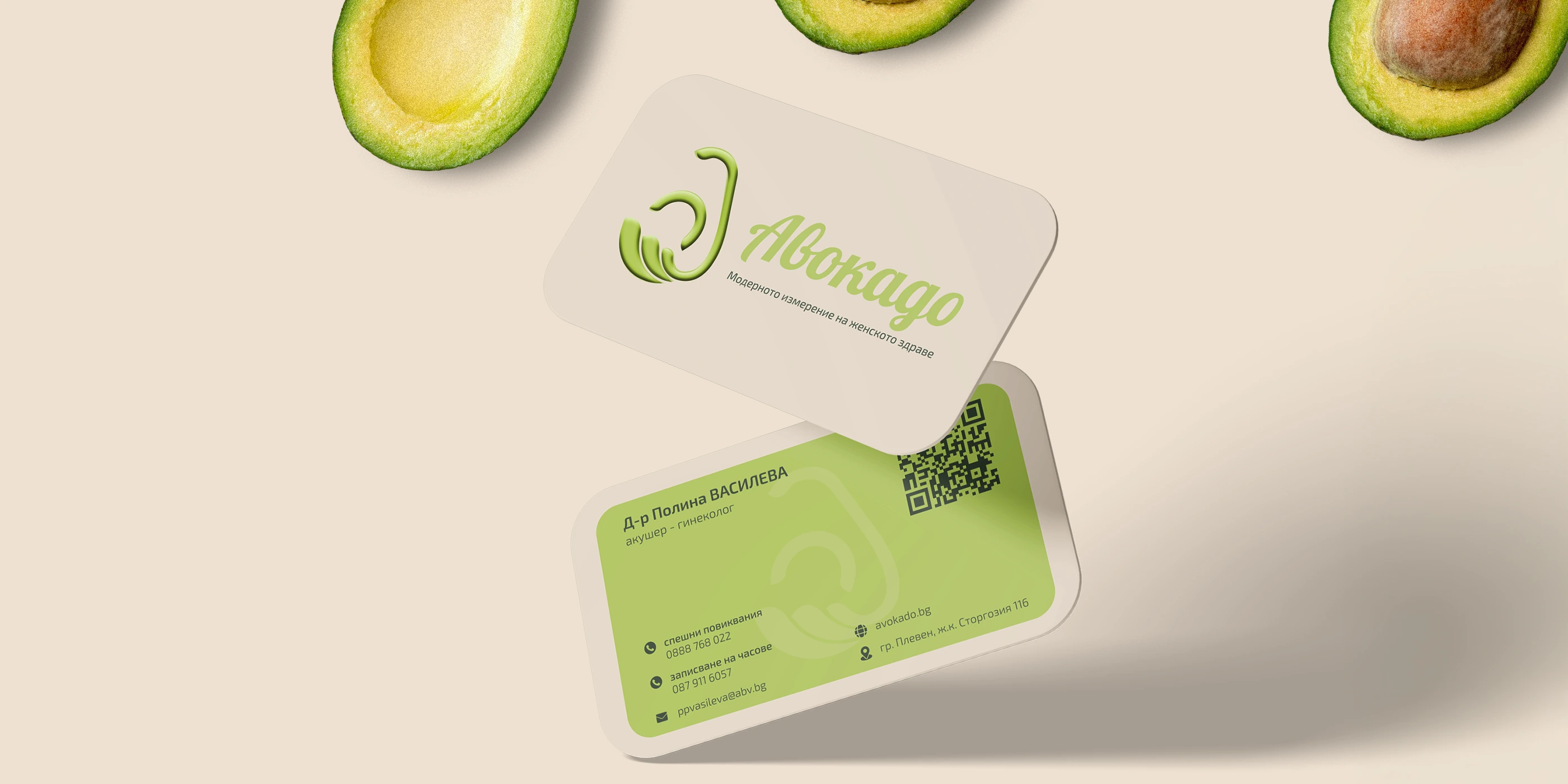
Logo Design
The client gave me full creative freedom, but after analyzing their brief and identity, I decided the best approach was to refine and modernize their existing idea rather than reinvent it. The result is a simplified, contemporary logo that preserves the brand’s essence while strengthening its impact.
The concept reflects the clinic’s core values of professionalism, care, and attention. At first glance, the design shows an avocado - linking directly to the clinic’s name. Symbolically, it represents a pregnant mother, aligning with their focus on women’s health.
The abstract hand cradling the avocado seed symbolizes a mother’s belly, embodying care, femininity, and gentleness - qualities central to the clinic’s mission.


Like this project
Posted Aug 20, 2025
Redefined Avocado OB-GYN Clinic's brand identity to reflect modern, professional, and approachable character.
Likes
3
Views
42
Timeline
Jan 6, 2024 - Feb 8, 2024