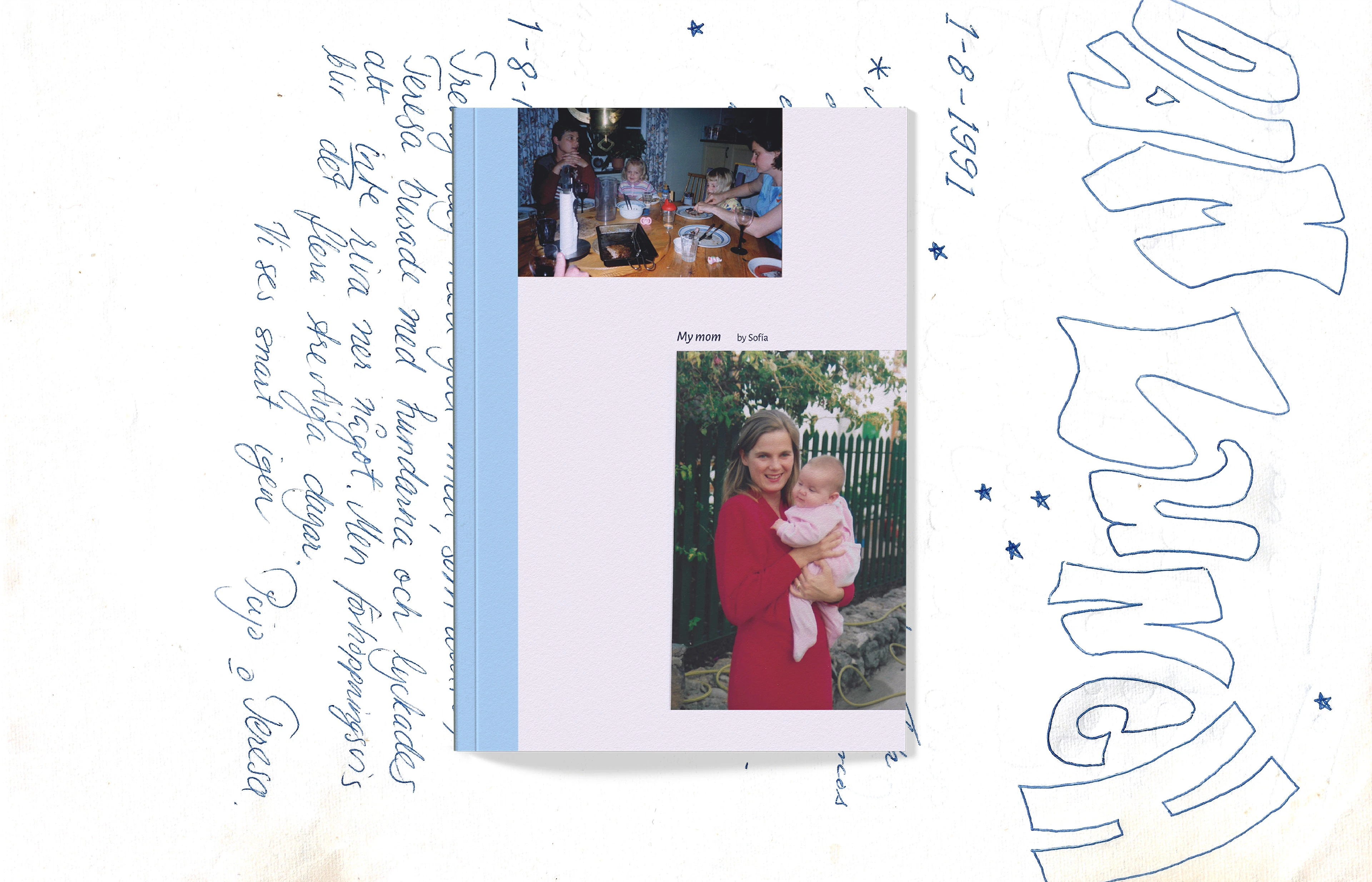
Family Recipes ― Cookbook
Sofía Jacqueline


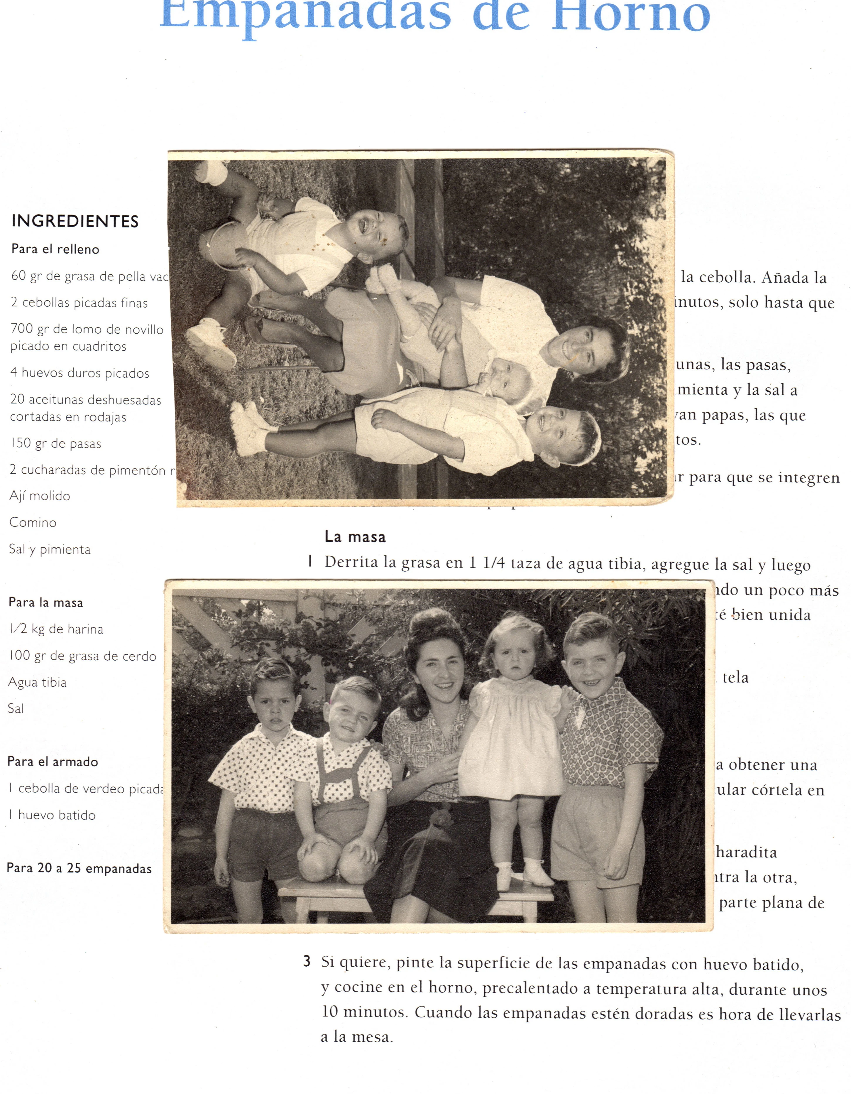
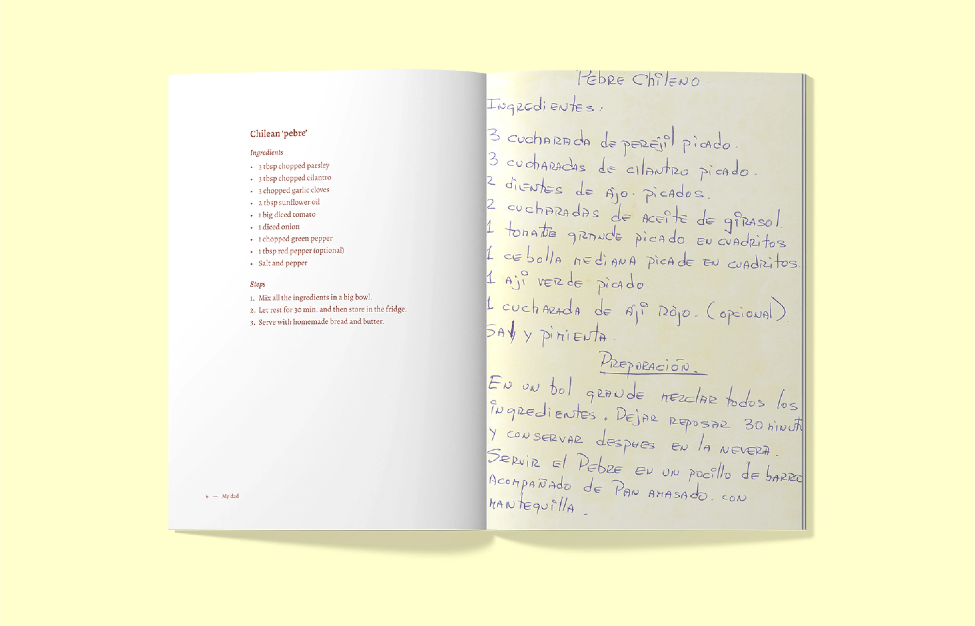
This project is a personal exploration of my heritage through family recipes and traditions. These cookbooks also serve as a family archive, connecting generations through shared culinary experiences. The main challenge was creating a cohesive set while ensuring each book reflected the unique cultural backgrounds of both sides of my family.
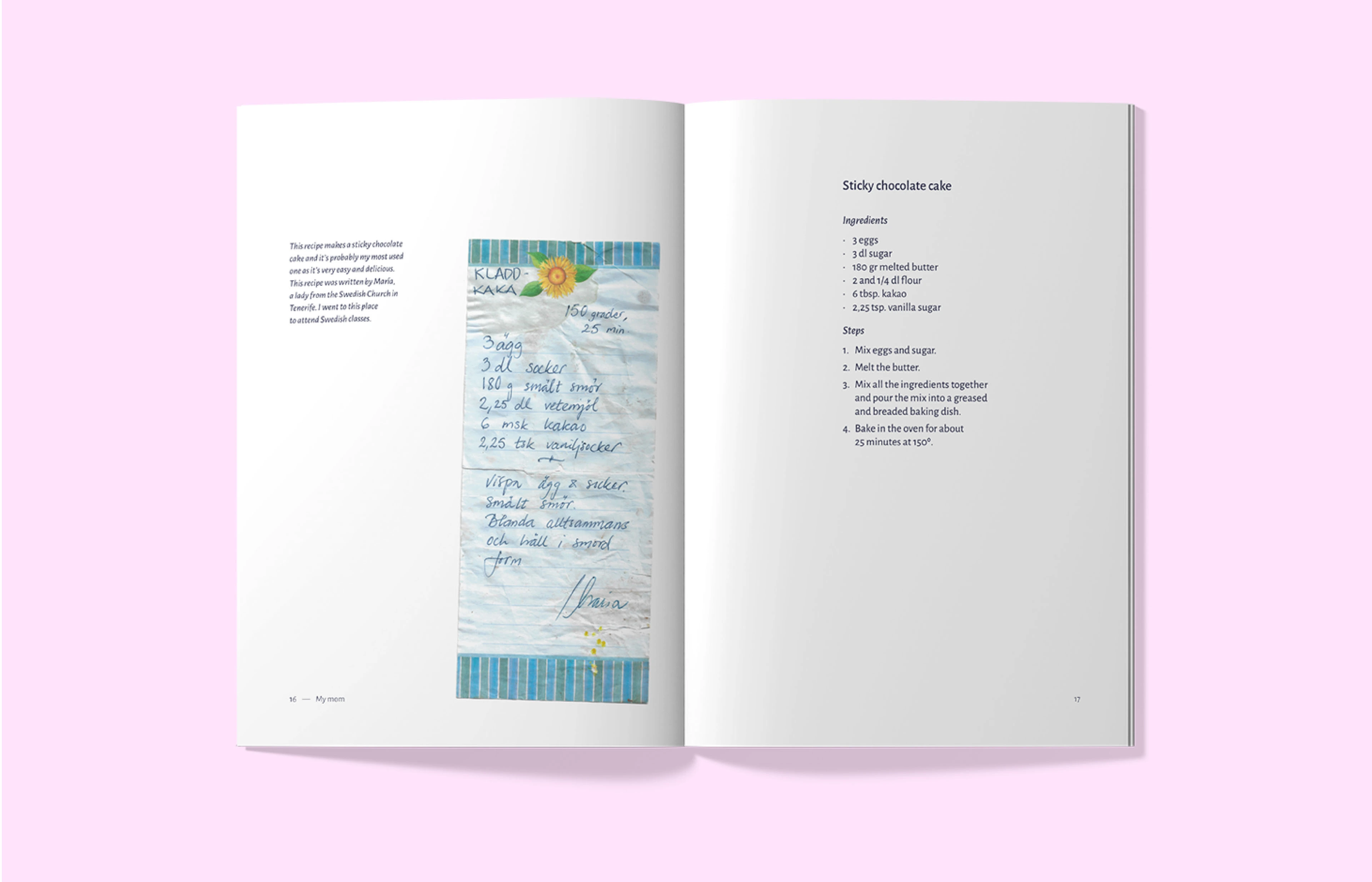
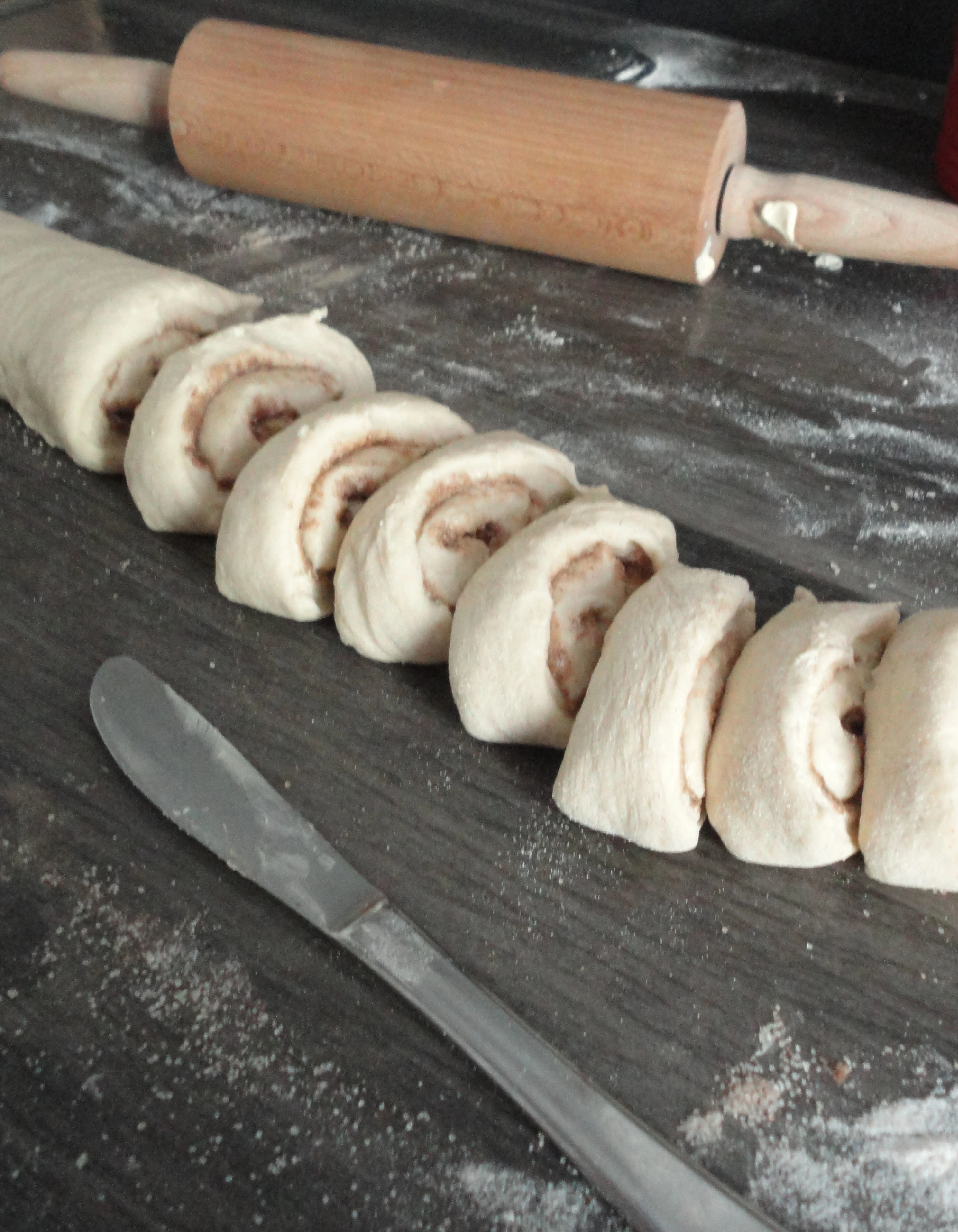
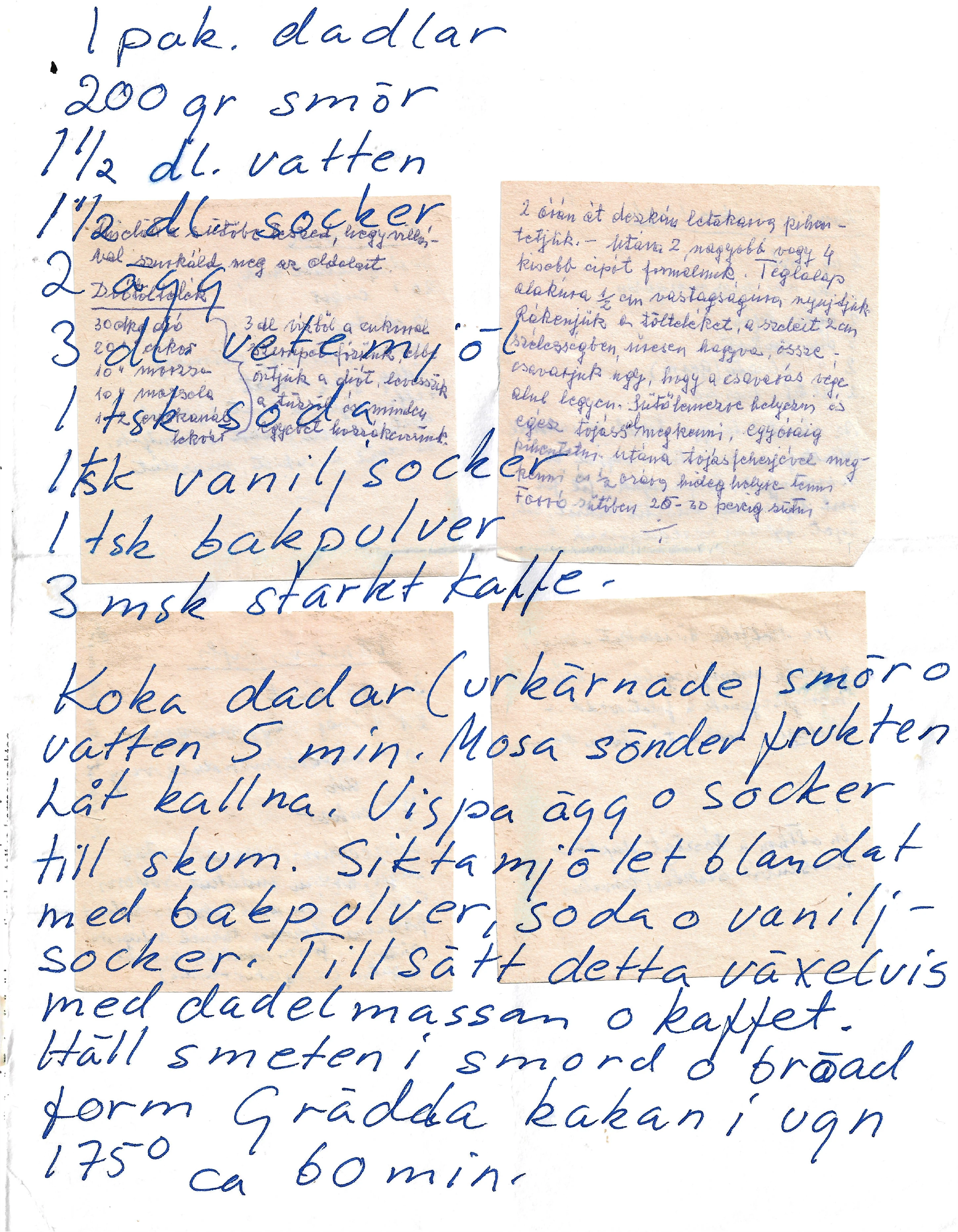
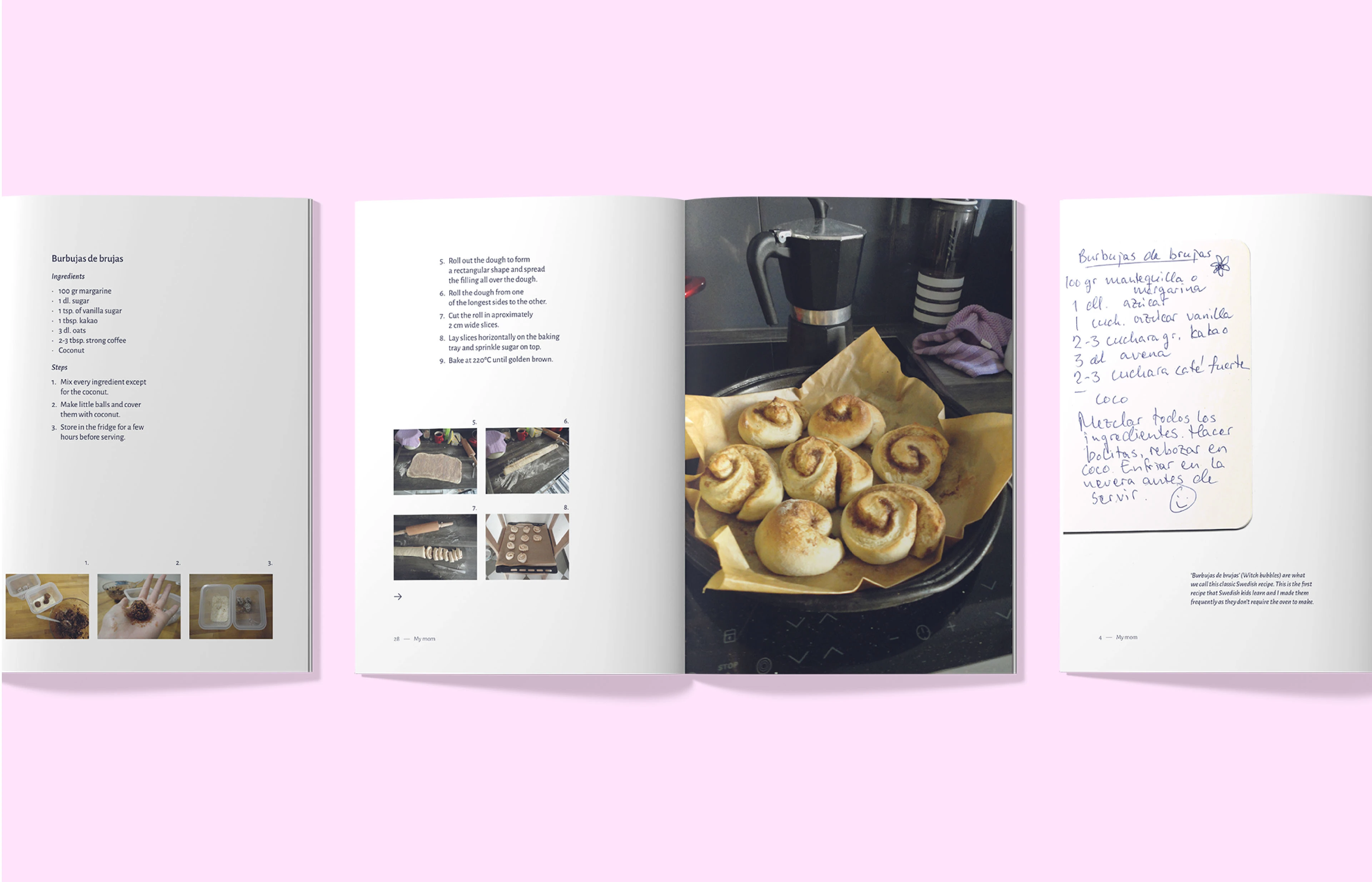
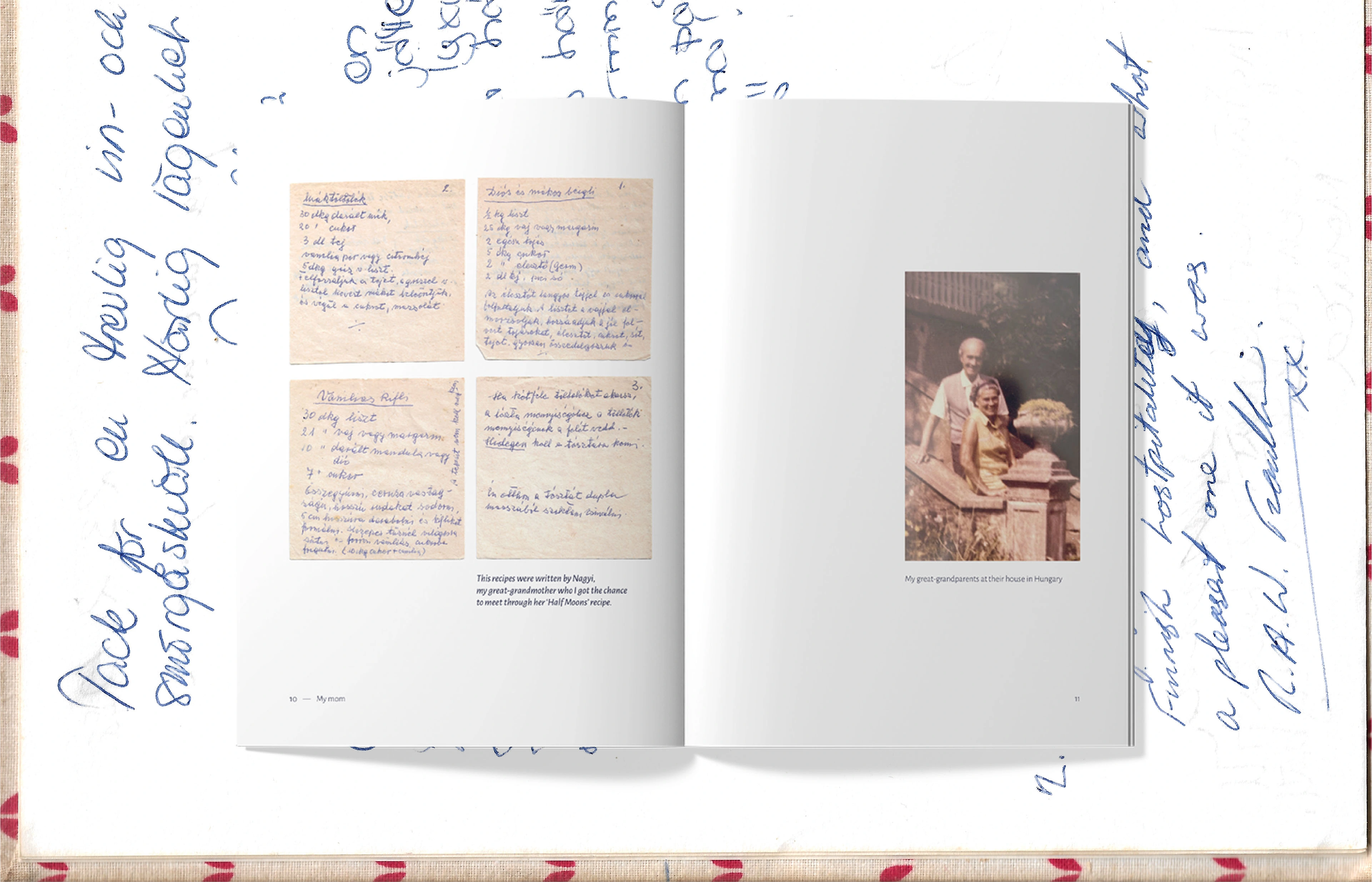
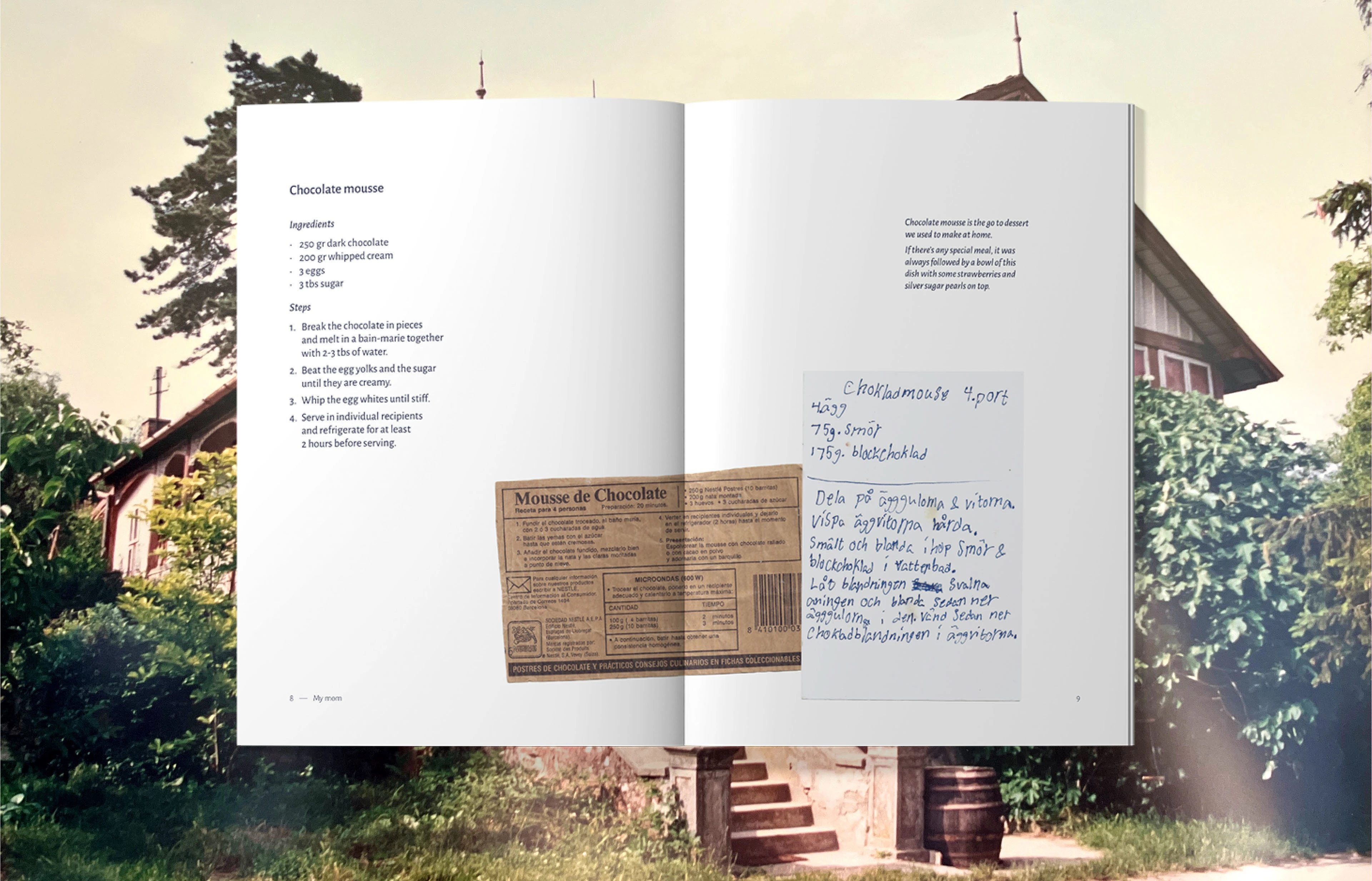
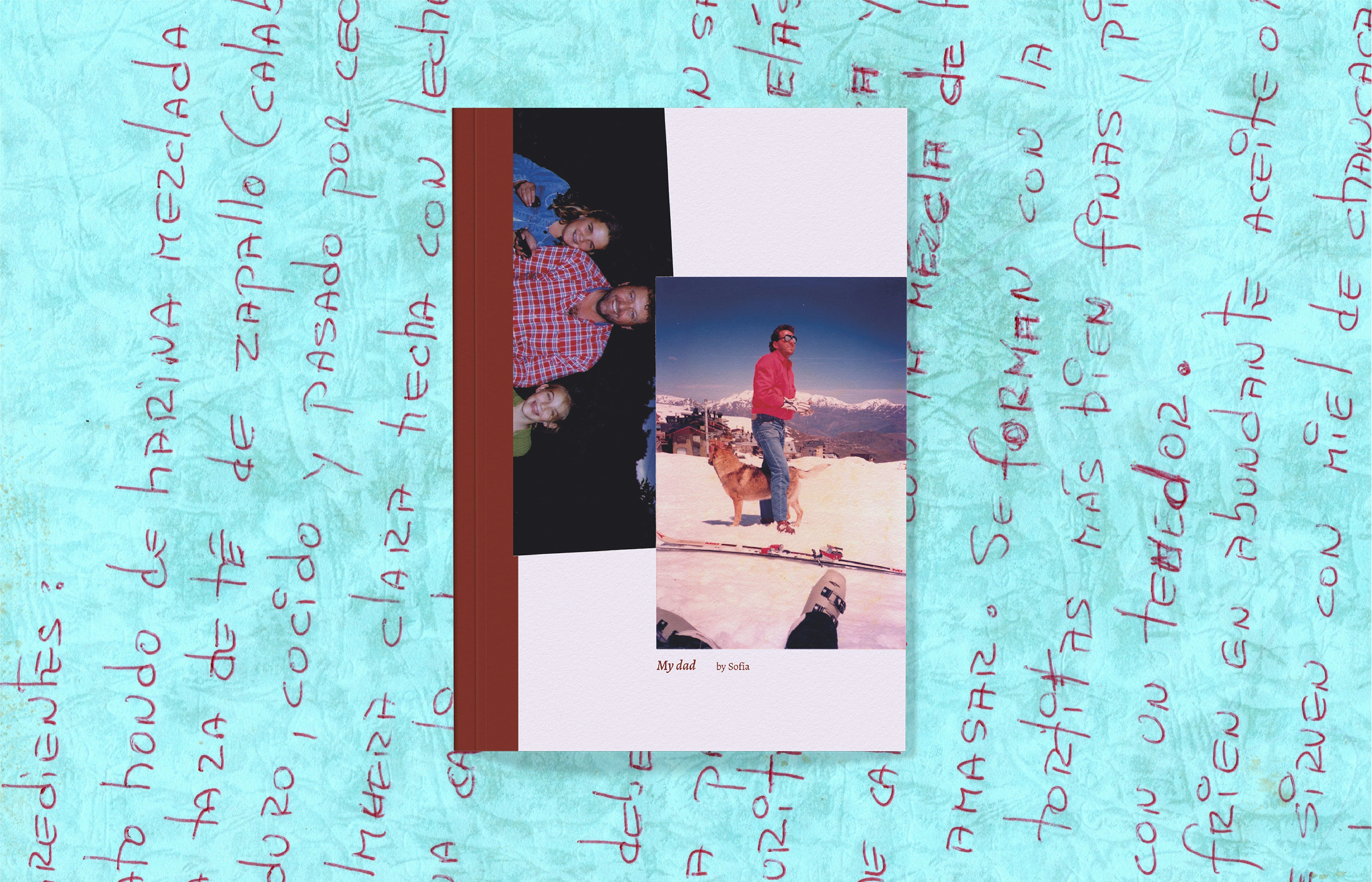
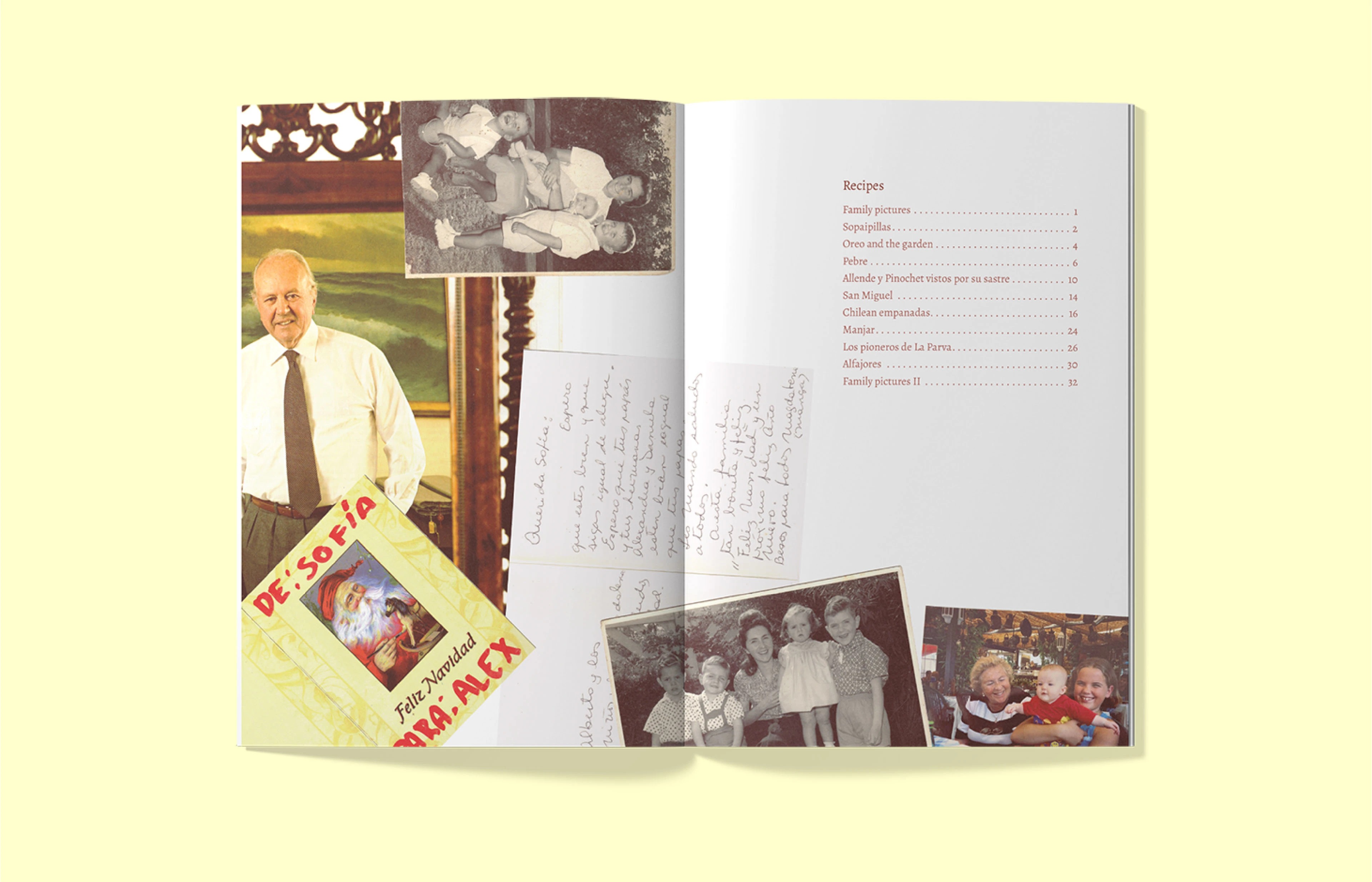
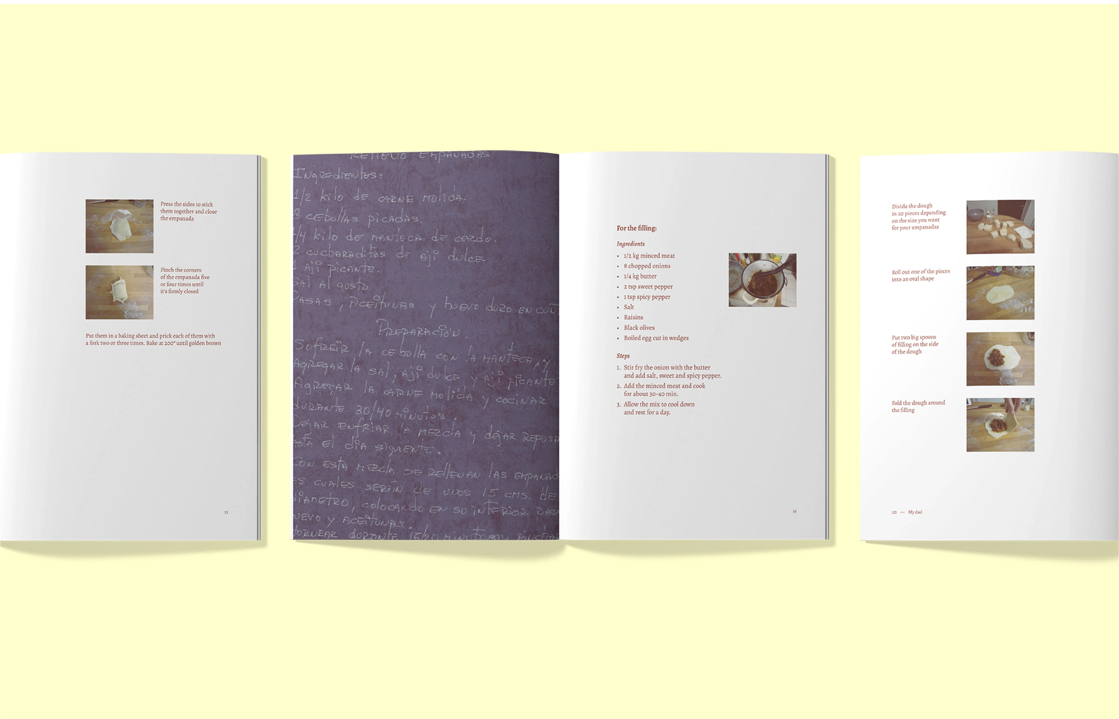
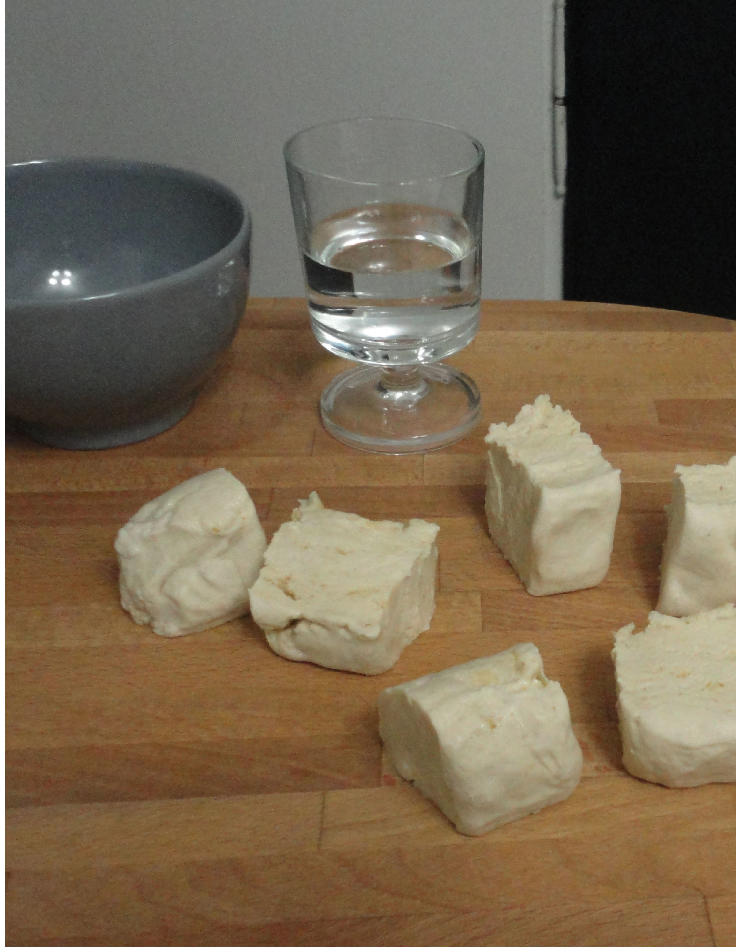
To unify the distinct heritages, I cooked and photographed the recipes with a raw, homemade aesthetic, keeping the kitchen settings natural. The books are distinguished by typography, color, and composition. My father’s Chilean book uses bold imagery, a serif typeface, and deep red tones to evoke savory flavors, while my mother’s Finnish book features smaller pieces, a sans-serif typeface, and lighter blue tones, reflecting sweeter dishes. Despite their differences, both books share a handmade, scrapbook aesthetic, evoking the feeling of sorting through a drawer of memories and family heirlooms.
Like this project
Posted Feb 4, 2025
A cookbook series exploring heritage through family recipes. Each book reflects a distinct culture while maintaining a unified, scrapbook-like aesthetic.

Animal Farm — Rebelión en la granja
Book Design ― Waia
Influyo — Self-management kit

Visual identity ― Margenus