Visual identity ― Margenus
Sofía Jacqueline


Margenus is an emerging fashion brand with a mission to redefine luxury for professional women. The goal was to develop a brand identity that captured the designer’s unique approach to fashion while appealing to women who value individuality, boldness, and sustainability. A key challenge was setting the brand apart in a fashion landscape where most competitors use monochromatic, all-caps logos, while also highlighting its focus on upcycling.
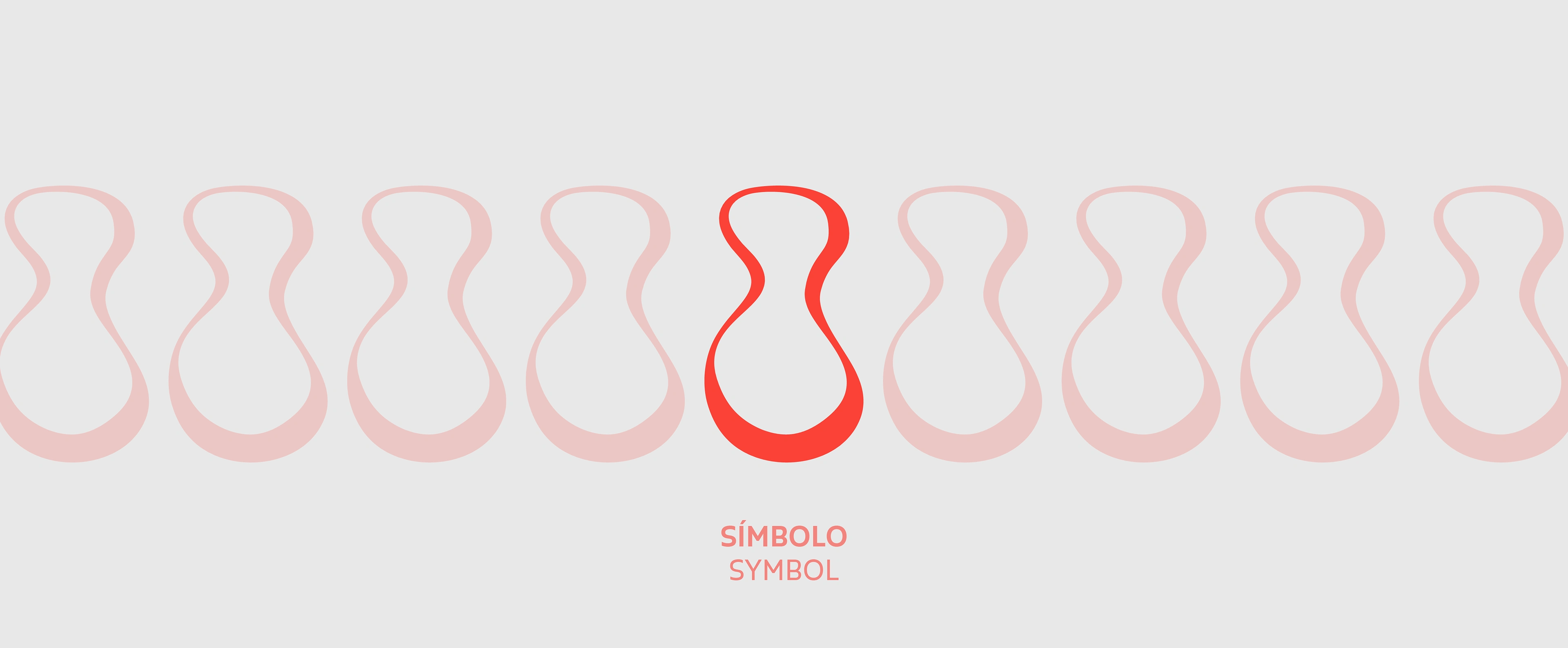
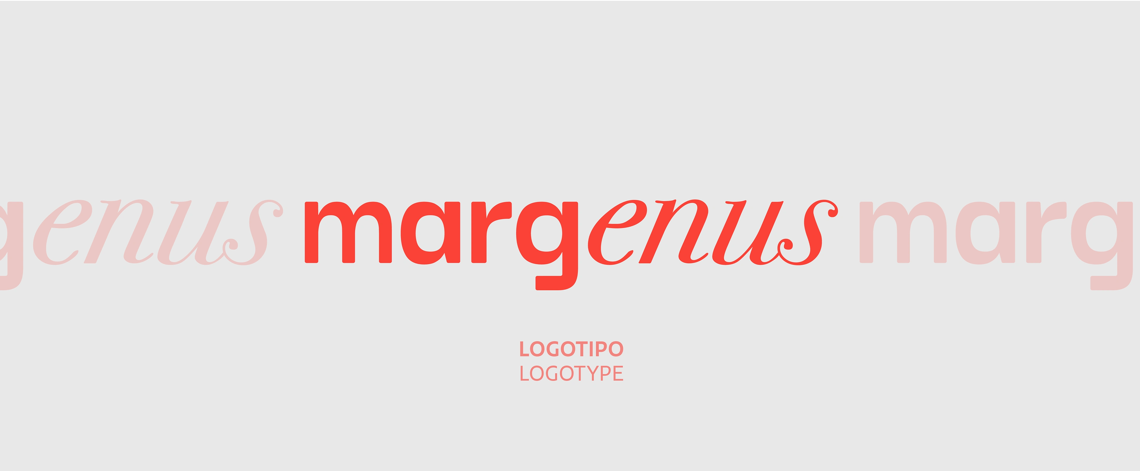
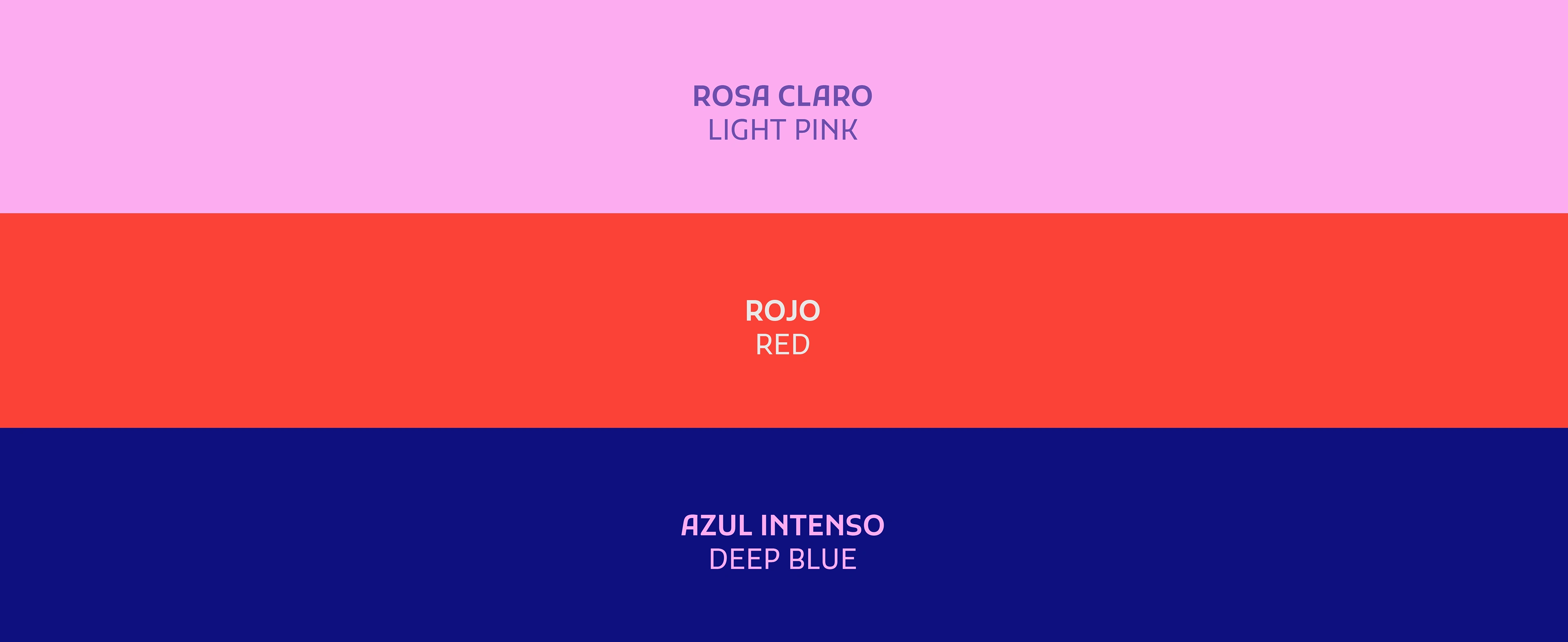
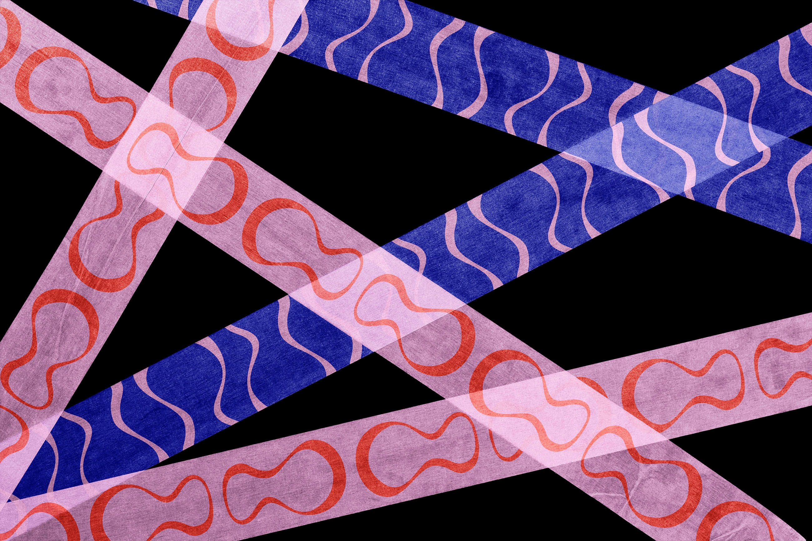
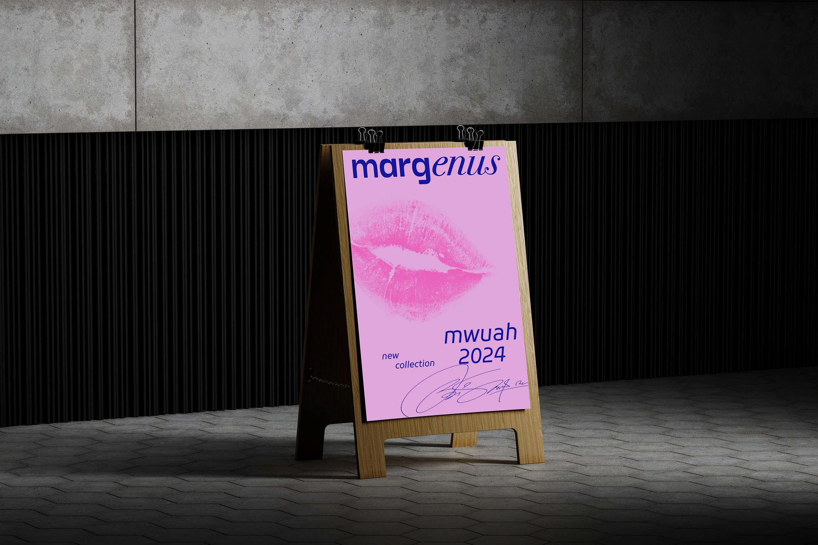
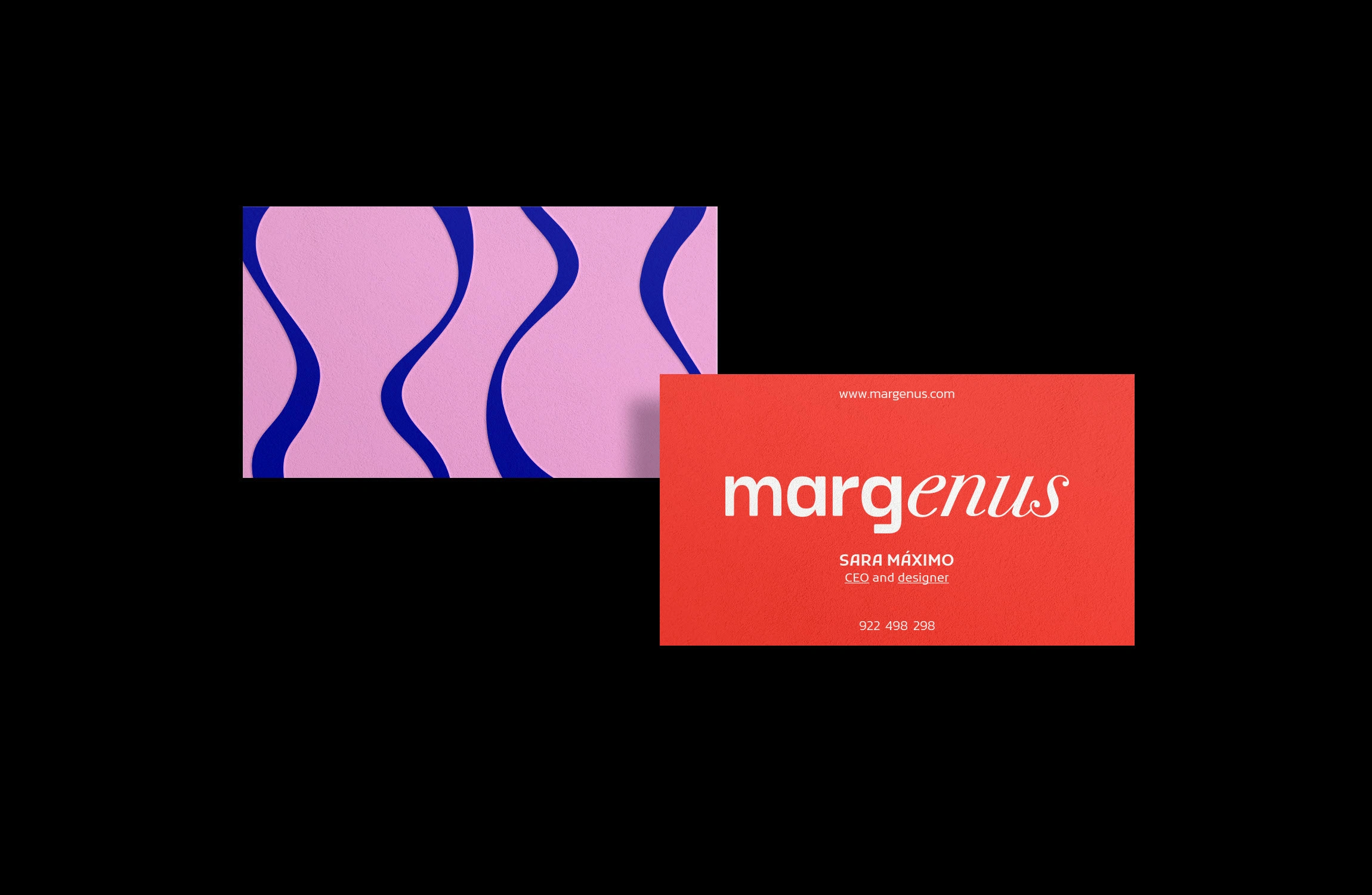
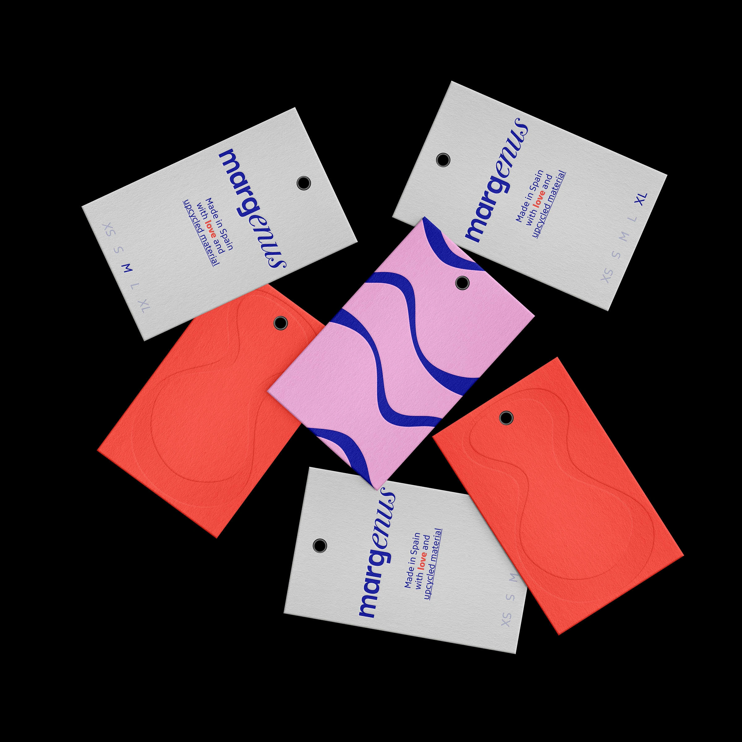
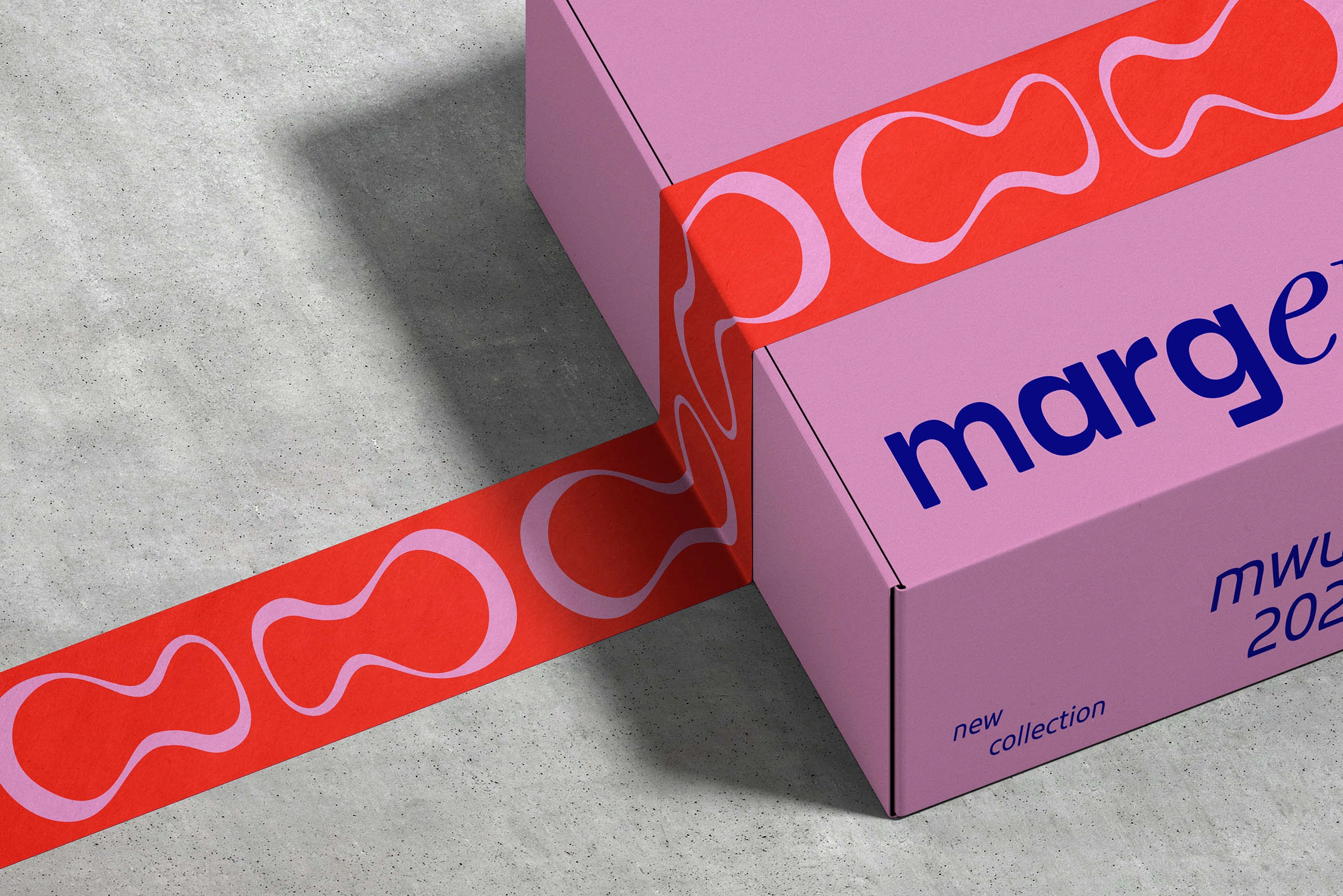
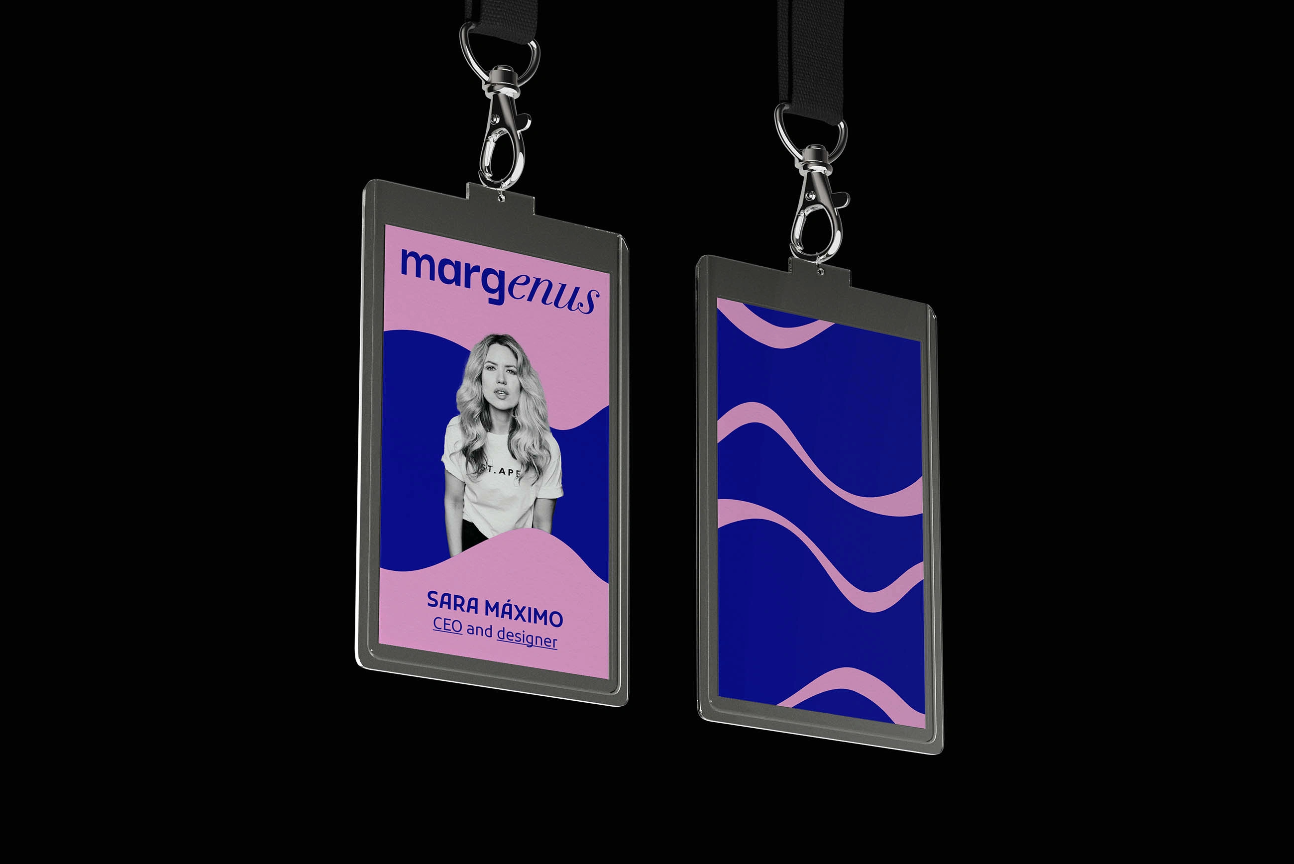
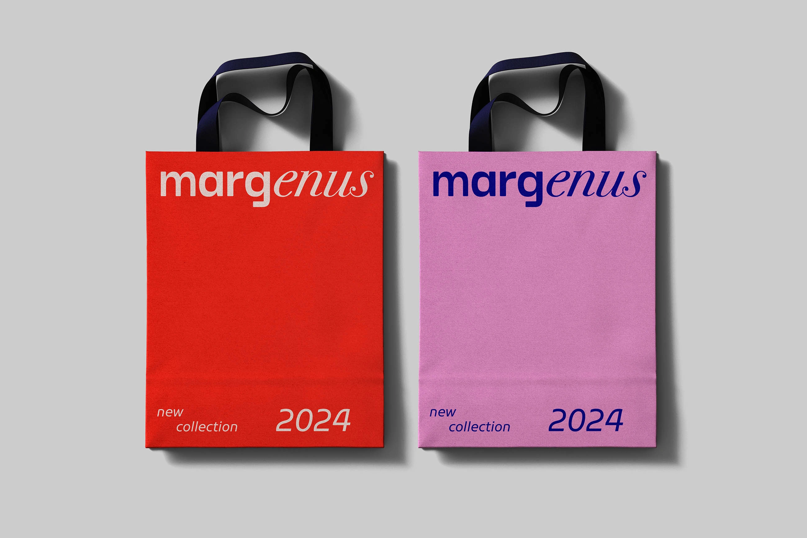
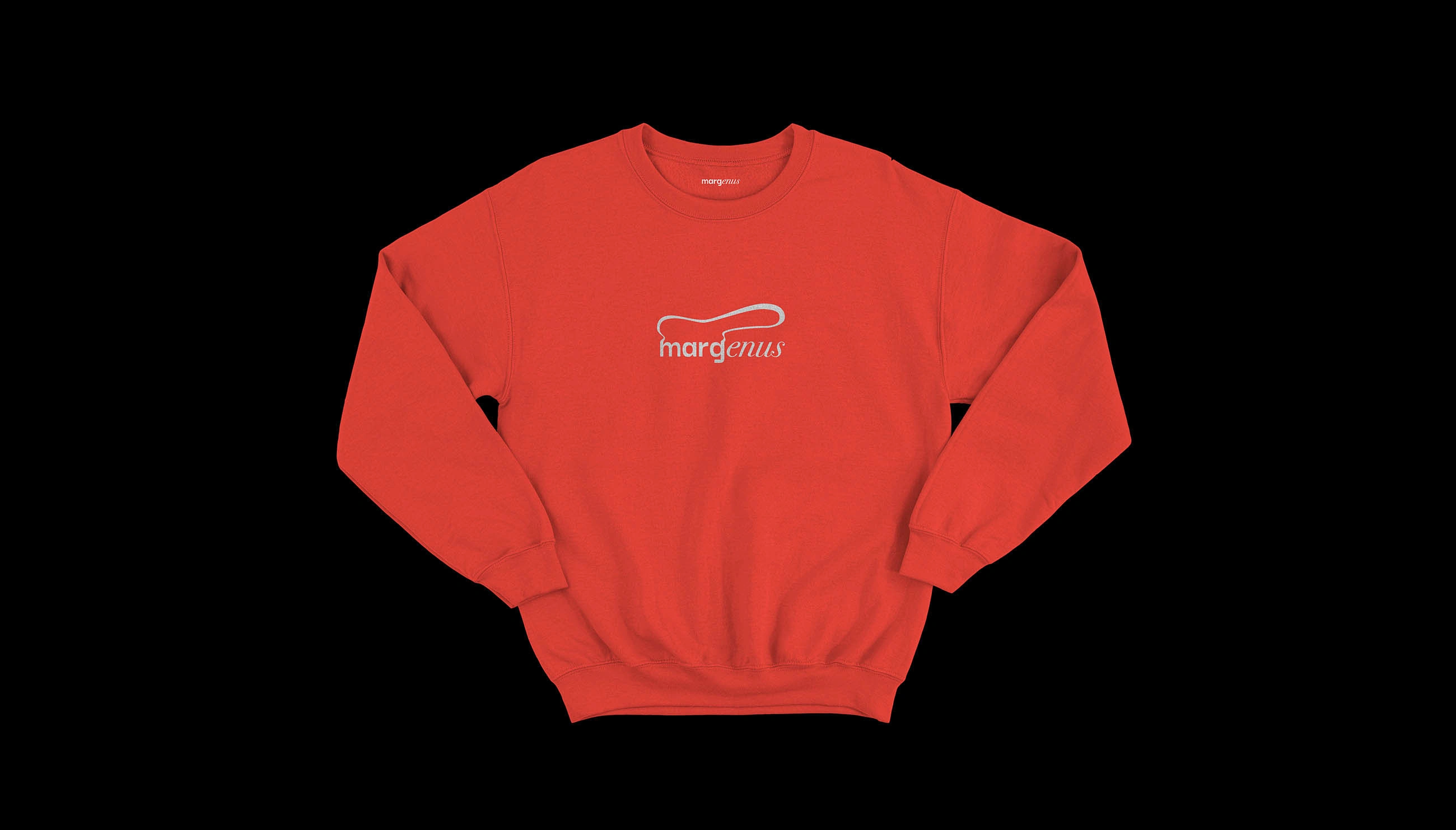
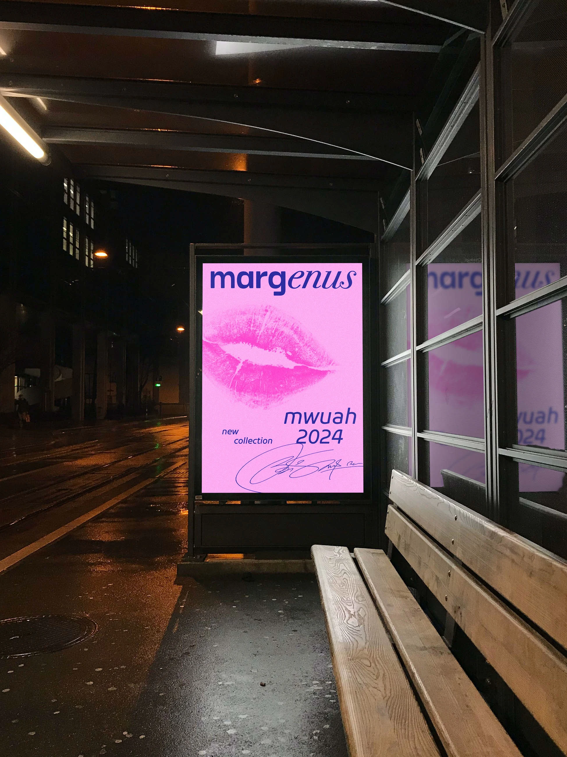
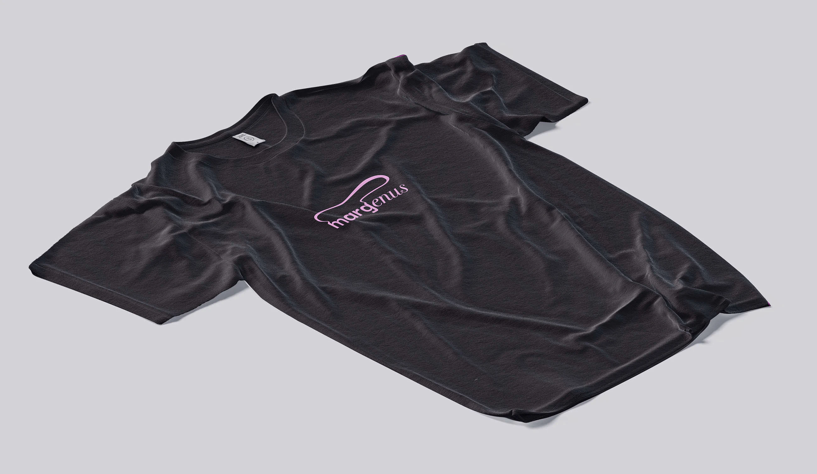
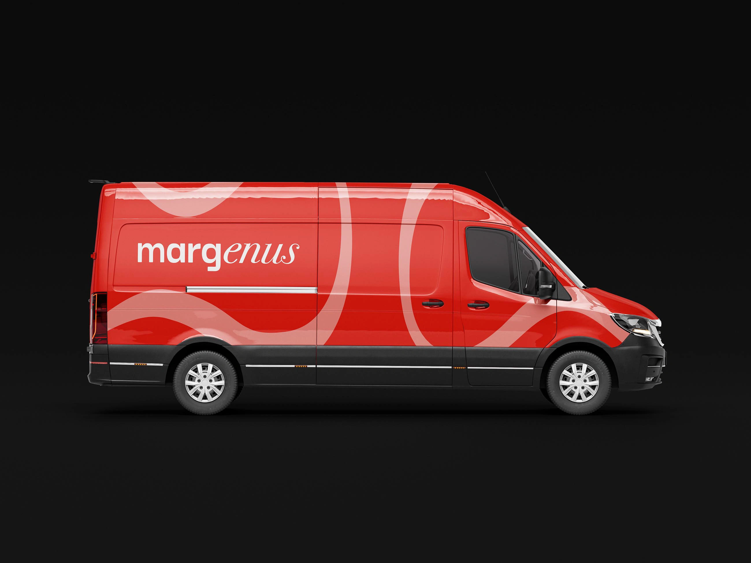
The brand differentiates itself through its use of color and typography. Instead of relying on a monochromatic palette, I introduced red, light pink, and deep blue to convey the brand’s uniqueness. The logo, composed in lowercase to stand out from competitors, combines a modern sans-serif typeface with a traditional serif, symbolizing the fusion of strength and elegance. The symbol, made from a continuous line that forms a closed shape, represents the cycle of reinvention. Corporate patterns deconstruct and reuse this symbol to reinforce the brand’s emphasis on upcycling and sustainability.
Like this project
Posted Feb 4, 2025
Margenus redefines luxury with bold, sustainable fashion. Its identity blends vibrant colors, serif-sans typography, and an organic symbol reflecting upcycling.


Visual Identity ― GL Law Firm
Family Recipes ― Cookbook
Animal Farm — Rebelión en la granja
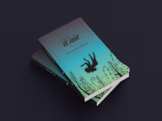
Book Design ― Waia