
Plinth
Each issue of the literary journal has its own typography and layout.
Role Designer and developer
Years 2014 to 2019
Scope Literary journal, Seven issues, Hand-written HTML & CSS
Industry Publishing
Team Myself, Garett Strickland, Tyann Prentice
I designed the typography and built every page, adjusting the column grid for each issue. Prose uses a consistent reading width, while each poem keeps its own arrangement.
Published by the Unwin-Dunraven Literary Ecclesia.
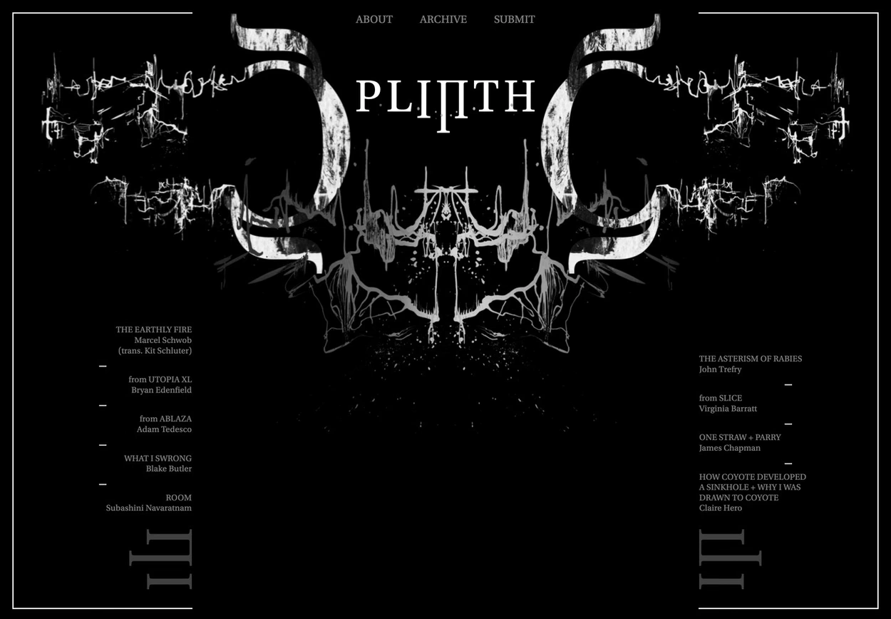
Issue 06 puts the entire journal on one scrolling black page, with Utopia Caption as the wordmark.
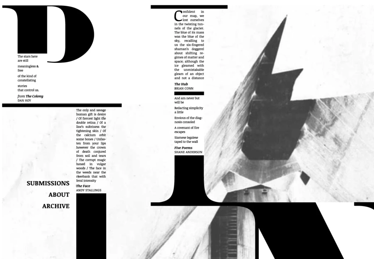
Issue 03 uses a poster image as its contents page, with clickable areas over the large letterforms.
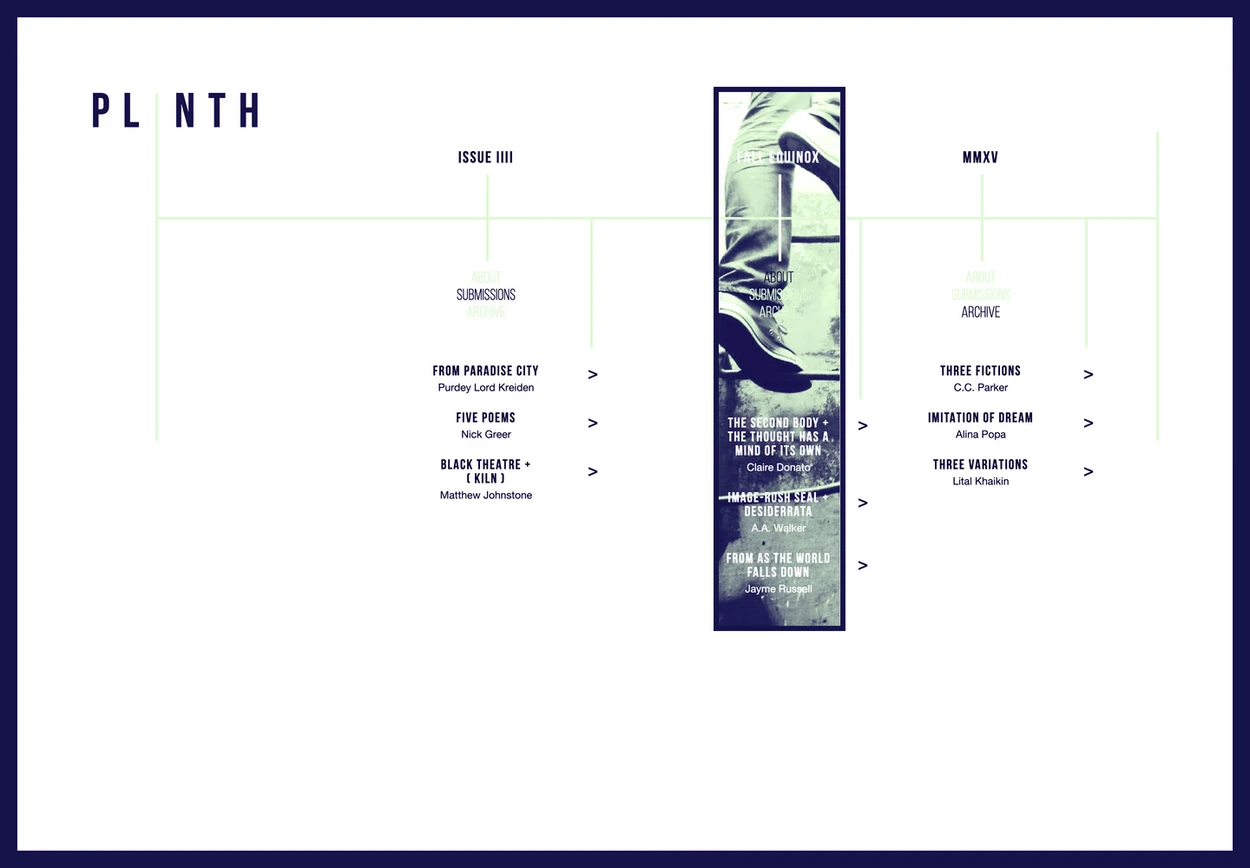
Issue 04 uses condensed capitals, a thin mint grid, and a navy border.
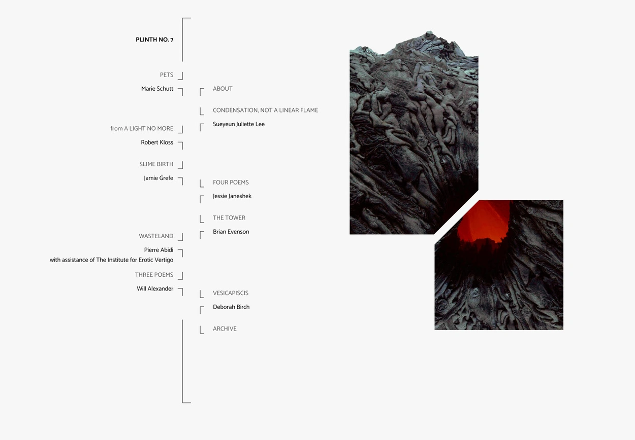
Issue 07 returns to the first issue’s bracket lines. Each of the seven issues has its own design.
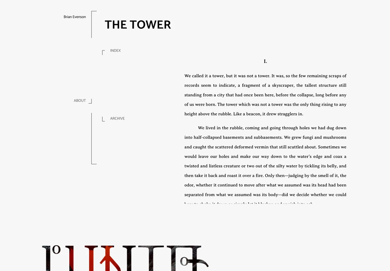
Brian Evenson’s “The Tower” uses a justified text column with the issue navigation in the margin.
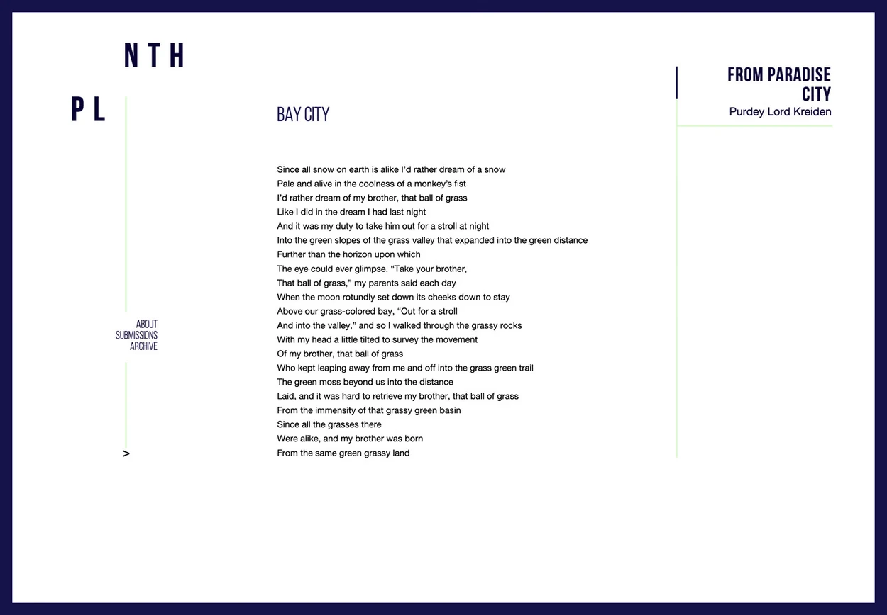
Purdey Lord Kreiden’s “from Paradise City” uses a narrow poem column with an uneven right edge.
The tour works backward through Plinth’s seven issues and opens one piece in each, showing the navigation and typography I designed for each issue.
0 likes · 0 views · Nov 7, 2026
Seven issues of a literary journal, each with its own typography and layout, designed and built by hand.
Timeline
Dec 31, 2013 - Dec 30, 2019

