Strategic Rebrand for Sherwood Concrete
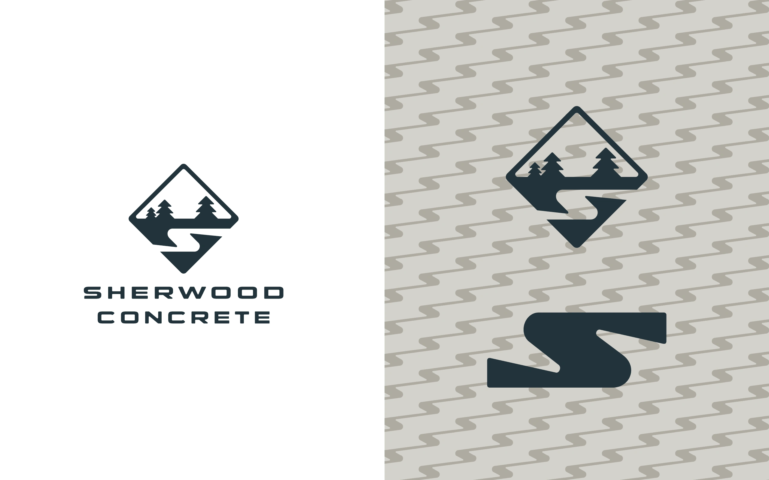
In a competitive construction materials industry, Sherwood Concrete needed more than just a visual refresh—they required a complete brand transformation that would signal their new management's innovative direction and commitment to quality. This comprehensive branding project was an opportunity to reposition the company from a traditional concrete supplier to a forward-thinking, reliable construction partner.
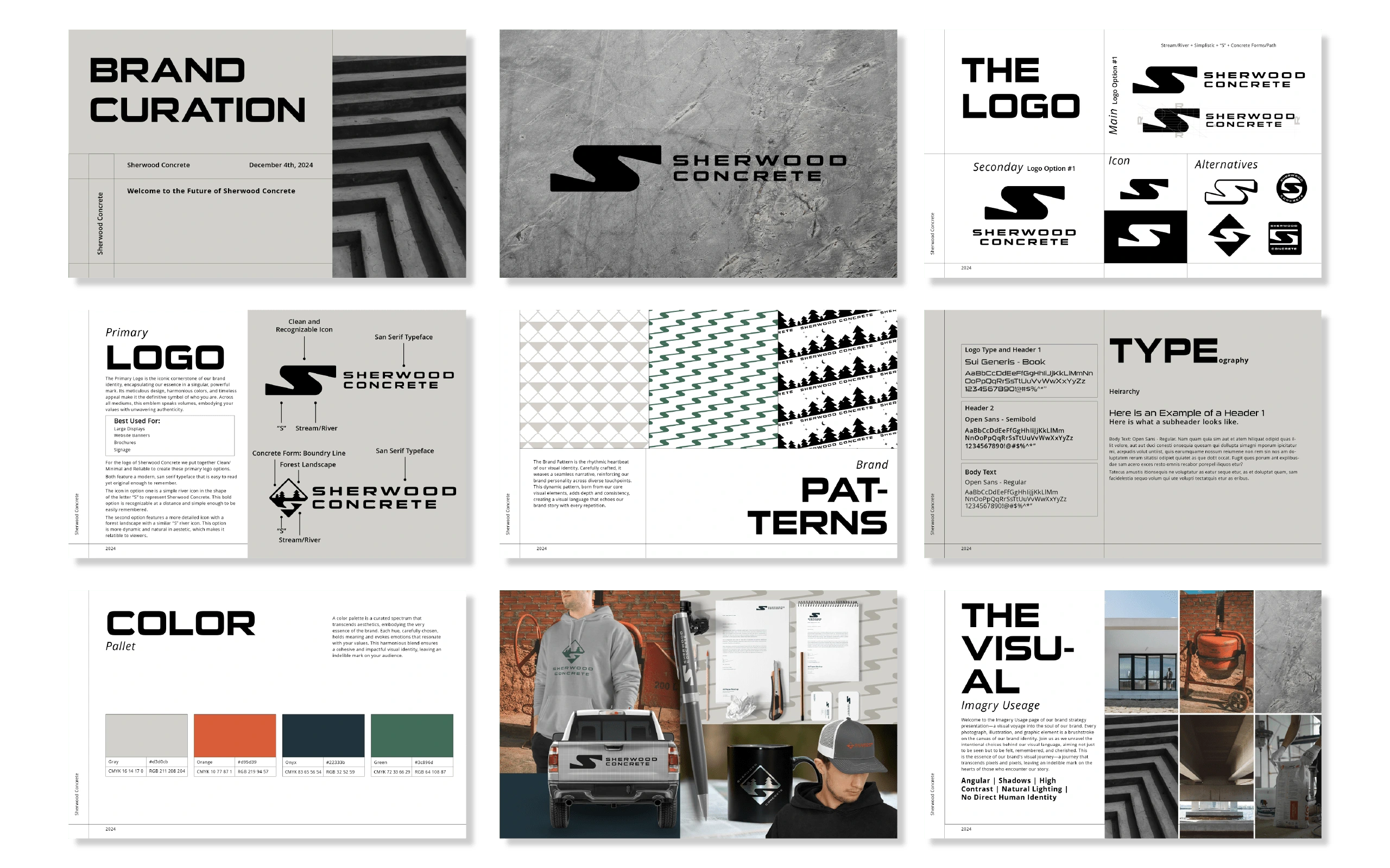
The design strategy centered on creating a visual identity that communicated strength, precision, and modernity. By developing a sophisticated color palette of deep slate grays, earthy green tones, and a bold accent of burnt orange, the brand system evokes the durability and technical expertise of Sherwood Concrete. The typography selection—a combination of a strong, geometric sans-serif for headlines and a clean, readable typeface for body text—reinforces the company's professional and contemporary approach.
Beyond aesthetics, the brand identity was meticulously crafted to provide flexibility across multiple touchpoints. Comprehensive brand guidelines ensure consistent application from heavy machinery wraps to corporate stationery, digital platforms, and marketing collateral. The resulting visual system not only modernizes Sherwood Concrete's image but provides a strategic framework that supports their business growth and market positioning, demonstrating how intentional design can be a powerful business tool.







Like this project
What the client had to say
Kaity did an amazing job for our client! Her creativity, professionalism, and attention to detail exceeded expectations. I highly recommend her for any project—she’s a true asset who delivers exceptional results!
Benjamin Bachman
Dec 13, 2024, Client
Posted Dec 12, 2024
Strategic rebrand for Sherwood Concrete transforms industry perception, blending modern design with technical precision to elevate a construction materials bran
Likes
3
Views
67
Timeline
Nov 25, 2024 - Dec 12, 2024
Clients
360 Outdoor Media Group

