GERONIMO: Travel Planning App
A Travel Planning App(Personal Project)
Overview
Geronimo is a mobile application that helps people of all age to plan their travel/holiday, which begins with choosing the destination and continues through booking their return tickets, accommodation and activities and guide them through the trip. It would save time by having all the bookings and guidance involved in a trip in one place.
(Project for MSc UX Design)
Problem
There are websites or mobile apps to book travel tickets, suggest holiday locations and activities, book hotel rooms, or even book a pre-planned holiday which includes other things. But, users would have to visit multiple platforms to book them all.
Solution
Making all bookings needed for a trip available in one app. Starting with suggesting places to visit, booking travel tickets and stay, and to even guide user through the whole trip with reminders and maps.
My Role
UX design
UX research
UI design
Timeline
Overall: 5+ weeks
Discovery & Research: 2+ weeks
Design & testing: 3 weeks
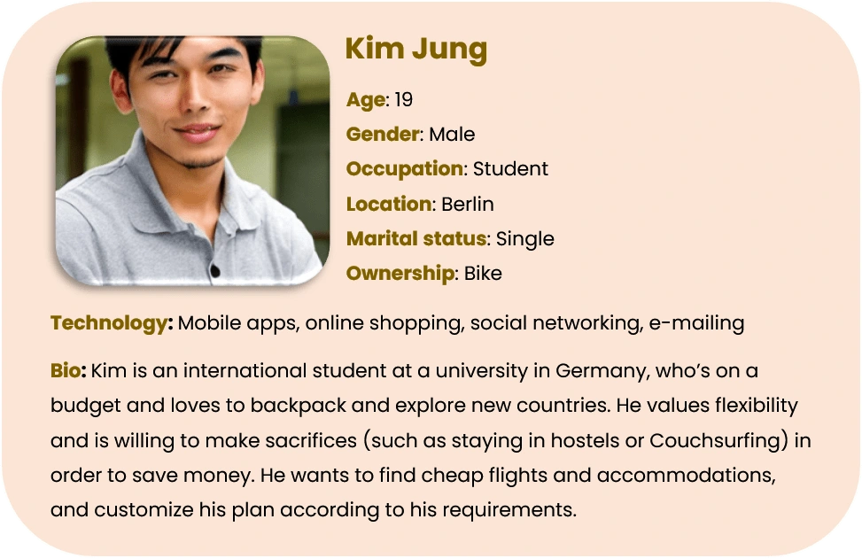
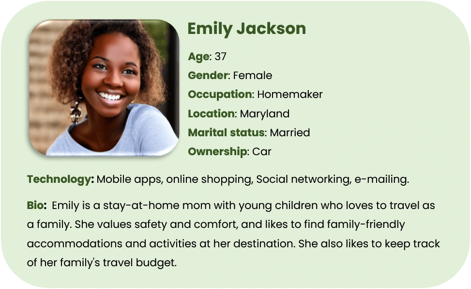
Personas
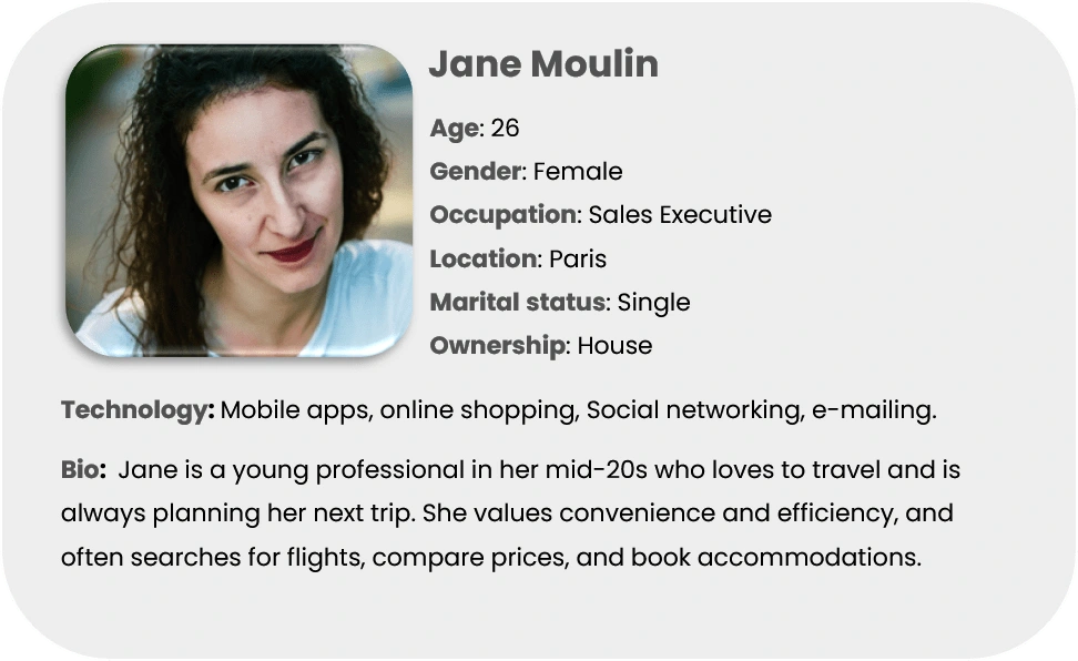
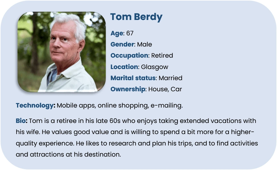
I wanted to form a deeper understanding of our users' goals, needs, experiences, and behaviors. So, I created 4 personas for each of the user segments. I used these personas whenever I wanted to step out of myself and reconsider my initial ideas.
User Journey
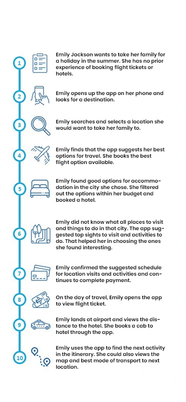
The below task scenario shows how a user's journey through the app during the process of planning a trip.
Emily Jackson wants to take her family for a holiday in the summer. She has no prior experience in booking flight tickets or hotels.
Emily opens up the app on her phone and looks for a destination.
Emily searches and selects a location she would want to take her family to.
Emily finds that the app suggests her best options for travel. She books the best flight option available.
Emily found good options for accommodation in the city she chose. She filtered out the options within her budget and booked a hotel.
Emily did not know all places to visit and things to do in that city. The app suggested top sights to visit and activities to do. That helped her in choosing the ones she found interesting.
Emily confirmed the suggested schedule for location visits and activities and continues to complete payment.
On the day of travel, Emily opens the app to view the flight ticket.
Emily lands at the airport and views the distance to the hotel. She books a cab to the hotel through the app.
Emily uses the app to find the next activity in the itinerary. She could also view the map and the best mode of transport to the next location.
Wireframes
Using Balsamiq, I translated my first sketches into low-fidelity wireframes. They capture the fundamental design and concept of the developed app. It was crucial to keep the Lo-Fi as straightforward and understated as possible. This is so that they could determine what was lacking and what they would want to include in the design while conducting user testing.
This design went through 2 iterations. The first one was to place all ideas in the app space, and the last one was to arrange every functionality for a better user experience.
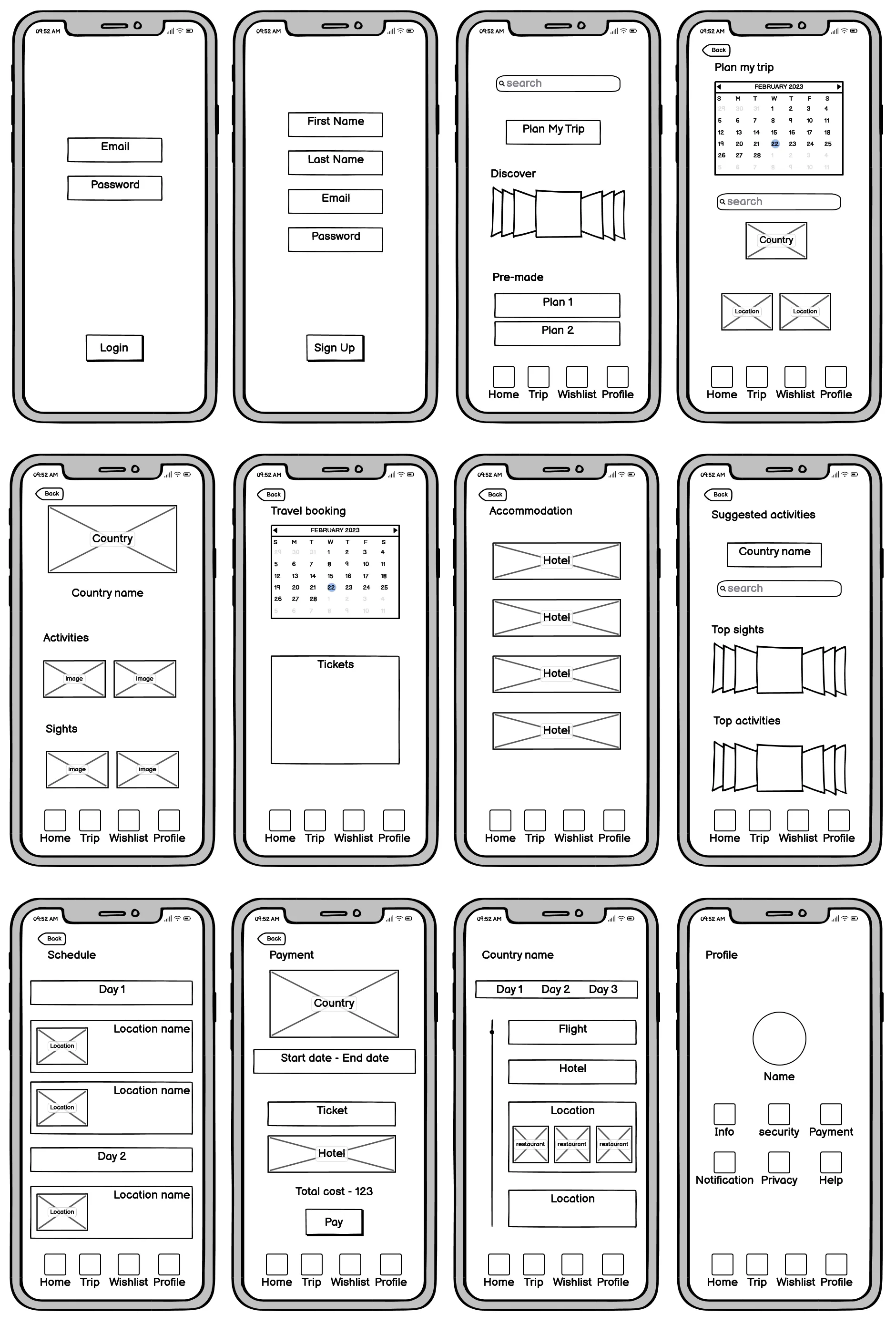
Final iteration wireframes of the app (created in Balsamiq)
Usability Testing
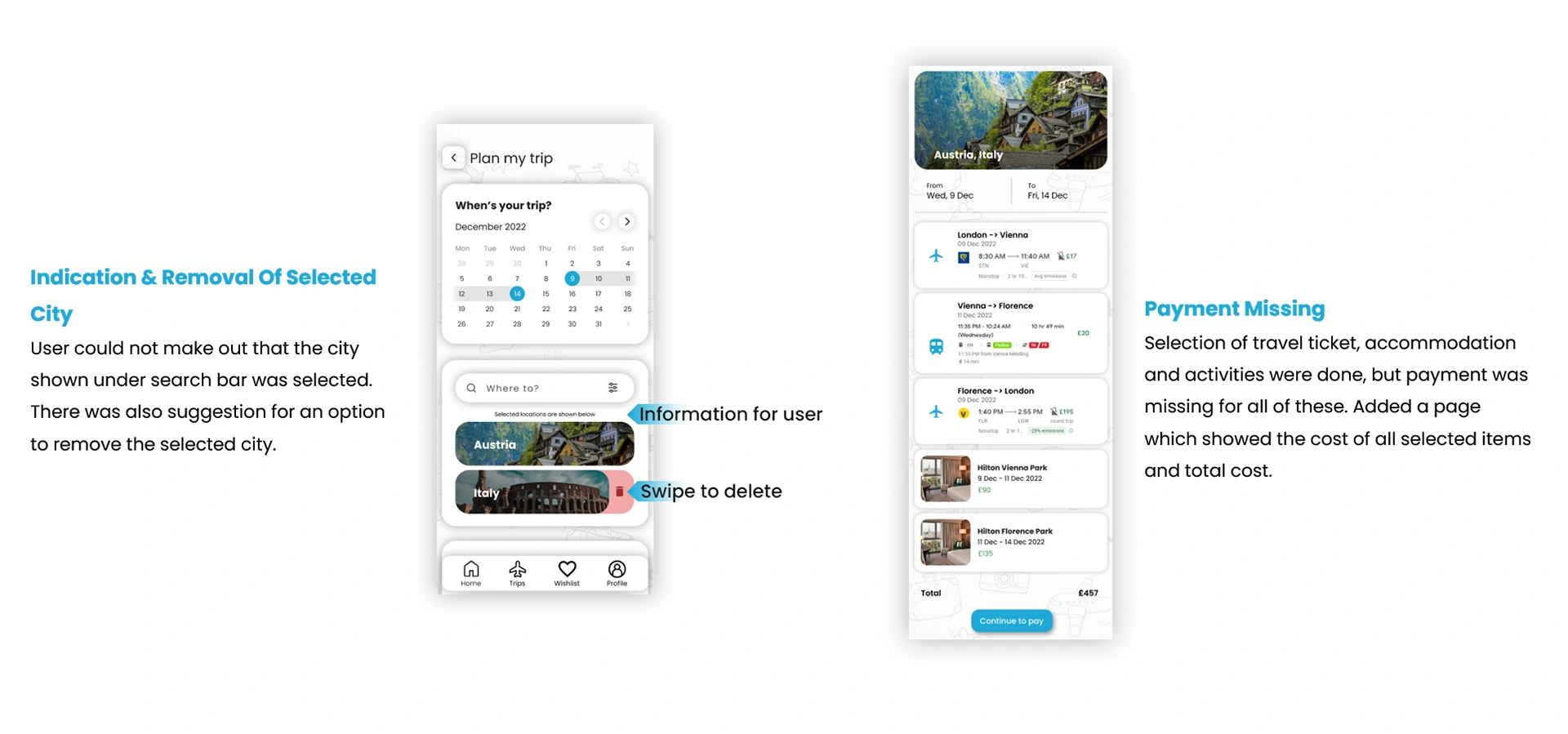
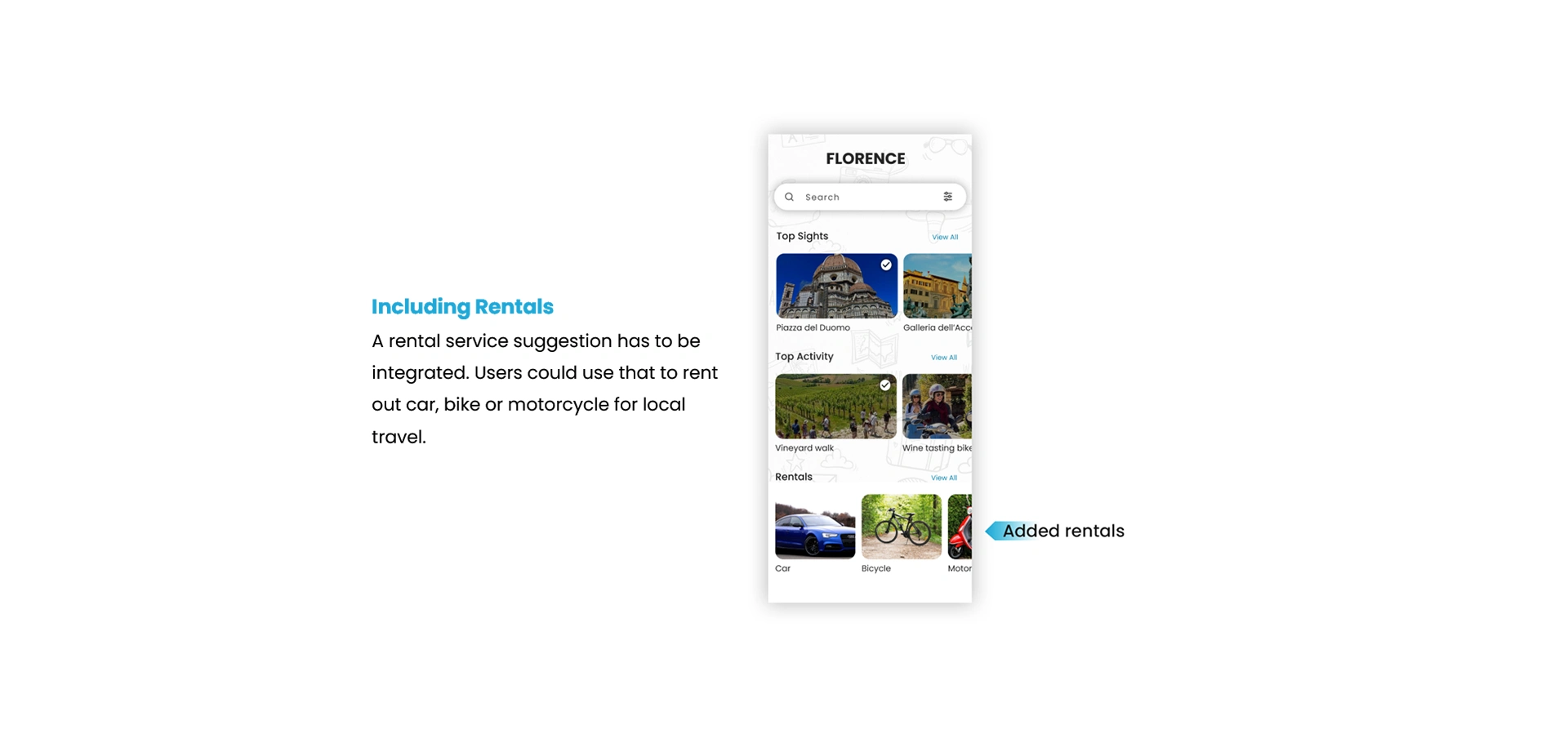
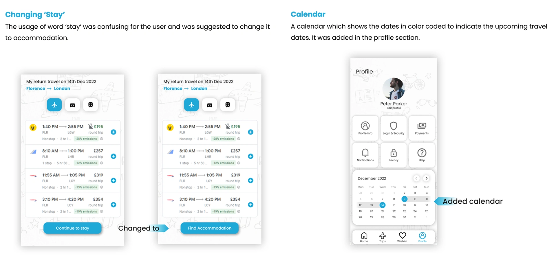
I created a fully-functional, high-fidelity prototype of the new flows using Figma. At the same time, I started recruiting subjects for the test who fit my criteria. I did 4 usability tests in the first round and 2 after iterating on the issues that I’ve identified:
UI Design
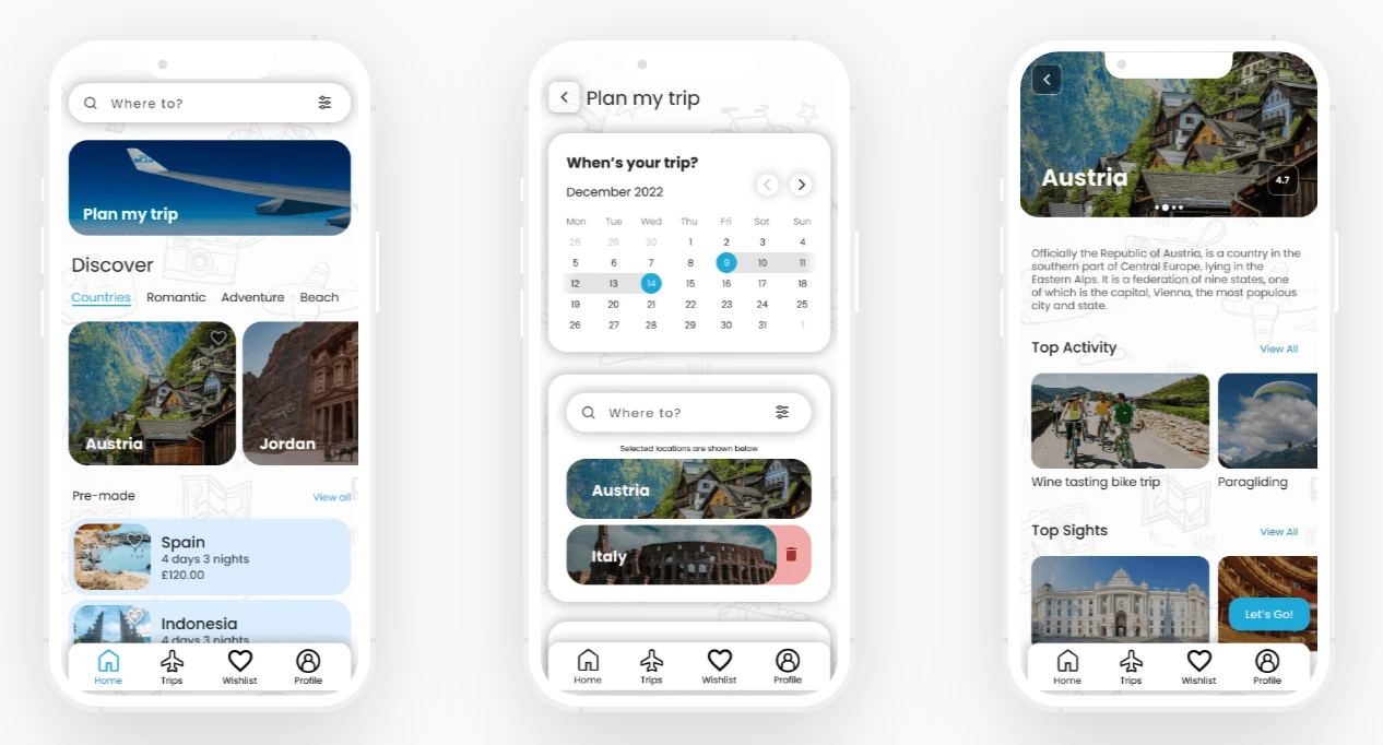
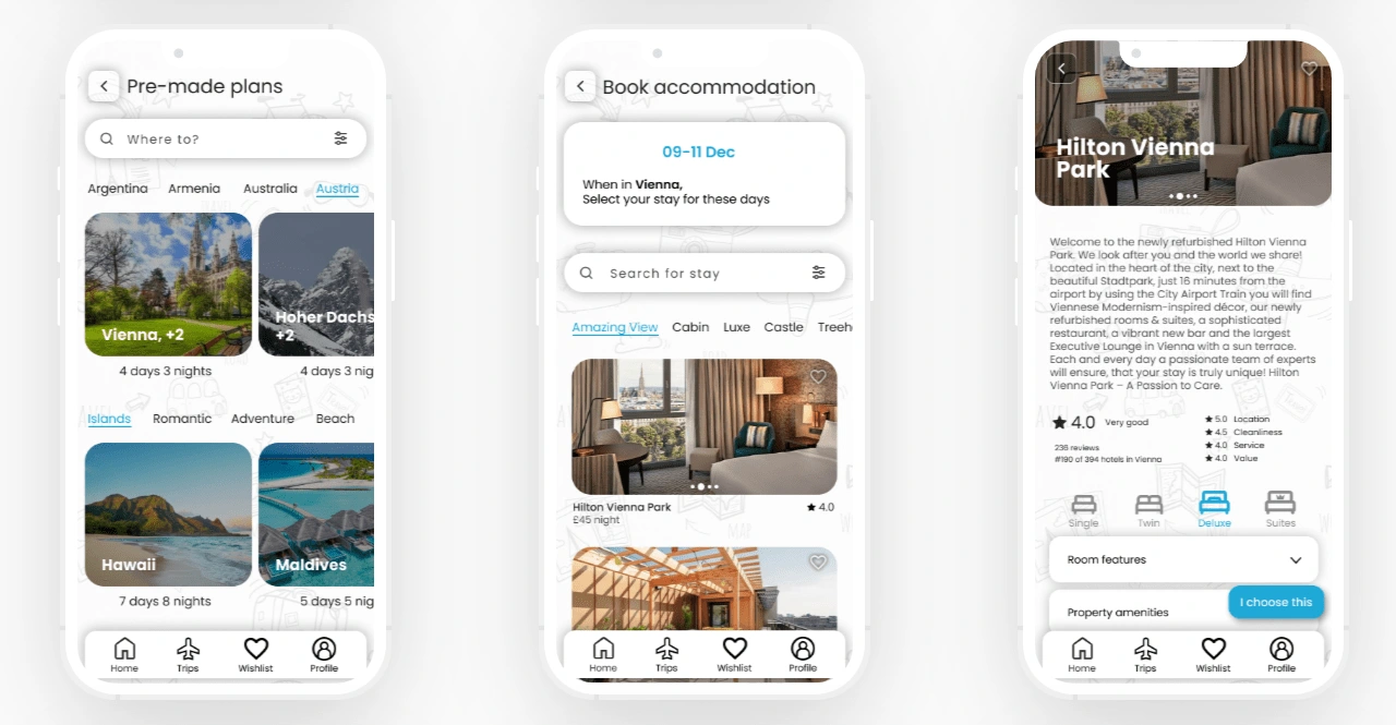
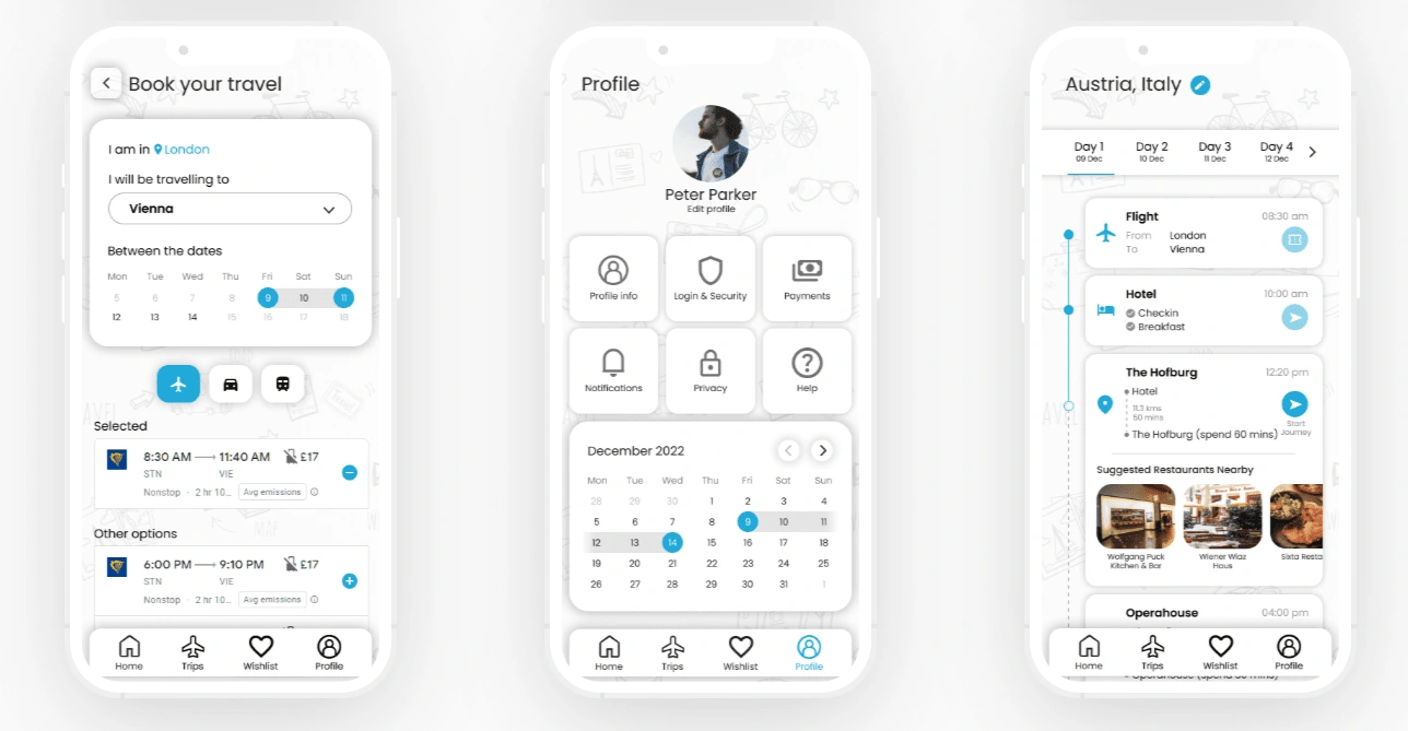
Once the usability issues were resolved, I moved on to design the final screens in Figma. My goal was to create a visual identity that aligned with the brand’s values. Also, I’ve checked the competition and took a deep dive into my catalog of references for inspiration.
The colour scheme chosen for this app had to be relaxing and comfortable for people of all ages. Therefore, the color combination of black, white and blue had been selected. Everyone is used to the classic style of black text on white background. Blue is usually very relaxing and is also colour-blind-friendly. If the app needs to have a dark mode, the whites and blacks could easily be reversed and the blue can remain the same.
Images are a vital part of the app. There would be images of the locations, hotels, restaurants, activities, etc. Since there would be images of different colours showcased, it would be more apt to have a white background.
Figma Prototype
Click the below button to view the prototype of the Geronimo app.
Next steps
After testing with multiple users, there came a few suggestions to include more functions that were based on their personal experiences. Due to time restrictions, they are moved to future development scope. In the next iteration, the following functionalities will be added:
01
There will be an online community for travelers to discuss or recommend destinations or activities to others.
02
There will be an AR live-view navigation to locations. This would give them an enhanced experience in navigating to destinations and back.
03
There are plans to add audio & video descriptions for historic sites and museums. This gives the user in-depth information about the destinations they visit.
04
There will be an option for the users to chat with accommodation and activity hosts.
Like this project
Posted Aug 18, 2024
Geronimo is a mobile app that helps people of all age to plan their travel/holiday, from choosing the destination and continues through booking and guidance.
