BBC Website Redesign
A Fresh Take on News and Entertainment(Personal Project)
Is there a problem?
The BBC website, a global news and content platform, has grown complex and outdated, resulting in reduced user engagement. This project seeks to assess the need for a redesign, propose improvements, and align with the diverse preferences of its audience.
Tools
Figma
Photoshop
Illustrator
My Role
UX design
UX research
UI Design
Timeline
Overall: 8+ weeks
Discovery & Research: 3+ weeks
Design & testing: 5 weeks
My Design Process
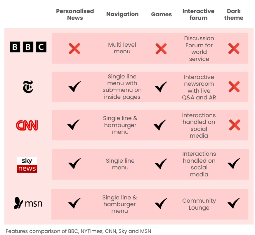
Competitor Analysis
Formative Tests
During the project's research phase, I conducted user testing and interviews to understand the usability issues and user expectations. Three individuals from various fields of employment were the subjects in this formative study. To collect responses from different perspectives, participants from various backgrounds and geological locations were chosen.
Think Aloud Protocol
The Think Aloud protocol was conducted on all 3 users. They were asked to go through all pages of the website and then were given tasks like finding specific/latest news from their field of work, finding related news of the same, etc.

SUS
A 5-point scale is used for the SUS questionnaire, which consists of ten questions (both positive and negative). It was assessed and received a score of 52.5%.
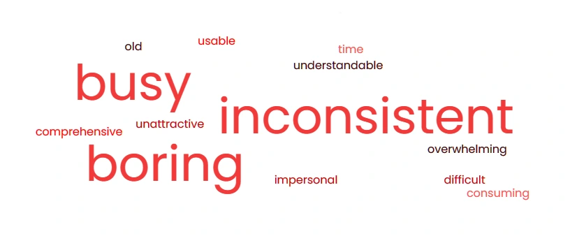
Product Reaction Card
The reduced product reaction cards list with 64 words was shared with the users after exploring the website. Each user chose five words from the list to describe the website. The responses received are shown as Wordcloud above. It had only 20% positive responses.
Observations
Overwhelming and busy interface
Difficulty in finding personalized news
Unimpressive site imagery
Navigation and menu confusion
Slow image loading
Lack of specific news discovery
Outdated UI design
Distracting ads impacting user engagement
Missing:
Related news recommendations
"You may be interested in" section
Interactive content
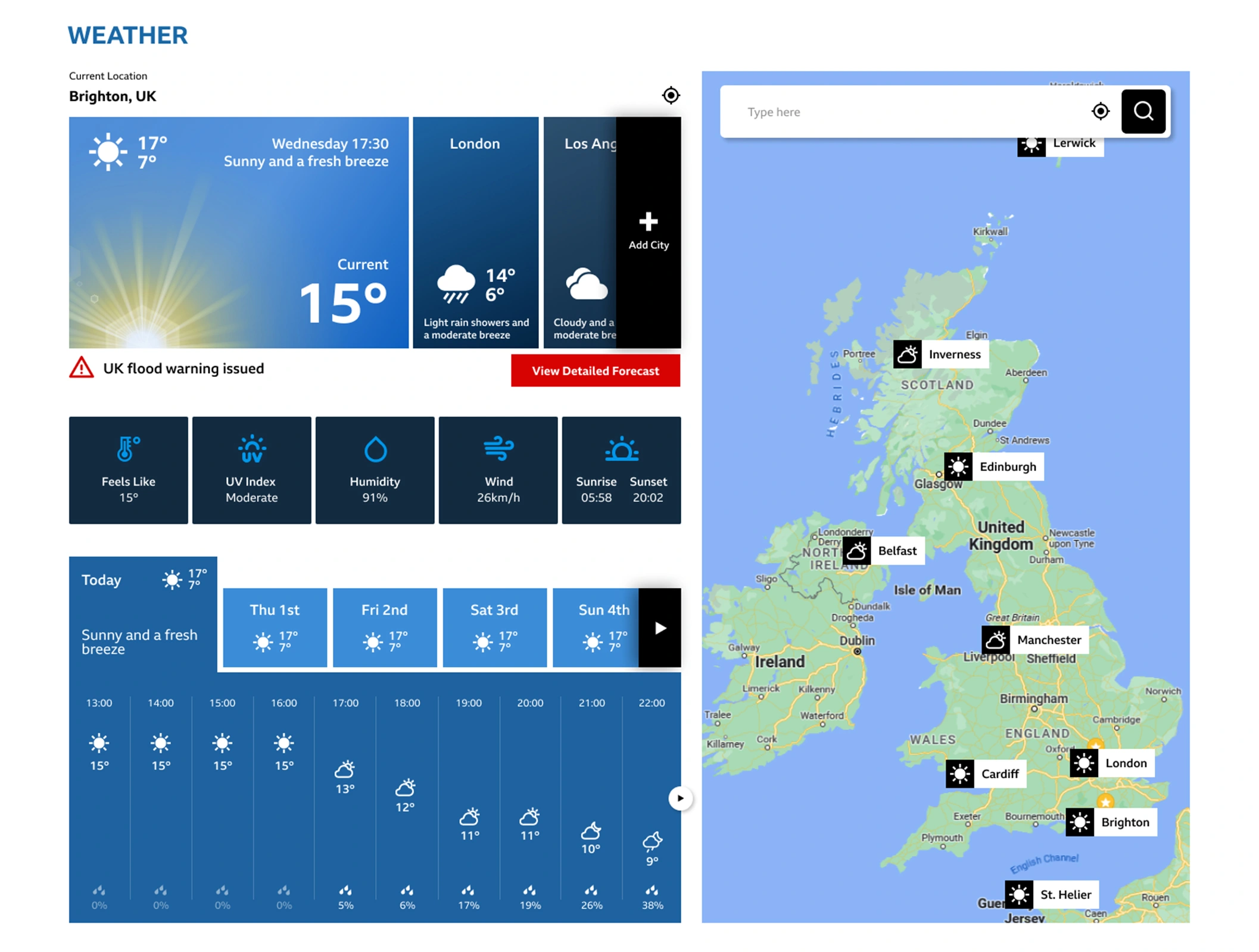
Automatic location detection for weather
Dark theme
"Tech" page option in the menu
Improved menu access during scrolling
Audio news feature desired
Recommendations
Simplify and enhance news layout for visual appeal.
Personalize the home page with user interest-based recommendations.
Streamline navigation menu for accessibility and easier browsing.
Ensure design consistency for interactive elements.
Implement automatic location-based weather detection.
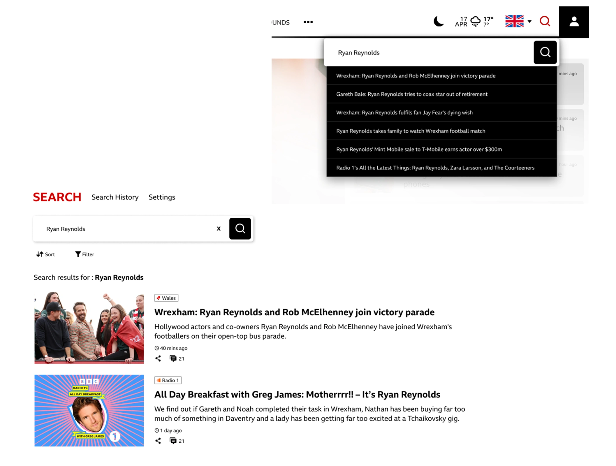
Improve search with recent news prioritization and effective sorting.
Introduce interactive content for increased engagement.
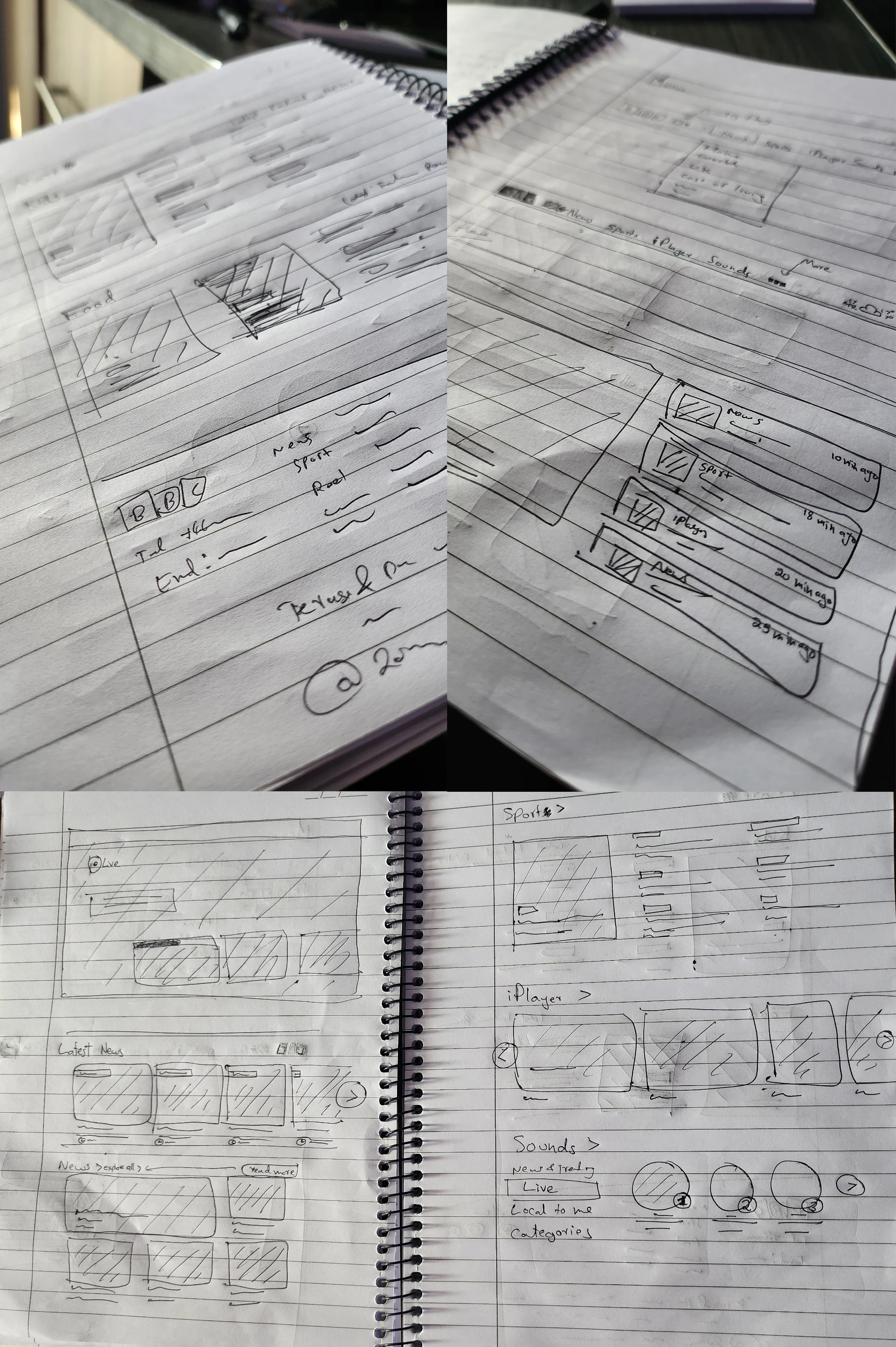
Sketches of layout
Sketches
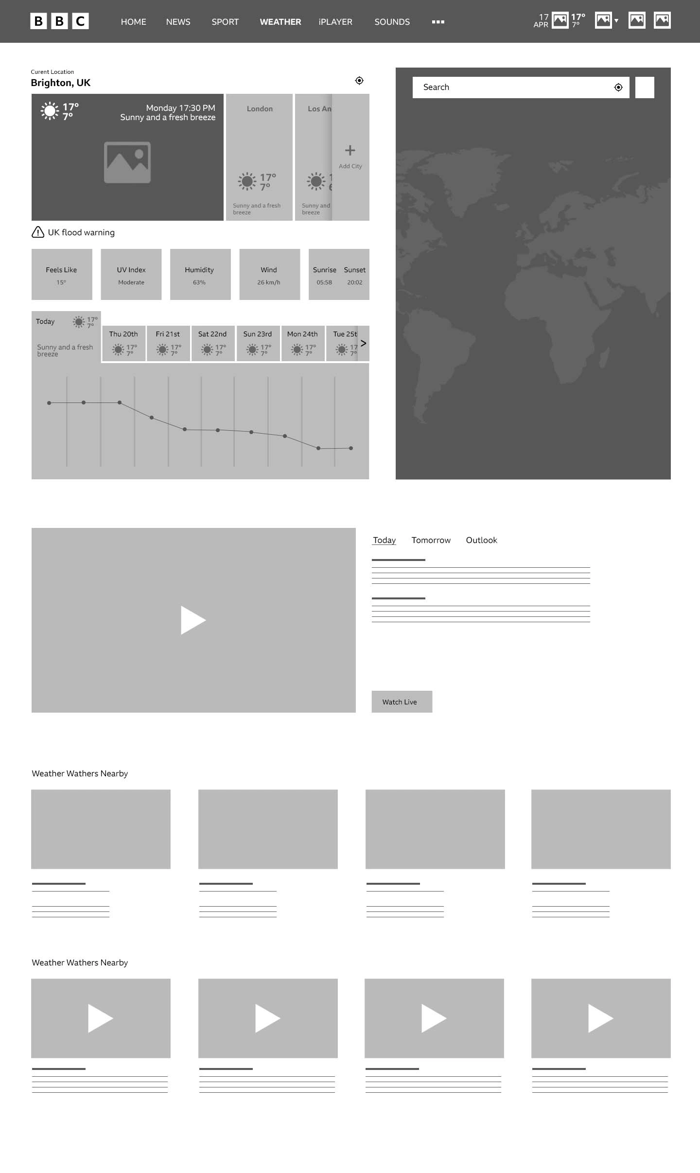
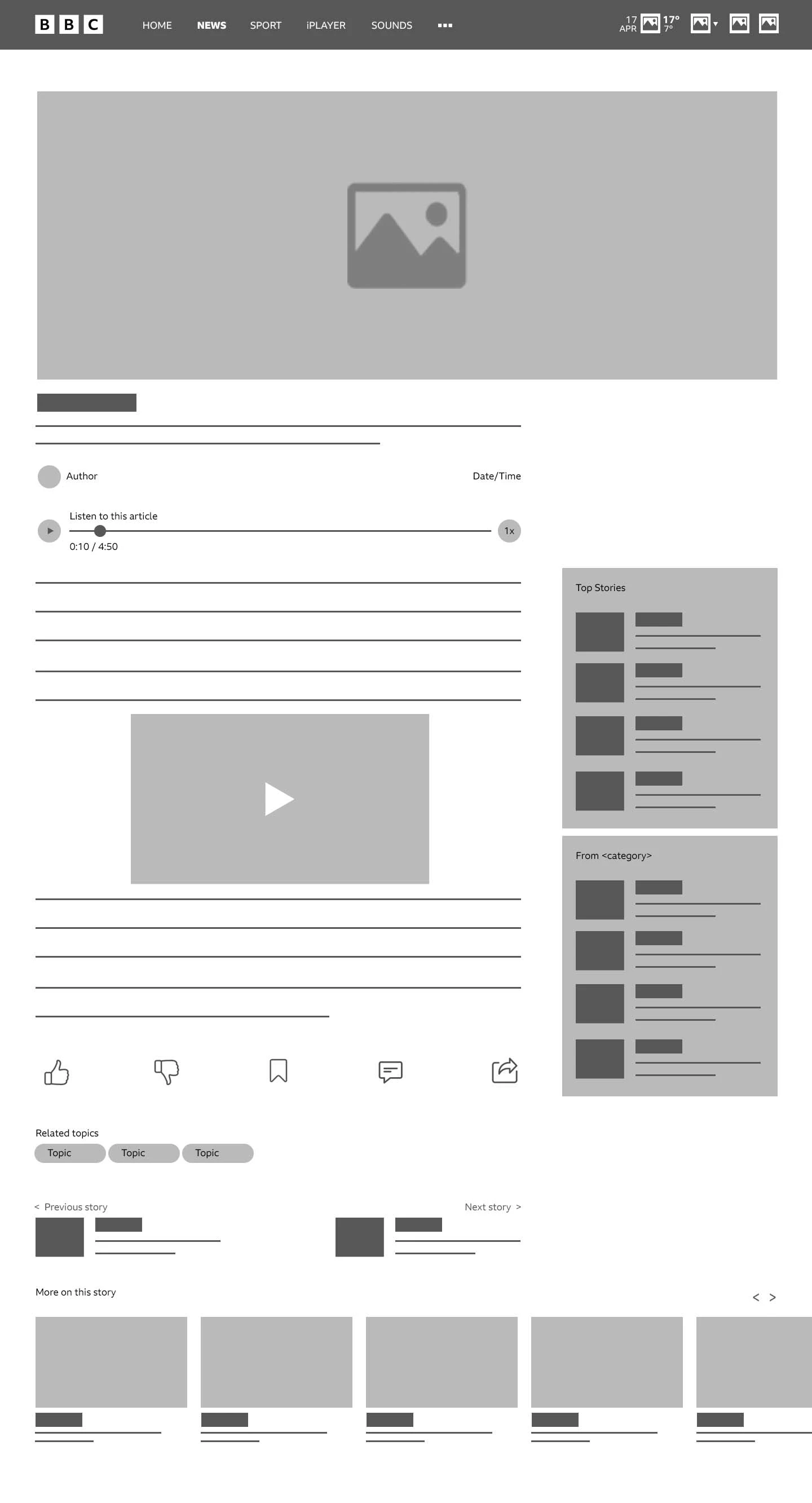
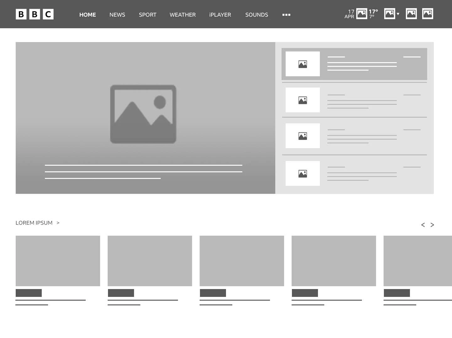
After analysing the test results, only a few of the pages were selected for redesigning. They include Home, News(including selected news), Weather, Account, and changes to the navigation layout. The layout for News will be followed for pages like Sport, Food, travel, etc. Since the pages CBBC, CBeeBies, and Bitesize have a target audience below 18 years old, I was not allowed to test with them. Hence, those pages were not chosen for redesigning. Before building wireframes, the layouts for these pages were hand drawn on a book with a pen, as they are easy and fast.
Fail Fast, Fail Cheap!
Wireframes
Using Figma, I translated my first sketches into low-fidelity wireframes. At this stage, the wireframes were defined enough for some user testing. Based on a few tests, I’ve made a few alternations and moved on to creating high-fidelity prototypes.
Branding
Since the BBC’s branding was quite good, there was no need for a Significant change in its branding. However, a few changes were made since the design demanded it and to improve the visual appeal.
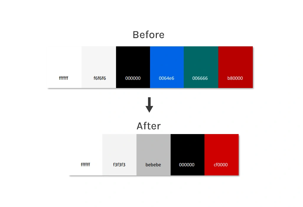
The colours have been modified a little bit and simplified to make it more streamlined. The shades of white and black are used mainly throughout the design for backgrounds and texts. The red colour is used to indicate important things like buttons, Live news, etc.
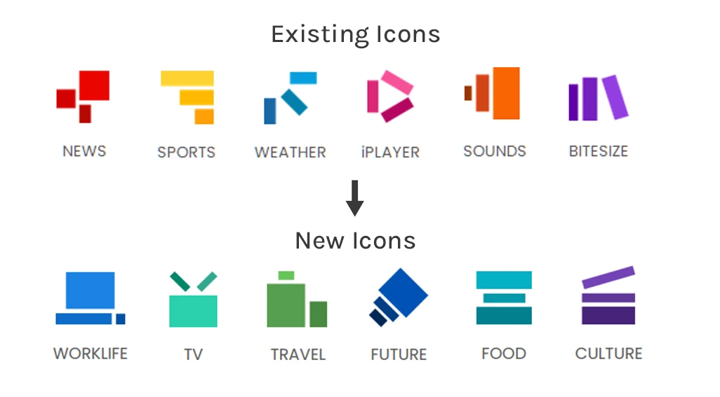
The website only has icons for the first six menu items. The only requirement for icons was that they be a combination of three rectangles and be related to the associated menu option. The icons for the remaining menu selections were generated in accordance with the specifications.
UI Design
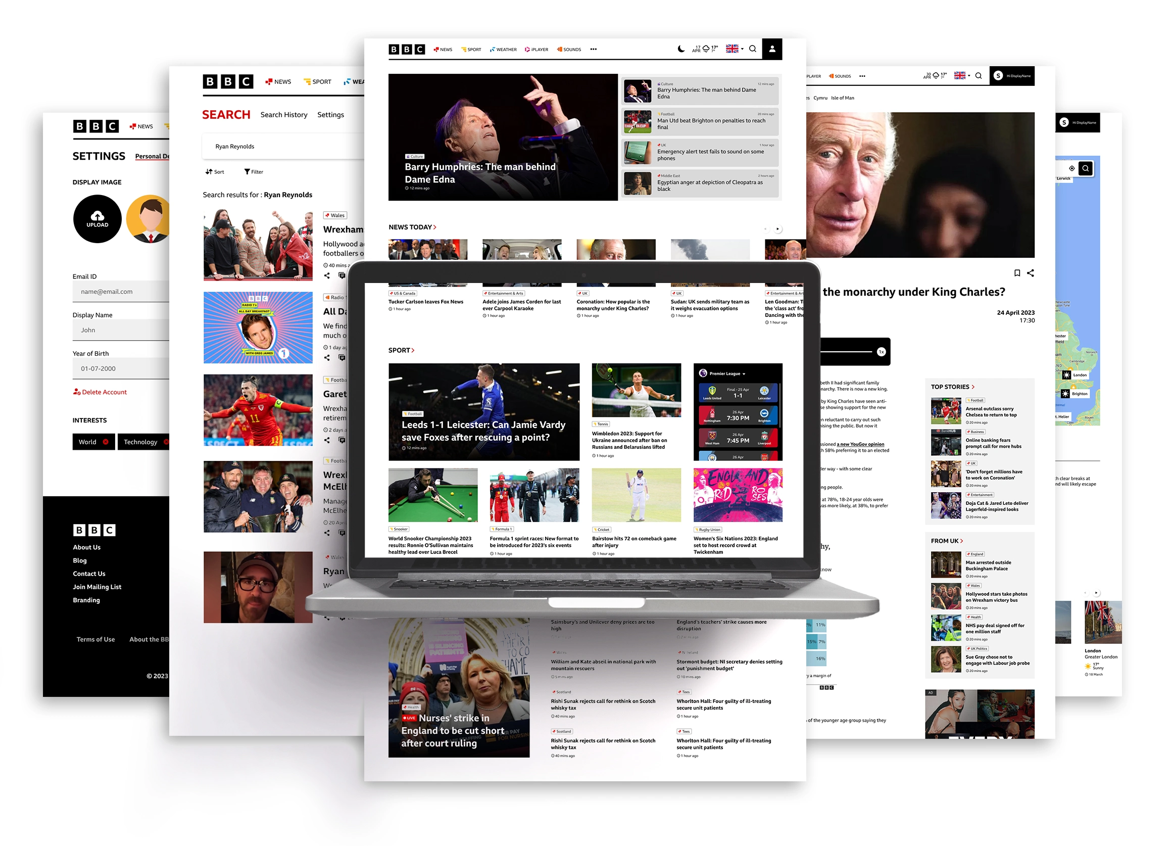
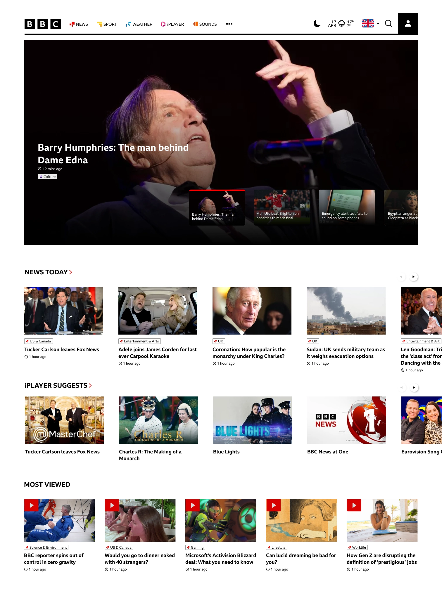
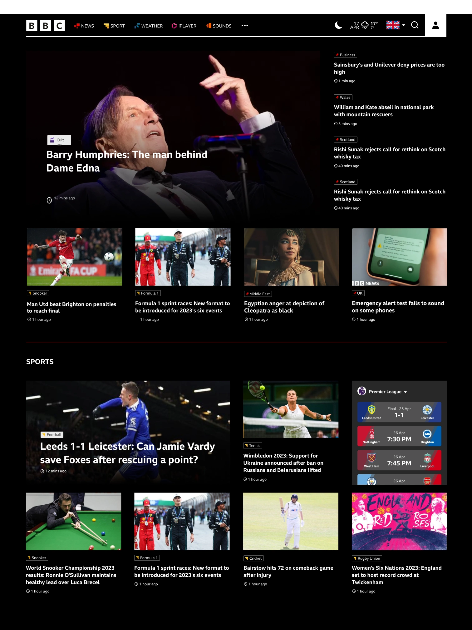
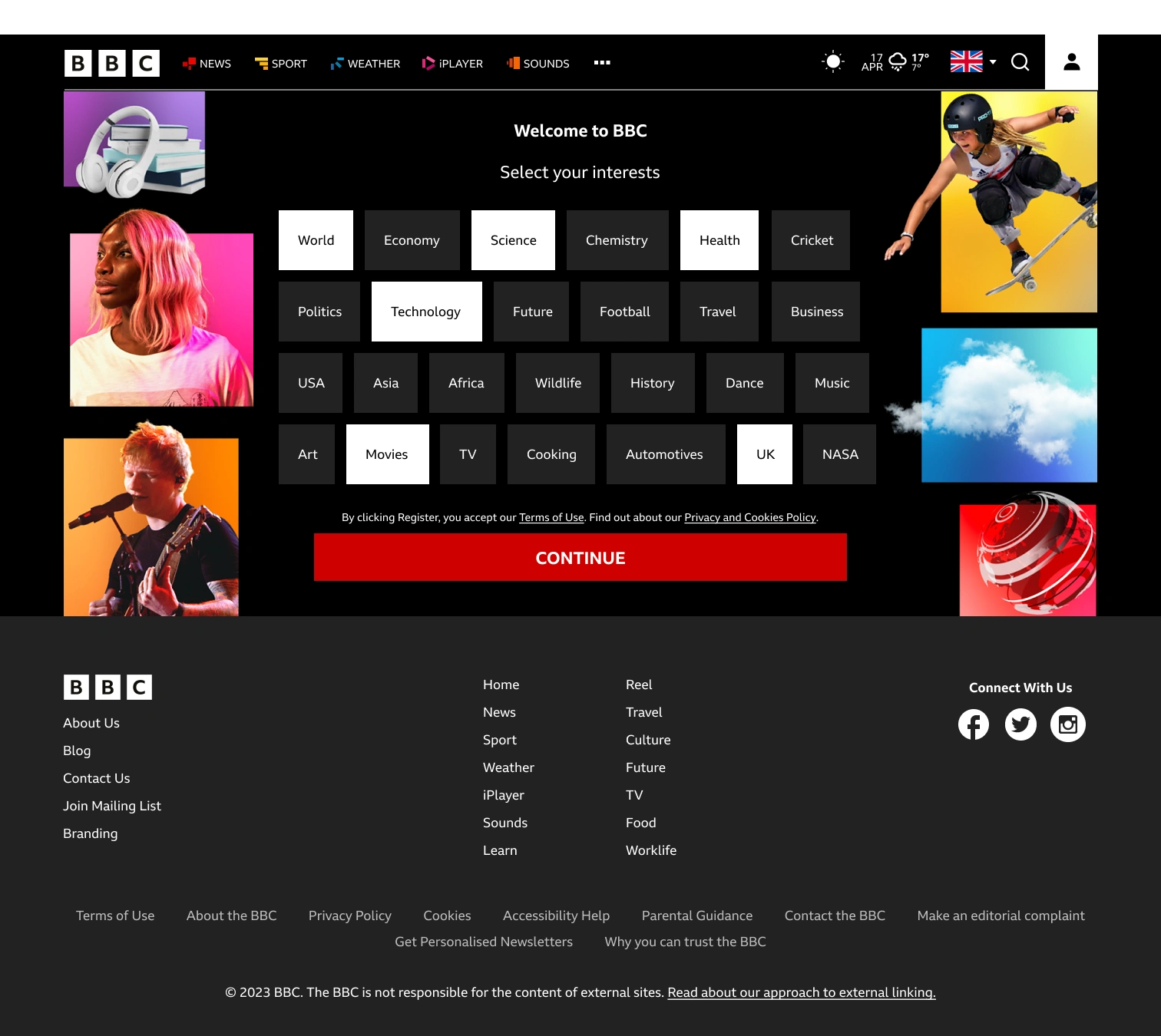
The screens below showcase the visual development of the BBC website revamp. Several styles were tried throughout this process, including one that relied primarily on sliders, one that prioritised text, and one that has got a similar style to the final design but with a darker layout.
Iterations
Several styles were tried throughout this process, including one that relied primarily on sliders, one that prioritised text, and one that has got a similar style to the final design but with a darker layout. These revisions resulted in the final design, which incorporated aspects from all three prior iterations.
Below are the 3 iterations before finalising the design.
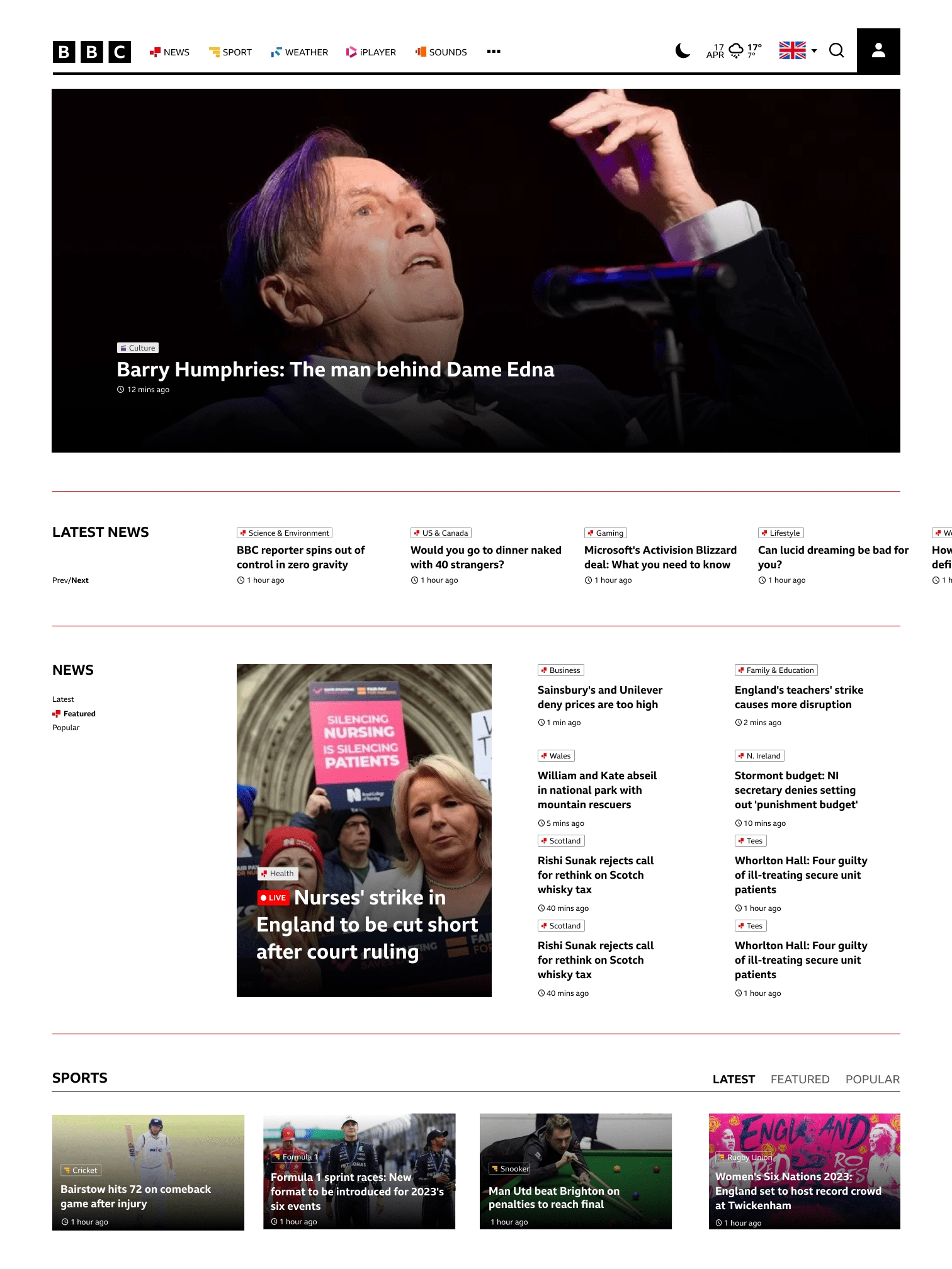
Final Design
The following is a list of organisational and visual modifications made to the BBC website. These are only the fundamental structural modifications made to the website design, while there are more minute changes to the design that has not been mentioned here.
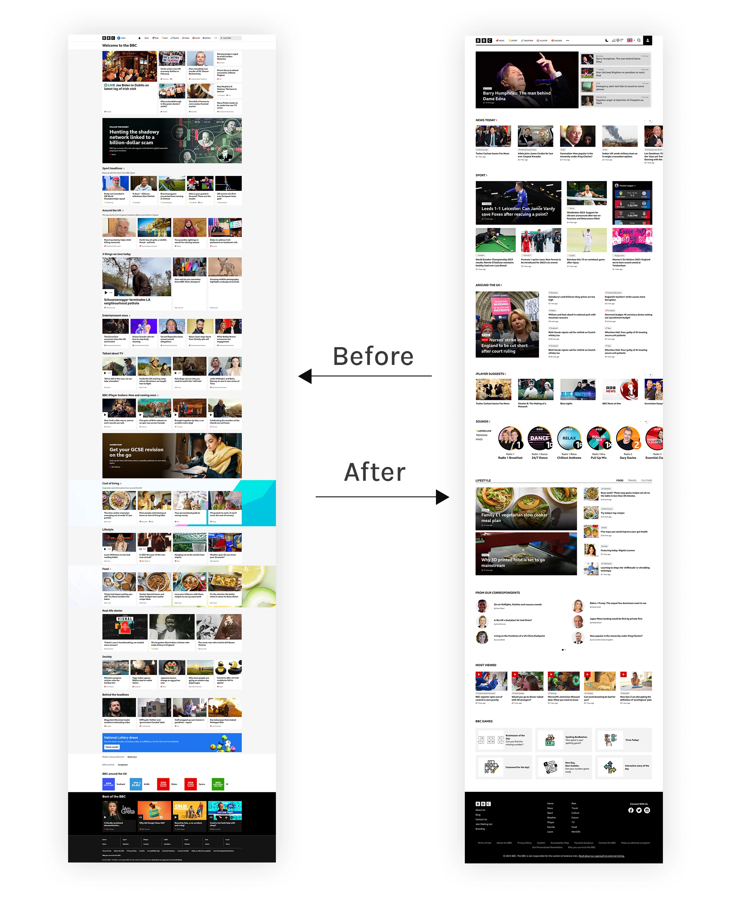
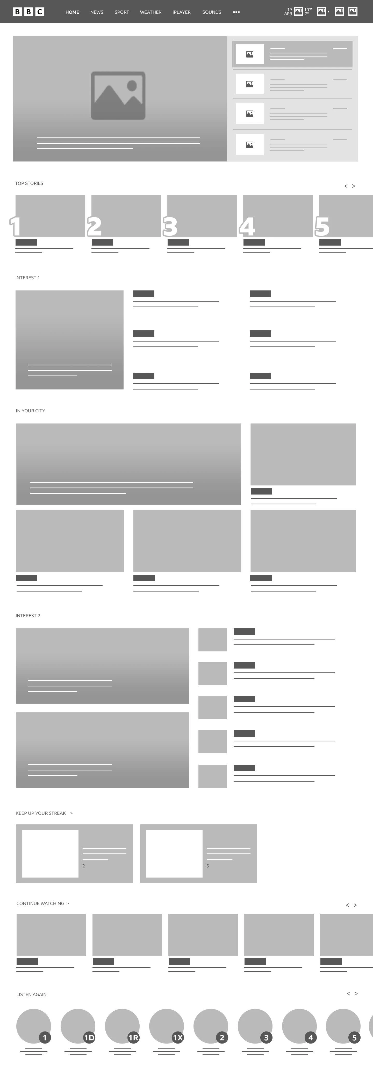
Home page: before and after
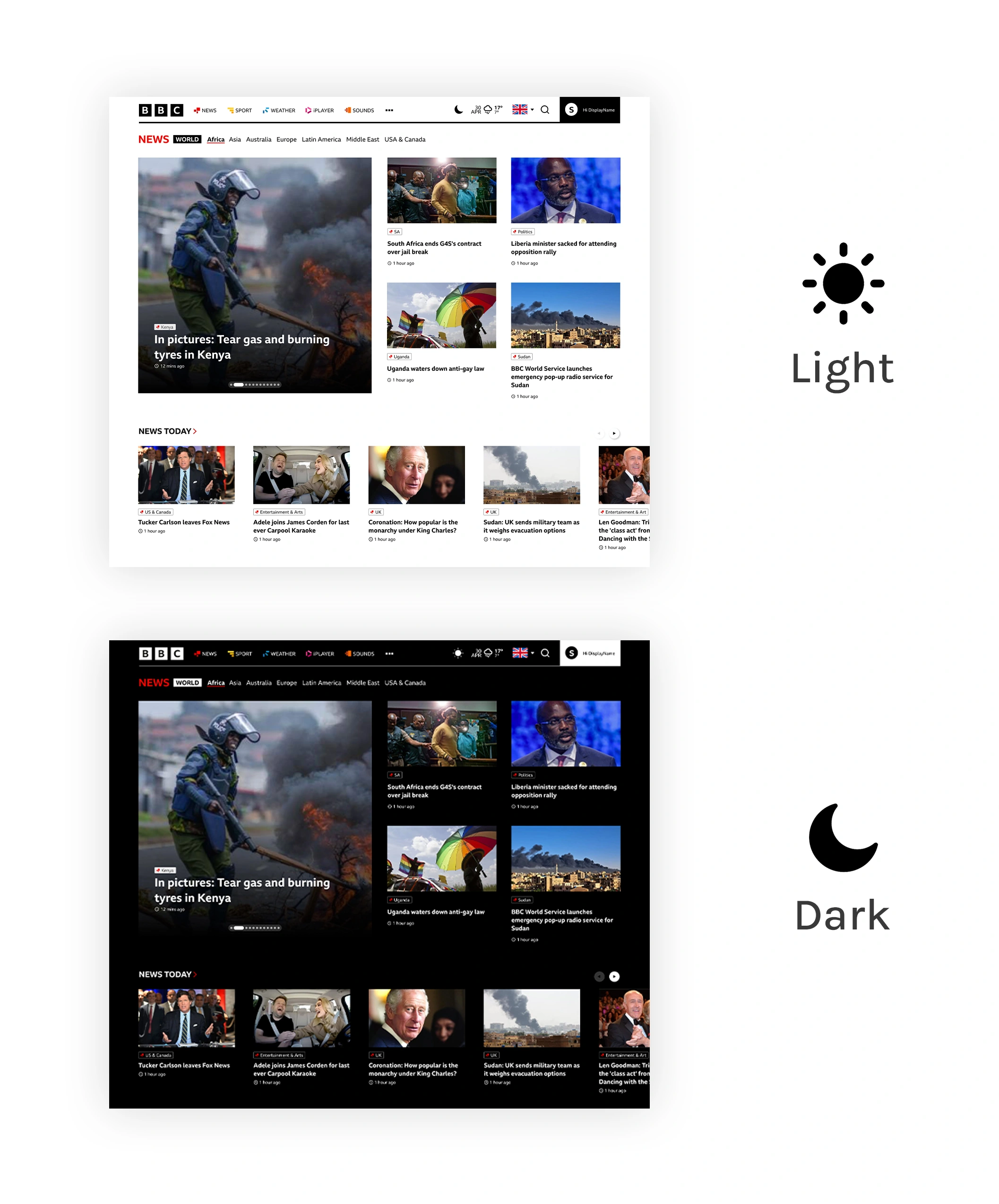
Design and Themes
Refined color palette.
Dark and light theme options.
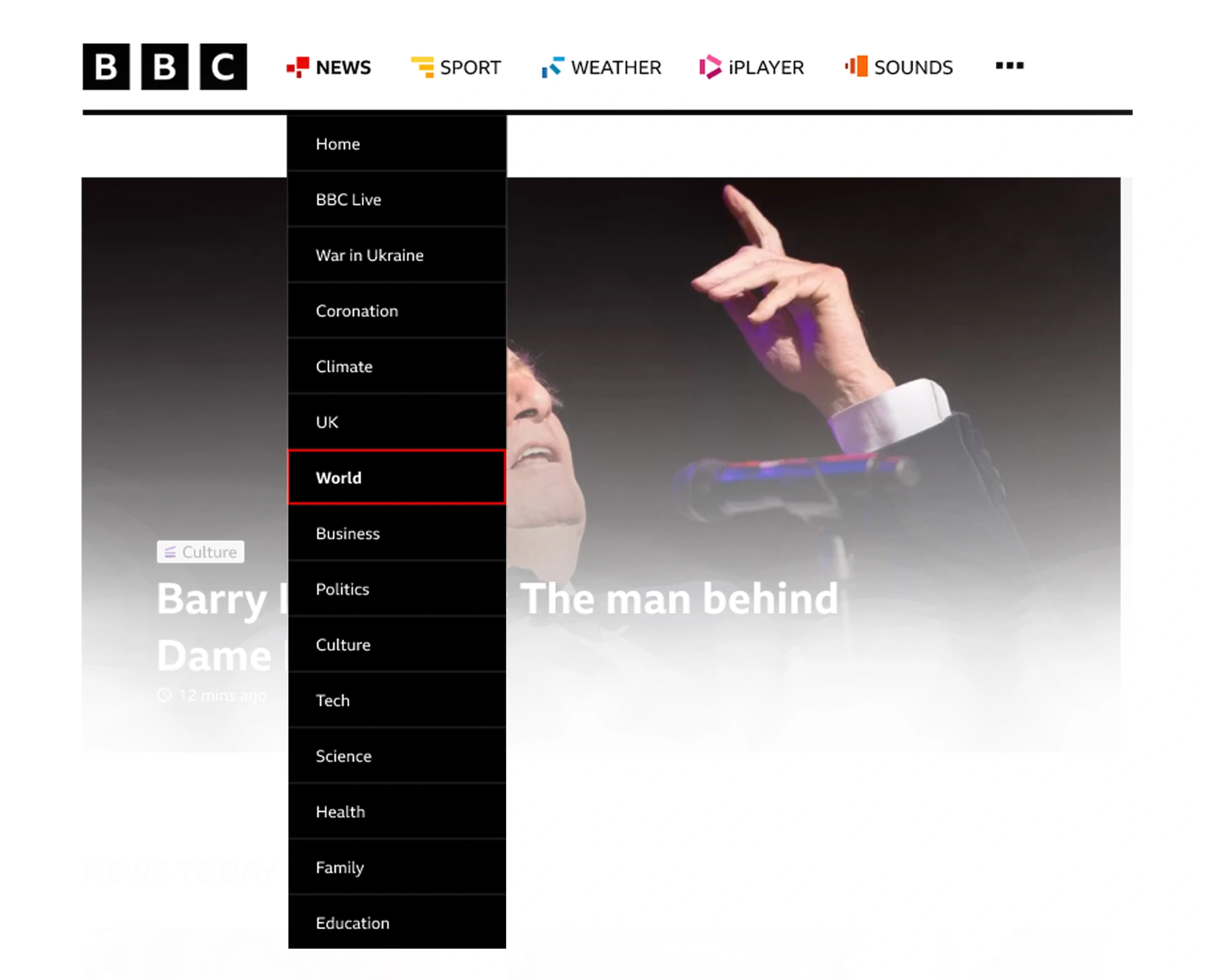
Navigation and Layout
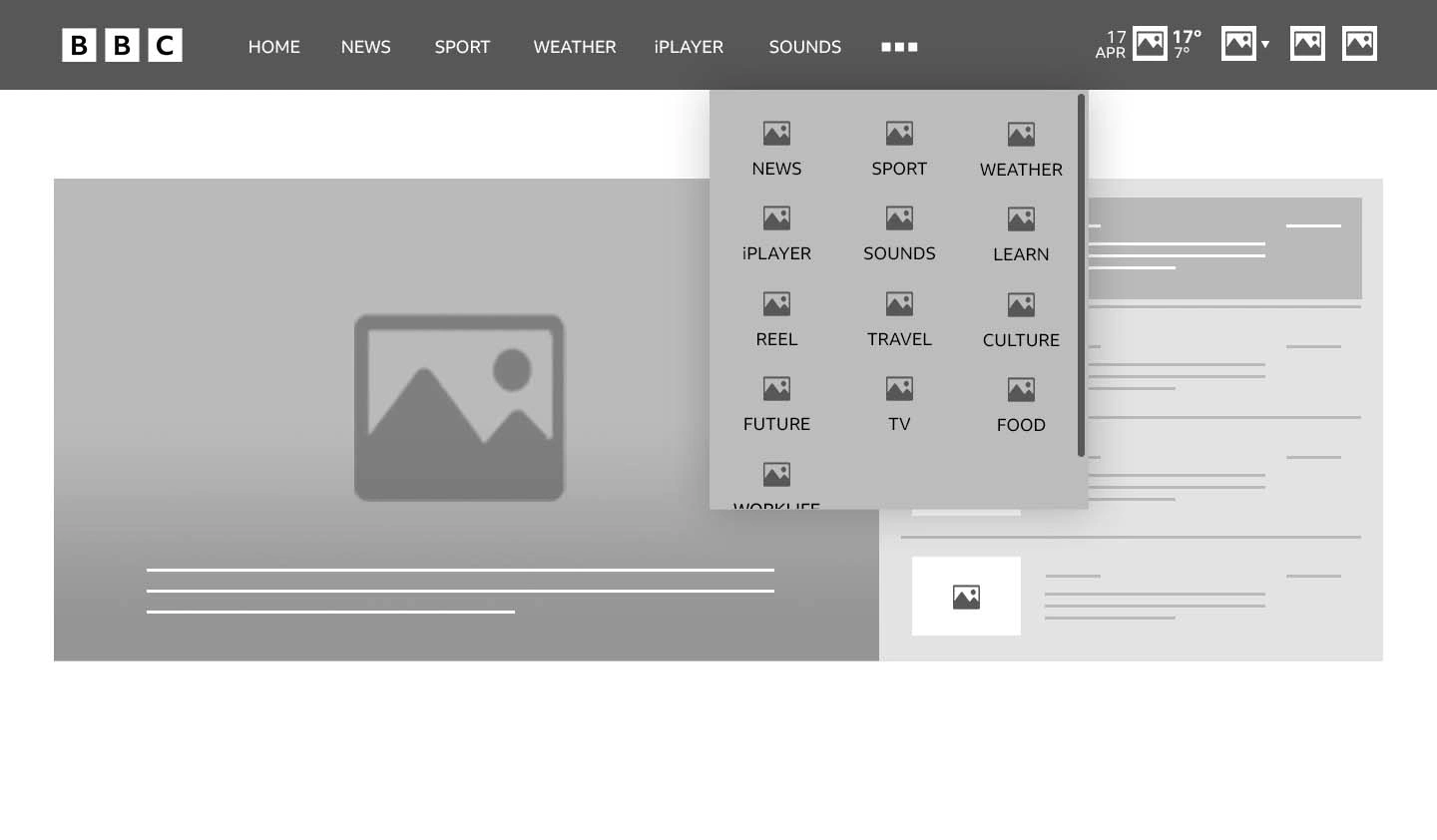
Dropdown menus.
Streamlined menu options.
Footer links for quick access.
Weather Information
Instant location-based weather display.
Detailed weather information on the same page.
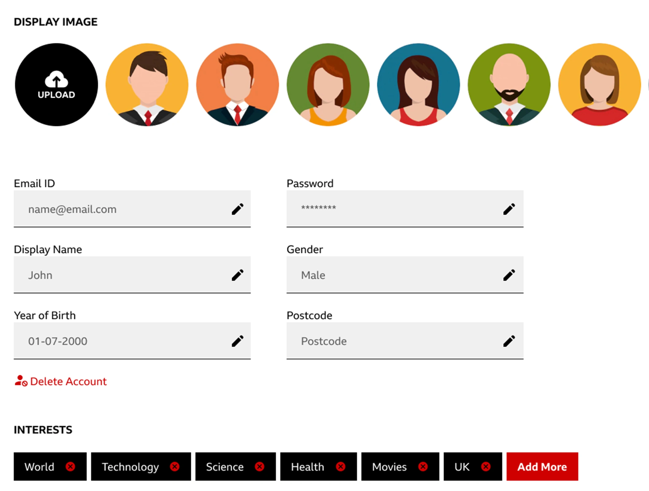
User Profile Features
Avatars and custom image uploads.
Editable topics of interest.
Search Functionality
Typing suggestions.
Sorting and filtering options.
Chronological search results.
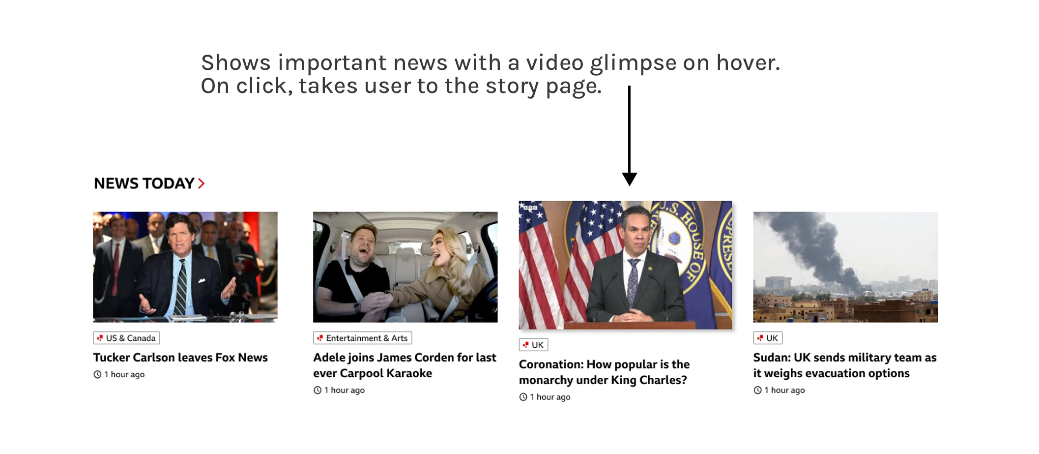
Content Enhancement
Dynamic layout for key news stories.
Video previews, interactive content, and personalized recommendations.
User Interaction:
Liking, disliking, commenting, and saving news stories.
Data-driven content recommendations.
Strategic ad placement below recommended stories.
Accessibility and Convenience:
'Listen to article' option.
Improved location switching and user interest-based suggestions
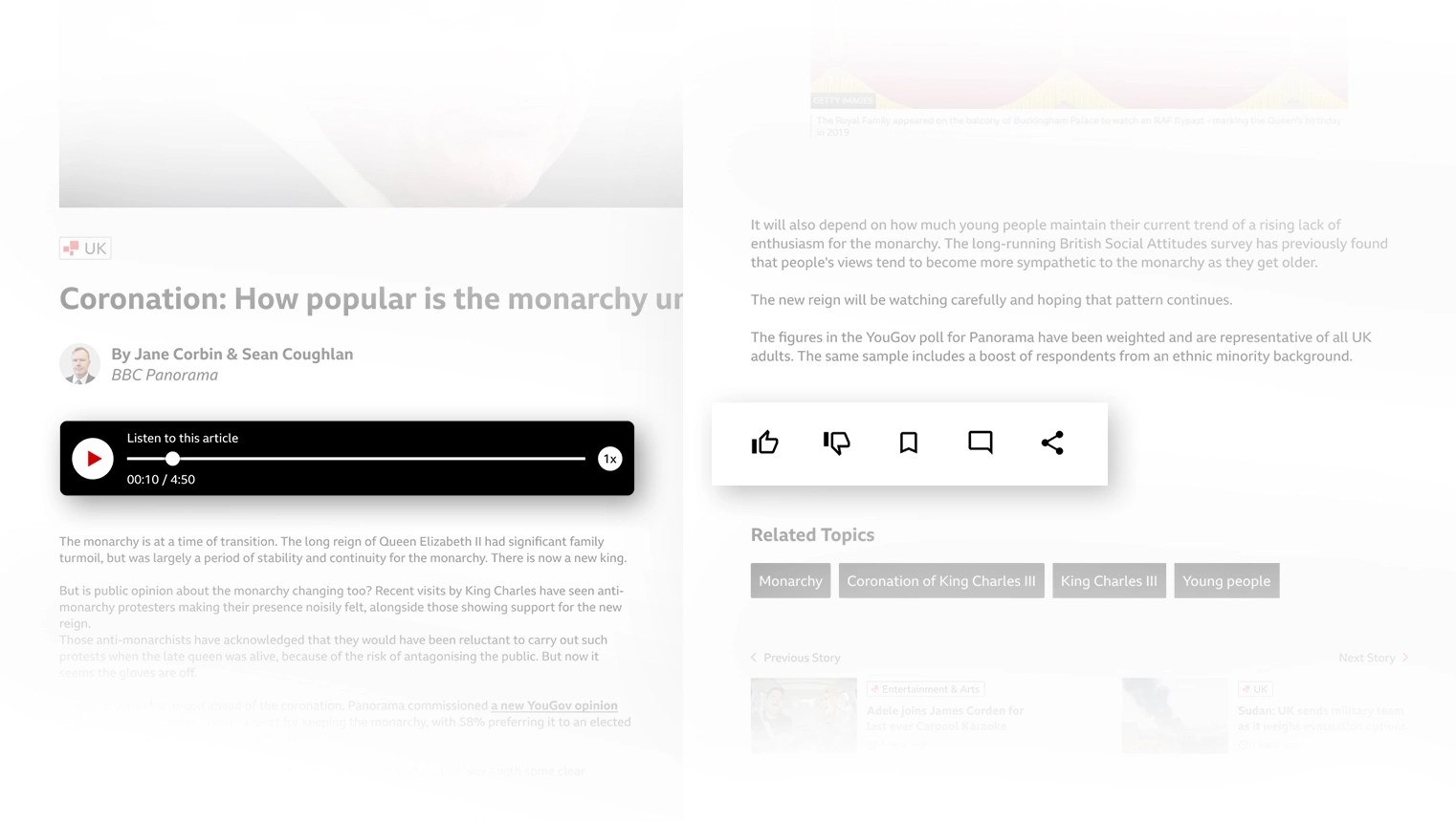

Home page

Home page: dark theme

News Page

World news
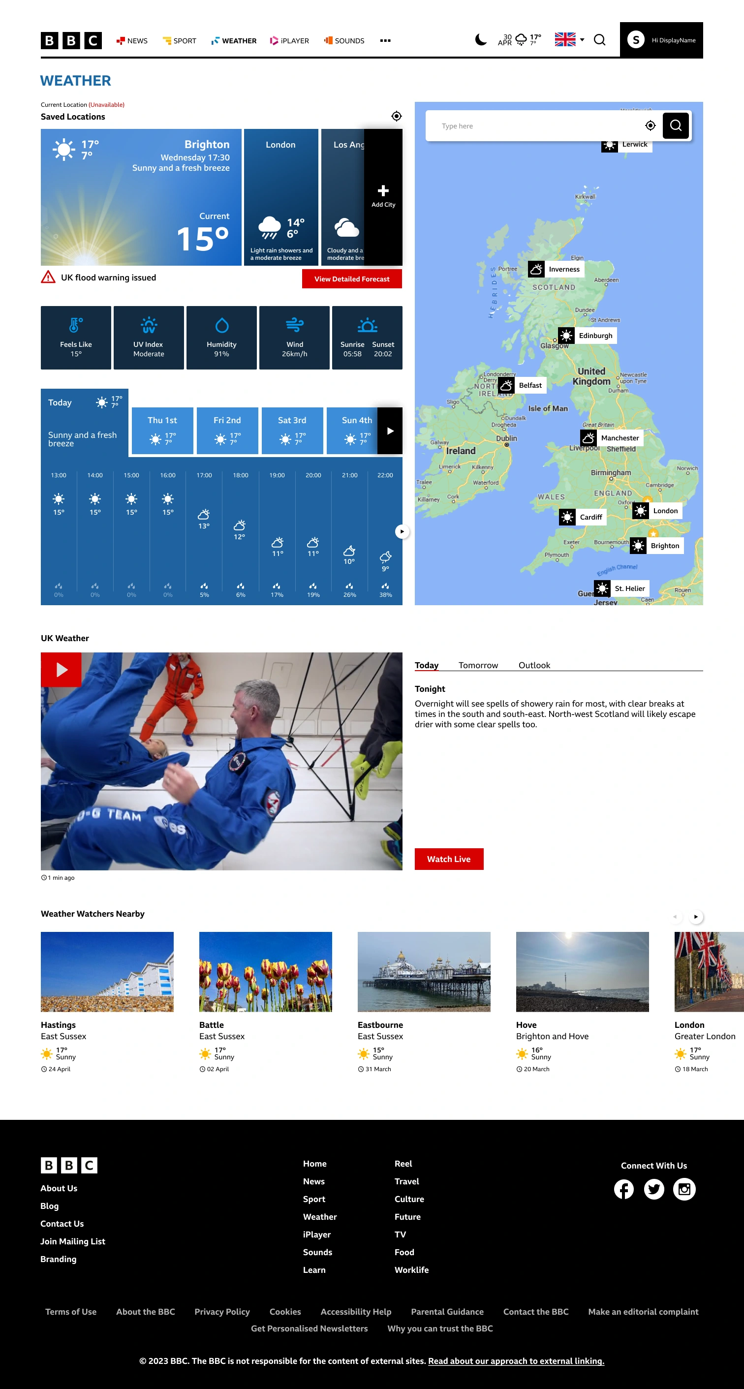
Weather
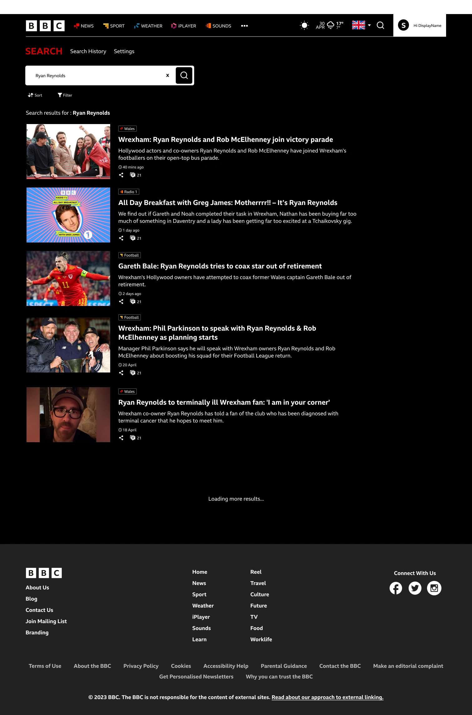
Search page
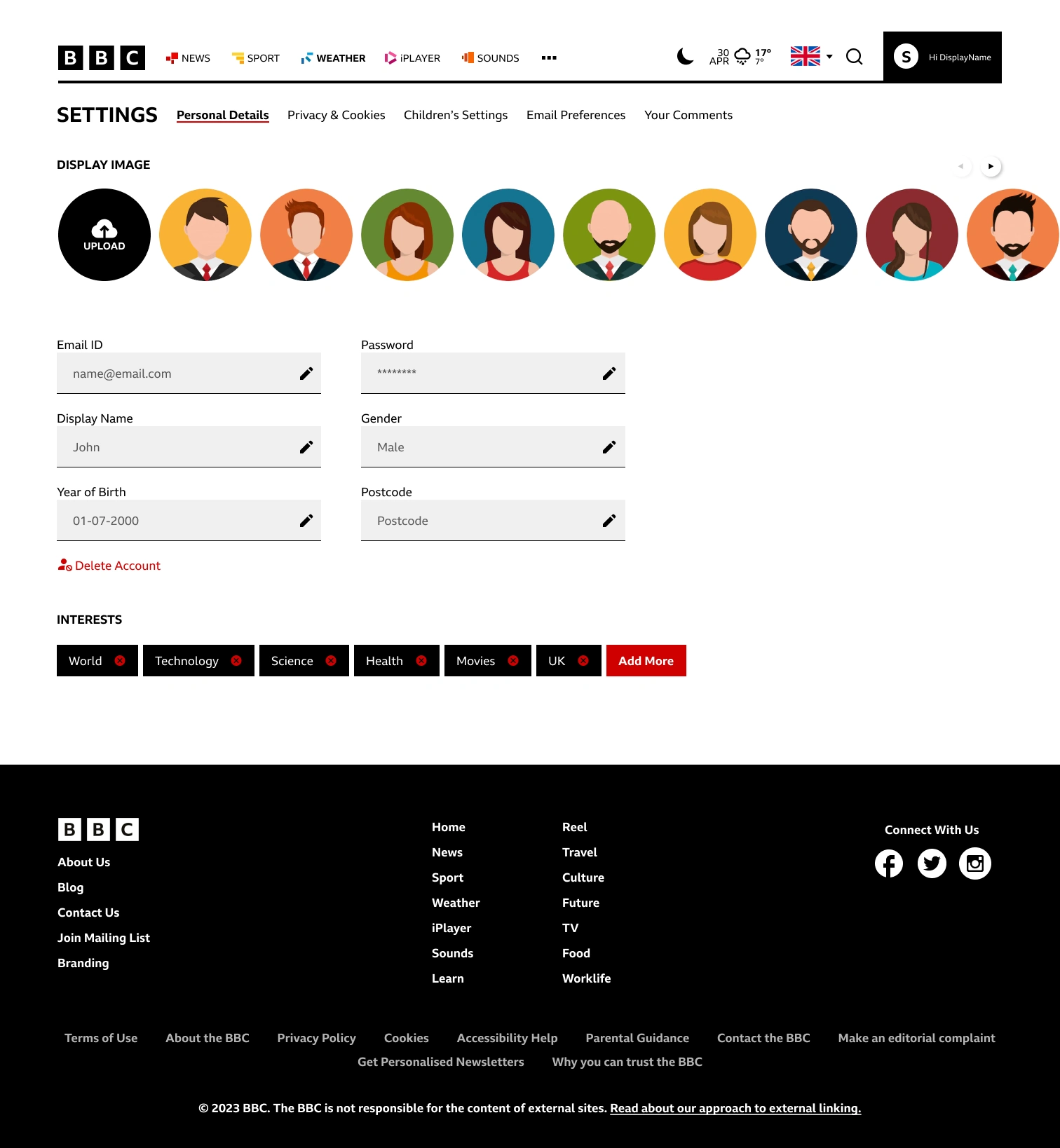
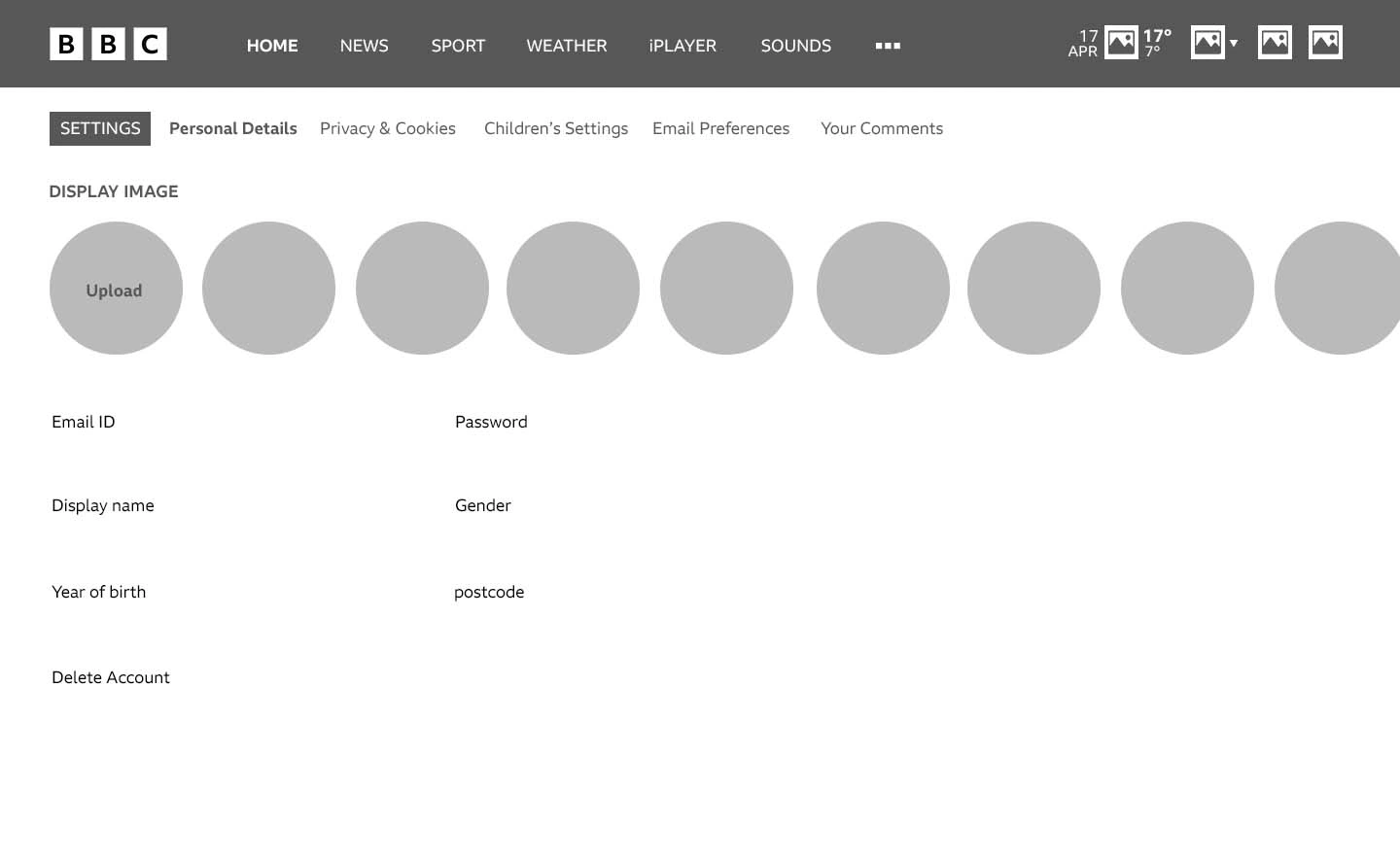
Profile page
Figma Prototype
Click the below button to view the prototype of the redesigned BBC website
Summative Tests
Summative testing was performed after the high-fidelity prototype was completed to check the changes made within the website. SUS questionnaire and Product reaction cards were repeated this time to compare the results with formative testing.
Participants: The same three individuals involved in the formative study and an additional two UX Design MSc students. Additional participants were included to see how people with UX design experience would perform in the tests.
SUS
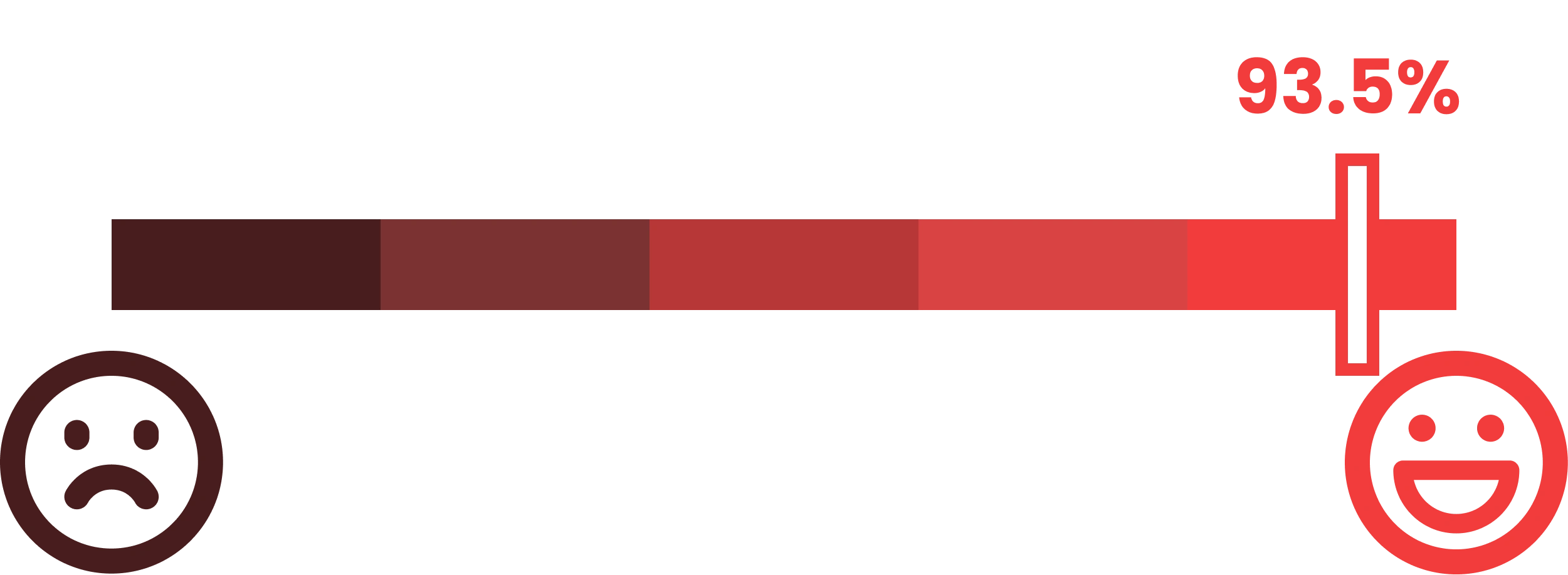
The same SUS questionnaire from formative testing was used, and it was assessed and received a score of 93.5%, which is higher than the score received in the formative test. This shows the improvement in my design.
Product Reaction Card
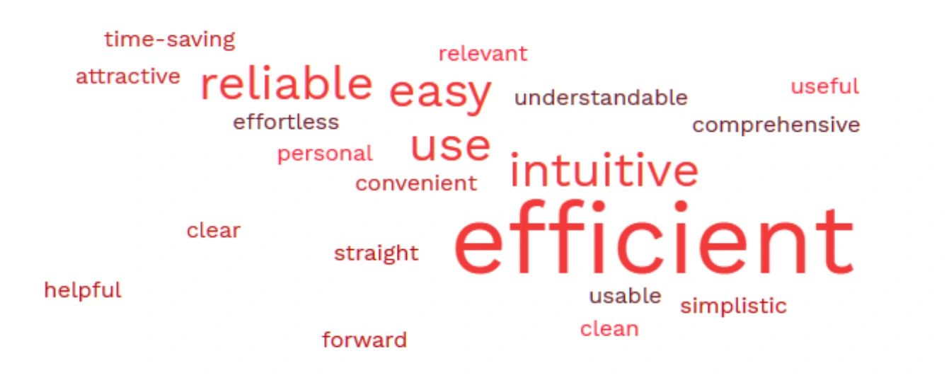
The reduced product reaction cards list with 64 words from the formative test is used again with the participants. Each user chose five words from the list to describe the website. The responses received are shown as Wordcloud above. It saw a huge improvement with 100% positive responses.
Like this project
Posted Aug 18, 2024
Redesigning the BBC website, focusing on enhancing the user experience and aligning the design with modern standards.

