Kairos

Khushi Yadav


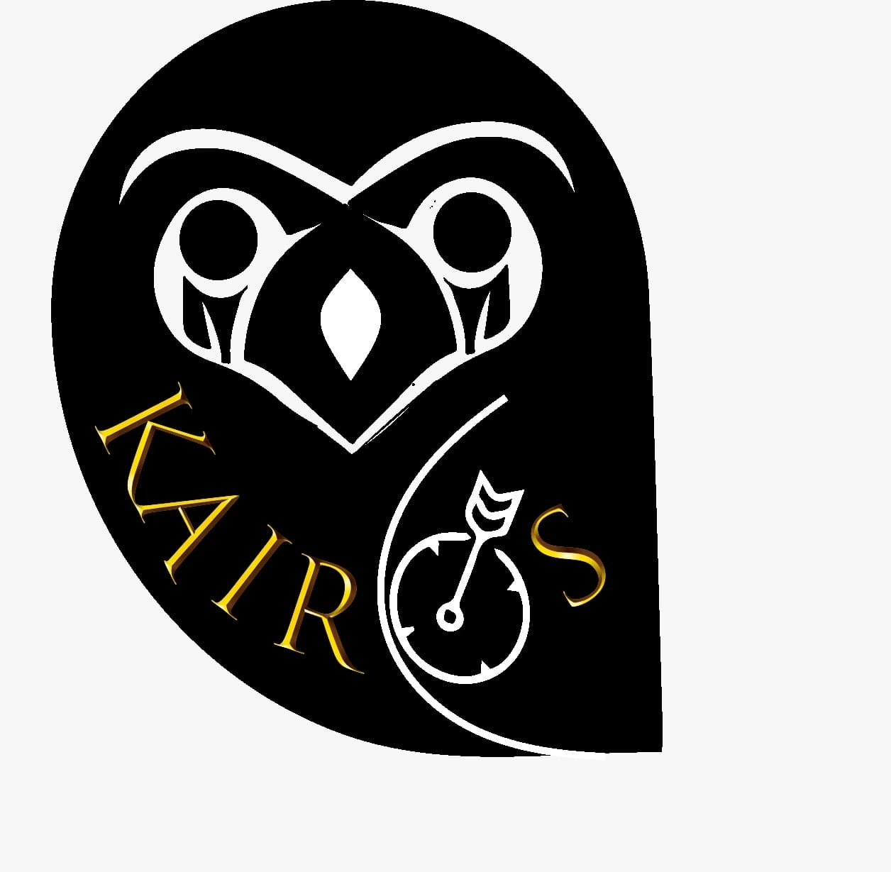
Kairos Logo
This logo is a winning entry that was designed combining elements of two different logos ;ours and the other winning team with which we had a tie.
It was an enriching experience as each element designed in our owl logo represented something about the upcoming workshop KAIROS which we thought was hard to compromise with.
It's interesting but our original logo did not begin with an owl in mind .It began with two persons - seen around the eye and us trying to give it heart shape to depict social& emotional learning .Then we had the idea of molding it in the shape of an owl as it would represent wisdom required to stroke the opportunity at the correct time ; which would essentially go on to encapsulate the entire meaning and intention behind this Workshop.
The colour scheme was also well thought:
Harnessing the power( black colour)of Social and emotional learning to get clarity ( white colour)to grab opportune moment for success. Harnessing power of Kairos requires Wisdom ( golden colour) which this bi- Weekly Workshop series strives to develop in students.
We utilized the colourful background of the other logo to come up with the final logo. It was a creative process that I really enjoyed.
Like this project
Posted Nov 16, 2024
Designed a logo for Kairos.
Likes
0
Views
0