Espira
Nadia Petković
Project Overview
An app for breathing better every day.
A simple and effective guide to practice the most well-known and tested breathing exercises from around the world, structured to suit individual goals and customized needs.
For mindfulness, energy, relaxation, and general mental and physical well-being.
The Problem
In a world filled with constant inputs causing chronic stress and fatigue, individuals seek relief through mindfulness practices like breathwork for enhanced physical and mental well-being. Despite numerous self-care options, establishing and maintaining healthy habits remains a persistent challenge
The Goal
The Espira app aims to provide an easy and effective way to learn breathwork, integrate it into a daily routine, and track growth along the way. The goal is to offer a simplistic and easy-to-use method for those who are overwhelmed with the daily pressures of life. The app will provide simple targets that make the commitment to self-care sustainable.
My Role
UX Researcher, UI/UX Designer & Visual Designer
Project Duration
12 Weeks
User research summary
User interviews
I conducted user interviews to gain a deeper and more personal understanding of users' reflections on using an app to guide them in their practice and to determine what is truly important to them.
Assumptions vs. Discoveries
I initially assumed users preferred more in-depth curated courses, but they leaned towards a simplified method and timer as the app's core features, placing a strong emphasis on customization options.
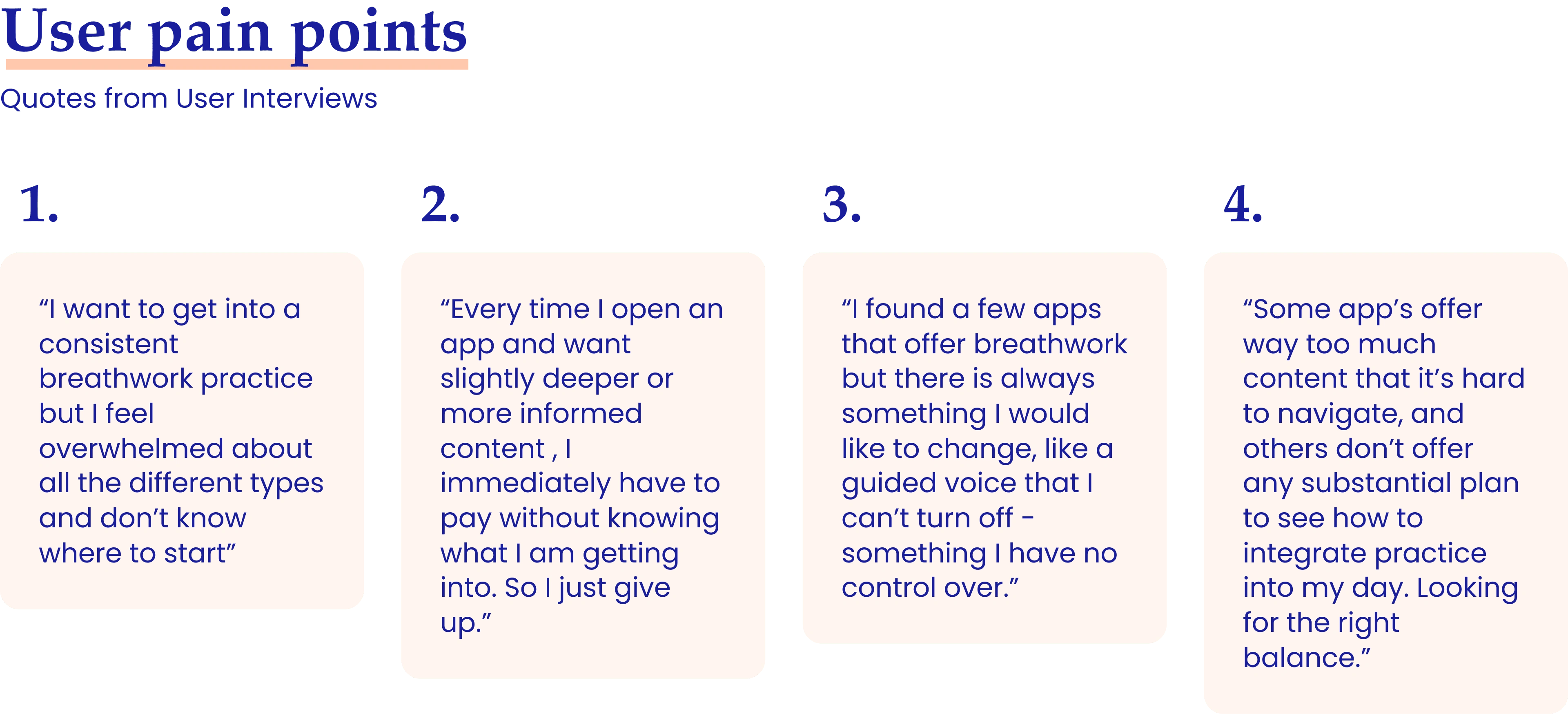
Findings
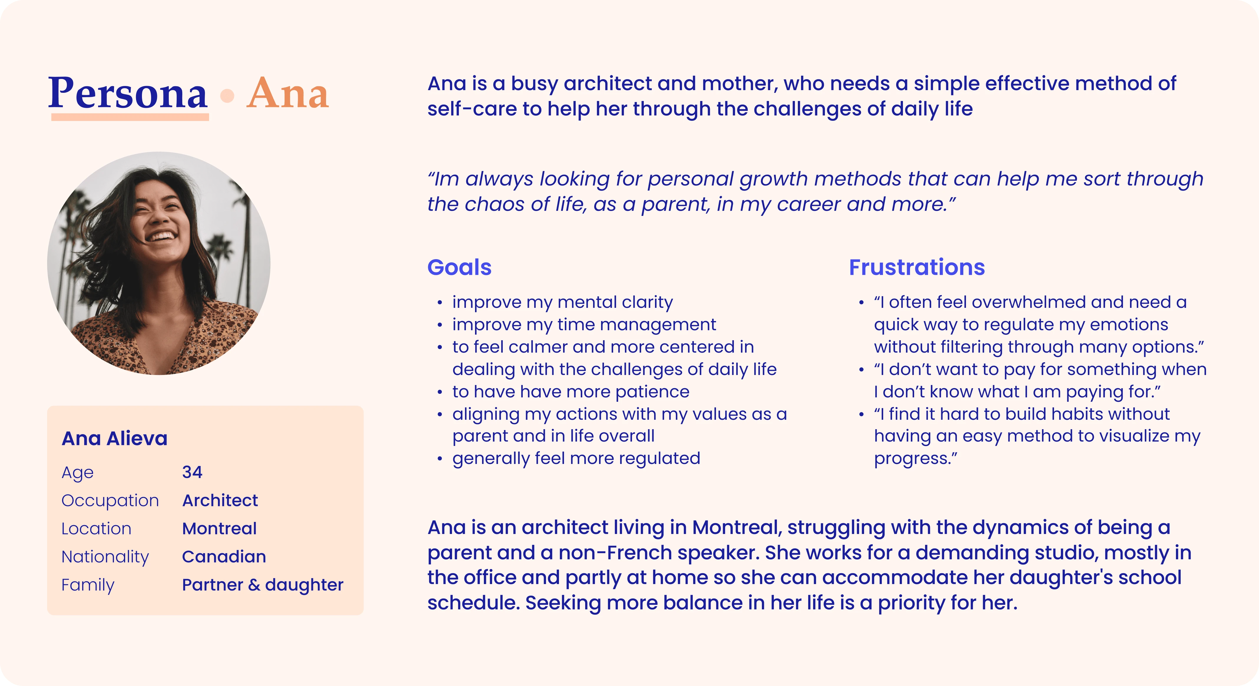
Users like Ana expressed a need for simplicity, customization, and trackability.
"I mainly use breathing exercises to regulate my emotions. It would be encouraging to record my practice and see how I am improving over time."
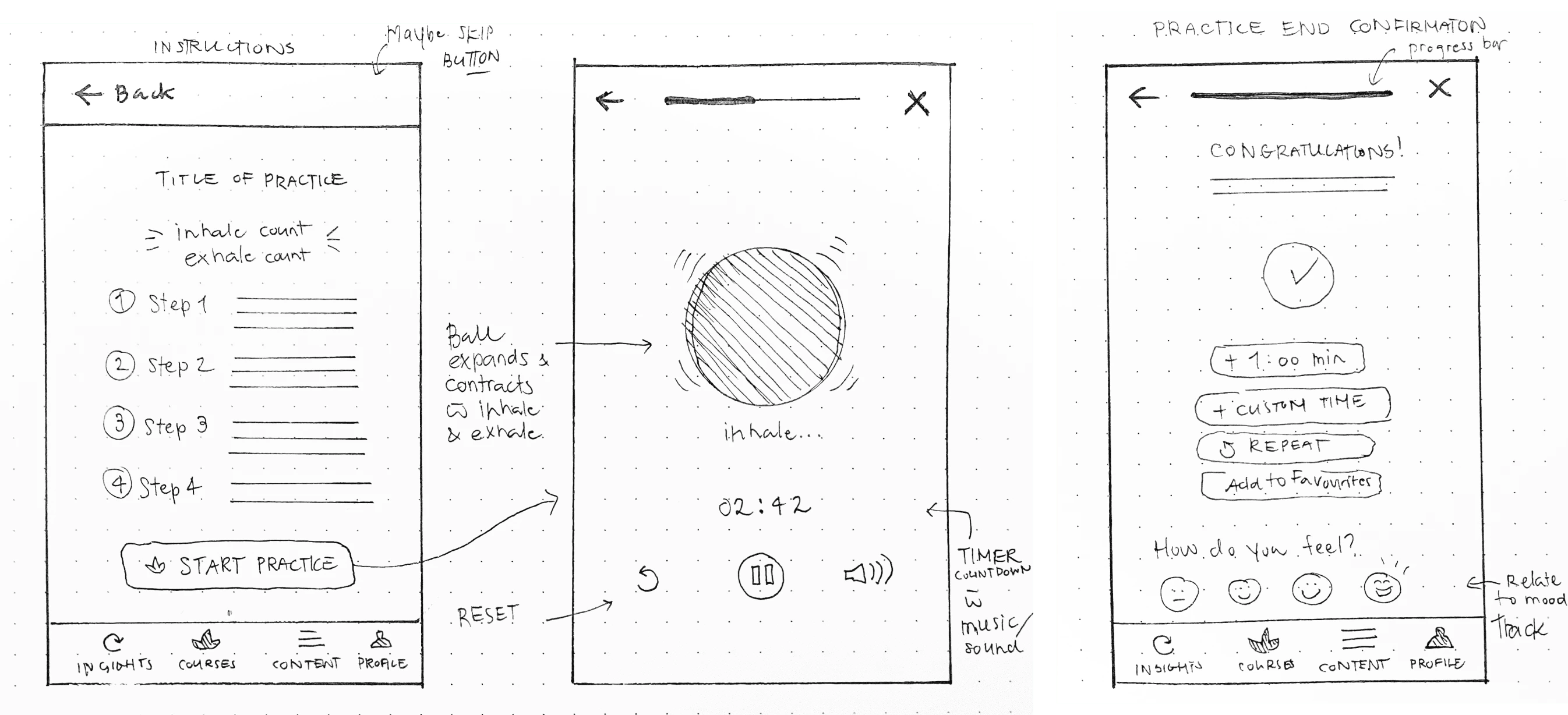
Paper prototypes
Main Screens
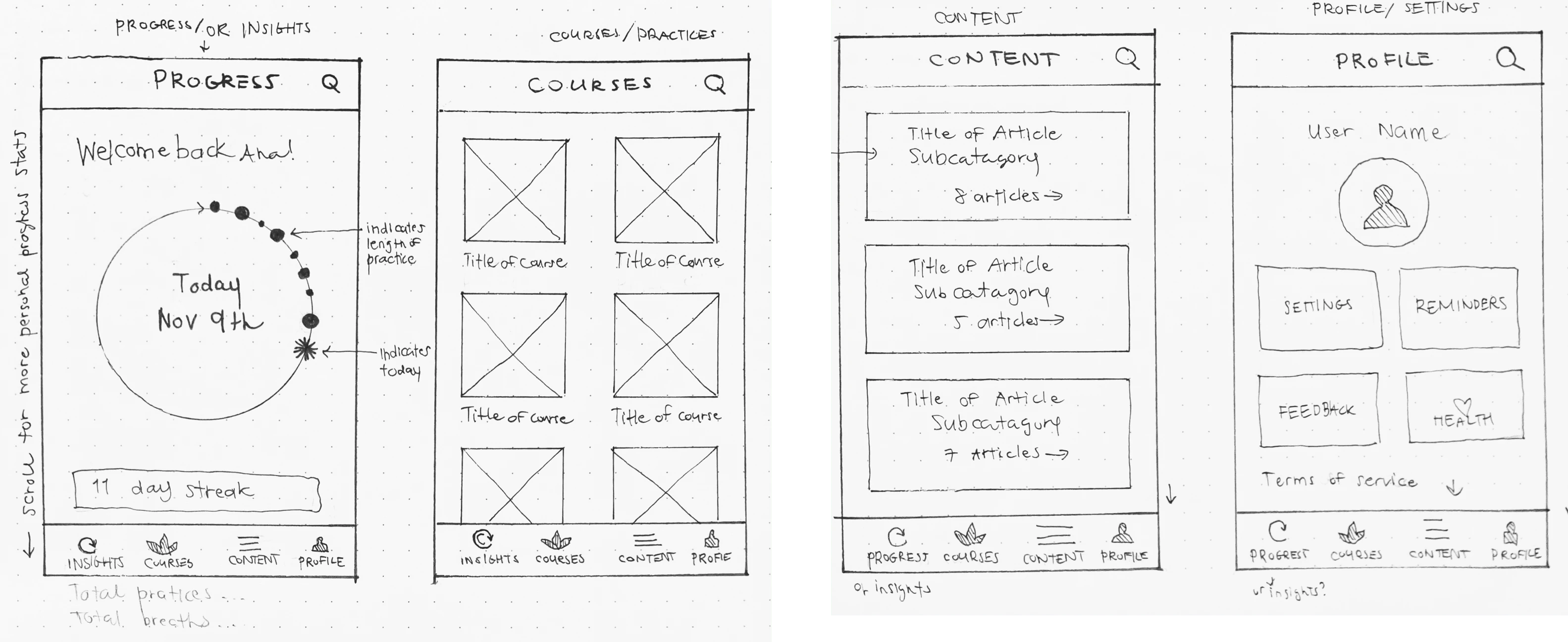
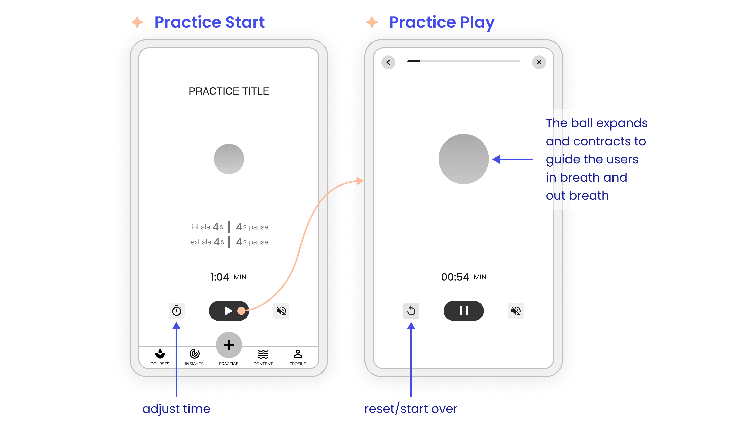
Practice Screen
Digital Wireframes
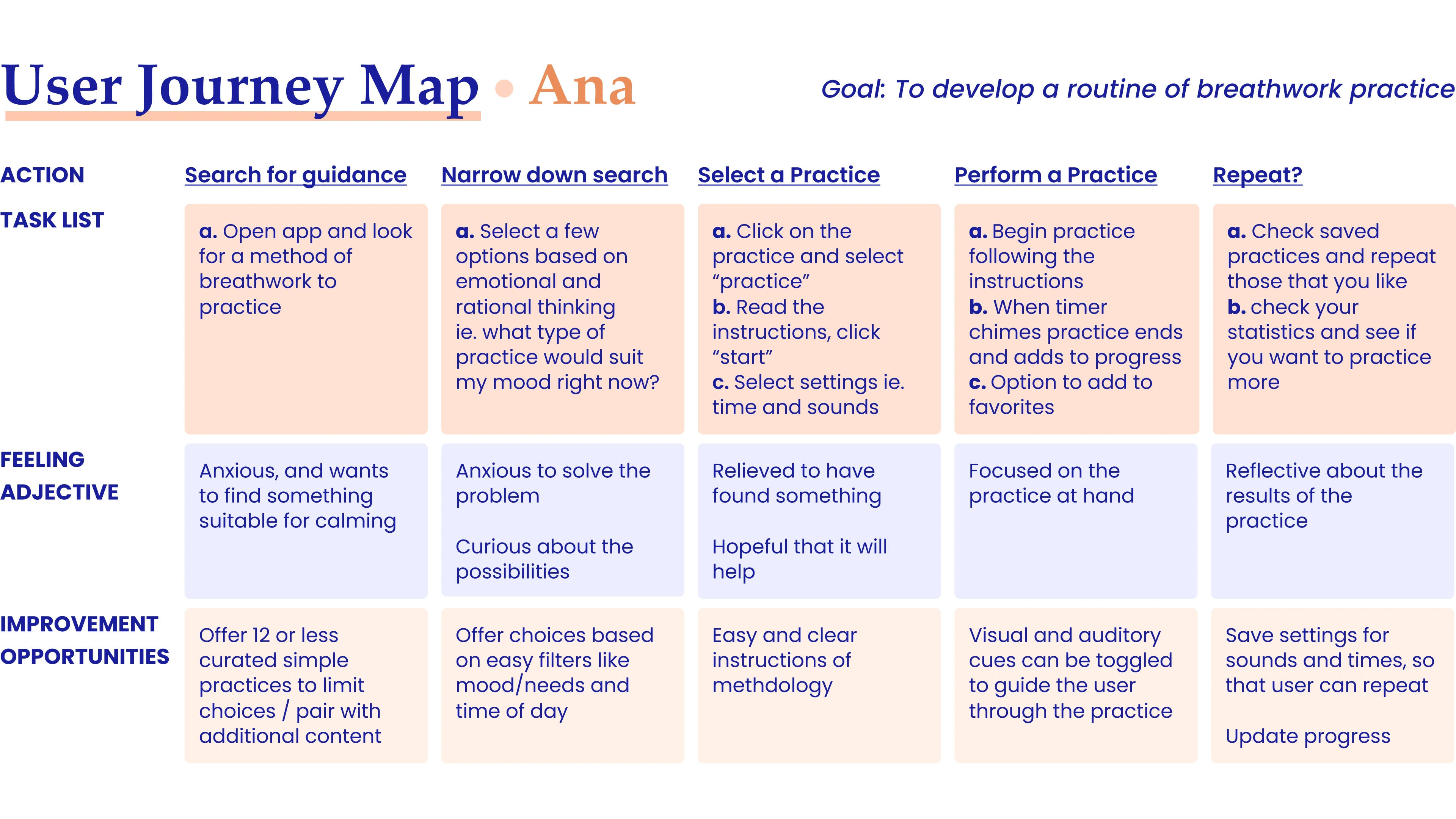
Following the research and paper mockups, I started to wireframe the functional aspects of the app based on what I learned.
The Goal
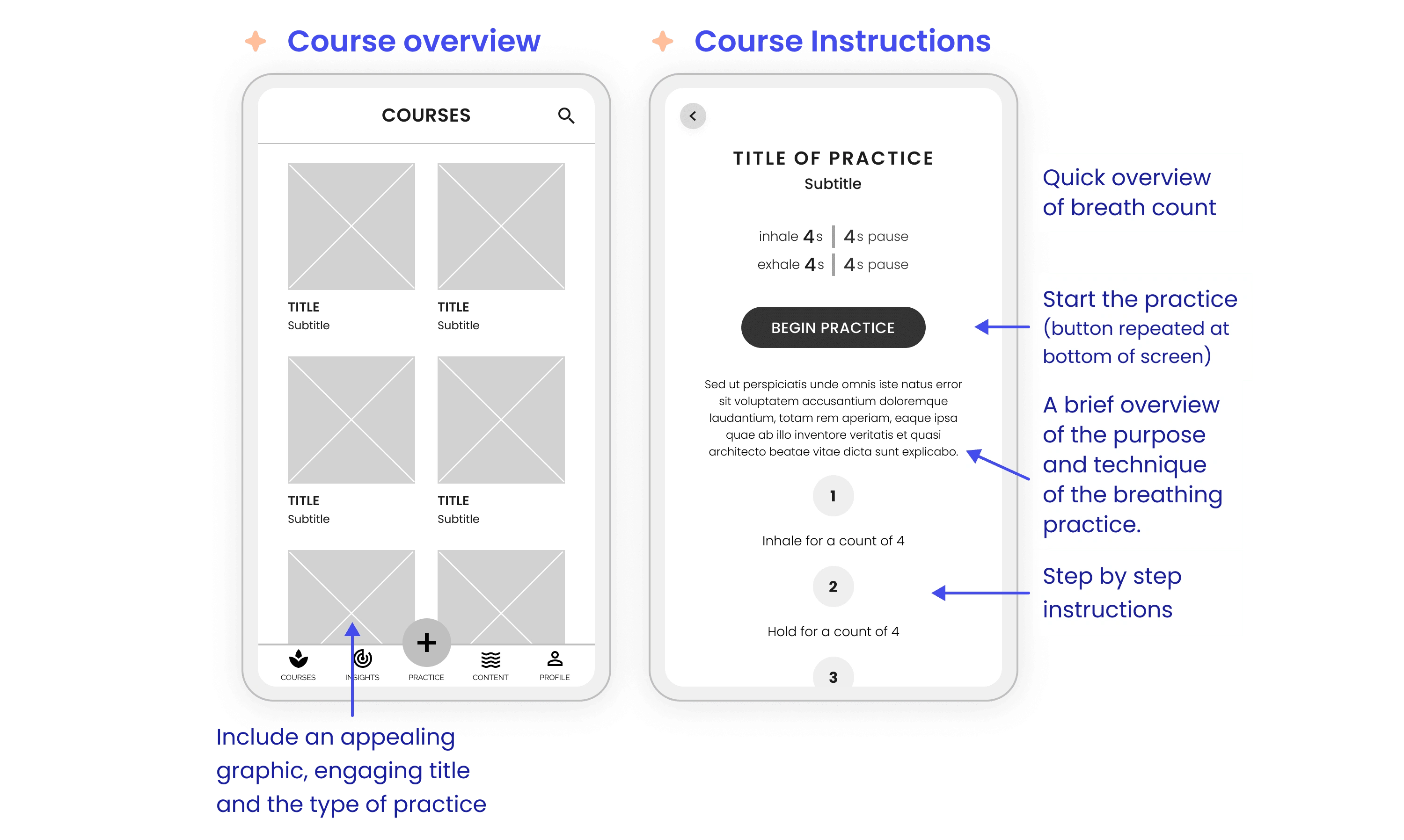
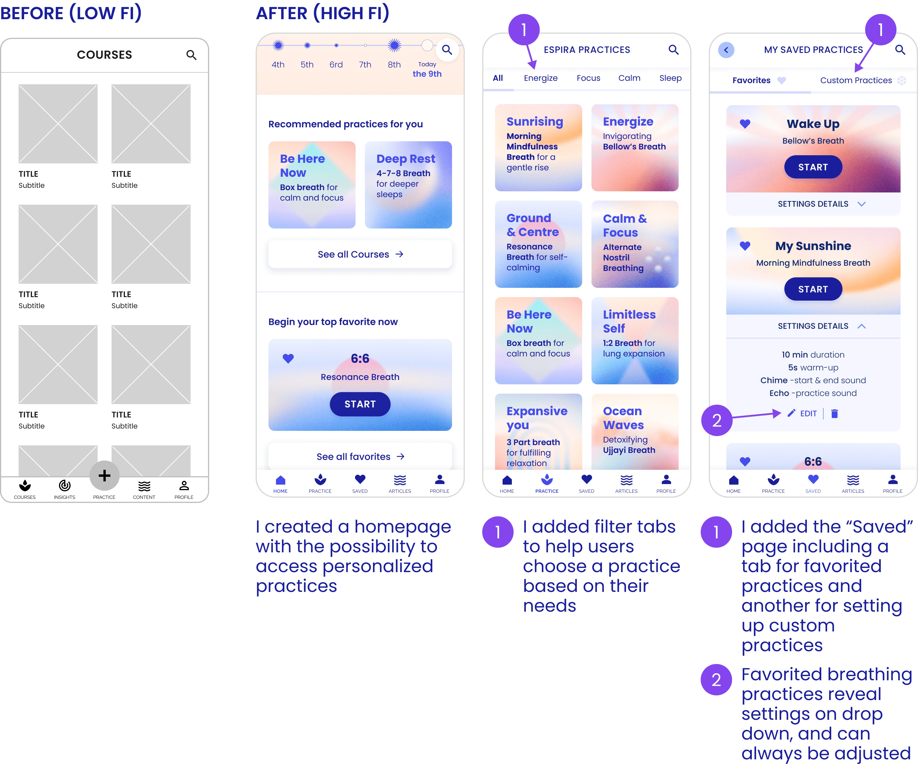
Create a straightforward course selection method that provides essential information about the course content
To create a meaningful practice screen using minimal elements
The Process
Consider relevant information to help users choose a course
Organize information in a way that helps users understand the course efficiently
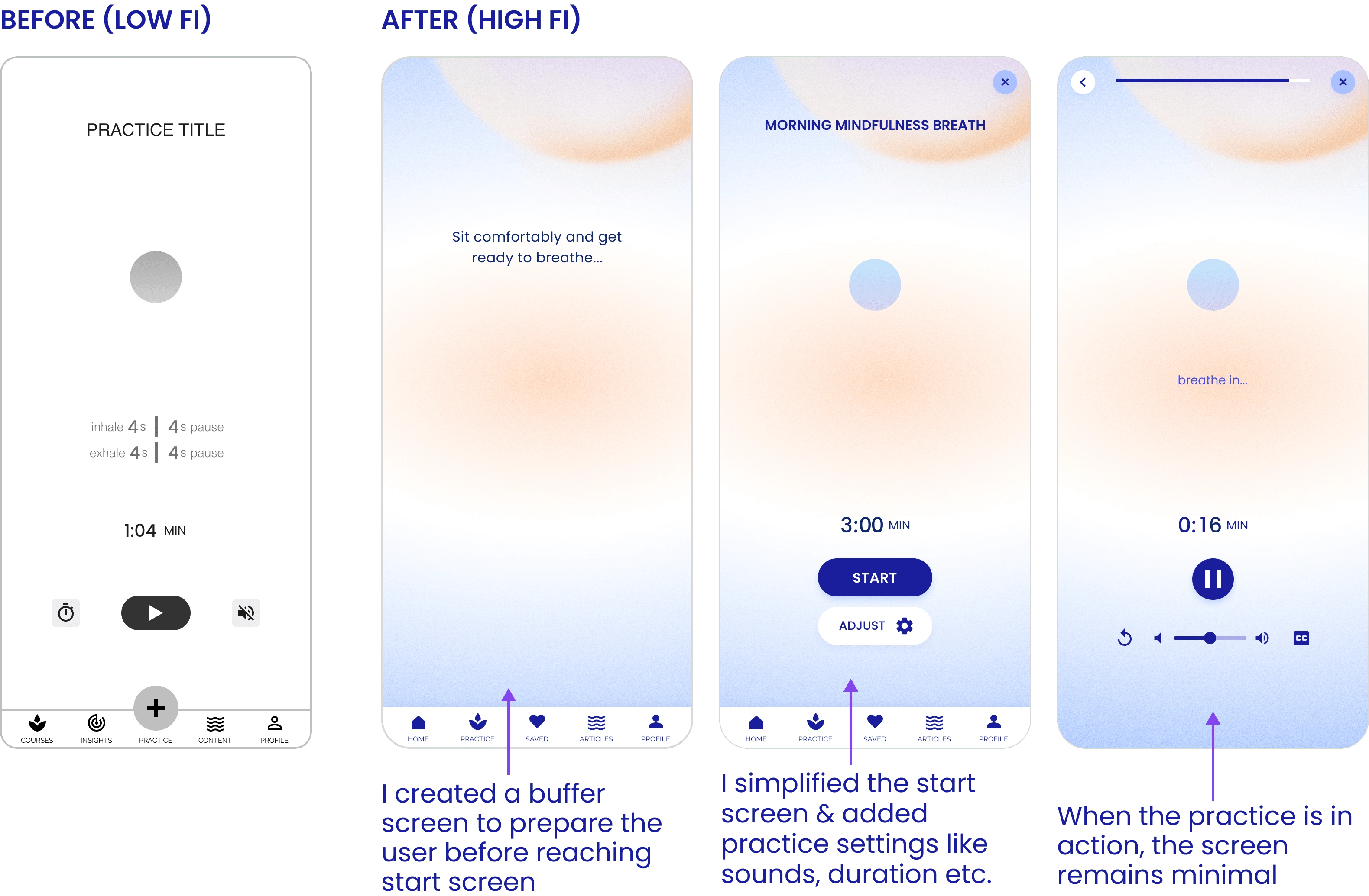
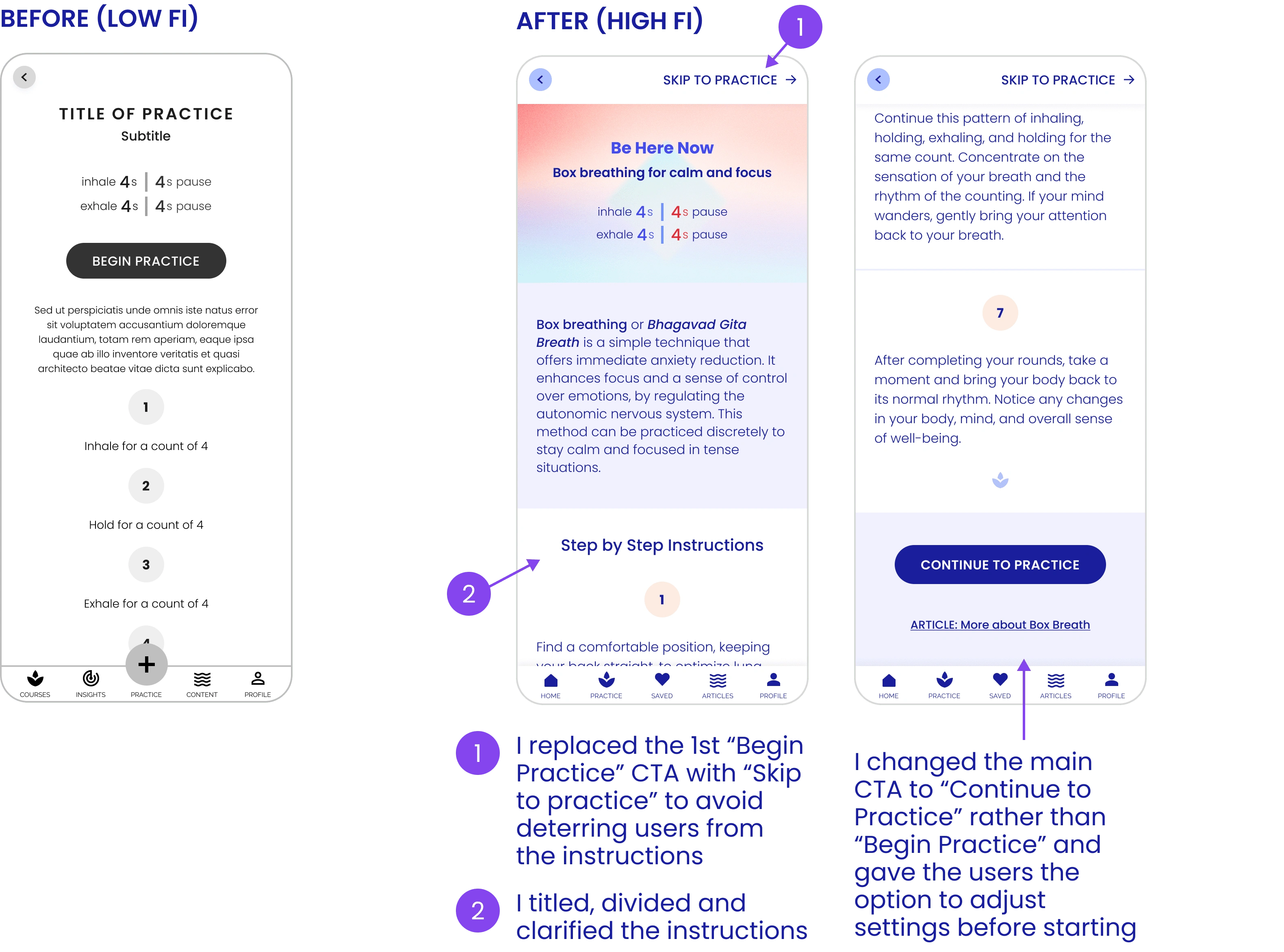
Allow users to skip instructions and directly access the practice - incorporating two start CTA's at the top and bottom of the screen instead of just one
Decide which elements, for what actions, and in which order
Select a visual cue (e.g., a ball or curve) to prompt users about the breathing action (expansion and contraction)
Usability Studies: Key Findings
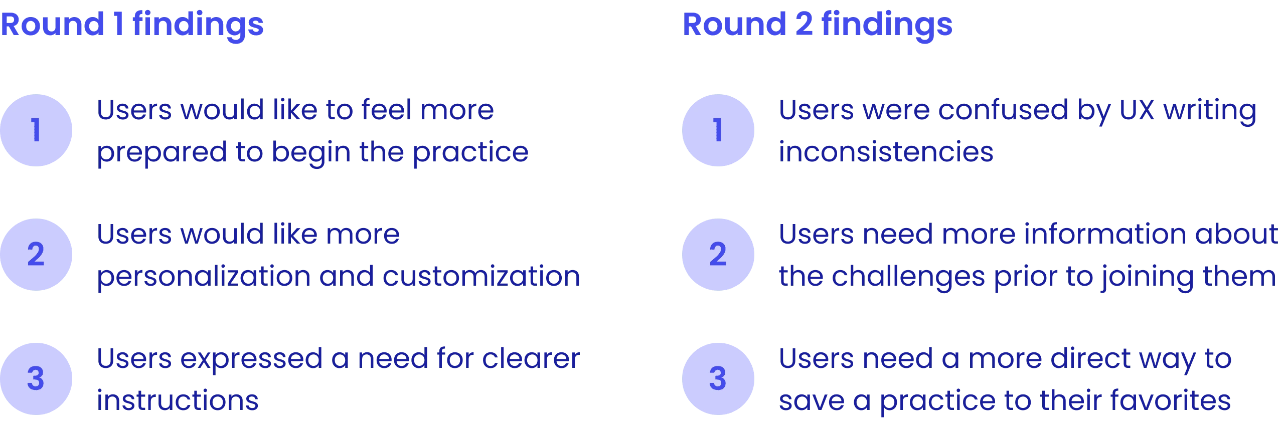
Usability Study Round 1: Findings
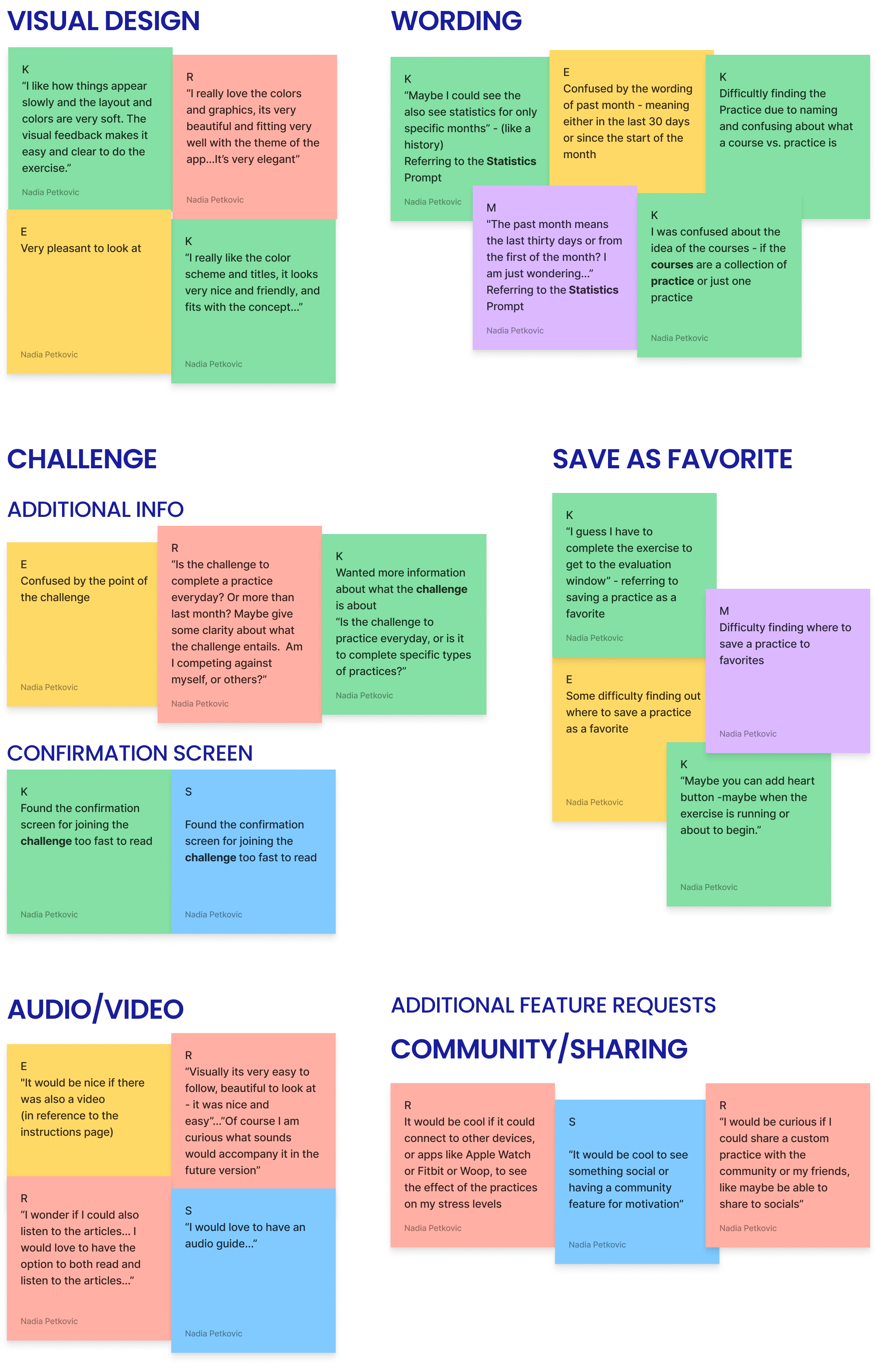
I conducted a moderated usability study with 5 participants and collected key information about how to improve the design, by creating an affinity diagram and identifying patterns and insights.
1.
A key Priority 0 insight from the 1st usability study highlighted the users' desire to feel prepared before starting the practice. Generally, users expressed the need for a reminder to sit comfortably before beginning their sessions.
2.
Another Priority 1 insight from the 1st usability study emphasized users' need for increased personalization. Users expressed a desire for more control in choosing and setting up their practices.
3.
Another Priority 1 insight was to provide clearer instructions. Participants were sometimes confused by the presence of two identical "Begin Practice" buttons on the instructions page, leading to uncertainty and scrolling back and forth. Additionally, users expressed a need for more specific details, such as whether to breathe through their mouth or nose.
"I am not sure if I should be breathing through my mouth or my nose..."
Usability Study Round 2: Findings
I altered the designs according to the insights from Round 1 and created the High-Fidelity mockups and prototype. Next, I conducted a second usability study of 6 Participants, this time unmoderated. I recorded my observations and created an affinity diagram to collect all my observations and turn them into insights.
Additionally, I collected observations
Using these observations I recorded a list of insights, in order of priority.
1.
A key Priority 0 insight from the 2nd usability study highlighted some inconsistencies in the UX Writing. For example, some users were confused by the words course as compared to practice - so I consolidated them into one word - practice. Additionally, some users were confused by the meaning of last and past month in the progress statistics, so I made sure to unify these words into a consistent phrase to describe the last 30 days - the past month.
2.
Another Priority 1 insight from the 2nd usability study revealed that participants needed more information about the challenges before joining them. Users weren't sure what challenges entailed.
3.
Additionally, a Priority 2 insight from the 2nd usability study observed that users had some difficulty figuring out where to save a practice to their favorites.
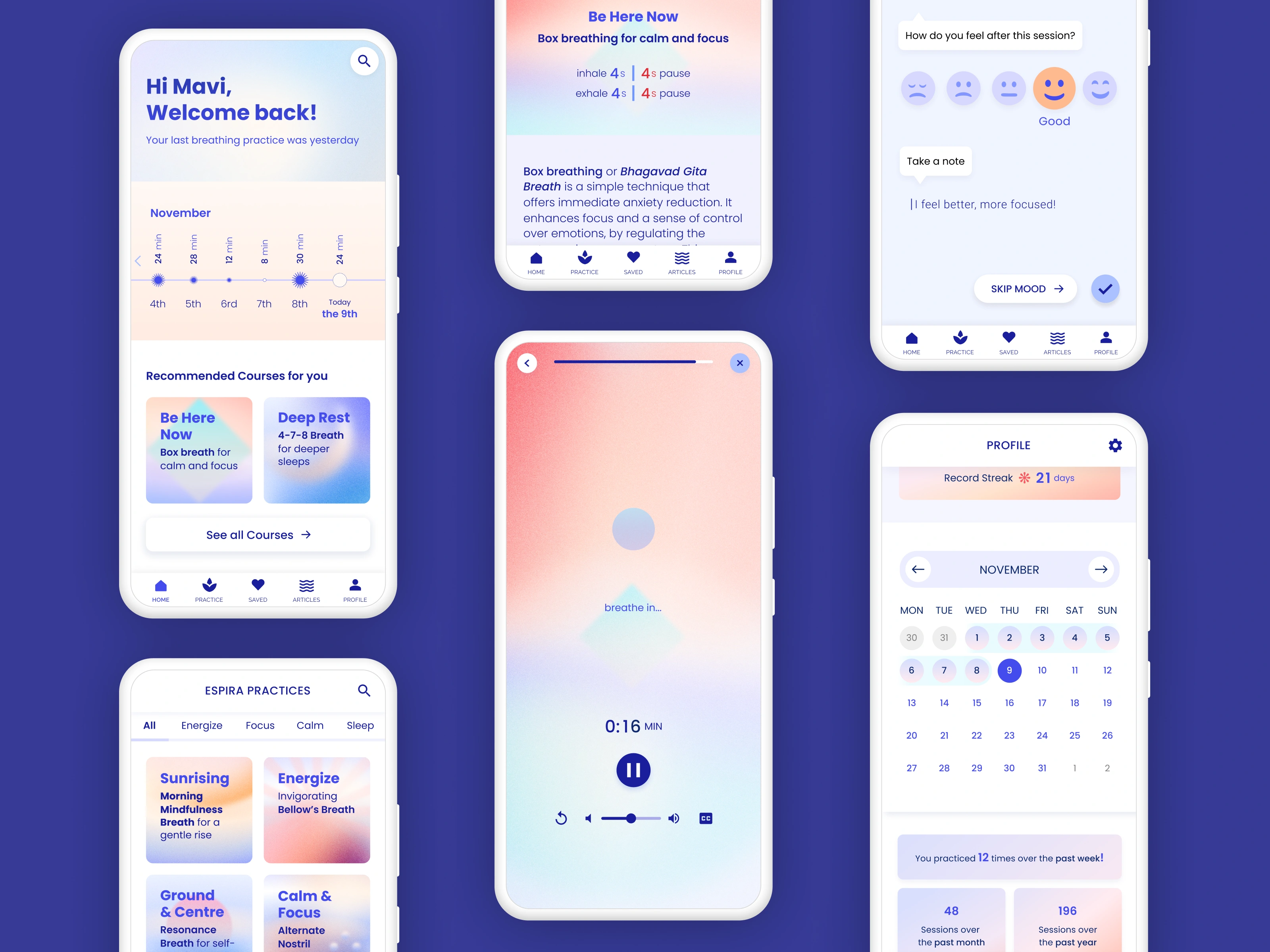
High-Fidelity Mockups
After making these adjustments and more, Version 3 emerged. A design is never "final" after all. The design aims to reflect the main user needs: simplicity, personalization & customization.
High-Fidelity Prototyping
Logging in and selecting a breathing practice
Completing a breathing practice
Checking progress & joining the monthly challenge
Takeaways
Impact
The value of refining an idea goes a long way. Participants seemed to enjoy the app overall and are looking forward to the launch.
"I would use this app. The softness of the colors is comforting, exactly what I need for practicing breathwork. I am looking forward to seeing it live."
What I learned
Throughout the process of creating Espira, I learned to appreciate and celebrate even the most critical feedback and see it as an opportunity. With each user test, I discovered the most unexpected and interesting observations that would help advance and refine my ideas and processes, in order to create a better product for everyone.
I also learned so much about the benefits of breathing exercises and the influence they can have on our well-being. I am looking forward to sharing the power of breath with a wider audience.
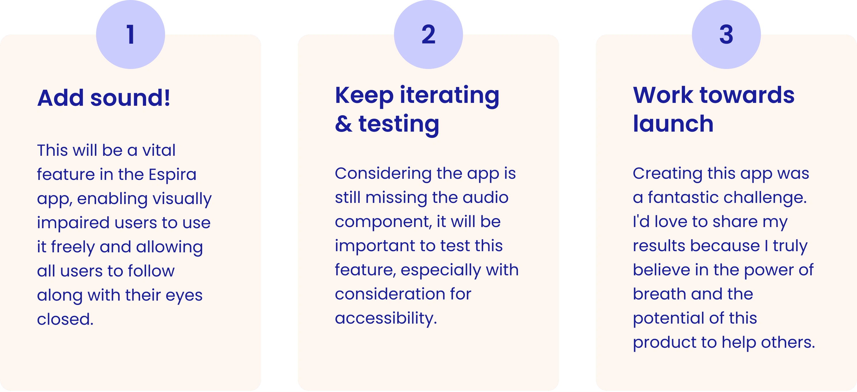
Next Steps
Thank you!
Like this project
Posted Jan 18, 2024
An app with various breathwork practices and customizable features, offering a simple, effective, and trackable self-care solution.
Likes
0
Views
51