Experimental Portfolio Design for Creative Director

Matias Machele
Verified


Meet SRC
SRC is Sean’s personal custom portfolio. He is a Creative Director currently at Square and wanted to showcase his projects uniquely.
At first, I hesitated a bit since I normally work with precise alignment, structure, and a more polished visual system. However, Sean encouraged me to go all in on something experimental and intentionally weird, to make the portfolio stand out from other projects.
In this case study, I’ll walk through what I built, the problems I solved, and the design decisions behind the project.
What I solved
Going Beyond the Ordinary
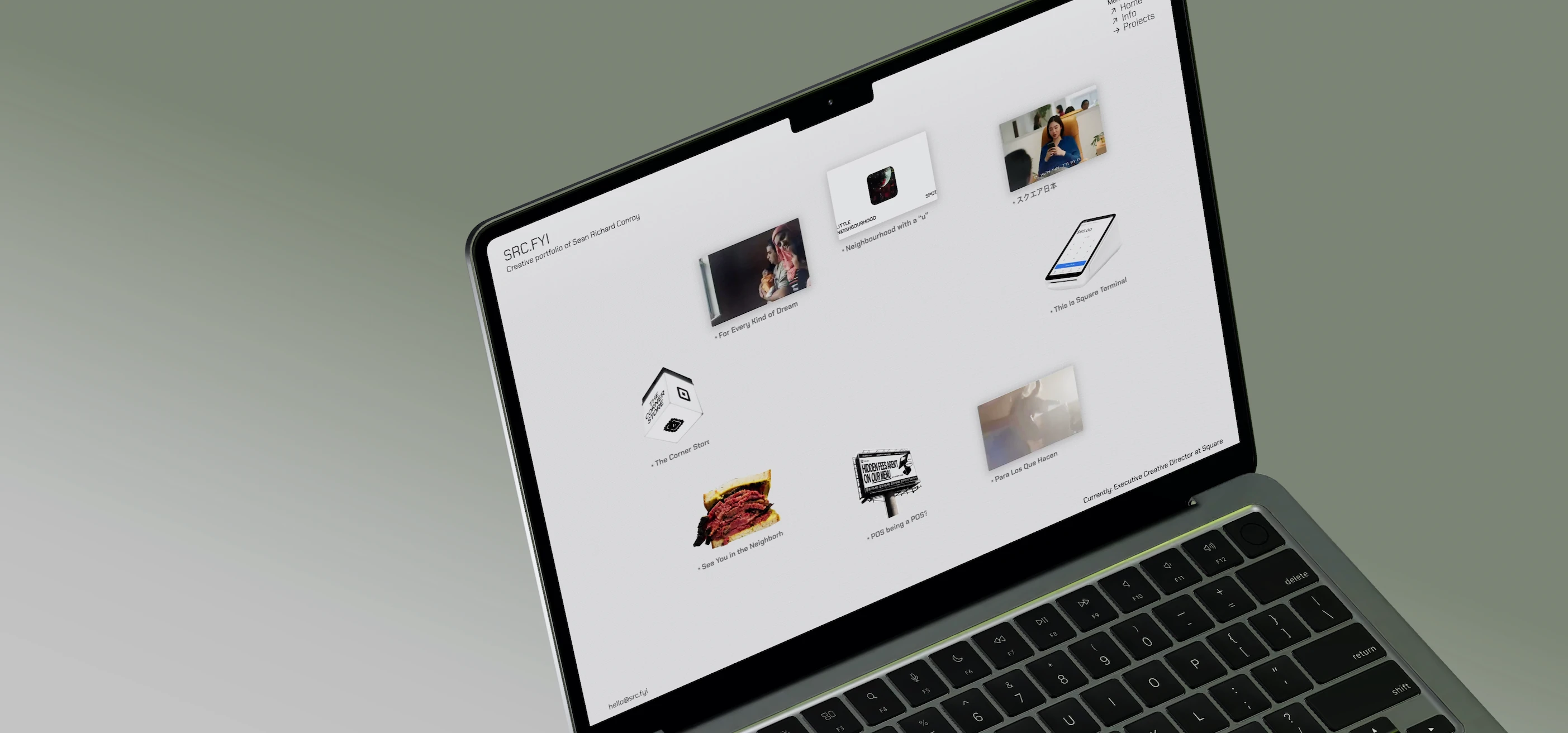
One of the biggest challenges I wanted to solve with this project was stepping outside of the ordinary and building something that felt genuinely fun to explore. Instead of creating another perfectly structured portfolio where visitors simply scroll through projects, we wanted to create an experience that encouraged people, potential clients, and other creatives to click around, interact, and discover things for themselves.
The goal was never to make the website feel perfectly organized. It was about creating a space that felt personal, unexpected, and a little weird in the best possible way. Sean gave me the freedom to experiment with the visual language and interaction, which allowed me to explore ideas that I normally would not use in a traditional portfolio.
From a technical perspective, one of the main challenges was making the website flexible enough to grow throughout the year. SRC is not meant to be a finished, static portfolio. New projects, pages, experiments, and ideas will continue to be added over time. To support this, I developed custom components and a flexible structure that makes it easier to create new pages, update existing content, and experiment with new layouts without having to rebuild the entire experience from scratch.
This became an important part of the design system. The website needed enough structure to remain functional and maintainable, while still leaving room for things to evolve. In a way, the system itself had to balance two opposite ideas: consistency and experimentation.
Designing Through Personality
A large part of the visual direction came from Sean himself. Rather than building a generic portfolio and applying his name to it, I wanted the website to feel like an extension of his personality, interests, and creative thinking.
We intentionally moved away from the overly serious tone that is common in creative portfolios. Instead, we looked for ways to introduce familiar objects, playful references, unexpected layouts, and visual interactions into the experience.
Some of the inspiration came from interfaces and visual systems that already exist in everyday life. Apple-like tiles, Cargo-style icons, digital interfaces, and even simple objects such as an Akash Deli sandwich became ways of representing projects and ideas. A neighborhood project could be represented through something as familiar as a deli sandwich, while a POS billboard project could become another visual object within the system.
These choices helped make the portfolio feel less like a traditional case-study archive and more like a collection of things you can explore.
Tools & Process
The project started in Figma, where I explored the overall structure, layouts, interactions, and visual direction. I also used Affinity Designer to create and refine some of the visual assets and graphics.
For motion and interaction concepts, I worked with Jitter to quickly test animations and explore how different elements could move and respond. For smaller video adjustments and quick edits, I used Wondershare, which allowed me to make simple changes without slowing down the overall workflow.
A lot of the process was also driven by experimentation. Instead of designing every detail in isolation and trying to make everything perfect before building it, I would test an idea, see how it felt inside the website, and then refine it from there.
A Portfolio That Isn’t Finished
SRC is intentionally a complex and simple website at the same time.
Underneath the visual experimentation is a flexible system designed to make the website easy to continue building. On the surface, however, the experience is deliberately unpredictable. It combines familiar design patterns with unusual flows, playful objects, custom interactions, and unexpected ways of presenting work.
The final result isn’t meant to be a perfect portfolio, and that was never the objective.
It is meant to be different.
It is meant to feel curious, creative, and a little experimental. Most importantly, it is meant to reflect the kind of thinking that exists behind the work itself: being less serious about following the rules and more interested in exploring what happens when you allow yourself to think freely.
As the year continues, SRC will continue to evolve with new projects, new pages, new experiments, and new ideas. The website is therefore not a finished product, but an ongoing creative space that grows alongside Sean and his work.
SRC loder
Like this project
Posted Aug 11, 2026
Experimental portfolio for a Creative Director at Square, blending editorial design with a unique, playful experience.