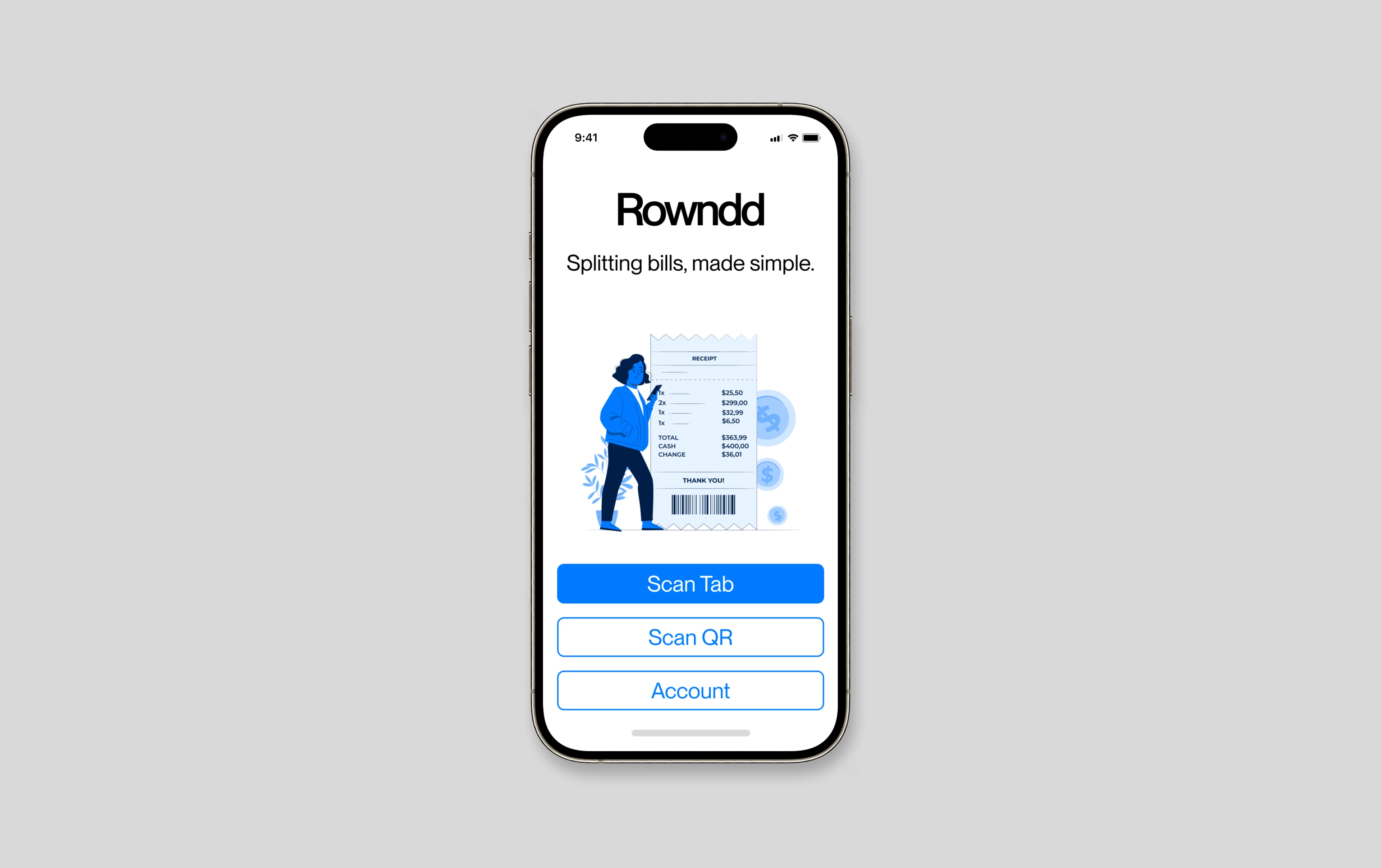
Rowndd | App Design
Robbie Broome
Initially named $PLITR, Rowndd was a concept I embarked on shortly after my first visit to the United States. Designed to remove the hassle of splitting checks amongst large groups, it offers an easier and more accurate alternative to sitting around with calculators to figure how much everyone should be paying.
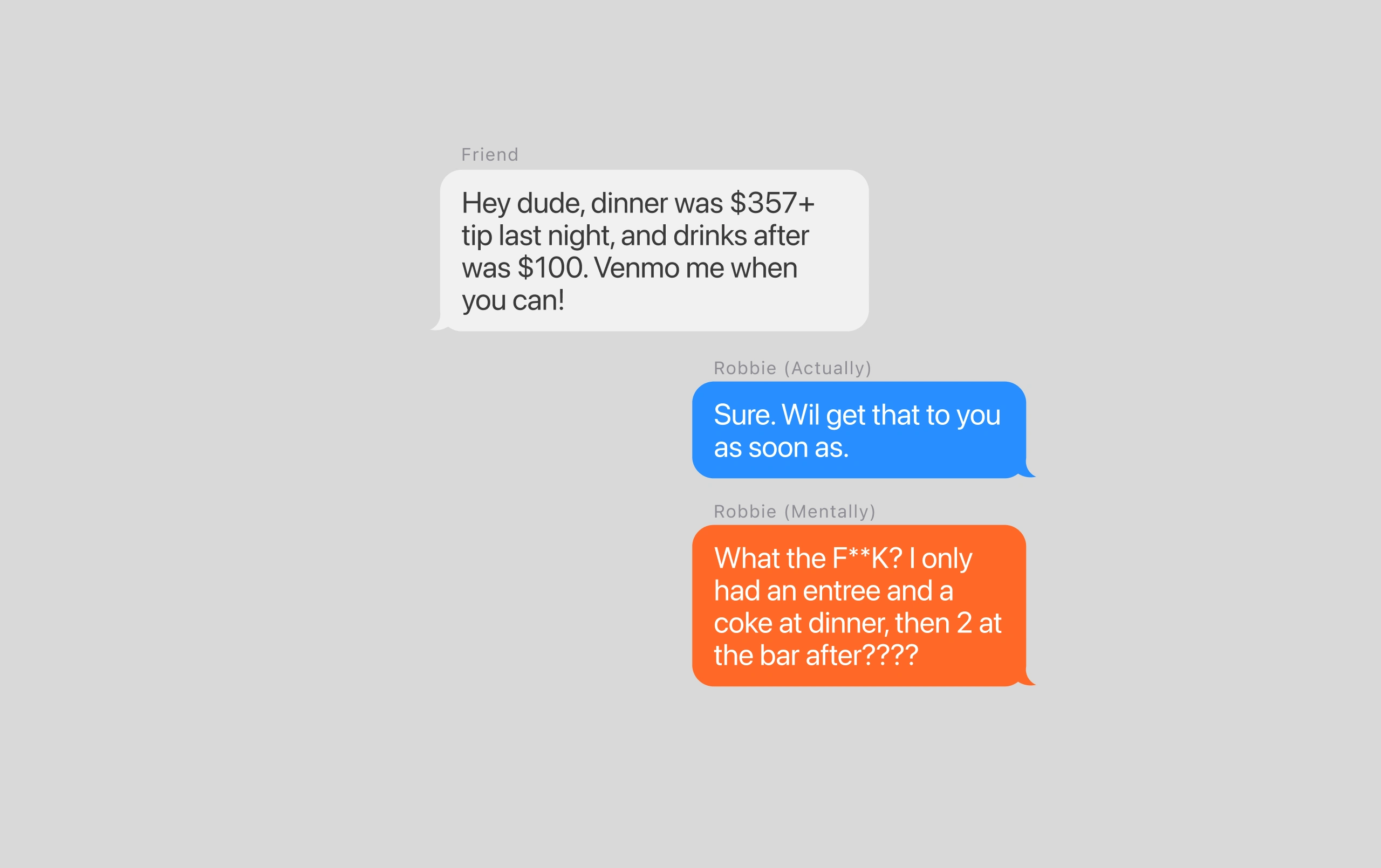
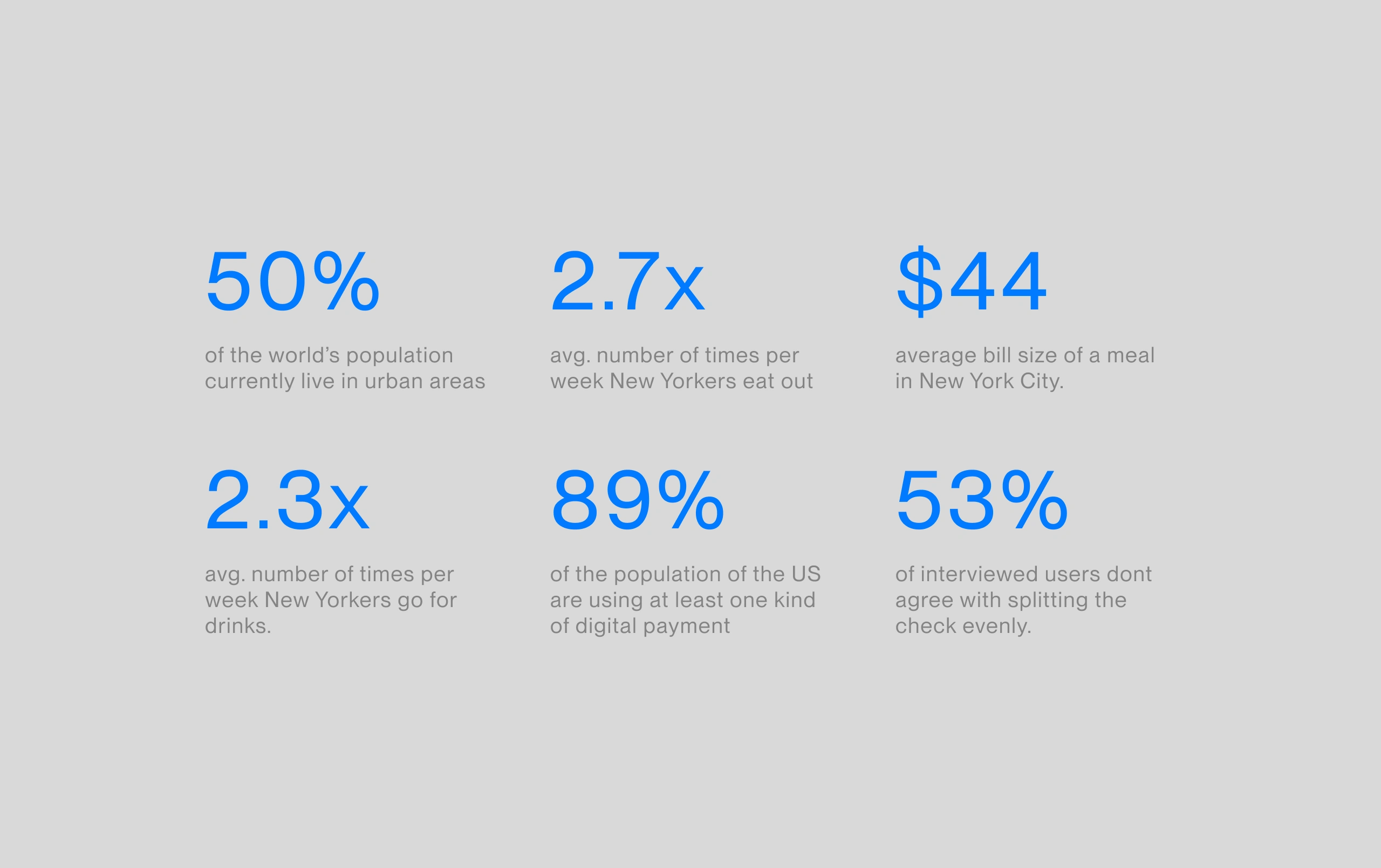
In large cities like New York, LA and London where going out with groups of friends and wealth disparity are pretty commonplace, splitting bills at the end of a dinner or night out can be at best 5 minutes of half-drunken maths counting out your share, and at worst an argument over splitting the bill evenly.
When I first came to New York and started eating out, two things became very apparent - wait staff hate splitting across multiple cards, and splitting the bill was always a hassle. Sometimes, that means waking up the day after a night out with 5 venmo requests, you being out of pocket and having to chase it, or you’ve just accepted you’re paying for Brian’s steak in part even though you had a salad.
Our original concept was simple, leverage OCR to produce an app that makes splitting the bill easy.
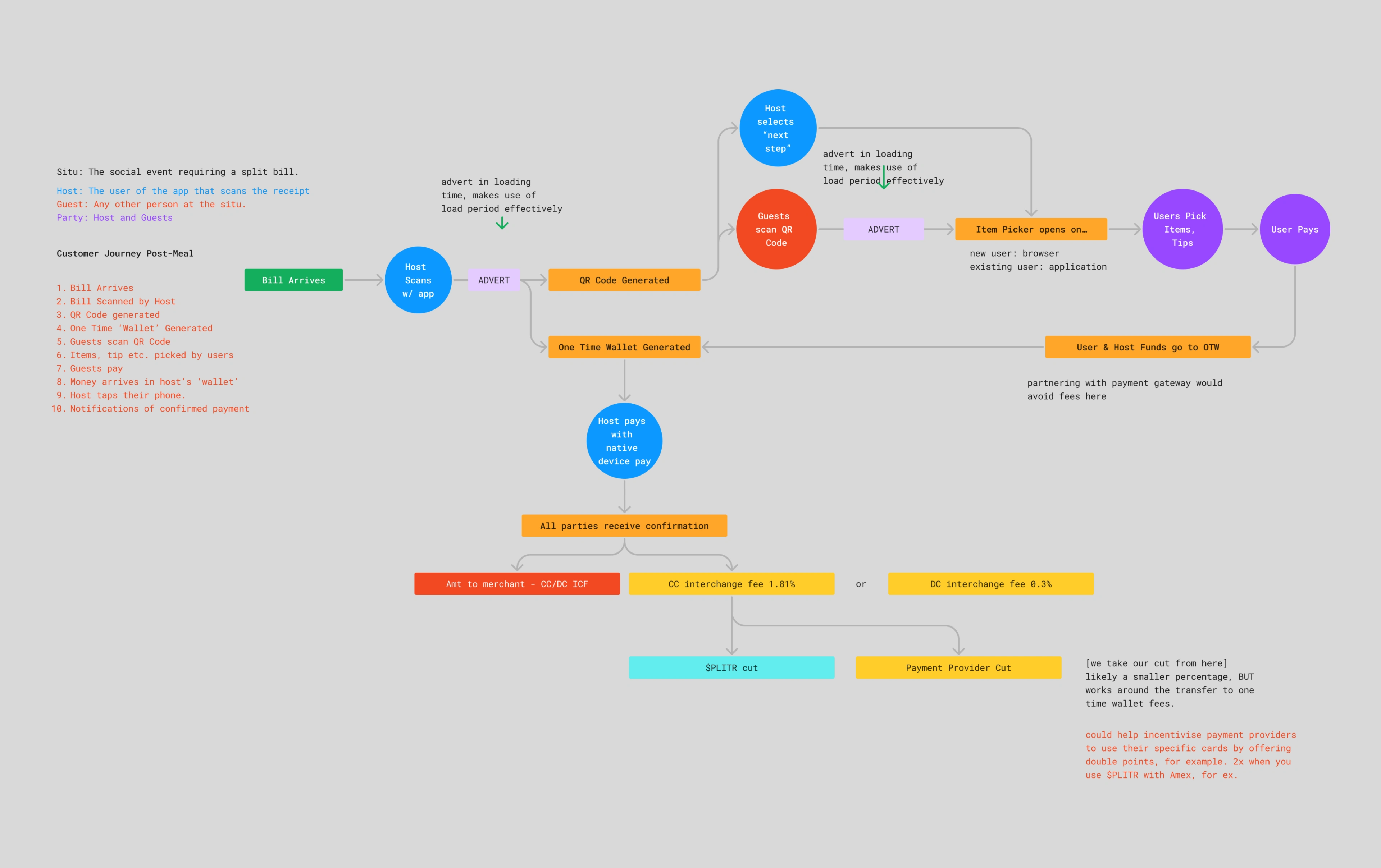
Open the app → Scan the receipt → App Generates the QR code for the item picker → Everyone scans the QR code → Picks their items and tip → Pays
Then the person who generated the QR code, would pay using their card, and receive the cash into their $PLITR account, which could then be withdrawn. We would take a small fee from everyone in the group for our cut.
When making what was at the time called “$PLITR” we focused on one thing - monetisation, and we designed based on assumptions. We figured that if Uber, Seamless, and other delivery companies were able to charge a small fee, that meant we could too.
The initial design of $PLITR worked in a similar way to how it does now, but it charged users a dollar or 5% fee for doing this, which seemed like it would be fine. But when we designed the prototype, it was met with pushback:
What we were making was solving a problem - but it wasn’t solving a problem that people were willing to pay for.
I began by analyzing data to ensure a market fit for the product. Our research found an uptick in dining out, influenced by increased urbanization, post-COVID habits, and the food culture of social media-focused post-millennials.The current challenge in the market is the escalating cost of dining out due to global inflation. However, we interpret this as an incentive rather than a deterrent, as it strengthens the case for fair bill splitting, thereby promoting the use of Rowndd.
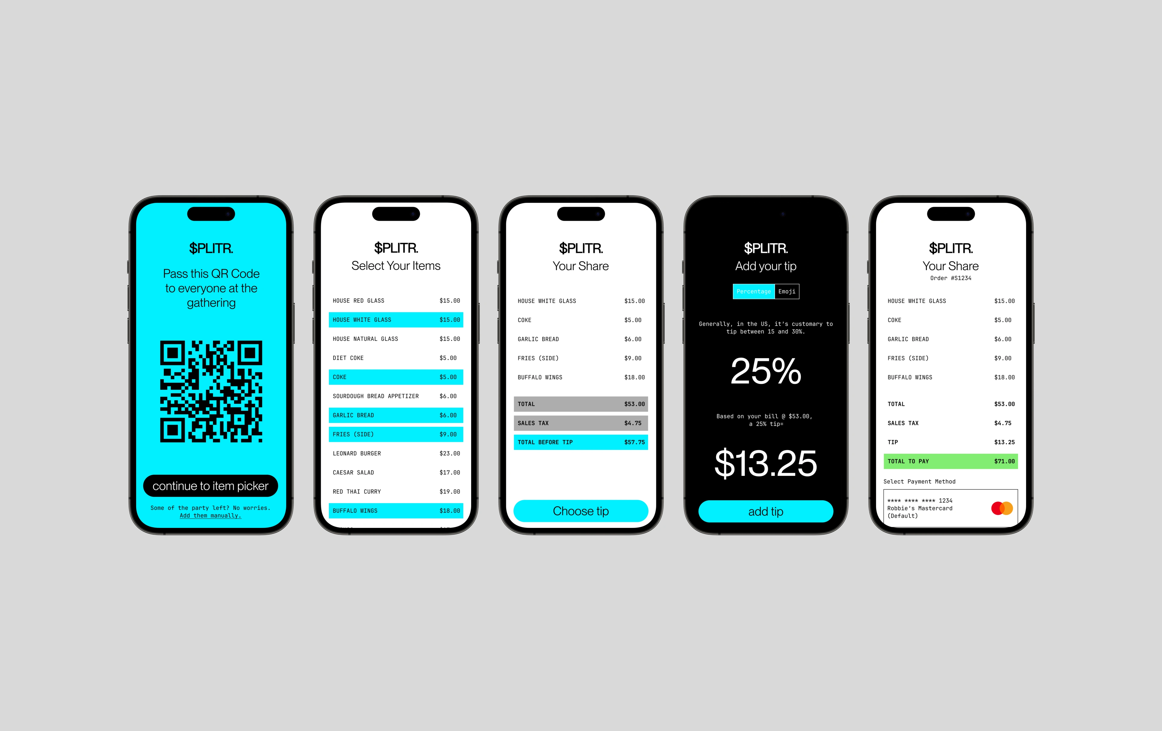
The original version of Rowndd was called "$PLITR" and contained a load of surplus features like a tip calculator, and in-app payments.
Coupling customer pushback, with payment processing.
We found straight away that people weren’t happy to pay a fee, so needed to rectify this. Of the 15 people we spoke to, 14 of them said when they saw the fee they would have closed the app and never used it again, so we returned to the drawing board.
After speaking to a developer, we also discovered to charge in-app payments, we’d have to use stripe or similar. This would also have us incur fees, meaning that we’d actually ending up losing money on the transactions, if we wanted everyone to be truly squared up.
Using Data as a means to Monetise
In light of the previous points made, we had to reassess how to make the app worthwhile. Realising that Stripe and the fees wouldn’t work, we looked to another way to monetise: Data.
We uncovered quickly that a lot of the habitual data we could gather from the app would be beneficial to marketers and agencies. We could gather insights on:
→ Popular days of the week to eat or drink out
→ Popular genres of food
→ Avg. check costs
→ Avg. number of people at a table
+ More
We could also add adverts, but decided against that as apps with ads are usually things like games where people are invested in continuing - we felt apps would cause user churn on Rowndd.
Restructuring the App & UI
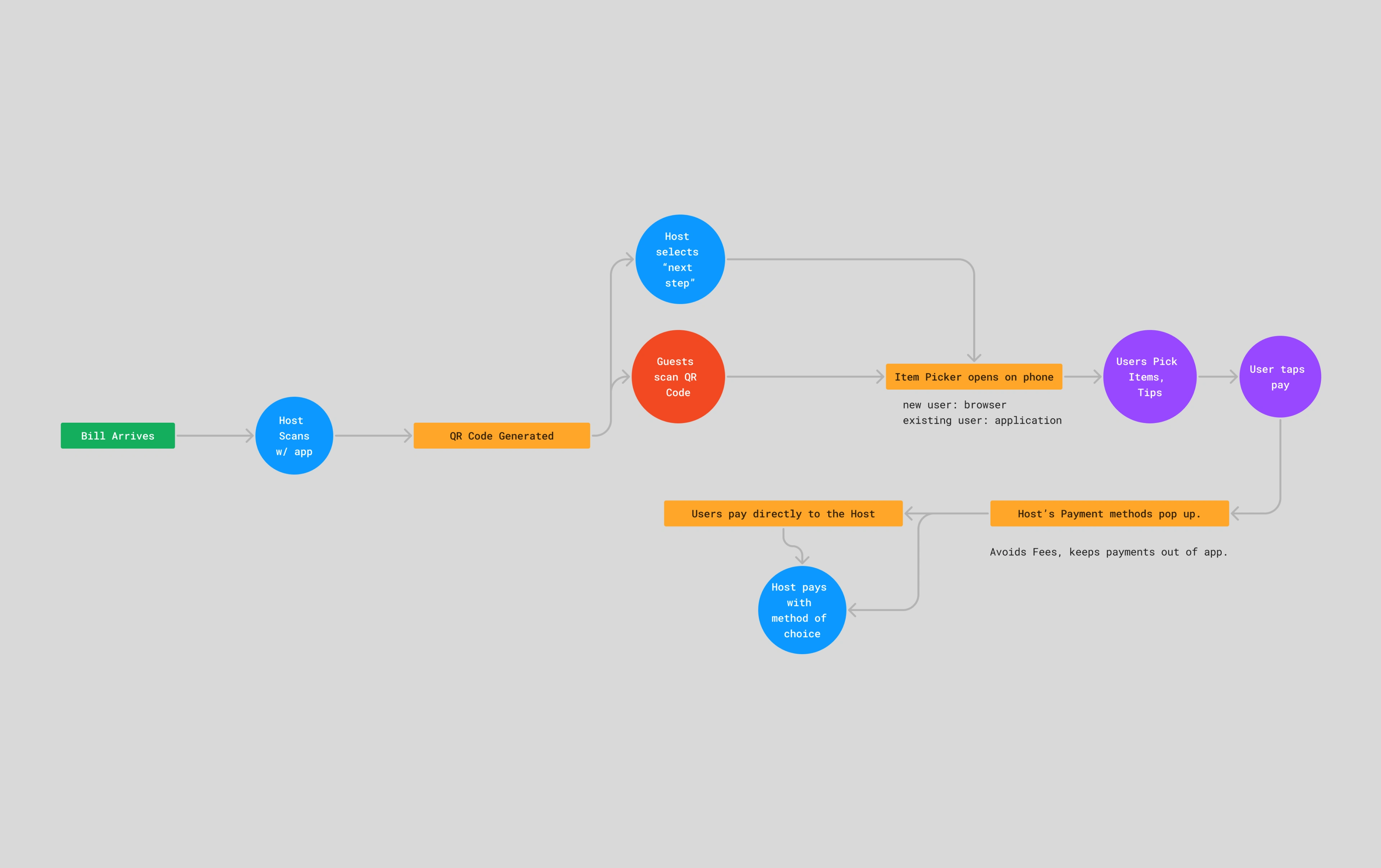
We realised we could remove traditional in-app payments, and utilise existing services like Venmo, Zelle, Paypal, and even wire transfers, we could negate the interchange fees and processing fees.
Instead of taking the payment like planned before, we would encourage users to add their payment methods to their account, which would then show to other members of the party on completion of the bill, so they knew where to send the money.
At this point, we’d already have gathered the above insights, and would now be able to get the following
→ Most common payment methods
→ Cost of Food compared to drinks
On completion of the payment, we would use GPS to enter their location too, which would also help us gain insight into the popular restaurants in the area.
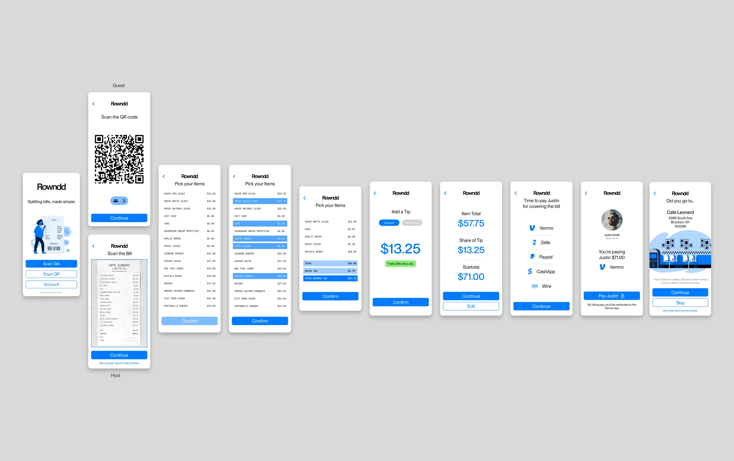
The nature of the app warranted a linear flow rather than hub and spoke. It's only ever used for one true purpose.
Testing the newly designed UI & Flow
Upon testing the new version with users, we found that it was met with a more positive response. There was no fee, the user flow was easy, and people didn’t mind sharing the data of their meal with the app, and those that didn’t felt it was easy to avoid sharing the data, so that it wasn’t a concern.
One thing users did mention was the splitting of items, for example if two people had the shared an appetiser, or the whole group drank a bottle of wine. To counter this, we allowed multiple clicks on the same item.
We also designed toast icons to stop errors or issues with tipping. Given that the App could be used anywhere, from the US to the UK, or by locals or tourists, this intends to make sure people are in line with the culture.
For example, in the US, it’s considered poor form to tip less than 18%, and 20% is the standard. But in the UK, there’s no need to tip. This would be defined by GPS also.
We also implemented a live picker, so that as items are being picked by people in the party, we can see who has picked what by colour, and help avoid any missing items or accidental splits.
We realised quickly that the app would market itself, just by being used. However, if the app had to be downloaded in situ, someone having capped data, or not wanting to download the app would mean the whole party to not use the app, resulting in poorer user satisfaction.
We implemented a browser function, that works the same way for guests. This also allows us to encourage app downloads after payments are made. We would simply capture a phone number or email address to send a receipt to, and then use this to follow up too. The user would scan the QR Code, then if no app was installed, it opens in browser.
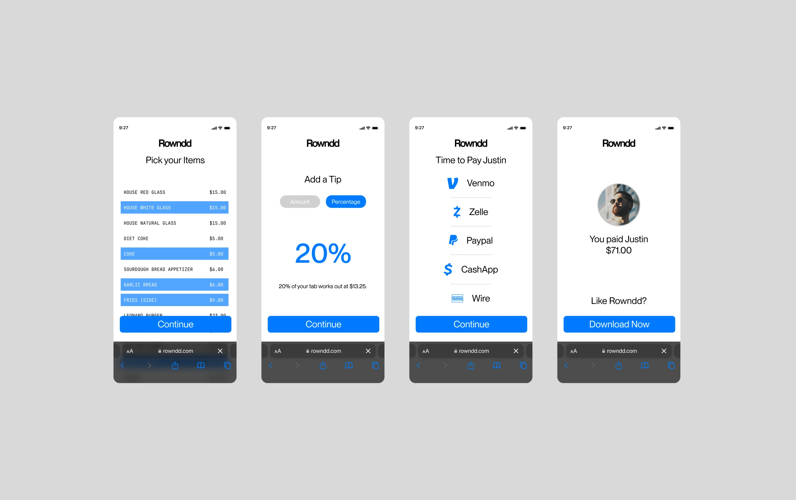
Showing the item picker within browser - the app would struggle to grow organically if everyone had to have the app downloaded already, so we implemented a browser function.
Like this project
Posted Apr 24, 2024
An app designed to help young urbanites effectively and fairly split bills amongst groups of two or more.
Likes
0
Views
14