FX Online Platform
Gauravi Linjara
exchangecurrency withoutthefear.
Moving money across currencies is high-stakes and opaque, rates shift, fees hide, and one wrong field costs real money.
I designed a foreign-exchange platform that makes the rate, the fee, and the outcome clear before you commit.
0
FX deals booked through the platform by May 2025.
Deals booked
0
AED in revenue generated on the new FX Online platform.
Revenue (AED)
0
RMs & Traders onboarded; 40% lift in perceived task clarity.
Users onboarded
live-platform figures reported by the business & stakeholders · as of May 2025
Case snapshot
Role
Sr. Product Designer — FX Online, Emirates NBD
Team
Team of 8 — architects, 4 backend, 2 frontend, me on design
Timeline
Sept 2024 – Apr 2025 · Dubai
Tools
Figma · usability testing
What I did
Designed a responsive FX deal-order platform for RMs and traders — research, the two-desk journeys, the rate-negotiation flow, dashboards, login and edge cases.
Impact
16,265 deals booked and 262Mn AED in revenue reported on the platform by May 2025; 400+ RMs and traders onboarded.
Constraints
Live rates that move every millisecond, a 90-second booking window, and audit & compliance requirements across two desks.
01 · Context
ratesthatmove every90seconds.
At Emirates NBD, Relationship Managers and Treasury negotiate foreign-currency deals where the market rate updates every millisecond. The job was to simplify a brutally complex, time-pressured system, so RMs and Traders could agree a rate and book a deal with confidence, fast.
Platform Internal FX negotiation & booking
Users Relationship Managers · Traders · Treasury
Constraint live rates · 90s rate window · audit & compliance
02 · Problem
noonetrustedthe rate.
01
Hidden true cost
The headline rate wasn't the real cost, fees appeared only at the end.
02
Rates that move
Quotes changed mid-flow, leaving users unsure what they'd actually pay.
03
Irreversible & scary
Transfers can't be undone, but the UI gave no confident final review.
04
Inconsistent across devices
Mobile, tablet and desktop each behaved differently.
03 · The shift
fromguesswork toaclearquote.
A cross-border transfer, the core task. Before vs. after the redesign.
Before - the guessing game
See a headline rate with no fee breakdown
Enter amount & recipient, hope the rate holds
Discover fees only at the final step
Submit with no clear summary of total cost
Wait, unsure what will actually arrive
After - the clear quote
✓
Rate and fee shown together, upfront
✓
Locked rate with a visible countdown
✓
Exactly-what-arrives shown before you commit
✓
Confident final review, then send
04 · Process
designedfor confidence.
Research the real anxieties, prototype the transparent flow, and validate it sprint by sprint.
voices from research
I never know if the rate I see is the rate I'll actually get — by the time I confirm, it's moved.
SME · cross-border payer
Once I hit send, the money's gone. I want to see exactly what lands before I commit.
Individual · first-time transfer
The headline rate looks great — until the fees show up at the very last step.
Cross-border payer
01 User interviews
02 Journey + cost-clarity mapping
03 Wireframes & flows in Figma
04 Responsive design system
05 Usability testing
06 Agile delivery with engineering
✓ Show total cost upfront
Rate, fee and final amount together, so the user decides with full information.
bury fees until checkout
It nudges conversion short-term but destroys the trust the whole product depends on.
05 · Solution
theclearquote, madevisible.
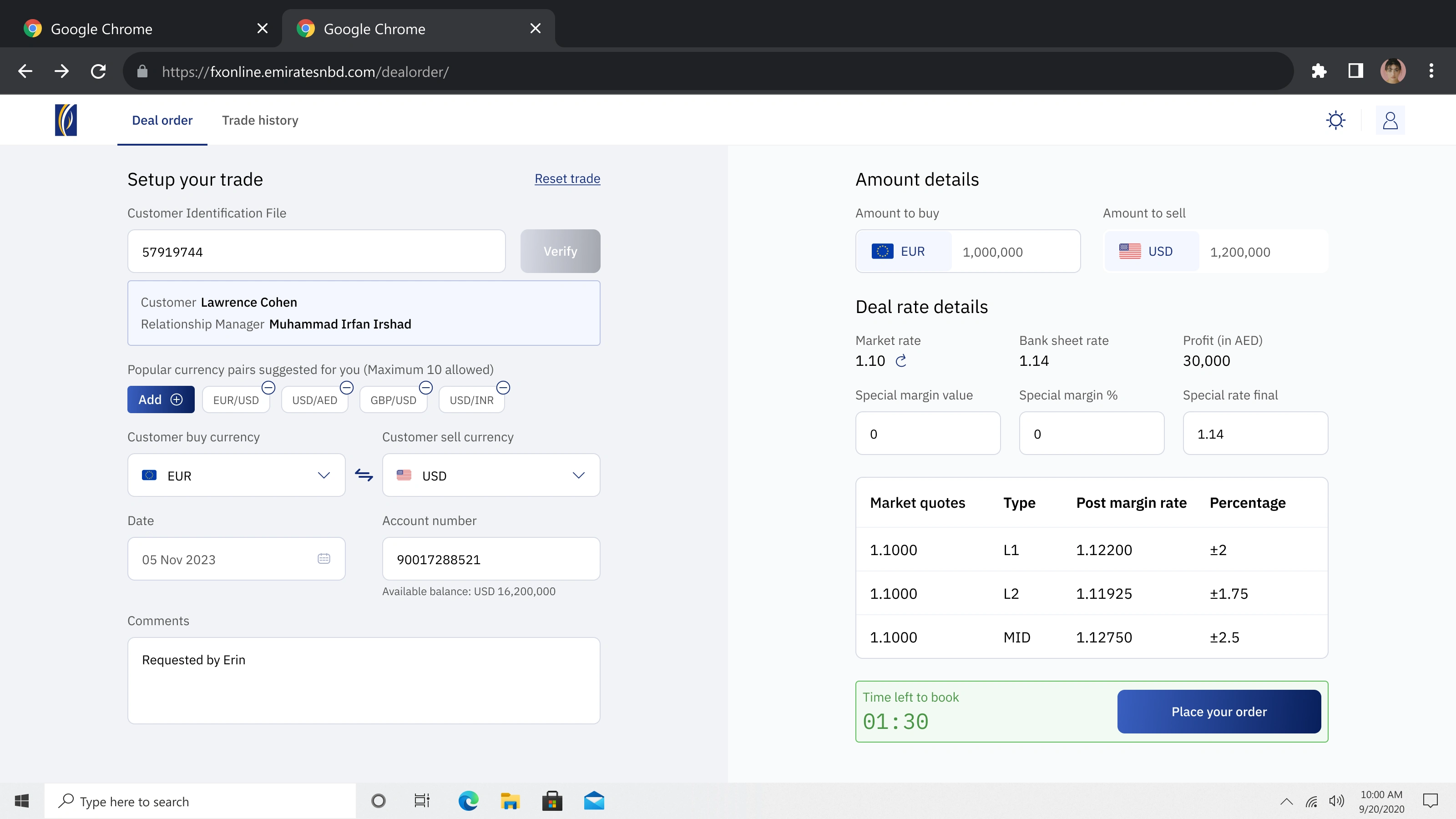
From the dense legacy trader terminal to one clear deal-order canvas, verify the client, see rate, margin & profit together, and book before the 90-second window closes.
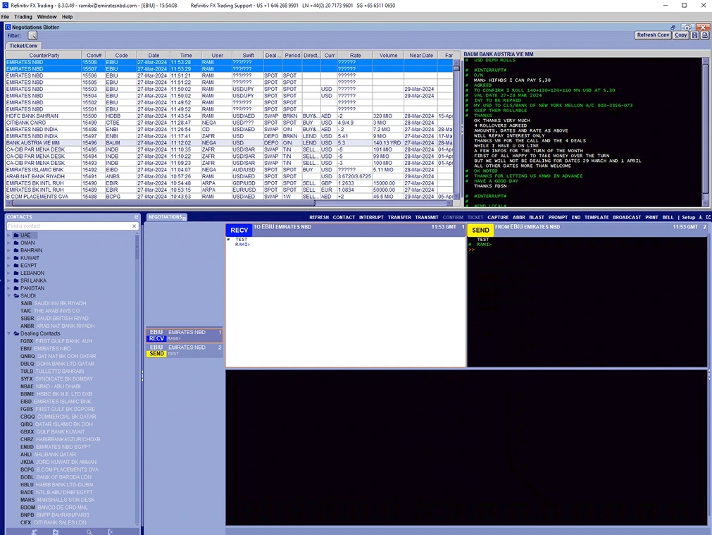
before · Refinitiv terminal
after · FX Online
06 · The flow
thedealorder, stepbystep.
01
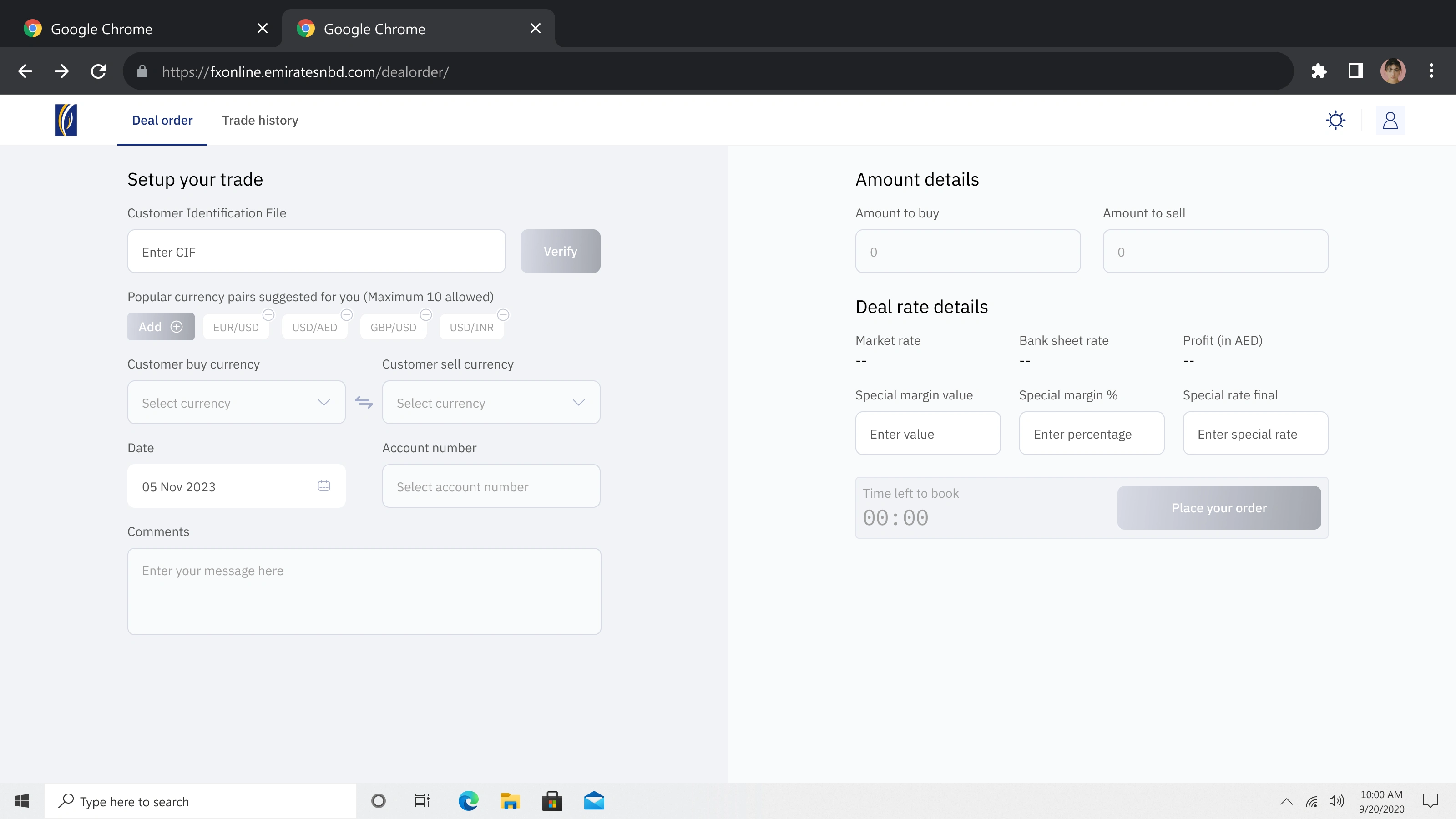
start the trade
The RM opens a clean deal-order canvas, setup on the left, live amounts and rate on the right.
02
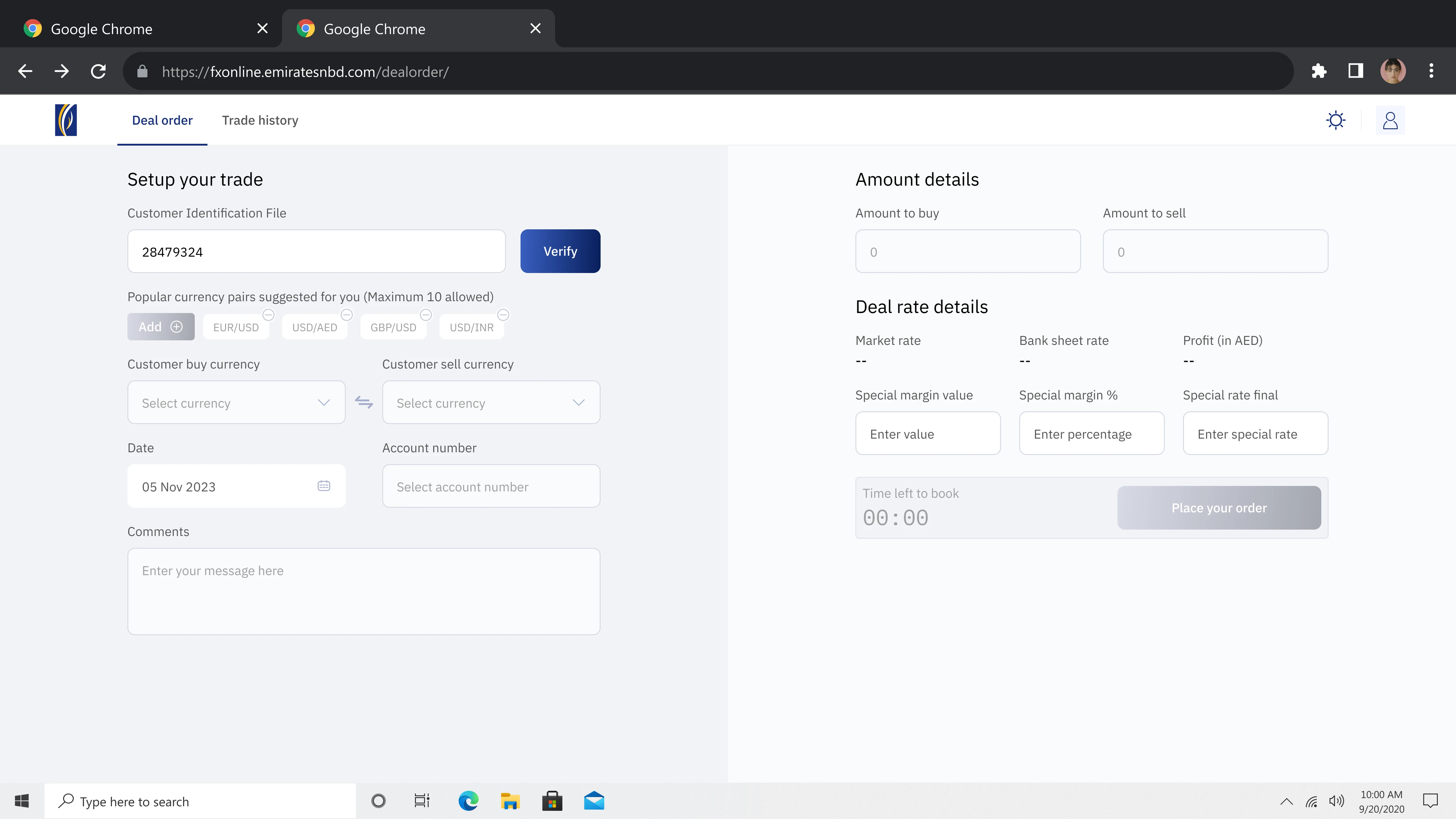
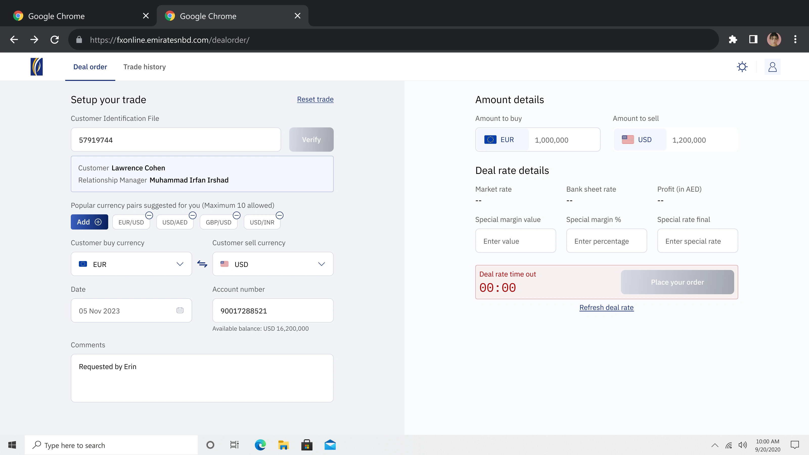
verify the client (CIF)
One tap confirms the customer and pulls their details, no re-typing what the bank already knows.
03
rate, margin & profit, together
Market quotes, post-margin rates and the live booking countdown, all in one confident view.
04
rate timed out? refresh, don't panic
When the 90-second rate expires, a clear timeout state lets the RM refresh instead of guessing.
07 · Design decisions
guardrailsona high-stakesscreen.
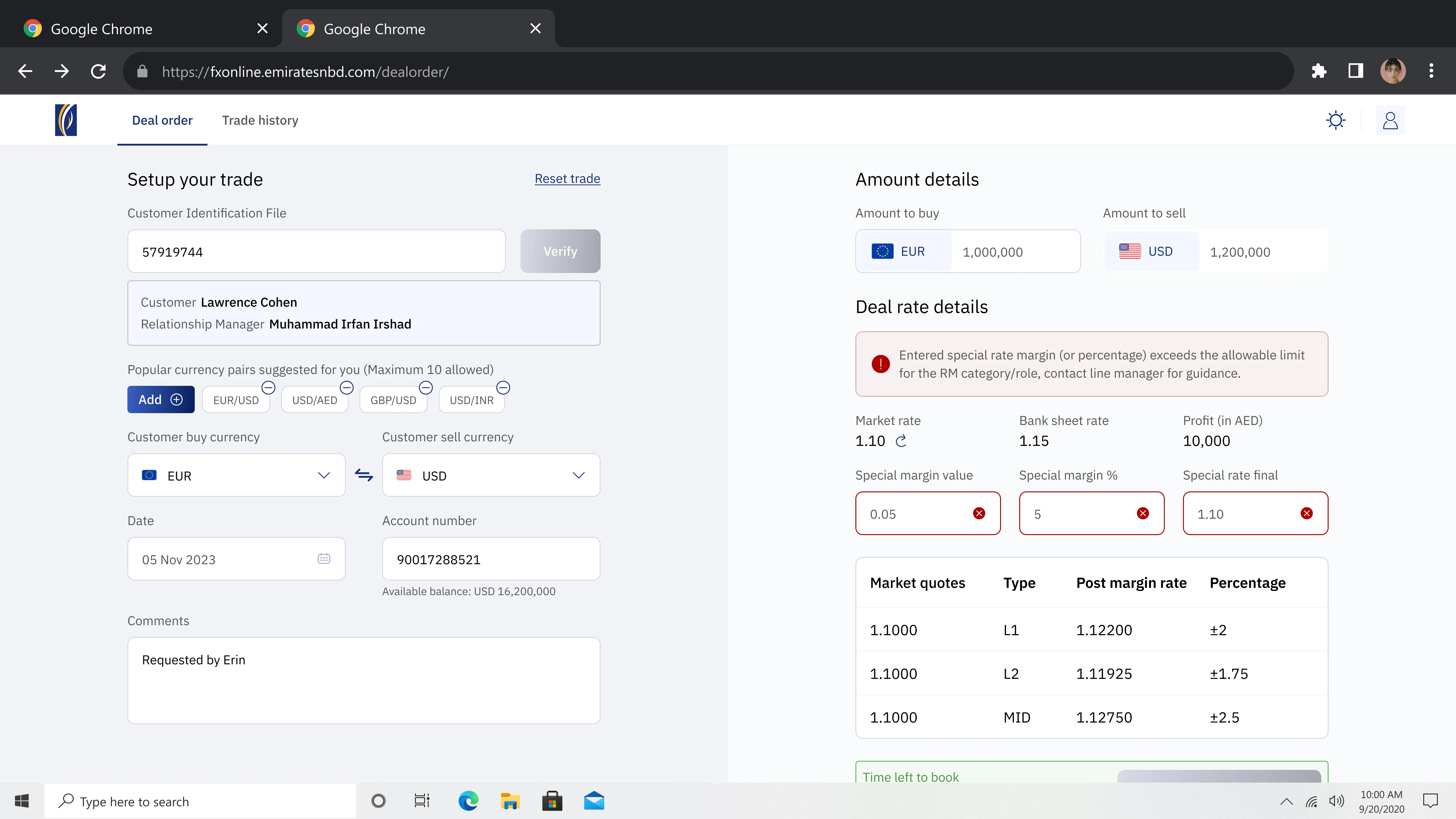
1
Inline guardrail: a special margin beyond the RM's authority (DOA) warns immediately, before submit, not after.
2
Client identity stays pinned at the top so the RM never loses context mid-negotiation.
3
A live market-quotes table makes the rate logic legible instead of hidden in a back-end.
08 · Impact
whatchanged, threeways.
For the user
Trust → up
Users see the true cost upfront and complete transfers faster, with confidence.
For the business
Fewer drop-offs
Transparency at the quote reduced abandonment at the scary final step.
For the org
One system
A responsive design system kept the experience consistent on every device.
"Good fintech design isn't flashy, it's a person sending money abroad and knowing, with total certainty, exactly what will arrive."
The principle behind the platform
09 · Beyond the Figma file
I shipped trust, not just screens.
A responsive design system and transparent-quote patterns, documented and handed to engineering, so cost-clarity held across every device and future flow.
Accessibility was built into the system — AA-contrast tokens, clear focus states and legible numerals for amounts and rates — so the quote stayed readable and trustworthy for everyone.
Next chapter · Dubai business online →
Like this project
Posted Jun 8, 2026
Designed a foreign-exchange platform for clear transaction visibility.
Likes
1
Views
0