Business Online Mobile App
Gauravi Linjara
corporatebanking, inyourpocket.
Business owners shouldn't need a desktop and a manual to approve a payment. I designed the Business Online mobile app so finance teams can review and approve payments from anywhere, with total confidence on a small screen.
⚡️ Impact
0 Faster to authorize a pending payment vs. the legacy flow, measured in usability testing.
Task speed 0
Scale 0
Clarity 0
Case Snapshot
Role: Sr. Product Designer — Business Online, mobile
Team: Cross-functional — product, iOS & Android eng, business, me on design
Timeline: 2024 · Emirates NBD, Dubai
Tools: Figma · attention heatmaps · usability testing
What I did
Designed the Business Online mobile app so finance teams can review and approve payments anywhere — research, authorization flows, accounts & payments, the device-activation journey, and a mobile design system.
Constraints
A small screen carrying high-stakes payments, with security and approval requirements.
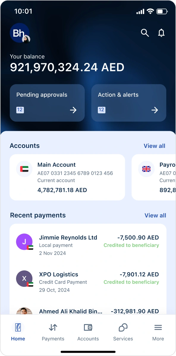
The Redesign
legacy→redesign.
01 · Context
bankingthatfits inathumb.
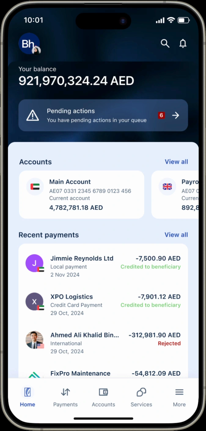
Corporate banking is built for big desktop dashboards, but the person who needs to approve a multi-million-AED payment is often away from their desk. The job: make high-stakes business banking feel safe and simple on a phone.
Platform
Business Online · mobile app
Users
Business owners · finance teams · authorizers
Constraint
small screen · high stakes · security
02 · Problem
highstakesona smallscreen.
01
Approvals stuck at the desk
Authorizers had to wait until they were at a desktop to release payments.
02
"Did it go through?"
Unclear status after authorizing, no confident confirmation on mobile.
03
Dense for a phone
Desktop-grade data crammed onto a small screen, hard to scan.
04
Multi-role complexity
Makers, checkers and authorizers each need a different view.
User + heatmap research
I just need to approve it and know it's done.
03 · Research
approvalssat belowthefold.
Before redrawing a single screen, we ran attention heatmaps on the live app — exposing the gap between what users needed and where their eyes actually went.
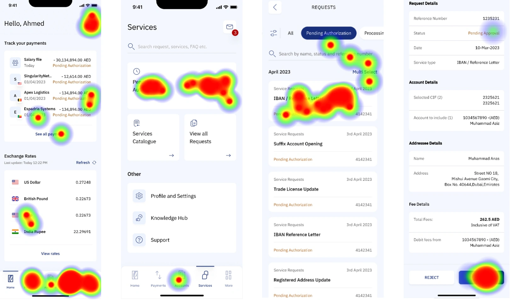
finding approvals sat below the fold
finding status text was rarely fixated on
finding dense tables were scanned, not read
04 · The Shift
fromdesk-bound toonthego.
Approving a pending payment, the core task. Before vs. after the mobile redesign.
↳ Before - desk-bound
Wait to get back to a desktop
Log in to the full corporate portal
Hunt for the pending item among dense tables
Approve with no clear mobile confirmation
Call to check it actually released
↳ After - Business Online
✓ Push notification: payment pending
✓ Open the app, see it front-and-centre
✓ Review amount, payee & status at a glance
✓ Authorize with biometrics, clear confirmation
done in seconds
05 · Process
designedforthe thumbzone.
Research how authorizers really work on mobile, prototype the flows, and validate with heatmaps and testing.
01 User interviews
02 Maker / checker / authorizer mapping
03 Mobile flows in Figma
04 Component anatomy & system
05 Heatmap + usability testing
06 Handoff to iOS & Android
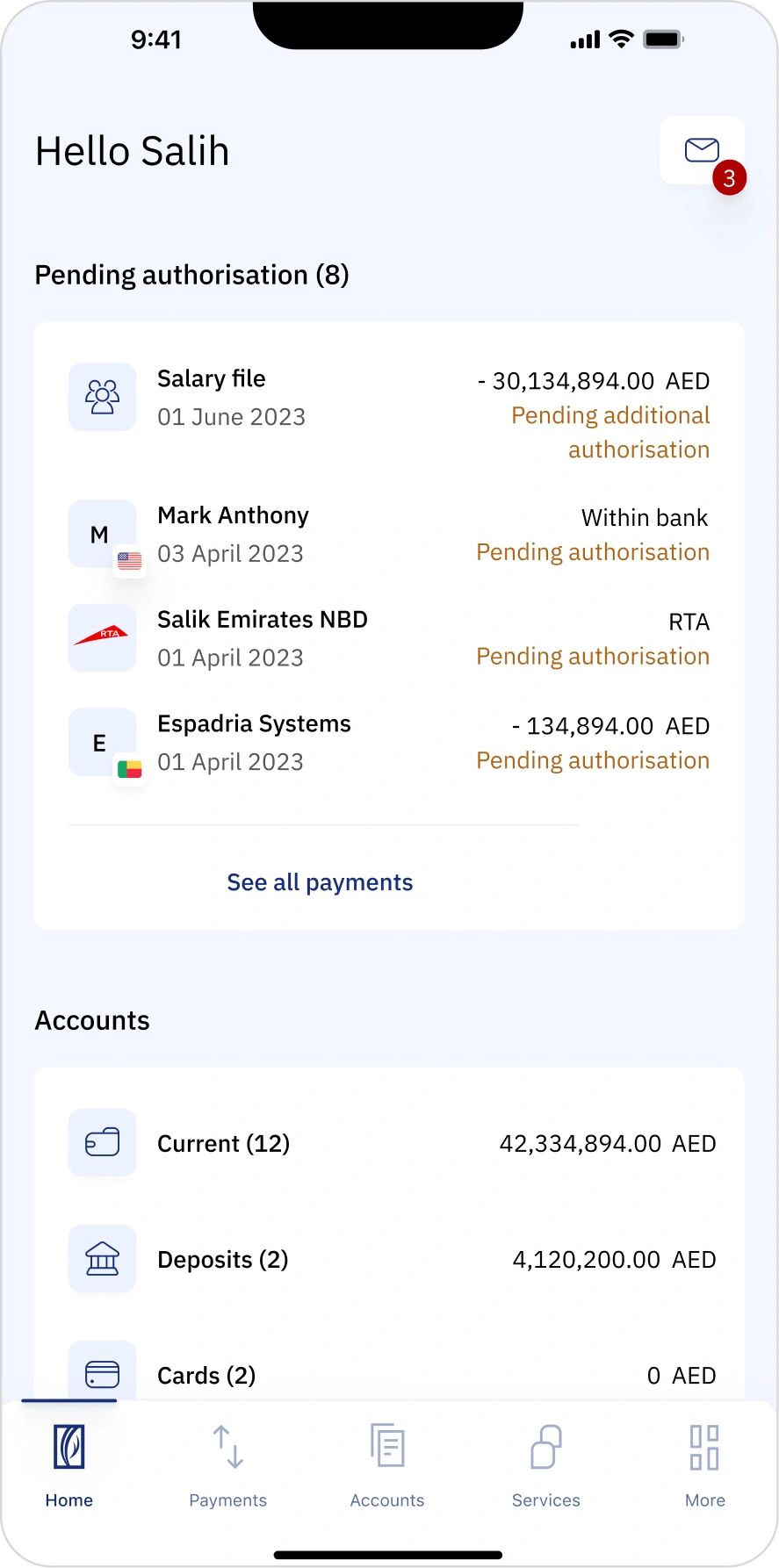
✓ Pending-first home screen
Put what needs action at the very top, authorizers see and clear tasks instantly.
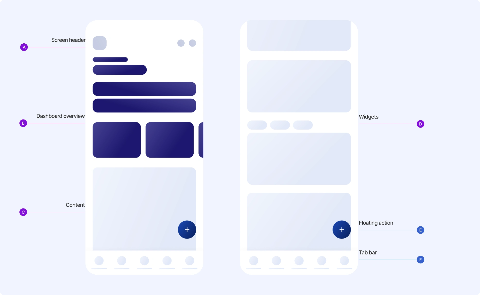
06 · Solution
theapp,inhand.
A Maker and a Checker don't need the same screen. Each home is tuned to what that role actually does — here are the key decisions, on the live build.
Checker
Pending Approvals, upfront Task-based prioritisation
Approve / Reject in context Role-aware CTAs replace the one generic button.
Maker
Create New, front and centre The Maker's primary action leads, in place of a generic CTA.
Role-relevant quick links Action cards for the Maker's common tasks replace the generic shortcut.
07 · The roles
onepayment, threeroles.
A corporate payment isn't one person's job: a Maker creates it, a Checker verifies it, an Authorizer releases it — each with a focused view and a clear approve-or-reject fork.
08 · Trust by Design
movingmoneyneedstrust.
In corporate banking, confidence is designed. Every element here does quiet work to make a CFO trust an irreversible transfer — hover the markers.
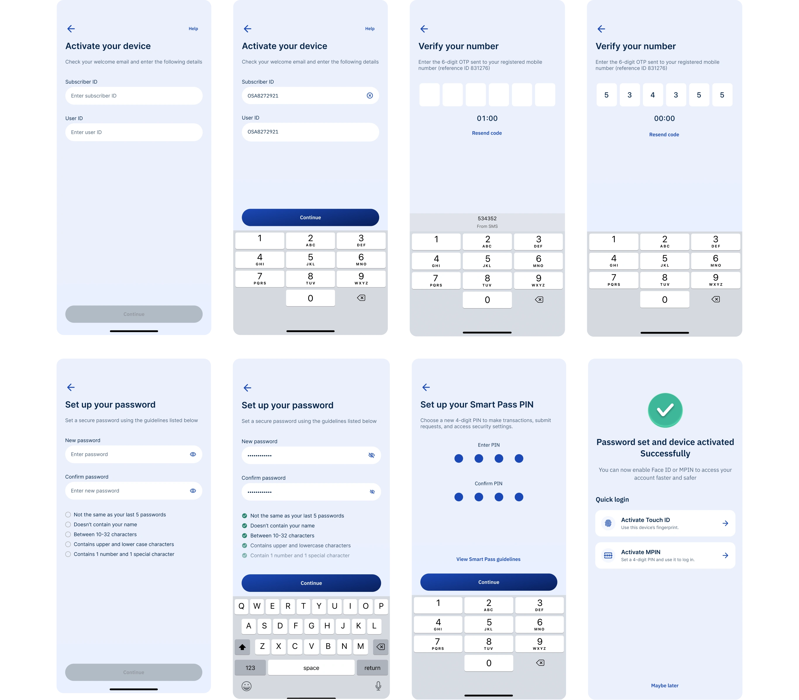
09 · Onboarding
securesetup, nobranchvisit.
Before touching a single fil, a corporate user has to prove who they are. We designed the full device-activation journey.
10 · Intended Impact
40%faster, offthedesk.
Designed for the user
Desk → pocket
Designed for the business
Approvals stop waiting
Built for the org
11 · Reflection
whatI'ddonext.
Close the loop on trust. Measure how often authorizers re-check a payment after releasing it, and design that residual anxiety away entirely.
12 · Beyond the Figma file
I shipped a mobile system, not just screens.
A documented component anatomy and mobile patterns handed to iOS and Android engineering, so the experience stayed consistent across platforms and every future release built on a real system.
Next chapter · the Bay podonos · onepin →
Like this project
Posted Jun 8, 2026
Designed a mobile banking app for seamless payment approvals on-the-go, enhancing user experience and efficiency.
Likes
1
Views
0