

Founders Faction | Visual Identity
Founders Faction began as a coastal co-working concept for city professionals. It quickly became something more considered: a values-led collective for founders building with purpose, grounded in Stoic and Existential thinking.
The challenge was building a brand around a philosophy rather than a product. One that felt genuinely grounded, not aspirational in the hollow, startup sense.
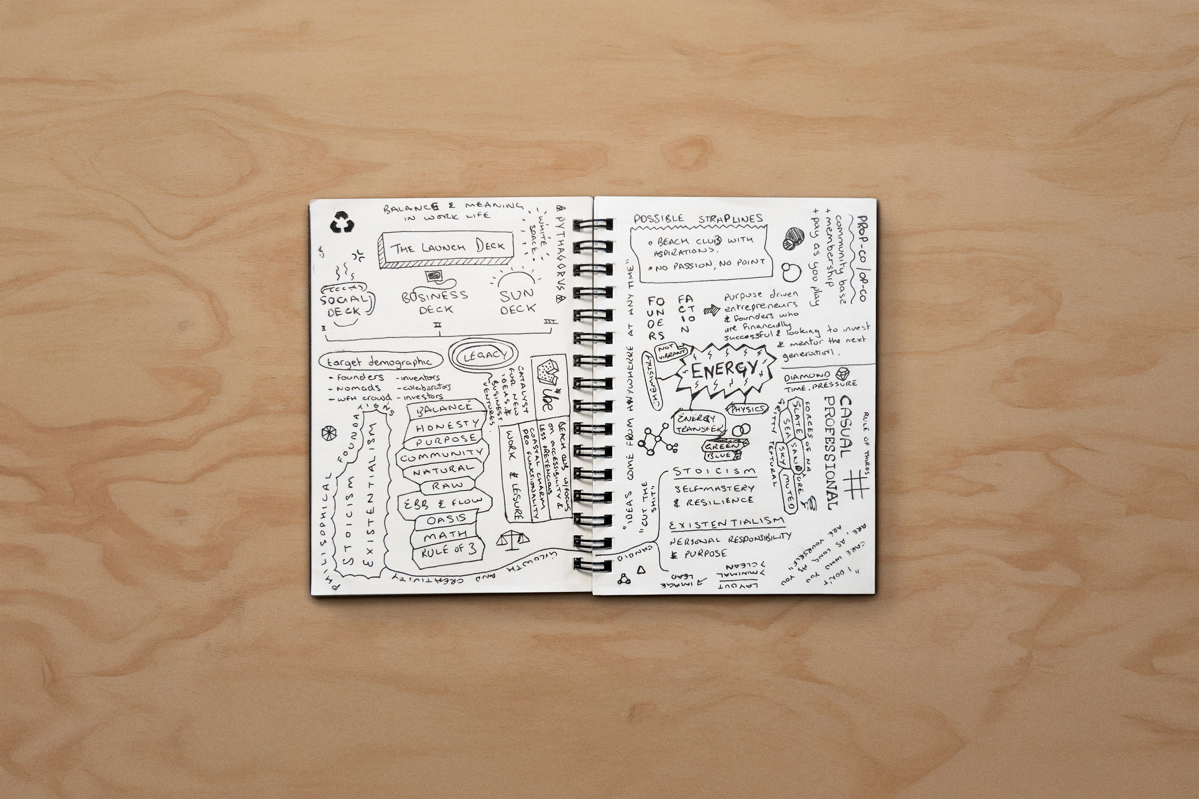
The thread running through the work was environment as values. Surf, skate and alpine culture aren't aesthetic references here, they're proxies for a particular way of thinking: slow down, go deep, build for the long term. Every decision connects back to that rhythm.
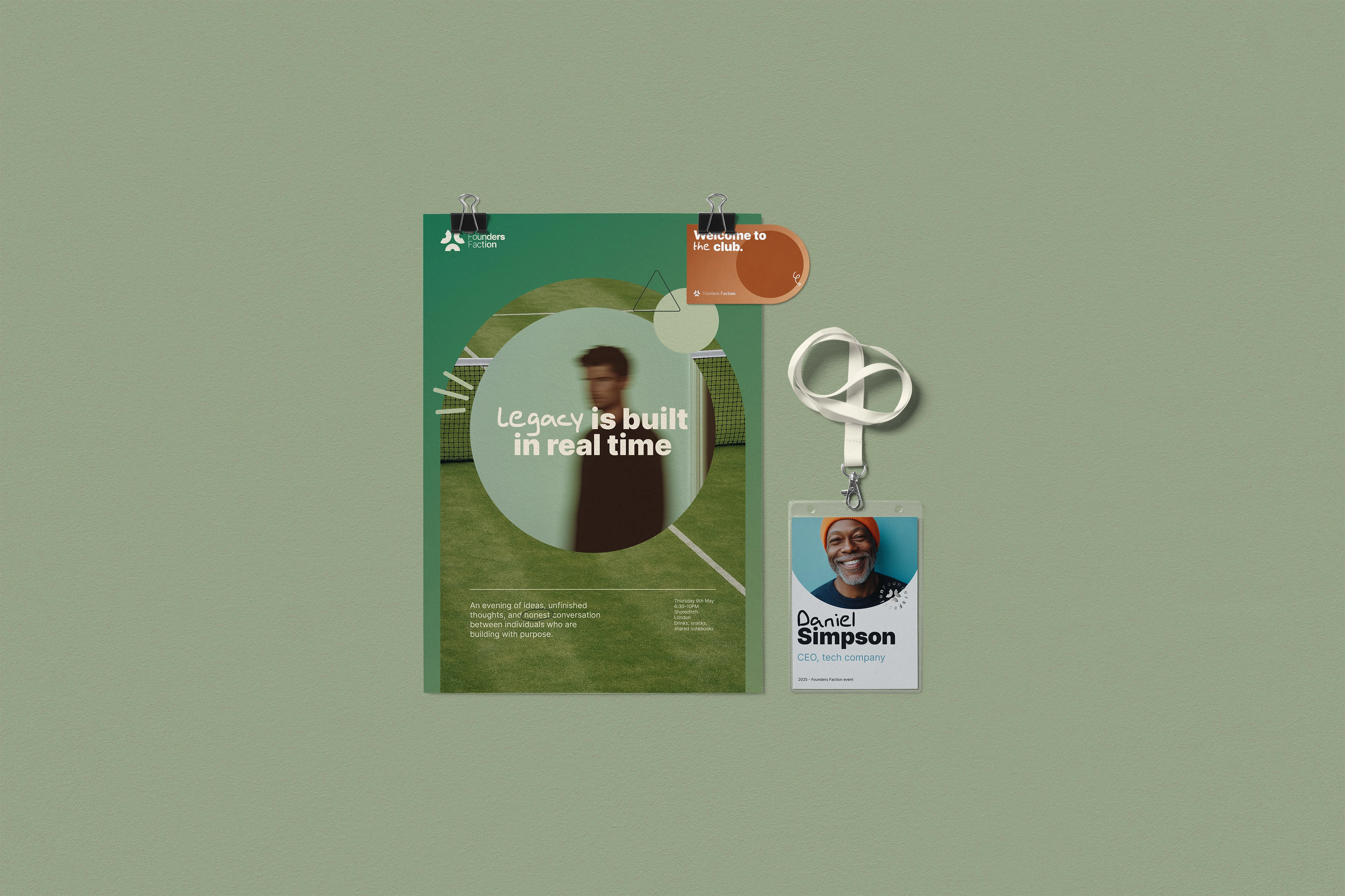
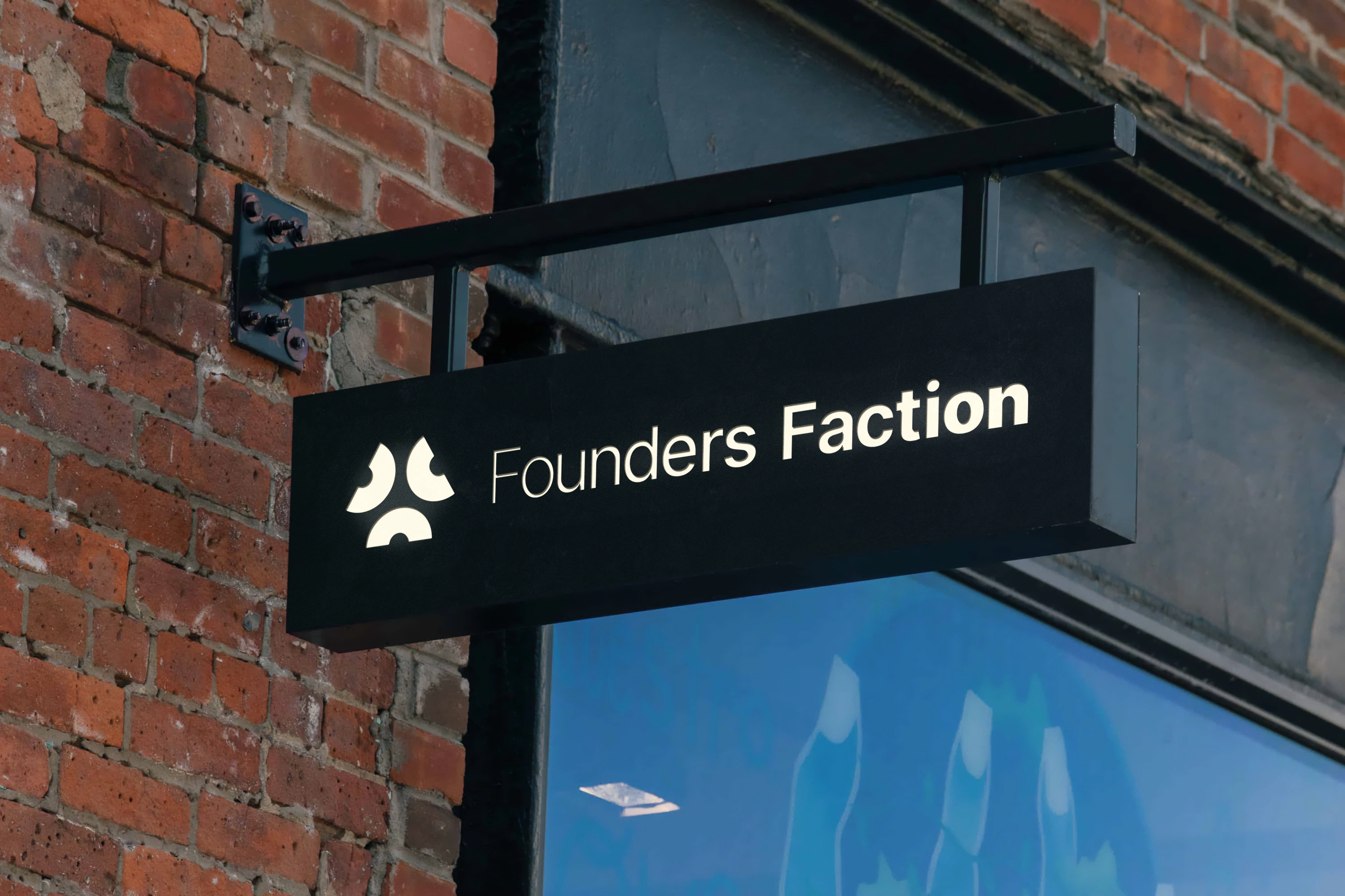
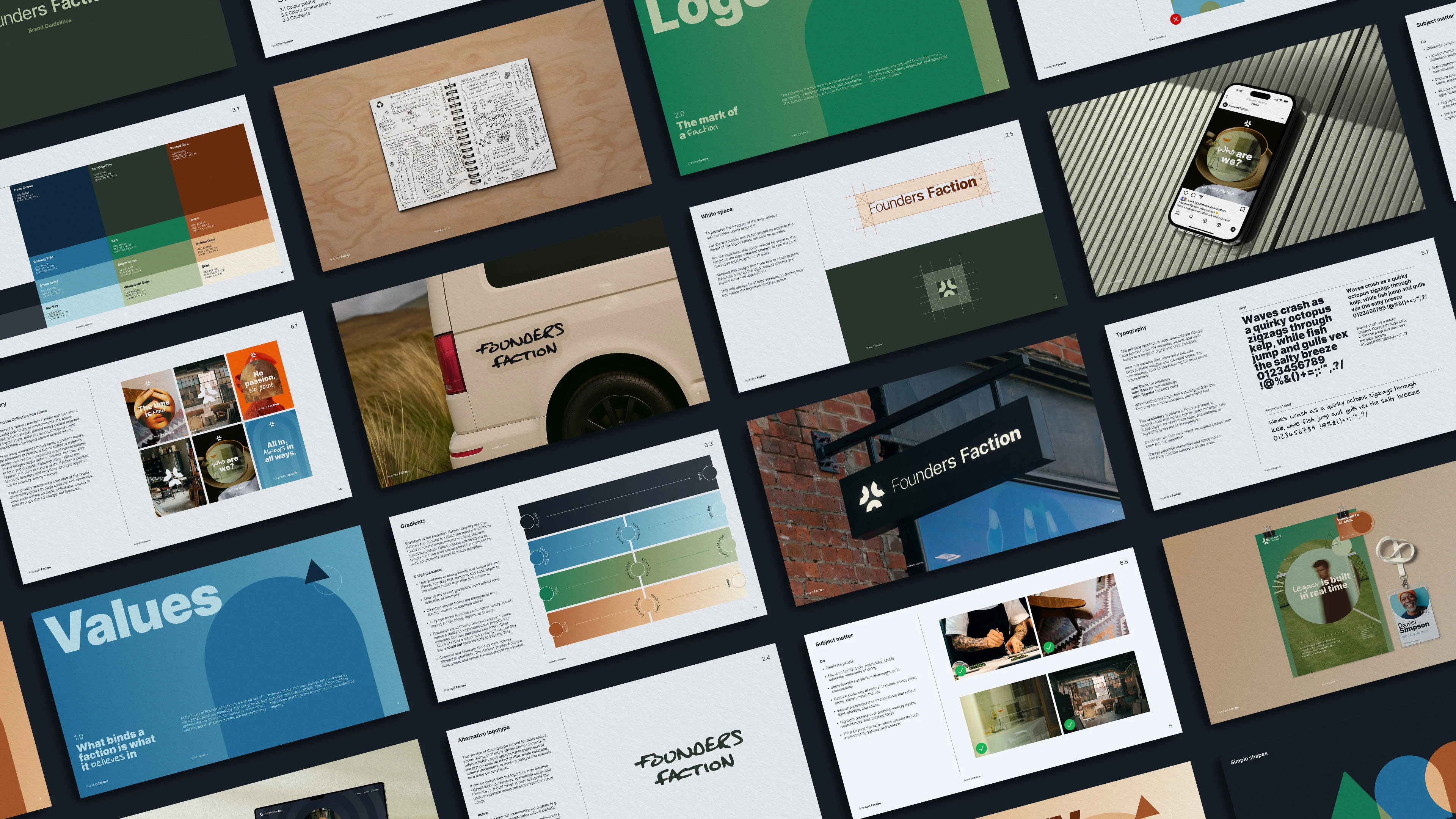
The logo mark is three abstract figures, back to back, arms open. Together they form a triangle, standing for Purposeful Growth, Enduring Legacy and Collective Energy. The shapes become a structural system across the brand, never decorative. A custom display typeface, Founders Hand, adds spontaneity alongside Inter's quieter confidence. The palette pulls from coastal materials: sun-faded navy, sandstone, driftwood grey, with terracotta and olive built in to carry the brand as it evolves toward alpine terrain.
The result is a brand identity the founder is building a ten-year plan around. It won Gold at the London Design Awards 2025 in Company Branding before the business had even launched.



0 likes · 21 views · May 21, 2026
Brand identity & framer web build for a values-led founder collective. Rooted in coastal and alpine culture, built around purpose, legacy and growth.
Timeline
May 15, 2025 - Aug 15, 2025

