Zero Earth

Aswin Ram T


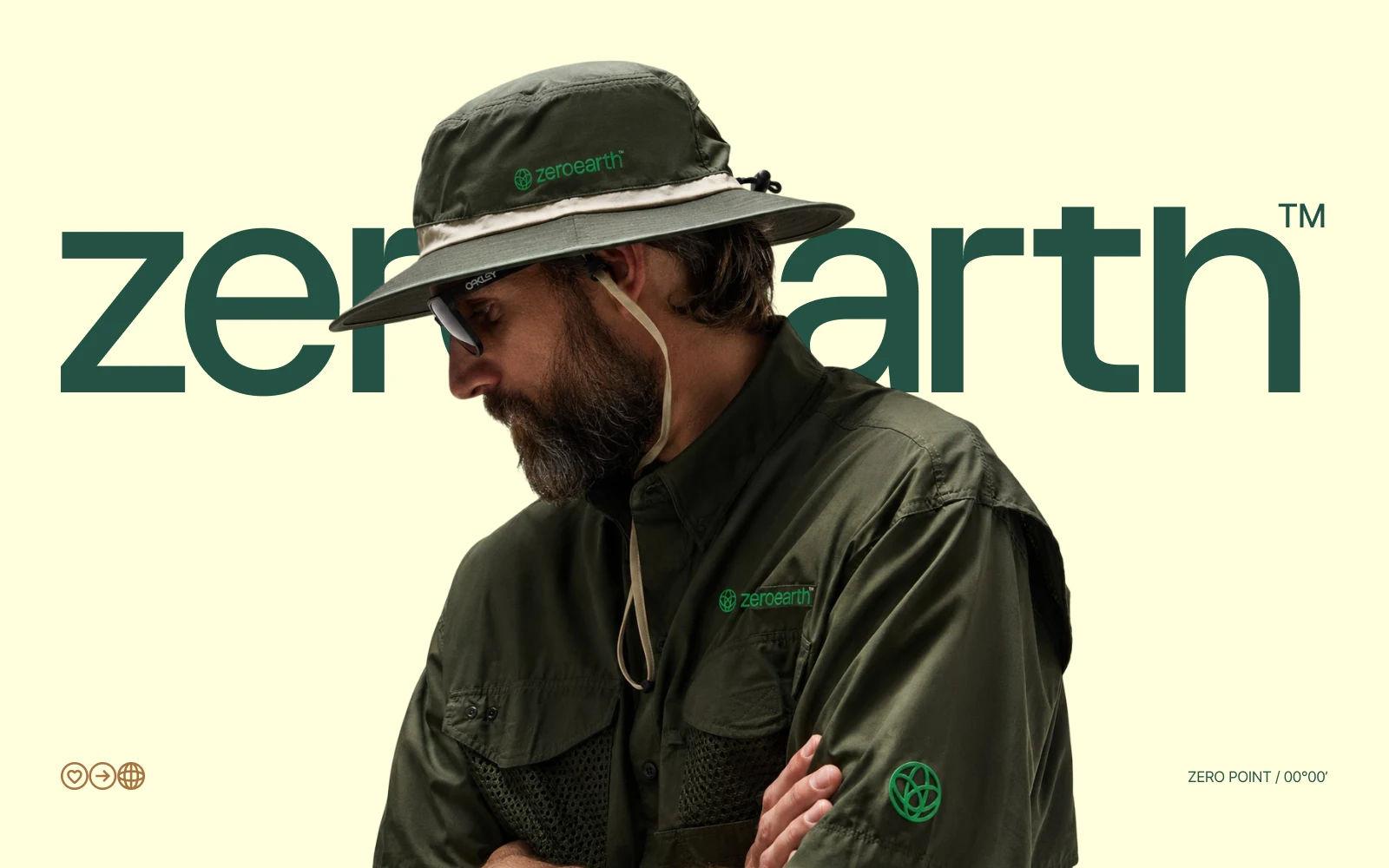
The primary mark brings the traveller and the Earth into one continuous form.
The Zero Earth - the ideal travel guide, designed for Indian travellers
Zero Earth is a travel brand, a comprehensive guide for people searching for connection. Rather than following a traditional travelling guide, Zero Earth zones in on the journey.The community is for travel addicted people of India.
The journey begins at point zero. Everything that follows after is the primary intrigue in the whole process of travelling, the destination being the mere landing point.

Conceptualisation
Zero earth focuses on human connections, community and travelling as a sacred and careful act. An act of letting go, and regaining control over your body, heart and mind.
That was the initial block placed in the entire course of Zero Earth’s brand identity conception. The idea was to nurture a connection with the Earth, the original traveller, and that movement involved in travel is where the core of the idea lies.
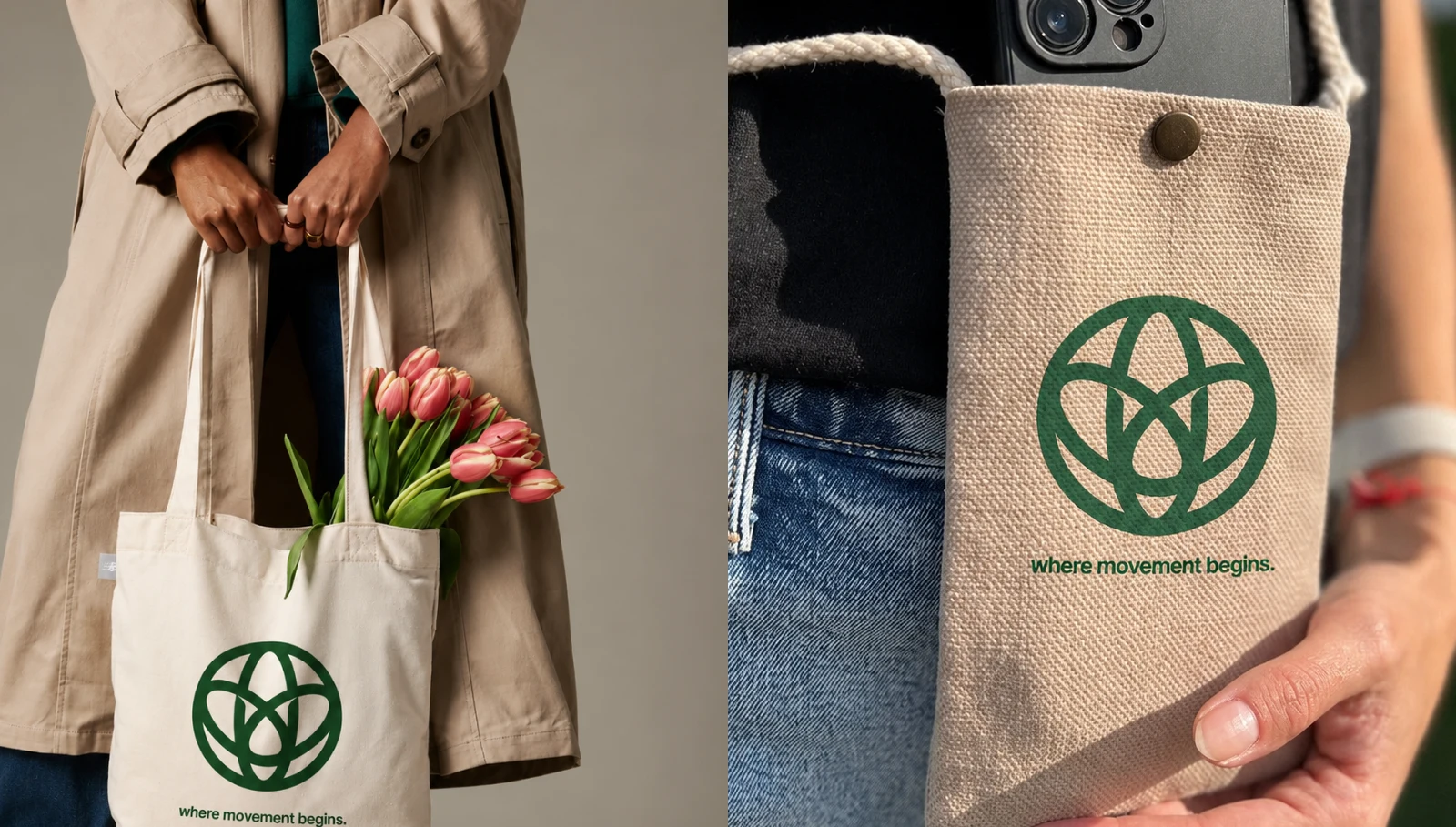
The identity extends naturally into everyday travel objects, making the mark feel useful and lived-in.
Visual Ideation
The entire designing process of Zero Earth involved multiple ideations, some that went in completely different directions, trying to touch all the elements one would be faced with during travel.
We were determined to find that middle space where everything met and melded together, a niche for all explorers to seek shelter under. So we combined dark greens, browns - palettes that are one with nature. The end result turned into something that reflected the image of nature that we wanted to pinpoint from the beginning.
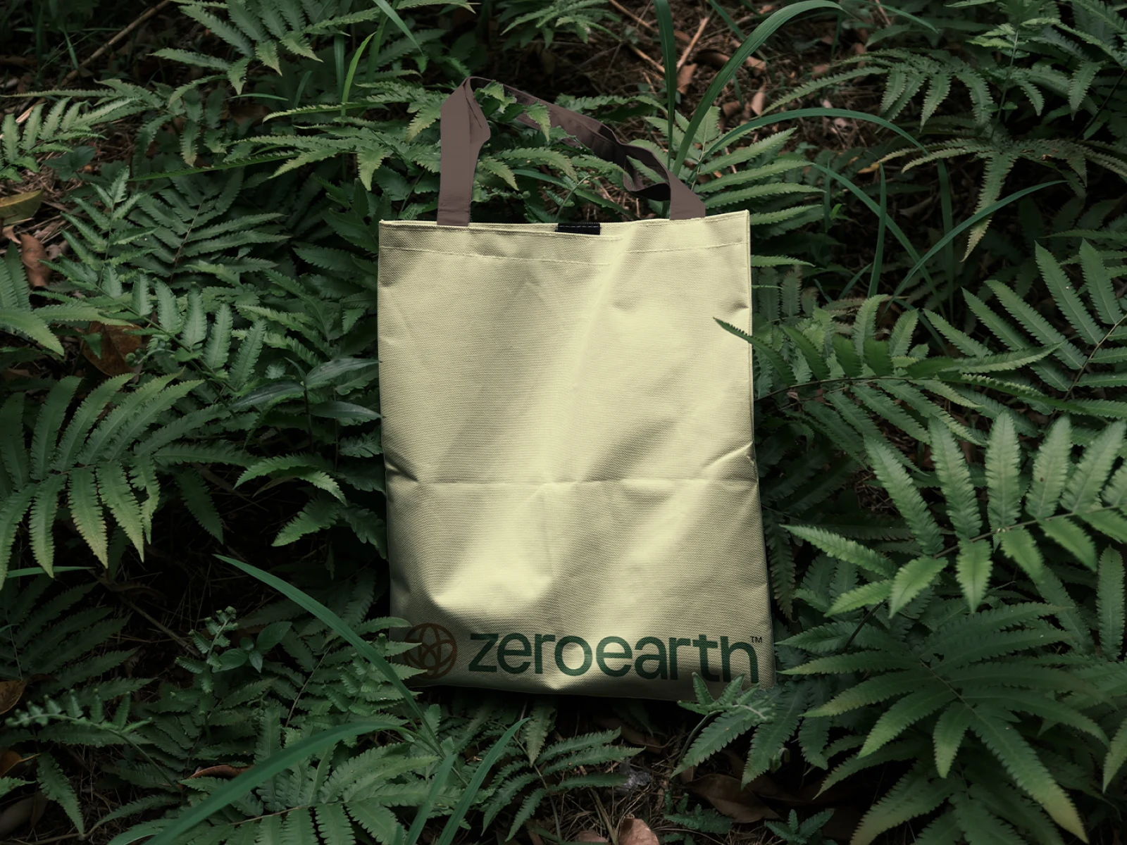
A restrained application system lets the identity belong to the landscape instead of competing with it.
Positioning
Positioning was one of the most integral parts of the branding process. Zero Earth needed to reach the right people:travellers, seekers of community and those who connect with the art of travelling rather than the rush to arrive.
The brand sits between a travel guide and a collective. It offers practical inspiration, but its deeper role is to help people find a rhythm, a route and a group of people to move with.
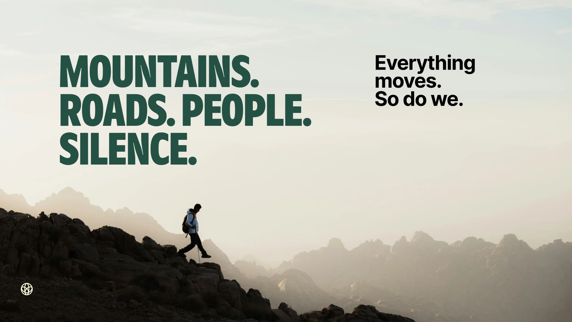
The campaign voice balances bold statements with quiet, open space.
Brand Voice
The language of Zero Earth is direct, grounded and rhythmic. Short phrases carry the weight of larger ideas, creating a voice that is easy to remember and strong enough to live across posters, films and social posts.
Mountains. Roads. People. Silence. These are not separate subjects; they are the elements that make every journey whole. Everything moves. So do we.
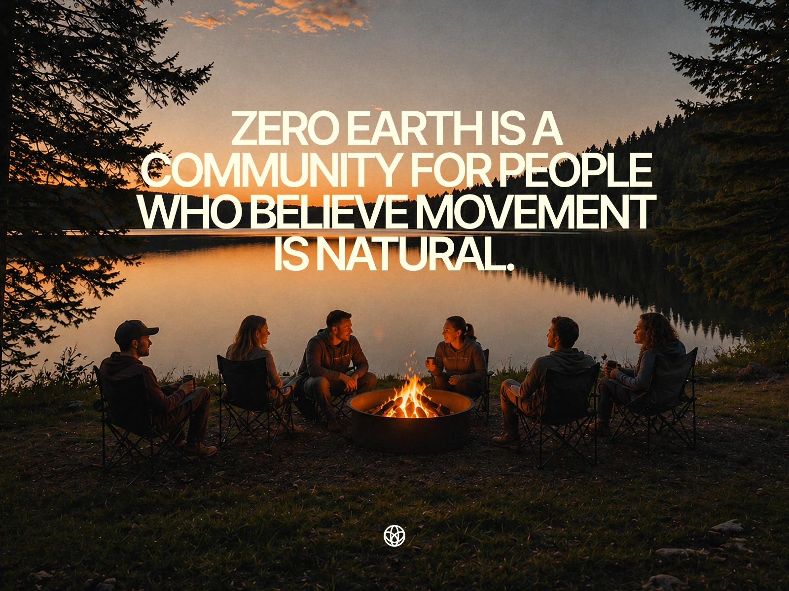
Community-led imagery turns the brand from a guide into a place of belonging.
Community
Zero Earth is a community for people who believe movement is natural. Travel becomes less about collecting destinations and more about creating shared stories around firelight, food, weather and unfamiliar roads.
The imagery places people at the centre without turning the landscape into a backdrop. Nature, conversation and movement exist together - each one shaping the other.
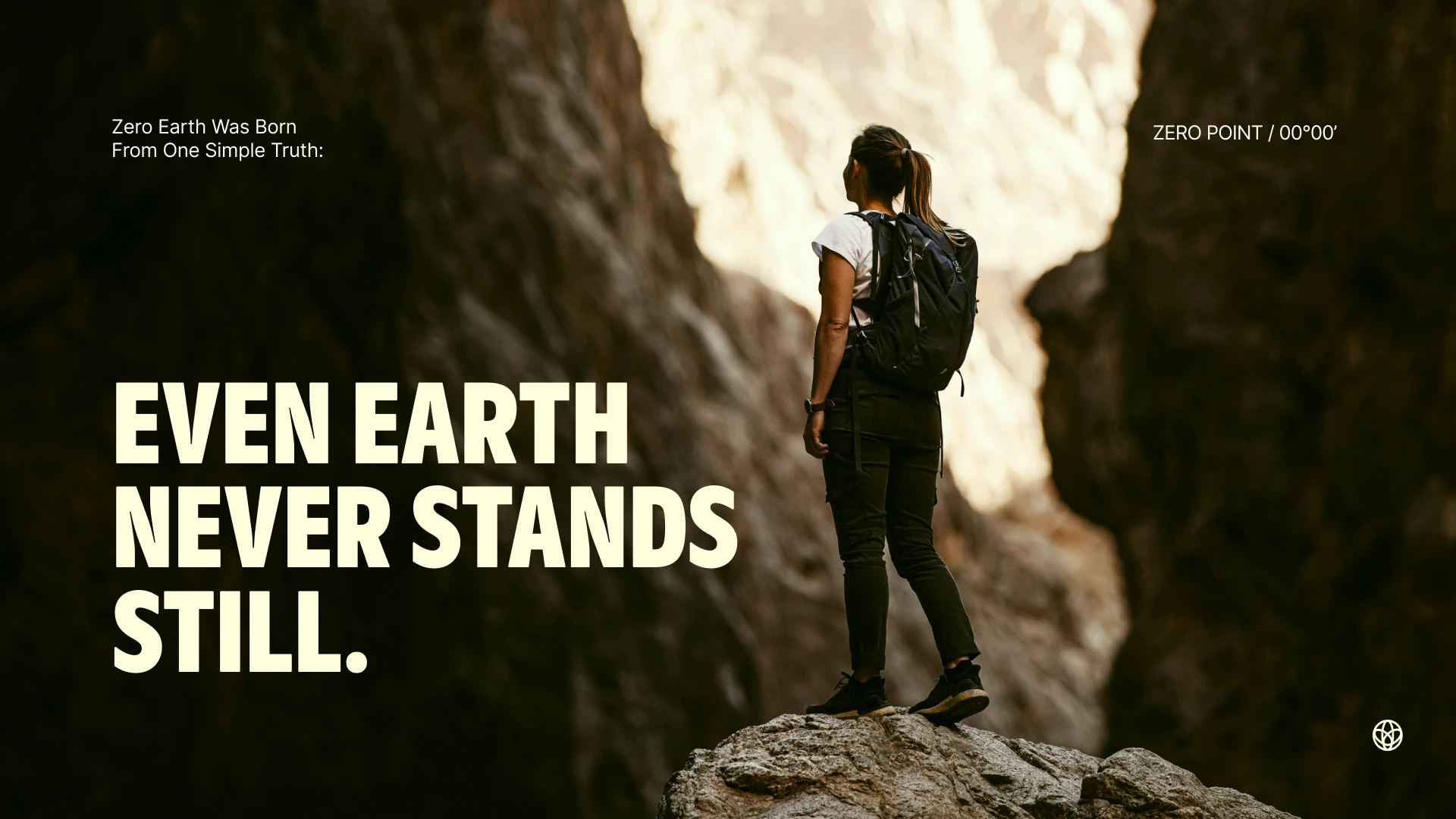
A bold manifesto line carries the identity across editorial and campaign-led communication.
Even Earth Never Stands Still
Movement also informed the digital expression of Zero Earth. Layered textures, blurred colour and shifting light translate the idea of a planet in constant motion.
The logo symbols act like coordinates within the composition - small anchors inside a fluid visual world. This tension between motion and orientation gives the brand a distinctive energy.
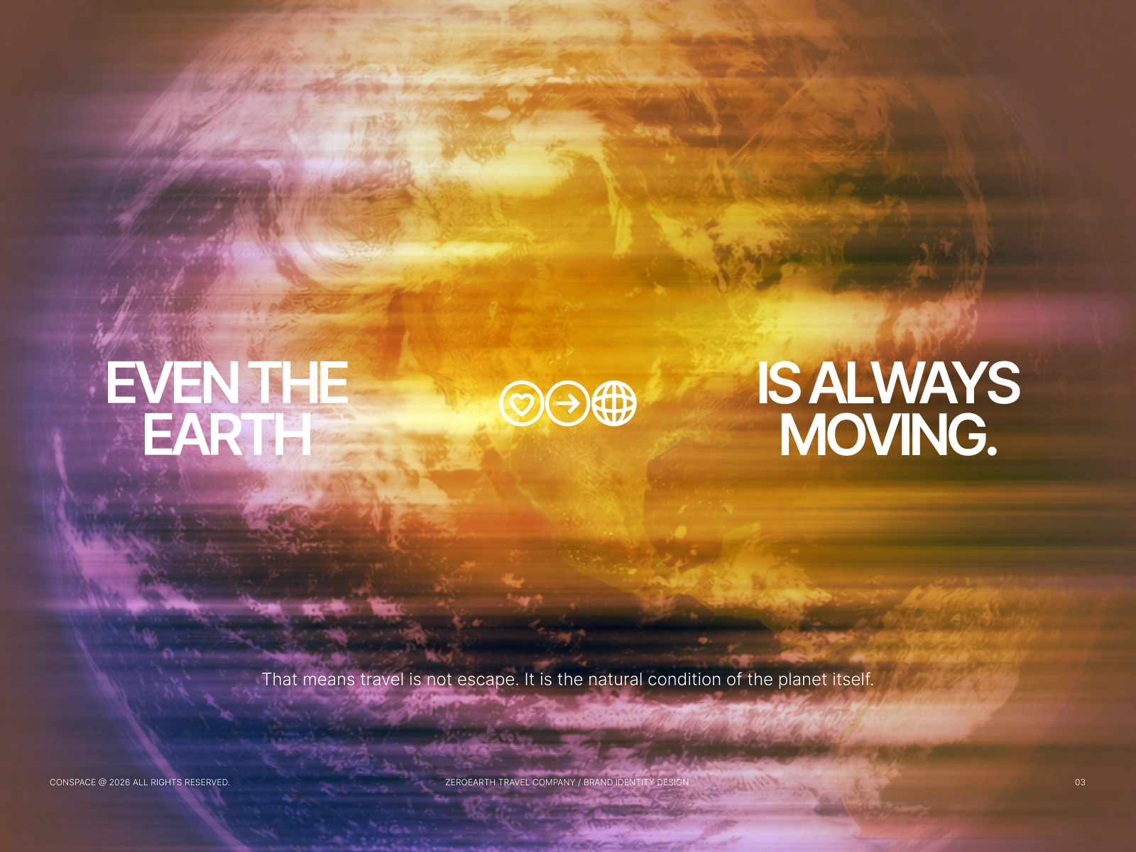
Motion graphics translate the brand idea into light, texture and continuous movement.
An Identity Built to Travel
The identity was built to travel. Embroidery, woven labels and durable applications allow the mark to move naturally across caps, bags, jackets and field essentials.
On merchandise, the symbol works as a quiet badge of belonging. It does not need to explain the whole brand; it only needs to be recognised by the people who share the same instinct to move.
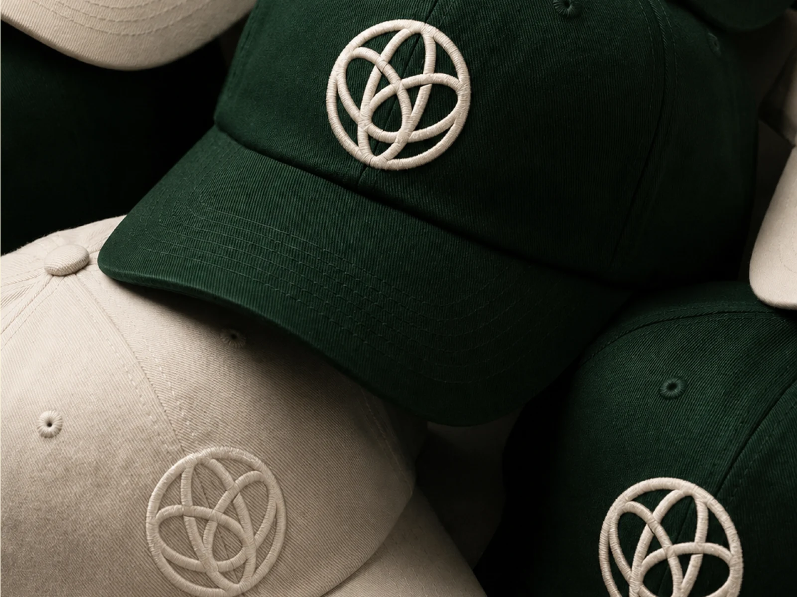
The symbol becomes a compact badge for an expanding travel community.
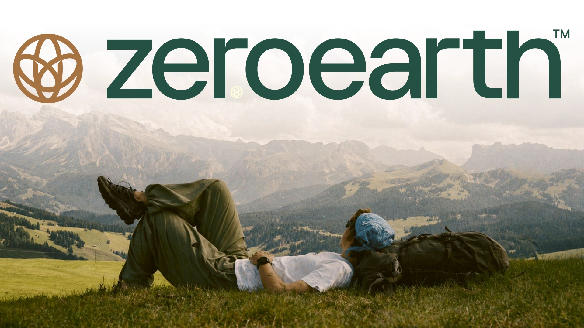
The primary lockup stays clear at scale while allowing the landscape to lead.
The Brand Signature
The word mark and symbol were designed to work independently and together. The rounded geometry of the mark suggests the Earth, a path and a point of connection, while the word mark remains clear, contemporary and approachable.
Placed over wide landscapes, the identity holds its presence without overpowering the image. It feels less like a stamp and more like an invitation.
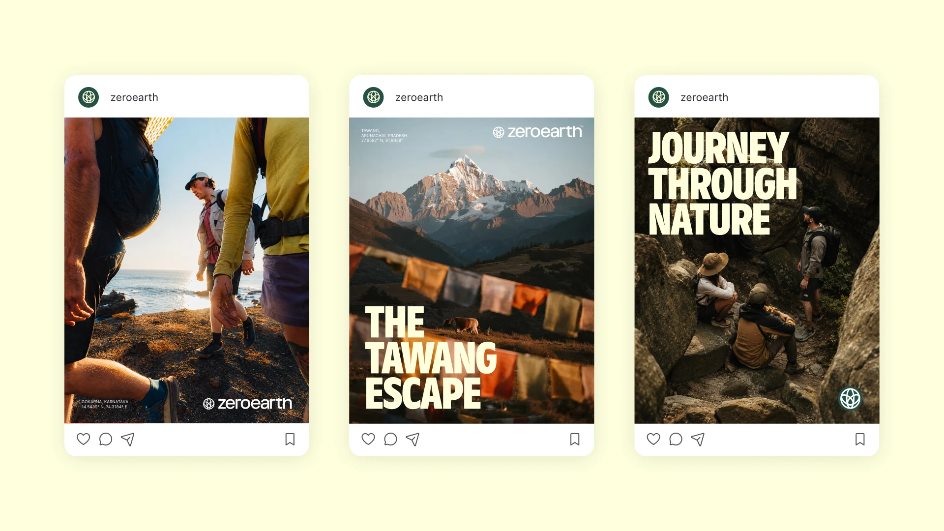
A flexible social system keeps every story recognisable without making every post look the same.
A Living Travel Guide
Social media is where the brand begins to behave like a living guide. The system combines travel photography, destination stories, coordinates, short manifestos and practical prompts within a consistent frame.
Each post is designed to feel like a fragment from a larger journey. Together, the feed becomes an evolving map of places, people and possibilities.
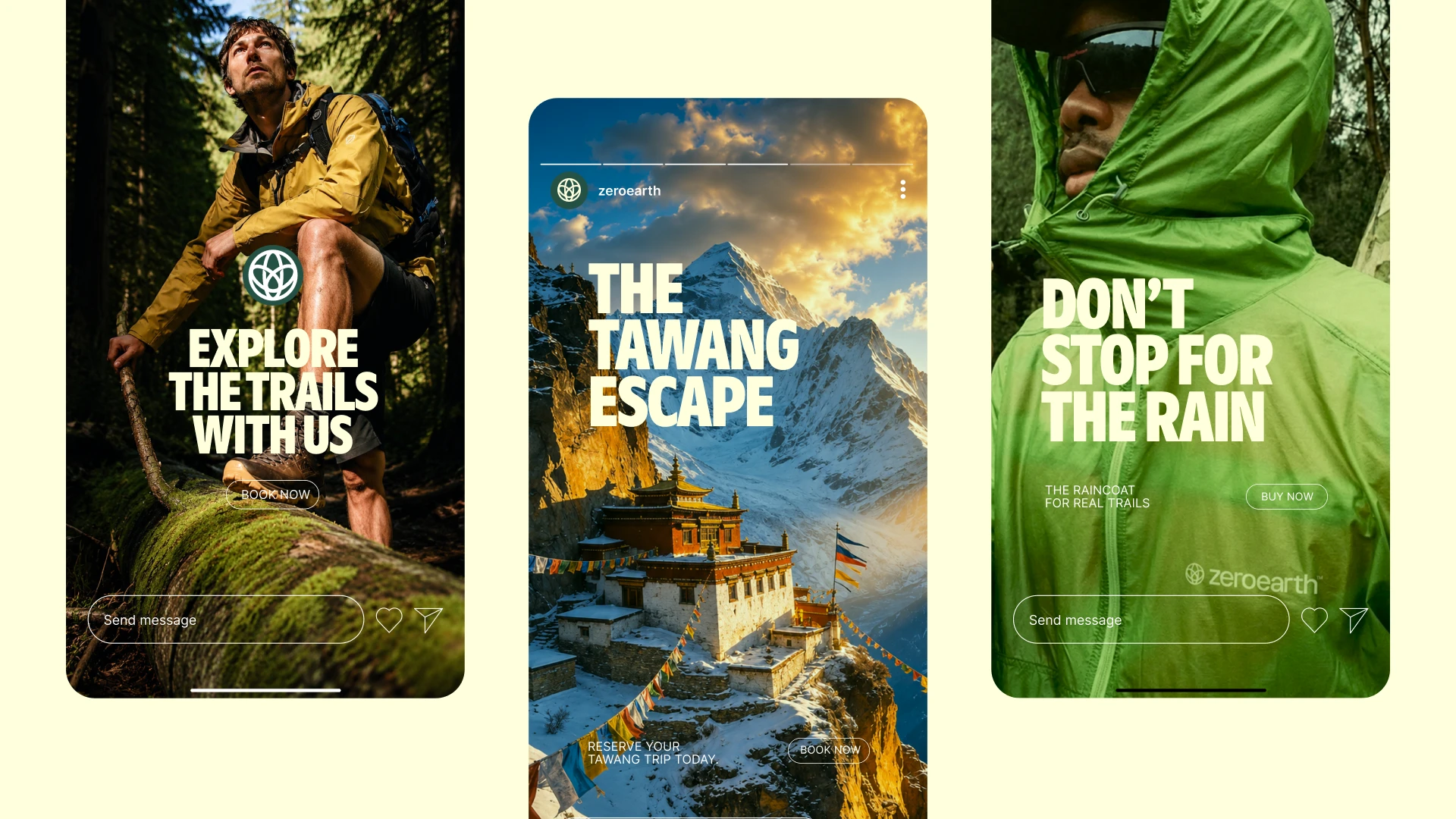
Campaign stories turn destinations into immediate, immersive invitations.
Stories Designed for Discovery
The story format was designed for discovery. Full-screen imagery, bold headlines and minimal navigation create a direct, immersive way to introduce routes such as Tawang, seasonal trails and rain-soaked escapes.
The content moves between inspiration and action. It gives the viewer a reason to stop, then a reason to go.
The final identity gives Zero Earth a grounded and expandable system - one that can live across community, content, merchandise and travel experiences while remaining true to a single idea: the journey begins at zero, and everything after is movement.
Thank you
Like this project
Posted Aug 3, 2026
Developed the brand identity for Zero Earth's travel guide.
Likes
1
Views
3
Timeline
Jun 2, 2026 - Jul 1, 2026