Visual identity for Thee Couture

Aswin Ram T

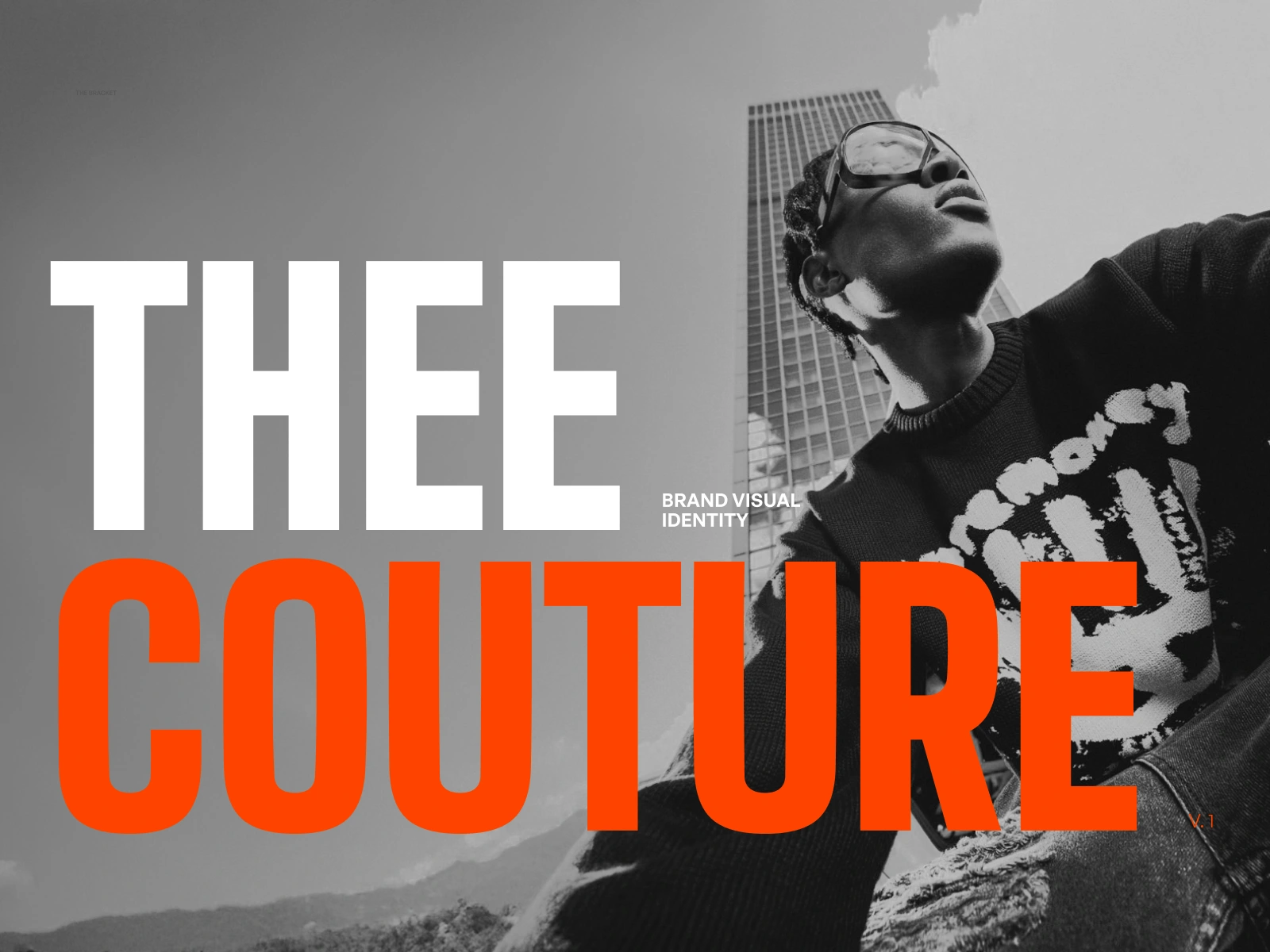
Thee Couture
Thee is a forward thinking clothing brand with a strong emphasis on Avant Garde streetwear. Made for boldness and confidence, Thee thrives on intensity, on trendsetters and deliberation.
Thee exists for those who move first and explain later. Every collection reads like a statement, not a suggestion — designed for people who treat getting dressed as an act of defiance.
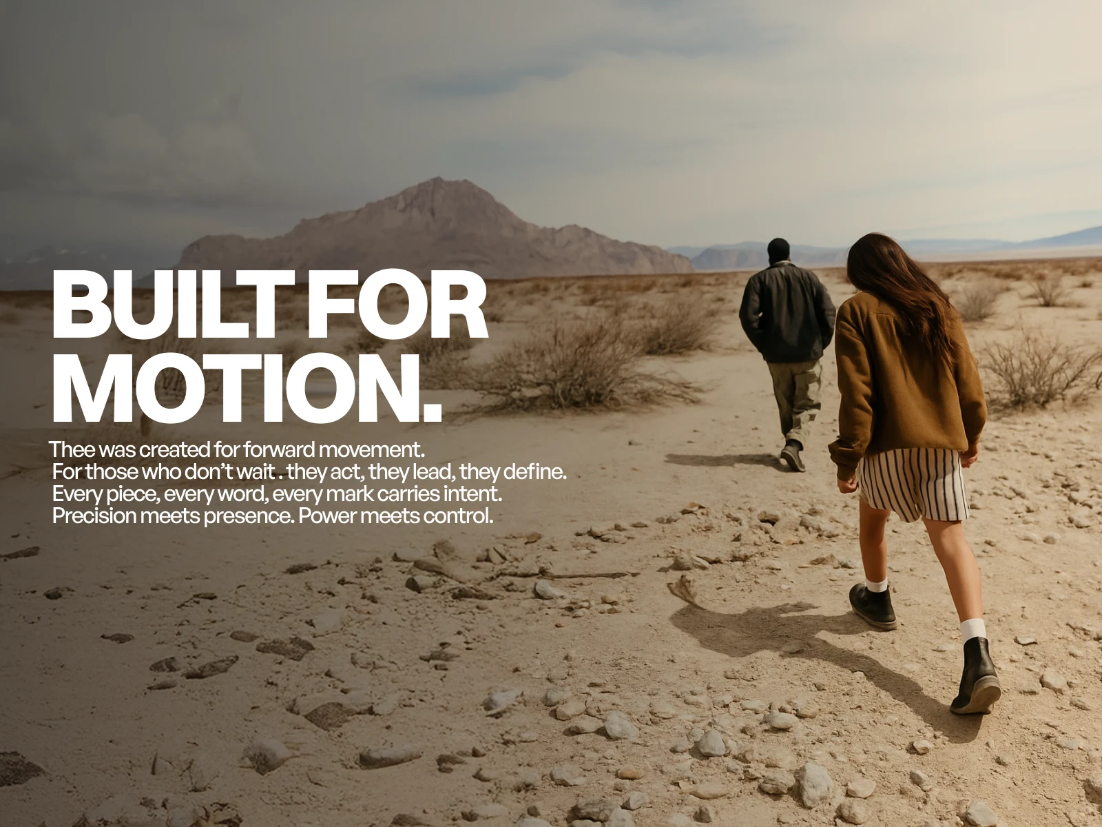
The manifesto line anchors the brand's core idea — movement, intent and forward momentum — directly onto the landscape.
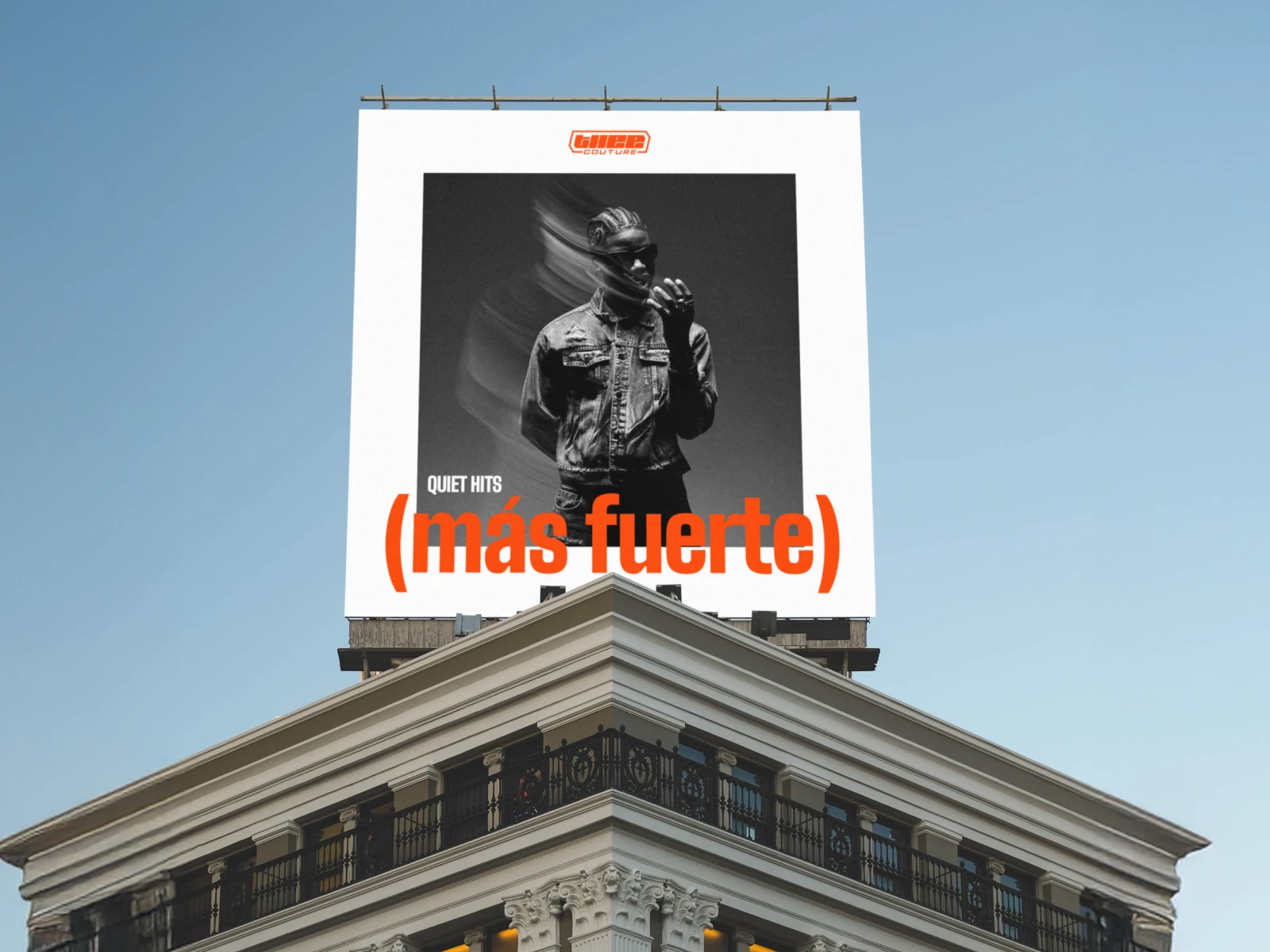
Placed above the city, the identity behaves like a cultural signal rather than a conventional ad.
Cultural Brand Image
Thee is made to be intentional with the image that they put out. Combining local culture with edgy streetwear, it creates a unique niche where fashion transcends locational divides.
It’s designed to stand out in the crowd, precision meeting bold colors establishing your presence as one that is impossible to go unnoticed. The core of the idea comes from moving forward fearlessly.
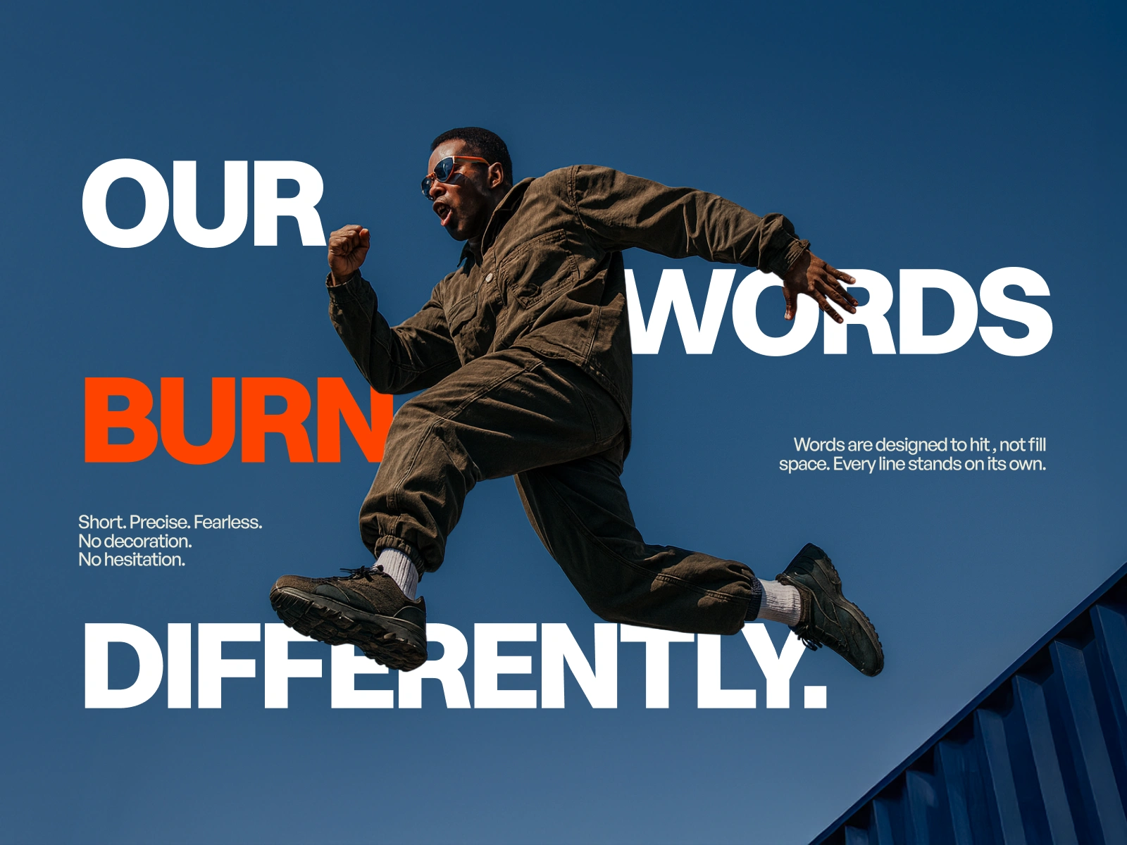
Type and motion collide, giving the brand's voice the same physicality as its clothing.
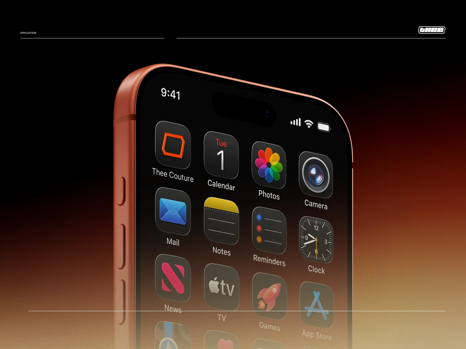
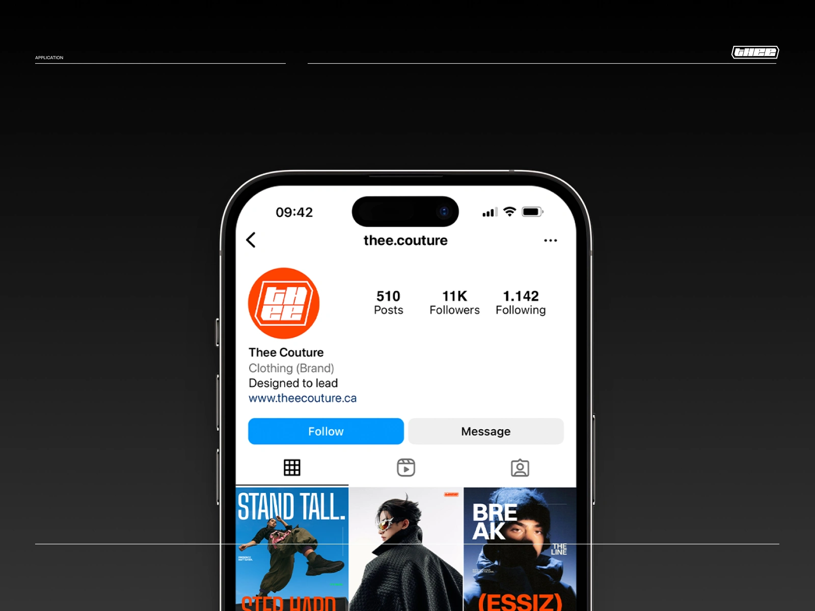
The identity condenses into a single icon, holding its own alongside everyday apps.
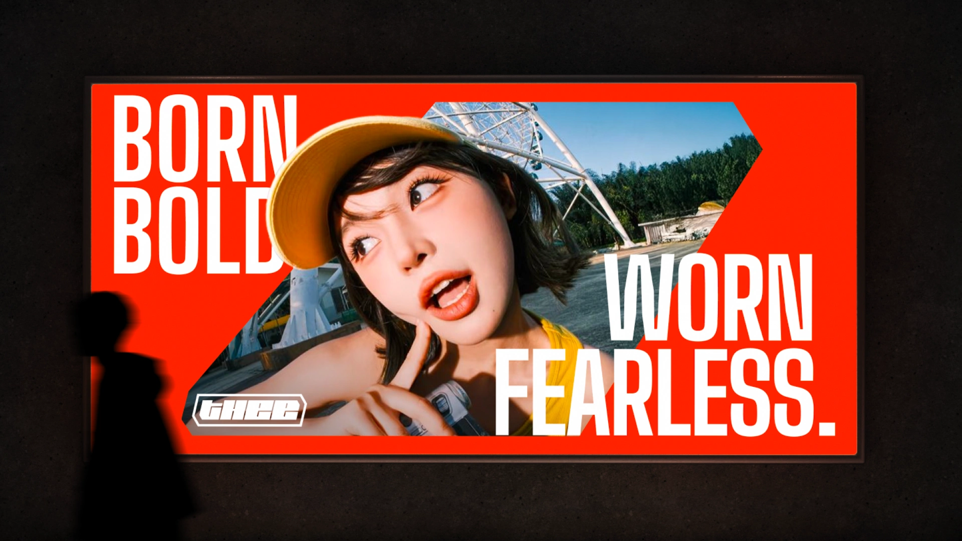
Saturated colour and cropped type turn a simple portrait into a statement piece.
Visual Ideation
Visually we wanted to translate the boldness that Thee represents. Our visual ideation process hinged entirely on the colors. For a streetwear brand, colors make up the entire visual identity, it’s the patron’s first encounter with the brand lineup so we wanted to deliver it with maximum impact.
Typography
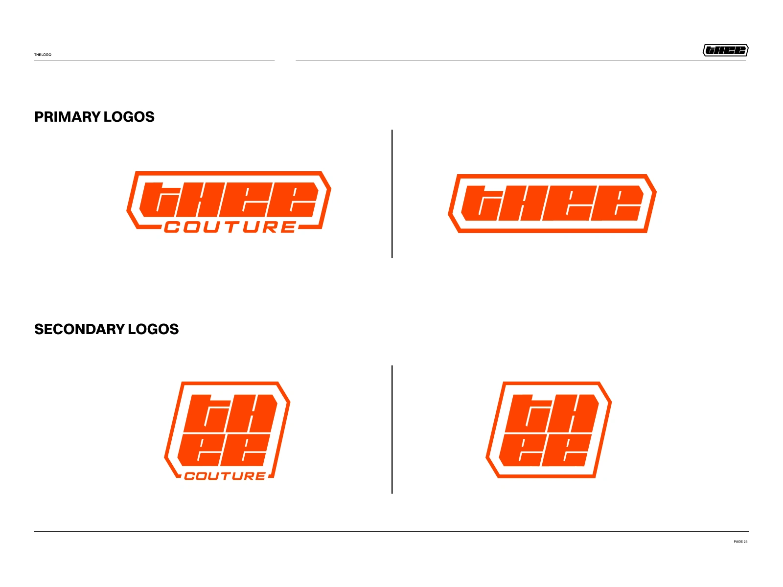
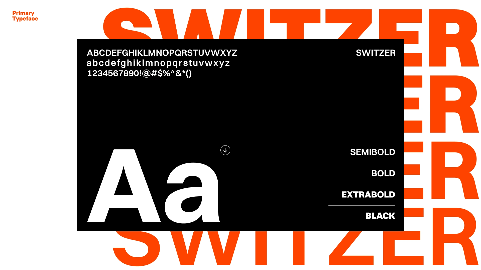
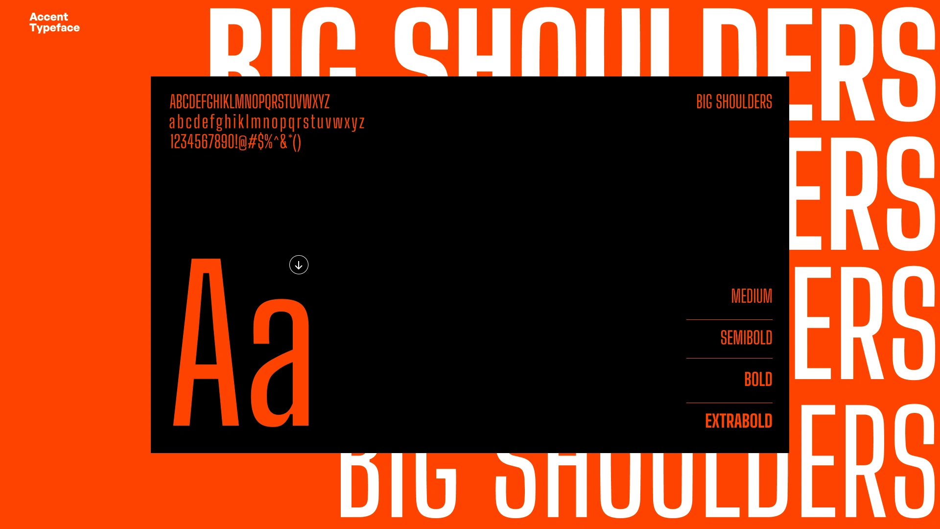
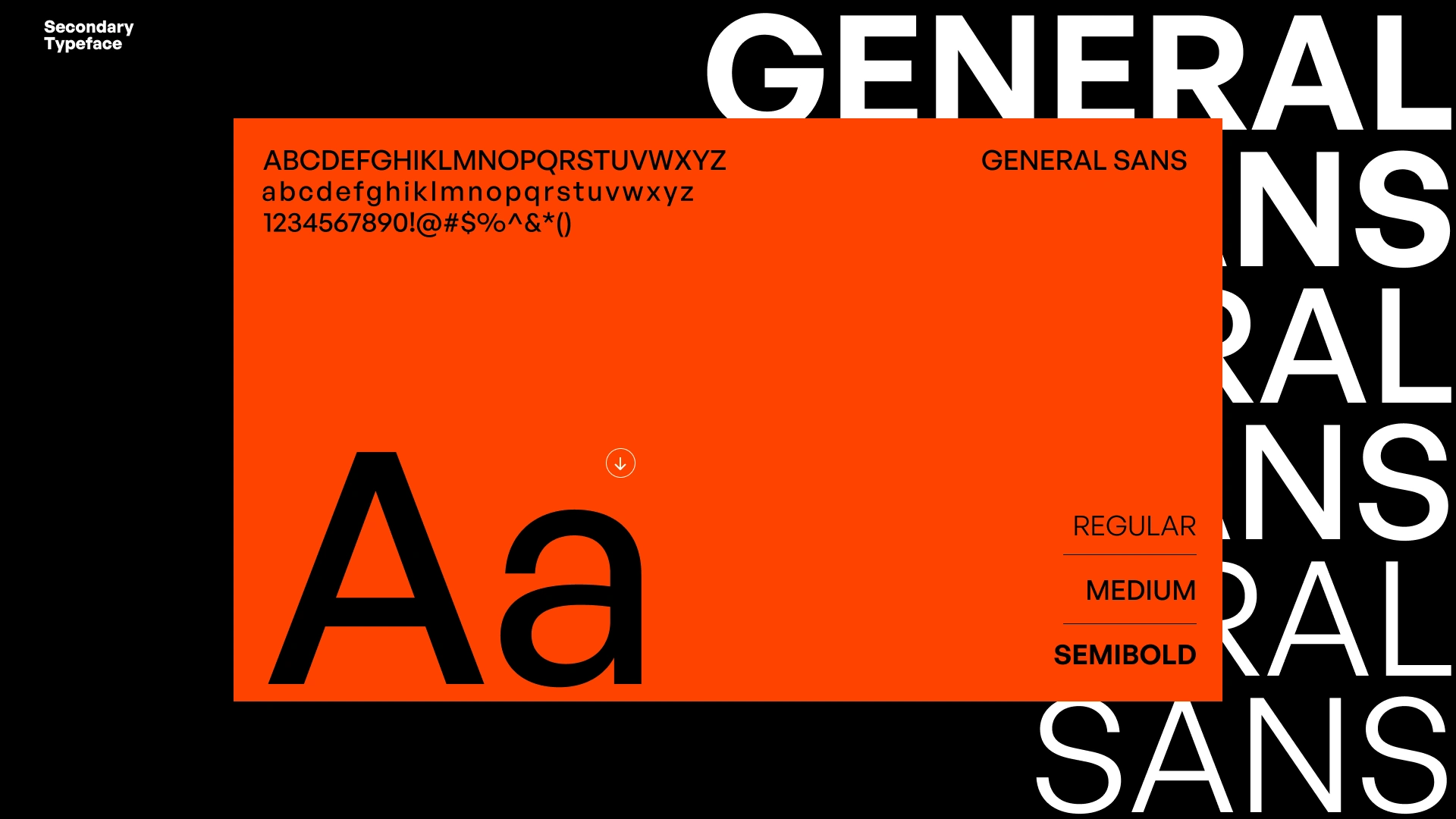
The type system was chosen to fight, not blend. Switzer carries the weight, Big Shoulders adds friction, and General Sans keeps the whole system legible under pressure — a hierarchy built for impact first, order second.
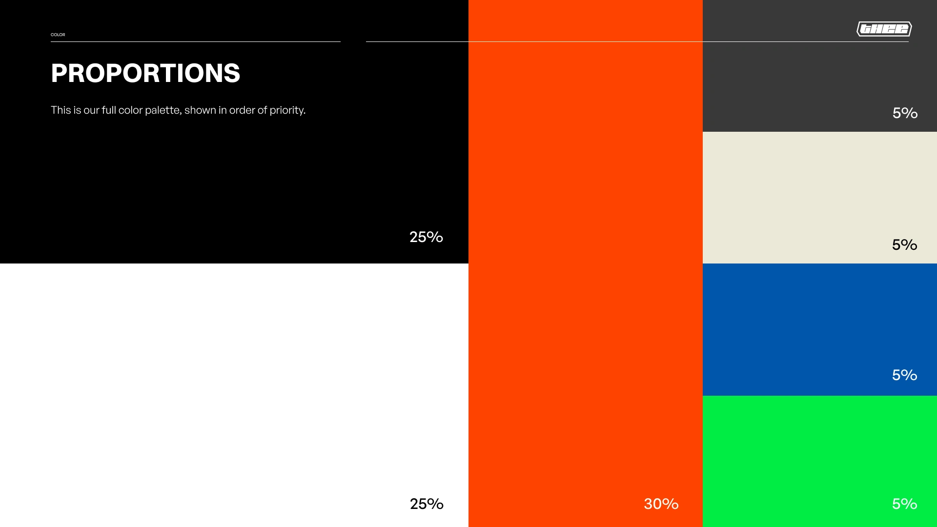
The palette is weighted deliberately, letting orange dominate while black and accent tones stay disciplined.
Color Palette
Bright colors that reflect the intersectionality of funkiness while also communicating the purposeful image of the brand.
Application
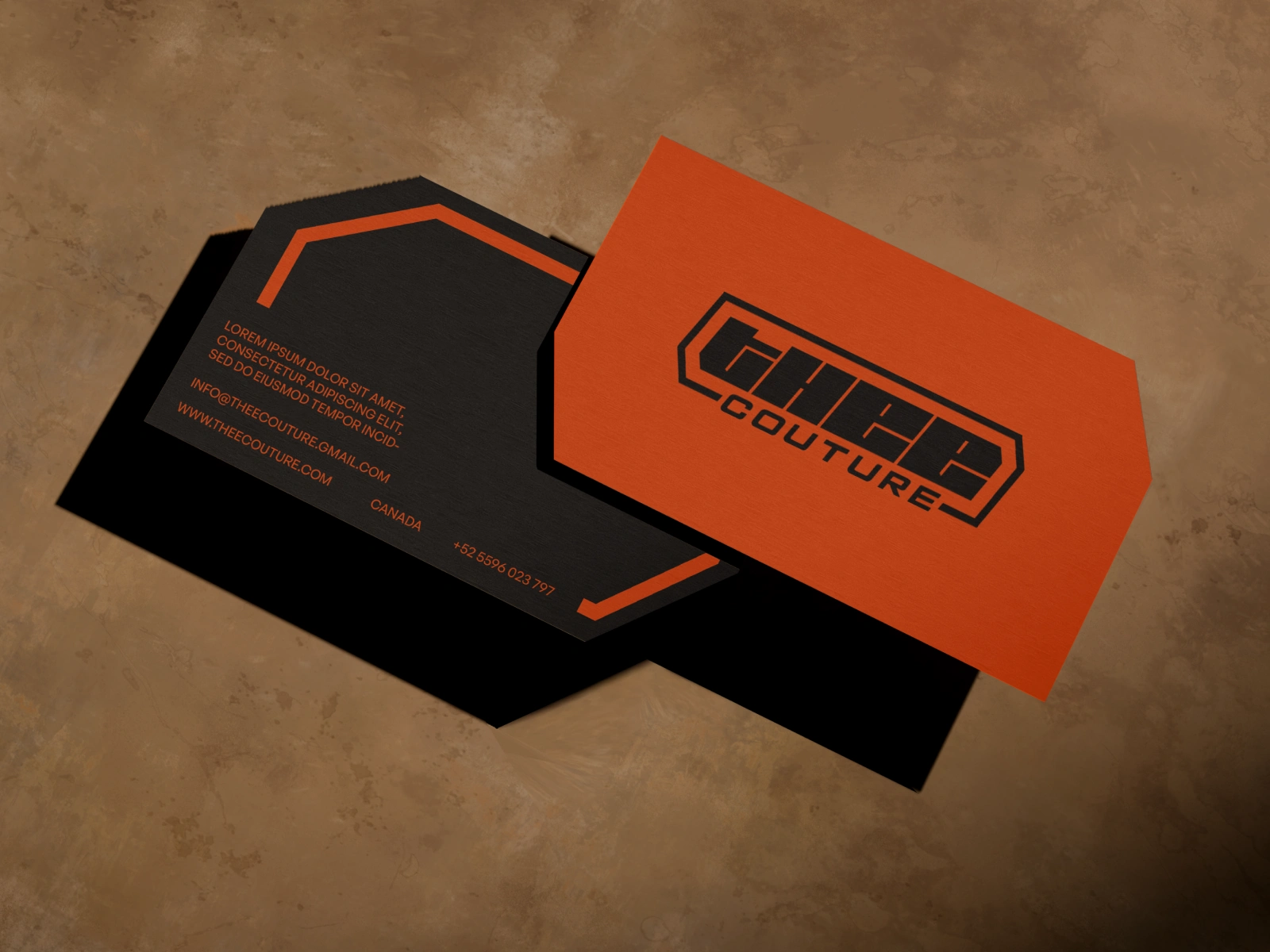
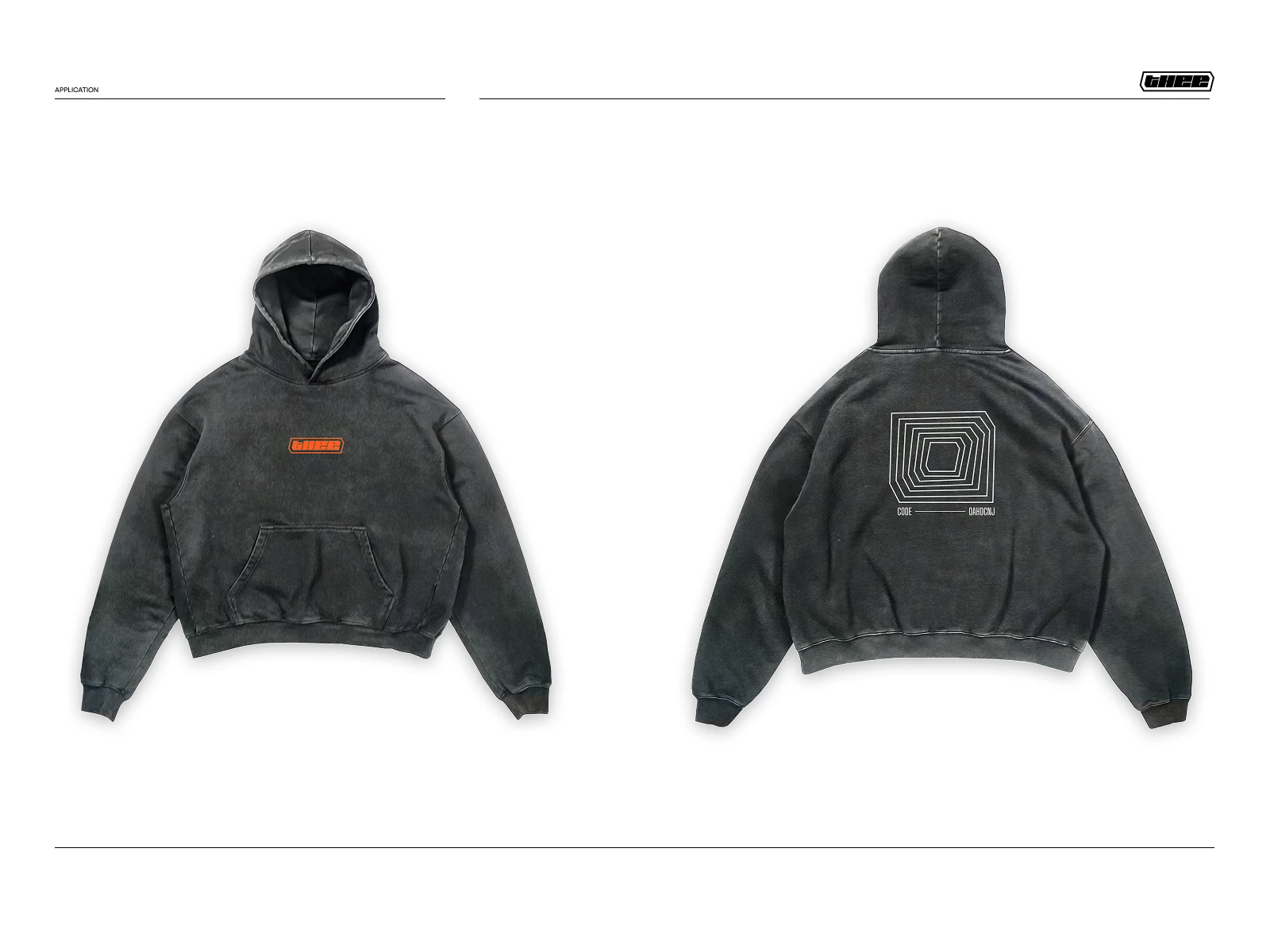
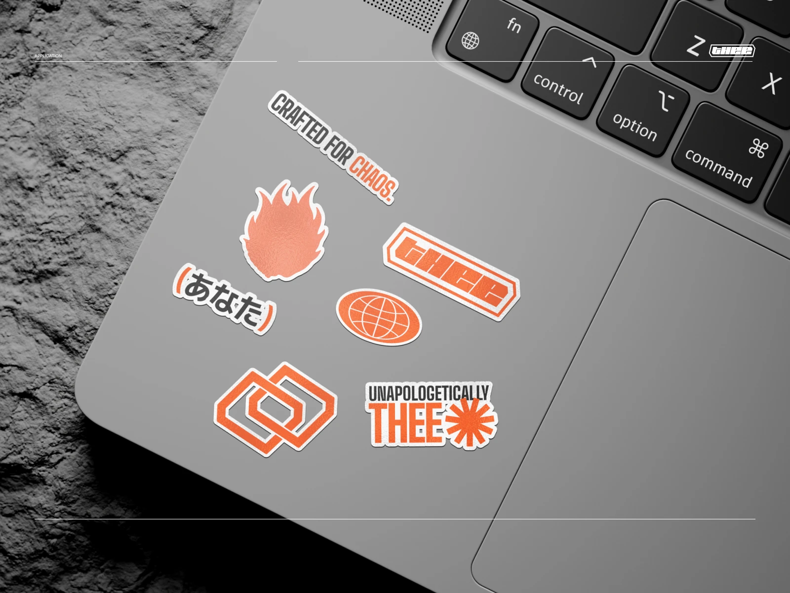
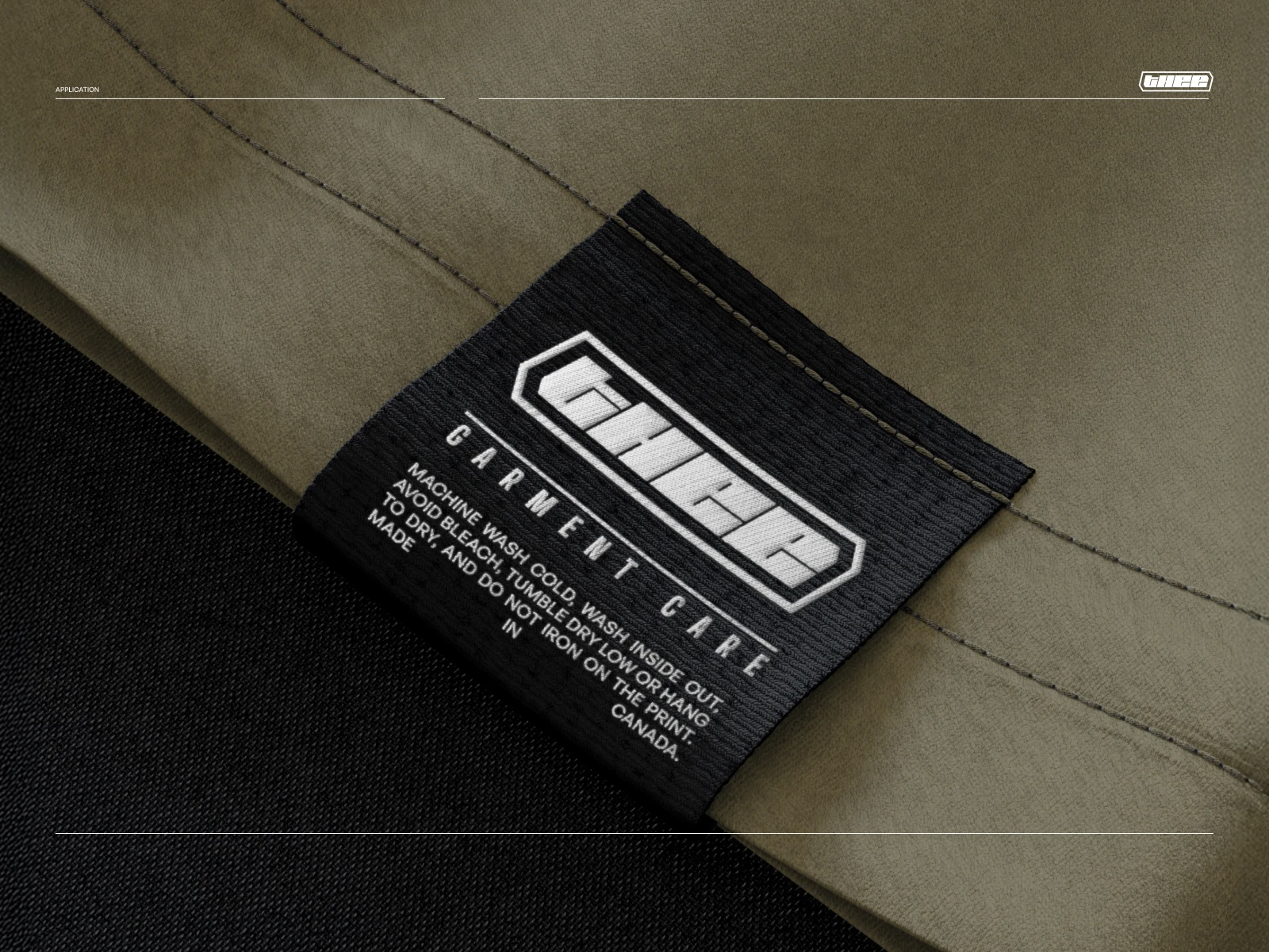
The identity was built to live everywhere, not just on the label. From business cards to garment tags, hoodies to hangtags, every touchpoint carries the same conviction. Nothing here is treated as an afterthought, the brand shows up with full intent, whether it's on a rooftop billboard or stitched into a seam no one else will see.
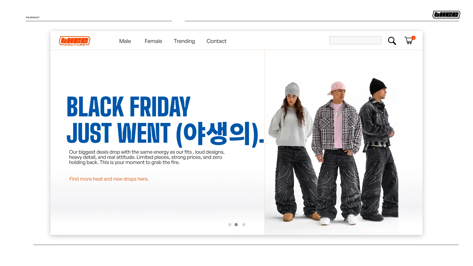
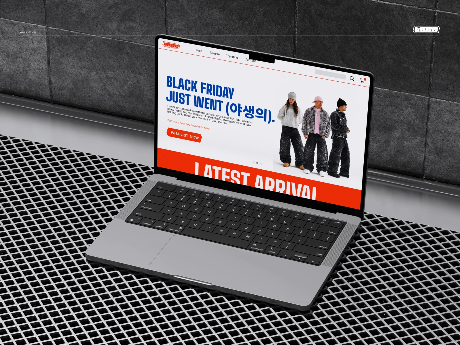
The digital storefront mixes language and typographic scale to keep the brand feeling global and unfiltered.
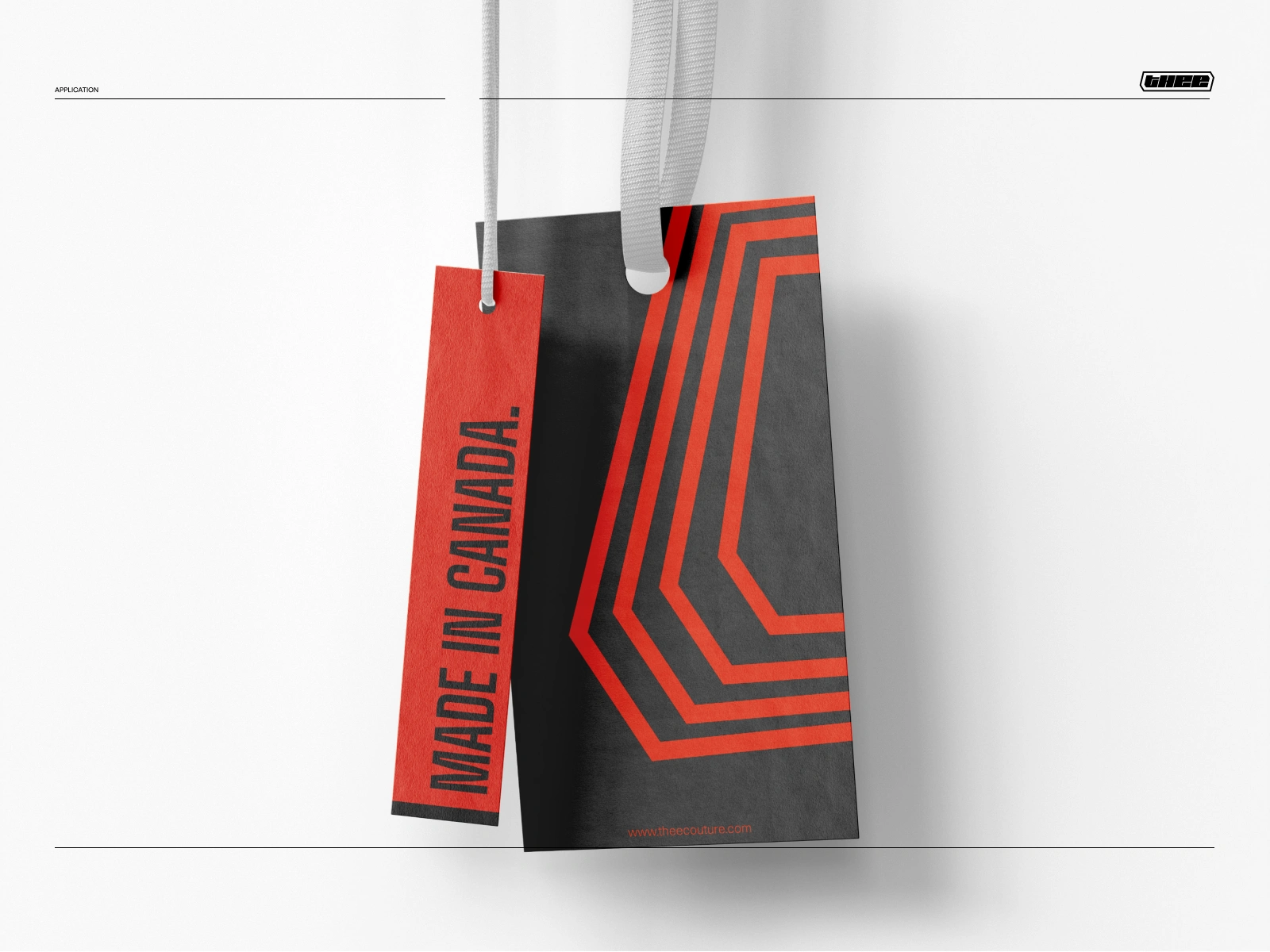
Even the smallest production detail is treated as branding, not an afterthought.
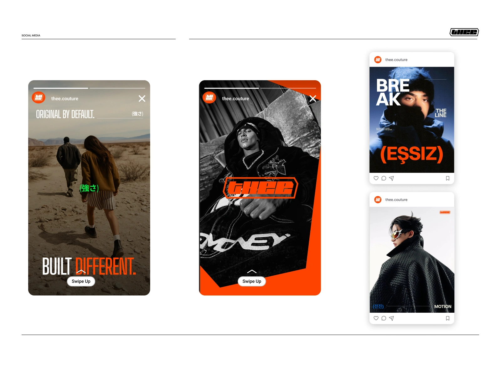
Full-screen story formats keep the campaign voice consistent across fast-moving social content.
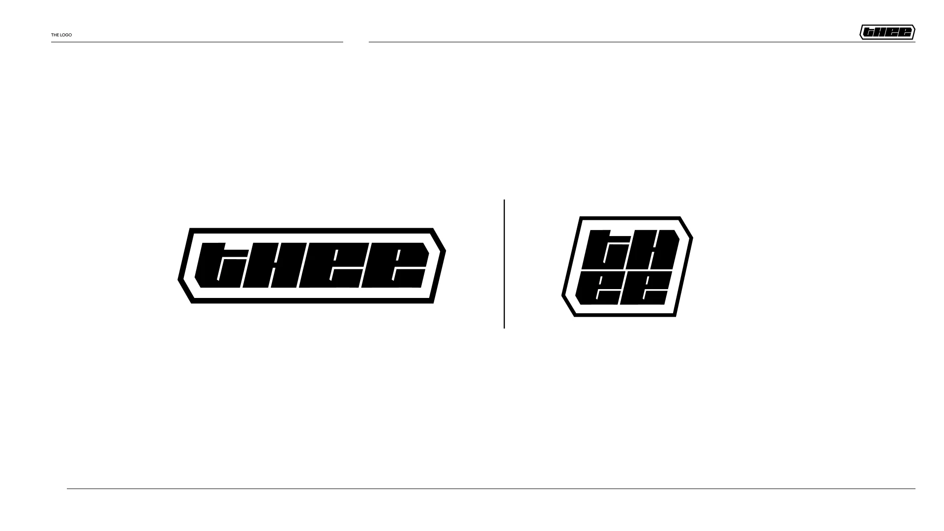
Left to stand alone, the mark closes the identity system exactly as it opened — bold, contained, unmistakably Thee.
Final Vision
What resulted out of the entire branding process was a funky determined venture, ready to pave a space for them in the streetwear culture landscape.
Thee doubles down on its own brand message as a fearless creatively intentional brand and conveys this through their merchandise.
Thee doesn't post to be seen. It posts to be remembered.
Like this project
Posted Aug 11, 2026
Created a bold visual identity for Thee featuring vibrant, funky colors.
Likes
0
Views
3