WonderEdu 2023
Rocky Black

WonderEdu is an education company specializing in organizing experiential activities for students from preschool to high school. Following the personality of determination, persistance, accompaniment and empathy, it focuses on three customer groups and offers the following service product categories:
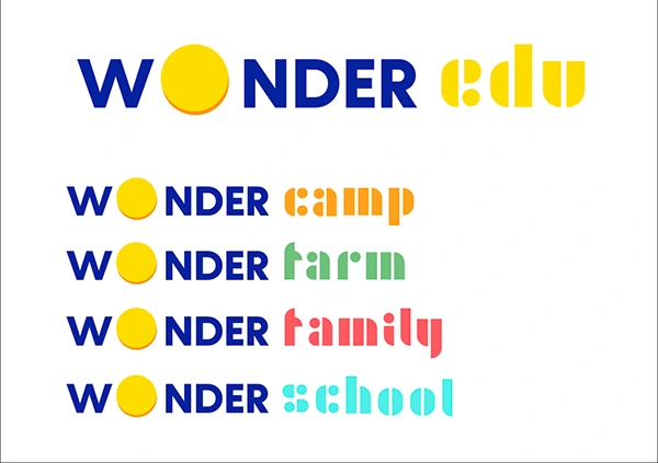
- WonderSchool: These are experiential programs for schools, primarily focusing on skills, teamwork, STEM (Science, Technology, Engineering, and Mathematics), and creative experiences for children.
- WonderFamily: These are experiential programs designed for families on weekends and holidays. They emphasize communication, understanding children, teamwork with children, and exploring life together.
- WonderCamp: These are experiential programs for students aged 10 to 16, focusing on life skills, soft skills for daily life, habits, study methods, and determination.
All three product groups are mainly organized at WonderFarm, a farm location, and offering overnight accommodation for the children to enjoy their course to the fullest.
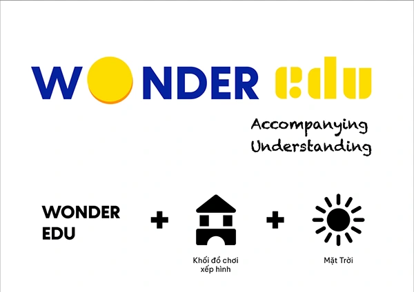
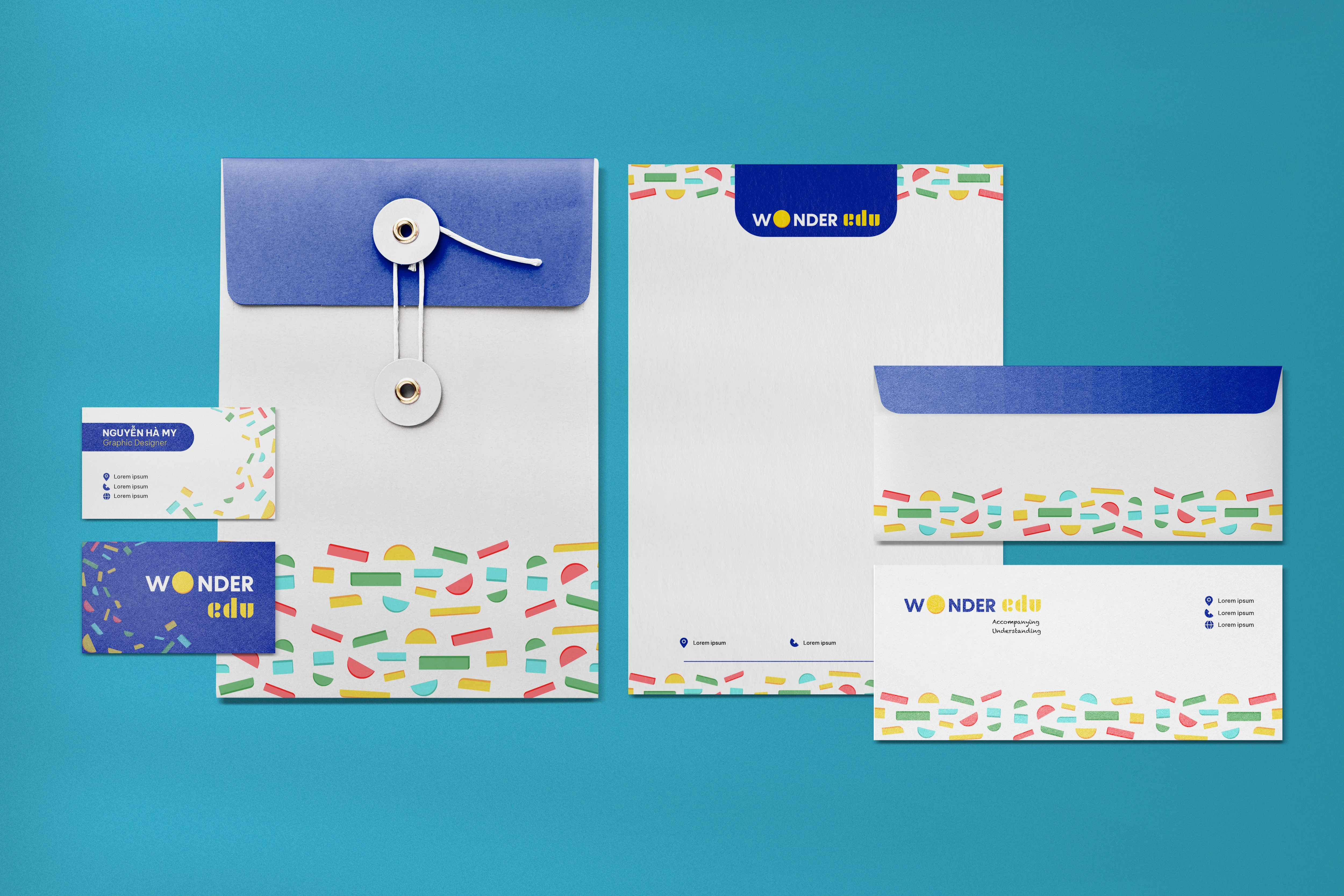
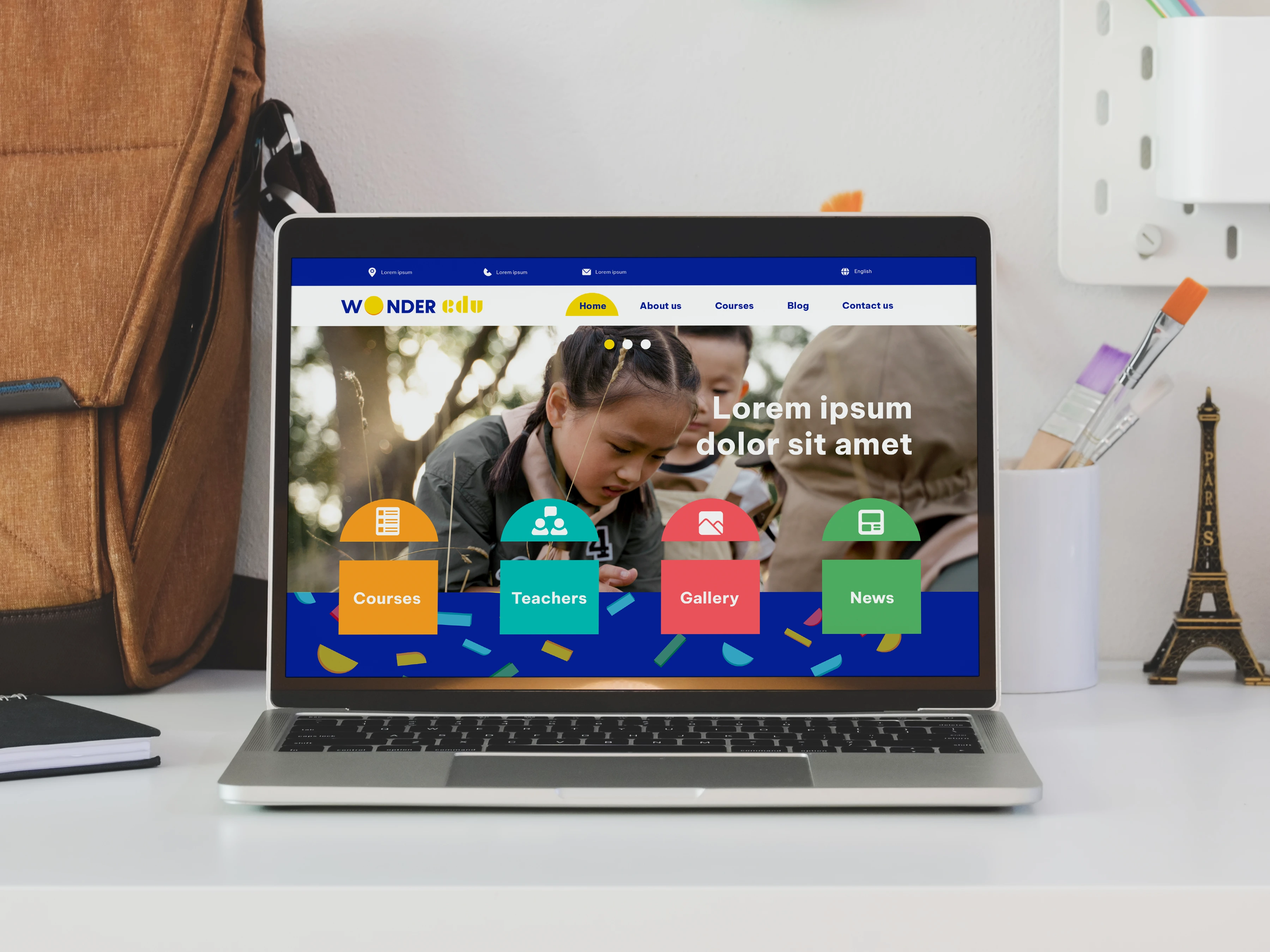
Logo: In order for the brand to appeal to both target audiences which are beneficiary (children from 10 to 16) and investing (their parents), I experimented with the idea of Montessori system while attempted to create a logo. From the research of the mentioned concept, I finally came to a conclusion to use the image of building blocks, the very first experiential toy that helps develop a child during one’s childhood, intellectually and creatively. Along with that, the logo is put in logotype so that it still holds relevance for the investing audience. As for the round yellow block being the only emphasis in the logotype, I would like to imagine it as the sun - the symbol of determination, which matches with the one of the brand essential traits.
Color: Exceptionally in this project, I consider of a palette of the most basic colors: blue, red, yellow and green with blue being the primary color. That is because, psychologically speaking, blue gives us the feeling of wisdom, in which it appears in most educational centres to deliver trust towards the investing audience.
Besides that, yellow being the secondary color also contributes in portraying the most outstanding quality of the brand - determination. Furthermore, yellow also instills a sense of excitement which I believe can make the brand in general look less dull.


Like this project
Posted May 7, 2025
A lighthearted project to kick off with my playground, starting with playful yet gentle initial branding demo for WonderEdu.