Improving Spotify UX for better consumption
UX Case Study to improve the podcast listening experience on Spotify
Ps: This case study was done in 2022 and in 2023 Spotify did update their podcasts to have chapters
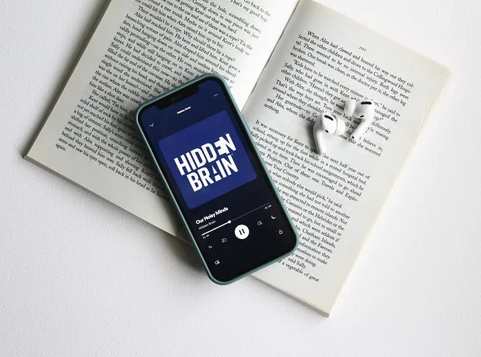
Why choose Spotify for my project?
I use Spotify for listening to my podcasts since it has a lot of perks such as Sync between devices and also the large varieties of podcasts you get (you almost get all of the podcasts)
Spotify is also one of the most popular and growing music streaming platforms in the world and the popularity of podcast usage is also growing.

Market Share of Spotify App
Project Timeline / Process
I used the 5-day design sprint method to do the project.
The steps involved were the following:

Methods Used
Problem Statement
Generate ideas and create solutions to expand the experience of listening to podcasts on Spotify.
#1 Understanding
Learn how other people listen to podcasts.
If they use something other than Spotify, why do they use it? What are the things that they like?
What could be improved when it comes to listening to podcasts?
How Might We?
I started with a how might we session to find opportunities for different insights and pain points. I sourced out forums, reviews, one on one talking to come up with the following How Might Wes
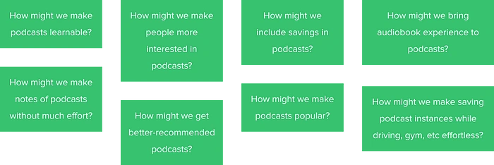
How Might We questions
Customer Journey Mapping
After How Might We, I landed on two themes
How does a user listen to use Spotify for podcasts?
How does a user takes notes or learns from podcasts?
I did a customer journey mapping of how these two things are done by users.
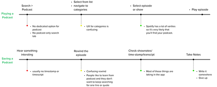
User Reviews
These were one of the recurring themes in user reviews.

#2 Defining
Defining Design Goals
Make it easier for people to find their podcast.
Design a system that lets people save clips/transcripts.
Make podcasts more scannable.
#3 Solution
Boot Up Note Taking
I expanded the goal, ideas, and How Might We to generate thoughts and ideas to increase my understanding and pointing solutions.

Top 3 Ideas
The New User Flow
I came up with a new flow that I thought would be better than the one that’s available right now.
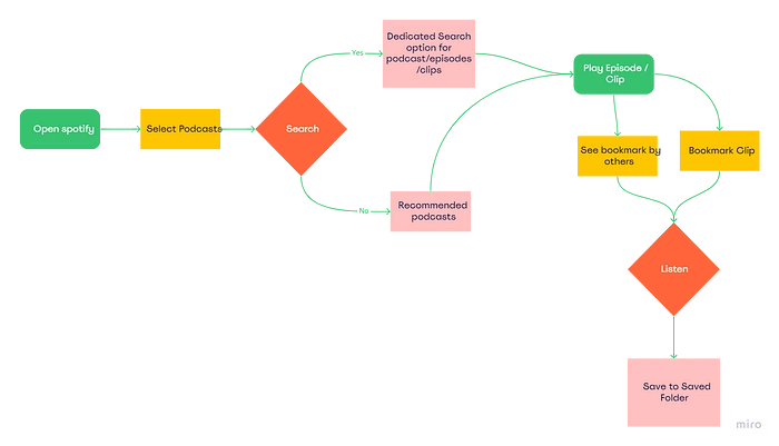
User Flow of the app
#4 Design
Dedicated Podcast Tab
A dedicated podcast tab different from the music section would help people navigate podcasts more easily.
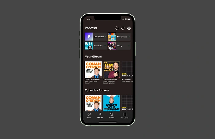
Redesigned Spotify Home
New Podcast Play UI
Bookmark Option
Inspired by audiobooks, I thought a bookmark option would be a great and simple addition to get more out of listening to podcasts
Popular Bookmark Highlights
Many people don’t like to listen to the whole podcast or sometimes they might be returning for just some pointers in the podcast. So highlighted clips of popular parts added by other users could also be helpful.
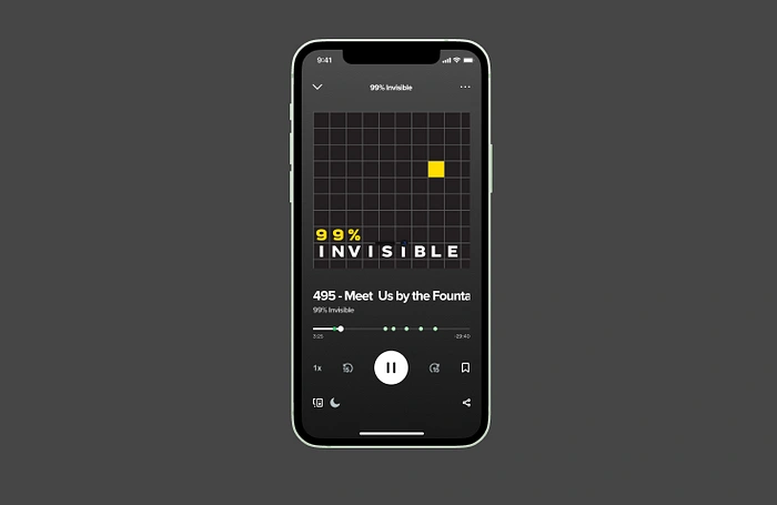
Redesigned Spotify Podcast Player
User flow
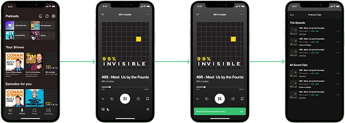
Screen Flow
Ending Note
This was a quick 5-day exercise and even during that, I found a lot of things that could be improved if given more time to do research and design. This was a small aspect of what are the things that could be improved.
I love using Spotify for most of my listening things so this was a personal yearning for me.
Thank you
Feel free to contact me on my Linkedin
Like this project
0
Posted Aug 30, 2023
This case study was done in 2022 and in 2023 Spotify did update their podcasts to have chapters. That was a similar route
Likes
0
Views
39


