Dayspring | Bread Brand Identity & Packaging Design

Q: How You Help a Trusted Brand Evolve to Stay Ahead
A: By aligning its unique offerings with evolving consumer preferences
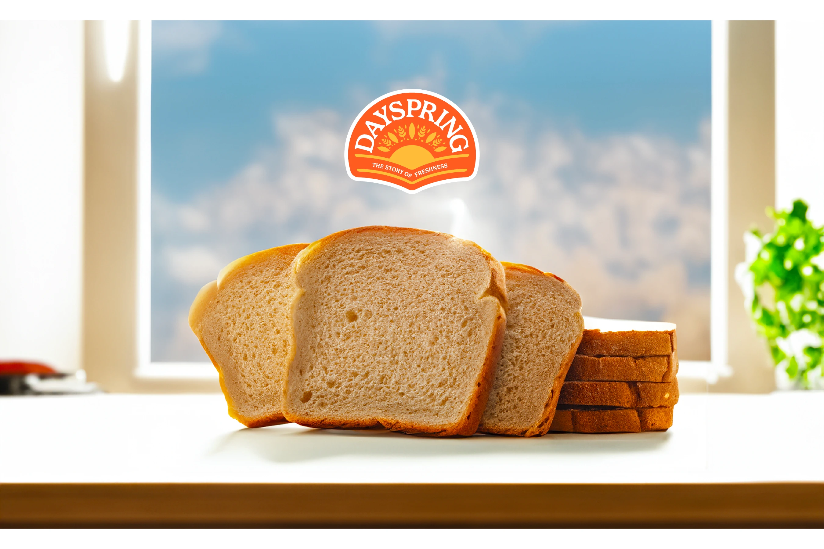
Dayspring, a household name in Lucknow by the Sahu Group, had built its reputation on trust and quality. But as consumer preferences shifted towards health-conscious choices, the brand needed to adapt to maintain its relevance. With its Zero Human Touch process, Dayspring had a powerful USP, but it wasn’t reflected in its branding or packaging.
The challenge was clear: modernize the brand while staying true to its legacy of trust and quality. This rebranding effort focused on redefining Dayspring’s visual identity, packaging, and messaging to resonate with today’s health-conscious audience.
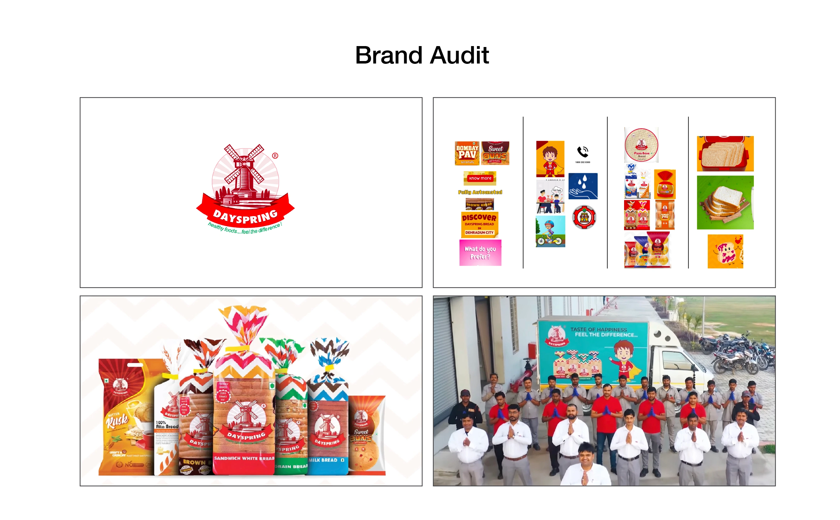
The existing packaging and branding lacked clarity and didn’t do justice to Dayspring’s unique strengths. The design struggled to stand out on supermarket shelves, and the message of freshness and hygiene wasn’t coming through effectively. For a brand with such a strong foundation, it was time to realign the identity with its values and consumer expectations.

Care, Trust, and Dayspring’s “Zero Human Touch” process were woven into the identity to appeal to loyal customers and attract today’s health-conscious audience.

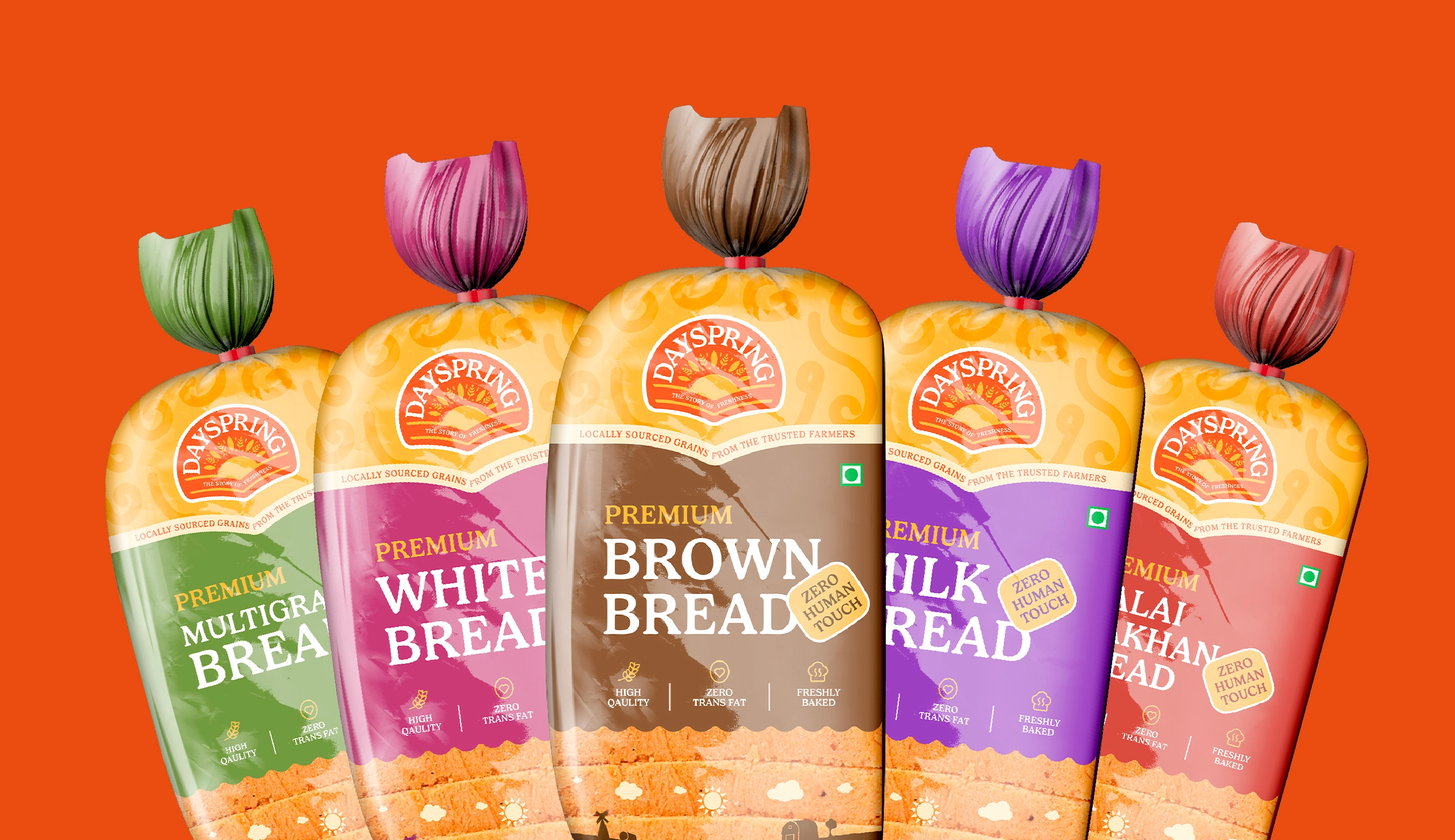
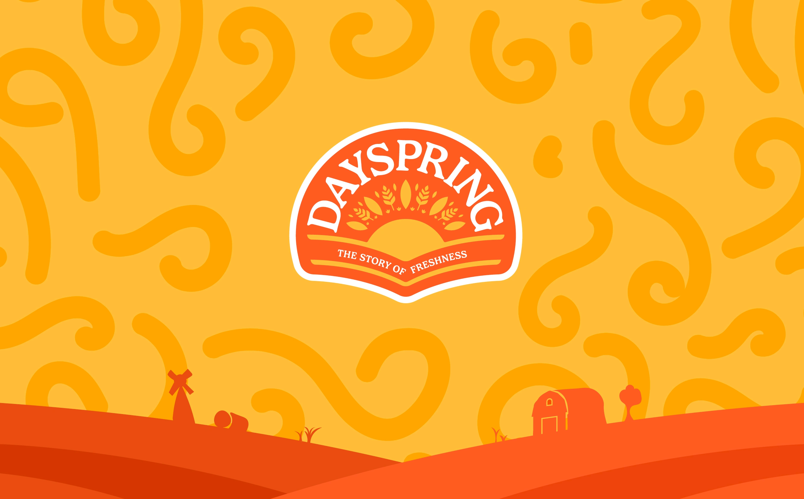
Vibrant colors, clean typography, and a modern visual identity were created to grab attention on shelves while showcasing the brand’s promise of health and quality.
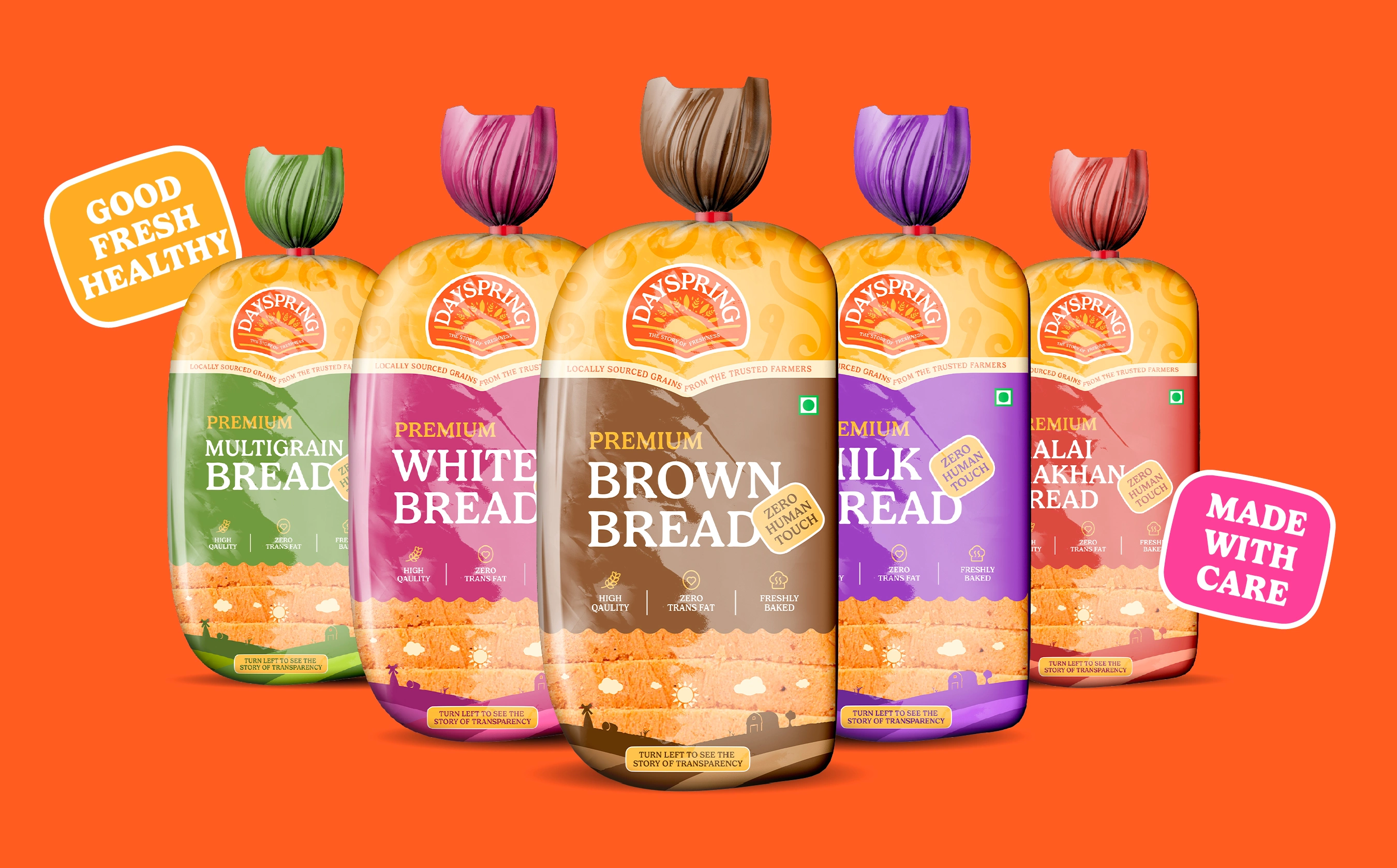
When we began rethinking Dayspring's packaging, one thing was clear— the old design wasn’t doing justice to the brand’s Zero Human Touch process and freshness promise.
To solve this, we went straight to the source—our consumers! Their feedback revealed what truly matters: trust, simplicity, and designs that feel as fresh as the product itself.
What changed with the new packaging?
1️⃣ The Zero Human Touch process got the spotlight it deserves— because hygiene and care matter more than ever!
2️⃣ We turned up the freshness vibes with vibrant colors and clean designs that scream “freshly baked!”
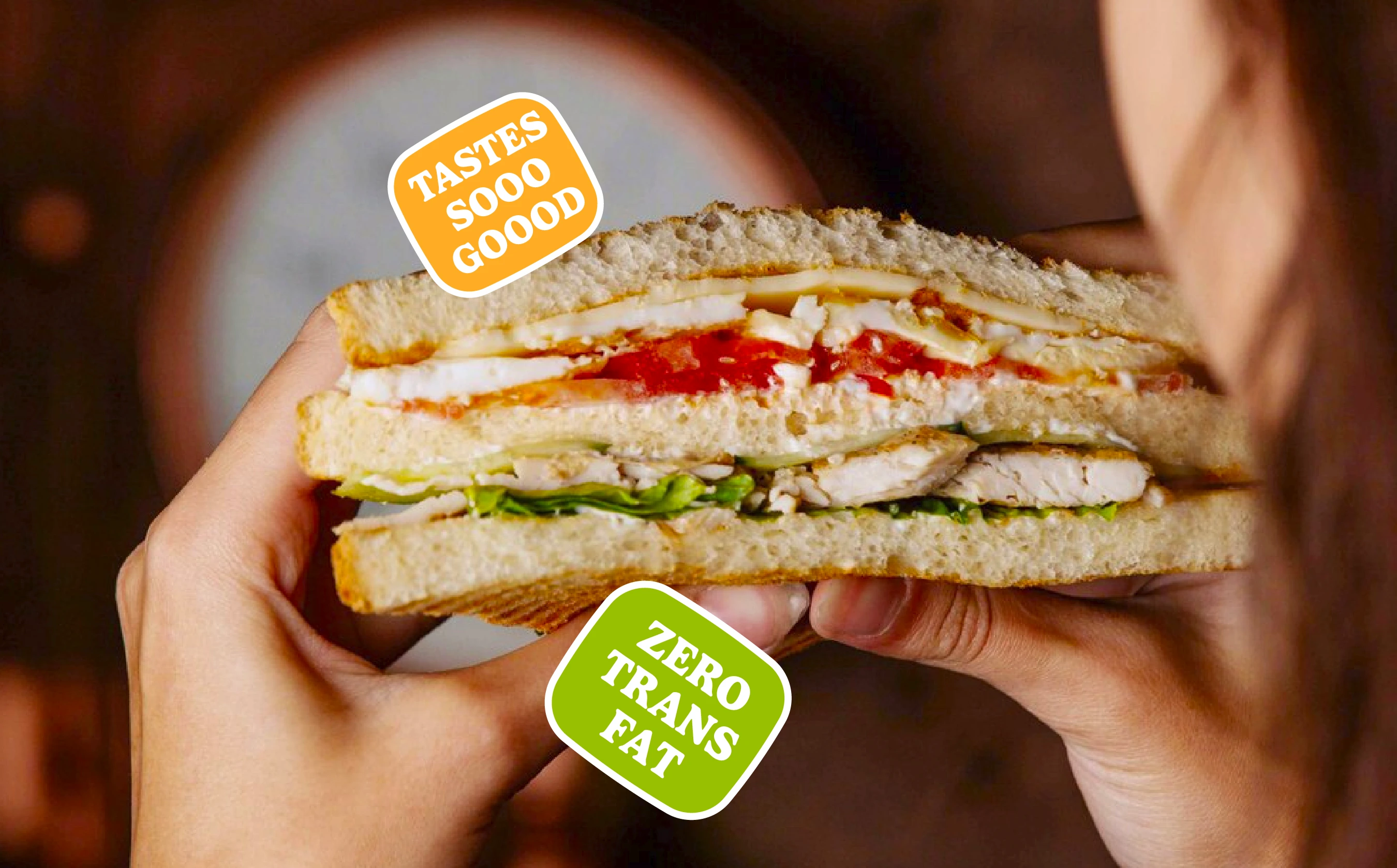
3️⃣ Benefits like “Zero Trans Fat” and “Locally Sourced Grains” are upfront, making transparency look effortlessly cool.
4️⃣ Icons and visuals were fine-tuned to say, “You can trust us,” without saying a word.


Like this project
Posted Jul 4, 2025
We helped Dayspring find the right positioning and become the customers' first choice. Services offered: Strategy | Branding | Packaging Design

