Hey Ernesto: Strategy-Led Brand Identity

Ernesto Carrazana


A strategy-first identity system for a founder-focused brand practice.
A self-initiated brand project built to help solo founders move from scattered ideas to a clear brand direction.
Hey Ernesto is my own brand and the foundation of my independent practice. I built it to define a focused offer for solo founders before design decisions start piling up.
The goal was practical: build a brand system that could explain my offer, create consistency across touchpoints, and make client conversations easier from the first interaction.
The Challenge
Many founders come to branding looking for a logo when the real issue is less visible: they haven't yet defined what their brand stands for, who it needs to reach, or why someone should choose it.
I had to solve that same problem for myself. The challenge was to turn a broad personal practice, spanning brand strategy and visual identity, into a focused and credible proposition without relying on generic agency language or visual trends.
My Role and Scope
I led the project as Brand Strategist and Brand Designer.
The scope included:
Brand purpose, positioning, and audience definition
Voice and messaging principles
Visual identity, including logo, typography, color, and graphic elements
A flexible visual system for my website, proposals, social content, and client-facing materials
The Visual System
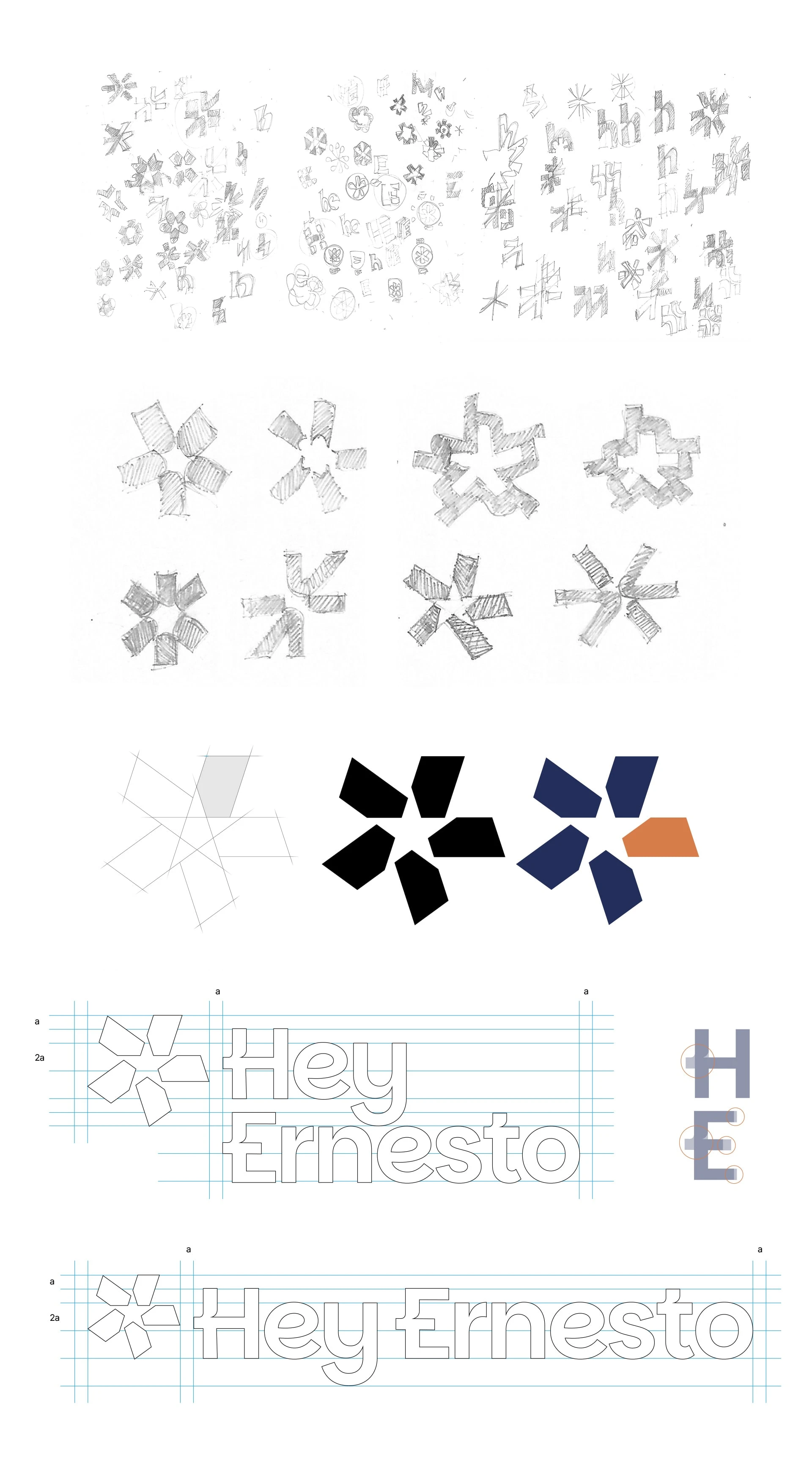
The visual system translates the strategy into a presence that feels approachable, clear, and professional. I wanted to avoid an identity that felt overly rigid or corporate, without relying on decorative elements that didn’t support the message.
Every decision had to answer one simple question: does this help a founder understand the offer and feel supported as they make brand decisions?
Symbols with a Clear Purpose
The identity combines an asterisk and a star as its core graphic elements.
The asterisk creates a point of attention. It signals that there is something worth noticing more intentionally.
The star works as a visual guide, representing direction, clarity, and support.
Together, they create a graphic language that highlights important ideas without relying on excessive elements or oversized claims.
Typography and Color
I chose Plus Jakarta Sans for its readability, friendly shapes, and flexibility across digital formats. It keeps the content direct and easy to scan, whether it appears in a proposal, on a website, or in a piece of content.
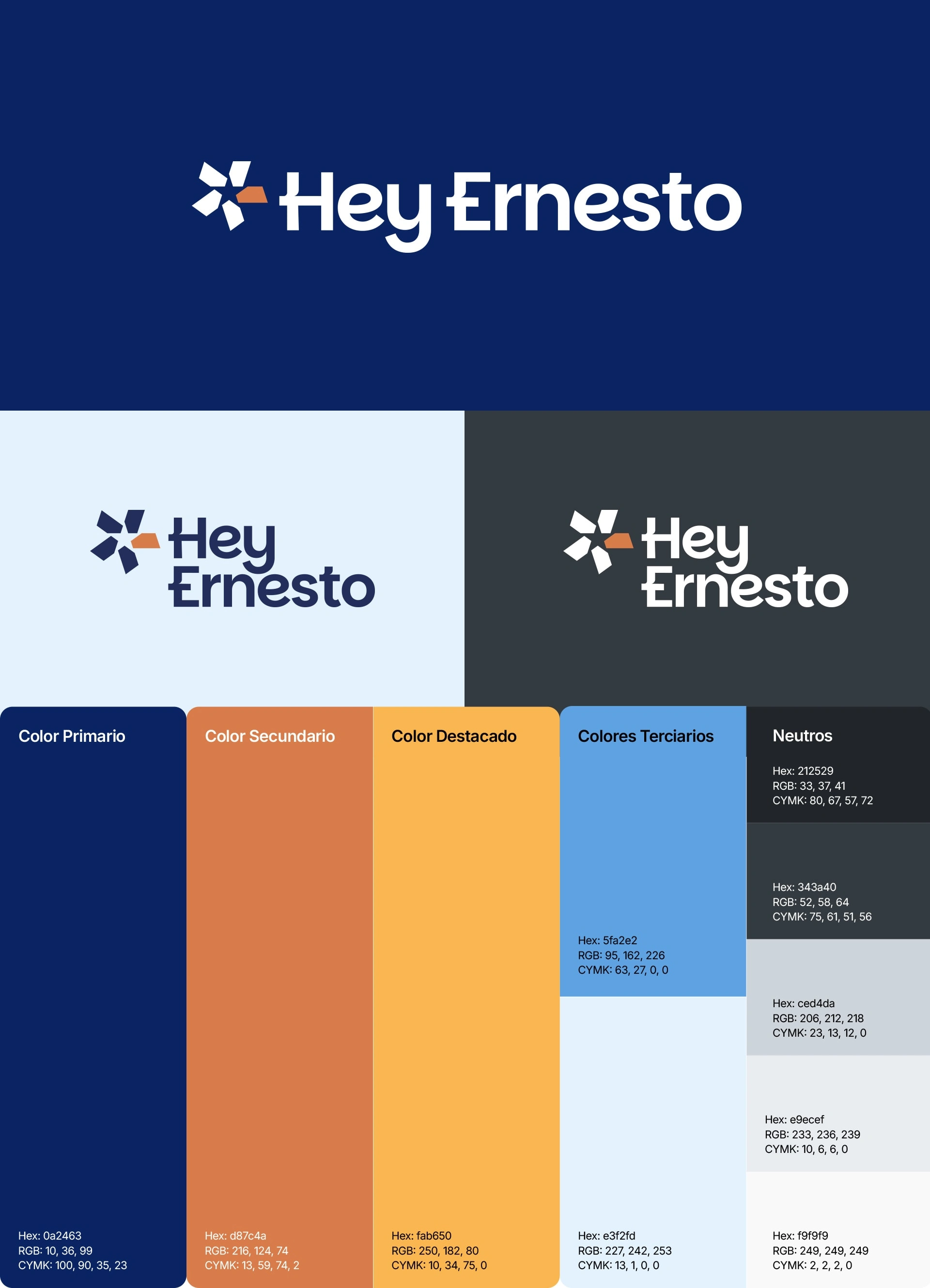
The color palette is organized around 4 functions:
Deep Blue: clarity, trust, and strategic thinking.
Soft White: visual space that lets ideas breathe.
Terracotta: warmth and human connection.
Amber: focused moments of emphasis.
Color isn't used as decoration. It organizes information, establishes hierarchy, and keeps the brand from feeling cold or distant.
A System Designed to Be Used
The identity was designed to stay consistent across the different touchpoints of my practice:
Website and service pages
Client proposals and documents
Presentations and working materials
Social media content
Business cards and other client-facing materials
The aim wasn't to create an extensive guide that would sit unused. It was to build a clear enough system that every piece feels part of the same brand, even as the format and context change.

What This Project Demonstrates
Building Hey Ernesto gave me a practical framework for the work I do with founder-led brands.
The project began with strategy, not visual preference. I defined the purpose, audience, positioning, and voice first, then built a visual system to support those decisions across real business touchpoints.
That sequence shapes how I approach client work:
Clarify what the brand needs to stand for.
Define the message and the people it needs to reach.
Build a visual identity that makes the strategy easier to recognize and use.
Create a system that can grow beyond a logo.
Hey Ernesto remains the working foundation of my brand practice. It shows how I turn an early idea into a clear brand direction, then into an identity built for everyday use.
Like this project
Posted Jan 12, 2026
A self-initiated brand identity for my independent practice, built from strategy first to help founders turn early ideas into clear, usable brands.