OppenheimerFunds
About
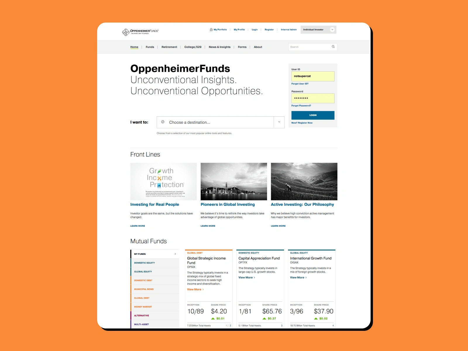
In 2014, OppenheimerFunds began a brand enhancement exercise in order to accommodate company growth during the next 5 years. The brand began taking a more subdued, editorial, typographically driven look and feel. The first digital property that began implementing this new approach was the Investor website.
Our Solution
We collaborated with the marketing, content and investment teams, to establish initial concepts and creative direction for the website. Once the direction was established and approved by senior leadership, it was applied to create an elegant, intuitive, and responsive user interface and visual design for the Investor website.
One of the key challenges we were solving for was to enable seamless navigation through a complex forrest of financial data. We were able to do that through persistent user testing, user interviews, and design iterations.
Services we provided
UX/UI design
Visual design
Visual language
Web design


Like this project
Posted Apr 17, 2024
Web design of an investor portal for this mutual funds giant.
Likes
0
Views
2

