Space Man 3D Printer Brand Design
Laura
Space Man 3D Printer full Brand Design
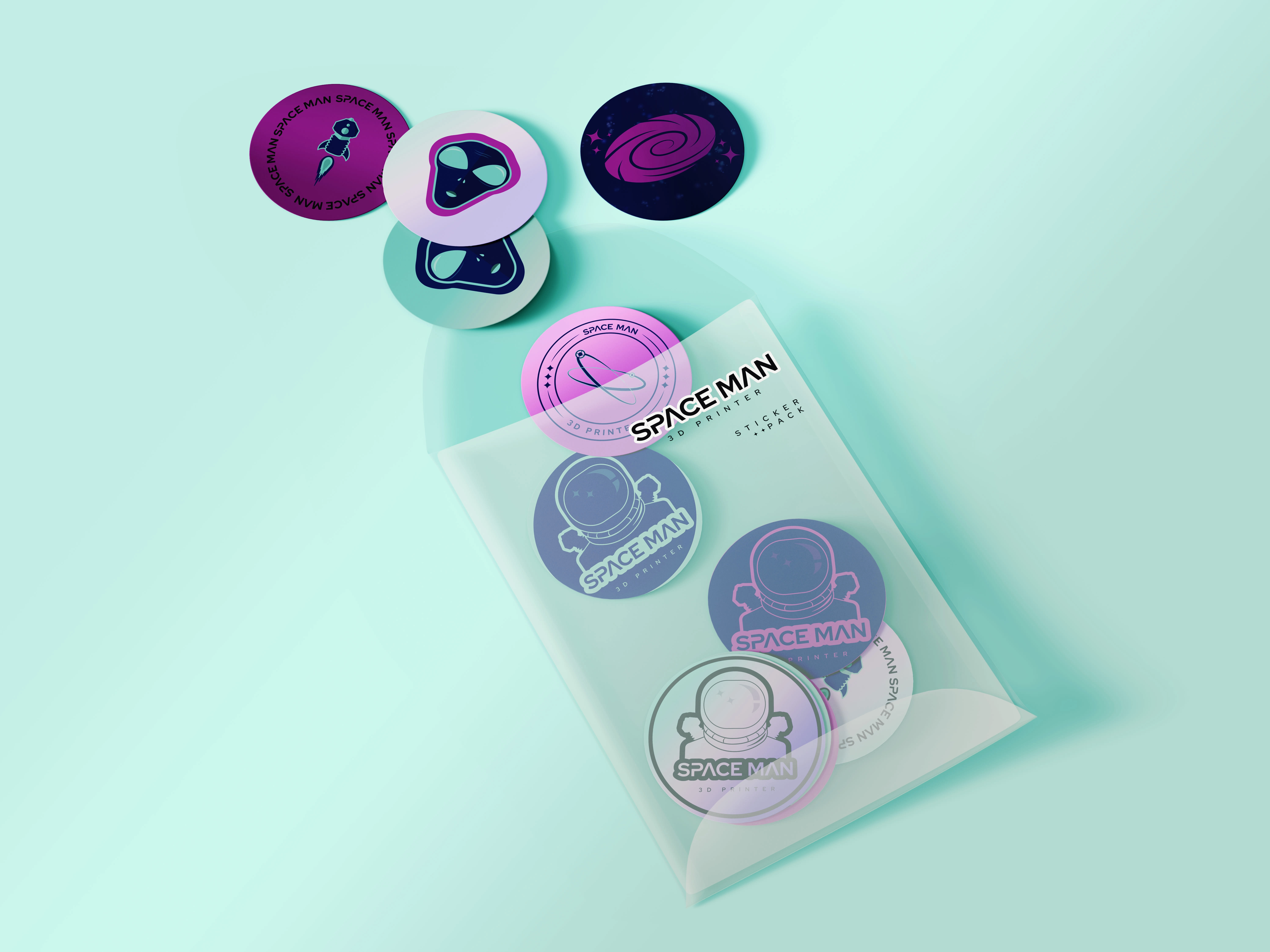
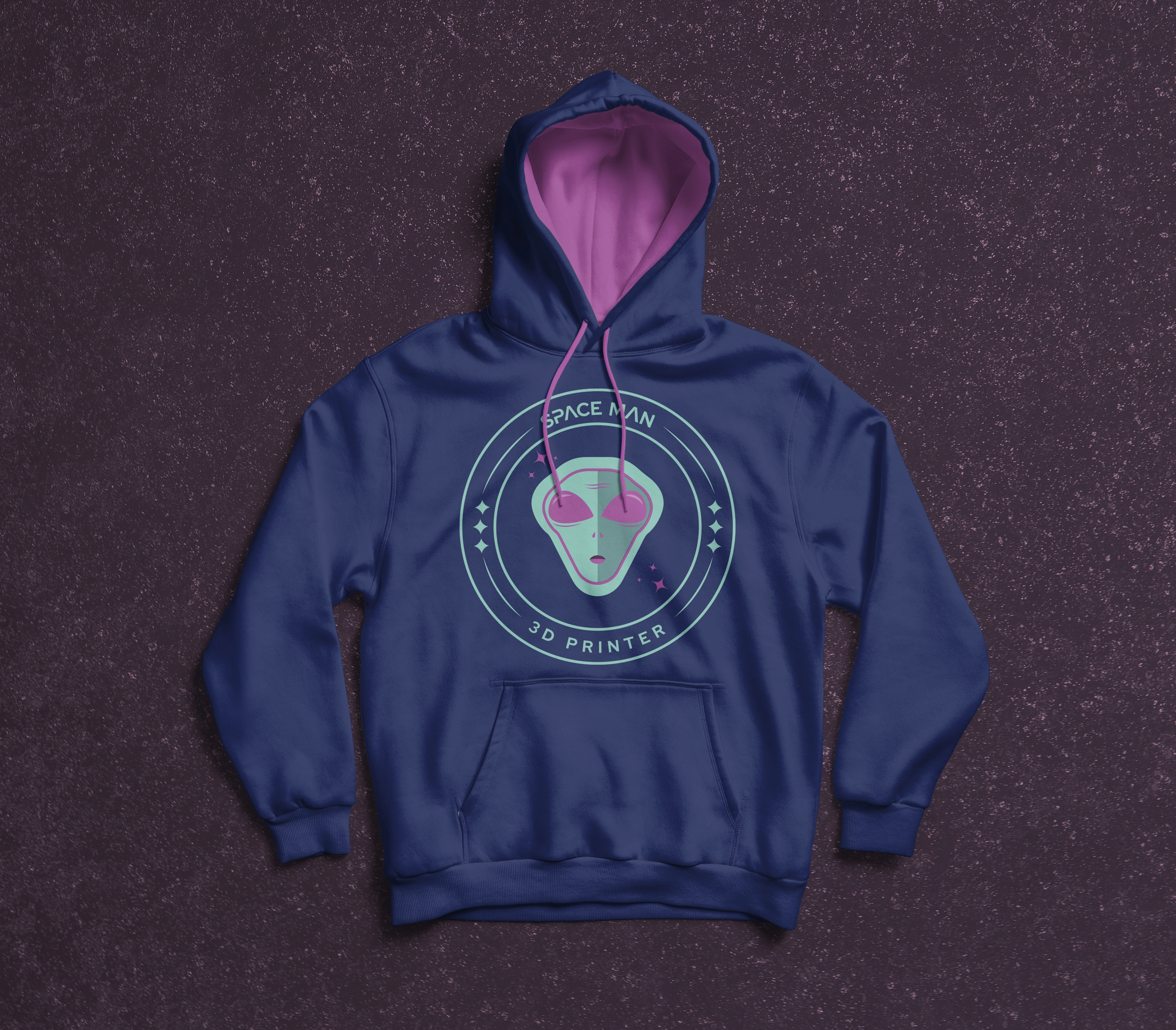
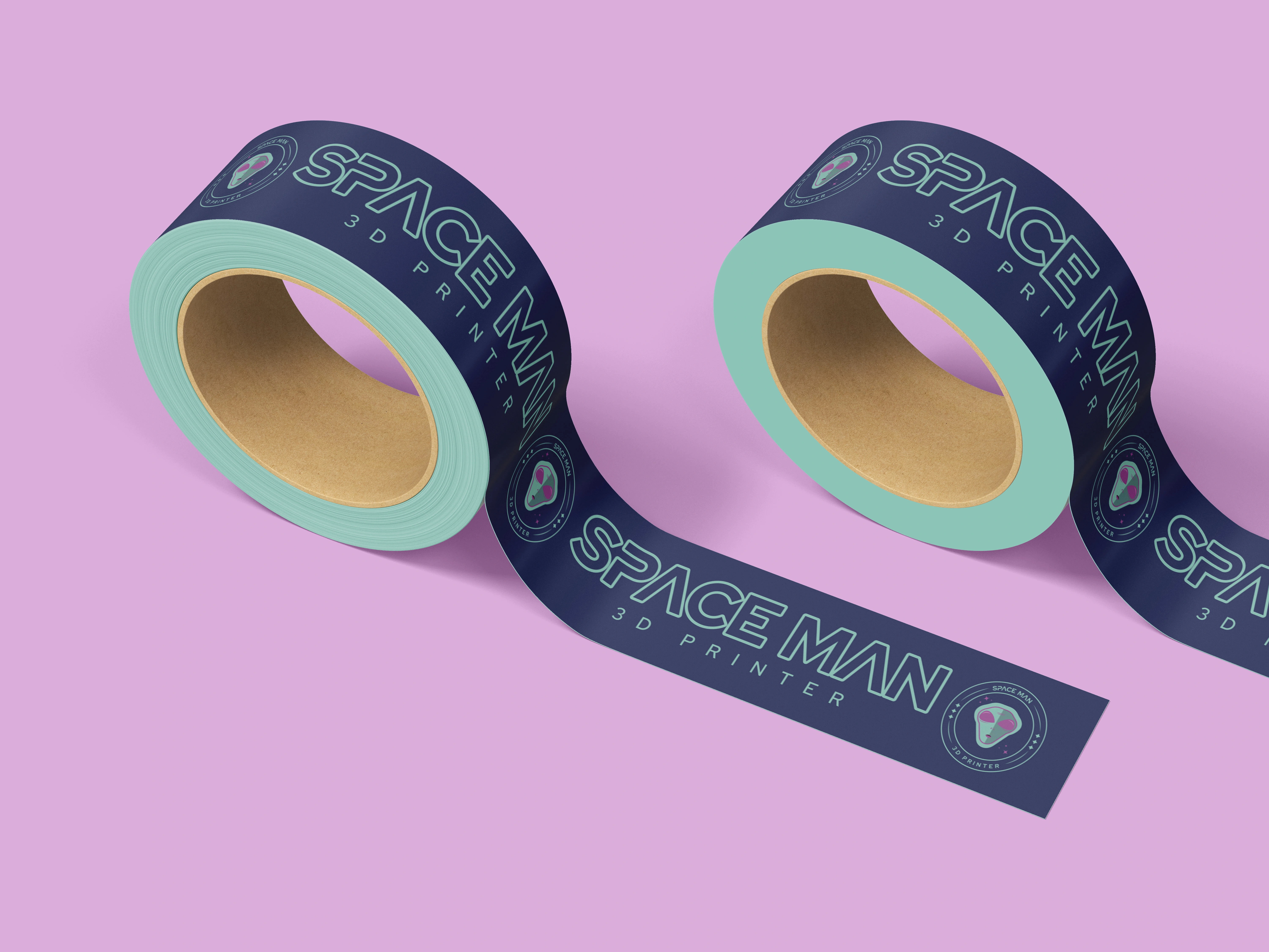
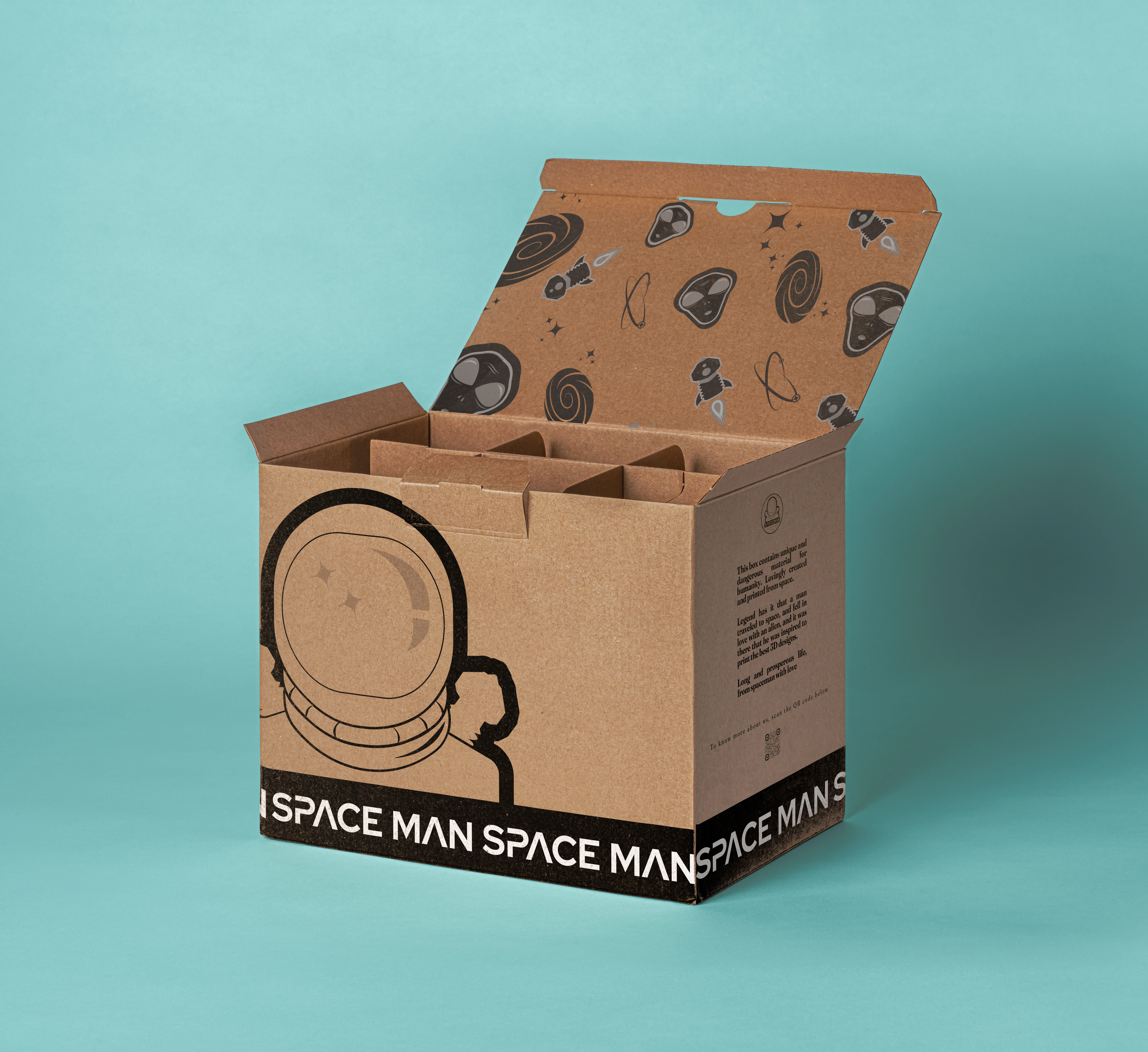
Space Man is a 3D printing company that needed to create its brand from scratch. The company drew inspiration from a space-themed and modern style, aiming for an approachable and friendly feel since they produce all types of pieces—from objects that improve everyday tasks to custom prints for gifts.
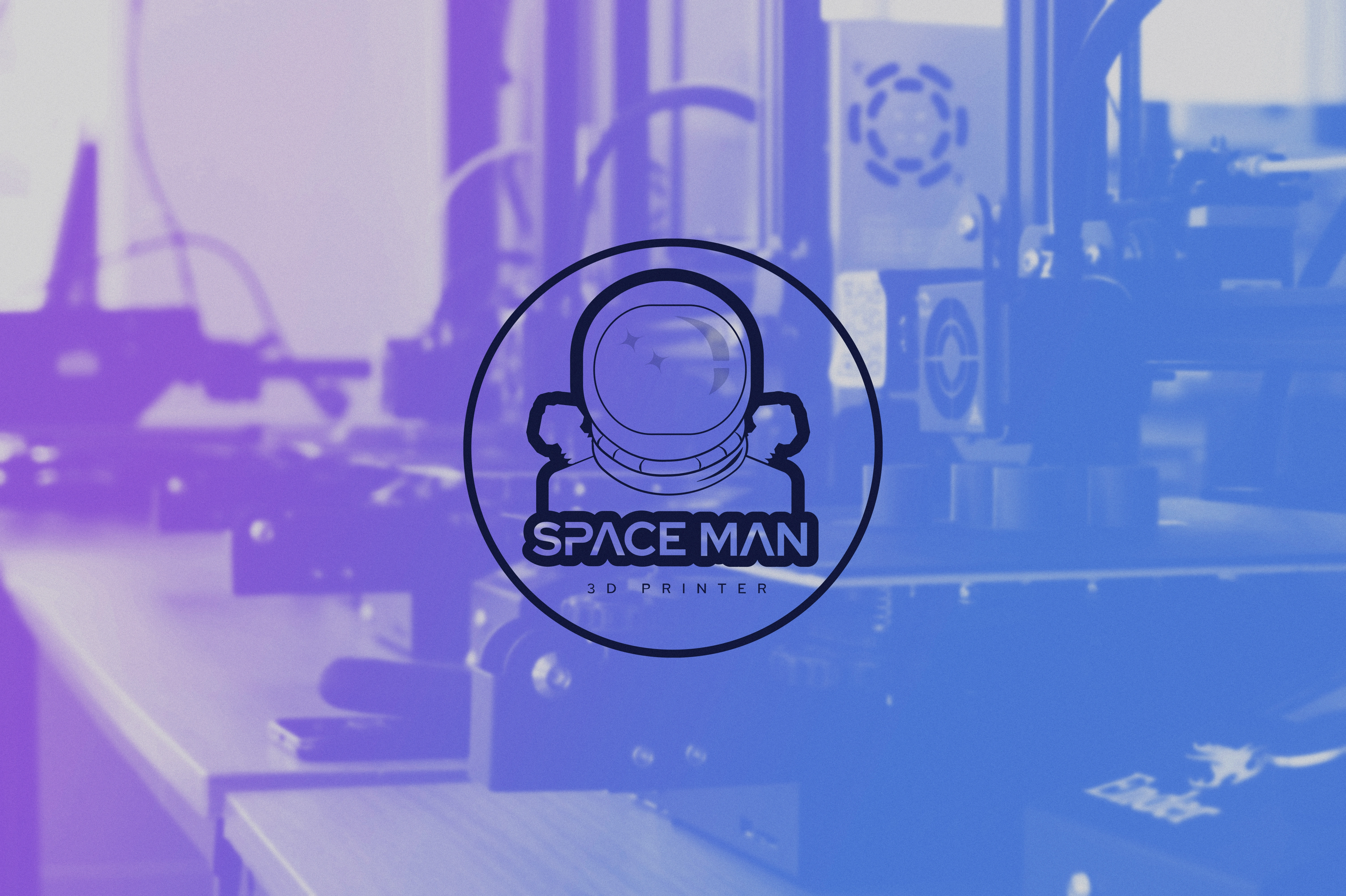
The goal was clear: create a brand universe that aligned with Space Man's values of innovation, unique products, and creativity. That's why I chose a color palette that represented the creative side of the brand while also making it more approachable and informal. On the other hand, the typography inspired by the space theme represented the modern and current aspect of the brand—legible and simple, so it would be easy to identify and remember.
Like this project
Posted Oct 10, 2025
A bold, playful brand identity for Space Man 3D Printer, blending innovation, creativity, and cosmic energy into a modern visual universe.
Likes
5
Views
37
Timeline
Feb 10, 2023 - Mar 10, 2023