StratEdge Consulting — Brand Identity Design

Temmy Visual


StratEdge Consulting — Brand Identity Design
Every consulting firm says they drive results. StratEdge needed a brand that actually looked like it. From mind map to final mark — this is how it came together.
THE BRIEF
StratEdge is a business strategy consulting firm built for companies that are serious about growth. The goal wasn't just a logo — it was a full visual identity that could walk into a boardroom and command respect without saying a word.
The brand had to feel modern and clean, but also trustworthy. Corporate, but not cold. The kind of identity that tells potential clients: these people know what they're doing.
MIND MAPPING
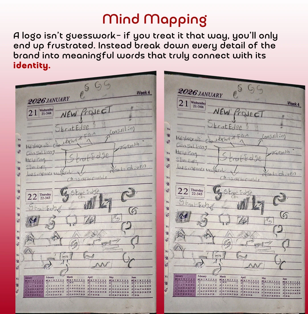
Before touching a single design tool, I opened my sketchbook. I broke down the brand name — StratEdge — into its core DNA. Strategy. Edge. Consulting. Growth. Achievement. Results-driven. Clarity.
Every word became a visual question. What does "edge" look like? What does "strategy" feel like? This phase isn't glamorous, but it's where the real design work happens — before Illustrator ever opens.
LOGO IDEATION
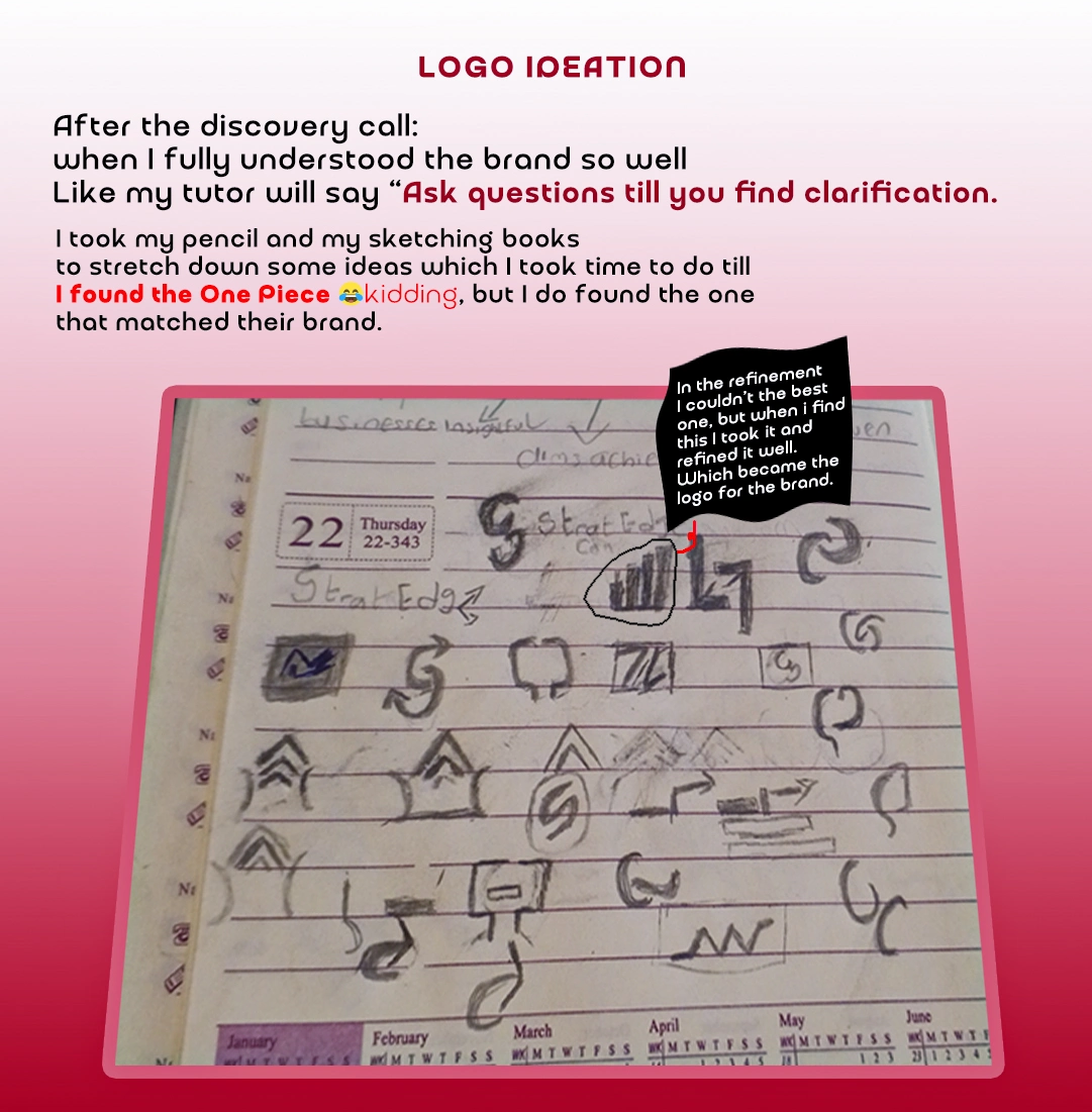
After the discovery phase, I went deep into ideation. Dozens of directions — letterforms, abstract marks, upward arrows, architectural shapes. Most got scrapped. A few got circled.
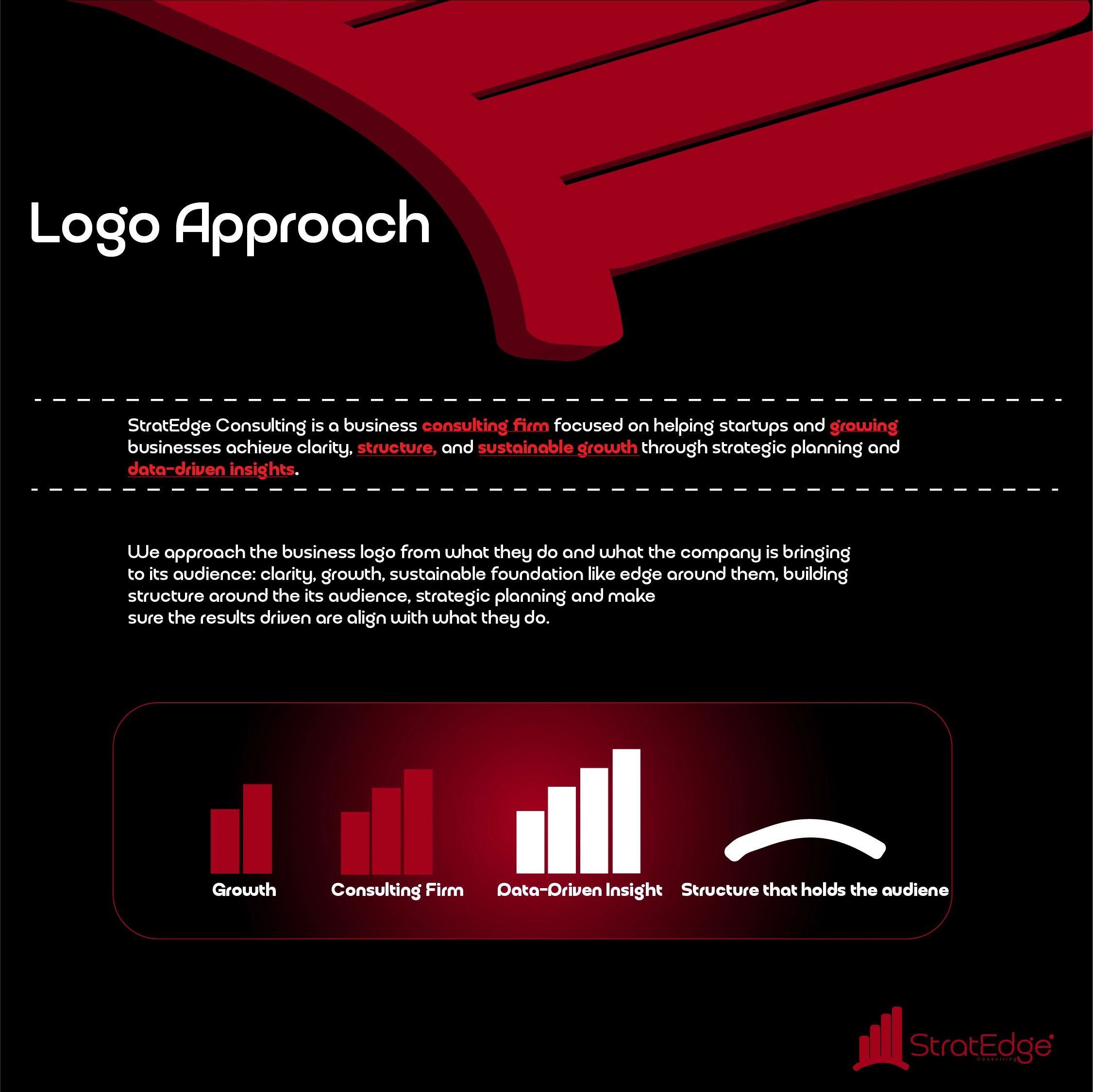
One sketch kept standing out. A rising bar chart sitting on a curved base — growth rising from a strong foundation. That was it. That was StratEdge.
EXECUTION
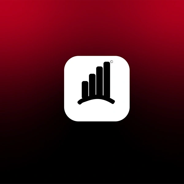
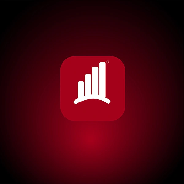
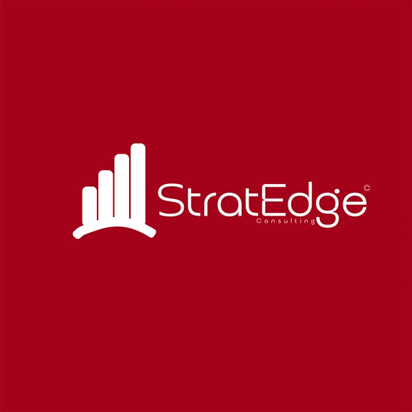
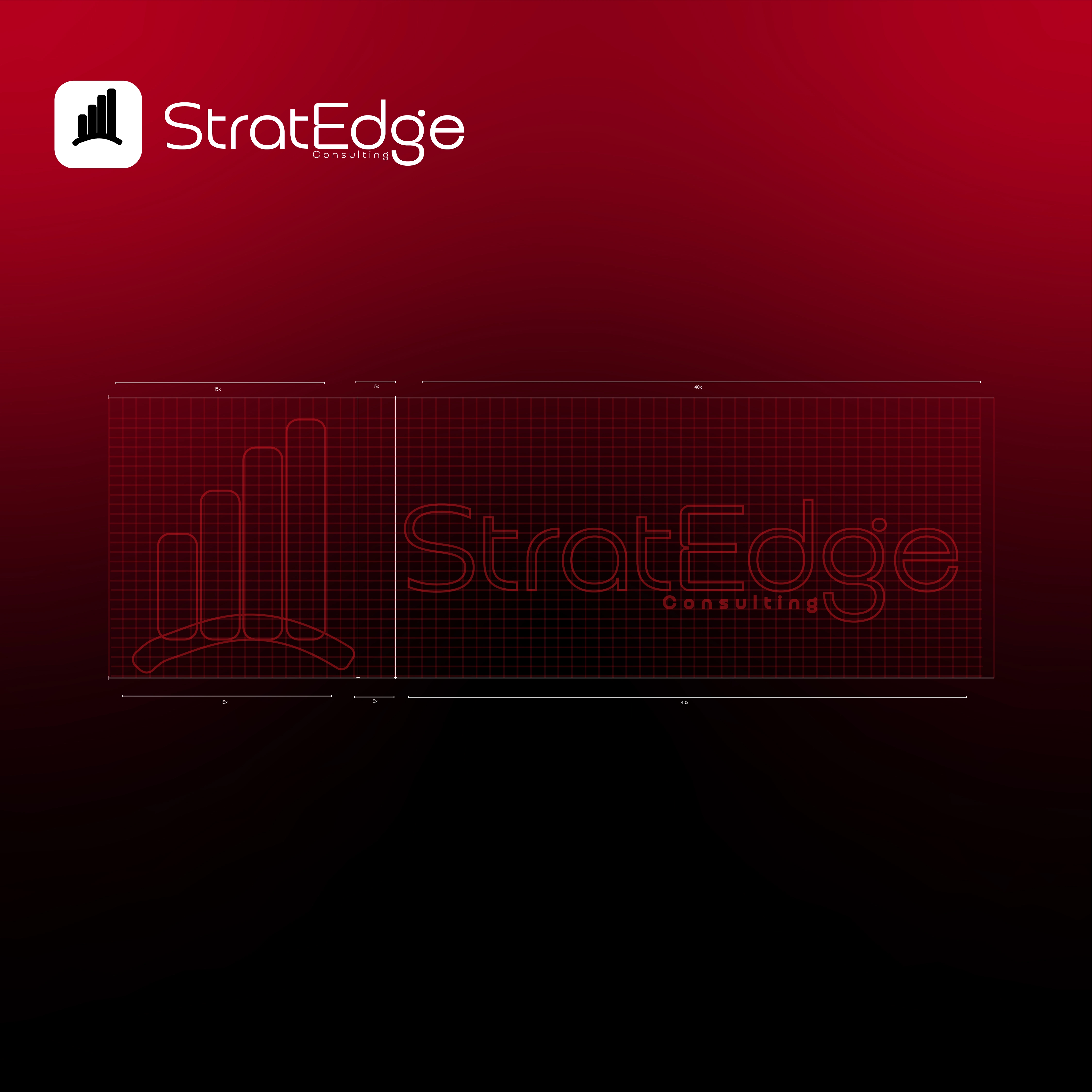
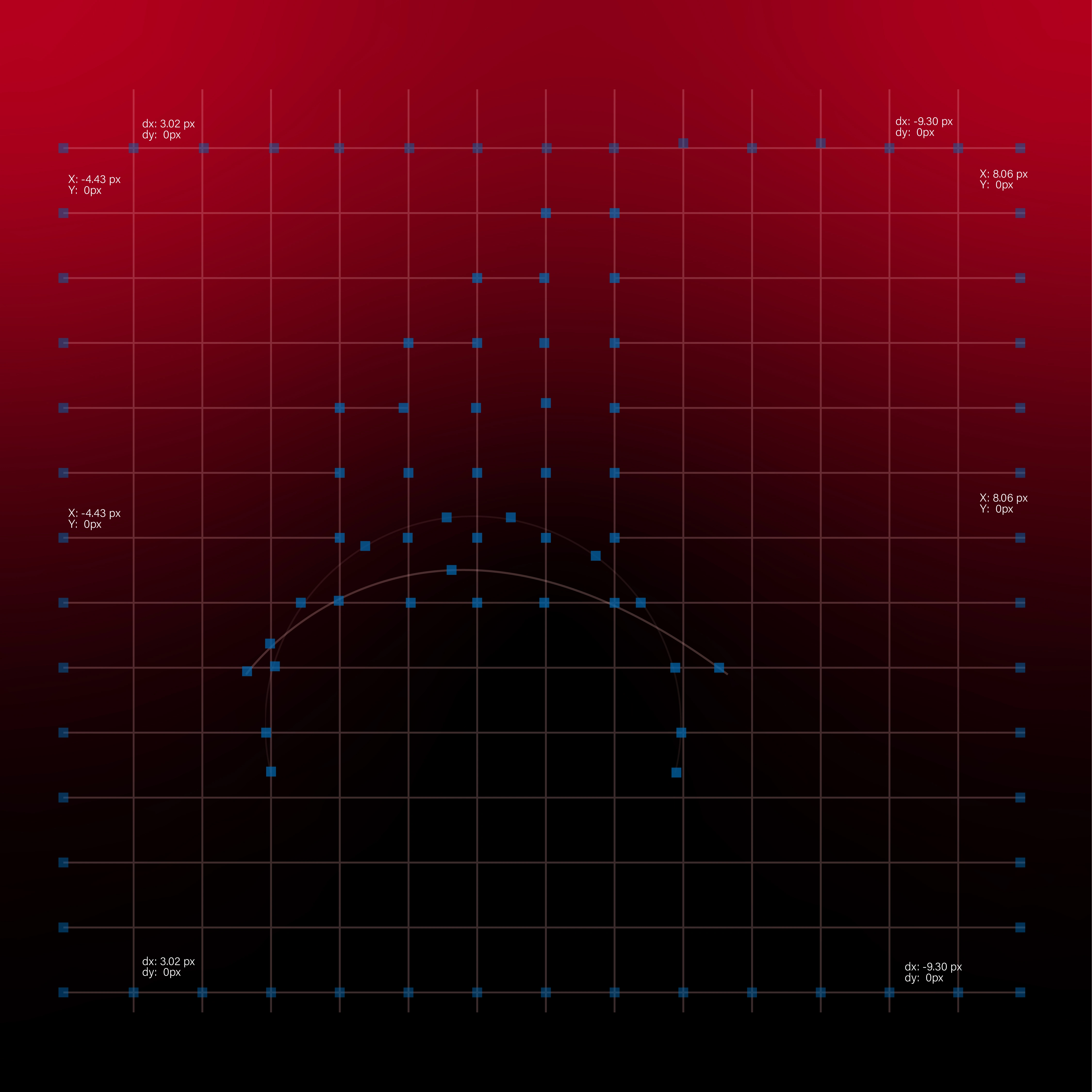
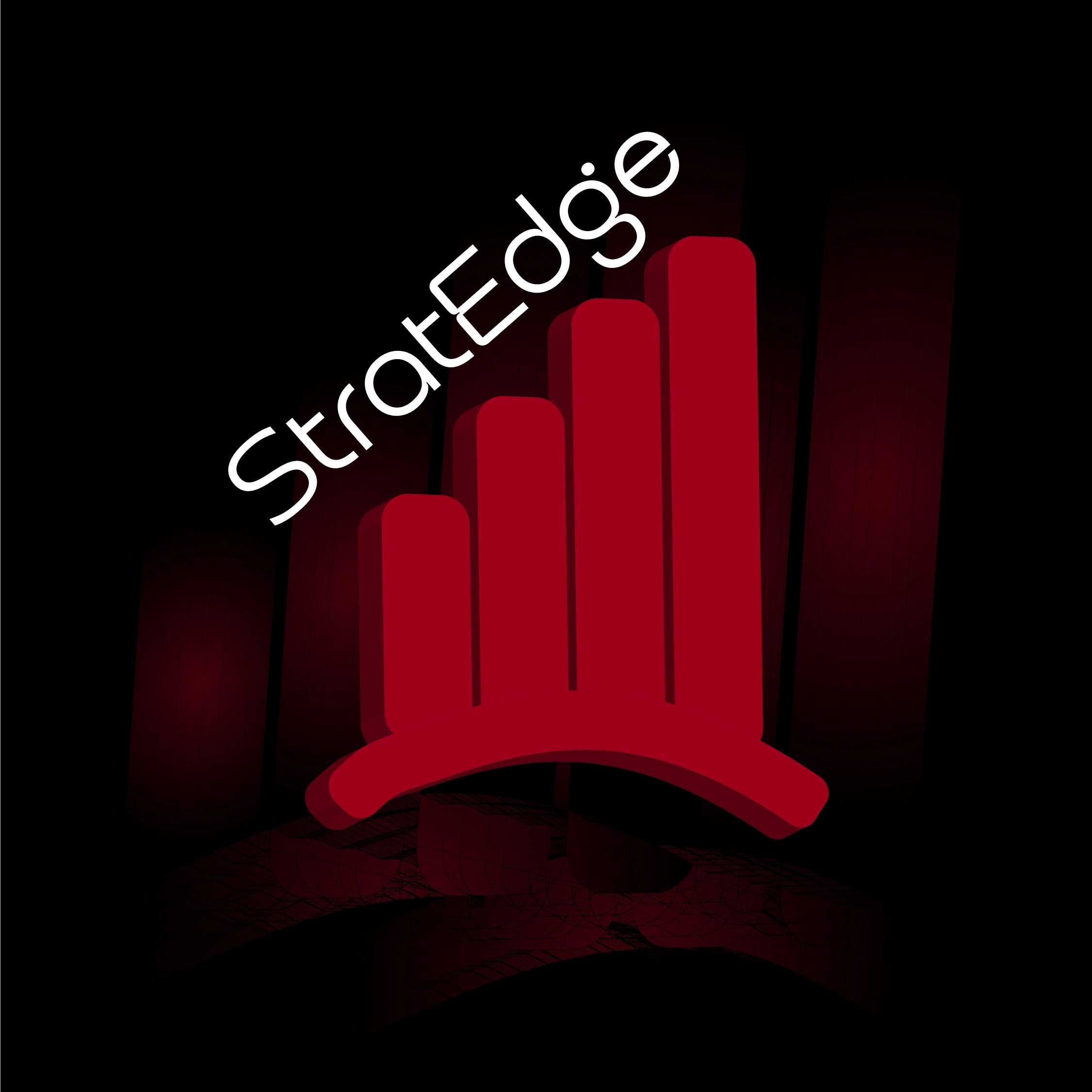
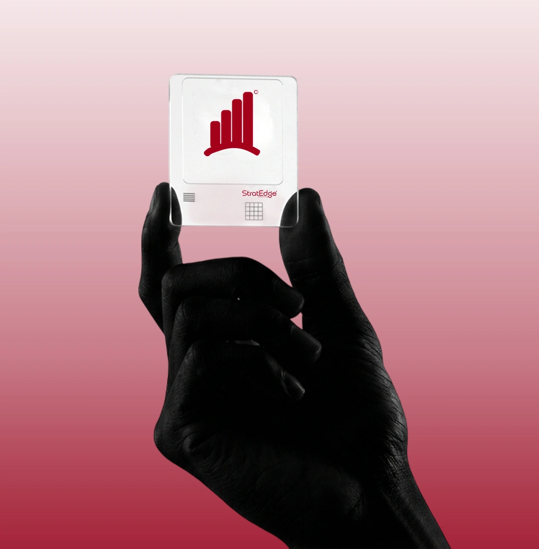
I took that rough sketch into Illustrator and refined it until every curve and proportion felt intentional. The icon — four ascending bars on an arched base — communicates upward growth built on solid strategy.
The wordmark pairs clean, modern typography with the icon. "Strat" and "Edge" carry equal visual weight — neither overpowers the other, just like good strategy and sharp execution should work together.
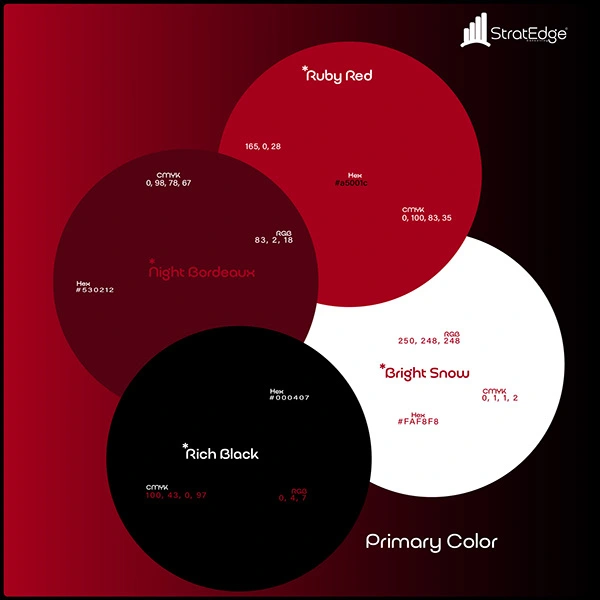
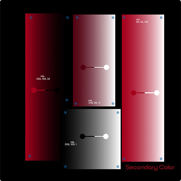
Color: Deep crimson red — bold, confident, ambitious. Not aggressive, but impossible to ignore.
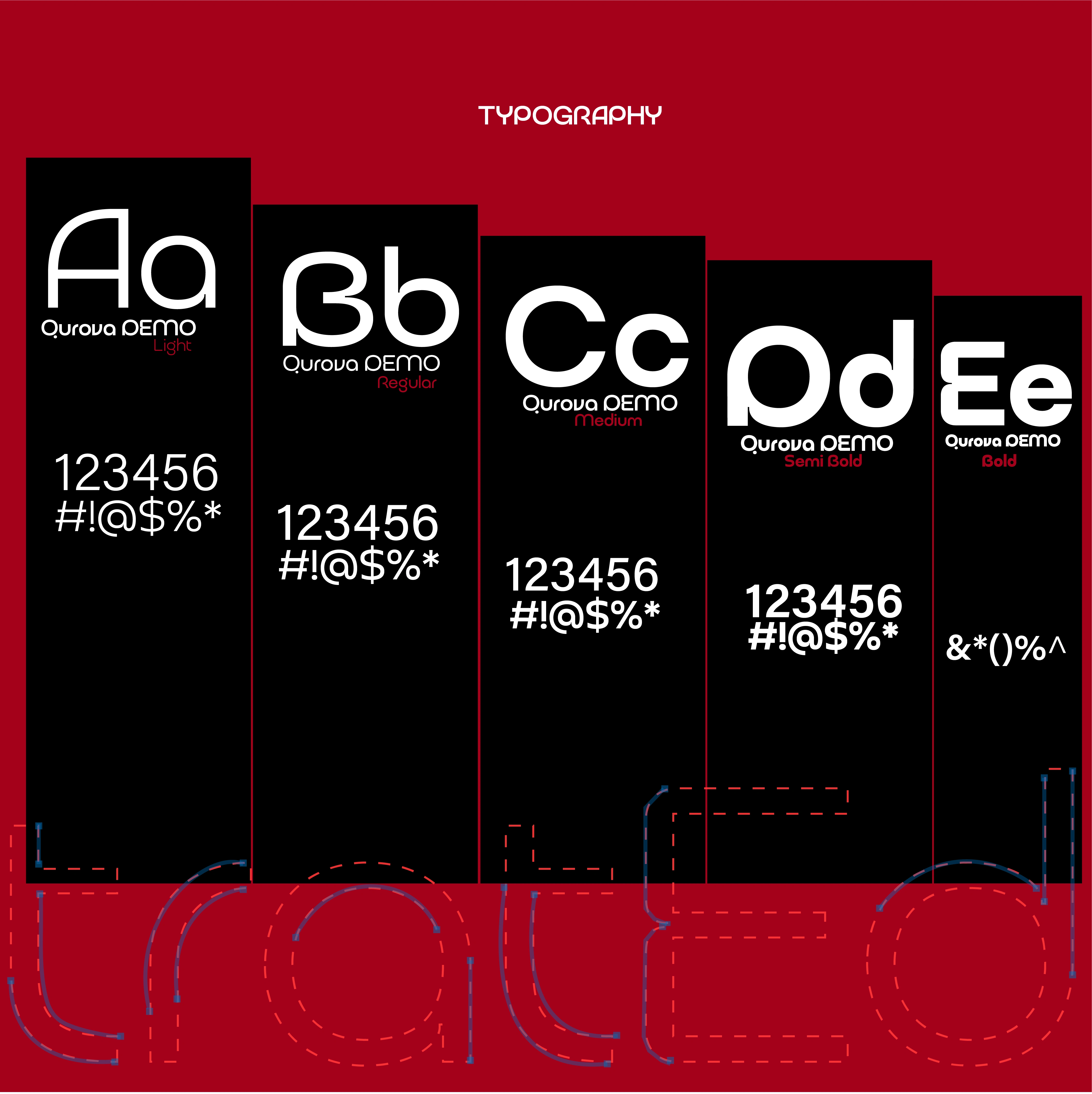
Typography: Clean sans-serif with rounded terminals — modern authority with a human touch.
LOGO VARIATIONS
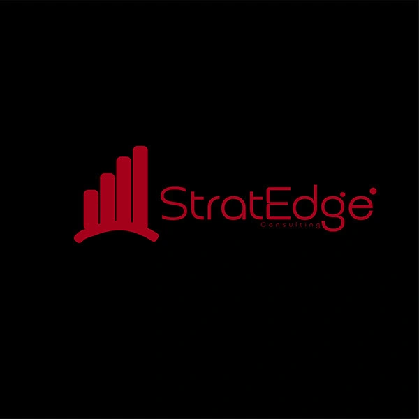
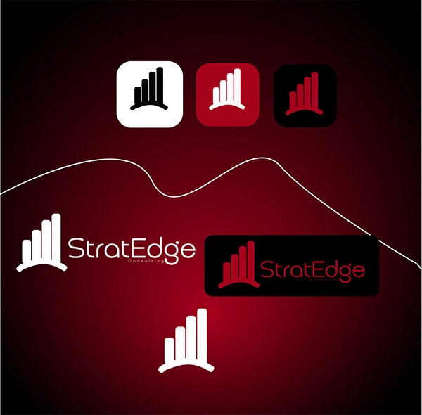
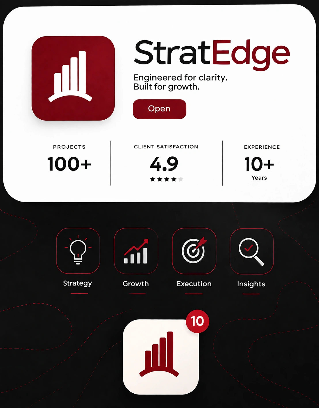
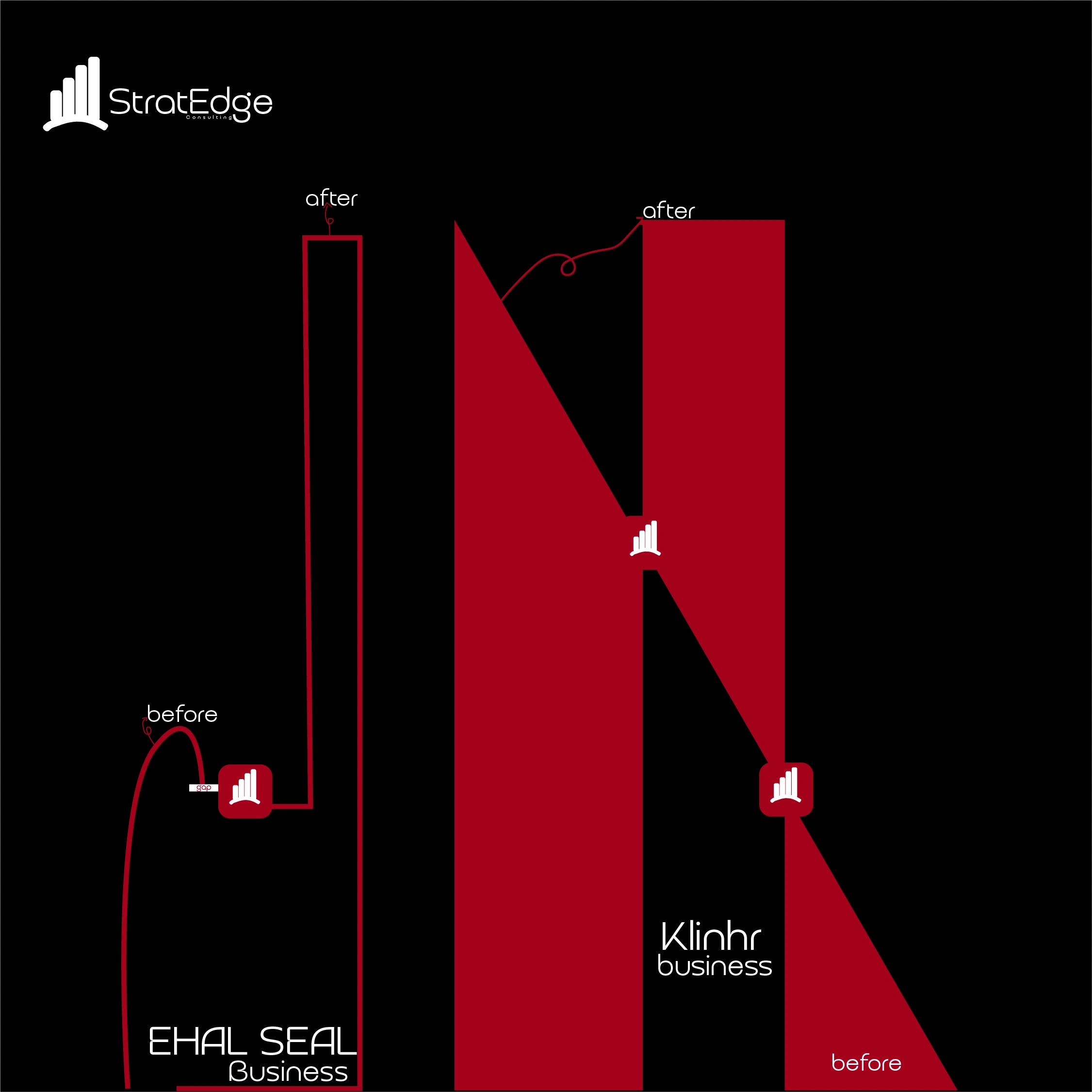
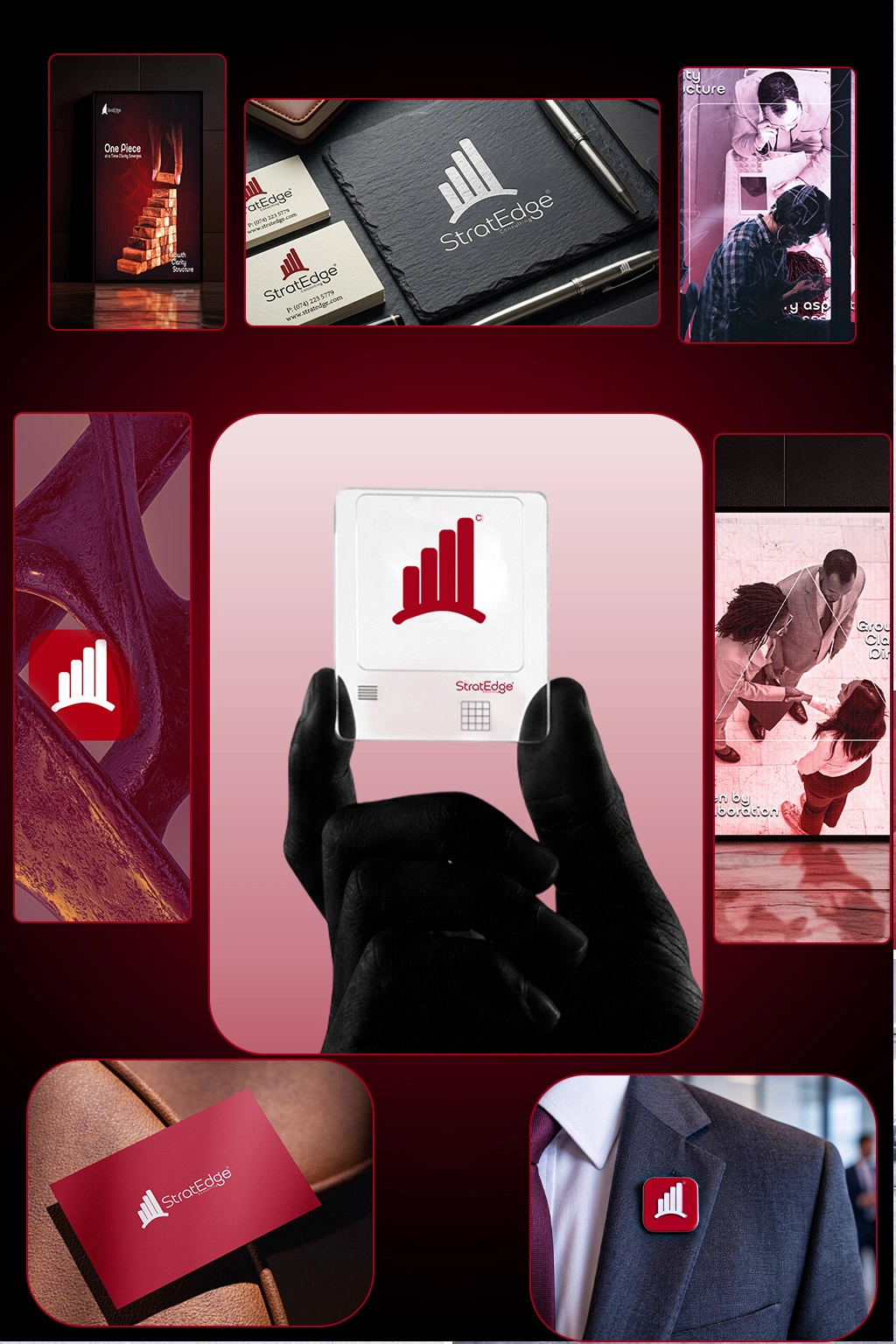
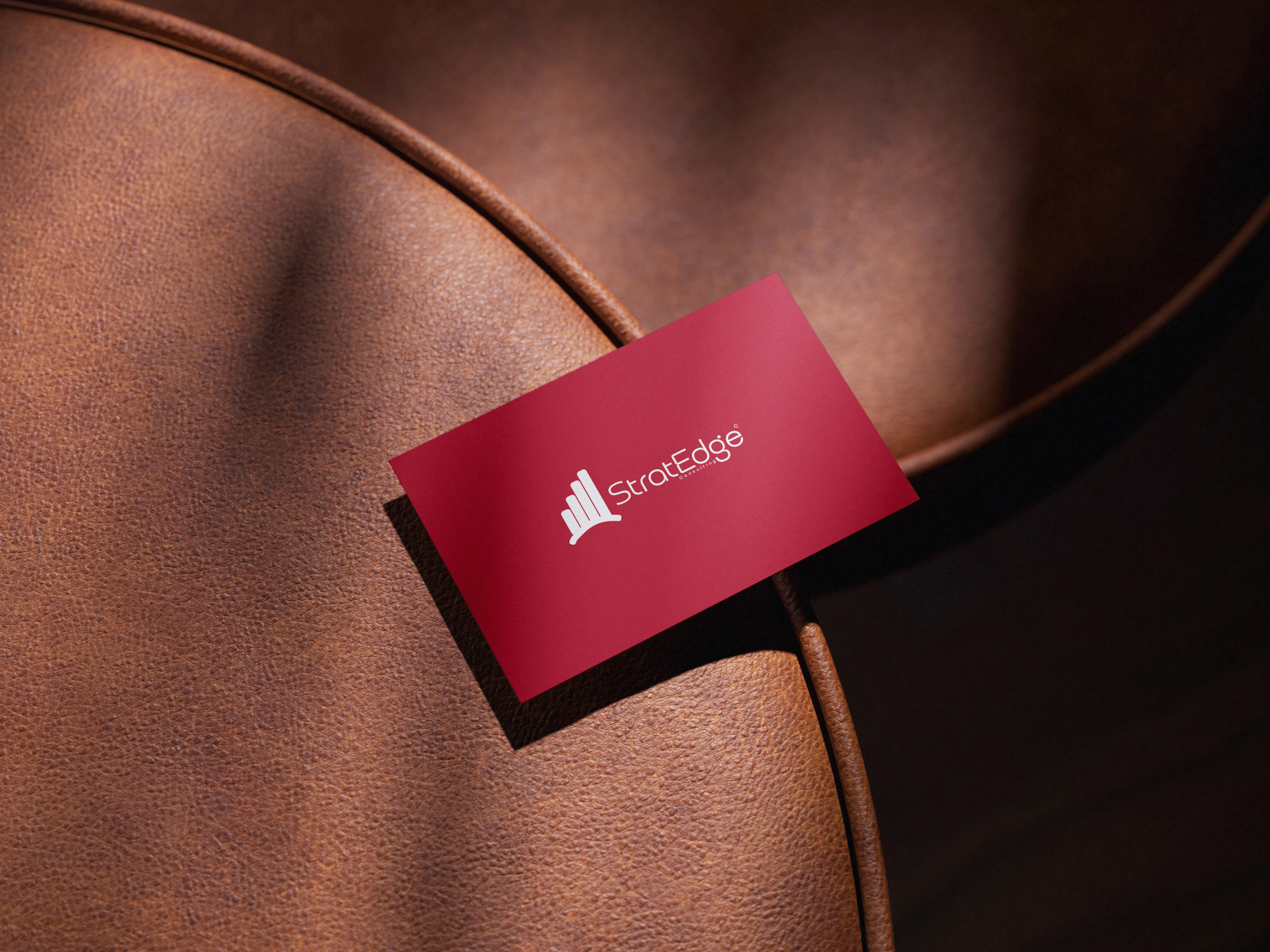
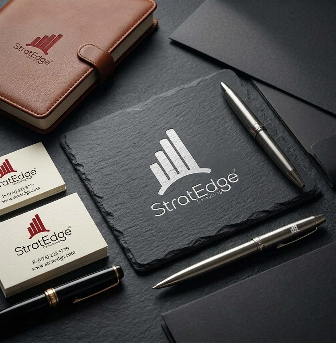
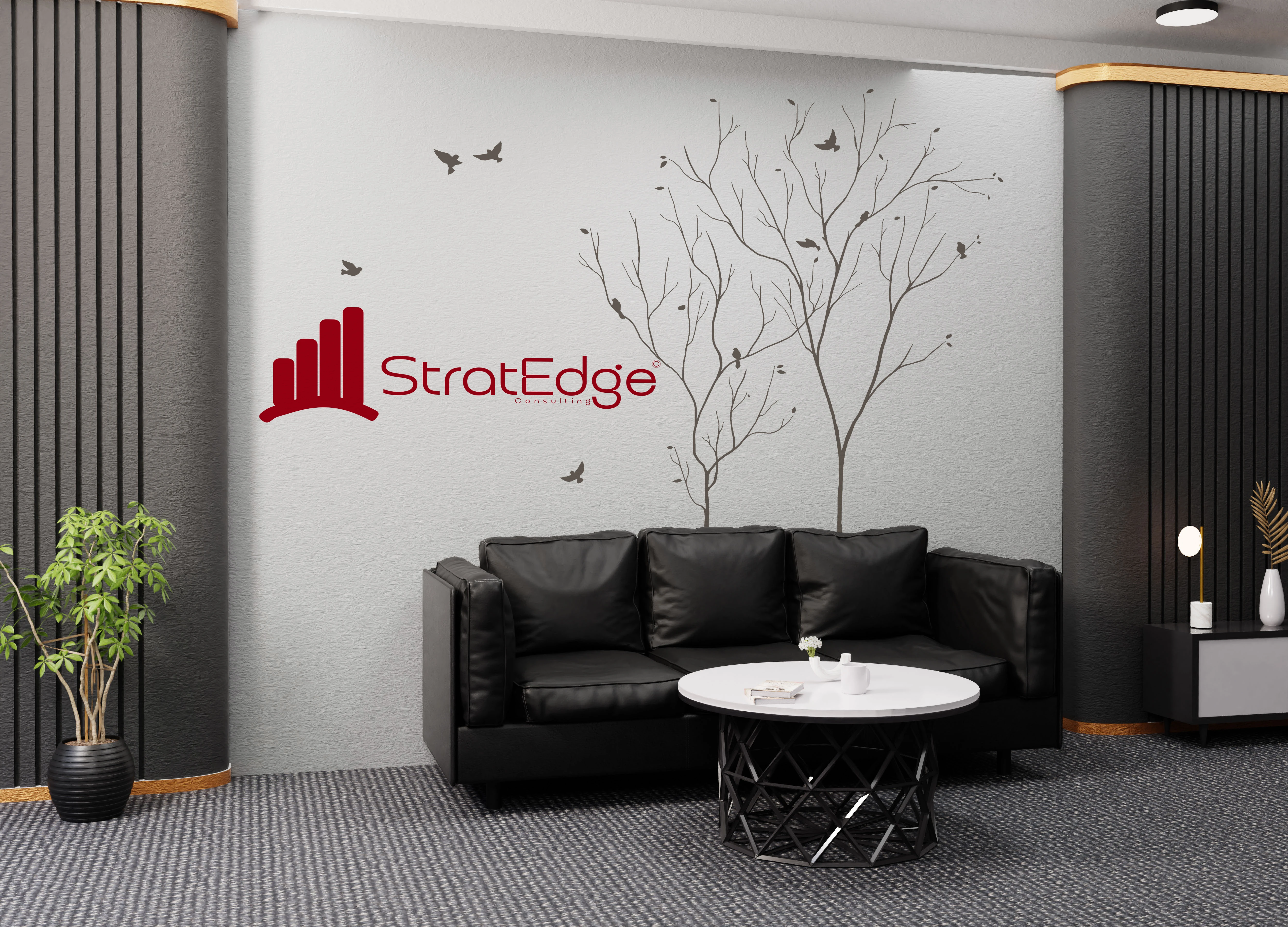
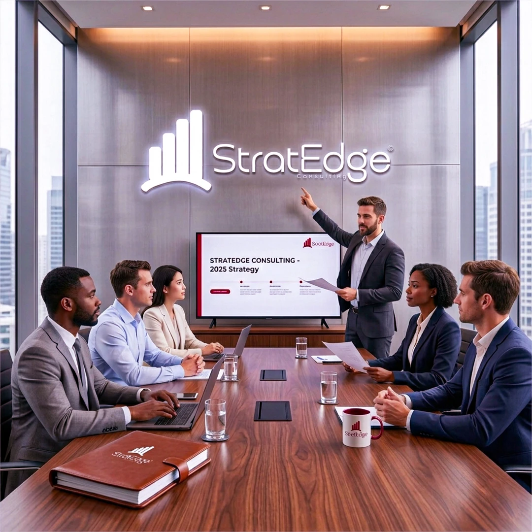
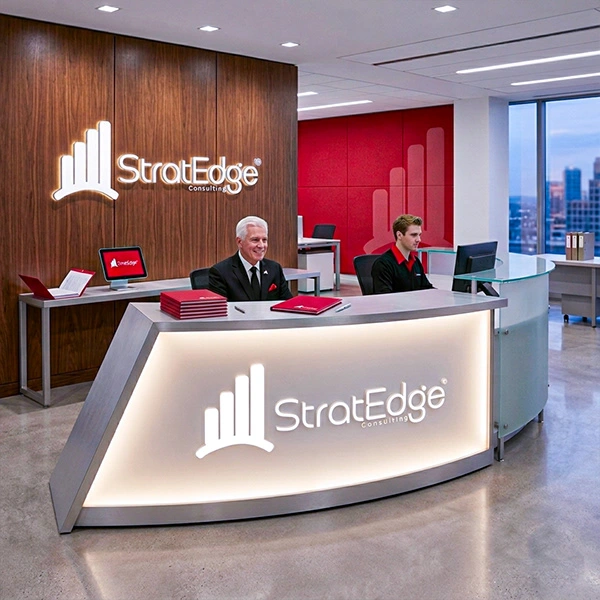
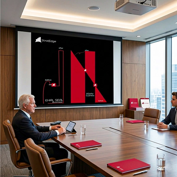
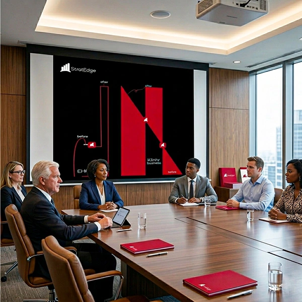
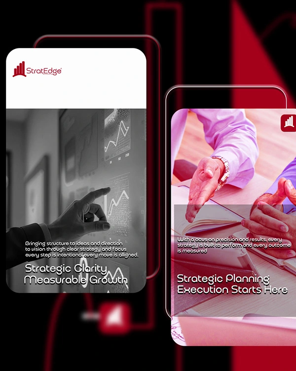
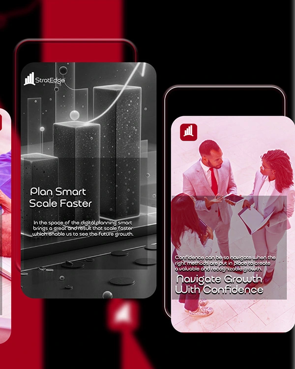
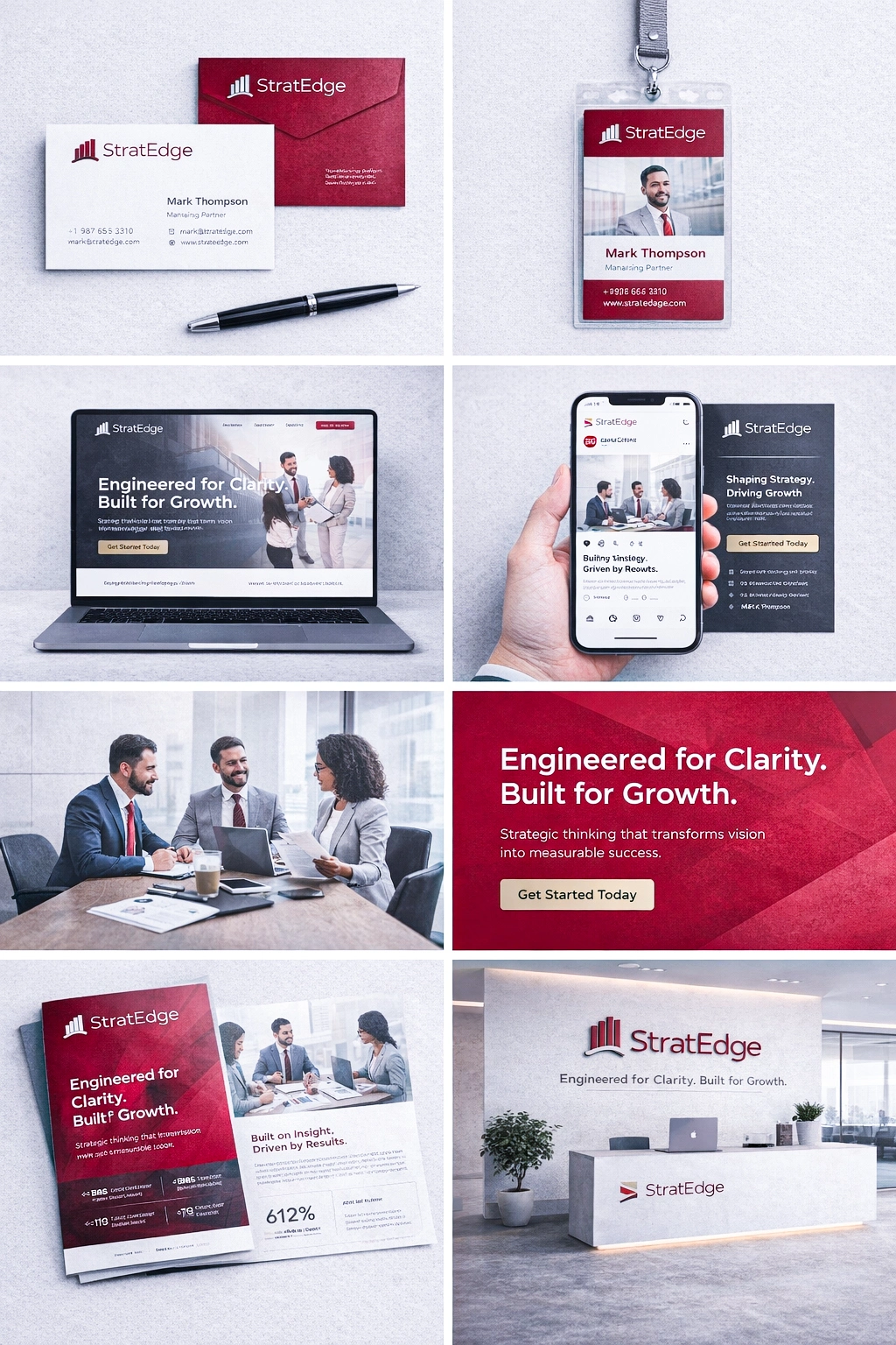
A strong brand lives in multiple environments. The identity was adapted into a full suite — primary lockup, standalone icon, light and dark versions. Whether it's on a website, a business card, or a phone screen — StratEdge shows up consistently.
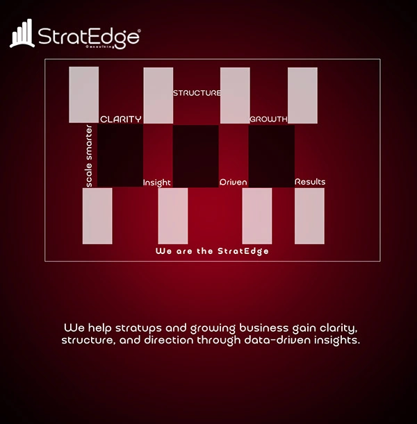
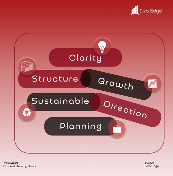
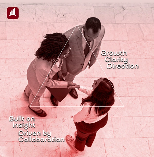
Meet StratEdge



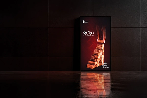
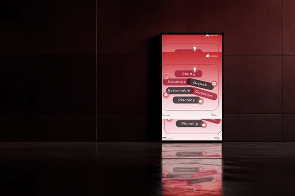
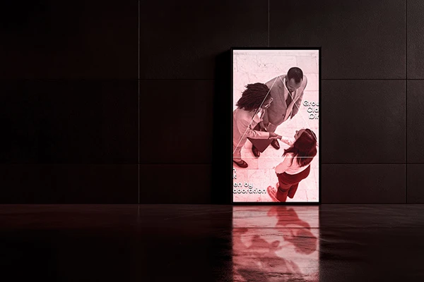
Brand Applications


Thanks for making it to the end — it means you actually care about the craft. 🙏
If you're building a brand that needs to mean something, let's work together.
Open for projects — DM me or reach out below. 📩 techguypassion@gmail.com 🌐 behance.net/johnsontemmy 📱 @temmyvisual
Like this project
Posted Jun 24, 2026
Every consulting firm says they drive results. StratEdge needed a brand that actually looked like it. From mind map to final mark — this is how it came together."