Veloura Berry Lime — Social Media Design by Temmy VisualVeloura Berry Lime — Social Media Design by Temmy Visual

Veloura Berry Lime — Social Media Design

Temmy Visual

Temmy Visual

DESIGN DIRECTION
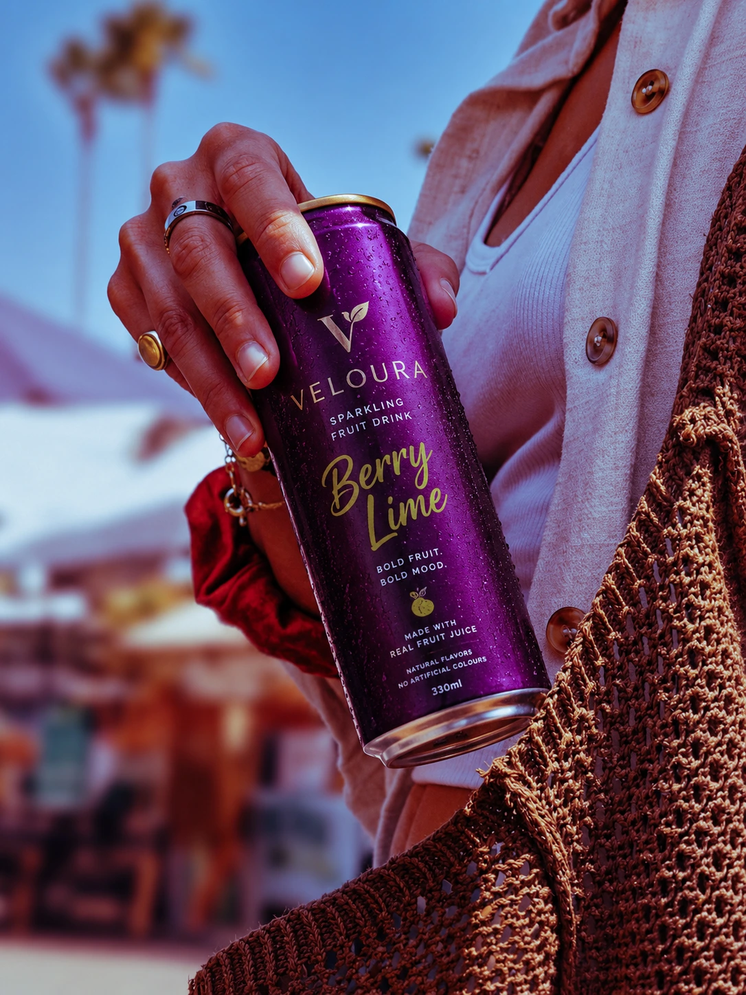
The moment I saw the can — deep metallic purple, gold typography, slim silhouette — the direction was clear. This wasn't a brand that needed softening. It needed amplifying.
Colour Strategy: Purple was already doing the heavy lifting on the can. The design system leaned into it fully — using it as the dominant background tone to create a world that felt like an extension of the product itself. Gold accents were kept intentional, never decorative for its own sake.
Typography: The script lettering on "Berry Lime" already carries personality. The supporting design frames it — giving it breathing room to be the statement it is.
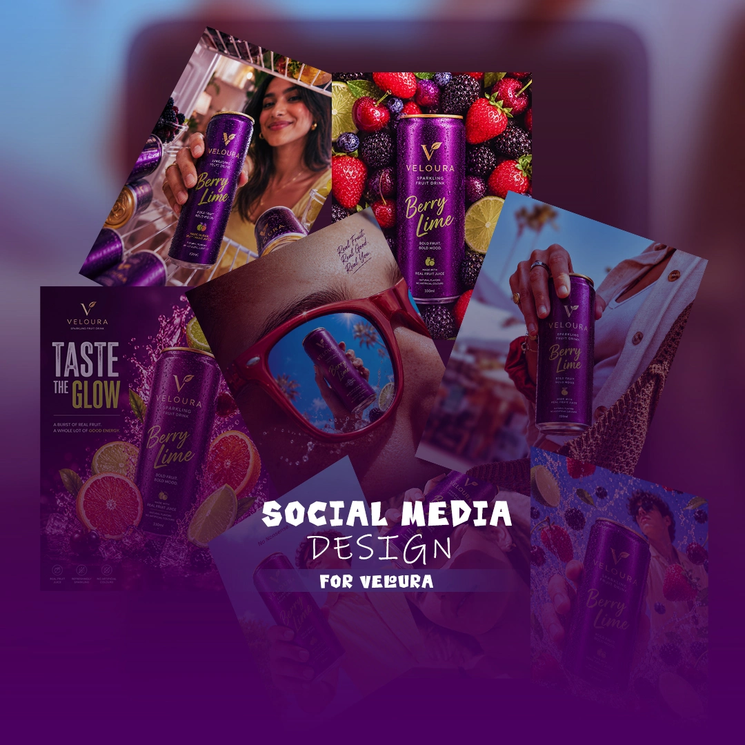
Photography Treatment: Three distinct visual directions were developed:
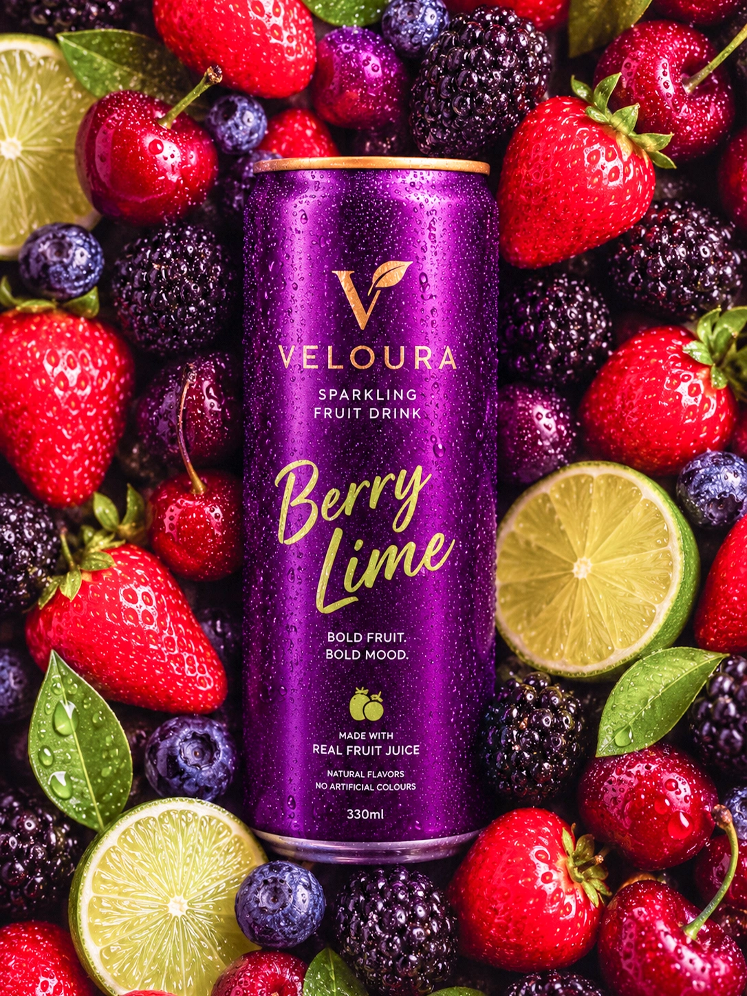
Product on Fruit Flatlay — The can surrounded by fresh, wet berries, limes, and cherries. This communicates the "real fruit" promise viscerally. You see what you're drinking.
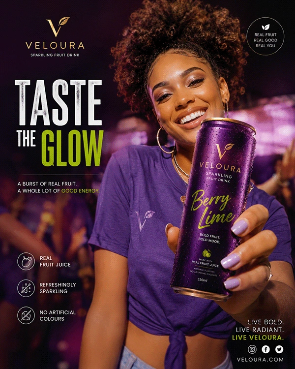
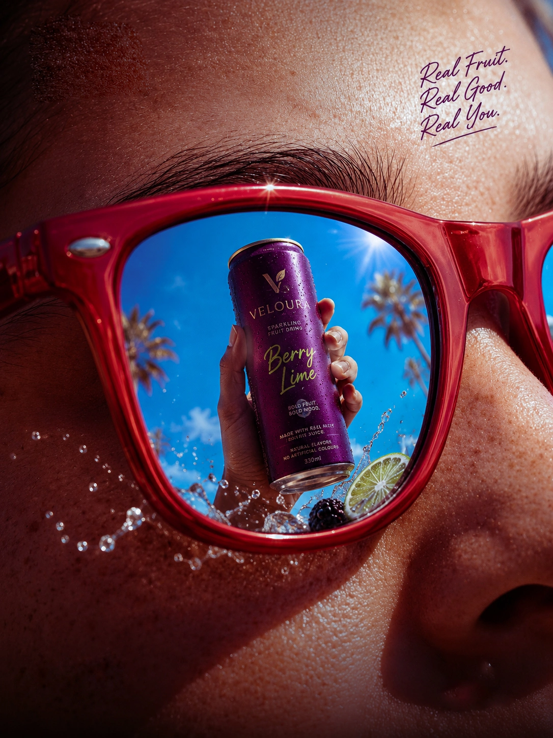
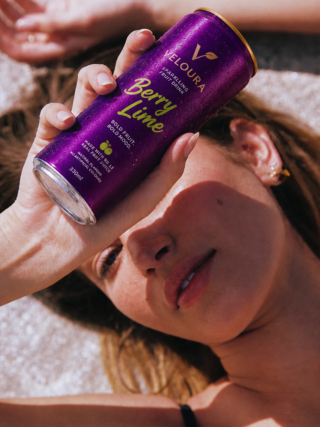
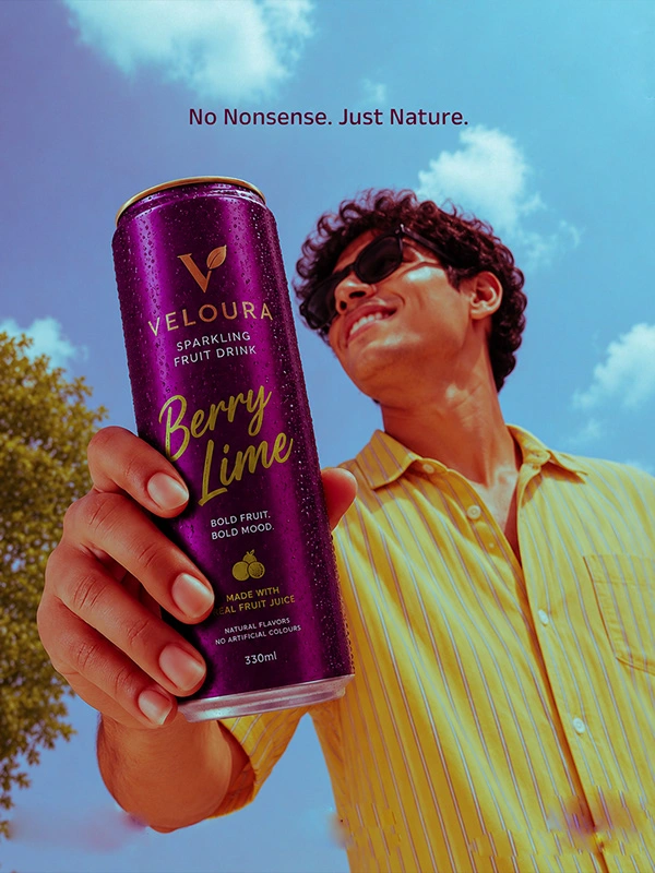
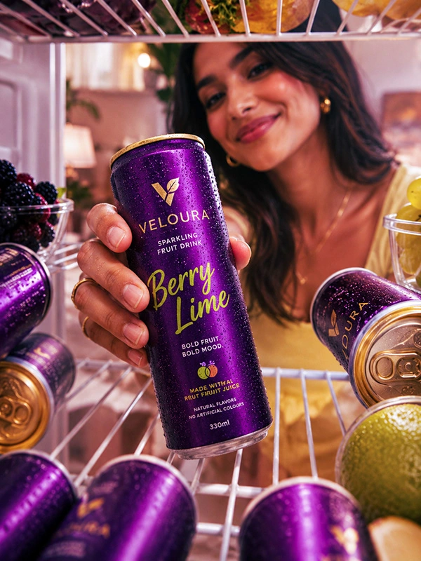
Lifestyle Integration — The can in a real hand, real setting, real light. Palm trees, warm tones, casual luxury. This anchors the brand in a world the audience wants to live in.
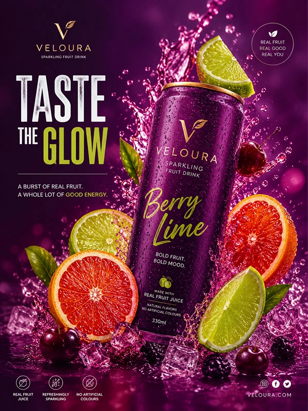
Graphic Promotional Poster — "Taste The Glow." Bold headline, fruit explosions, product front and centre. Built for maximum impact in a feed scroll.
THE THINKING BEHIND "TASTE THE GLOW"
That tagline didn't come from nowhere. Veloura's core promise — real fruit, real energy, no artificial colours — is a physical promise. Glow is what happens when you actually put good things in your body. It became the campaign hook that tied together the promotional content, giving the visuals a narrative anchor beyond just "here's a drink."
Great beverage branding doesn't just sell a drink. It sells the feeling of drinking it — who you are in that moment, where you are, what you're feeling. Every design decision on this project was made with that in mind.
Veloura didn't need to look premium. It needed to feel premium. That's the difference.
Project by Temmy Visual Brand Identity & Social Media Design behance.net/johnsontemmy · @temmyvisual
Like this project